8 Scatterplots
In this chapter we will work with our data to generate a plot of two variables from the Woodworth et al. dataset. Before we get to generate our plot, we still need to work through the steps to get the data in the shape we need it to be in for our particular question. In particular we need to generate the object summarydata that just has the variable we need.You have done these steps before so go back to the relevant Lab and use that to guide you through.
8.0.1 Activity 1: Set-up
- Open R Studio and ensure the environment is clear.
- Open the
stub-scatterplot.Rmdfile and ensure that the working directory is set to your Data Skills folder and that the two .csv data files (participant-info.csvandahi-cesd.csv) are in your working directory (you should see them in the file pane).
- Look through your previous work to find the code that loads the
tidyverse, reads in the data files and creates an object calledall_datthat joins the two objectsdatandpinfo.
8.0.2 Activity 2: Select
Select the columns ahiTotal, cesdTotal, sex, age, educ from the all_dat and save them in a new object named variable summarydata.
8.0.3 Activity 3: Simple scatterplots
First, we want to look at whether there seems to be a relationship between happiness and depression scores across all participants.
In order to visualise two continuous variables, we can use a scatterplot. Using the ggplot code you learned about in Intro to Data Viz, try and recreate the below plot.
A few hints:
- Use the
summarydatadata. - Put
ahiTotalon the x-axis andcesdTotalon the y-axis. - Rather than using
geom_bar(),geom_violin(), orgeom_boxplot(), for a scatterplot you need to usegeom_point(). - Rather than using
scale_fill_viridis_d()to change the colour, add the argumentcolour = "red"togeom_point(except replace “red” with whatever colour you’d prefer). - Remember to edit the axis names.

Figure 8.1: Scatterplot of happiness and depression scores
How would you describe the relationship between the two variables?
8.0.4 Activity 4: Adding a line of best fit
Scatterplots are very useful but it can often help to add a line of best fit to help interpretation. Add the below layer to the scatterplot code from Activity 4:
- This code uses the function
geom_smooth()to draw the line. There are several different methods but we want a straight, or linear, line so we specifymethod = "lm". - This line is really a regression line, which you’ll learn more about in level 2. For now, the steeper the slope of the line, the stronger the relationship between the two variables.
- By default the regression line will be extended, beyond the original y-axis limits, if you want to change this so that your plots looks like the below, add
limits = c(0,60)toscale_y_continuous()
geom_smooth(method = "lm")## `geom_smooth()` using formula 'y ~ x'## Warning: Removed 20 rows containing missing values (geom_smooth).
Figure 8.2: Scatterplot of happiness and depression scores
8.0.5 Activity 5: Setting the factors
It seems fairly obvious that there might be a negative relationship between happiness and depression, so instead we want to look at whether this relationship changes depending on different demographic variables.
Just like in the last chapter, we need to ensure that R knows what type of data each variable is. At the moment, sex, educ, and income are all registered as numeric variables, but we know that they’re really categories.
str(summarydata)## tibble[,6] [992 x 6] (S3: tbl_df/tbl/data.frame)
## $ ahiTotal : num [1:992] 32 34 34 35 36 37 38 38 38 38 ...
## $ cesdTotal: num [1:992] 50 49 47 41 36 35 50 55 47 39 ...
## $ sex : num [1:992] 1 1 1 1 1 1 2 1 2 2 ...
## $ age : num [1:992] 46 37 37 19 40 49 42 57 41 41 ...
## $ educ : num [1:992] 4 3 3 2 5 4 4 4 4 4 ...
## $ income : num [1:992] 3 2 2 1 2 1 1 2 1 1 ...- Using the same method you used in the last chapter, overwrite
sex,educandincomeinsummarydataas factors.
8.0.6 Activity 6: Grouped scatterplots
We can now use our factors to display the data in the scatterplots for each group.
- Rather than adding
colourtogeom_point()which sets the colour for all the data points, instead we addcolour = sexto the aesthetic mapping on the first line. This tellsggplot()to produce different colours for each level (or group) in the variablesex. scale_color_viridis_d()works exactly like the other colour blind friendly scale functions you have used, so we can usenameandlabelsto adjust the legend.
ggplot(summarydata, aes(x = ahiTotal , y = cesdTotal, colour = sex)) +
  geom_point() +
  scale_x_continuous(name = "Happiness Score") +
  scale_y_continuous(name = "Depression Score",
                     limits = c(0,60)) +
  theme_minimal() +
  geom_smooth(method = "lm") +
  scale_color_viridis_d(name = "Participant sex",
                       labels = c("Male", "Female"),
                       option = "E")
## `geom_smooth()` using formula 'y ~ x'## Warning: Removed 42 rows containing missing values (geom_smooth).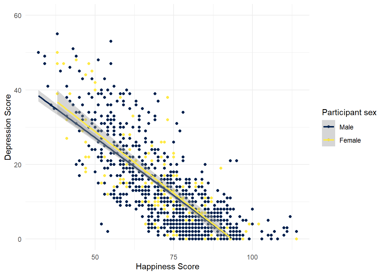
Figure 5.2: CAPTION THIS FIGURE!!
It looks like the relationship between happiness and depression is about the same for male and female participants.
- Create two more scatterplots that show the relationship between happiness and depression grouped by a)
incomeand b)educ. Make sure you update the legend labels (you might need to check the code book).
8.0.7 Activity 7: Group by a new variable
So, let’s be honest, there’s not much going on with any of the demographic variables - the relationship between depression and anxiety is pretty much the same for all of the groups. A reasonable hypothesis might be that rather than being connected to any demographic variables, the relationship between happiness and depression changes depending upon your general happiness level.
- Using
mutatecreate a new variable namedhappinessinsummarydatathat evaluates whether a participant’s happiness score is equal to or higher than the medianahiTotalscore. - This is not an easy task as it’s not something we’ve explicitly shown you how to do but it’s the last activity for this semester so before you go to the solution, do a bit of trial and error, then look at the hints to see if you can get near the answer.
- If you’ve done it right,
summarydatashould contain a column namedhappinesswith the valueTRUEifahiTotalis above the overall median andFALSEif it is below.
mutate(data, new_variable = equal_or_more_than_median)mutate(data, new_variable = variable >= median(variable))Now, reproduce the below plot using this new variable:
## `geom_smooth()` using formula 'y ~ x'## Warning: Removed 9 rows containing missing values (geom_smooth).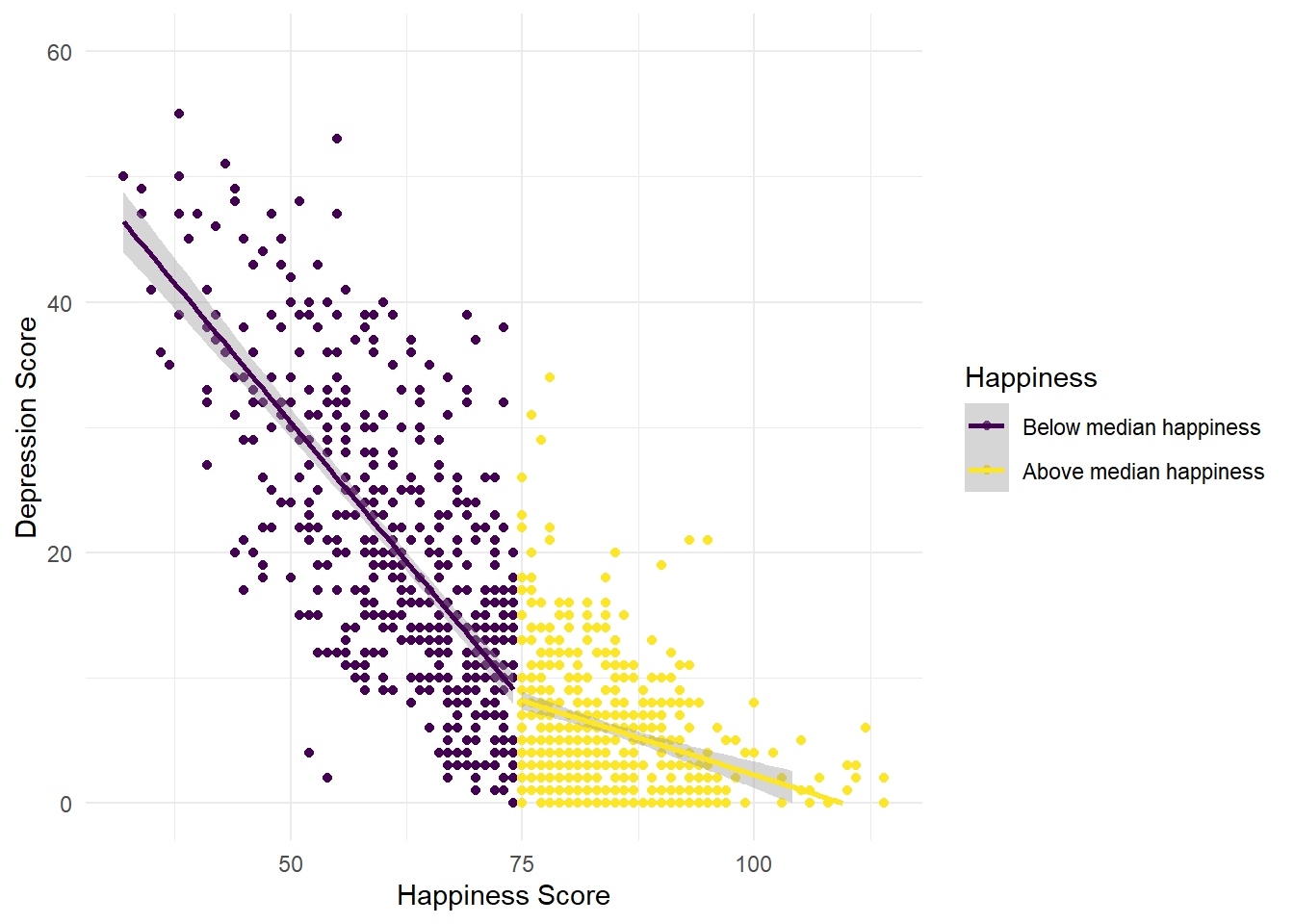
Figure 7.6: CAPTION THIS FIGURE!!
What might you conclude from this plot?
The line for the “unhappy” group is much steeper than the line for the “happy” group. That is, is you’re generally unhappy, then you report a much stronger link between your happiness and depression levels than if you’re generally happy.
If you actually wanted to look at the difference in the relationships statistically, you could compute the correlation coefficients like below, but don’t worry about that until Level 2.
dat_above <- filter(summarydata, happiness == TRUE)
dat_below <- filter(summarydata, happiness == FALSE)

cor.test(dat_above$ahiTotal, dat_above$cesdTotal)
cor.test(dat_below$ahiTotal, dat_below$cesdTotal)
##
## Pearson's product-moment correlation
##
## data: dat_above$ahiTotal and dat_above$cesdTotal
## t = -7.6564, df = 491, p-value = 1.024e-13
## alternative hypothesis: true correlation is not equal to 0
## 95 percent confidence interval:
## -0.4032637 -0.2453473
## sample estimates:
## cor
## -0.3265828
##
##
## Pearson's product-moment correlation
##
## data: dat_below$ahiTotal and dat_below$cesdTotal
## t = -22.474, df = 497, p-value < 2.2e-16
## alternative hypothesis: true correlation is not equal to 0
## 95 percent confidence interval:
## -0.7509362 -0.6635268
## sample estimates:
## cor
## -0.70995518.0.7.1 Finished!
Great job! As you may have noticed, this chapter tried to push you and test what you’ve learned - we hope you can see just how far you’ve come in the space of just a couple of months, it’s genuinely amazing what you have achieved and you should feel proud. In Psych 1B we will continue using these wrangling skills on new data and also data that you collect yourself.
8.0.8 Activity solutions - Scatterplots
8.0.8.1 Activity 1
library(tidyverse)
dat <- read_csv ('ahi-cesd.csv')
pinfo <- read_csv('participant-info.csv')
all_dat <- inner_join(dat, pinfo, by=c("id", "intervention")
8.0.8.2 Activity 2
summarydata <- select(all_dat, ahiTotal, cesdTotal, sex, age, educ, income)8.0.8.3 Activity 3
ggplot(all_dat, aes(x = ahiTotal , y = cesdTotal)) +
  geom_point(colour = "red") +
  scale_x_continuous(name = "Happiness Score") +
  scale_y_continuous(name = "Depression Score") +
  theme_minimal()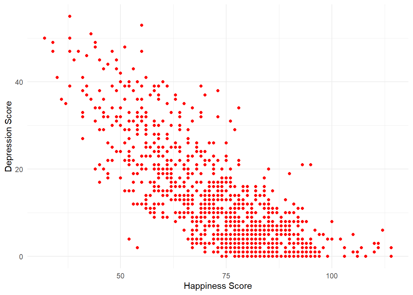
Figure 8.3: CAPTION THIS FIGURE!!
8.0.8.4 Activity 4
ggplot(all_dat, aes(x = ahiTotal , y = cesdTotal)) +
  geom_point(colour = "red") +
  scale_x_continuous(name = "Happiness Score") +
  scale_y_continuous(name = "Depression Score",
                     limits = c(0,60)) +
  theme_minimal() +
  geom_smooth(method = "lm")
## `geom_smooth()` using formula 'y ~ x'## Warning: Removed 20 rows containing missing values (geom_smooth).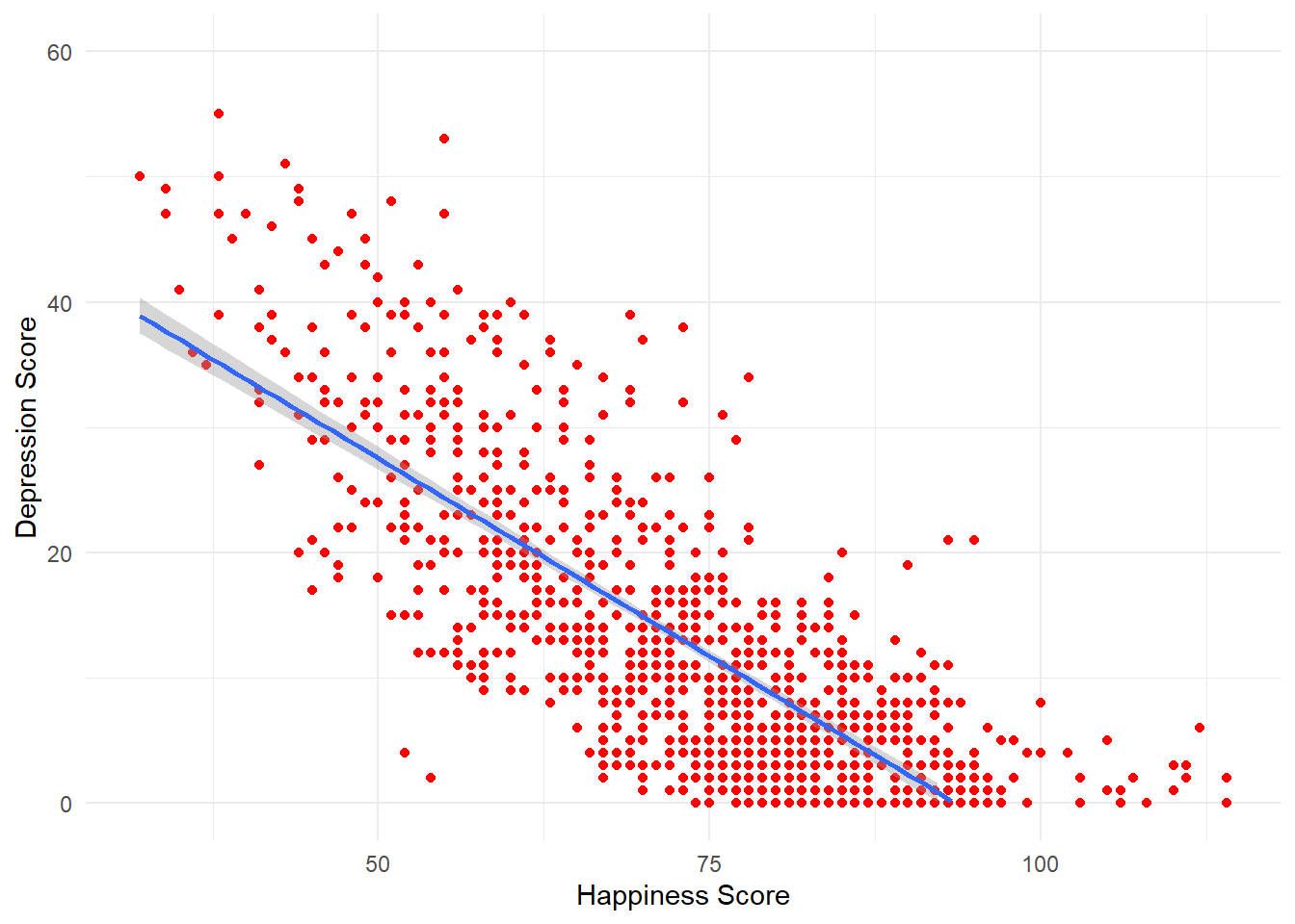
Figure 8.4: CAPTION THIS FIGURE!!
8.0.8.5 Activity 5
summarydata <- summarydata %>%
  mutate(sex = as.factor(sex),
         educ = as.factor(educ),
         income = as.factor(income))
8.0.8.6 Activity 6
ggplot(summarydata, aes(x = ahiTotal , y = cesdTotal,
                        colour = educ)) +
  geom_point() +
  scale_x_continuous(name = "Happiness Score") +
  scale_y_continuous(name = "Depression Score",
                     limits = c(0,60)) +
  theme_minimal() +
  geom_smooth(method = "lm") +
  scale_color_viridis_d(name = "Education level",
                       labels = c("Less than Year 12",
                                  "Year 12",
                                  "Vocational training",
                                  "Bachelor’s degree",
                                  "Postgraduate degree"),
                       option = "E")
## `geom_smooth()` using formula 'y ~ x'## Warning: Removed 78 rows containing missing values (geom_smooth).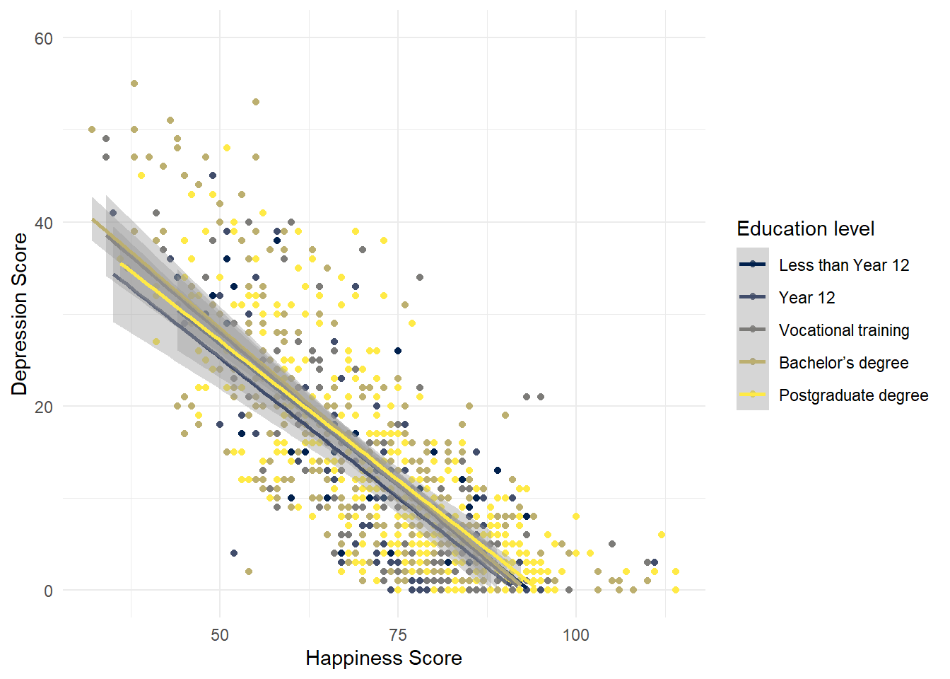
Figure 8.5: CAPTION THIS FIGURE!!
ggplot(summarydata, aes(x = ahiTotal , y = cesdTotal,
                        colour = income)) +
  geom_point() +
  scale_x_continuous(name = "Happiness Score") +
  scale_y_continuous(name = "Depression Score",
                     limits = c(0,60)) +
  theme_minimal() +
  geom_smooth(method = "lm") +
  scale_color_viridis_d(name = "Income",
                       labels = c("Below average",
                                  "Average",
                                  "Above average"))
## `geom_smooth()` using formula 'y ~ x'## Warning: Removed 62 rows containing missing values (geom_smooth).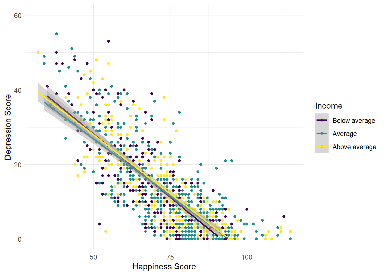
Figure 7.8: CAPTION THIS FIGURE!!
8.0.8.7 Activity 7
summarydata <- mutate(summarydata, severity = cesdTotal >= 18)