6 Corsi Blocks 2
6.2 Walkthrough video
There is a walkthrough video of this chapter available via Zoom. We recommend first trying to work through each section of the book on your own and then watching the video if you get stuck, or if you would like more information. This will feel slower than just starting with the video, but you will learn more in the long-run. Please note that there may have been minor edits to the book since the video was recorded. Where there are differences, the book should always take precedence.
6.3 Activity 1: Set-up
Login to the server and then:
- Open your Corsi Block project;
- Open the
corsi_stub2.RmdMarkdown file that we'll use for this chapter; - Your environment should be clear but if there are objects in it, remove them by pressing the brush icon.
6.4 Activity 2: Loading the data
In code chunk 1, write and run the code that:
- Loads the
tidyverse - Loads
demographic_data.csvinto an object nameddemographic_datausing the functionread_csv() - Loads
score_data.csvinto an object namedscore_datausing the functionread_csv() - Joins the two datasets together using
inner_join()by their common column (Participant) and saves it in an object namedfull_dat
The final step might be a bit tricky to do from memory as you've only done it once but try and do the others without looking at the hint first.
library(package_name)
object_name1 <- read_csv("file_name1.csv")
object_name2 <- read_csv("file_name1.csv")
object_name3 <- inner_join(x = table1, y = table2, by = "common_columns")
library(tidyverse)
demographic_data <- read_csv("demographic_data.csv")
score_data <- read_csv("score_data.csv")
full_dat <- inner_join(x = demographic_data,
                       y = score_data,
                       by = "Participant")
6.5 Activity 3: Selecting variables
Often you will have more variables (columns) than you need. For the analysis we're interested in, we really only need three columns, Participant, Condition, and Corsi_Score.
You can create a new dataset with just the columns you want using the select() function. You can either specify the columns you want to keep:
Or you could specify which columns you want to drop using -variable:
Which method you use will depend on how many variables you have, sometimes it's quicker to specify that ones you want, sometimes it's quicker to specify the ones you don't want. Additionally, the columns in the object you create will be arranged in the order you state them so you can also use select() to rearrange the order of your columns.
- In code chunk 2, use
select()to create a new object namedanalysis_datathat just contains the columnsParticipant,Condition,Age, andCorsi_Scorein that order. Your starting dataset should befull_dat.
6.6 Activity 4: Filtering observations
Whilst select() is used to pick and choose columns, filter() is used to pick which rows of data you want to keep based on one or more criteria.
filter() is very powerful and can be used in a number of ways. For example, you can use it to select rows where one of the variables equals an exact value. If this value is text, it should be in quotation marks (e.g., "man") but if it's a number it doesn't need to be. You do have to use the double equal sign in both though:
# only keep data from men
full_dat %>%
  filter(Gender == "Man")

# only keep data from ppts who are exactly 18
full_dat %>%
  filter(Age == 18)
You can also use it to keep a range of values. For numerical values, you can do this by specifying criteria like more than or less than.
# only keep data from ppts whose Age is more than 18
full_dat %>%
  filter(Age > 18)

# only keep data from ppts whose Age is more than or equal to 18
full_dat %>%
  filter(Age >= 18)
You can also specify a range of values using some slightly weird notation %in% which will keep any row where the value equals one of the ones you specify. Whenever you have to enter multiple values to a single argument, you need to wrap them in c() which stands for combine. A common error is to forget to use c() when you've got multiple values - make a note of this!
# keep ppts whose Age equals 18, 25, or 30
full_dat %>%
  filter(Age %in% c(18,25,30))

# keep pppts whose Gender equals man or woman
full_dat %>%
  filter(Gender %in% c("Man", "Woman"))
Finally, you can also combine multiple criteria using & (AND) or | (OR):
# keep data from men over 30
full_dat %>%
  filter(Age > 30 & Gender == "Man")

# keep data from men over 30 or non-binary under 25
full_dat %>%
  filter(Age > 30 & Gender == "Man" |
           Age < 25 & Gender == "Non-Binary")
The | symbol can be a little hard to find on the keyboard. Normally you can type it by pressing Shift + \ . The key will likely show a symbol of a bar split in two which is slightly confusing.
Previous research (e.g., Hester at el., 2004) has found that age can affect performance on the Corsi block task.
- In code chunk 3, use
filter()to create a new object namedage_controlthat just has data from participants whose age is 20 or older but 30 or younger. Your starting dataset should beanalysis_data
How many participants are left in the sample after filtering for age?
6.7 Activity 5: Summarise
Now we have reduced the dataset down to just the variables and observations we're interested in, let's compute the descriptive statistics and visualise this reduced sample.
- In code chunk 4, calculate the mean score (
Corsi_Score) and standard deviation for each group (Condition) using the data setage_control. Save it in an object namedgroup_statsand call the column namesmean_scoreandsd_score. You will need to usegroup_by()andsummarise()to do this. - You've done this a couple of times before now, try doing it from memory and talk it through with your group before you look at the hint or solution.
6.8 Activity 6: Visualise
We also want to create a boxplot of the scores in each group.
- In code chunk 5, write and run the code that creates a boxplot of the
Corsi_Scoresfor eachCondition. - Use
age_controlas your dataset. - The grouping variable should be mapped to the
xaxis and the measurement should be mapped to theyaxis. - You've done this before, use the search function in the book to find an example.
ggplot(data, aes(x = grouping_variable, y = measurement)) +
  geom_boxplot()
ggplot(age_control, aes(x = Condition, y = Corsi_Score)) +
  geom_boxplot()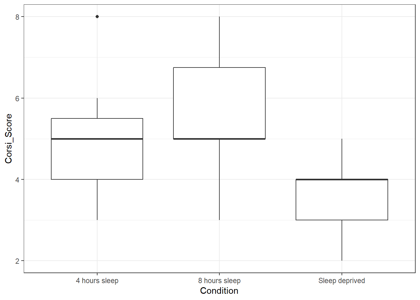
Is the hypothesis that sleep deprivation will negatively affect spatial working memory supported in the 20-30 age group?
6.9 Activity 7: Make it look nice
6.9.1 Adding colour
ggplot() gives you a huge amount of control over how your plots look. First, we can add colour by adding fill to the mapping. fill also takes the value Condition because we want a different colour for each level of condition.
ggplot(age_control, aes(x = Condition,
                        y = Corsi_Score,
                        fill = Condition)) +
geom_boxplot() 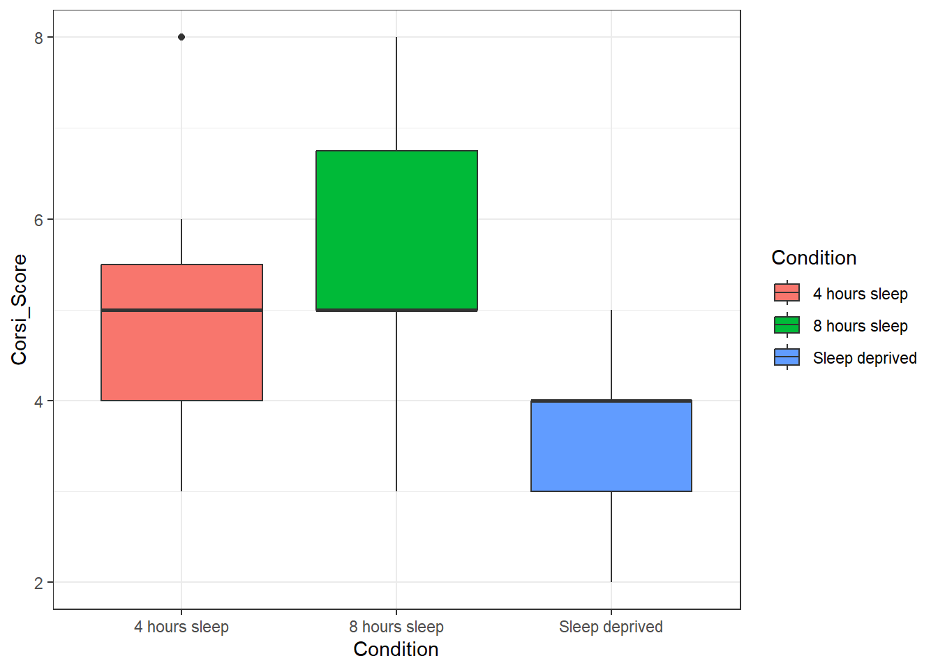
By default, any time you add in colour as a variable, ggplot() will produce a legend guide to tell you what the colours means. Sometimes this is necessary because you can't read the plot without knowing what the colours mean, but in this case, we already know what the colours mean because it's on the x-axis so all this legend is doing is taking up space. We can remove it by adding a layer and a call to guides().
ggplot(age_control, aes(x = Condition,
                        y = Corsi_Score,
                        fill = Condition)) +
  geom_boxplot() +
  guides(fill = "none")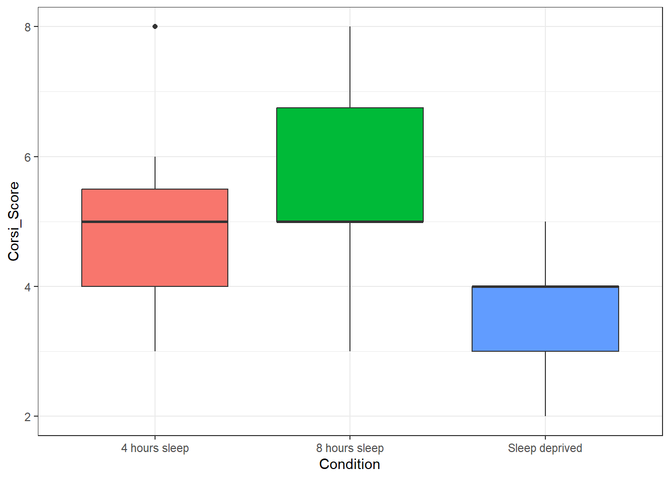
For reasons that are unclear, the default colours in ggplot() are extremely unhelpful to most colour-blind people so it's best to change them from the default. Thankfully there are built-in colour scales we can use, here, let's try the viridis scale by adding on a layer of scale_fill_viridis_d().
- The viridis palette has 8 options, in code chunk 6, add the below code and try changing
optionfrom any letter from A to H and see which one your favourite is. - Sometimes when you add in colour, it can make the black lines harder to read. One approach to this problem is to reduce the transparency of the colour fill by using the argument
alphawhich will take a value of 0 (completely transparent) to 1 (fully opaque). Try changing this value to see which value works best (sometimes it is trial-and-error):
ggplot(age_control, aes(x = Condition,
                        y = Corsi_Score,
                        fill = Condition)) +
  geom_boxplot(alpha = 0.7) +
  guides(fill = "none") +
  scale_fill_viridis_d(option = "E")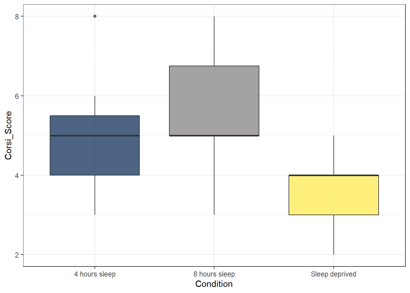
6.9.2 Reordering factors
There are many different types of data but two important concepts are discrete and continuous variables.
Discrete variables are variables that can only take on specific values or categories. These values are often counted and are typically whole numbers or categories. In our dataset, condition is an example of a discrete variable.
In contrast, continuous variables are those that can take on any value within a specific range or interval. These variables can be measured at different levels of precision and can include fractions or decimals. In our dataset, age is an example of a continuous variable.
What type of variable is corsi_score?
A lot of the time, whether a variable is discrete or continuous is easy enough to spot by whether the data is text (probably discrete) or numeric (probably continuous), however, this isn't always the case. Whilst the corsi score is a number, it can only take on a specific and relatively set of values (the whole numbers 1-9). In other cases you might have a category coded as numbers (e.g., gender coded as 1, 2, 3)
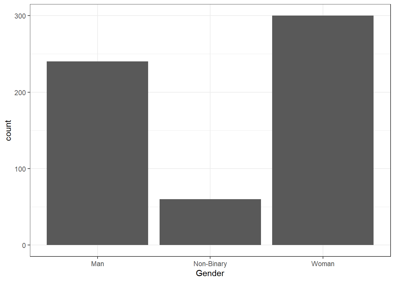
In R, factors are a type of variable that represents categorical data with distinct levels or categories. It is similar to a discrete variable because both involve distinct values or categories. By default, R will order any factors alpha-numerically. Sometimes this is what you want but sometimes you'd prefer a different order, for example if we make a bar chart of the counts of how many participants of each gender there are it will look like this:
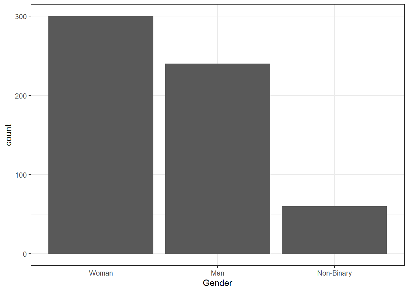
But you may prefer to reorder the factor levels using mutate() and factor(). The function mutate() is used to create new variables or over-write existing ones and we're going to use it a lot.
Because we're overwriting the variables in an existing object rather than creating new ones, this code can seem a bit confusing but you can read it as "start with the dataset demographic data and then, overwrite the column Gender with Gender as a reordered factor and arrange the levels in the order woman, man, non-binary and save it all in the original object". Because we're passing multiple values to levels we to use c() to combine them all.
demographic_data <- demographic_data %>%
  mutate(Gender = factor(Gender,
                         levels = c("Woman", "Man", "Non-Binary")))
If you run the plot code again, you'll see it has updated the order:
- In code chunk 7, use
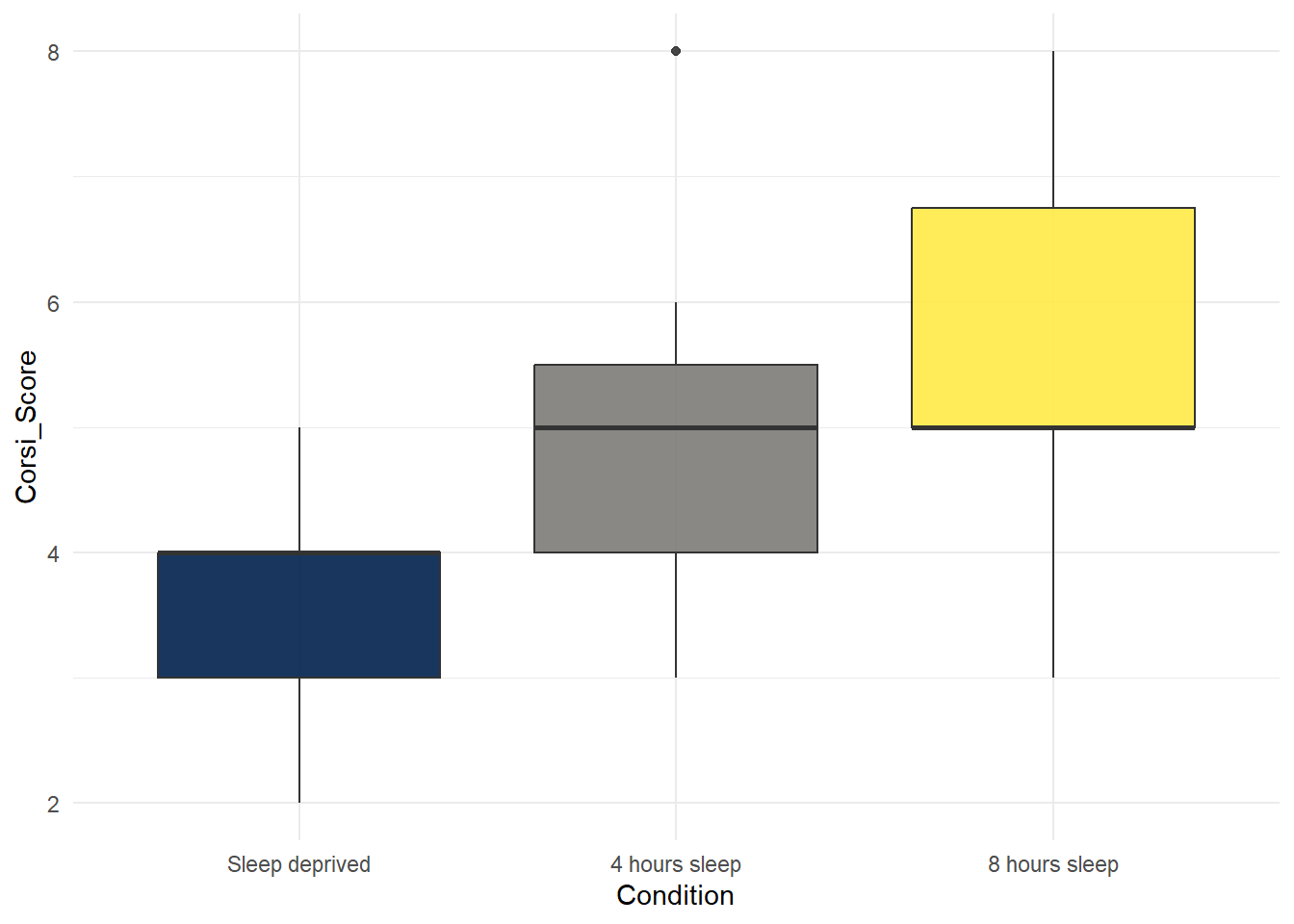
mutate()andfactorto reorder the variableConditionin the datasetage_controlso that the bars are in the order "Sleep deprived", "4 hours sleep", "8 hours sleep" and then run the box plot code again.
# relevel the factor
age_control <- age_control %>%
  mutate(Condition = factor(Condition,
                            levels = c("Sleep deprived",  "4 hours sleep", "8 hours sleep")))

#
ggplot(age_control, aes(x = Condition,
                        y = Corsi_Score,
                        fill = Condition)) +
  geom_boxplot(alpha = 0.9) +
  guides(fill = "none") +
  scale_fill_viridis_d(option = "E") +
  theme_minimal()