3 Costa et al. (2026): Replication of “Does Money Buy Happiness”
In this chapter, we assume you have covered data wrangling tasks such as creating and modifying variables, and calculating summary statistics. There are quite a few visualisation opportunities here, so we assume you can create things like scatterplots, bar plots, and boxplots.
3.1 Task preparation
3.1.1 Introduction to the data set
For this task, we are using open data from Costa et al. (2026) who collated several replication attempts of Diener et al. (2010). The abstract of Costa et al. is:
This dataset results from a multi-lab replication of Diener et al. (2010) organized by the Collaborative Replication and Education Project (CREP). This project aimed to understand the relationships between different types of needs (basic needs, psychological needs, standard of living, etc.), people’s positive and negative feelings, and life evaluations. This dataset includes data collected across each site contributing to the study. It includes predictor variables associated with participants’ mood and current financial comfort. It also includes demographic data like education, gender, marital status, residential area and income. The data are stored in a. csv file to be used for additional analysis, as an educational tool, and further interdisciplinary collaboration.
You can also read the abstract of the original study by Diener et al:
The Gallup World Poll, the first representative sample of planet Earth, was used to explore the reasons why happiness is associated with higher income, including the meeting of basic needs, fulfillment of psychological needs, increasing satisfaction with one’s standard of living, and public goods. Across the globe, the association of log income with subjective well-being was linear but convex with raw income, indicating the declining marginal effects of income on subjective well-being. Income was a moderately strong predictor of life evaluation but a much weaker predictor of positive and negative feelings. Possessing luxury conveniences and satisfaction with standard of living were also strong predictors of life evaluation. Although the meeting of basic and psychological needs mediated the effects of income on life evaluation to some degree, the strongest mediation was provided by standard of living and ownership of conveniences. In contrast, feelings were most associated with the fulfillment of psychological needs: learning, autonomy, using one’s skills, respect, and the ability to count on others in an emergency. Thus, two separate types of prosperity—economic and social psychological—best predict different types of well-being.
To summarise, they were interested in the age old question of: Does money buy you happiness? The original study by Diener et al. collected different variables including income (in US Dollars), perception of well-being, household income/status, financial confidence, and daily experiences. Costa et al. represent the CREP (Collaborative Replication and Education Project) network who organise replication studies for student dissertation projects. Across several data collection sites, they replicated the methods of Diener et al., and this data set combines them all into one file.
For this activity, it was a little too awkward to work with the raw data, so we are focusing on your summarising and visualisation skills to work with their clean data.
3.1.2 Organising your files and project for the task
Before we can get started, you need to organise your files and project for the task, so your working directory is in order.
You can create a folder for the data analysis journeys book and a new sub-folder for this chapter, something like:
analysis_journeys, create a new folder for this chapter called something likeCosta_wrangle. WithinCosta_wrangle, create two new folders calleddataandfigures.Create an R Project for
Costa_wrangleas an existing directory for your chapter folder. This should now be your working directory.Create a new R Markdown or Quarto document and give it a sensible title describing the chapter, such as
Costa et al. (2026): Replication of does money buy happiness. Delete everything below line 10 so you have a blank file to work with and save the file in yourCosta_wranglefolder.We are working with a new data set, so please save the following data file: Diener_replications.csv. Right click the link and select “save link as”, or clicking the link will save the files to your Downloads. Make sure that you save the file as “.csv”. Save or copy the file to your
data/folder withinCosta_wrangle.
You are now ready to start working on the task!
3.2 Overview
3.2.1 Load tidyverse and read the data files
Before we explore what wrangling we need to do, load
3.2.2 Explore costa_data
In costa_data, we have 36 variables that Costa et al. (2026) have already prepared for analysis. We are not going to work with all of the variables, so the key columns (variables) we want you to understand are:
| Variable | Type | Description |
|---|---|---|
| dataSet | character | Data collection location/source. |
| ladder | double | The Cantril scale for people’s perception of well-being. Where they place themselves on a ladder from 1 worse life quality to 10 best life quality. |
| income | double | Annual income in US Dollars ($) or converted to US Dollars. |
| gender | character | gender category as man, woman, nonbinary, or NA. |
| age | double | Age in years. |
| residentialArea | character | Participant residential area of rural, village, urban/city, or suburban. |
| PositiveFeelings | double | Mean value for average daily smile/laugh and enjoyment. |
| NegativeFeelings | double | Mean value for average daily worry, sadness, depression, and anger. |
| BasicNeeds | double | Mean value for food and shelter needs met. |
| PsychNeeds | double | Mean value for psychological needs met. |
| study_site | character | Relabelling dataSet as study data collection site. |
Now we have introduced the data set, explore them using different methods we introduced. For example, opening the data object as a tab to scroll around, explore with glimpse(), or even try plotting some of the variables to see what they look like..
3.3 Summarising/visualising your data
Compared to other chapters, we are using the clean version of their data set (you can see their data cleaning script here if you are interested). So, the majority of this chapter we are going to spend on summarising and visualising the data to practice answering questions you might have of data.
3.3.1 Demographics
- How many data collection sites are included in the data? There were data collection sites.
- Looking at the sample size per data collection site, what was the largest and smallest number of participants? The largest site had and the smallest site had .
- To 2 decimal places, the mean age of all the participants was (SD = ).
-
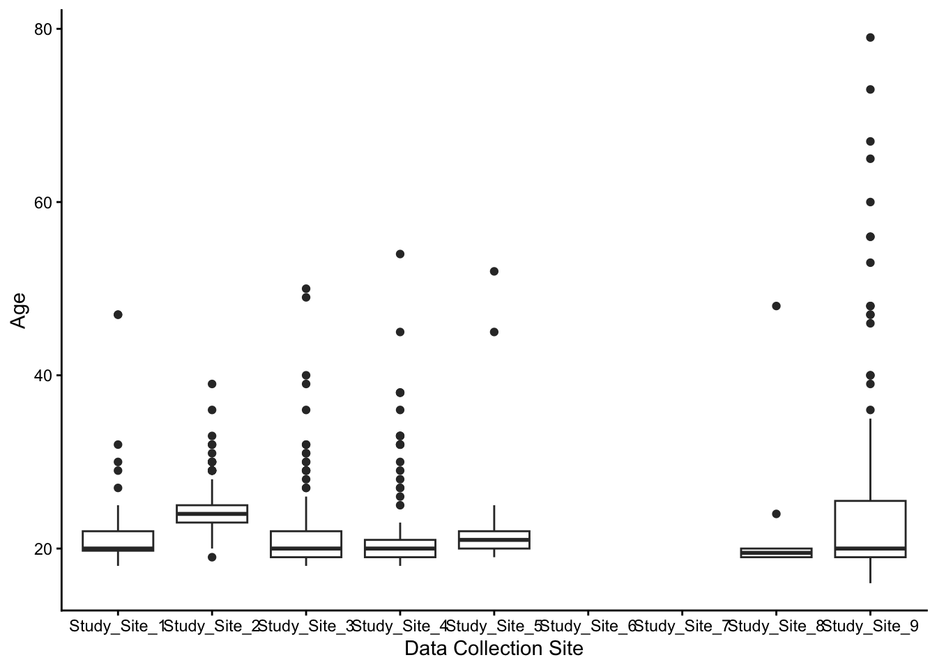
Is there much variation in the participant ages across data collection sites? Identify an appropriate visualisation type to visualise
ageacrossstudy_site. There is creative freedom here, but think about what information you have available in these two variables.Did any study sites opt out of collecting age data?
Which study site had the largest variation in participant ages?
-
In psychology research, one potential issue along the WEIRD continuum is whether participants are concentrated in urban or city environments. How many participants reported living in rurally or in a village?
Rural:
Village:
3.3.2 Income and well-being
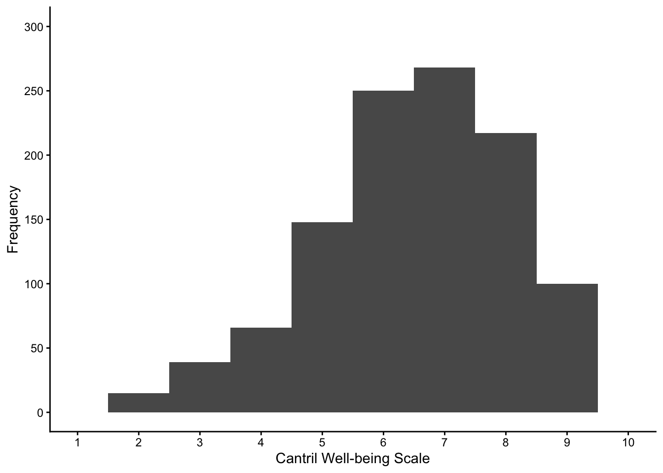
- The Cantril scale of well-being lets people select which rung of a ladder they would place themselves for life quality, where responses range from 1 to 10. Try and reproduce the following histogram to visualise the responses to
ladder. Look closely at each feature to reproduce, like the bins and axis breaks.
- Now, try and reproduce the following histogram to visualise the responses to
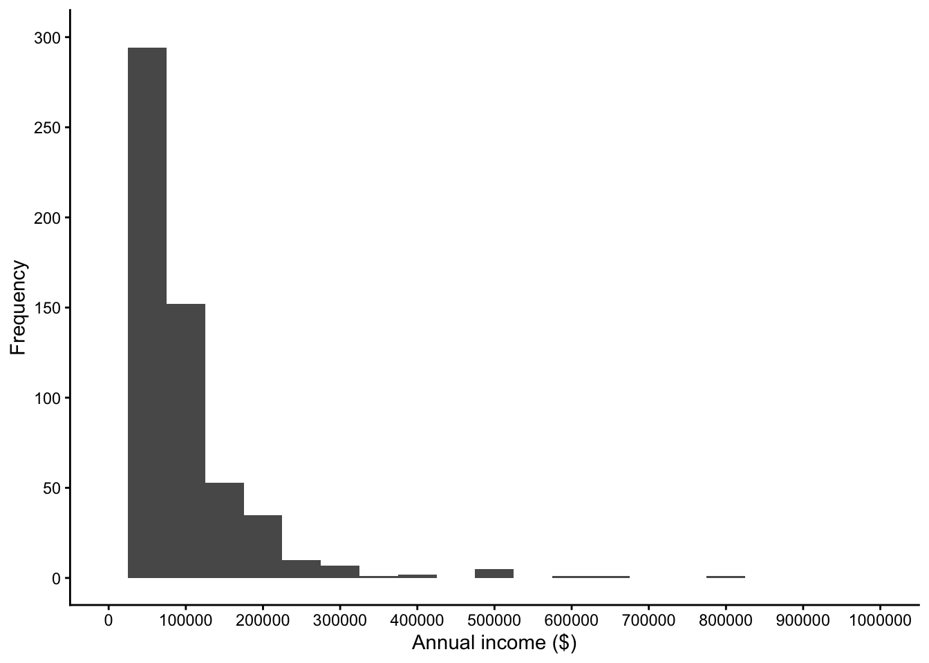
income. Look closely at each feature to reproduce, like the bins and axis breaks. Hint 1: There is a huge - almost certainly an error - value to exclude. Hint 2: scientific notation can be annoying here, so add the codeoptions(scipen = 999)before your plot code.
# increase scientific notation threshold
options(scipen = 999)

costa_data %>%
  filter(income <= 1000000) %>%
  ggplot(aes(x = income)) +
  geom_histogram(binwidth = 50000) +
  theme_classic() +
  scale_x_continuous(breaks = seq(0, 1000000, 100000),
                     limits = c(0, 1000000)) +
  scale_y_continuous(breaks = seq(0, 300, 50),
                     limits = c(0, 300)) +
  labs(x = "Annual income ($)",
y = "Frequency")-
After visualising the Cantril scale (
ladder) and annual income (income) in isolation, one potential question is whether there is a relationship between the two. This task has a few steps for you to consider:Create a scatterplot between
ladderandincome. Add a regression line for a linear relationship. Remember to exclude the huge unrealistic extreme value. If you did not adjust scientific notation before, you will need to add it here.Does it look like there is a positive or negative relationship? It looks like there is a relationship, meaning as annual income increases, values of well-being tend to .
Working with data like annual income can be tricky as it tends to be quite skewed, with lots of people earlier lower values and a few people earning higher values. There are different ways of handling it, but if you replace
incomewithlogIncome(applying a common logarithm to income), is there relationship similar to the raw income values?
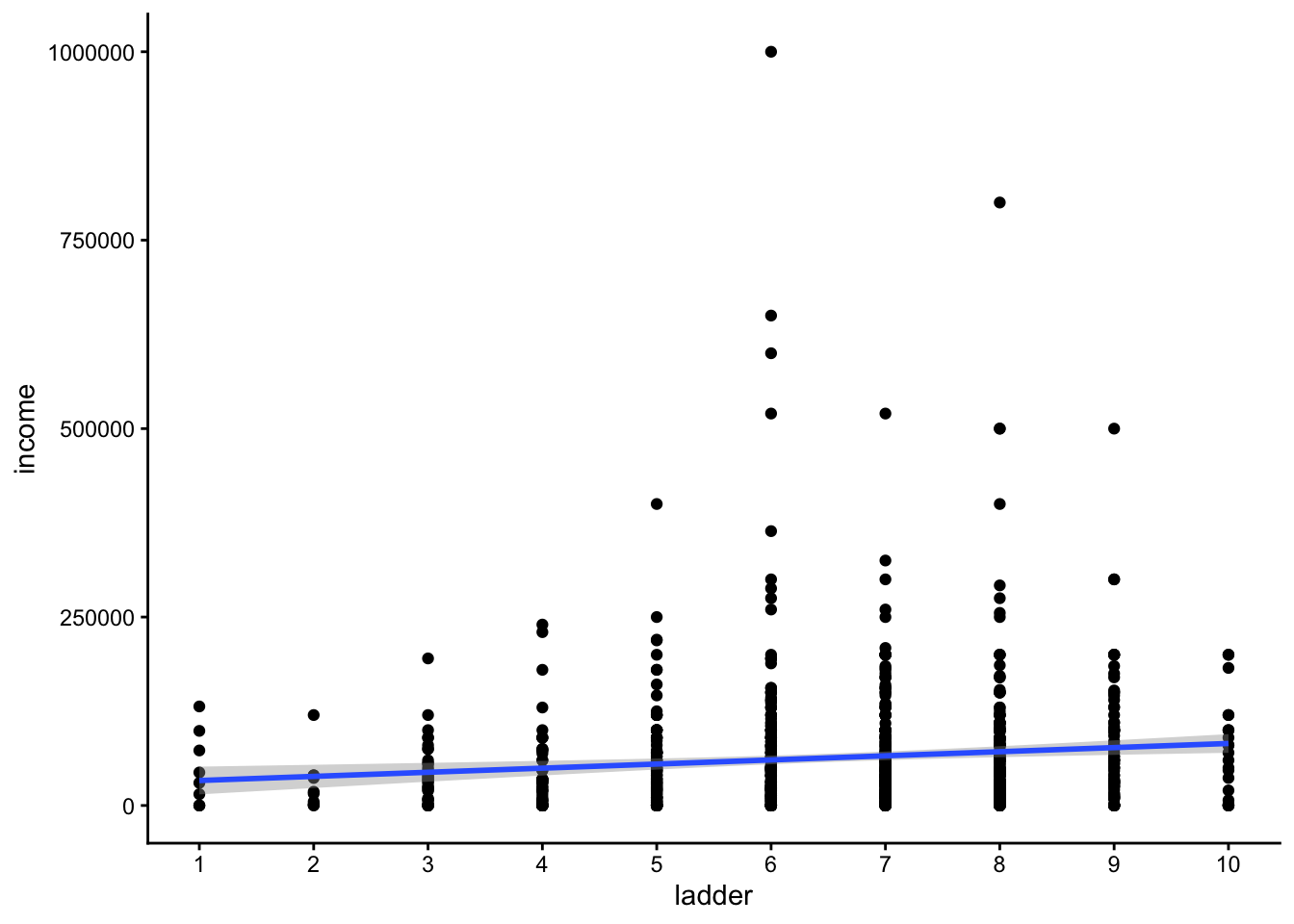
If you replace the income variable with LogIncome, there is a still a slight positive relationship.
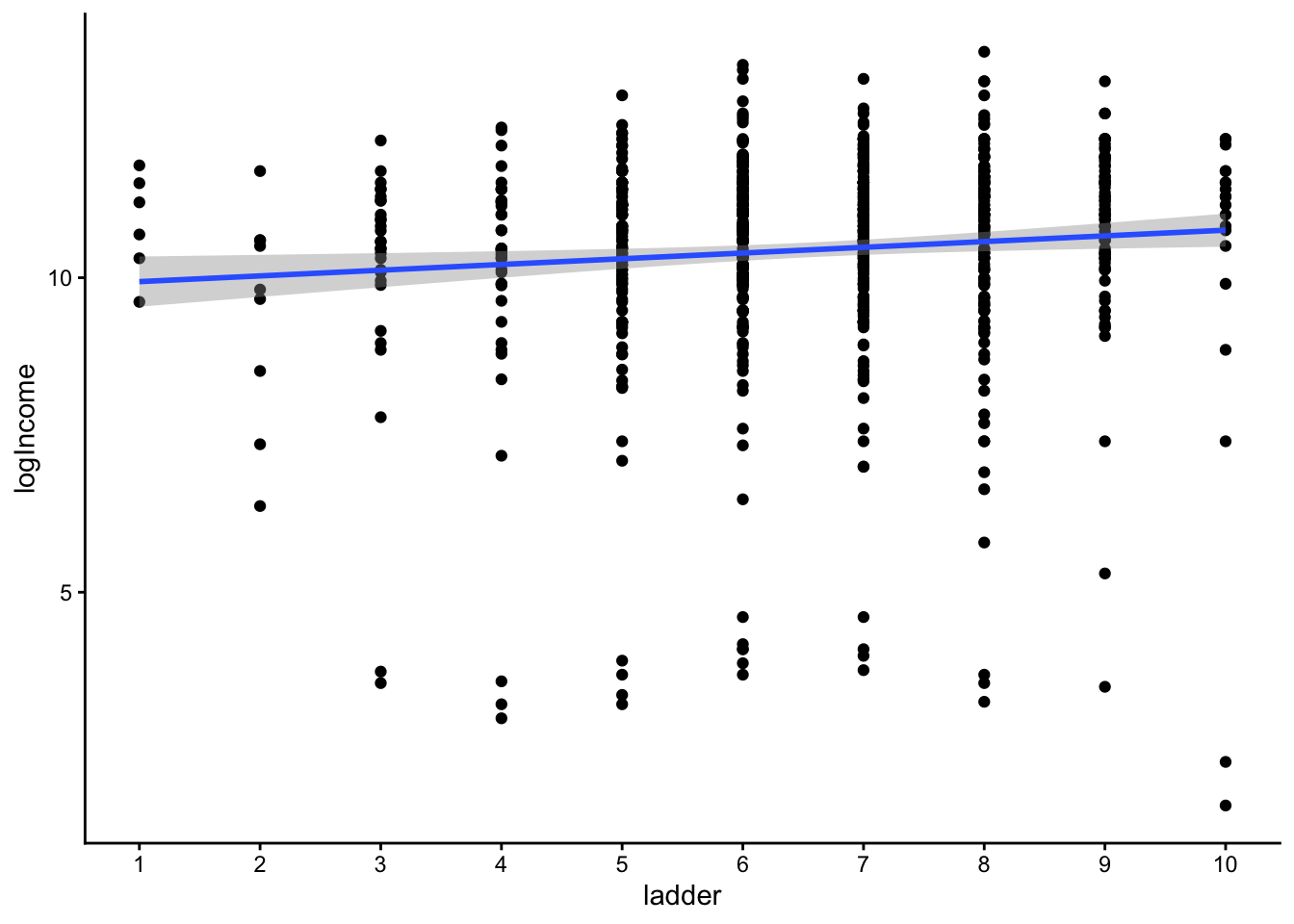
To make more specific conclusions, you would need to apply your statistical models we do not assume you have covered in this chapter.
-
For a final task, we would like you to recreate this scatterplot to visualise the relationship between psychological needs (
PsychNeeds) and positive feelings (PositiveFeelings). However, one potentially new feature is splitting a plot into different panes or facets. Use your search skills to see how you can spread the plot into eachstudy_site, where we can explore whether the relationship is roughly consistent across the study sites.How would you describe the relationship across study sites? Across the study sites, there is a relationship, meaning as meeting psychological needs increases, values of positive feelings tend to .
-
If you use
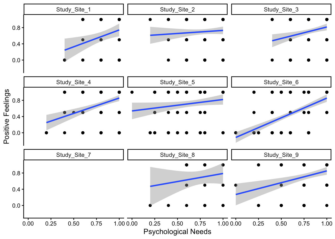
geom_point()to visualise the relationship, what is a potential problem with the data to fit a linear relationship to?
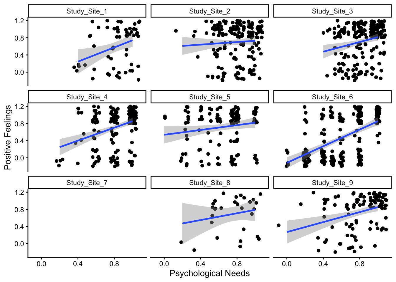
To recreate the plot, we have a scatterplot between psychological needs and positive feelings. We add jitter to the points to avoid some overlap and we use facet wrap to spread study site across panes.
If we replace geom jitter with geom point, we can see the data are closer to ordinal. Both variables are the mean of few items, so there are only certain response options available, meaning a standard parametric analysis technique would be potentially inappropriate.
3.4 Conclusion
Well done! Hopefully you recognised how far your skills have come to be able to do this independently, regardless of how many hints you needed.
For this chapter, we focused on summarising and visualising the data to be accessible early in your learning journey. Once you are further along in your studies, why not try and apply some inferential statistics to address their research questions? For example, does meeting basic and psychological needs predict perceived well-being on the Cantril scale? Do basic and psychological needs predict positive (or negative) feelings?