12 Mega pipe
12.1 Walkthrough video
There is a walkthrough video of this chapter available via Zoom.
- Video notes: this video was recorded in 2020. Since then the book has been updated visually. There are no other differences between the video and this book chapter.
12.1.1 Activity 1: Set-up
- Open a new R markdown document, name it "Mega pipe" and save it in your Data Skills folder.
- Set the working directory to your Data Skills folder.
- Type and run the code that loads the
tidyversepackage. - Use
read_csv()to load in the data. you should create three objectsresponses,scoringandqformatsthat contain the respective data.
12.1.2 Activity 2: Mega pipe
We're going to build on what you learned in Pipes and rewrite all of the code we did in Reshaping Data (which you can see below) using a pipe. As a reminder, the code:
- Transforms the data from wide-form to long-form
- Joins together the three objects by their common columns
- Calculates a total AQ score for each participant
rlong <- pivot_longer(data = responses,
                      names_to = "Question",
                      values_to = "Response",
                      cols = Q1:Q10)

rlong_join <- inner_join(rlong, qformats, by = "Question")

scores <- inner_join(rlong_join, scoring, by = c("QFormat", "Response"))

scores_grouped <- group_by(scores, Id, gender)

AQ_all <- summarise(scores_grouped, total_score = sum(Score))- Rewrite the above code using pipes
%>%. Make sure you have completed Pipes before you attempt this.
12.1.3 Activity 3: Pipe plot
Now we've got our total AQ scores, let's use the pipe to make a graph.
- Take
AQ_allthen filter it leaving only female participants then useggplot()to create a histogram of the total scores (you did this in Reshaping Data). If you've done it correctly, it should look like the below (you can change the colours if you like).
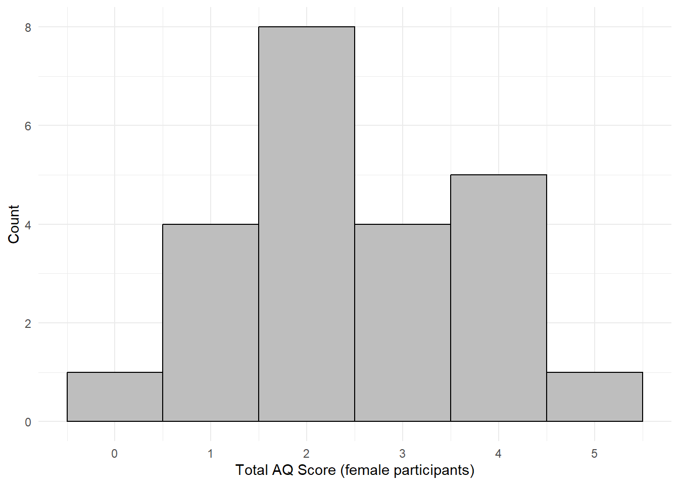
Figure 12.1: Histogram of scores for female participants
Remember this for your group project - rather than creating new objects for each graph you want to make you can just pipe the data you want to display straight into ggplot().
12.1.4 Activity 4: AQ score by gender
More men and boys are currently diagnosed as autistic than women and girls and there is increasing evidence that there is an over-representation of transgender and nonbinary people in those with autism spectrum disorder (ASD) or who meet the AQ cut-off score for ASD, therefore, it seems sensible to visualise AQ scores by gender (note that this dataset is simulated and that whilst the pattern of results is based on what we would expect from the evidence, these are not real data).
- Using the data in
AQ_all, create a violin-boxplot of the total AQ scores by gender. - Hint:
gendershould be on the x-axis,total_scoreshould be on the y-axis. - You can use a pipe if you want, but it doesn't make much difference in this activity.
Look at the graph and answer the following questions:
- Which group has the lowest median total AQ score?
- Which group has an outlier?
- Which of the following do you think would be an accurate conclusion to draw from the plot?
12.1.5 Activity 5: Bad bar plots
In the research methods lectures for Psych 1A, we talked about the importance of data visualisation and how different graphs might lead you to make very different conclusions about your data. For this reason, we've taught you how to make violin-boxplots because these show the true distribution of the data, however, it's useful to know how to make bad bar plots so that you can see the difference they make to your own data (but never use them as your only method of visualisation!).
- Copy, paste and run the below code in a new code chunk
- Making a bar chart works a little differently to the other graphs you have made so far. Previously,
ggplot()has just visualised the raw data, however, for a bar chart you actually want to visualise a summary of the data, e.g., the mean. - You can read the
stat_summarycode as "draw a summary of the data, use a bar chart to do so and the function to display on the y-axis should be the mean. Then, draw another summary but this time use an errorbar and the function to apply to the data is standard error of the mean".
AQ_all %>%
  ggplot(aes(x = gender, y = total_score)) +
  stat_summary(geom = "bar", fun = "mean") +
  stat_summary(geom = "errorbar", fun.data = "mean_se", width = .2) +
  theme_minimal()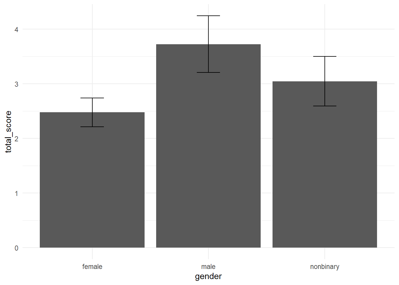
Figure 7.3: Bad bar chart of means
Think back to your interpretation of the violin-boxplot, that men and nonbinary people's scores did not differ much and both had higher AQ scores than women. Would you have concluded the same thing if you had looked at the bar chart?
In this dataset, the outlier in the male group results in the mean score being much higher than the nonbinary mean, it's only through looking at the full distribution with the violin-boxplot that you can accurately intepret the data.
12.1.6 Activity 6: Density plots
The final type of visualiation we're going to show you are density plots as they are a useful way of visualising how the distributions of different groups compare to each other. You've actually already seen a density plot - it's the base of a violin plot, however, it can be useful to overlap them.
- Copy, paste, and run the below code in a new code chunk.
- A lot of this code should be familiar to you, most of it is editing the axis labels and the theme.
- Adding
fill = gendertellsggplotto produce different coloured geoms for each level ofgender. Try removingfill = genderand see what happens to the plot. -
geom_density()is our new geom and tells R to draw the density curve. The argumentalphacontrols the transparency of the colours, try adjusting this value.
ggplot(AQ_all, aes(x = total_score, fill = gender)) +
  geom_density(alpha = .3) +
  theme_minimal() +
  scale_fill_viridis_d(option = "D") +
  scale_x_continuous(name = "Total AQ Score", breaks = c(1,2,3,4,5,6,7,8,9,10)) +
  scale_y_continuous(name = "Density")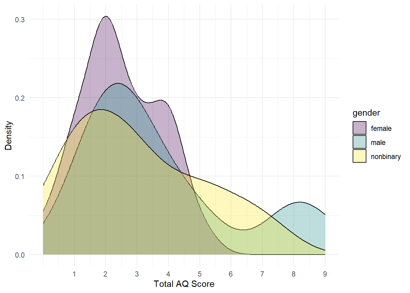
Figure 5.2: Grouped density plot
The y-axis displays density, i.e., what proportion of the data points fall at each point on the x-axis.
- Approximately what percent of female participants had a total AQ of 2?
It's important to be able to translate between proportions and percentages, it will make your understanding of statistics and p-values much easier. To translate a proportion into a percentage, you multiply by 100 or move the decimal place two places to the right so a proportion of .5 = 50%, a proportion of .03 = 3% and so on.
12.1.7 Activity 7: Saving plots
Finally, it's useful to be able to save a copy of your plots as an image file so that you can use it in a presentation or word document and to do this we can use the function ggsave().
There are two ways you can use ggsave(). If you don't tell ggsave() which plot you want to save, by default it will save a copy of the last plot you created. If you've been following this chapter in order, the last plot you created should have been the density plot from Activity 6.
All that ggsave() requires is for you to tell it what file name it should save the plot to and the type of image file you want to create (the below example uses .png but you could also use e.g., .jpeg and other image types).
- Copy, paste and run the below code into a new code chunk.
- Check your Data Skills folder, you should now see the saved image file.
ggsave("density.png")The default size for an image is 7 x 7, you can change this manually if you think that the dimensions of the plot are not correct or if you need a particular size.
- Copy paste and run the below code to overwrite the image file with new dimensions.
ggsave("density.png", width = 10, height = 8)The second way of using ggsave() is to save your plot as an object and then tell it which object to write to a file. The below code saves the pipe plot from Activity 3 into an object named AQ_histogram and then saves it to an image file "AQ_histogram.png".
Note that when you save a plot to an object, it won't display in R Studio. To get it to display you need to type the object name in the console (i.e., AQ_histogram). The benefit of doing it this way is that if you are making lots of plots, you can't accidentally save the wrong one because you are explicitly specifying which plot to save rather than just saving the last one.
- Copy, paste and run the below code and then check your Data Skills folder for the image file. Resize the plot if you think it needs it.
AQ_histogram <- AQ_all %>%
  filter(gender == "female") %>%
  ggplot(aes(x = total_score)) +
  geom_histogram(binwidth = 1, colour = "black", fill = "grey") +
  theme_minimal()+
  scale_x_continuous(name = "Total AQ Score (female participants)", breaks = c(0,1,2,3,4,5,6,7,8,9,10)) +
  scale_y_continuous(name = "Count")

ggsave("AQ_histogram.png", plot = AQ_histogram)
12.1.8 Activity solutions - Mega pipe
12.1.8.2 Activity 2
AQ_all <- pivot_longer(data = responses,
                      names_to = "Question",
                      values_to = "Response",
                      cols = Q1:Q10) %>%
  inner_join(qformats, by = "Question") %>%
  inner_join(scoring, by = c("QFormat", "Response")) %>%
  group_by(Id, gender) %>%
  summarise(total_score = sum(Score))
12.1.8.3 Activity 3
AQ_all %>%
  filter(gender == "female") %>%
  ggplot(aes(x = total_score)) +
  geom_histogram(binwidth = 1, colour = "black", fill = "grey") +
  theme_minimal()+
  scale_x_continuous(name = "Total AQ Score (female participants)", breaks = c(0,1,2,3,4,5,6,7,8,9,10)) +
  scale_y_continuous(name = "Count")
12.1.8.4 Activity 4
ggplot(AQ_all, aes(gender, total_score)) +
  geom_violin(trim = FALSE) +
  geom_boxplot(width = .2) +
  theme_minimal()