Appendix G — Accessibility
G.1 Visual Impairment
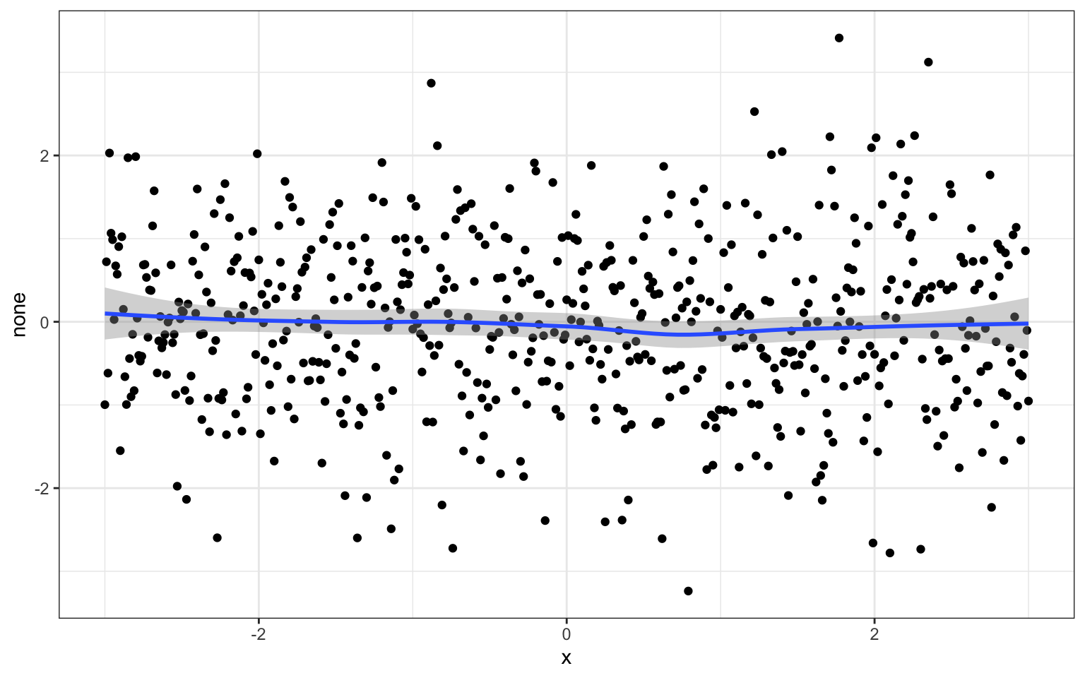
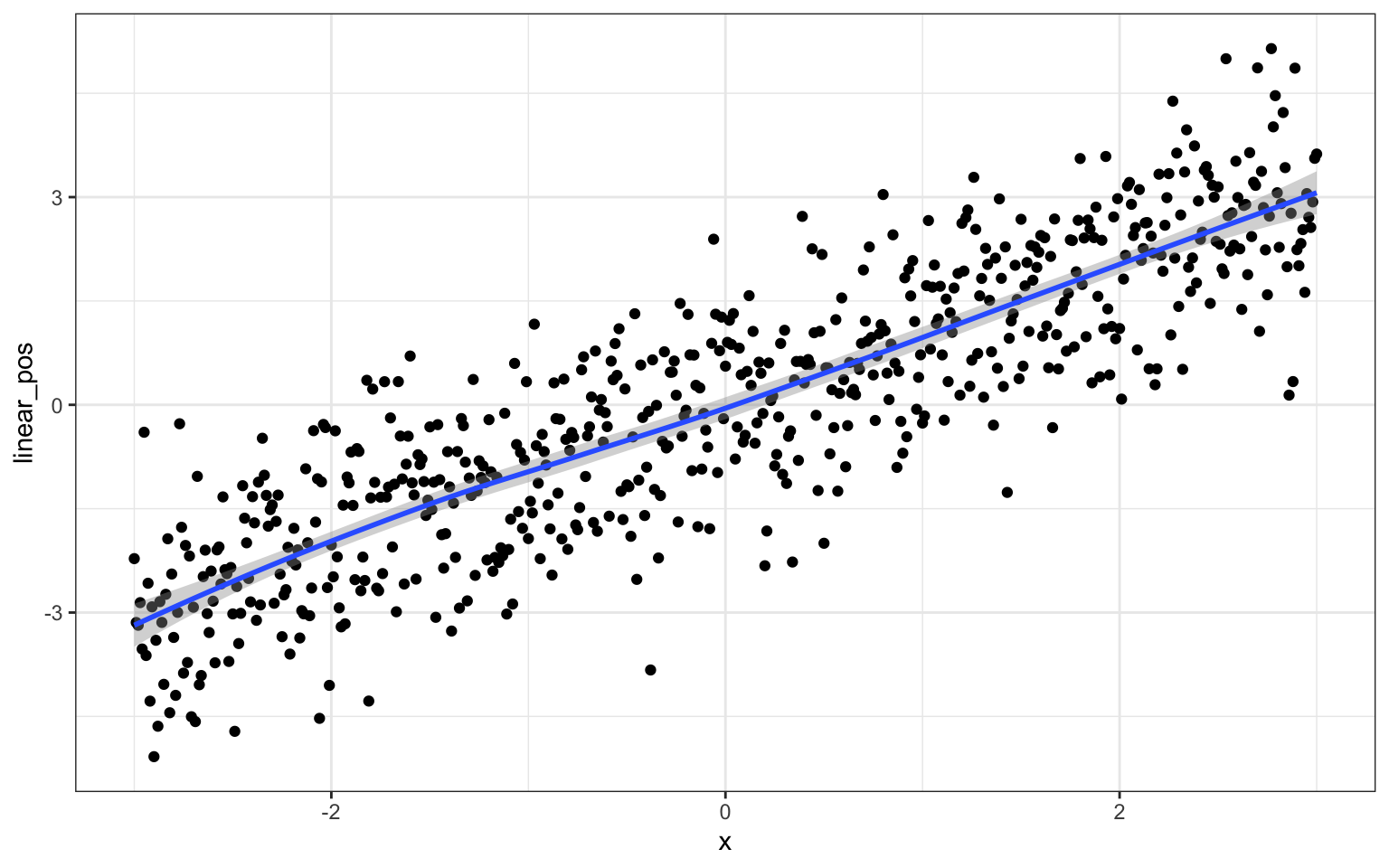
Here is some code to simulate different relationships.
G.1.1 Sonify
Siegert & Williams (2017)
No relationship sounds like a steady or randomly wavering tone.
A linear positive relationship sounds like an increasing tone.
A linear negative relationship sounds like a decreasing tone.
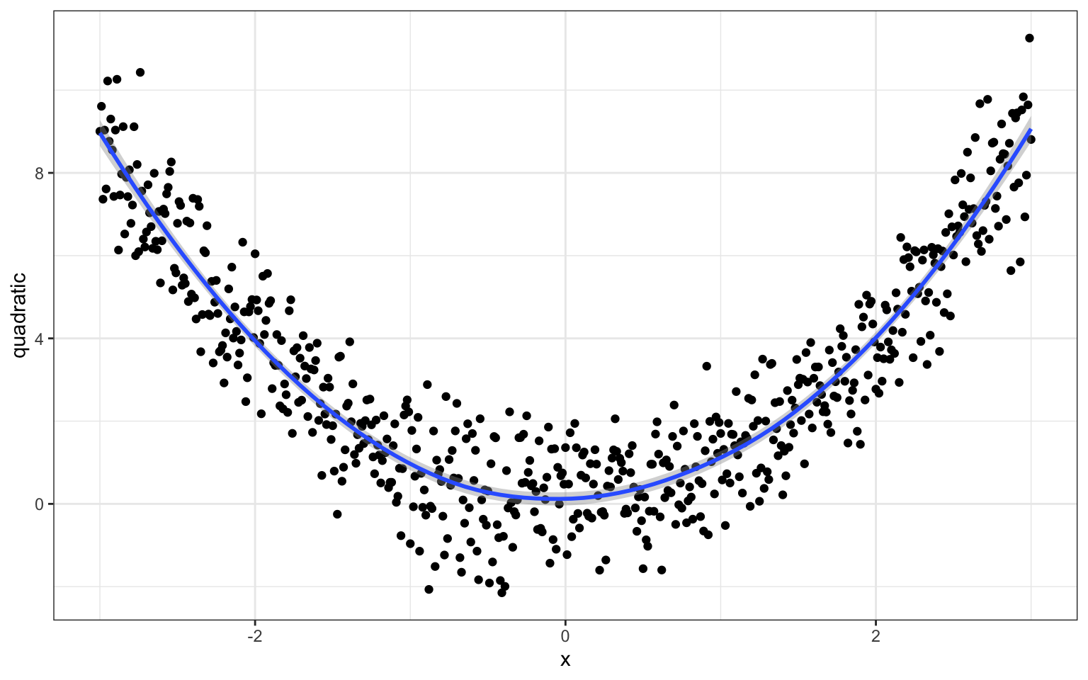
This quadratic relationship decreases in pitch and then increases.
G.1.2 BrailleR
BrailleR Godfrey et al. (2020)
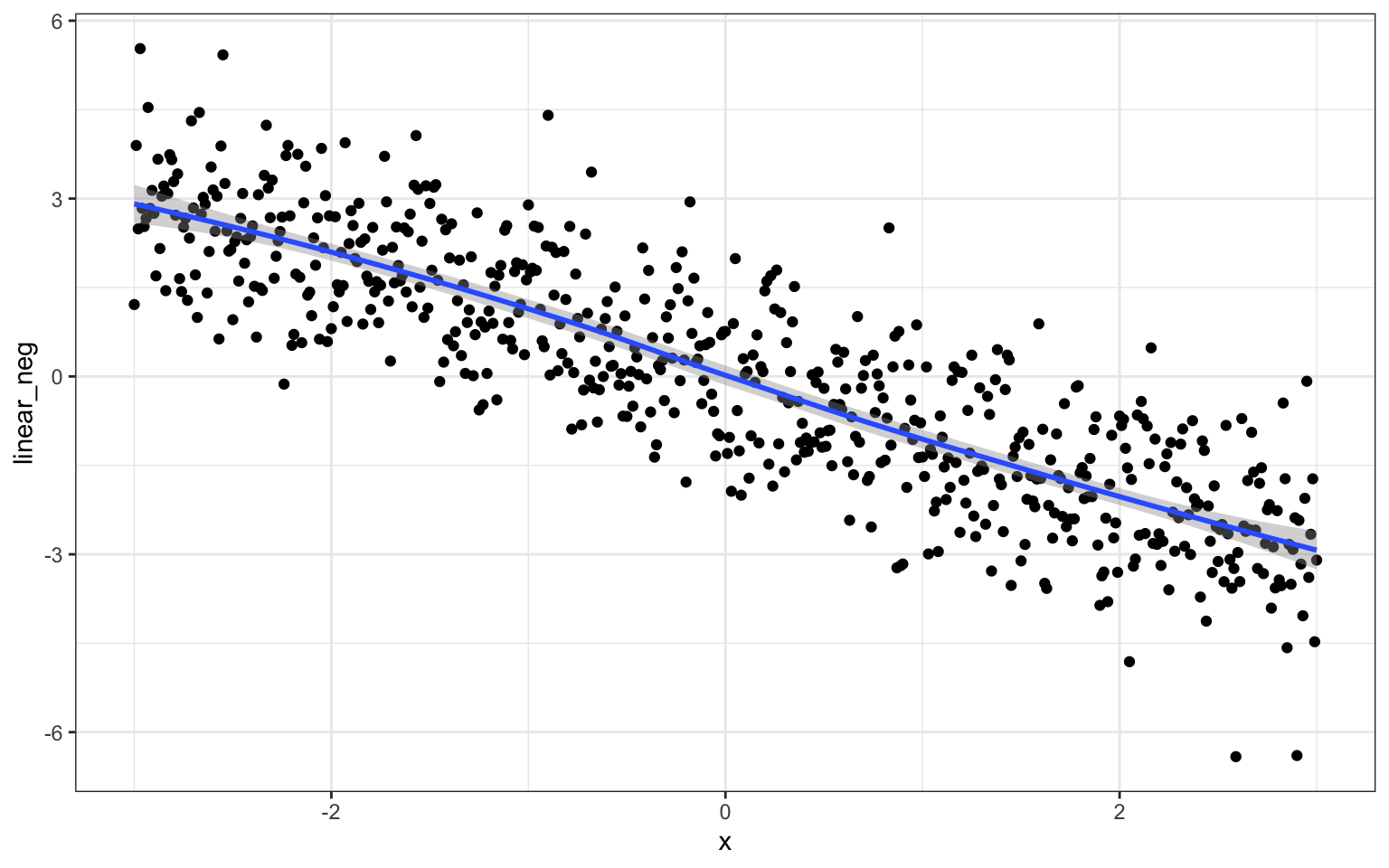
This is an untitled chart with no subtitle or caption.
It has x-axis '' with labels -2, 0 and 2.
It has y-axis '' with labels -6, -3, 0, 3 and 6.
It has 2 layers.
Layer 1 is a set of 601 big solid circle points of which about 93% can be seen.
Layer 2 is a 'lowess' smoothed curve with 95% confidence intervals covering 2.9% of the graph.
You can see it doesn’t alway get everything right. It only readds the axis labels if they have been explicitly set.
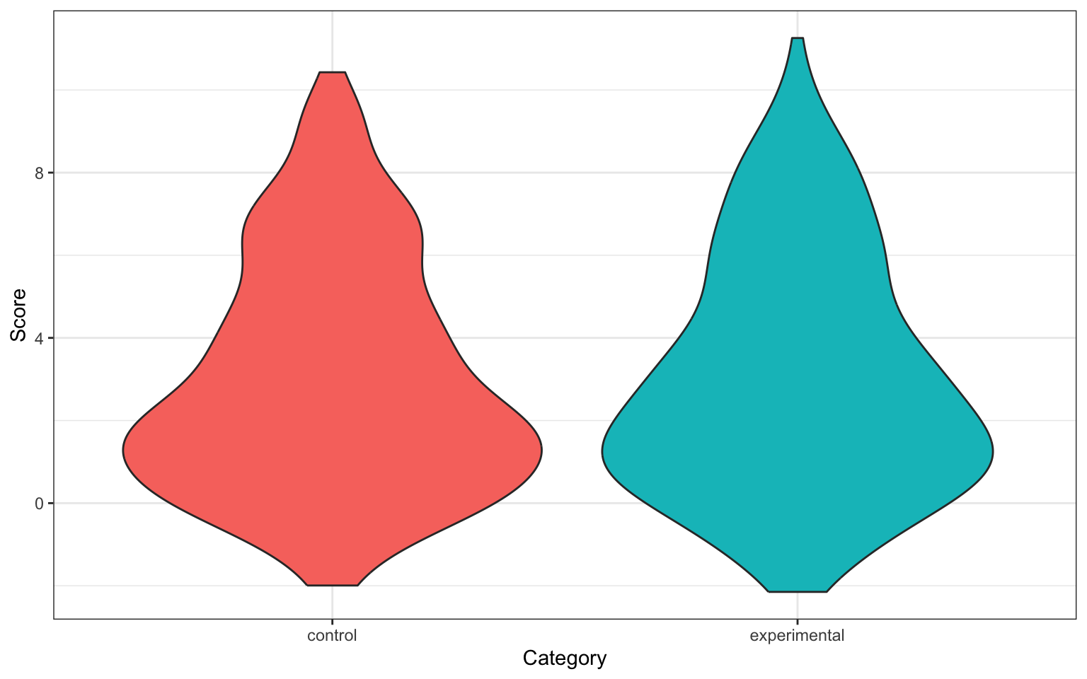
ggplot(dat, aes(x = category, y = quadratic, fill = category)) +
  geom_violin(show.legend = FALSE) +
  labs(x = "Category",
       y = "Score")
This is an untitled chart with no subtitle or caption.
It has x-axis 'Category' with labels control and experimental.
It has y-axis 'Score' with labels 0, 4 and 8.
The chart is a violin graph that VI cannot process.