Appendix M — More Plots
This appendix will introduce you to some more plot styles, like maps and word clouds, and things you can do with plots, such as add annotations.
M.0.1 Set-up
- Open your
reproresproject - Create a new quarto file called
10-next.qmd - Update the YAML header
- Replace the setup chunk with the one below:
```{r}
#| label: setup
#| include: false

# packages needed for this chapter section
library(tidyverse)   # for data wrangling
library(ggthemes)    # for themes
library(patchwork)   # for combining plots
library(plotly)      # for interactive plots
# devtools::install_github("hrbrmstr/waffle")
library(waffle)      # for waffle plots
library(ggbump)      # for bump plots
library(treemap)     # for treemap plots
library(ggwordcloud) # for word clouds
library(tidytext)    # for manipulating text for word clouds
library(gganimate)   # for animated plots

#install.packages("rnaturalearthhires", repos = "http://packages.ropensci.org", type = "source")
library(sf)          # for mapping geoms
library(rnaturalearth) # for map data
library(rnaturalearthdata) # extra mapping data

theme_set(theme_light())
```
Download the ggplot2 cheat sheet.
M.0.2 Defaults
The code below creates two plots using the default (light) theme and palettes. First, load the data and set issue_category to a factor so you can control the order of the categories.
Next, create a bar plot of number of calls by issue category.
And create a scatterplot of wait time by call time, distinguished by issue category.
Finally, combine the two plots using the + from patchwork to see the default styles for these plots.
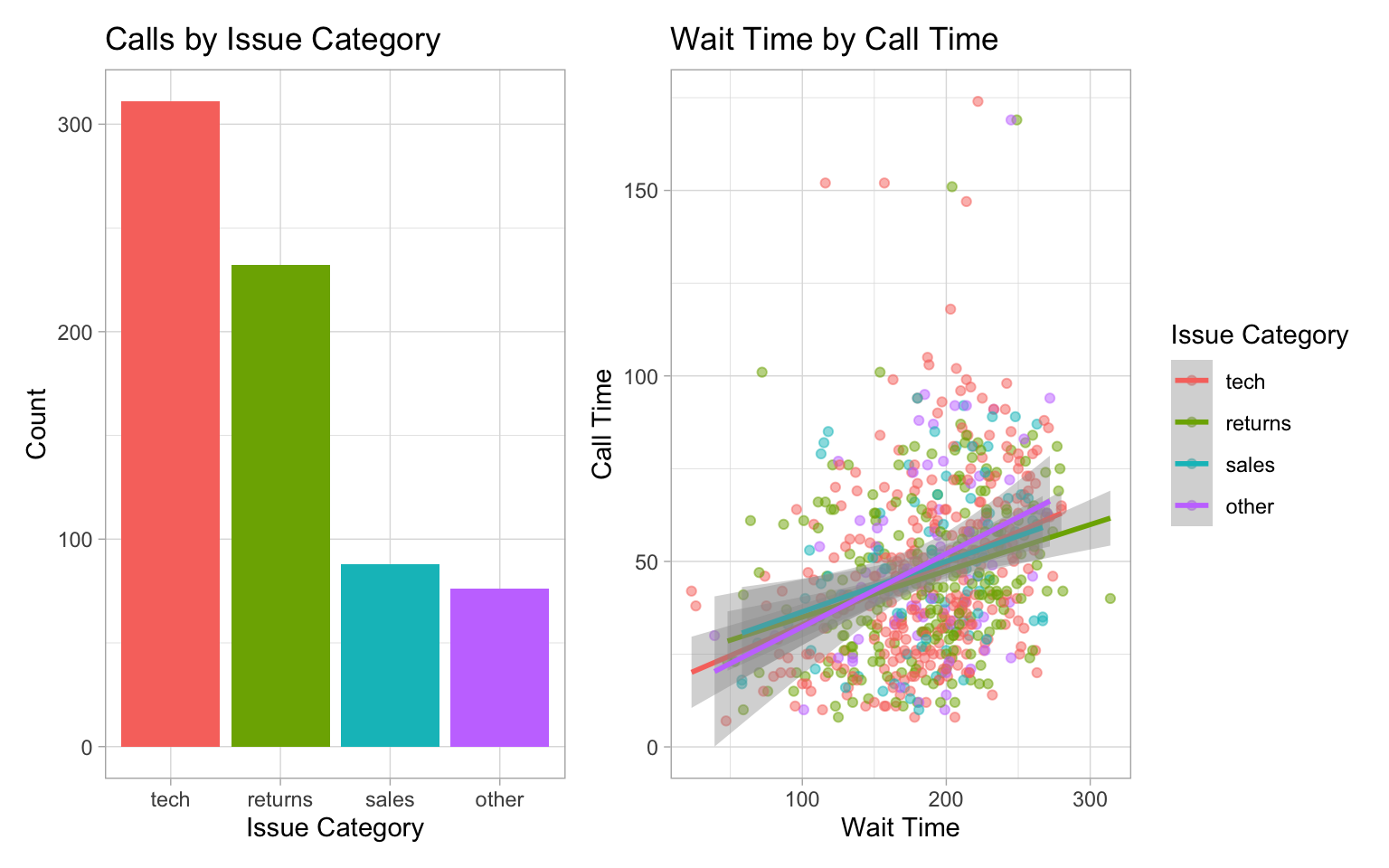
Try changing the theme using built-in themes or customising the colours or linetypes with scale_* functions. See Appendix @ref(plotstyle) for details.
M.0.3 Annotations
It’s often useful to add annotations to a plot, for example, to highlight an important part of the plot or add labels. The annotate() function creates a specific geom at x- and y-coordinates you specify.
M.0.3.1 Text annotations
Add a text annotation by setting the geom argument to “text” or “label” and adding a label. Labels have padding and a background, while text is just text.
- Backslash-n
\nin the label text controls where the line breaks are. Try removing or changing the position of these to see what happens. -
xandycontrol the coordinates of the label. You will likely have to play around with these values to get them right. - The argument
hjustis the horizontal justification of text, andvjustis the vertical justification. The default values are 0.5, where the text is centred on the x and y coordinates. 0 will justify to the left and bottom, while 1 justifies to the right and top. - You can change the
angleof text, but not labels.
bar +
  # add left-justified text to the second bar
  annotate(geom = "text",
           label = "Our goal is to\nreduce this\ncategory",
           x = 1.65, y = 150,
           hjust = 0, vjust = 1,
           color = "white", fontface = "bold",
           angle = 45) +
  # add a centred label to the third bar
  annotate(geom = "label",
           label = "Our goal is\nto increase this\ncategory",
           x = 3, y = 75,
           hjust = 0.5, vjust = 1,
           color = " darkturquoise", fontface = "bold")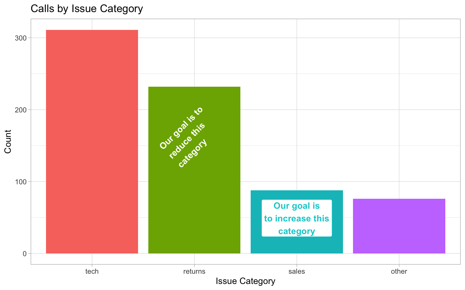
See if you can work out how to make the figure below, starting with the following:
Hint: you will need to add 1 label annotation and 8 separate text annotations.
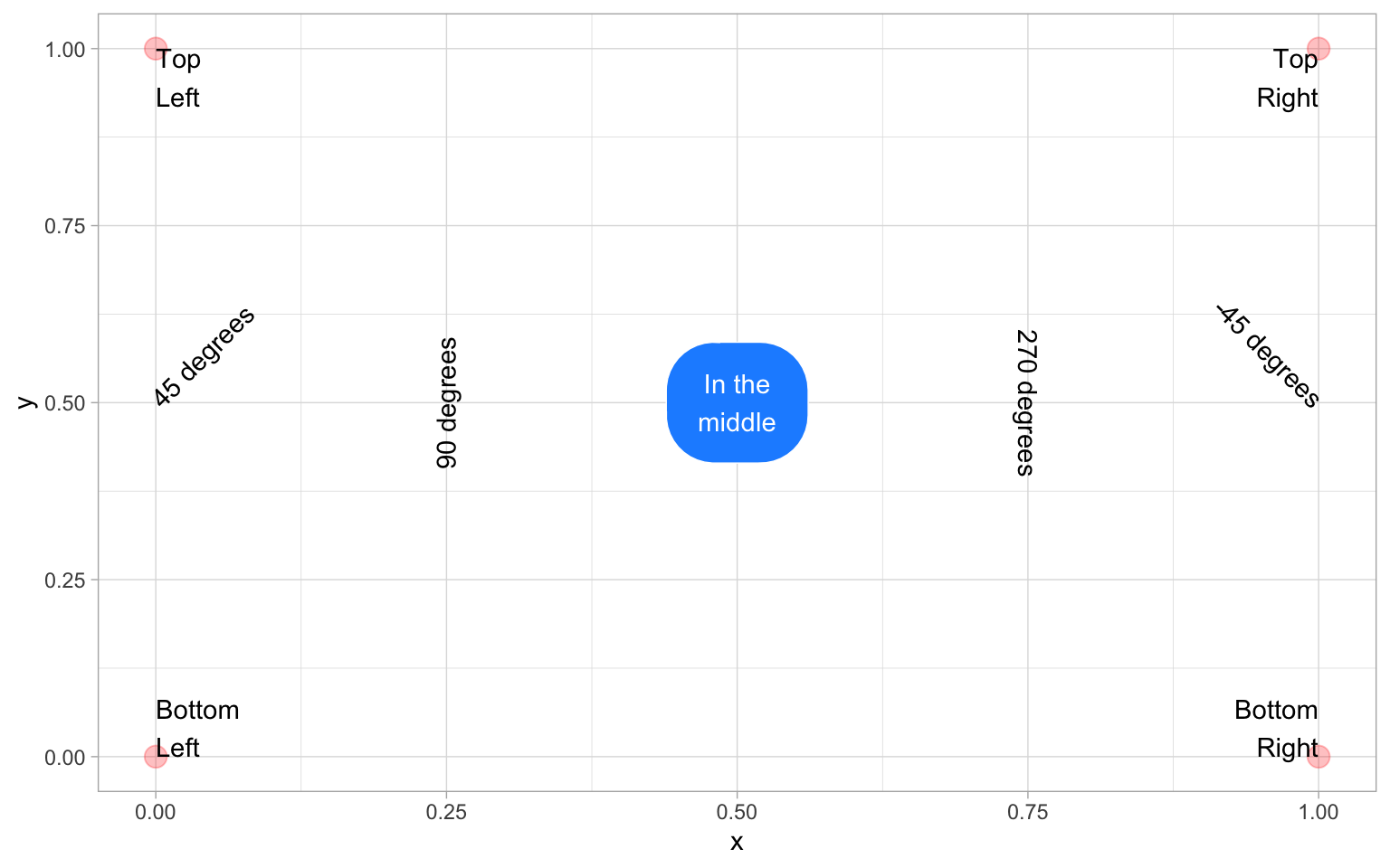
tibble(x = c(0, 0, 1, 1),
       y = c(0, 1, 0, 1)) |>
  ggplot(aes(x, y)) +
geom_point(alpha = 0.25, size = 4, color = "red") +
annotate("label", label = "In the\nmiddle",
x = 0.5, y = 0.5,
fill = "dodgerblue", color = "white",
label.padding = unit(1, "lines"),
label.r = unit(1.5, "lines")) +
annotate("text", label = "Bottom\nLeft",
x = 0, y = 0, hjust = 0, vjust = 0) +
annotate("text", label = "Top\nLeft",
x = 0, y = 1, hjust = 0, vjust = 1) +
annotate("text", label = "Bottom\nRight",
x = 1, y = 0, hjust = 1, vjust = 0) +
annotate("text", label = "Top\nRight",
x = 1, y = 1, hjust = 1, vjust = 1) +
annotate("text", label = "45 degrees",
x = 0, y = 0.5, hjust = 0, angle = 45) +
annotate("text", label = "90 degrees",
x = 0.25, y = 0.5, angle = 90) +
annotate("text", label = "270 degrees",
x = 0.75, y = 0.5, angle = 270)+
annotate("text", label = "-45 degrees",
x = 1, y = 0.5, hjust = 1, angle = -45)M.0.3.2 Other annotations
You can add other geoms to highlight parts of a plot. The example below adds a rectangle around a group of points, a text label, a straight arrow from the label to the rectangle, and a curved arrow from the label to an individual point.
point +
  # add a rectangle surrounding long call times
  annotate(geom = "rect",
           xmin = 100, xmax = 275,
           ymin = 140, ymax = 180,
           fill = "transparent", color = "red") +
  # add a text label
  annotate("text",
           x = 260, y = 120,
           label = "outliers") +
  # add an line with an arrow from the text to the box
  annotate(geom = "segment",
           x = 240, y = 120,
           xend = 200, yend = 135,
           arrow = arrow(length = unit(0.5, "lines"))) +
  # add a curved line with an arrow
  # from the text to a wait time outlier
  annotate(geom = "curve",
          x = 280, y = 120,
          xend = 320, yend = 45,
          curvature = -0.5,
          arrow = arrow(length = unit(0.5, "lines")))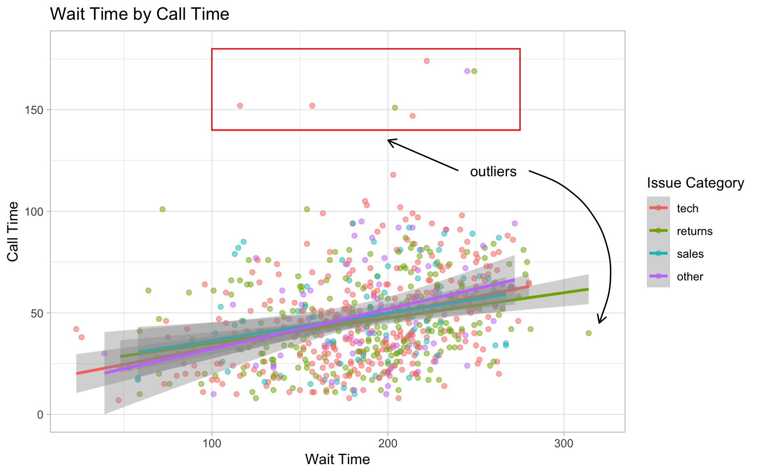
See the ggforce package for more sophisticated options, such as highlighting a group of points with an ellipse.
M.0.4 Other Plots
M.0.4.1 Interactive Plots
The plotly package can be used to make interactive graphs. Assign your ggplot to a variable and then use the function ggplotly() on the plot object. Note that interactive plots only work in HTML files, not PDFs or Word files.
Hover over the data points above and click on the legend items.
M.0.4.2 Waffle Plots
In Chapter @ref(ggplot), we mentioned that pie charts are such a poor way to visualise proportions that we refused to even show you how to make one. Waffle plots are a delicious alternative.
Use waffle by hrbrmstr on GitHub using the install_github() function below, rather than the one on CRAN you get from using install.packages().
By default, geom_waffle() represents each observation with a tile and splits these across 10 rows. You can play about with the n_rows argument to determine what works best for your data.
survey_data |>
  count(issue_category) |>
  ggplot(aes(fill = issue_category, values = n)) +
  geom_waffle(
    n_rows = 23, # try setting this to 10 (the default)
    size = 0.33, # line size
    make_proportional = FALSE, # use raw values
    colour = "white", # line colour
    flip = FALSE, # bottom-top or left-right
    radius = grid::unit(0.1, "npc") # set to 0.5 for circles
  ) +
  theme_enhance_waffle() + # gets rid of axes
  scale_fill_colorblind(name = "Issue Category")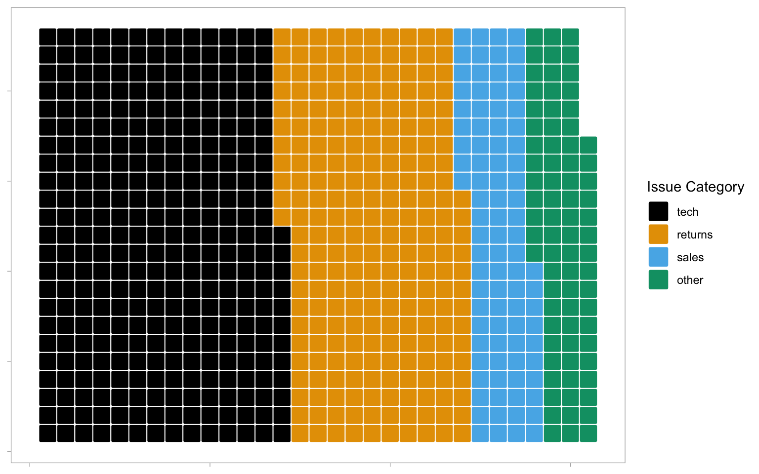
The waffle plot can also be used to display the counts as proportions To achieve these, set n_rows = 10 and make_proportional = TRUE. Now, rather than each tile representing one observation, each tile represents 1% of the data.
survey_data |>
  count(issue_category) |>
  ggplot(aes(fill = issue_category, values = n)) +
  geom_waffle(
    n_rows = 10,
    size = 0.33,
    make_proportional = TRUE, # compute proportions
    colour = "white",
    flip = FALSE,
    radius = grid::unit(0.1, "npc")
  ) +
  theme_enhance_waffle() +
  scale_fill_colorblind(name = "Issue Category")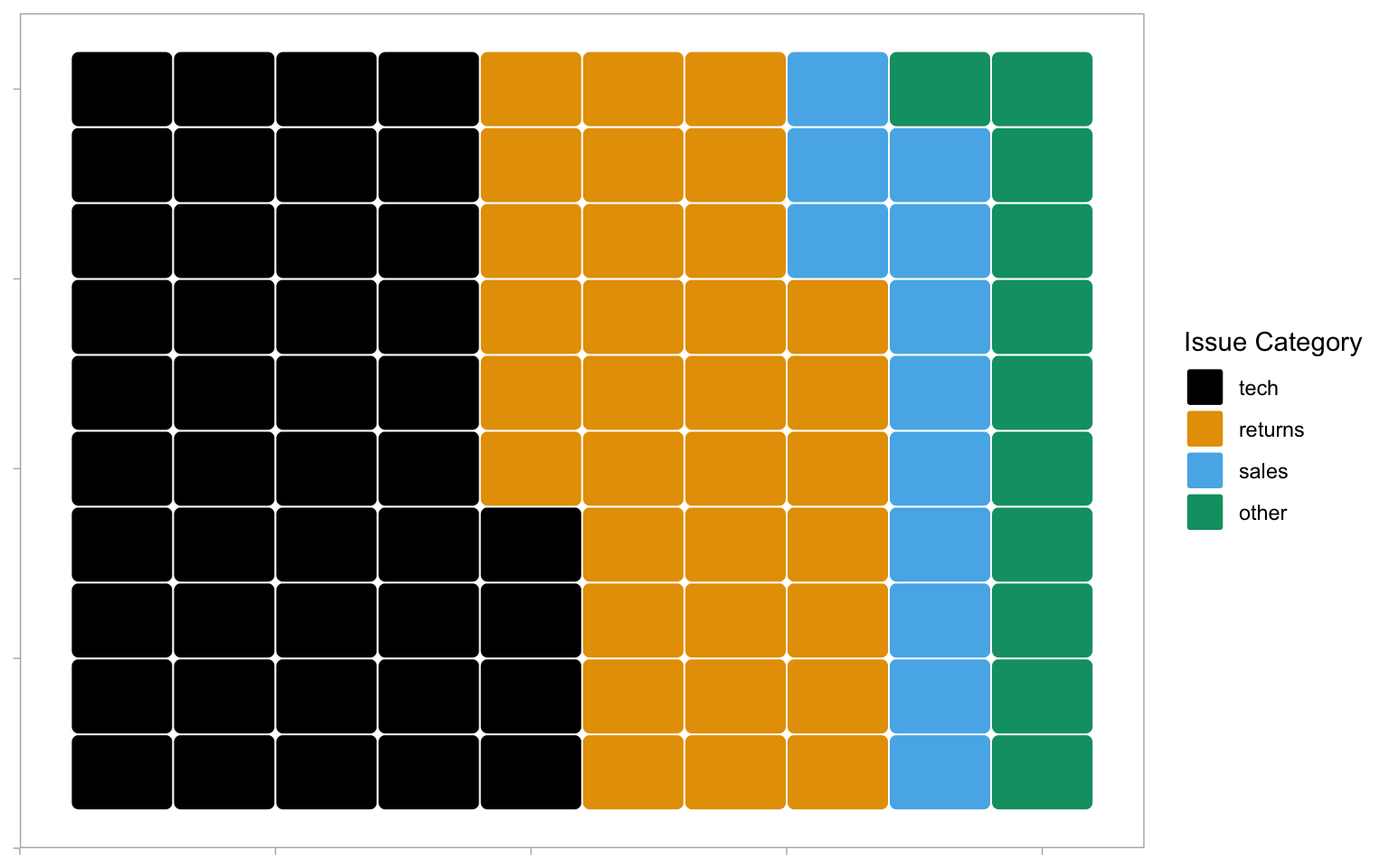
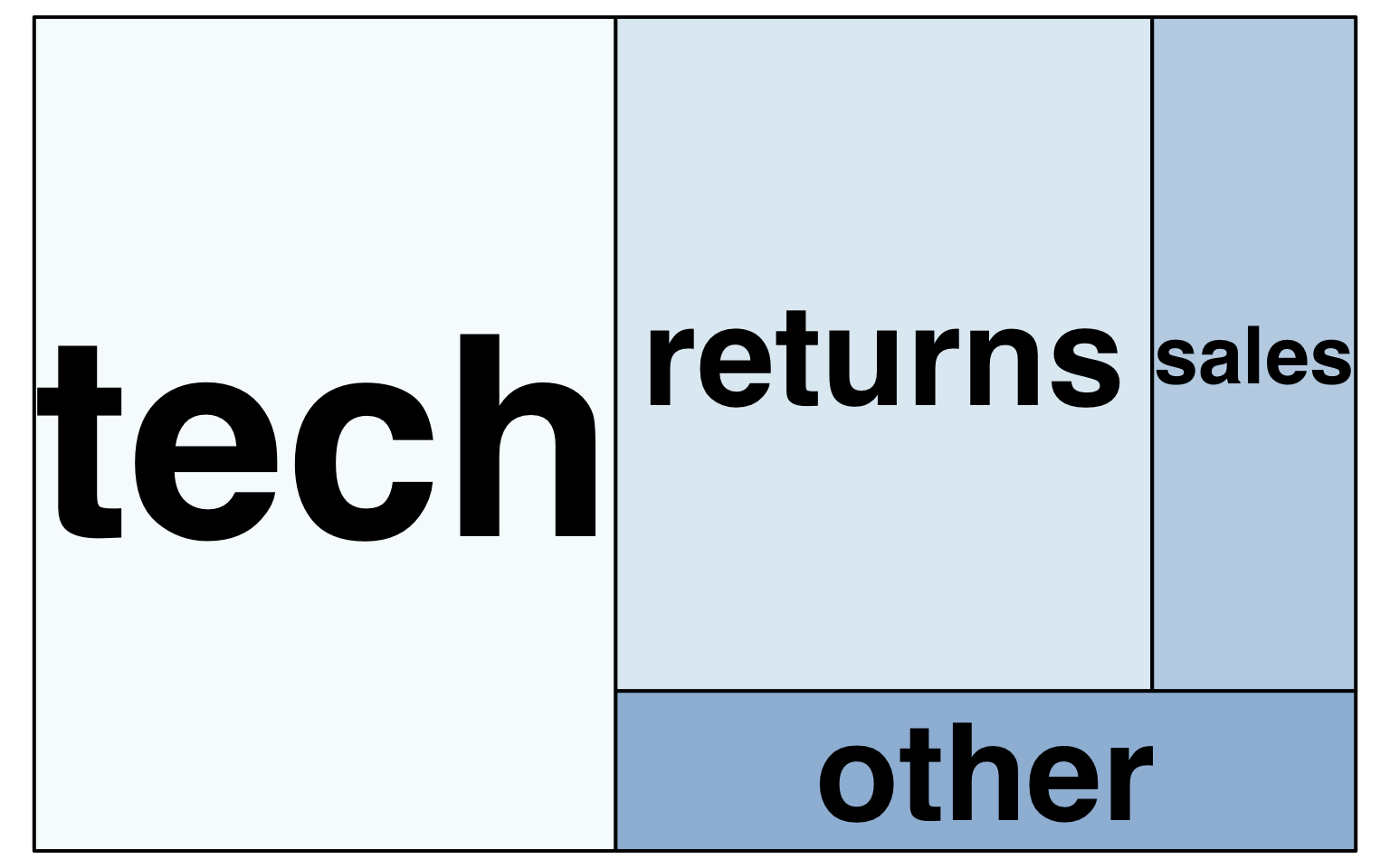
M.0.4.3 Treemap
Treemap plots are another way to visualise proportions. Like the waffle plots, you need to count the data by category first. You can use any brewer palette for the fill.
survey_data |>
  count(issue_category) |>
  treemap(
    index = "issue_category", # column with number of rectangles
    vSize = "n", # column with size of rectangle
    title = "",
    palette = "BuPu",
    inflate.labels = TRUE # expand labels to size of rectangle
  )
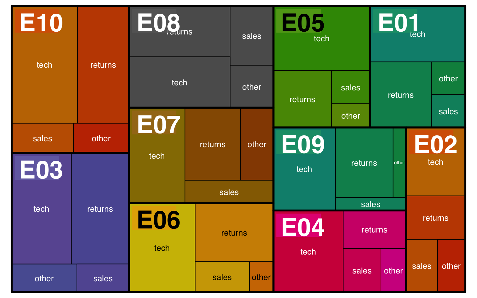
You can also represent multiple categories with treemaps
survey_data |>
  count(issue_category, employee_id) |>
  arrange(employee_id) |>
  treemap(
    # use c() to specify two variables
    index = c("employee_id", "issue_category"),
    vSize = "n",
    title = "",
    palette = "Dark2",
    # set different label sizes for each type of label
    fontsize.labels = c(30, 10),
    # set different alignments for two label types
    align.labels = list(c("left", "top"), c("center", "center"))
  )
M.0.4.4 Bump Plots
Bump plots are very useful for visualising how rankings change over time. So first, we need to get some ranking data. Let’s start with a more typical raw data table, containing an identifying column of person and three columns for their scores each week
Now we make the table long, group by week, and use the rank() function to find the rank of each person’s score each week. Use n() - rank(score) + 1 to reverse the ranks so that the highest score gets rank 1. We also need to make the week variable a number.
# calculate ranks
rank_data <- score_data |>
  pivot_longer(cols = -person,
               names_to = "week",
               values_to = "score") |>
  group_by(week) |>
  mutate(rank = n() - rank(score) + 1) |>
  ungroup() |>
  arrange(week, rank) |>
  mutate(week = str_replace(week, "week_", "") |> as.integer())

rank_data| person | week | score | rank |
|---|---|---|---|
| Abeni | 1 | 80 | 1 |
| Beth | 1 | 75 | 2 |
| Carmen | 1 | 60 | 3 |
| Beth | 2 | 85 | 1 |
| Abeni | 2 | 75 | 2 |
| Carmen | 2 | 70 | 3 |
| Abeni | 3 | 90 | 1 |
| Carmen | 3 | 80 | 2 |
| Beth | 3 | 75 | 3 |
A typical mapping for a bump plot puts the time variable in the x-axis, the rank variable on the y-axis, and sets colour to the identifying variable.
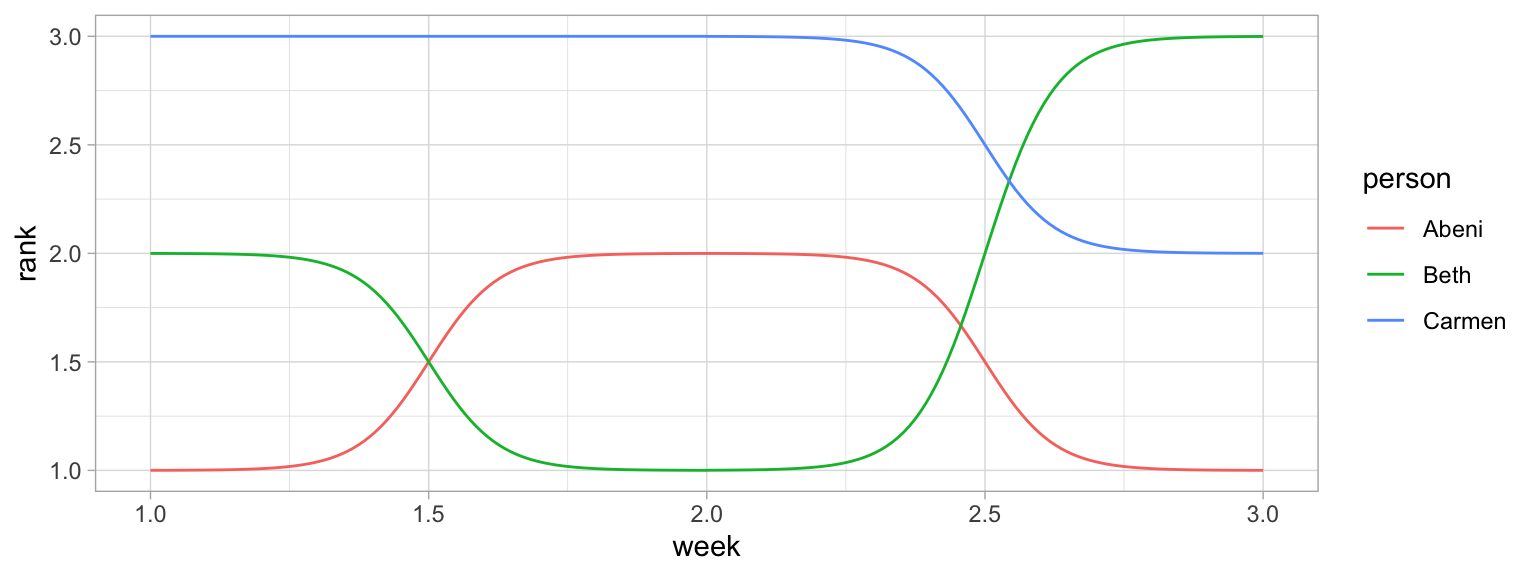
We can make this more attractive by customising the axes and adding text labels. Try running each line of this code to see how it builds up.
- Add
label = personto the mapping so we can add in text labels. - Increase the size of the lines with the
sizeargument togeom_bump() - We don’t need labels for weeks 1.5 and 2.5, so change the x-axis
breaks - The
expandargument for the two scale_ functions expands the plot area so we can fit text labels to the right. - It makes more sense to have first place at the top, so reverse the order of the y-axis with
scale_y_reverse()and fix the breaks and expansion. - Add text labels with
geom_text(), but just for week 3, so setdata = filter(rank_data, week == 3)for this geom. - Set
x = 3.05to move the text labels just to the right of week 3, and sethjust = 0to right-justify the text labels (the default ishjust = 0.5, which would center them on 3.05). - Remove the legend and grid lines. Increase the x-axis text size.
ggplot(data = rank_data,
       mapping = aes(x = week,
                     y = rank,
                     colour = person,
                     label = person)) +
  ggbump::geom_bump(size = 10) +
  scale_x_continuous(name = "",
                     breaks = 1:3,
                     labels = c("Week 1", "Week 2", "Week 3"),
                     expand = expansion(c(.05, .2))) +
  scale_y_reverse(name = "Ranking",
                  breaks = 1:3,
                  expand = expansion(.2)) +
  geom_text(data = filter(rank_data, week == 3),
            color = "black", x = 3.05, hjust = 0) +
  theme(legend.position = "none",
        panel.grid.major = element_blank(),
        panel.grid.minor = element_blank(),
        axis.text.x = element_text(size = 12))
Warning: Using `size` aesthetic for lines was deprecated in ggplot2 3.4.0.
ℹ Please use `linewidth` instead.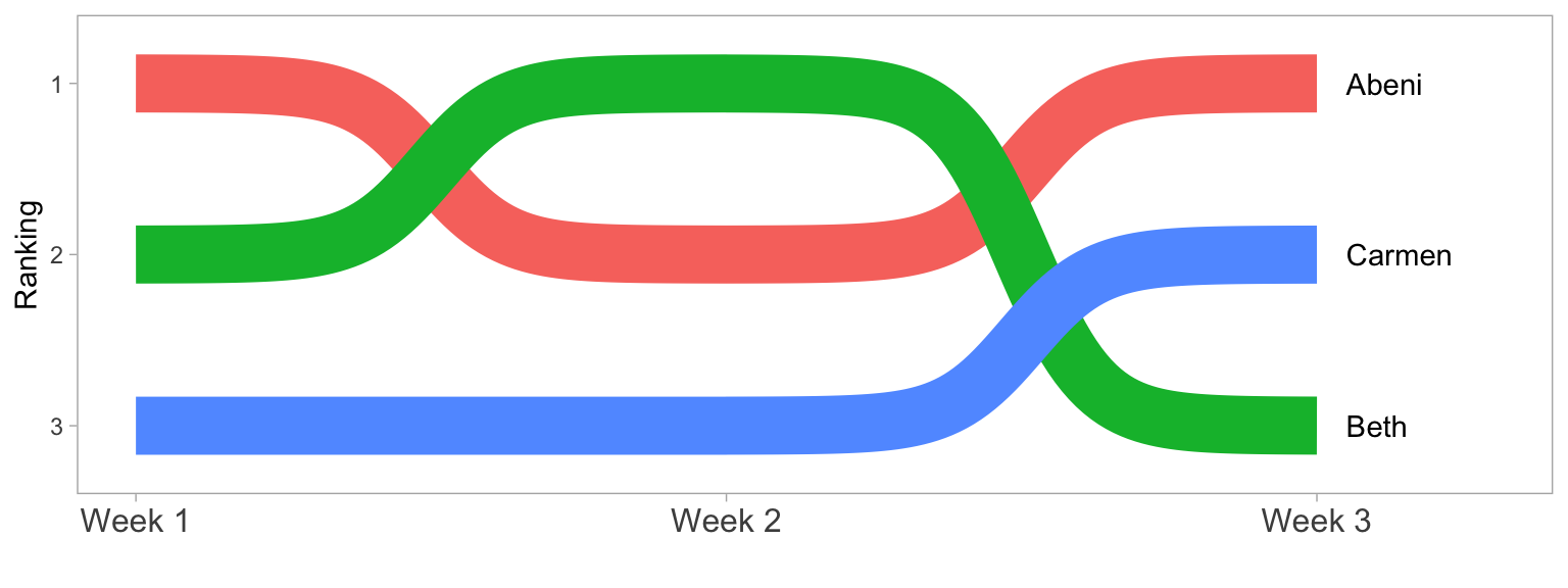
M.0.4.5 Word Clouds
Word clouds are a common way to summarise text data. First, download amazon_alexa.csv into your data folder and then load it into an object. This dataset contains text reviews as well as the 1-5 rating from customers who bought an Alexa device on Amazon.
We can use this data to look at how the words used differ depending on the rating given. To make the text data easy to work with, the function tidytext::unnest_tokens() splits the words in the input column into individual words in a new output column. unnnest_tokens() is particularly helpful because it also does things like removes punctuation and transforms all words to lower case to make it easier to work with. Compare words and alexa to see how they map on to each other.
We can then add another line of code using a pipe that counts how many instances of each word there is by rating to give us the most popular words.
| word | rating | n |
|---|---|---|
| i | 5 | 1859 |
| the | 5 | 1839 |
| to | 5 | 1633 |
| it | 5 | 1571 |
| and | 5 | 1477 |
| my | 5 | 980 |
The problem is that the most common words are all function words rather than content words, which makes sense because these words have the highest word frequency in natural language.
Helpfully, tidytext contains a list of common “stop words”, i.e., words that you want to ignore, that are stored in an object named stop_words. It is also very useful to define a list of custom stop words based upon the unique properties of your data (it can sometimes take a few attempts to identify what’s appropriate for your dataset). This dataset contains a lot of numbers that aren’t informative, and it also contains “https” from website links, so we’ll get rid of both with a custom stop list.
Once you have defined your stop words, you can then use anti_join() to remove any word that is present in the stop word list.
To get the top 25 words, we then group by rating and use dplyr::slice_max(), ordered by the column n.
custom_stop <- tibble(word = c(0:9, "https", 34))
words <- alexa |>
unnest_tokens(output = "word", input = "verified_reviews") |>
count(word, rating) |>
anti_join(stop_words, by = "word") |>
anti_join(custom_stop, by = "word") |>
group_by(rating) |>
slice_max(order_by = n, n = 25, with_ties = FALSE) |>
ungroup()First, let’s make a word cloud for customers who gave a 1-star rating:
- Filter retains only the data for 1-star ratings.
-
labelcomes from thewordcolumn and is the data to plot (i.e., the words). -
colourmakes the words red (you could also set this towordto give each word a different colour ornto vary colour continuously by frequency). -
sizemakes the size of the word proportional ton, the number of times the word appeared. -
ggwordcloud::geom_text_wordcloud_area()is the word cloud geom. -
ggwordcloud::scale_size_area()controls how big the word cloud is (this usually takes some trial-and-error).
rating1 <- filter(words, rating == 1) |>
  ggplot(aes(label = word, colour = "red", size = n)) +
  geom_text_wordcloud_area() +
  scale_size_area(max_size = 10) +
  ggtitle("Rating = 1") +
  theme_minimal(base_size = 14)

rating1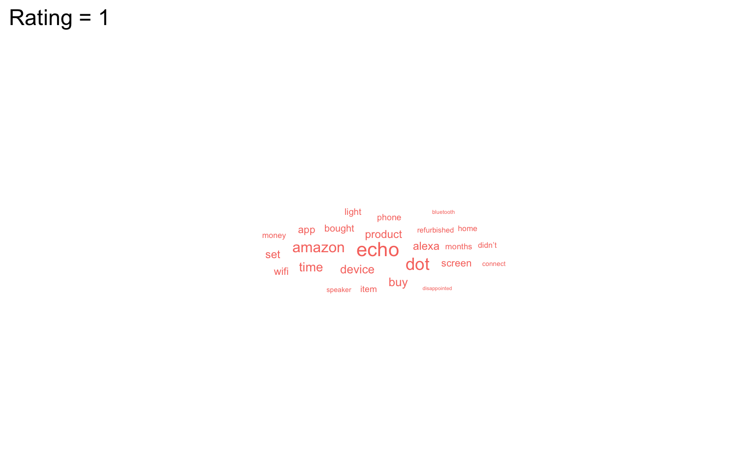
We can now do the same but for 5-star ratings and paste the plots together with patchwork (word clouds don’t play well with facets).
rating5 <- filter(words, rating == 5) |>
  ggplot(aes(label = word, size = n)) +
  geom_text_wordcloud_area(colour = "darkolivegreen3") +
  scale_size_area(max_size = 12) +
  ggtitle("Rating = 5") +
  theme_minimal(base_size = 14)

rating1 + rating5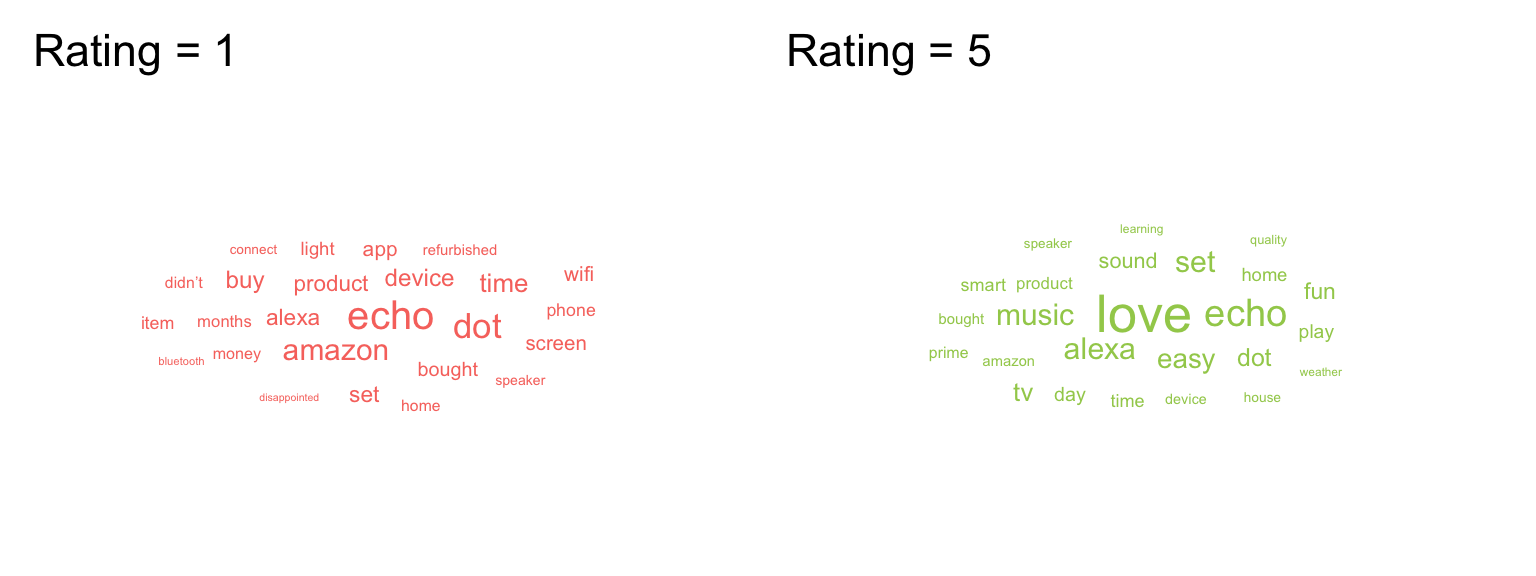
It’s worth highlighting that whilst word clouds are very common, they’re really the equivalent of pie charts for text data because we’re not very good at making accurate comparisons based on size. You might be able to see what’s the most popular word, but can you accurately determine the 2nd, 3rd, 4th or 5th most popular word based on the clouds alone? There’s also the issue that just because it’s text data doesn’t make it a qualitative analysis and just because something is said a lot doesn’t mean it’s useful or important. But, this argument is outwith the scope of this book, even if it is a recurring part of Emily’s life thanks to her qualitative wife.
M.0.4.6 Maps
Working with maps can be tricky. The sf package provides functions that work with ggplot2, such as geom_sf(). The rnaturalearth package (and associated data packages that you may be prompted to download) provide high-quality mapping coordinates.
-
ne_countries()returns world country polygons (i.e., a world map). We specify the object should be returned as a “simple feature” classsfso that it will work withgeom_sf(). If you would like a deep dive on simple feature objects, check out a vignette from thesfpackage. - It’s worth checking out what the object
ne_countries()returns to see just how much information is available. - Try changing the values and colours below to get a sense of how the code works.
# get the world map coordinates
world_sf <- ne_countries(returnclass = "sf", scale = "medium")

# plot them on a light blue background
ggplot() +
  geom_sf(data = world_sf, size = 0.3) +
  theme(panel.background = element_rect(fill = "lightskyblue2"))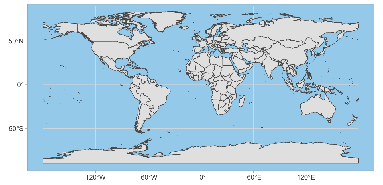
You can combine multiple countries using bind_rows() and visualise them with different colours for each country.
# get and bind country data
uk_sf <- ne_states(country = "united kingdom", returnclass = "sf")
ireland_sf <- ne_states(country = "ireland", returnclass = "sf")
islands <- bind_rows(uk_sf, ireland_sf) |>
  filter(!is.na(geonunit))

# set colours
country_colours <- c("Scotland" = "#0962BA",
                     "Wales" = "#00AC48",
                     "England" = "#FF0000",
                     "Northern Ireland" = "#FFCD2C",
                     "Ireland" = "#F77613")

ggplot() +
  geom_sf(data = islands,
          mapping = aes(fill = geonunit),
          colour = NA,
          alpha = 0.75) +
  coord_sf(crs = sf::st_crs(4326),
           xlim = c(-10.7, 2.1),
           ylim = c(49.7, 61)) +
  scale_fill_manual(name = "Country",
                    values = country_colours)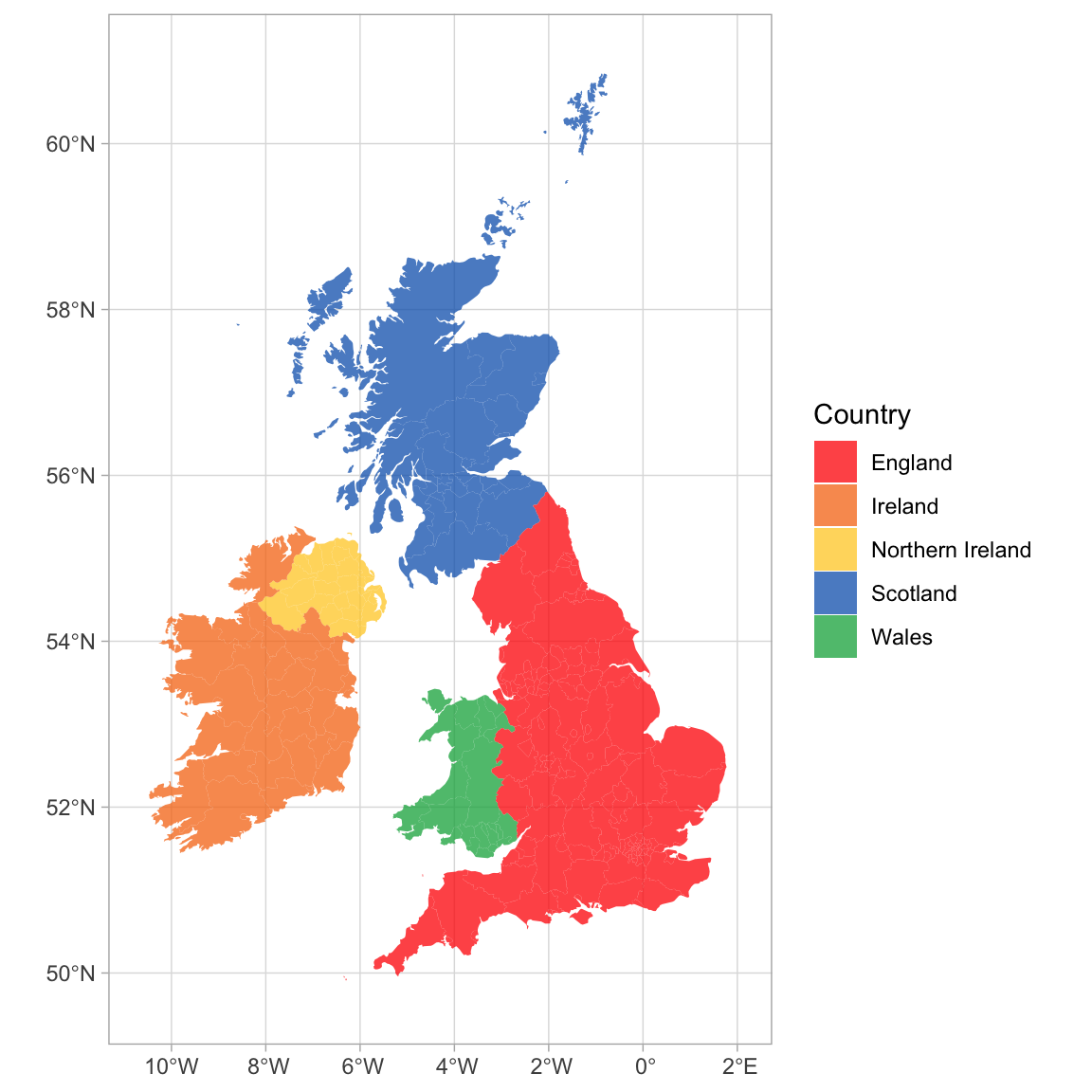
You can join Scottish population data to the map table to visualise data on the map using colours or labels.
# load map data
scotland_sf <- ne_states(geounit = "Scotland",
                         returnclass = "sf")

# load population data from
# https://www.indexmundi.com/facts/united-kingdom/quick-facts/scotland/population
scotpop <- read_csv("data/scottish_population.csv",
                    show_col_types = FALSE)

# join data and fix typo in the map
scotmap_pop <- scotland_sf |>
  mutate(name = ifelse(name == "North Ayshire",
                       yes = "North Ayrshire",
                       no = name)) |>
  left_join(scotpop, by = "name") |>
select(name, population, geometry)There is a typo in the data from rnaturalearth, so you need to change “North Ayshire” to “North Ayrshire” before you join the population data.
- Setting the fill to population in
geom_sf()gives each region a colour based on its population. - The colours are customised with
scale_fill_viridis_c(). The breaks of the fill scale are set to increments of 100K (1e5 in scientific notation) and the scale is set to span 0 to 600K. -
paste0()creates the labels by taking the numbers 0 through 6 and adding “00 k” to them. - Finally, the position of the legend is moved into the sea using
legend.position().
# plot
ggplot() +
  geom_sf(data = scotmap_pop,
          mapping = aes(fill = population),
          color = "white",
          size = .1) +
  coord_sf(xlim = c(-8, 0), ylim = c(54, 61)) +
  scale_fill_viridis_c(name = "Population",
                       breaks = seq(from = 0, to = 6e5, by = 1e5),
                       limits = c(0, 6e5),
                       labels = paste0(0:6, "00 K")) +
  theme(legend.position = c(0.16, 0.84))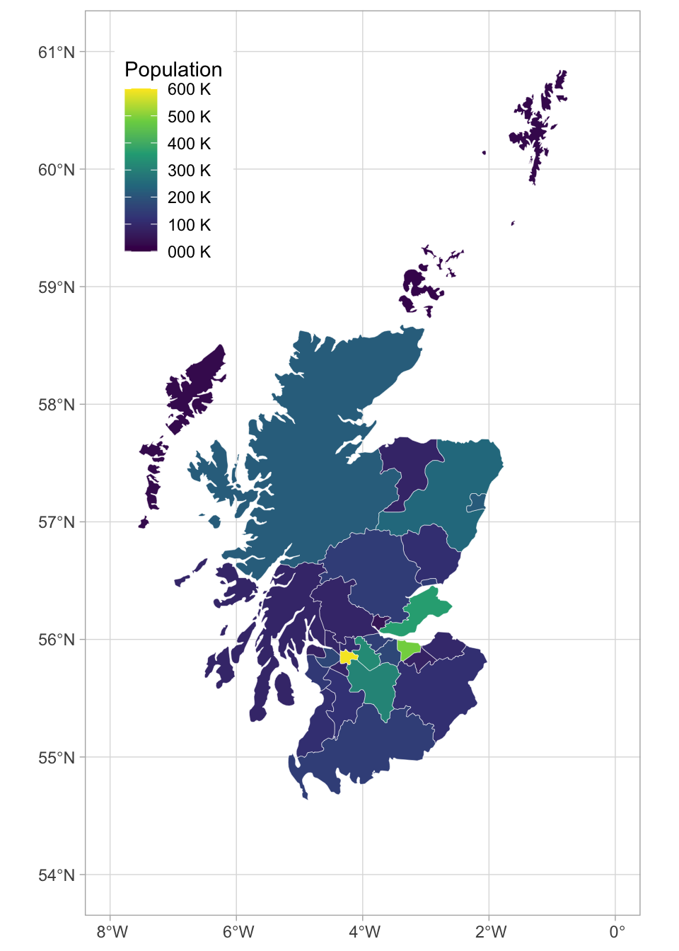
M.0.4.7 Animated Plots
Animated plots are a great way to add a wow factor to your reports, but they can be complex to make, distracting, and not very accessible, so use them sparingly and only for data visualisation where the animation really adds something. The package gganimate has many functions for animating ggplots.
Here, we’ll load some population data from the United Nations. Download the file into your data folder and open it in Excel first to see what it looks like. The code below gets the data from the first tab, filters it to just the 6 world regions, makes the data long, and makes sure the year column is numeric and the pop column shows population in whole numbers (the original data is in 1000s).
# load and process data
worldpop <- readxl::read_excel("data/WPP2019_POP_F01_1_TOTAL_POPULATION_BOTH_SEXES.xlsx", skip = 16) |>
filter(Type == "Region") |>
select(region = 3, `1950`:`1992`) |>
pivot_longer(cols = -region,
names_to = "year",
values_to = "pop") |>
mutate(year = as.integer(year),
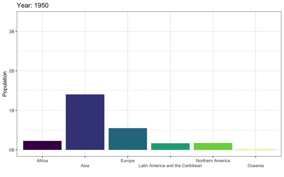
pop = round(1000 * as.numeric(pop)))Let’s make an animated plot showing how the population in each region changes with year. First, make a static plot. Filter the data to the most recent year so you can see what a single frame of the animation will look like.
worldpop |>
  filter(year == 1992) |>
  ggplot(aes(x = region, y = pop, fill = region)) +
  geom_col(show.legend = FALSE) +
  scale_fill_viridis_d() +
  scale_x_discrete(name = "",
                   guide = guide_axis(n.dodge=2))+
  scale_y_continuous(name = "Population",
                     breaks = seq(0, 3e9, 1e9),
                     labels = paste0(0:3, "B")) +
  ggtitle('Year: 1992')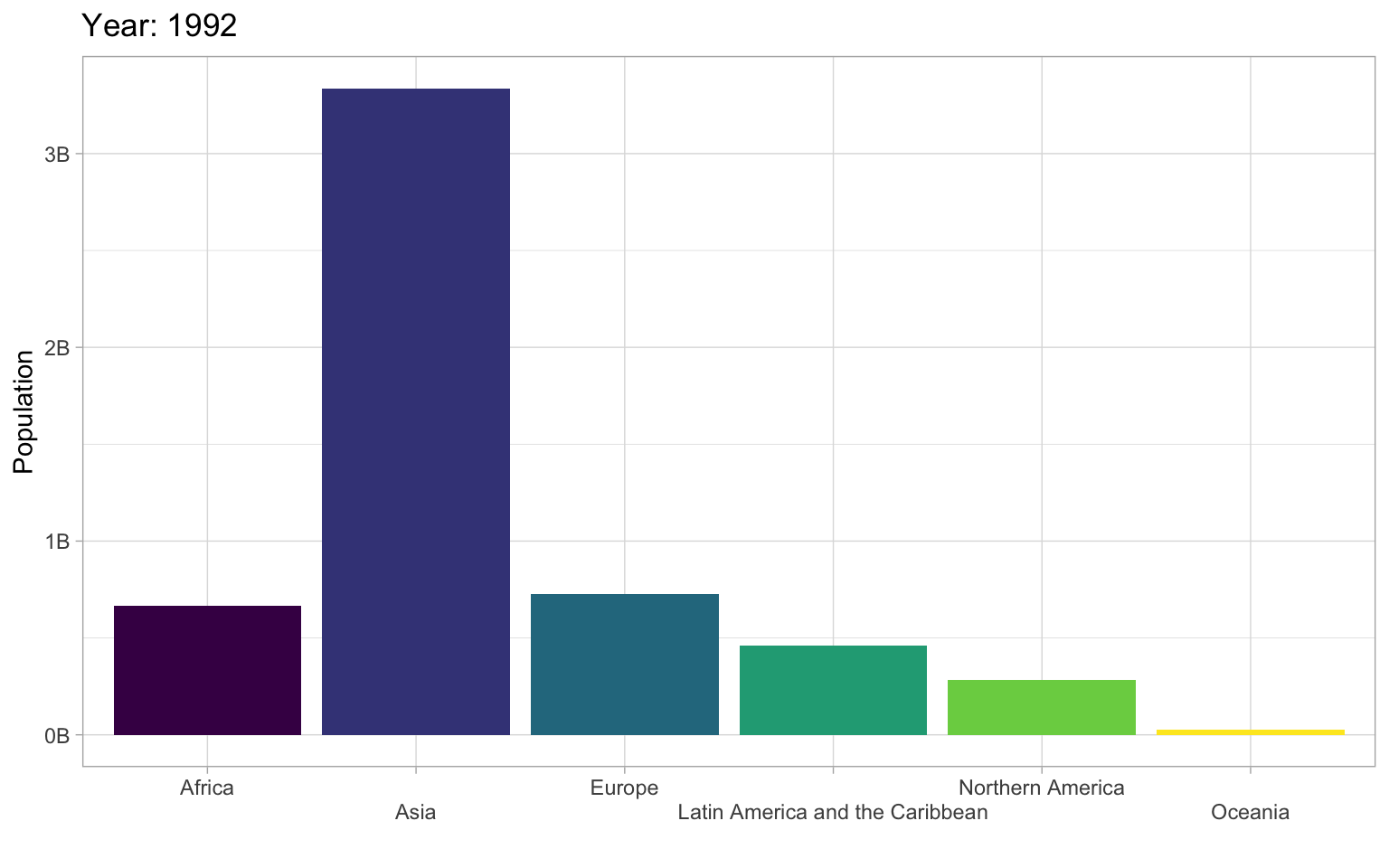
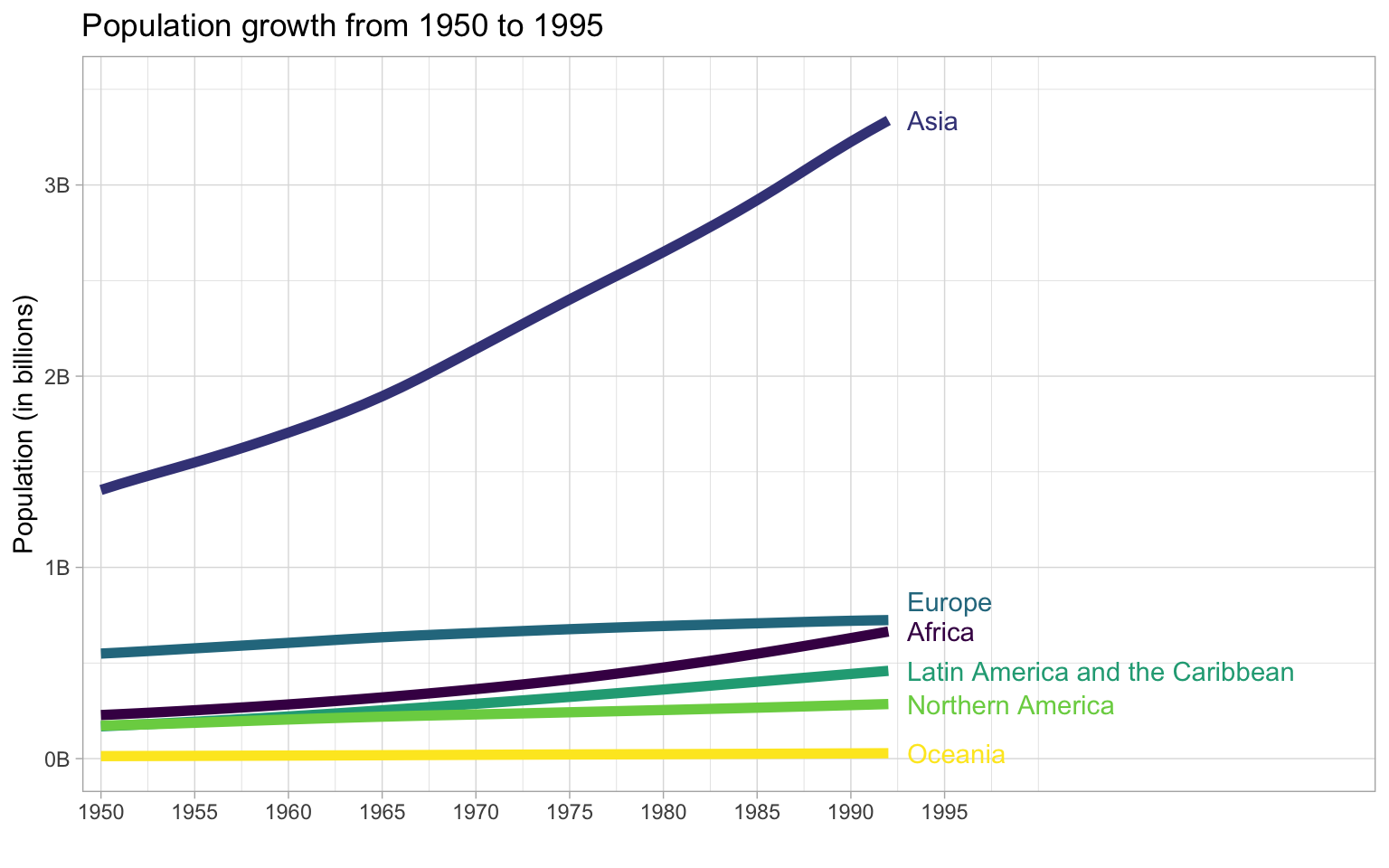
To convert this to an animated plot that shows the data from multiple years:
- Remove the filter and add
transition_time(year). - Use the
{}syntax to include theframe_timein the title. - Use
anim_save()to save the animation to a GIF file and set this code chunk toeval = FALSEbecause creating an animation takes a long time and you don’t want to have to run it every time you knit your report.
anim <- worldpop |>
  ggplot(aes(x = region, y = pop, fill = region)) +
  geom_col(show.legend = FALSE) +
  scale_fill_viridis_d() +
  scale_x_discrete(name = "",
                   guide = guide_axis(n.dodge=2))+
  scale_y_continuous(name = "Population",
                     breaks = seq(0, 3e9, 1e9),
                     labels = paste0(0:3, "B")) +
  ggtitle('Year: {frame_time}') +
  transition_time(year)

dir.create("images", FALSE) # creates an images directory if needed

anim_save(filename = "images/gganim-demo.gif",
          animation = anim,
          width = 8, height = 5, units = "in", res = 150)
You can show your animated gif in an html report (animations don’t work in Word or a PDF) using include_graphics(), or include the GIF in a dynamic document like PowerPoint.
There are actually not many plots that are really improved by animating them. The plot below gives the same information at a single glance.
M.0.5 Resources
There are so many more options for data visualisation in R than we have time to cover here. The following resources will get you started on your journey to informative, intuitive visualisations.
- The R Graph Gallery (this is really useful)
- Look at Data from Data Vizualization for Social Science
- Graphs in Cookbook for R
- Top 50 ggplot2 Visualizations
- R Graphics Cookbook by Winston Chang
- ggplot extensions
- plotly for creating interactive graphs
- Drawing Beautiful Maps Programmatically
- gganimate