4 1A: Lab 4
4.1 Pre-class activities
4.1.1 Activity 1: dplyr recap
In Lab 3 we were introduced to the tidyverse package, dplyr, and its six important functions. As a recap, which function(s) would you use to approach each of the following problems?
We have a dataset of 400 adults, but we want to remove anyone with an age of 50 years or more. To do this, we could use the function.
We are interested in overall summary statistics for our data, such as the overall average and total number of observations. To do this, we could use the function.
Our dataset has a column with the number of cats a person has, and a column with the number of dogs. We want to calculate a new column which contains the total number of pets each participant has. To do this, we could use the function.
We want to calculate the average for each participant in our dataset. To do this we could use the functions.
We want to order a dataframe of participants by the number of cats that they own, but want our new dataframe to only contain some of our columns. To do this we could use the functions.
4.1.2 Data visualisation
As Grolemund and Wickham tell us:
Visualisation is a fundamentally human activity. A good visualisation will show you things that you did not expect, or raise new questions about the data. A good visualisation might also hint that you’re asking the wrong question, or you need to collect different data. Visualisations can surprise you, but don’t scale particularly well because they require a human to interpret them.
(http://r4ds.had.co.nz/introduction.html)
Being able to visualise our variables, and relationships between our variables, is a very useful skill. Before we do any statistical analyses or present any summary statistics, we should visualising our data as it is:
A quick and easy way to check our data make sense, and to identify any unusual trends.
A way to honestly present the features of our data to anyone who reads our research.
ggplot() builds plots by combining layers (see Figure 4.1)). If you’re used to making plots in Excel this might seem a bit odd at first, however, it means that you can customise each layer and R is capable of making very complex and beautiful figures (this website gives you a good sense of what’s possible).
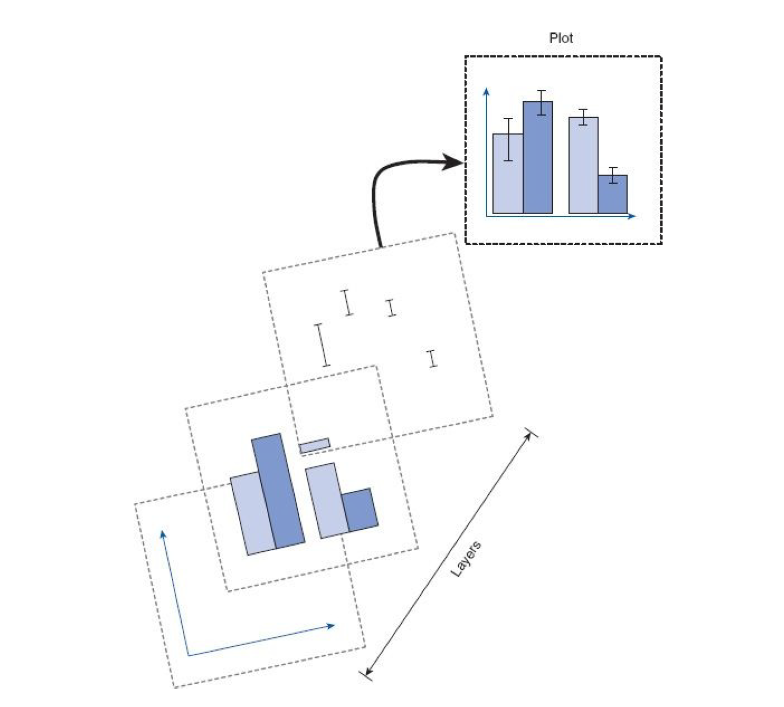
Figure 4.1: ggplot2 layers from Field et al. (2012)
4.1.3 Activity 2: Set-up
We’re going to use the data from the Labs to explain how ggplot2 works so let’s do the set-up as usual.
- Open R Studio and ensure the environment is clear.
- Download the
lab 4 pre-class Markdown file, extract the file and then move it in to your Data Skills folder. - Open the
stub-4.1.Rmdfile and ensure that the working directory is set to your Data Skills folder and that the two .csv data files are in your working directory (you should see them in the file pane).
- Type and run the below code to load the
tidyversepackage and to load in the data files in to the Activity 2 code chunk.
4.1.4 Activity 3: Factors
Before we go any further we need to perform an additional step of data processing that we have glossed over up until this point. First, run the below code to look at the structure of the dataset:
## tibble [992 x 8] (S3: spec_tbl_df/tbl_df/tbl/data.frame)
##  $ ahiTotal    : num [1:992] 32 34 34 35 36 37 38 38 38 38 ...
##  $ cesdTotal   : num [1:992] 50 49 47 41 36 35 50 55 47 39 ...
##  $ sex         : num [1:992] 1 1 1 1 1 1 2 1 2 2 ...
##  $ age         : num [1:992] 46 37 37 19 40 49 42 57 41 41 ...
##  $ educ        : num [1:992] 4 3 3 2 5 4 4 4 4 4 ...
##  $ income      : num [1:992] 3 2 2 1 2 1 1 2 1 1 ...
##  $ occasion    : num [1:992] 5 2 3 0 5 0 2 2 2 4 ...
##  $ elapsed.days: num [1:992] 182 14.2 33 0 202.1 ...
R assumes that all of the variables are numeric (represented by num) and this is going to be a problem because whilst sex, educ, and income are represented by numerical codes, they aren’t actually numbers, they’re categories, or factors.
We need to tell R that these variables are factors and we can use mutate() to do this by overriding the original variable with the same data but classified as a factor. Type and run the below code to change the categories to factors.
summarydata <- summarydata %>%
  mutate(sex = as.factor(sex),
         educ = as.factor(educ),
         income = as.factor(income))
You can read this code as “overwrite the data that is in the column sex with sex as a factor”.
Remember this. It’s a really important step and if your graphs are looking weird this might be the reason.
4.1.5 Activity 4: Bar plot
For our first example we will recreate the bar plot showing the number of male and female participants from Lab 2 by showing you how the layers of code build up (next semester we have data that includes non-binary participants).
- The first line (or layer) sets up the base of the graph: the data to use and the aesthetics (what will go on the x and y axis, how the plot will be grouped).
aes()can take both anxandyargument, however, with a bar plot you are just asking R to count the number of data points in each group so you don’t need to specify this.
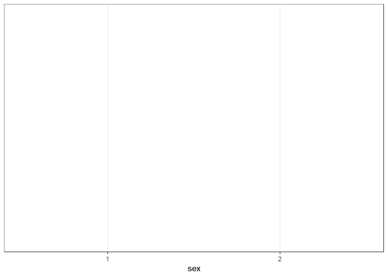
Figure 4.2: First ggplot layer sets the axes
- The next layer adds a geom or a shape, in this case we use
geom_bar()as we want to draw a bar plot.
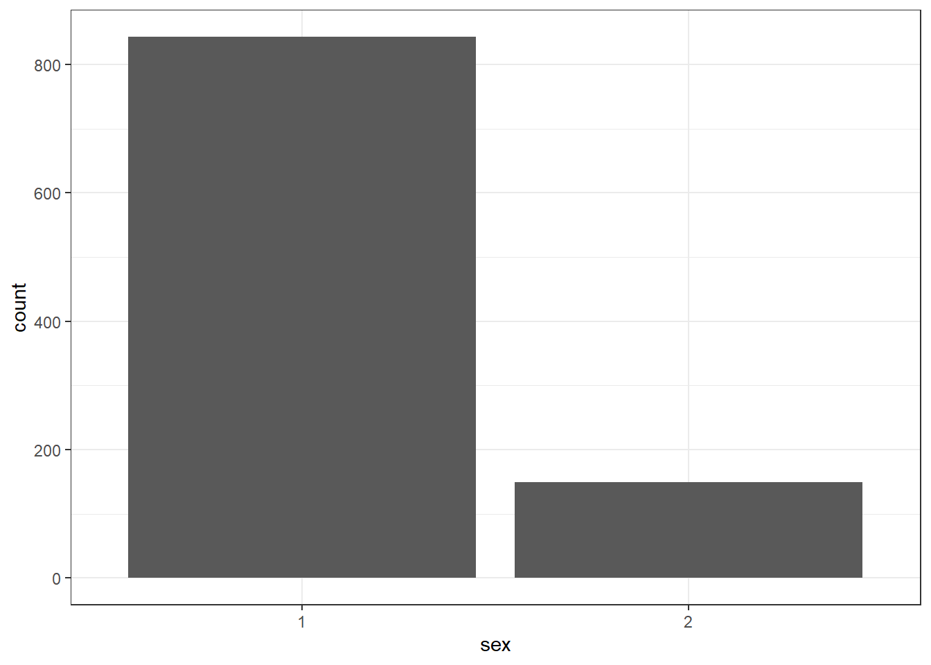
Figure 4.3: Basic barplot
- Adding
fillto the first layer will separate the data into each level of the grouping variable and give it a different colour. In this case, there is a different coloured bar for each level ofsex.
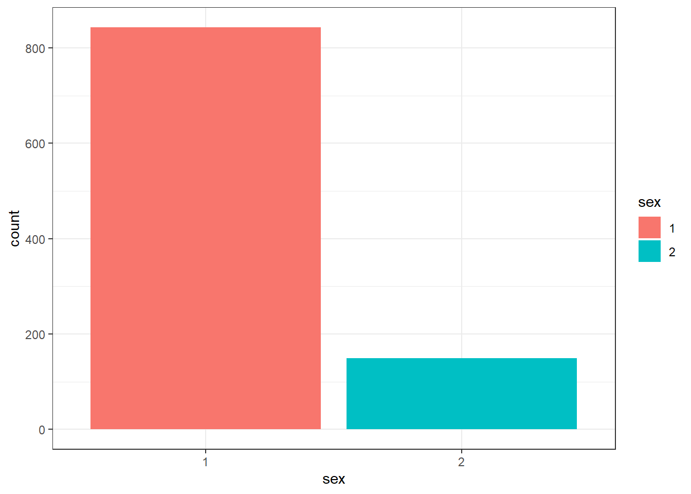
Figure 4.4: Barplot with colour
fill()has also produced a plot legend to the right of the graph. When you have multiple grouping variables you need this to know which groups each bit of the plot is referring to, but in this case it is redundant because it doesn’t tell us anything that the axis labels don’t already. We can get rid of it by addingshow.legend = FALSEto thegeom_bar()code.
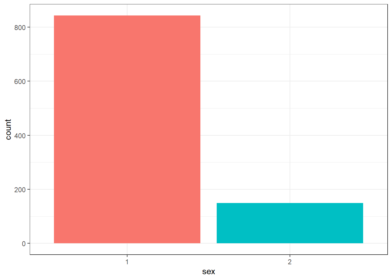
Figure 4.5: Barplot without legend
We might want to tidy up our plot to make it look a bit nicer. First we can edit the axis labels to be more informative. The most common functions you will use are:
scale_x_continuous()for adjusting the x-axis for a continuous variablescale_y_continuous()for adjusting the y-axis for a continuous variablescale_x_discrete()for adjusting the x-axis for a discrete/categorical variablescale_y_discrete()for adjusting the y-axis for a discrete/categorical variable
And in those functions the two most common arguments you will use are:
namewhich controls the name of each axislabelswhich controls the names of the break points on the axis
There are lots more ways you can customise your axes but we’ll stick with these for now. Copy, paste, and run the below code to change the axis labels and change the numeric sex codes into words.
ggplot(summarydata, aes(x = sex, fill = sex)) +
geom_bar(show.legend = FALSE) +
scale_x_discrete(name = "Participant Sex",
labels = c("Female", "Male")) +
scale_y_continuous(name = "Number of participants")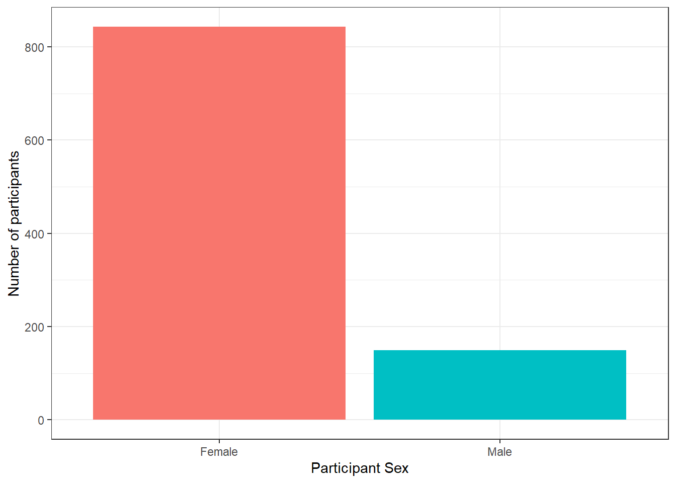
Figure 4.6: Barplot with axis labels
Second, you might want to adjust the colours and the visual style of the plot. ggplot2 comes with built in themes. Below, we’ll use theme_minimal() but try typing theme_ into a code chunk and try all the options that come up to see which one you like best.
ggplot(summarydata, aes(x = sex, fill = sex)) +
  geom_bar(show.legend = FALSE) +
  scale_x_discrete(name = "Participant Sex",
                   labels = c("Female", "Male")) +
scale_y_continuous(name = "Number of participants") +
theme_minimal()
Figure 4.7: Barplot with minimal theme
There are various options to adjust the colours but a good way to be inclusive is to use a colour-blind friendly palette that can also be read if printed in black-and-white. To do this, we can add on the function scale_fill_viridis_d(). This function has 5 colour options, A, B, C, D, and E. I prefer E but you can play around with them and choose the one you prefer.
ggplot(summarydata, aes(x = sex, fill = sex)) +
  geom_bar(show.legend = FALSE) +
  scale_x_discrete(name = "Participant Sex",
                   labels = c("Female", "Male")) +
  scale_y_continuous(name = "Number of participants") +
theme_minimal() +
scale_fill_viridis_d(option = "E")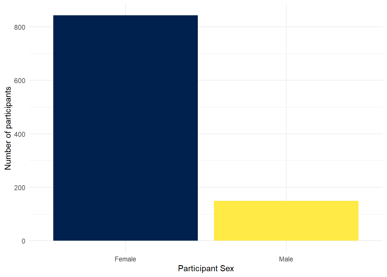
Figure 2.5: Barplot with colour-blind friendly colour scheme
Finally, you can also adjust the transparency of the bars by adding alpha to geom_bar(). Play around with the value and see what value you prefer.
ggplot(summarydata, aes(x = sex, fill = sex)) +
  geom_bar(show.legend = FALSE, alpha = .8) +
  scale_x_discrete(name = "Participant Sex",
                   labels = c("Female", "Male")) +
  scale_y_continuous(name = "Number of participants") +
  theme_minimal() +
  scale_fill_viridis_d(option = "E")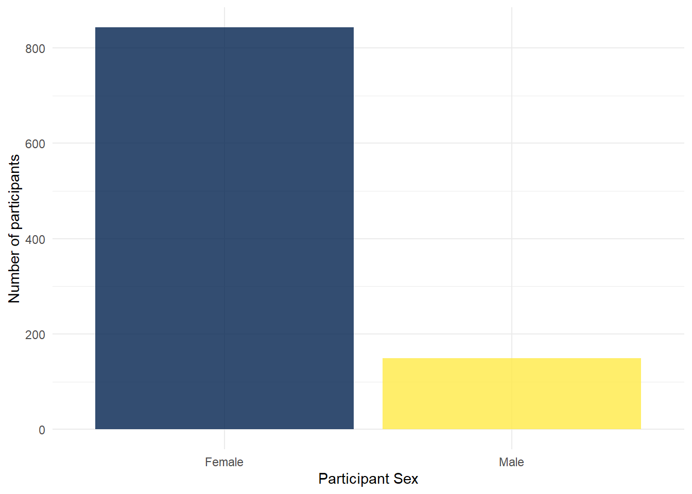
Figure 4.8: Barplot with adjusted alpha
In R terms, ggplot2 is a fairly old package. As a result, the use of pipes wasn’t included when it was originally written. As you can see in the code above, the layers of the code are separated by + rather than %>%. In this case, + is doing essentially the same job as a pipe - be careful not to confuse them.
4.1.6 Activity 5: Violin-boxplot
As our final activity we will also explain the code used to create the violin-boxplot from Lab 2, hopefully now you will be able to see how similar it is in structure to the bar chart code. In fact, there are only three differences:
- We have added a
yargument to the first layer because we wanted to represent two variables, not just a count. geom_violin()has an additional argumenttrim. Try setting this toTRUEto see what happens.geom_boxpot()has an additional argumentwidth. Try adjusting the value of this and see what happens.
ggplot(summarydata, aes(x = income, y = ahiTotal, fill = income)) +
  geom_violin(trim = FALSE, show.legend = FALSE, alpha = .4) +
  geom_boxplot(width = .2, show.legend = FALSE, alpha = .7)+
  scale_x_discrete(name = "Income",
                   labels = c("Below Average", "Average", "Above Average")) +
  scale_y_continuous(name = "Authentic Happiness Inventory Score")+
  theme_minimal() +
  scale_fill_viridis_d()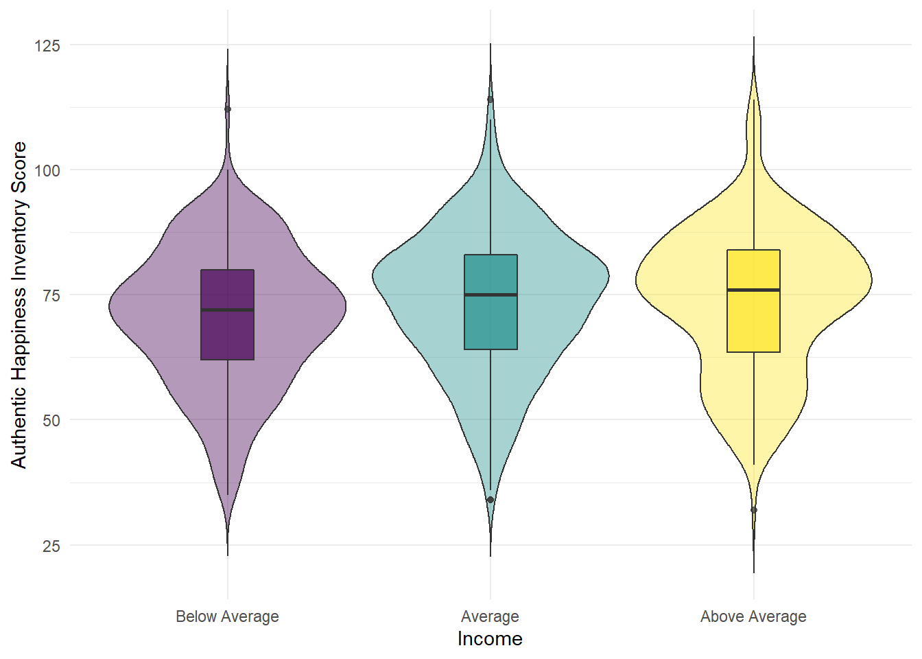
Figure 4.9: Violin-boxplot
4.1.7 Activity 6: Layers part 2
The key thing to note about ggplot is the use of layers. Whilst we’ve built this up step-by-step, they are independent and you could remove any of them except for the first layer. Additionally, although they are independent, the order you put them in does matter. Try running the two code examples below and see what happens.
ggplot(summarydata, aes(x = income, y = ahiTotal)) +
  geom_violin() +
  geom_boxplot()

ggplot(summarydata, aes(x = income, y = ahiTotal)) +
  geom_boxplot() +
  geom_violin()
4.1.7.1 Finished!
Well done! ggplot can be a bit difficult to get your head around at first, particularly if you’ve been used to making graphs a different way. But once it clicks, you’ll be able to make informative and professional visualisations with ease, which, amongst other things, will make your reports look FANCY.
4.2 In-class activities
4.2.1 Getting the data ready to work with
Today in the lab we will be working with our data to generate a plot of two variables from the Woodworth et al. dataset. Before we get to generate our plot, we still need to work through the steps to get the data in the shape we need it to be in for our particular question. In particular we need to generate the object summarydata that just has the variable we need.You have done these steps before so go back to the relevant Lab and use that to guide you through.
4.2.2 Activity 1: Set-up
- Open R Studio and ensure the environment is clear.
- Download the
lab 4 in-class Markdown file, extract the file and then move it in to your Data Skills folder.
- Open the
stub-4.2.Rmdfile and ensure that the working directory is set to your Data Skills folder and that the two .csv data files are in your working directory (you should see them in the file pane).
- Look through your previous work to find the code that loads the
tidyverse, reads in the data files and creates an object calledall_datthat joins the two objectsdatandpinfo.
4.2.3 Activity 2: Select
Select the columns all_dat, ahiTotal, cesdTotal, sex, age, educ, income, occasion, elapsed.days from the data and create an object named variable summarydata.
4.2.4 Activity 3: Arrange
Arrange the data in the variable created above (summarydata) by ahiTotal with lowest score first and save it in an object named ahi_asc.
4.2.5 Activity 4:Filter
Filter the data ahi_asc by only keeping those who are 65 years old or younger and save it in an object named age_65max.
4.2.6 Activity 5: Group and summarise
- First, calculate the overall median
ahiTotalscore for all participants (hint: usesummarise()) and save it in an object calledoverall_median.
- Then, group the data stored in the variable
age_65maxby sex, and store it indata_sex.
- Then, use summarise to create a new variable
sex_median, which calculates the median ahiTotal score for each sex in this grouped data and assign it a table head calledmedian_score.
(Hint: if you’re stuck, see this dplyr documentation).
4.2.7 Activity 6: Mutate
Use mutate() to create a new column in data_sex called Happiness which categorises participants based on whether they score above or below the overall median ahiTotal score (i.e., the median score for all participants, not grouped by sex).
mutate(data, new_variable = old_variable > median score
4.2.8 Activity 7: Scatterplots
In order to visualise two continuous variables, we can use a scatterplot. Using the ggplot code you learned about in the pre-class activities, try and recreate the below plot.
A few hints:
- Use the
age_65maxdata. - Put
ahiTotalon the x-axis andcesdTotalon the y-axis. - Rather than using
geom_bar(),geom_violin(), orgeom_boxplot(), for a scatteplot you need to usegeom_point(). - Rather than using
scale_fill_viridis_d()to change the colour, add the argumentcolour = "red"togeom_point(except replace “red” with whatever colour you’d prefer). - Remember to edit the axis names.
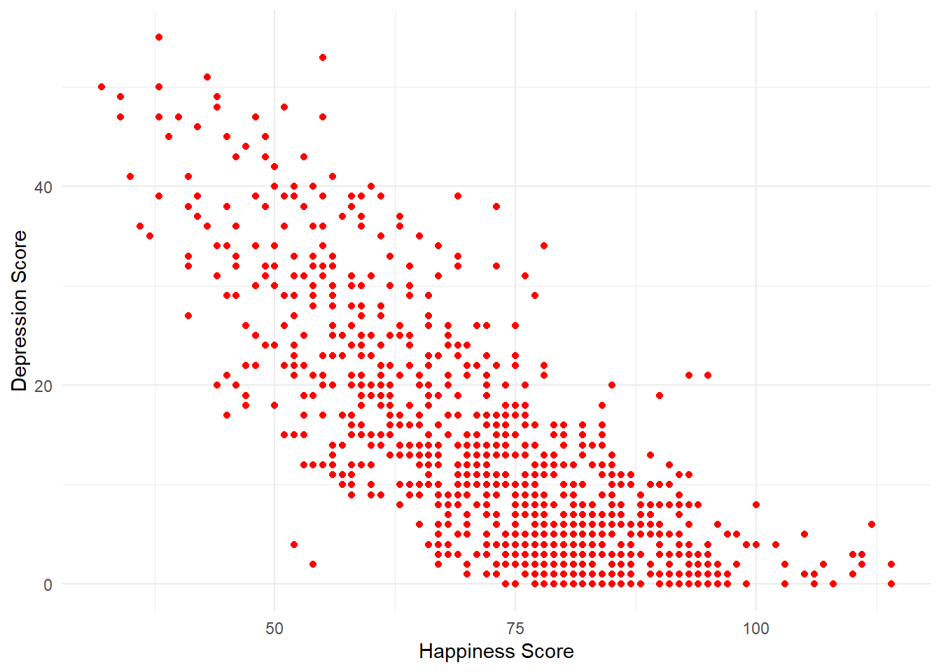
Figure 4.10: Scatterplot of happiness and depression scores
How would you describe the relationship between the two variables?
4.2.8.1 Finished!
Great job! You have now worked with the essential basics of good practice in data wrangling! In Psych 1B we will continue using these wrangling skills on new data and also data that you collect yourself.
4.2.9 Activity solutions
4.2.9.1 Activity 1
4.2.9.2 Activity 2
4.2.9.5 Activity 5
4.3 Homework
You can download all the R homework files and Assessment Information you need from the Lab Homework section of the Psych 1A Moodle.