10 Customising Visualisations & Reports
10.1 Intended Learning Outcomes
The final chapter of ADS moves beyond the core skills needed to complete the course. Our aim in this chapter is to give you a sense of what is now available to you with your new-found R skills. There's a lot in this chapter, as we wanted to present an overview of the possibilities, although there are no exercises at the end. If you're enrolled on ADS, you may wish to prioritise the summative assessment this week and come back to this chapter at a later date.
- Create and customise advanced types of plots
- Structure data in report, presentation, and dashboard formats
- Include linked figures, tables, and references
10.2 Walkthrough video
There is a walkthrough video of this chapter available via Echo360 (coming soon). Please note that there may have been minor edits to the book since the video was recorded. Where there are differences, the book should always take precedence.
10.3 Visualisation
10.3.1 Set-up
First, create a new project for the work we'll do in this chapter named 10-advanced. Second, open and save a new R Markdown document named visualisations.Rmd, delete the welcome text and load the required packages for this section. You will probably need to install several new packages.
library(tidyverse)   # data wrangling functions
library(ggthemes)    # for themes
library(patchwork)   # for combining plots
library(plotly)      # for interactive plots
# devtools::install_github("hrbrmstr/waffle")
library(waffle)      # for waffle plots
library(ggbump)      # for bump plots
library(treemap)     # for treemap plots
library(ggwordcloud) # for word clouds
library(tidytext)    # for manipulating text for word clouds
library(sf)          # for mapping geoms
library(rnaturalearth) # for map data
library(rnaturalearthdata) # extra mapping data
library(gganimate)   # for animated plots

theme_set(theme_light())
You'll need to make a folder called "data" and download data files into it: survey_data.csv and scottish_population.csv.
Download the ggplot2 cheat sheet.
10.3.2 Defaults
The code below creates two familiar plots from Chapter 3, using the default (light) theme and palettes. First, load the data and set issue_category to a factor so you can control the order of the categories.
# update column specification
ct <- cols(issue_category = col_factor(levels = c("tech", "returns", "sales", "other")))

# load data
survey_data <- read_csv(file = "data/survey_data.csv",
                        col_types = ct)
Next, create a bar plot of number of calls by issue category.
# create bar plot
bar <- ggplot(data = survey_data,
              mapping = aes(x = issue_category,
                            fill = issue_category)) +
  geom_bar(show.legend = FALSE) +
  labs(x = "Issue Category",
       y = "Count",
       title = "Calls by Issue Category")
And create a scatterplot of wait time by call time, distinguished by issue category.
#create scatterplot
point <- ggplot(data = survey_data,
                mapping = aes(x = wait_time,
                              y = call_time,
                              color = issue_category)) +
  geom_point(alpha = 0.5) +
  geom_smooth(method = lm, formula = y~x) +
  labs(x = "Wait Time",
       y = "Call Time",
       color = "Issue Category",
       title = "Wait Time by Call Time")
Finally, combine the two plots using the + from patchwork to see the default styles for these plots.
bar + point
Figure 10.1: Default plot styles.
Try changing the theme using built-in themes or customising the colours or linetypes with scale_* functions. See Appendix H for details.
10.3.3 Annotations
It's often useful to add annotations to a plot, for example, to highlight an important part of the plot or add labels. The annotate() function creates a specific geom at x- and y-coordinates you specify.
10.3.3.1 Text annotations
Add a text annotation by setting the geom argument to "text" or "label" and adding a label. Labels have padding and a background, while text is just text.
- Backslash-n
\nin the label text controls where the line breaks are. Try removing or changing the position of these to see what happens. -
xandycontrol the coordinates of the label. You will likely have to play around with these values to get them right. - The argument
hjustis the horizontal justification of text, andvjustis the vertical justification. The default values are 0.5, where the text is centred on the x and y coordinates. 0 will justify to the left and bottom, while 1 justifies to the right and top. - You can change the
angleof text, but not labels.
bar +
  # add left-justified text to the second bar
  annotate(geom = "text",
           label = "Our goal is to\nreduce this\ncategory",
           x = 1.65, y = 150,
           hjust = 0, vjust = 1,
           color = "white", fontface = "bold",
           angle = 45) +
  # add a centred label to the third bar
  annotate(geom = "label",
           label = "Our goal is\nto increase this\ncategory",
           x = 3, y = 75,
           hjust = 0.5, vjust = 1,
           color = " darkturquoise", fontface = "bold")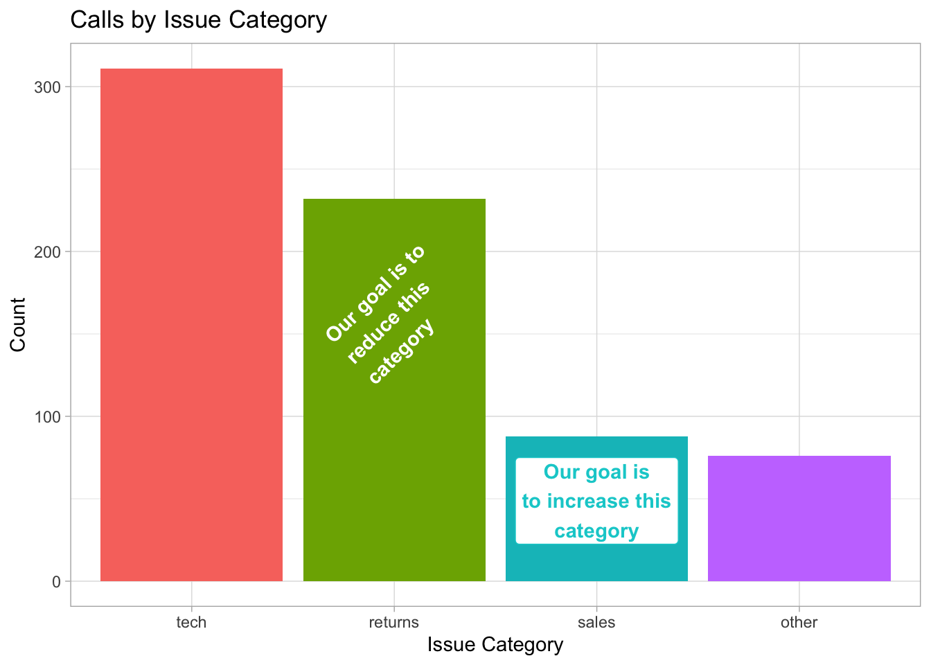
Figure 10.2: An example of annotation text and label.
See if you can work out how to make the figure below, starting with the following:
tibble(x = c(0, 0, 1, 1),
       y = c(0, 1, 0, 1)) %>%
  ggplot(aes(x, y)) +
  geom_point(alpha = 0.25, size = 4, color = "red")
Hint: you will need to add 1 label annotation and 8 separate text annotations.
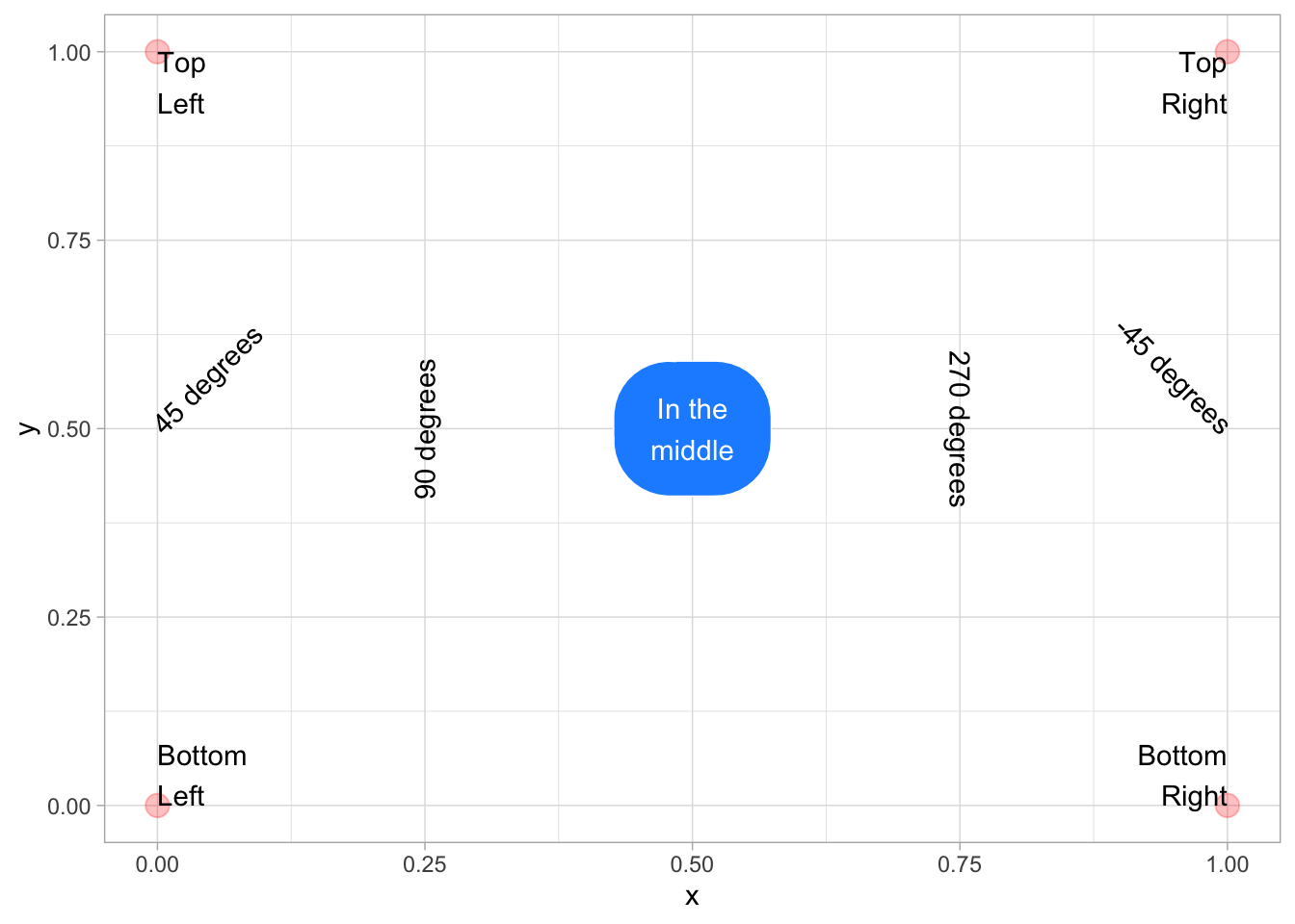
tibble(x = c(0, 0, 1, 1),
       y = c(0, 1, 0, 1)) %>%
  ggplot(aes(x, y)) +
  geom_point(alpha = 0.25, size = 4, color = "red") +
  annotate("label", label = "In the\nmiddle",
           x = 0.5, y = 0.5,
           fill = "dodgerblue", color = "white",
           label.padding = unit(1, "lines"),
           label.r = unit(1.5, "lines")) +
  annotate("text", label = "Bottom\nLeft",
           x = 0, y = 0, hjust = 0, vjust = 0) +
  annotate("text", label = "Top\nLeft",
           x = 0, y = 1, hjust = 0, vjust = 1) +
  annotate("text", label = "Bottom\nRight",
           x = 1, y = 0, hjust = 1, vjust = 0) +
  annotate("text", label = "Top\nRight",
           x = 1, y = 1, hjust = 1, vjust = 1) +
  annotate("text", label = "45 degrees",
           x = 0, y = 0.5, hjust = 0, angle = 45) +
  annotate("text", label = "90 degrees",
           x = 0.25, y = 0.5, angle = 90) +
  annotate("text", label = "270 degrees",
           x = 0.75, y = 0.5, angle = 270)+
  annotate("text", label = "-45 degrees",
           x = 1, y = 0.5, hjust = 1, angle = -45)
10.3.3.2 Other annotations
You can add other geoms to highlight parts of a plot. The example below adds a rectangle around a group of points, a text label, a straight arrow from the label to the rectangle, and a curved arrow from the label to an individual point.
point +
  # add a rectangle surrounding long call times
  annotate(geom = "rect",
           xmin = 100, xmax = 275,
           ymin = 140, ymax = 180,
           fill = "transparent", color = "red") +
  # add a text label
  annotate("text",
           x = 260, y = 120,
           label = "outliers") +
  # add an line with an arrow from the text to the box
  annotate(geom = "segment",
           x = 240, y = 120,
           xend = 200, yend = 135,
           arrow = arrow(length = unit(0.5, "lines"))) +
  # add a curved line with an arrow
  # from the text to a wait time outlier
  annotate(geom = "curve",
          x = 280, y = 120,
          xend = 320, yend = 45,
          curvature = -0.5,
          arrow = arrow(length = unit(0.5, "lines")))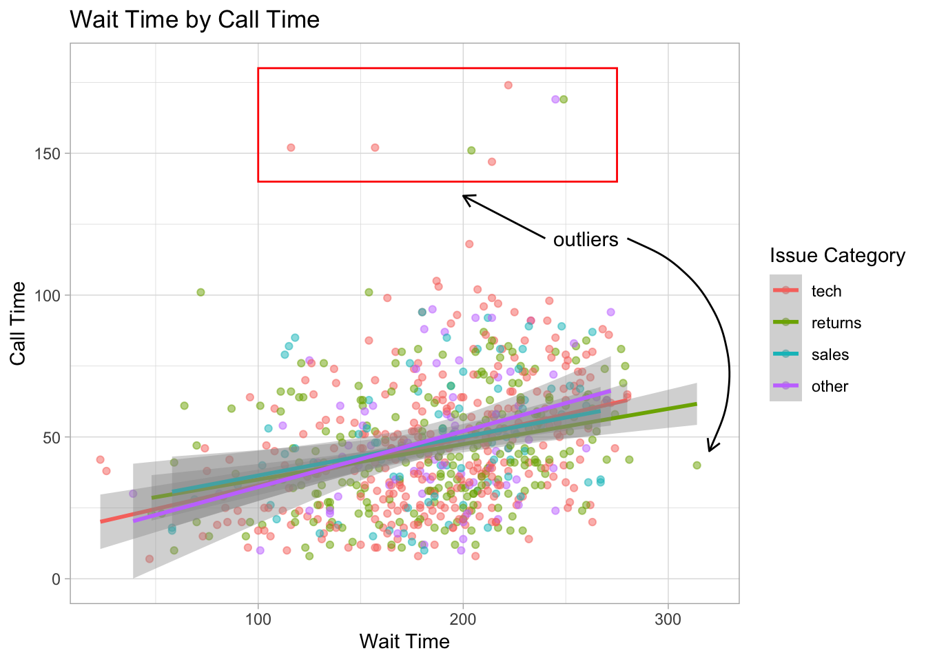
Figure 10.3: Example of annotatins with the rect, text, segment, and curve geoms.
See the ggforce package for more sophisticated options, such as highlighting a group of points with an ellipse.
10.3.4 Other Plots
10.3.4.1 Interactive Plots
The plotly package can be used to make interactive graphs. Assign your ggplot to a variable and then use the function ggplotly() on the plot object. Note that interactive plots only work in HTML files, not PDFs or Word files.
ggplotly(point)Figure 10.4: Interactive graph using plotly
Hover over the data points above and click on the legend items.
10.3.4.2 Waffle Plots
In Chapter 3, we mentioned that pie charts are such a poor way to visualise proportions that we refused to even show you how to make one. Waffle plots are a delicious alternative.
Use waffle by hrbrmstr on GitHub using the install_github() function below, rather than the one on CRAN you get from using install.packages().
devtools::install_github("hrbrmstr/waffle")By default, geom_waffle() represents each observation with a tile and splits these across 10 rows. You can play about with the n_rows argument to determine what works best for your data.
survey_data %>%
  count(issue_category) %>%
  ggplot(aes(fill = issue_category, values = n)) +
  geom_waffle(
    n_rows = 23, # try setting this to 10 (the default)
    size = 0.33, # line size
    make_proportional = FALSE, # use raw values
    colour = "white", # line colour
    flip = FALSE, # bottom-top or left-right
    radius = grid::unit(0.1, "npc") # set to 0.5 for circles
  ) +
  theme_enhance_waffle() + # gets rid of axes
  scale_fill_colorblind(name = "Issue Category")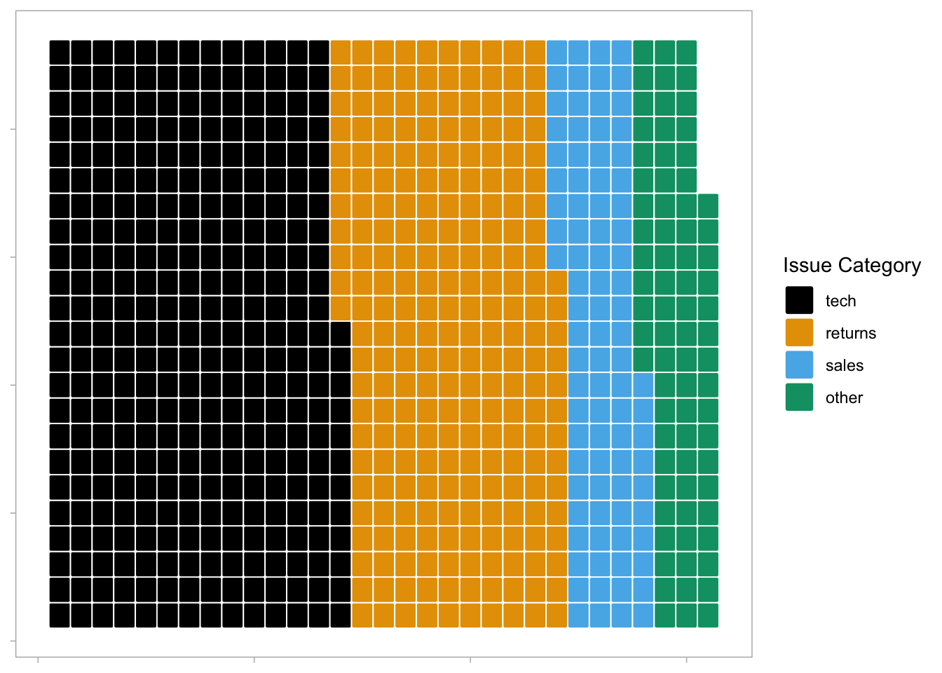
Figure 10.5: Waffle plot.
The waffle plot can also be used to display the counts as proportions To achieve these, set n_rows = 10 and make_proportional = TRUE. Now, rather than each tile representing one observation, each tile represents 1% of the data.
survey_data %>%
  count(issue_category) %>%
  ggplot(aes(fill = issue_category, values = n)) +
  geom_waffle(
    n_rows = 10,
    size = 0.33,
    make_proportional = TRUE, # compute proportions
    colour = "white",
    flip = FALSE,
    radius = grid::unit(0.1, "npc")
  ) +
  theme_enhance_waffle() +
  scale_fill_colorblind(name = "Issue Category")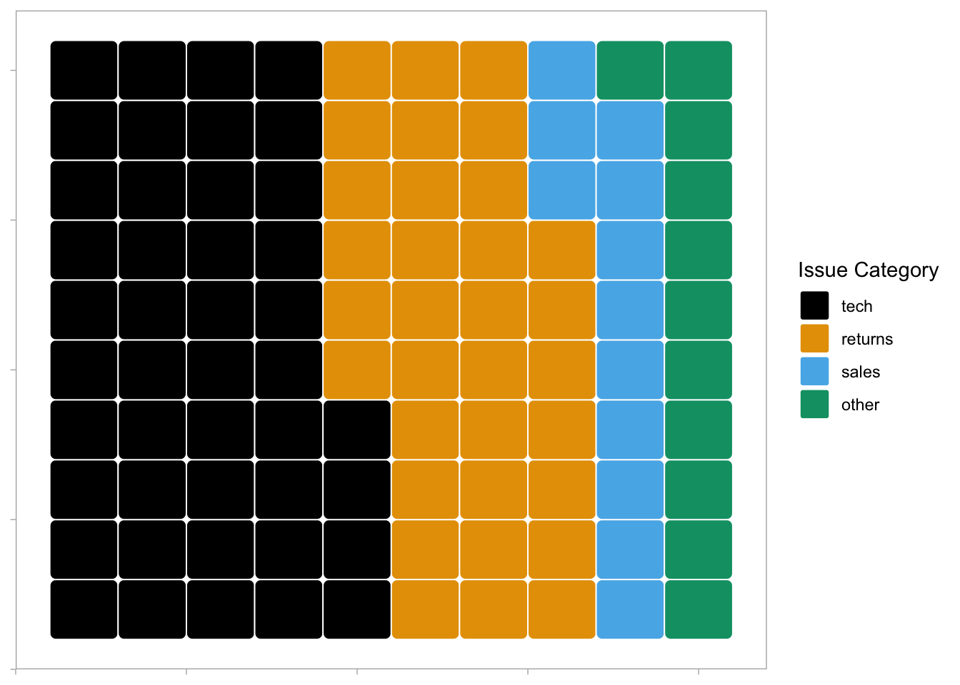
Figure 10.6: Proportional waffle plot.
10.3.4.3 Treemap
Treemap plots are another way to visualise proportions. Like the waffle plots, you need to count the data by category first. You can use any brewer palette for the fill.
survey_data %>%
  count(issue_category) %>%
  treemap(
    index = "issue_category", # column with number of rectangles
    vSize = "n", # column with size of rectangle
    title = "",
    palette = "BuPu",
    inflate.labels = TRUE # expand labels to size of rectangle
  )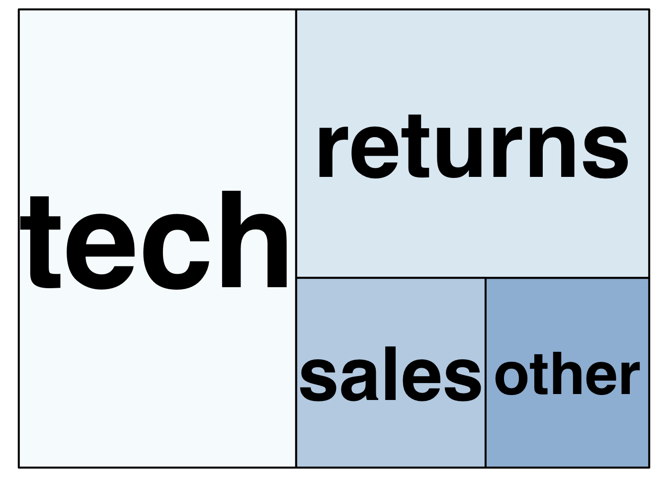
Figure 10.7: Treemap plot.
You can also represent multiple categories with treemaps
survey_data %>%
  count(issue_category, employee_id) %>%
  arrange(employee_id) %>%
  treemap(
    # use c() to specify two variables
    index = c("employee_id", "issue_category"),
    vSize = "n",
    title = "",
    palette = "Dark2",
    # set different label sizes for each type of label
    fontsize.labels = c(30, 10),
    # set different alignments for two label types
    align.labels = list(c("left", "top"), c("center", "center"))
  )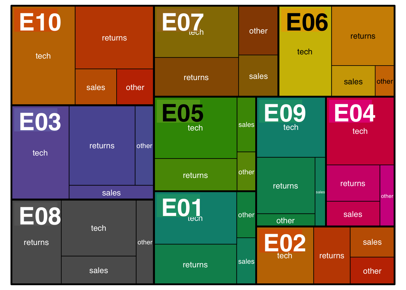
Figure 10.8: Treemap with two variables
10.3.4.4 Bump Plots
Bump plots are very useful for visualising how rankings change over time. So first, we need to get some ranking data. Let's start with a more typical raw data table, containing an identifying column of person and three columns for their scores each week
# make a small dataset of scores for 3 people over 3 weeks
score_data <- tribble(
  ~person, ~week_1, ~week_2, ~week_3,
  "Abeni",      80,     75,       90,
  "Beth",       75,     85,       75,
  "Carmen",     60,     70,       80
)
Now we make the table long, group by week, and use the rank() function to find the rank of each person's score each week. Use n() - rank(score) + 1 to reverse the ranks so that the highest score gets rank 1. We also need to make the week variable a number.
# calculate ranks
rank_data <- score_data %>%
  pivot_longer(cols = -person,
               names_to = "week",
               values_to = "score") %>%
  group_by(week) %>%
  mutate(rank = n() - rank(score) + 1) %>%
  ungroup() %>%
  arrange(week, rank) %>%
  mutate(week = str_replace(week, "week_", "") %>% as.integer())

rank_data| person | week | score | rank |
|---|---|---|---|
| Abeni | 1 | 80 | 1 |
| Beth | 1 | 75 | 2 |
| Carmen | 1 | 60 | 3 |
| Beth | 2 | 85 | 1 |
| Abeni | 2 | 75 | 2 |
| Carmen | 2 | 70 | 3 |
| Abeni | 3 | 90 | 1 |
| Carmen | 3 | 80 | 2 |
| Beth | 3 | 75 | 3 |
A typical mapping for a bump plot puts the time variable in the x-axis, the rank variable on the y-axis, and sets colour to the identifying variable.
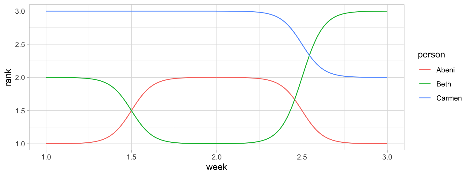
Figure 10.9: Basic bump plot
We can make this more attractive by customising the axes and adding text labels. Try running each line of this code to see how it builds up.
- Add
label = personto the mapping so we can add in text labels. - Increase the size of the lines with the
sizeargument togeom_bump() - We don't need labels for weeks 1.5 and 2.5, so change the x-axis
breaks - The
expandargument for the two scale_ functions expands the plot area so we can fit text labels to the right. - It makes more sense to have first place at the top, so reverse the order of the y-axis with
scale_y_reverse()and fix the breaks and expansion. - Add text labels with
geom_text(), but just for week 3, so setdata = filter(rank_data, week == 3)for this geom. - Set
x = 3.05to move the text labels just to the right of week 3, and sethjust = 0to right-justify the text labels (the default ishjust = 0.5, which would center them on 3.05). - Remove the legend and grid lines. Increase the x-axis text size.
ggplot(data = rank_data,
       mapping = aes(x = week,
                     y = rank,
                     colour = person,
                     label = person)) +
  ggbump::geom_bump(size = 10) +
  scale_x_continuous(name = "",
                     breaks = 1:3,
                     labels = c("Week 1", "Week 2", "Week 3"),
                     expand = expansion(c(.05, .2))) +
  scale_y_reverse(name = "Ranking",
                  breaks = 1:3,
                  expand = expansion(.2)) +
  geom_text(data = filter(rank_data, week == 3),
            color = "black", x = 3.05, hjust = 0) +
  theme(legend.position = "none",
        panel.grid.major = element_blank(),
        panel.grid.minor = element_blank(),
        axis.text.x = element_text(size = 12))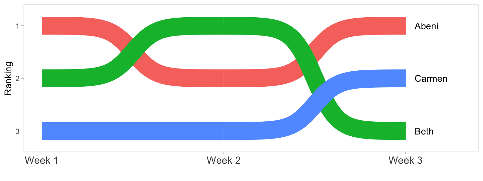
Figure 10.10: Bump plot with added features.
10.3.4.5 Word Clouds
Word clouds are a common way to summarise text data. First, download amazon_alexa.csv into your data folder and then load it into an object. This dataset contains text reviews as well as the 1-5 rating from customers who bought an Alexa device on Amazon.
# https://www.kaggle.com/sid321axn/amazon-alexa-reviews
# extracted from Amazon by Manu Siddhartha & Anurag Bhatt
alexa <- rio::import("data/amazon_alexa.csv")
We can use this data to look at how the words used differ depending on the rating given. To make the text data easy to work with, the function tidytext::unnest_tokens() splits the words in the input column into individual words in a new output column. unnnest_tokens() is particularly helpful because it also does things like removes punctuation and transforms all words to lower case to make it easier to work with. Compare words and alexa to see how they map on to each other.
words <- alexa %>%
  unnest_tokens(output = "word", input = "verified_reviews")
We can then add another line of code using a pipe that counts how many instances of each word there is by rating to give us the most popular words.
words <- alexa %>%
  unnest_tokens(output = "word", input = "verified_reviews") %>%
count(word, rating, sort = TRUE) | word | rating | n |
|---|---|---|
| i | 5 | 1859 |
| the | 5 | 1839 |
| to | 5 | 1633 |
| it | 5 | 1571 |
| and | 5 | 1477 |
| my | 5 | 980 |
The problem is that the most common words are all function words rather than content words, which makes sense because these words have the highest word frequency in natural language.
Helpfully, tidytext contains a list of common "stop words", i.e., words that you want to ignore, that are stored in an object named stop_words. It is also very useful to define a list of custom stop words based upon the unique properties of your data (it can sometimes take a few attempts to identify what's appropriate for your dataset). This dataset contains a lot of numbers that aren't informative, and it also contains "https" from website links, so we'll get rid of both with a custom stop list.
Once you have defined your stop words, you can then use anti_join() to remove any word that is present in the stop word list.
To get the top 25 words, we then group by rating and use dplyr::slice_max(), ordered by the column n.
custom_stop <- tibble(word = c(0:9, "https", 34))

words <- alexa %>%
  unnest_tokens(output = "word", input = "verified_reviews") %>%
  count(word, rating) %>%
  anti_join(stop_words, by = "word") %>%
  anti_join(custom_stop, by = "word") %>%
  group_by(rating) %>%
  slice_max(order_by = n, n = 25, with_ties = FALSE) %>%
  ungroup()
First, let's make a word cloud for customers who gave a 1-star rating:
- Filter retains only the data for 1-star ratings.
-
labelcomes from thewordcolumn and is the data to plot (i.e., the words). -
colourmakes the words red (you could also set this towordto give each word a different colour ornto vary colour continuously by frequency). -
sizemakes the size of the word proportional ton, the number of times the word appeared. -
ggwordcloud::geom_text_wordcloud_area()is the word cloud geom. -
ggwordcloud::scale_size_area()controls how big the word cloud is (this usually takes some trial-and-error).
rating1 <- filter(words, rating == 1) %>%
  ggplot(aes(label = word, colour = "red", size = n)) +
  geom_text_wordcloud_area() +
  scale_size_area(max_size = 10) +
  ggtitle("Rating = 1") +
  theme_minimal(base_size = 14)

rating1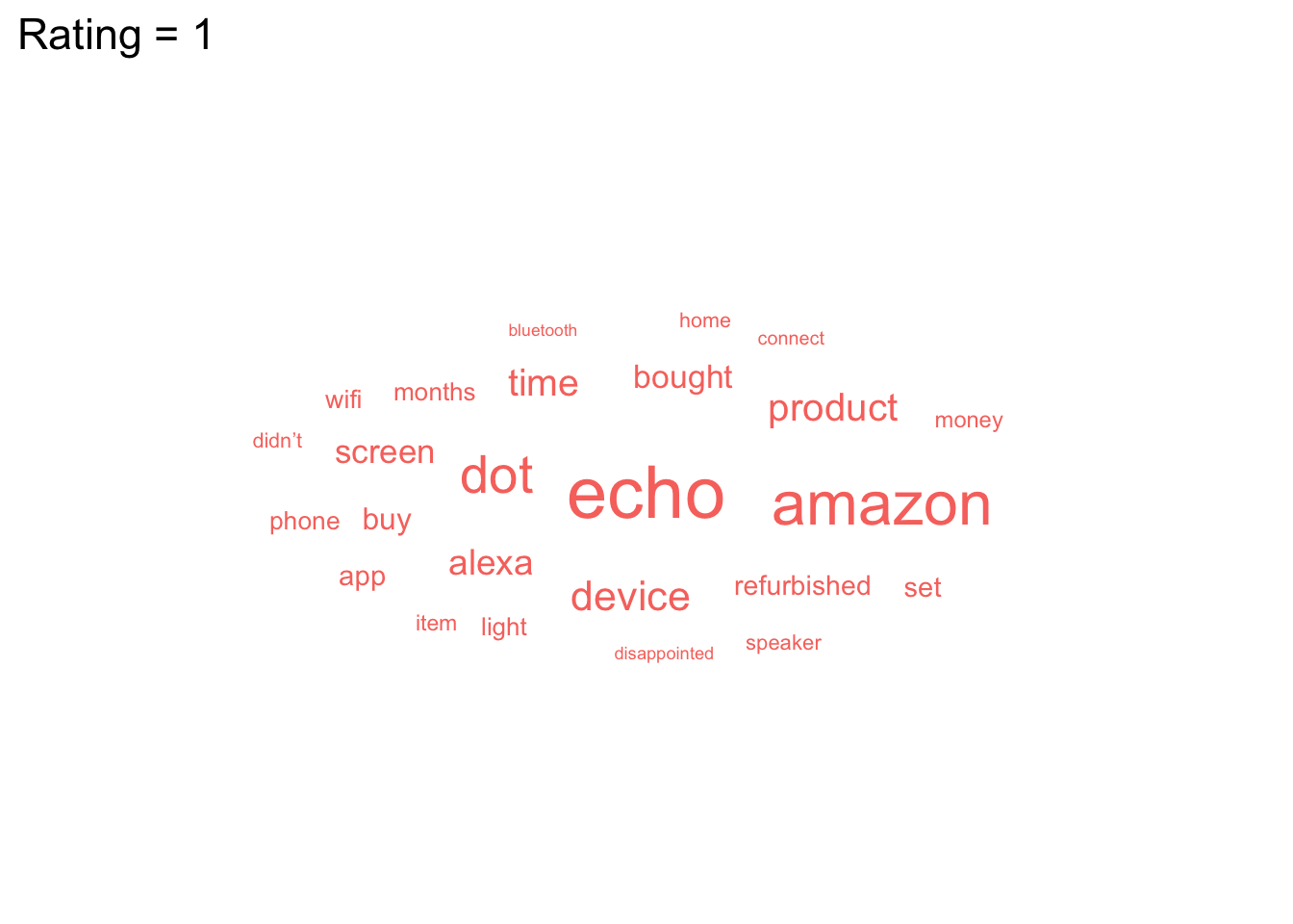
We can now do the same but for 5-star ratings and paste the plots together with patchwork (word clouds don't play well with facets).
rating5 <- filter(words, rating == 5) %>%
  ggplot(aes(label = word, size = n)) +
  geom_text_wordcloud_area(colour = "darkolivegreen3") +
  scale_size_area(max_size = 12) +
  ggtitle("Rating = 5") +
  theme_minimal(base_size = 14)

rating1 + rating5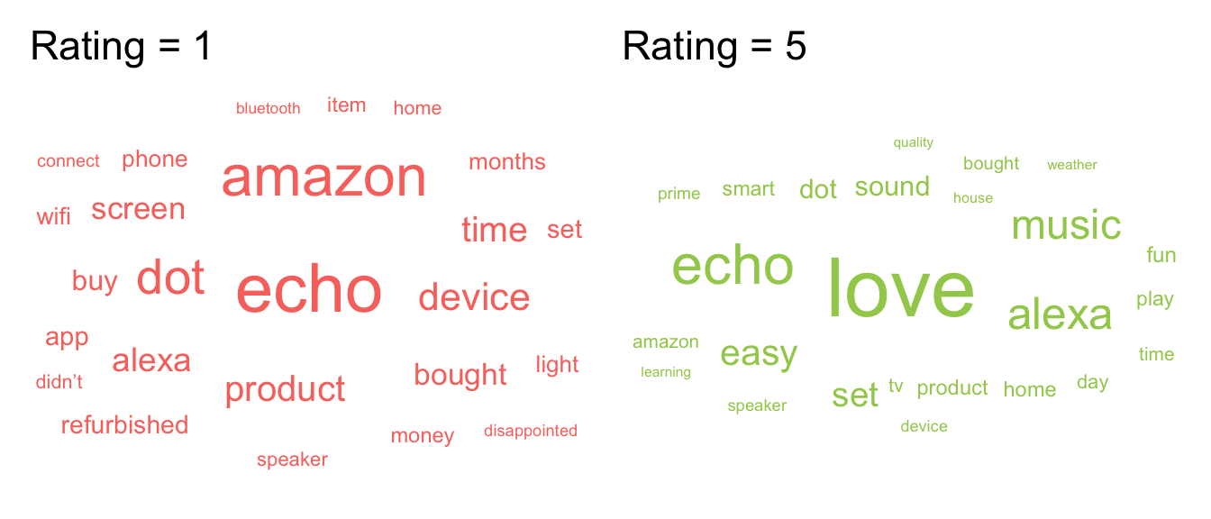
Figure 10.11: Word cloud.
It's worth highlighting that whilst word clouds are very common, they're really the equivalent of pie charts for text data because we're not very good at making accurate comparisons based on size. You might be able to see what's the most popular word, but can you accurately determine the 2nd, 3rd, 4th or 5th most popular word based on the clouds alone? There's also the issue that just because it's text data doesn't make it a qualitative analysis and just because something is said a lot doesn't mean it's useful or important. But, this argument is outwith the scope of this book, even if it is a recurring part of Emily's life thanks to her qualitative wife.
10.3.4.6 Maps
Working with maps can be tricky. The sf package provides functions that work with ggplot2, such as geom_sf(). The rnaturalearth package (and associated data packages that you may be prompted to download) provide high-quality mapping coordinates.
-
ne_countries()returns world country polygons (i.e., a world map). We specify the object should be returned as a "simple feature" classsfso that it will work withgeom_sf(). If you would like a deep dive on simple feature objects, check out a vignette from thesfpackage. - It's worth checking out what the object
ne_countries()returns to see just how much information is available. - Try changing the values and colours below to get a sense of how the code works.
# get the world map coordinates
world_sf <- ne_countries(returnclass = "sf", scale = "medium")

# plot them on a light blue background
ggplot() +
  geom_sf(data = world_sf, size = 0.3) +
  theme(panel.background = element_rect(fill = "lightskyblue2"))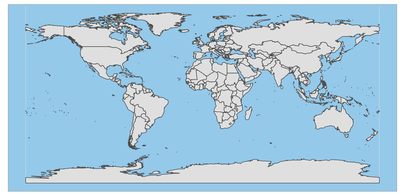
You can combine multiple countries using bind_rows() and visualise them with different colours for each country.
# get and bind country data
uk_sf <- ne_states(country = "united kingdom", returnclass = "sf")
ireland_sf <- ne_states(country = "ireland", returnclass = "sf")
islands <- bind_rows(uk_sf, ireland_sf) %>%
  filter(!is.na(geonunit))

# set colours
country_colours <- c("Scotland" = "#0962BA",
                     "Wales" = "#00AC48",
                     "England" = "#FF0000",
                     "Northern Ireland" = "#FFCD2C",
                     "Ireland" = "#F77613")

ggplot() +
  geom_sf(data = islands,
          mapping = aes(fill = geonunit),
          colour = NA,
          alpha = 0.75) +
  coord_sf(crs = sf::st_crs(4326),
           xlim = c(-10.7, 2.1),
           ylim = c(49.7, 61)) +
  scale_fill_manual(name = "Country",
                    values = country_colours)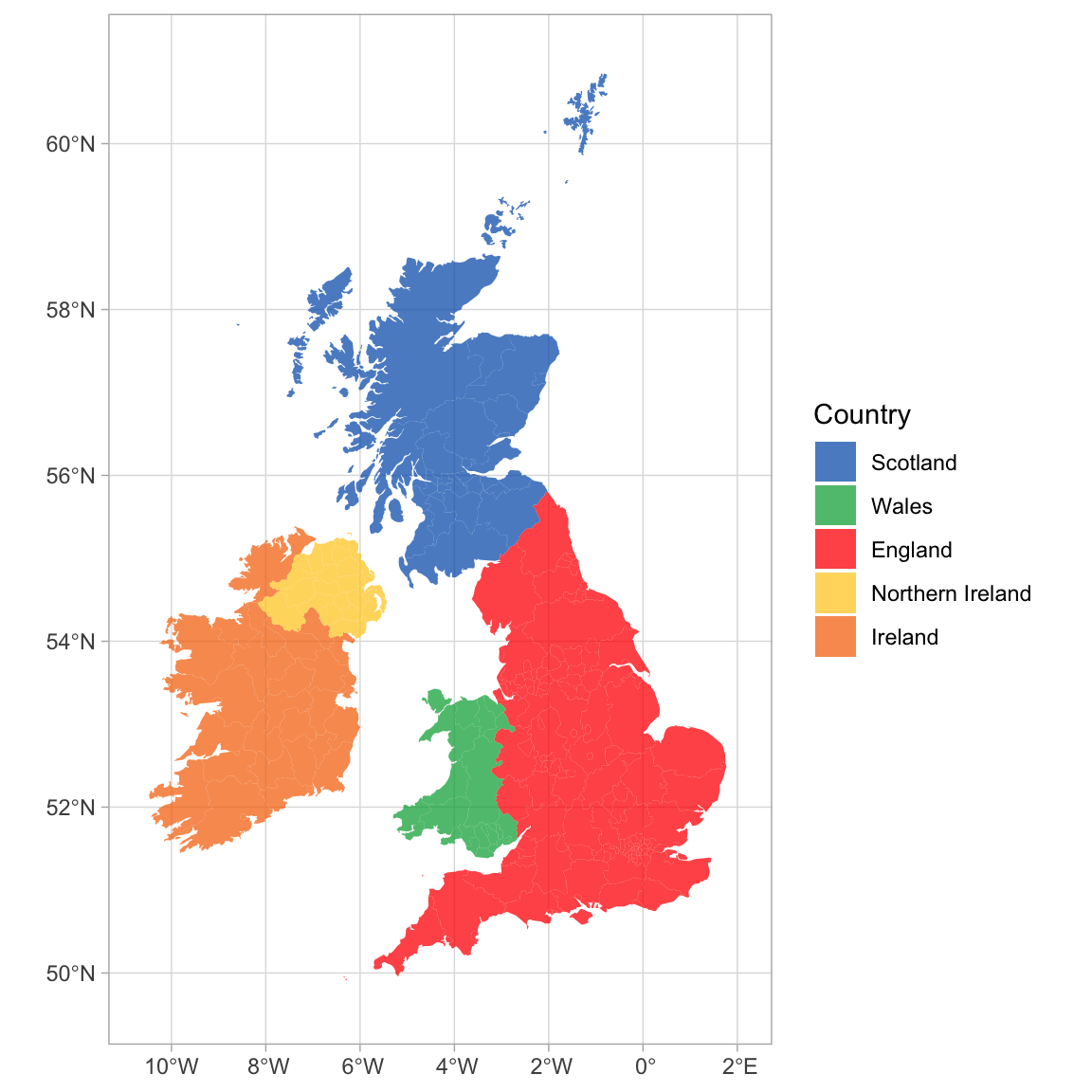
Figure 10.12: Map coloured by country.
You can join Scottish population data to the map table to visualise data on the map using colours or labels.
# load map data
scotland_sf <- ne_states(geounit = "Scotland",
                         returnclass = "sf")

# load population data from
# https://www.indexmundi.com/facts/united-kingdom/quick-facts/scotland/population
scotpop <- read_csv("data/scottish_population.csv",
                    show_col_types = FALSE)

# join data and fix typo in the map
scotmap_pop <- scotland_sf %>%
  mutate(name = ifelse(name == "North Ayshire",
                       yes = "North Ayrshire",
                       no = name)) %>%
  left_join(scotpop, by = "name") %>%
  select(name, population, geometry)
There is a typo in the data from rnaturalearth, so you need to change "North Ayshire" to "North Ayrshire" before you join the population data.
- Setting the fill to population in
geom_sf()gives each region a colour based on its population. - The colours are customised with
scale_fill_viridis_c(). The breaks of the fill scale are set to increments of 100K (1e5 in scientific notation) and the scale is set to span 0 to 600K. -
paste0()creates the labels by taking the numbers 0 through 6 and adding "00 k" to them. - Finally, the position of the legend is moved into the sea using
legend.position().
# plot
ggplot() +
  geom_sf(data = scotmap_pop,
          mapping = aes(fill = population),
          color = "white",
          size = .1) +
  coord_sf(xlim = c(-8, 0), ylim = c(54, 61)) +
  scale_fill_viridis_c(name = "Population",
                       breaks = seq(from = 0, to = 6e5, by = 1e5),
                       limits = c(0, 6e5),
                       labels = paste0(0:6, "00 K")) +
  theme(legend.position = c(0.16, 0.84))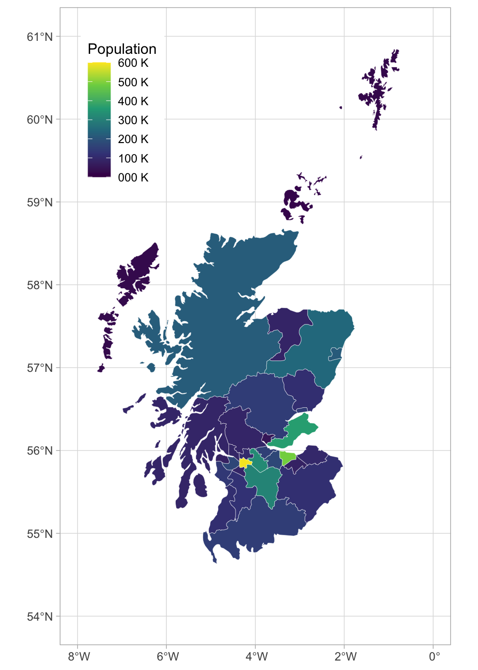
Figure 10.13: Map coloured by population.
10.3.4.7 Animated Plots
Animated plots are a great way to add a wow factor to your reports, but they can be complex to make, distracting, and not very accessible, so use them sparingly and only for data visualisation where the animation really adds something. The package gganimate has many functions for animating ggplots.
Here, we'll load some population data from the United Nations. Download the file into your data folder and open it in Excel first to see what it looks like. The code below gets the data from the first tab, filters it to just the 6 world regions, makes the data long, and makes sure the year column is numeric and the pop column shows population in whole numbers (the original data is in 1000s).
# load and process data
worldpop <- readxl::read_excel("data/WPP2019_POP_F01_1_TOTAL_POPULATION_BOTH_SEXES.xlsx", skip = 16) %>%
  filter(Type == "Region") %>%
  select(region = 3, `1950`:`1992`) %>%
  pivot_longer(cols = -region,
               names_to = "year",
               values_to = "pop") %>%
  mutate(year = as.integer(year),
         pop = round(1000 * as.numeric(pop)))
Let's make an animated plot showing how the population in each region changes with year. First, make a static plot. Filter the data to the most recent year so you can see what a single frame of the animation will look like.
worldpop %>%
  filter(year == 1992) %>%
  ggplot(aes(x = region, y = pop, fill = region)) +
  geom_col(show.legend = FALSE) +
  scale_fill_viridis_d() +
  scale_x_discrete(name = "",
                   guide = guide_axis(n.dodge=2))+
  scale_y_continuous(name = "Population",
                     breaks = seq(0, 3e9, 1e9),
                     labels = paste0(0:3, "B")) +
  ggtitle('Year: 1992')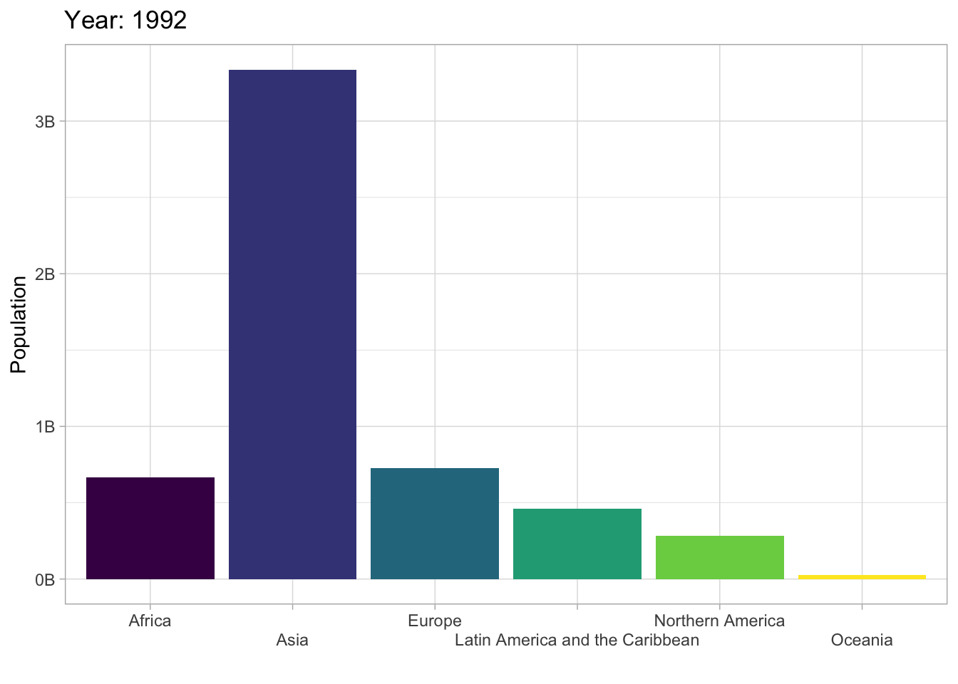
To convert this to an animated plot that shows the data from multiple years:
- Remove the filter and add
transition_time(year). - Use the
{}syntax to include theframe_timein the title. - Use
anim_save()to save the animation to a GIF file and set this code chunk toeval = FALSEbecause creating an animation takes a long time and you don't want to have to run it every time you knit your report.
anim <- worldpop %>%
  ggplot(aes(x = region, y = pop, fill = region)) +
  geom_col(show.legend = FALSE) +
  scale_fill_viridis_d() +
  scale_x_discrete(name = "",
                   guide = guide_axis(n.dodge=2))+
  scale_y_continuous(name = "Population",
                     breaks = seq(0, 3e9, 1e9),
                     labels = paste0(0:3, "B")) +
  ggtitle('Year: {frame_time}') +
  transition_time(year)

dir.create("images", FALSE) # creates an images directory if needed

anim_save(filename = "images/gganim-demo.gif",
          animation = anim,
          width = 8, height = 5, units = "in", res = 150)
You can show your animated gif in an html report (animations don't work in Word or a PDF) using include_graphics(), or include the GIF in a dynamic document like PowerPoint.
knitr::include_graphics("images/gganim-demo.gif")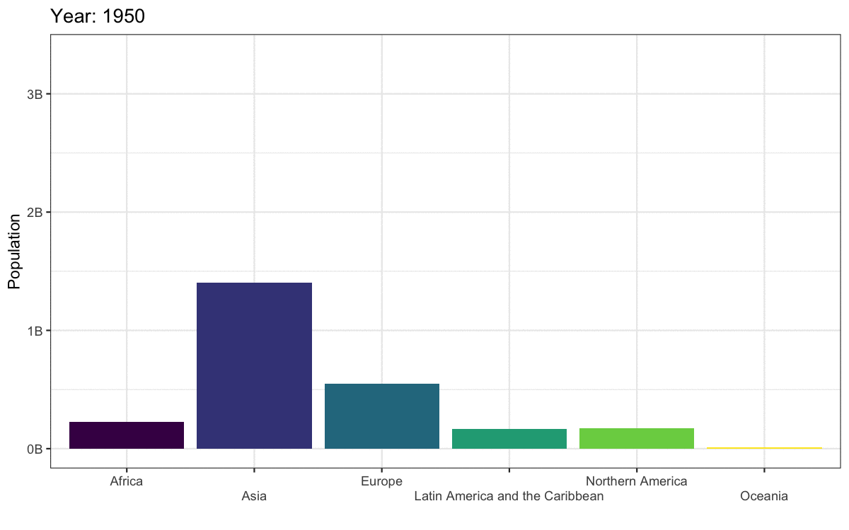
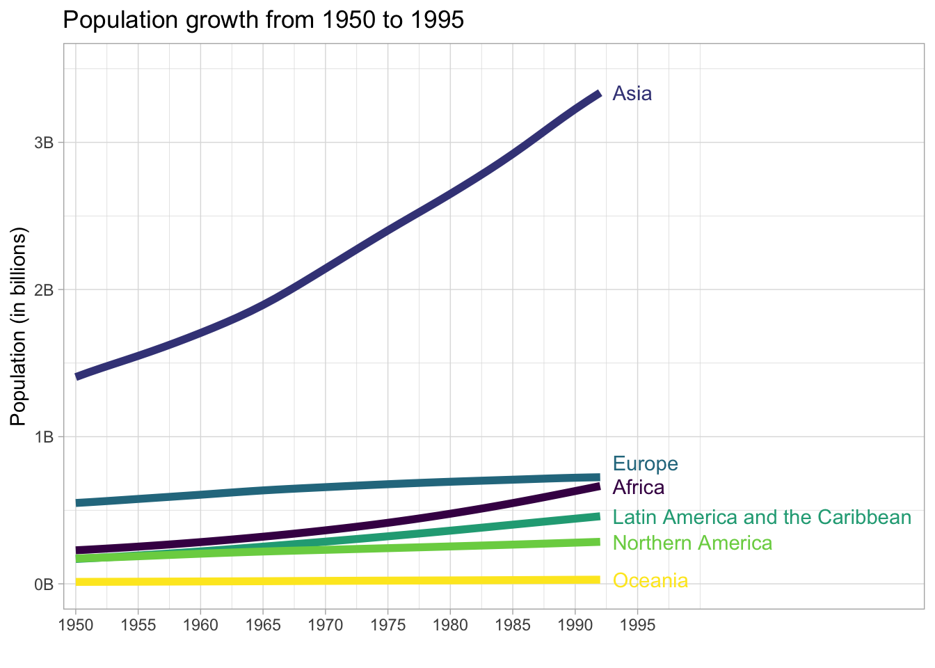
Figure 10.14: Animated gif.
There are actually not many plots that are really improved by animating them. The plot below gives the same information at a single glance.
10.3.5 Resources
There are so many more options for data visualisation in R than we have time to cover here. The following resources will get you started on your journey to informative, intuitive visualisations.
- The R Graph Gallery (this is really useful)
- Look at Data from Data Vizualization for Social Science
- Graphs in Cookbook for R
- Top 50 ggplot2 Visualizations
- R Graphics Cookbook by Winston Chang
- ggplot extensions
- plotly for creating interactive graphs
- Drawing Beautiful Maps Programmatically
- gganimate
10.4 Reports
10.4.1 Set-up
Close your visualisation Markdown and open and save an new R Markdown document named reports.Rmd, delete the welcome text and load the required packages for this section.
library(tidyverse)     # data wrangling functions
library(bookdown)      # for chaptered reports
library(flexdashboard) # for dashboards
library(DT)            # for interactive tables
You'll need to make a folder called "data" and download data files into it: amazon_alexa.csv and scottish_population.csv.
10.4.2 Linked documents
If you need to create longer reports with links between sections, you can edit the YAML to use a bookdown format. bookdown::html_document2 is a useful one that adds figure and table numbers automatically to any figures or tables with a caption and allows you to link to these by reference.
To create links to tables and figures, you need to name the code chunk that created your figures or tables, and then call those names in your inline coding:
```{r my-table}
# table code here``````{r my-figure}
# figure code here```See Table\ \@ref(tab:my-table) or Figure\ \@ref(fig:my-figure).The code chunk names can only contain letters, numbers and dashes. If they contain other characters like spaces or underscores, the referencing will not work.
You can also link to different sections of your report by naming your headings with {#}:
# My first heading {#heading-1}

## My second heading {#heading-2}

See Section\ \@ref(heading-1) and Section\ \@ref(heading-2)
The code below shows how to link text to figures or tables in a full report using the built-in diamonds dataset - use your reports.Rmd to create this document now. You can see the HTML output here.
---
title: "Linked Document Demo"
output:
  bookdown::html_document2:
    number_sections: true
---

```{r setup, include=FALSE}
knitr::opts_chunk$set(echo = FALSE,
                      message = FALSE,
                      warning = FALSE)
library(tidyverse)
library(kableExtra)
theme_set(theme_minimal())
```

Diamond price depends on many features, such as:

- cut (See Table\ \@ref(tab:by-cut))
- colour (See Table\ \@ref(tab:by-colour))
- clarity (See Figure\ \@ref(fig:by-clarity))
- carats (See Figure\ \@ref(fig:by-carat))
- See section\ \@ref(conclusion) for concluding remarks

## Tables

### Cut

```{r by-cut}
diamonds %>%
  group_by(cut) %>%
  summarise(avg = mean(price),
            .groups = "drop") %>%
  kable(digits = 0,
        col.names = c("Cut", "Average Price"),
        caption = "Mean diamond price by cut.") %>%
  kable_material()
```

### Colour

```{r by-colour}
diamonds %>%
  group_by(color) %>%
  summarise(avg = mean(price),
            .groups = "drop") %>%
  kable(digits = 0,
        col.names = c("Cut", "Average Price"),
        caption = "Mean diamond price by colour.") %>%
  kable_material()
```

## Plots

### Clarity

```{r by-clarity, fig.cap = "Diamond price by clarity"}
ggplot(diamonds, aes(x = clarity, y = price)) +
  geom_boxplot()
```

### Carats

```{r by-carat, fig.cap = "Diamond price by carat"}
ggplot(diamonds, aes(x = carat, y = price)) +
  stat_smooth()
```

### Concluding remarks {#conclusion}

I am not rich enough to worry about any of this.
This format defaults to numbered sections, so set number_sections: false in the YAML header if you don't want this. If you remove numbered sections, links like \@ref(conclusion) will show "??", so you need to use URL link syntax instead, like this:
See the [last section](#conclusion) for concluding remarks.10.4.3 References
There are several ways to do in-text references and automatically generate a bibliography in R Markdown. Markdown files need to link to a BibTex file (a plain text file with references in a specific format) that contains the references you need to cite. You specify the name of this file in the YAML header, like bibliography: filename.bib and cite references in text using an at symbol and a shortname, like [@tidyverse].
10.4.3.1 Creating a BibTeX file
Most reference software like EndNote, Zotero or Mendeley have exporting options that can export to BibTeX format. You just need to check the shortnames in the resulting file.
You can also make a BibTeX file and add references manually. In RStudio, go to File > New File... > Text File and save the file as "bibliography.bib".
Next, add the line bibliography: bibliography.bib to your YAML header.
10.4.3.2 Adding references
You can add references to a journal article in the following format:
@article{shortname,
  author = {Author One and Author Two and Author Three},
  title = {Paper Title},
  journal = {Journal Title},
  volume = {vol},
  number = {issue},
  pages = {startpage--endpage},
  year = {year},
  doi = {doi}
}
See A complete guide to the BibTeX format for instructions on citing books, technical reports, and more.
You can get the reference for an R package using the functions citation() and toBibtex(). You can paste the bibtex entry into your bibliography.bib file. Make sure to add a short name (e.g., "ggplot2") before the first comma to refer to the reference.
## @Book{,
##   author = {Hadley Wickham},
##   title = {ggplot2: Elegant Graphics for Data Analysis},
##   publisher = {Springer-Verlag New York},
##   year = {2016},
##   isbn = {978-3-319-24277-4},
##   url = {https://ggplot2.tidyverse.org},
## }
Google Scholar entries have a BibTeX citation option. This is usually the easiest way to get the relevant values, although you have to add the DOI yourself. You can keep the suggested shortname or change it to something that makes more sense to you.
10.4.3.3 Citing references
You can cite references in text like this:
This tutorial uses several R packages [@tidyverse;@rmarkdown].This tutorial uses several R packages (Allaire et al., 2018; Wickham, 2017).
Put a minus in front of the @ if you just want the year:
Franconeri and colleagues [-@franconeri2021science] review research-backed guidelines for creating effective and intuitive visualizations.Franconeri and colleagues (2021) review research-backed guidelines for creating effective and intuitive visualizations.
10.4.3.4 Citation styles
You can search a list of style files (e.g., APA, MLA, Harvard) and download a file that will format your bibliography. You'll need to add the line csl: filename.csl to your YAML header.
10.4.3.5 Reference section
By default, the reference section is added to the end of the document. If you want to change the position (e.g., to add figures and tables after the references), include <div id="refs"></div> where you want the references.
Add in-text citations and a reference list to your report.
10.4.4 Interactive tables
One way to make your reports more exciting is to use interactive tables. The DT::datatable() function displays a table with some extra interactive elements to allow readers to search and reorder the data, as well as controlling the number of rows shown at once. This can be especially helpful. This only works with HTML output types. The DT website has extensive tutorials, but we'll cover the basics here.
library(DT)

scotpop <- read_csv("data/scottish_population.csv",
                    show_col_types = FALSE)

datatable(data = scotpop)
You can customise the display, such as changing column names, adding a caption, moving the location of the filter boxes, removing row names, applying classes to change table appearance, and applying advanced options.
# https://datatables.net/reference/option/
my_options <- list(
  pageLength = 5, # how many rows are displayed
  lengthChange = FALSE, # whether pageLength can change
  info = TRUE, # text with the total number of rows
  paging = TRUE, # if FALSE, the whole table displays
  ordering = FALSE, # whether you can reorder columns
  searching = FALSE # whether you can search the table
)

datatable(
  data = scotpop,
  colnames = c("County", "Population"),
  caption = "The population of Scottish counties.",
  filter = "none", # "none", "bottom" or "top"
  rownames = FALSE, # removes the number at the left
  class = "cell-border hover stripe", # default is "display"
  options = my_options
)
Create an interactive table like the one below from the diamonds dataset of diamonds where the table value is greater than 65 (the whole table is much too large to display with an interactive table). Show 20 items by default and remove the search box, but leave in the filter and other default options.
10.4.5 Other formats
You can create more than just reports with R Markdown. You can also create presentations, interactive dashboards, books, websites, and web applications.
10.4.5.1 Presentations
You can choose a presentation template when you create a new R Markdown document. We'll use ioslides for this example, but the other formats work similarly.
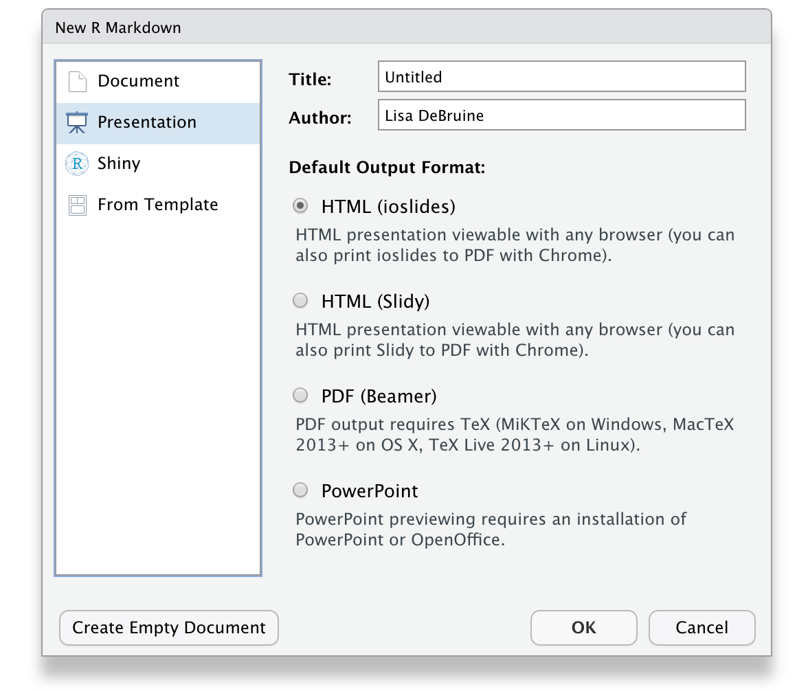
Figure 10.15: Ioslides RMarkdown template.
The main differences between this and the Rmd files you've been working with until now are that the output type in the YAML header is ioslides_presentation instead of html_document and this format requires a specific title structure. Each slide starts with a level-2 header.
The template provides you with examples of text, bullet point, code, and plot slides. You can knit this template to create an HTML document with your presentation. It often looks odd in the RStudio built-in browser, so click the button to open it in a web browser. You can use the space bar or arrow keys to advance slides.
The code below shows how to load some packages and display text, a table, and a plot. You can see the HTML output here.
---
title: "Presentation Demo"
author: "Lisa DeBruine"
output: ioslides_presentation
---

```{r setup, include=FALSE}
knitr::opts_chunk$set(echo = FALSE)
library(tidyverse)
library(kableExtra)
```

## Slide with Markdown

The following slides will present some data from the `diamonds` dataset from **ggplot2**.

Diamond price depends on many features, such as:

- cut
- colour
- clarity
- carats

## Slide with a Table

```{r}
diamonds %>%
  group_by(cut, color) %>%
  summarise(avg_price = mean(price),
            .groups = "drop") %>%
  pivot_wider(names_from = cut, values_from = avg_price) %>%
  kable(digits = 0, caption = "Mean diamond price by cut and colour.") %>%
  kable_material()
```

## Slide with a Plot

```{r pressure}
ggplot(diamonds, aes(x = cut, y = price, color = color)) +
  stat_summary(fun = mean, geom = "point") +
  stat_summary(aes(x = as.integer(cut)),
               fun = mean, geom = "line") +
  scale_x_discrete(position = "top") +
  scale_color_viridis_d(guide = guide_legend(reverse = TRUE)) +
  theme_minimal()
```
10.4.5.2 Dashboards
Dashboards are a way to display text, tables, and plots with dynamic formatting. After you install flexdashboard, you can choose a flexdashboard template when you create a new R Markdown document.
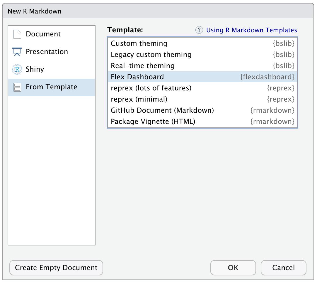
Figure 10.16: Flexdashboard RMarkdown template.
The code below shows how to load some packages, display two tables in a tabset, and display two plots in a column. You can see the HTML output here.
---
title: "Flexdashboard Demo"
output:
  flexdashboard::flex_dashboard:
    social: [ "twitter", "facebook", "linkedin", "pinterest" ]
    source_code: embed
    orientation: columns
    vertical_layout: fill
---

```{r setup, include=FALSE}
library(flexdashboard)
library(tidyverse)
library(kableExtra)
library(DT) # for interactive tables
theme_set(theme_minimal())
```

Column {data-width=350, .tabset}
--------------------------------

### By Cut

This table uses `kableExtra` to render the table with a specific theme.

```{r}
diamonds %>%
  group_by(cut) %>%
  summarise(avg = mean(price),
            .groups = "drop") %>%
  kable(digits = 0,
        col.names = c("Cut", "Average Price"),
        caption = "Mean diamond price by cut.") %>%
  kable_classic()
```

### By Colour

This table uses `DT::datatable()` to render the table with a searchable interface.

```{r}
diamonds %>%
  group_by(color) %>%
  summarise(avg = mean(price),
            .groups = "drop") %>%
  DT::datatable(colnames = c("Colour", "Average Price"),
                caption = "Mean diamond price by colour",
                options = list(pageLength = 5),
                rownames = FALSE) %>%
  DT::formatRound(columns=2, digits=0)
```

Column {data-width=350}
-----------------------

### By Clarity

```{r by-clarity, fig.cap = "Diamond price by clarity"}
ggplot(diamonds, aes(x = clarity, y = price)) +
  geom_boxplot()
```


### By Carats

```{r by-carat, fig.cap = "Diamond price by carat"}
ggplot(diamonds, aes(x = carat, y = price)) +
  stat_smooth()
```
Change the size of your web browser to see how the boxes, tables and figures change.
The best way to figure out how to format a dashboard is trial and error, but you can also look at some sample layouts.
10.4.5.3 Books
You can create online books with bookdown. In fact, the book you're reading was created using bookdown. After you download the package, start a new project and choose "Book project using bookdown" from the list of project templates.
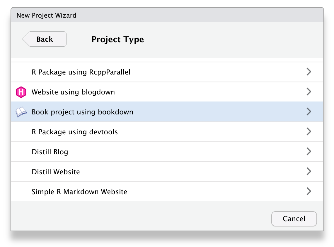
Figure 10.17: Bookdown project template.
Each chapter is written in a separate .Rmd file and the general book settings can be changed in the _bookdown.yml and _output.yml files.
10.4.5.4 Websites
You can create a simple website the same way you create any R Markdown document. Choose "Simple R Markdown Website" from the project templates to get started. See Appendix L for a step-by-step tutorial.
For more complex, blog-style websites, you can investigate blogdown. After you install this package, you will also be able to create template blogdown projects to get you started.
10.4.5.5 Shiny
To get truly interactive, you can take your R coding to the next level and learn Shiny. Shiny apps let your R code react to user input. You can do things like make a word cloud, search a google spreadsheet, or conduct a survey.
This is well outside the scope of this class, but the skills you've learned here provide a good start. The free book Building Web Apps with R Shiny by one of the authors of this book can get you started creating shiny apps.
10.5 Course Complete
And so, we are done. We've covered a huge amount over the course of Applied Data Skills, and whilst you're likely more comfortable with some bits than others, the skills you have developed are truly impressive. Even if you go no further than what you've learned in this book, you can now work reproducibly to produce informative summaries and visualisations that provide new insights into your data and reduce human error.
But it's also important to recognise that your knowledge of R will never be complete. In the course of writing this book, the entire ADS team have learned new functions, new arguments, new approaches, and new reasons to love or loathe certain data visualisations. The flexibility and possibility of R is what makes it frustrating and empowering in equal measure. What we hope more than anything is that Applied Data Skills is the start of your journey with R, not the end. Please keep in touch, we'd love to see where it takes you.
Emily Nordmann,
Lisa DeBruine,
Gaby Mahrholz,
Jaimie Torrance