10 Wrapping up
Intended Learning Outcomes
10.1 Writing about data
Any time you produce a data report — whether for a university course, a workplace, or a research project — you will need to write about what you did and why. These methodological explanations are not about narrating your code line-by-line. They are about explaining the analytical decisions you made and why they matter for interpretation. The reader of your report may not know R, but they still need to understand and trust your results.
10.1.1 Focus on decisions, not code
A common mistake is to describe what the code does rather than what analytical decisions were made and why. The reader of your report should not need to understand R to follow your explanation.
Warning
Poor example:
“I used filter() to remove rows where age was NA, then I used group_by() and summarise() to calculate the mean score for each condition, and then I used ggplot() with geom_boxplot() to make a box plot.”
Better example:
“Participants with missing age data were excluded (n = 12), leaving a final sample of 340. Mean scores were calculated for each experimental condition. A box plot was used to compare condition scores as it allows clear visual comparison of the distributions across a small number of discrete groups.”
The poor example tells the reader which functions were used but nothing about why any of those decisions were made. The better example explains the decisions (what was excluded and why, what was calculated, and why a particular visualisation was chosen) without mentioning any code at all.
10.1.2 What to include in a methodological explanation
For each insight in your report, your explanation should briefly cover whichever of the following are relevant:
- Filters and inclusion criteria — What data did you include or exclude, and why? How many observations were affected?
- Missing data — How did you handle missing values? Were they removed, and if so, from which variables and how many?
- Summary measures — What did you calculate (e.g., means, counts, proportions)? If you report percentages, what is the denominator?
- Choice of table or figure — Why did you choose to present the data the way you did? What does this format make it easy to see?
- Joins — If you combined datasets, what did you join on and how did you verify the result was sensible?
You don’t need to cover all of these for every insight, only those that are relevant. The goal is to give the reader enough information to understand and trust your results without reading the code.
TipKnowledge check: Writing about data
Which of the following is the best methodological explanation for a figure showing average life satisfaction scores by country?
Tip
Which of the following is the best methodological explanation for a table showing the number of respondents by age group?
10.2 Code quality and commenting
Good code is not just code that works, it is code that someone else (or future you) can read and understand. If you come back to a project after six months, or if a colleague needs to check your work, clear and well-commented code will save everyone a lot of time.
10.2.2 Keep your code readable
Beyond comments, there are a few simple things you can do to make your code easier to read:
- Use line breaks in pipes — Put each step of a pipeline on its own line. This is much easier to read than one very long line.
- Don’t put everything in one chunk — Break your code into logical sections. Each chunk should do one thing (e.g., load data, wrangle data, create a plot).
-
Use meaningful object names —
dat_filteredis more informative thand2orx. -
Be consistent — Pick a naming convention and stick with it. The tidyverse convention is
snake_case(e.g.,mean_score,dat_filtered).
TipKnowledge check: Code commenting
Which of the following is the best code comment for the line dat <- dat |> drop_na(score)?
10.3 Reproducible report checklist
Whenever you produce a report using R and Quarto, it is worth working through a checklist before you consider it finished. Many of these points may seem obvious, but they are the most common sources of errors and broken renders.
10.3.1 Know your data
Before you write a single line of analysis code, make sure you understand the data you are working with.
10.3.2 Reproducibility
10.3.3 Content and presentation
TipKnowledge check: Reproducibility and data checking
Why is it important to restart R and run all chunks in order before rendering your report?
What is wrong with the following file path in a Quarto report: read_csv("C:/Users/emily/Desktop/ADS/data/survey.csv")?
True or false: it is acceptable to open your data file in Excel and fix a typo before loading it into R, as long as you note the change in a comment.
You load a dataset and run count(dat, gender) and see the values “Female”, “female”, “F”, and “Male”. What is the most likely problem?
Which of the following is the best first step when you receive a new dataset?
10.4 Extending your skills
This book and course are only intended to get you started with the skills you will need to begin your journey into data skills. Below are some suggestions for where you might go next.
10.4.1 More plots
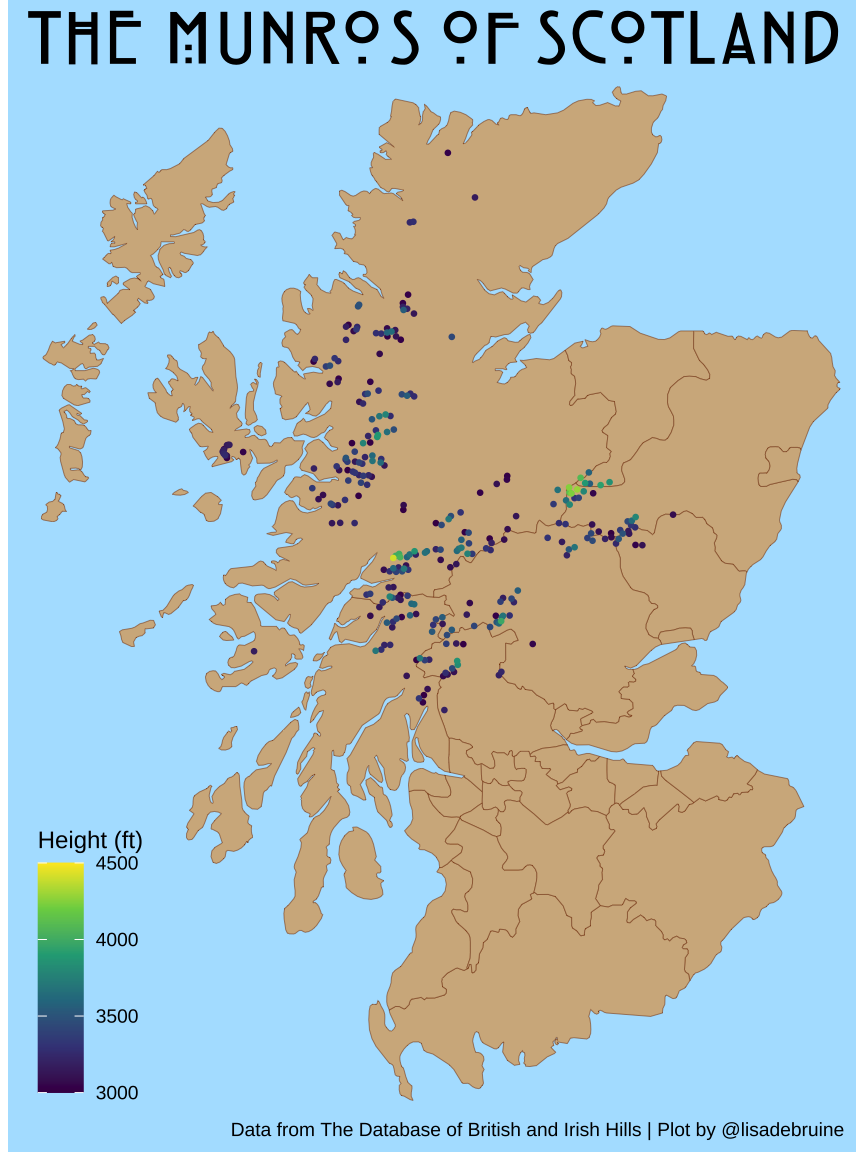
Appendix H will introduce you to some more plot styles, like maps and word clouds, and things you can do with plots, such as add annotations.
Lisa participated in the 2022 30 Day Chart Challenge and ended up collecting all 30 plots in a tutorial book with step-by-step explanations of how they created them.
10.4.2 Websites and presentations with Quarto
We’ve been concentrating on creating single documents with Quarto, but you can do much more with it, such as create presentations and websites. See the Quarto guide for a list of everything that it can do.
Appendix A will teach you how to create a simple webpage using quarto, link multiple pages, and style your content using css.
You can easily create presentations using revealjs in Quarto. Get started by creating a new Quarto document, pasting in the following, and rendering it.
Check the revealjs Quarto docs for many more things you can do with presentations.
10.5 Glossary
10.6 Further resources
- Quarto guide
- R for Data Science (2e) — a comprehensive free textbook covering data import, tidying, transformation, visualisation, and communication
- ggplot2: Elegant Graphics for Data Analysis — the definitive guide to ggplot2
- Data transformation cheat sheet
- Data visualisation cheat sheet
10.2.1 Comments should explain “why”, not “what”
Your code comments should give insight into your reasoning, not describe what R is doing. The code itself already tells the reader what it does; what it cannot tell them is why you made a particular decision.
Poor commenting:
Better commenting:
In the poor example, the comments simply restate what the code does. In the better example, the comments explain the rationale, why under-18s were removed, and that there were missing values that needed handling.