3 Data Visualisation Through ggplot2
3.1 Overview
Data visualisation is very important for understanding your data. It is a key part of data analysis in exploring data, checking assumptions, and displaying results. Figures and plots allow you to get insight into patterns in your data. For example, in regards to seeing differences between groups, but also for seeing where things don't quite match up with what you think should be happening. A great example of this is Anscombe's Quartet, which you can read up about at a later date if you like - see here - four datasets given exact same means, but with very different underlying structures when visualised. The key point is that it is always good to visualise your data and visualisation should be a common step in your data skills set.
In the PsyTeachR Data Skills book we introduced data visualisation using ggplot2, the main visualisation package of tidyverse. You should look back at that when working through this chapter, and you can find additional info here at the main page for the package: ggplot2.
For visualisaion we use ggplot2 and below we have listed some great online resources that you might want to consult if you want a fuller understanding:
In this chapter, we will revisit plotting data and expand your skills in order to make effective and informative figures. This will become really beneficial to you as your progress because data visualisation is a skill that applies to multiple careers, not just Psychology.
In this chapter you will:
- Recap on data visualisation
- Expand your skills to produce new figures
- Learn about Mental Rotation research
3.2 Data Visualisation Basics
3.2.1 Introducing the Data Set: Mental Rotation Ability
The data we will use today comes from a replication of a classic experiment merging the fields of Perception and Cognition. Shepard and Metzler (1971) demonstrated that when participants were shown two similar three-dimensional shapes, one just a rotated version of the other (see the figure below - top panel), and asked whether they were the same shape or not, the reaction time and error rates of responses were a function of rotation; i.e. the larger the difference in rotation between the two shapes, the longer it took participants to say "same" or "different", and the more errors they made.
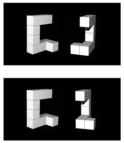
Figure 3.1: The Mental Rotation Task as shown in Ganis and Kievit (2016) Figure 1
The image shown in Figure 3.1 actually comes from the replication by Ganis and Kievit (2016). In the top panel the two shapes are the same but the shape on the right is rotated vertically at 150 degrees from the original (the left shape) and so participants should respond "same". In the bottom panel, however, the two shapes are different; the one on the right is again rotated at 150 degrees, but in this trial it takes longer for participants to realise that they are different shapes.
You can read more about Ganis and Kievit (2016) in your own time, but the basic methods are that they ran 54 participants on a series of these images using four angles of rotation (0, 50, 100, 150 degrees) and asked people to respond 'same' or 'different' on each trial. The data can be downloaded from here. You should use this data to follow along below and try to answer the questions.
Look at the data
- Download the data folder, unzip it, and save it to a folder you have access to.
- Set your working directory to that folder
Session >> Set Working Directory >> Choose Directory - Open a new Rscript or .RMarkdown file and save it within the folder that contains the data, giving the script a sensible name, e.g.
Chapter3_visualisations.R. If you prefer to work in RMarkdown, just remember you will need to embed code into code chunks, as shown in Chapter 1. - Copy the three code lines below into your script and run them to bring
tidyverseinto the library and to read in the two data files.
library("tidyverse")

menrot <- read_csv("MentalRotationBehavioralData.csv")
demog <- read_csv("demographics.csv")- Note, there is no difference between
library(tidyverse)andlibrary("tidyverse")both will work. - However, there is a difference between
demog <- read_csv("demographics.csv")anddemog <- read_csv(demographics.csv). You will need quotes around the .csv file name as shown in the code chunk above (e.g.demog <- read_csv("demographics.csv")), or the code won't work.
This is a really great question as we always seem to be saying to use
dplyr or readr or ggplot, but we
never actually call them in. Remember, however, that
tidyverse is actually a collection of
packages, the most common packages in fact, and we use it to
bring in these common packages (including ggplot2) because
you will probably need the other packages along with it for the codes to
run smoothly. We will try to tell you when you need to call other
packages alongside tidyverse, but do keep in mind that most
of your codes will at least start with the tidyverse
package.
Small point, if looking for help on ggplot, the package
is actually called ggplot2. This is the newer version of
the package, so search ggplot2 if you need help.
Let's start by having a look at the data we have brought in. You can do this whichever way you choose; we mentioned three ways in the previous chapter.
First, demog - short for demographics. It has three columns:
- Participant - the ID of the participant
- Age - the age of the participant
- Sex - the sex of the participant
Secondly, menrot - short for mental rotation. It has 8 columns:
- Participant - the ID of the participant; matches with ID in
demog - Trial - the trial number in the experiment for each participant
- Condition - the name of the image shown; R indicates the rotated image was different
- Time - the reaction time to respond on each trial in milliseconds
- DesiredResponse - what participants should have responded on each trial; Different or Same
- ActualResponse - what participants did respond on each trial; Different or Same
- Angle - the angle that the shape on the right was rotated compared to the shape on the left (0, 50, 100, 150)
- CorrectResponse - whether the participant was correct or incorrect on a given trial
Ganis and Kievit (2016) is a very short paper that is really to introduce the stimuli set rather than give an extensive background on the topic of mental rotation - we call this a ‘methods paper’. That said, the writing of the paper is very clear and the procedure is well detailed as to how they ran the actual experiment.
When writing a procedure, remember to give as much information as needed to allow someone to exactly replicate your study. Have a read at this procedure when you have time and think about what information is there, but also what information is not there, to help you develop your writing and your reports. For example, which fingers did the participants use to respond and why would that be important?
We now have our data and we want to create some plots to visualise it. We will show you the code to create four types of plots and then get you to practice some yourself, but you will remember some of this from the PsyTeachR Data Skills book. As we go through the plots, you should edit/change the code we give you and see what differences you can control and what changes you can create in the plots. Editing and altering code that works to see what happens when you change something is a great way of working.
3.2.2 Basic Structure of ggplot()
The two main things to know about working with ggplot are that:
- the usual
ggplotformat is:
ggplot(data, aes(x = x_axis, y = y_axis)) + geom_type_of_plot()
The first thing you enter is your dataframe/tibble; your data. Then, within the aes() you say what is on the x_axis and y_axis, using the column names from within your tibble. aes stands for aesthetics and maps data into visual features. Finally, you tell the code what type of plot you want.
-
ggplotworks on a concept of layers
Layers are a common way for graphics to work. Think about it as ggplot() function creating your first layer and then every function after that is adding more layers on top to create the figure you want. The first layer is always your data and the axis/axes, i.e. `ggplot(....). The second layer, added by using the plus symbol '+', is the type of plot. We will look at adding more layers as we progress.
ggplot() is a powerful package that is used by a whole range of industries, including newspapers and mainstream media outlets, as it can make quite sophisticated images. One of the beauties of data skills is just how transferable they are across many fields.
3.2.3 Scatterplots - geom_point()
Scatterplots are a great way of visualising continuous data - data that can take any value on the scale it is measured. For example, in the current dataset, you can use scatterplots to explore the potential relationship between two continuous variables such as Age and Reaction Time: Do both variables increase/decrease at the same rate (i.e., a positive relationship)? Does one variable increase and the other decrease (i.e., a negative relationship)? Or maybe there is no overall relationship?
In our data, say we want to test if the overall average time to respond in the mental rotation task is related to the age of the participant while highlighting the sex of the participants. We could show this relationship in a scatterplot using the code below, which:
- Wrangles the data to create an average response time for each participant,
Mean_Time, and then joins this information to the demographic data, byParticipant. All this is stored in the tibblemenrot_time_age. - It then plots a scatterplot (
geom_point()) whereageis plotted on the x-axis, andMean_Timeis on the y-axis - Finally, it uses an additional
aescall tocolorbySexwhich will color each point based on whether it was a male or female participant responding. This is the default coloring of this call when there are two options. Later we will look at controlling this and using more colors ourselves.
menrot_time_age <- group_by(menrot, Participant) %>%
  summarise(Mean_Time = mean(Time, na.rm = TRUE)) %>%
  inner_join(demog, "Participant")

ggplot(data = menrot_time_age,
       aes(x = Age,
           y = Mean_Time,
           color = Sex)) +
  geom_point()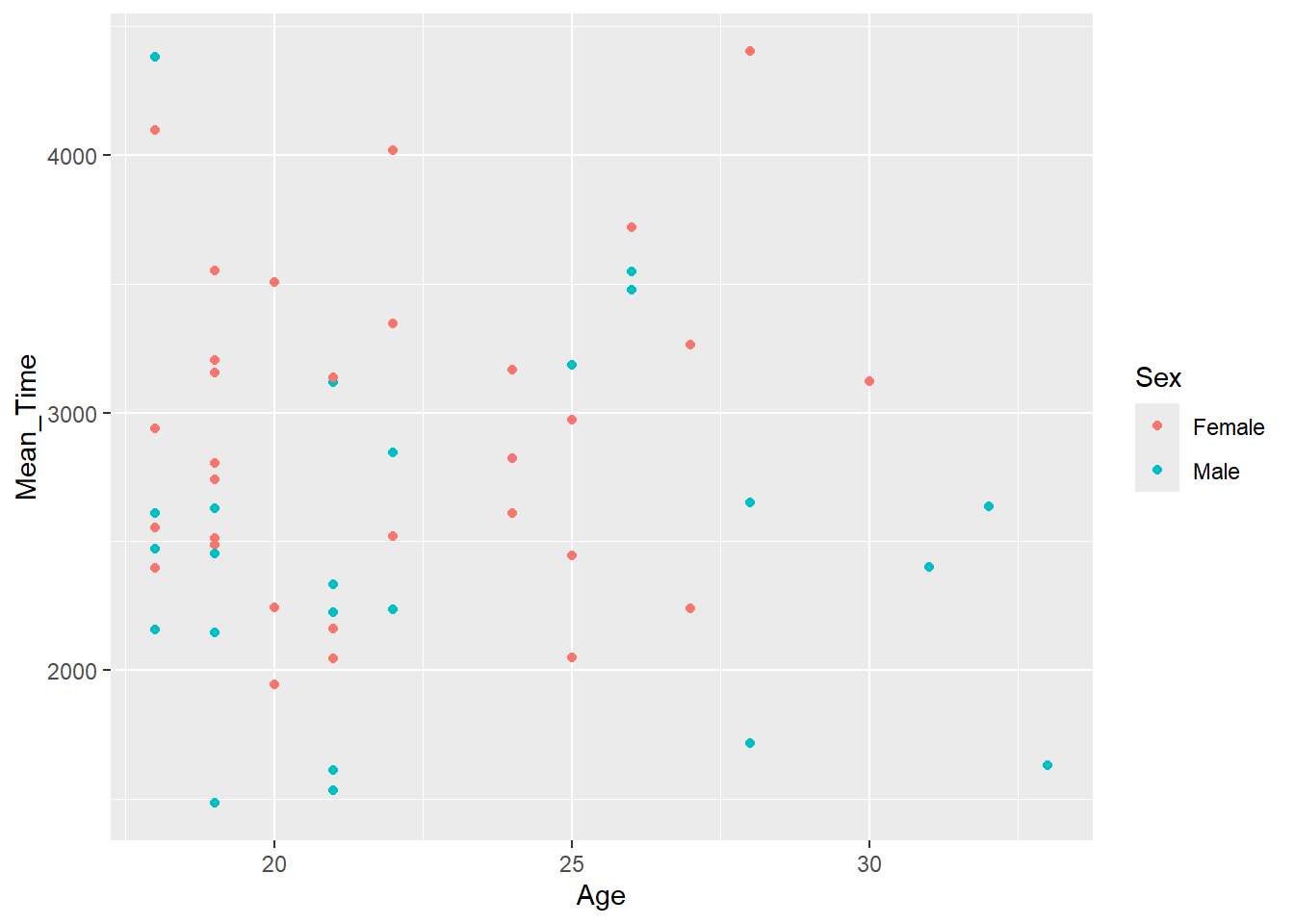
Figure 3.2: A scatterplot of Mean Time as a function of Age
Quickfire Questions
Looking at the scatterplot in Figure 3.2, what can you say about the relationship between age and overall response time?
Looking at the scatterplot, what can you say about difference between male and female participants?
If you look at the figure, does it appear that as age increases (x-axis) so does overall resposne time (y-axis)? Or as age decreases so does overall response time? Or maybe even as age increases, overall response time decreases? Well, actually, looking at the figure there appears to be no relationship between the two variables at all and it is not the case that as one either increases or decreases so does the other. The relationship appears flat.
When comparing sex, based on the color of the dots, again there appears to be no major differences here as the relationship looks flat for both sex.
Later in the book we will look at correlational analysis - a method of quantifying the relationship between two variables.
Note: It will often be the case that to visualise data you first have to wrangle it into a format. When we do this we will be using the functions we saw in Chapter 2, so make sure you have been through those tasks and have understood what the wrangle verbs are doing and how pipes work. Keep in mind that most functions use the format, function(data, argument)
3.2.4 Histograms - geom_histogram()
Histograms are a great way of showing the overall distribution of your data. Does your data look normally distributed? Or is your data skewed - positive skew or negative skew? Is it peaky? Is it flat? These are terms that will become familiar to you as you learn more about statistics, so try to think about these terms and concepts when visualising and looking at your data.
Looking at our data, say we wanted to test if the overall distribution of mean response times for correct trials was normally distributed. We could visualise this question through the following code, which:
- Wrangles the data to create an average response time for each participant,
Mean_Time, and then filters this information for correct trials only. This is then stored in the tibblemenrot_hist_correct. - Plots a histogram (
geom_histogram()) whereMean_Timeis plotted on the x-axis, and the count of each value inMean_Timeis plotted on the y-axis. The code creates the y-axis automatically and we don't have to state it:
menrot_hist_correct <- group_by(menrot, Participant, CorrectResponse) %>%
  summarise(Mean_Time = mean(Time, na.rm = TRUE)) %>%
  filter(CorrectResponse == "Correct")

ggplot(data = menrot_hist_correct,
       aes(x = Mean_Time)) +
  geom_histogram()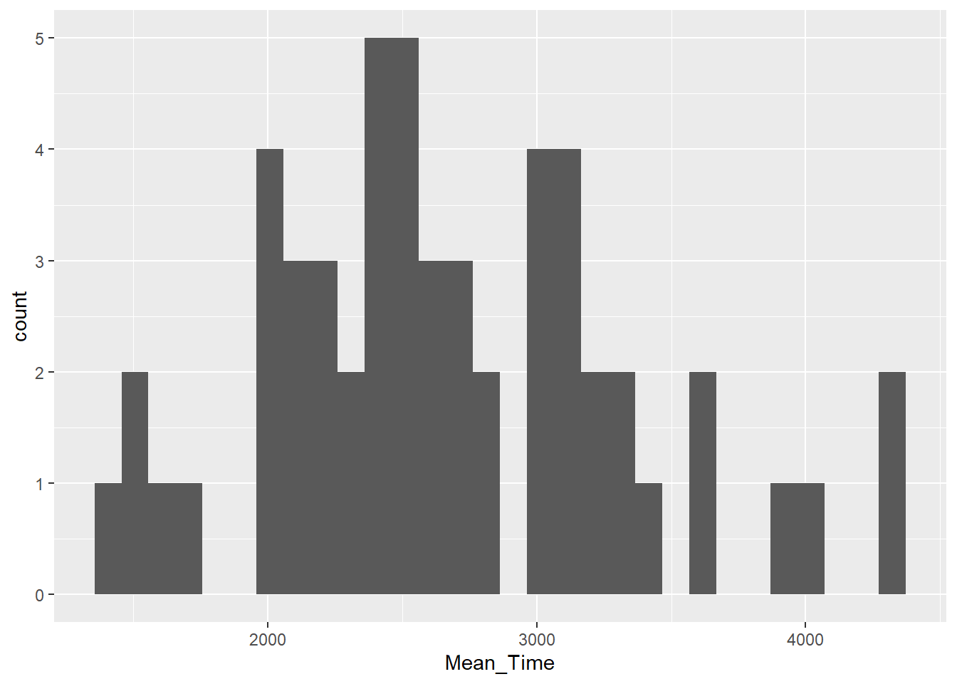
Figure 3.3: A histogram of distribution of Mean Time counts
Quickfire Questions
Looking at the histogram in Figure 3.3, what can you say about the overall shape of the distribution?
Looking at the histogram, what is the most common average overall response time for correct trials?
Keep in mind that real data will never give that beautiful textbook shape that you see in classic diagrams when looking for normally distributed data or skewed data. Your decisions regarding your distributions will often require a degree of judgement.
Positive skewed data means that most of the data is shifted to the left (low numbers) with a tail stretching to the right (high numbers). Negative skew is where most of the data is shifted to the right (high numbers) with a tail stretching to the left (low numbers). Normally distributed data has most of the data in the middle with even tails on either side. Although not perfect, the data shown in our histogram is a reasonable representation of normally distributed data in the real world; particularly for a small sample of participants.
As the y-axis is the count of the values on the x-axis, the most common overall response time can be found by reading the highest column of the data. For this distribution, this looks to be around 2500 milliseconds or 2.5 seconds.
3.2.5 Boxplots - geom_boxplot()
Boxplots are a great means for visualising the spread of your data and for highlighting outliers in your data. When looking at boxplots, you should consider:
- whether the median (thick horizontal black line) is in the middle of its box or is higher or lower than the middle of the box?
- whether the box is evenly distributed around the median or not?
- are the box whiskers (vertical tails at top and bottom of box) a similar length on both sides of the box?
- are there any outliers - usually highlighted as a star or a dot beyond the whiskers?
Let's look at and compare the distributions of mean reaction times for correct and incorrect responses. This can be done using the below code, which:
- Repeats the first two wrangle steps as when we created a scatterplot, but additionally groups by
CorrectResponse, and stores the data in the tibblemenrot_box_correct - Plots a boxplot (
geom_boxplot()) of the overall average response times on the y-axis,Mean_Time, based on the condition,CorrectResponse, on the x-axis - Uses an additional
aescall tofillthe colour of the boxplots, of the two categories, based on whetherCorrectResponsewas correct or incorrect. Again these are default and we will look at editing this later. - Turns off the legend using the
guides()call as it isn't needed because the x-axis tells you which group is which. More on that later though.
Run the code as is first. Then, run the code with fill = TRUE instead. What's the difference? Notice that fill is the name of the call in the ggplot(...) function. They are linked.
menrot_box_correct <- group_by(menrot, Participant, CorrectResponse) %>%
  summarise(Mean_Time = mean(Time, na.rm = TRUE)) %>%
  inner_join(demog, "Participant")

ggplot(data = menrot_box_correct,
       aes(x = CorrectResponse,
           y = Mean_Time,
           fill = CorrectResponse)) +
  geom_boxplot() +
  guides(fill = FALSE)
## `summarise()` has grouped output by 'Participant'. You can override using the
## `.groups` argument.## Warning: The `<scale>` argument of `guides()` cannot be `FALSE`. Use "none" instead as
## of ggplot2 3.3.4.
## This warning is displayed once every 8 hours.
## Call `lifecycle::last_lifecycle_warnings()` to see where this warning was
## generated.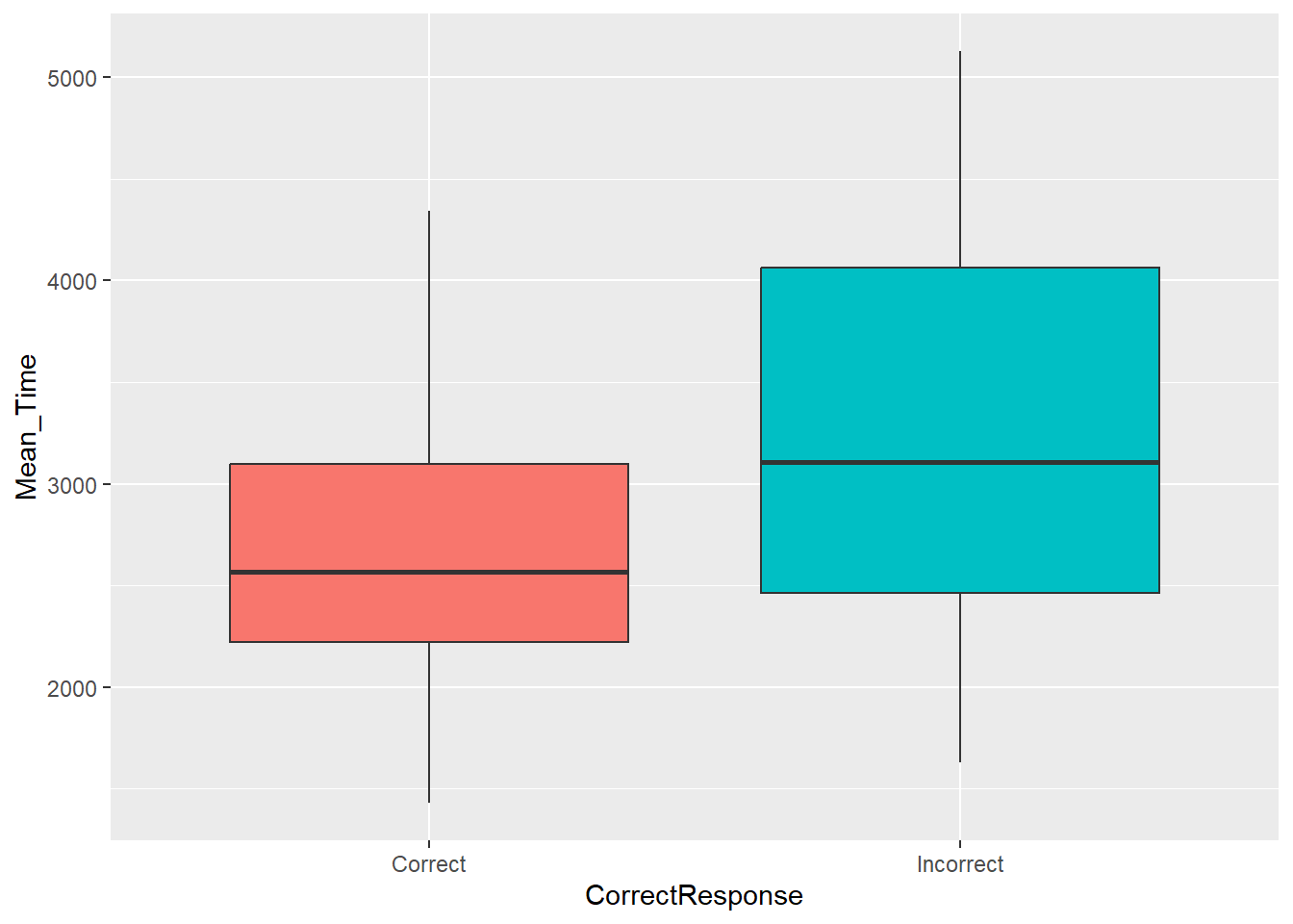
Figure 3.4: A boxplot of the spreads of Mean Time for Correct and Incorrect Responses
Quickfire Questions
Looking at the boxplots, how many outliers were there?
Looking at the boxplots in Figure 3.4, which condition has the longer median overall average response time to the mental rotation task?
There are a number of ways of determining outliers. Two methods are through standard deviations (usually 2.5 or 3 SD are used as cut-offs) or through boxplots, where an outlier is determined as \(1.5*IQR\) (inter-quartile range) above or below the top and bottom of the box. Outliers are shown as dots above or below the whiskers of the boxplot. As you can see in the figure there are no outliers to see in this data.
The median is one of the five values required to make a boxplot and is shown as the horizontal thick black line within the box itself. Looking at the two conditions and comparing the position of the median on the y-axis (response time) we can see that the median response time for incorrect trials was higher than correct trials. This would suggest that people take longer to make up their mind and to give a decision on the trials that they get wrong. Makes sense if you think about it; uncertainty takes longer and leads to more errors.
3.2.6 Violin-boxplots – geom_violin() and geom_boxplot()
Violin-boxplots allow us to combine the information from a boxplot and a histogram into the one figure. As such, we can see the entire distribution of the data whilst retaining the useful information that boxplots convey.
When looking at violin-boxplots, you should consider the points outlined in the previous section in addition to:
- whether the violin has a bulge in the middle
- whether the violin tapers off at the top and at the bottom
- whether there is just one bulge in the violin (symbolising where most of the scores are) or more than one bulge (potentially indicating more than 1 response pattern or sample within the dataset)
As in the previous task, let's look at and compare the distributions of mean reaction times for correct and incorrect responses. To create an effective violin-boxplot, we can add two key pieces of information to the code in the previous task:
- Add on
geom_violin()as another layer. You must ensure that your code is arranged correctly, such that the violin plots appear underneath the boxplots. That is, you need to callgeom_violin()before you callgeom_boxplot(). - Add a width call to the
geom_boxplot()function. Through trial-and-error, you can choose a value that ensures the boxplots fit within the confines of the violin plots.
menrot_box_correct <- group_by(menrot, Participant, CorrectResponse) %>%
  summarise(Mean_Time = mean(Time, na.rm = TRUE)) %>%
  inner_join(demog, "Participant")

ggplot(data = menrot_box_correct,
       aes(x = CorrectResponse,
           y = Mean_Time,
           fill = CorrectResponse)) +
  geom_violin() +
  geom_boxplot(width = 0.2) +
  guides(fill = FALSE)
## `summarise()` has grouped output by 'Participant'. You can override using the
## `.groups` argument.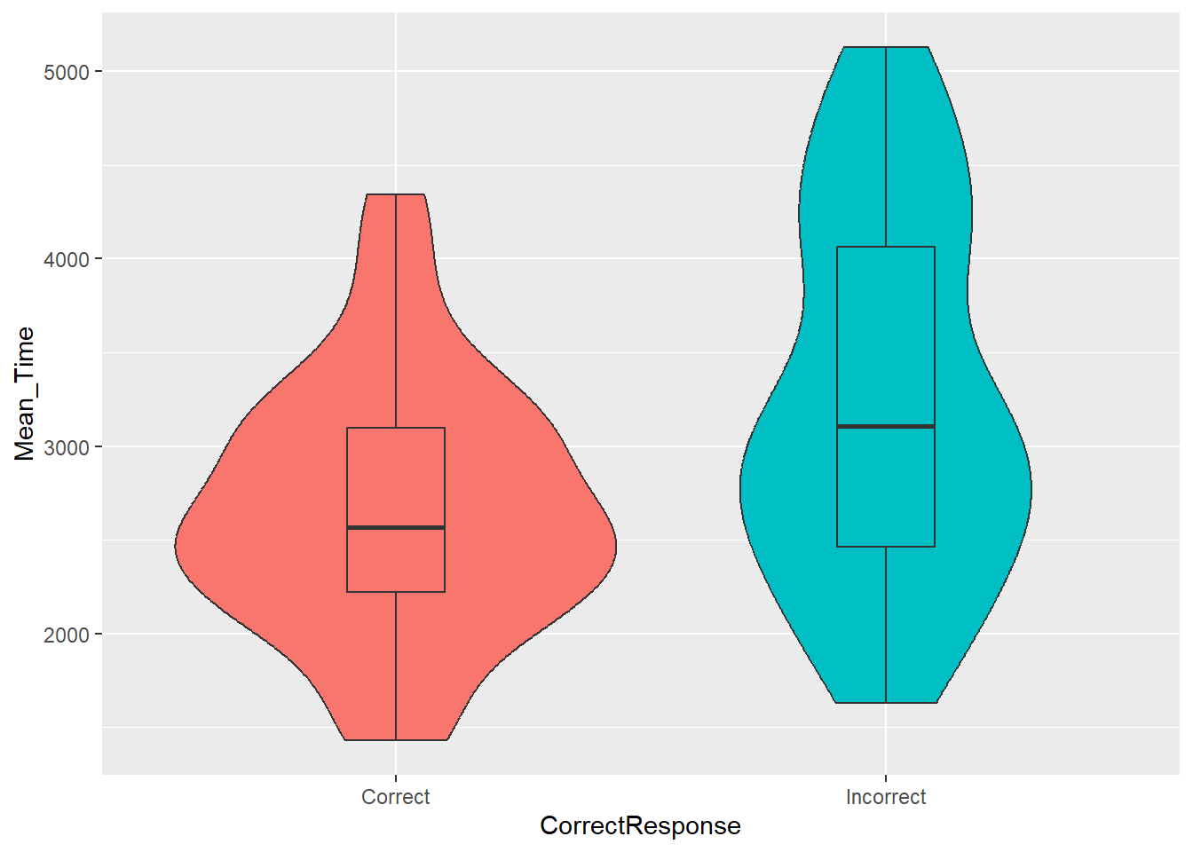
Figure 3.5: A violin-boxplot of the spreads of Mean Time for Correct and Incorrect Responses
Quickfire Questions
Looking at the code, what happens if you insert
trim = FALSEinto thegeom_violin()call?Looking at the code, what happens if you change the value of width from 0.2 to 0.6?
3.2.7 Barplots - geom_bar() or geom_col()
Barplots typically show specific values of a condition. Sometimes this will be really simple like the count of a variable the mean, e.g. how many people replied yes. Others will show something a bit more complex such as the average spread of values via error bars, e.g. standard error. When looking at barplots, the main considerations are whether or not there appears to be a difference between the conditions you are interested in or whether all conditions are about the same.
It is worth knowing that barplots are now used less frequently than they were as they actually do not show a lot of information, as discussed in this blog, One simple step to improving statistical inference. However, you will still see them being used so it is great to be able to create and interpret them.
Using geom_bar()
Using our data, let's say we are interested in whether there is a difference in the average percentage of correct and incorrect responses across male and female participants. We could visualise this using the following code, which:
- Wrangles the data through a series of steps to establish the overall percent average for correct and incorrect responses for both sex, stored in
menrot_resp_sex. - Plots a barplot (
geom_bar()) with the conditionSexon the x-axis, theAvg_Percenton the y-axis, created through the wrangle, andfillthe bars based onCorrectResponse. - Finally, within the
geom_barit says to treat the data as final values and not to average them,stat = "identity", and makes both columns visible by moving them apartposition = position_dodge(.9))- without this last step the bars would overlap and you wouldn't see everything. Try changing the.9. - Note: Each participant did 96 trials in this study.
total_n_trials <- 96

menrot_resp_sex <- count(menrot, Participant, CorrectResponse) %>%
  inner_join(demog, "Participant") %>%
  mutate(PercentPerParticipant = (n/total_n_trials)*100) %>%
  group_by(Sex, CorrectResponse) %>%
  summarise(Avg_Percent = mean(PercentPerParticipant))

ggplot(data = menrot_resp_sex,
       aes(x = Sex,
           y = Avg_Percent,
           fill = CorrectResponse)) +
  geom_bar(stat = "identity",
           position = position_dodge(.9))
## `summarise()` has grouped output by 'Sex'. You can override using the `.groups`
## argument.
Figure 3.6: A barplot of the average percent Correct and Incorrect responses for Female and Male participants - using geom_bar()
Using geom_col()
geom_col() - short for column - is an alternative to geom_bar() that does not require the part of the code where you say to not do anything to the data, i.e. stat="identity". This is shown below. Notice the difference in codes, but that they produce the same figure.
ggplot(data = menrot_resp_sex,
aes(x = Sex,
y = Avg_Percent,
fill = CorrectResponse)) +
geom_col(position = position_dodge(.9))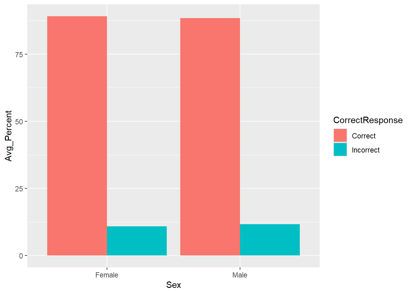
Figure 3.7: A barplot of the average percent Correct and Incorrect responses for Female and Male participants - using geom_col()
Quickfire Questions
Looking at the barplot and data, on average, which sex had the most correct responses?
Looking at the barplot and data, on average, which sex had the most incorrect responses?
Looking at the code, what happens if you decrease the position.dodge() value?
Looking at the code, what happens if you change the aes call of
filltocolor?
Remember that in barplots plotting the mean, the top of the column is the average value of that condition. This is actually why people do not like barplots; though commonly used, they really only show you one value for your data, the average, and they disregard all other information unless some indication of spread is given.
With that in mind, comparing the two Correct columns we can see that females had on average more correct responses than males. Doing the same for the Incorrect columns we can see that males had more incorrect responses than females. This actually makes sense as the response option in the experiment was either correct or incorrect, so when you add all the correct and incorrect percentage responses for one sex together you should get 100%. If females gave more correct reponses then they must have given less incorrect responses.
The last two questions are about playing with the code. Remember we
said that plots work through a concept of layers. If you set
position.dodge() to 0, you will find that one of the
columns disappears because they completely overlap now. So we need to
set position.dodge() to a reasonable value to have the
columns separate. Why not set it at 1? In barplots, you often find that
the different levels (or categories) of the the same variable are
touching. Note, however, that the value of the dodge, in this case 1, is
relative to the size of the x-axis - if the scale of your x-axis ran
from 0 to 100 then a dodge of 1 will have very little effect. Sometimes
you need a little trial and error. Always look at the output of your
code.
The final point shows that you can add a lot more calls than just x
and y axis to change the presentation of your figures. fill
changes the color of the columns, color changes the outline
color of the columns. We will see more of these as we progress and we
will look at the difference between putting them inside the
aes() and outside of it. Have a play about with these on
other figures and see what happens. It is worth pointing out here
though, above where we turned the legend off using
guides(fill = FALSE), that works because we used the
fill = ... call to change colours. If we had used the
color = ... call to change colours we need to use
guides(colors = FALSE) to turn off the legend. See how they
are linked? The guide matches what you called.
3.2.8 Themes, Labels, Guides, and facet_wraps()
There are a couple of other layers you can add to your ggplot calls to make your figures look more professional. We will show you the code here, but we want you to run them and teach yourself how they work by changing the code, removing parts within ggplot, and by adding them to the other figures we have shown above.
-
themes- changing the overall presentation of your figure. Try running the below code and comparing the figure to the barplot above. Remember,?theme_bw()will give some information or look at the cheatsheets for different themes such astheme_light(),theme_classic(),theme_gray()andtheme_dark().-
theme_gray()is actually the default and is equivalent to not stating any theme function. _theme_classic()is very close to a basic APA figure presentation.
-
labs- putting appropriate labels on your figures so readers understand what is being displayed. Try changing the text within the quotes.facet_wraps- splitting data into separate figures for clarity. This will only work when one of your conditions is categorical, but it can be a really effective means of displaying information.guides- remove it and see what happens. Do you understand why we usefillin this situation, but perhaps not others?
Try running and editing this code:
total_n_trials <- 96
menrot_better_plot <- count(menrot, Participant, CorrectResponse) %>%
inner_join(demog, "Participant") %>%
mutate(PercentPerParticipant = n/total_n_trials) %>%
group_by(Sex, CorrectResponse) %>%
summarise(Avg_Percent = mean(PercentPerParticipant))
ggplot(data = menrot_better_plot,
aes(x = Sex,
y = Avg_Percent,
fill = CorrectResponse)) +
geom_col(position = position_dodge(.9)) +
labs(x = "Sex of Participant",
y = "Percent Average (%)") +
guides(fill = FALSE) +
facet_wrap(~CorrectResponse) +
theme_bw()3.2.9 Saving your Figures
It would be really useful to save a copy of your plots as an image file so that you can use them in a presentation or report. One approach we can use is the function ggsave().
There are two ways you can use ggsave(). If you don't tell ggsave() which plot you want to save, by default it will save the last plot you created. To demonstrate this let's run the code from Activity 3.2.6 again to produce the nice violin-boxplot:
ggplot(data = menrot_box_correct,
aes(x = CorrectResponse,
y = Mean_Time,
fill = CorrectResponse)) +
geom_violin() +
geom_boxplot(width = 0.2) +
guides(fill = FALSE)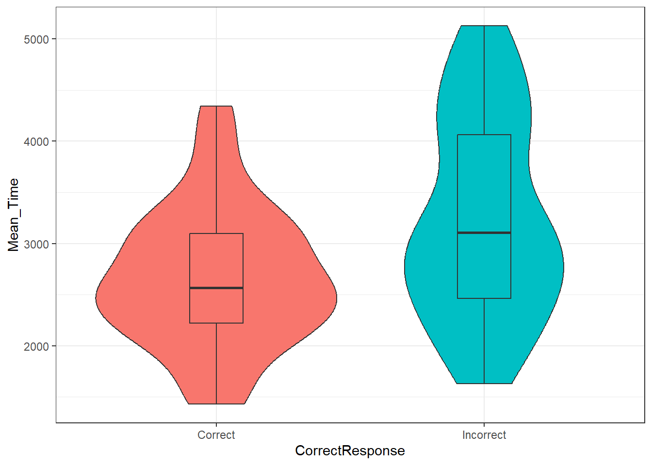
Figure 3.8: Violin-boxplot2
Now that we've got the plot we want to save as our last produced plot, all that ggsave() requires is for you to tell it what file name it should save the plot to and the type of image file you want to create (the below example uses .png but you could also use e.g., .jpeg and other image types).
- Type and run the below code into a new code chunk and then check your chapter folder. If you have performed this correctly then you see the saved image file.
ggsave("violin-boxplot.png")Note that the image tends to save at a default size, or the size that the image is displayed in your viewer, but you can change this manually if you think that the dimensions of the plot are not correct or if you need a particular size or file type.
- Type and run the below code to overwrite the image file with new dimensions.
- try different dimensions and units to see the difference. You might want to create violin-boxplot-v1, ...-v2, ...-v3, and compare them. Remember you can use
?ggsave()in the console window to bring up the help on this function.
- try different dimensions and units to see the difference. You might want to create violin-boxplot-v1, ...-v2, ...-v3, and compare them. Remember you can use
ggsave("violin-boxplot.png",
width = 10,
height = 8,
units = "in")Alternatively, the second way of using ggsave() is to save your plot as an object, just like we have done with tibbles, and then tell ggsave() which object you want to save.
- Type and run the below code and then check your folder for the image file. Resize the plot if you think it needs it.
- The below code saves the plot from Activity 3.2.6 into an object named
vioboxand then saves it to an image file "violin-boxplot-stored.png". -
Note: We do not add on
ggsave(). Instead it is a separate line of code and we tell it which object to save. So, do not do+ ggsave()
- The below code saves the plot from Activity 3.2.6 into an object named
viobox <- ggplot(data = menrot_box_correct,
aes(x = CorrectResponse,
y = Mean_Time,
fill = CorrectResponse)) +
geom_violin() +
geom_boxplot(width = 0.2) +
guides(fill = FALSE)
ggsave("violin-boxplot-stored.png", plot = viobox)Finally, note that when you save a plot to an object, you will not see the plot displayed anywhere. To get the figure to display you need to type the object name in the console (i.e., viobox). The benefit of saving figures this way is that if you are making lots of plots, you can't accidentally save the wrong one because you are explicitly specifying which plot to save rather than just saving the last one.
3.2.10 Choosing Appropriate Figures
As you progress through Psychology, you will come across a variety of different figures and plots, each looking slightly different and giving different information. When looking at these figures, and indeed when choosing one for your own analyses, you have to think about which figure is the most appropriate for your data. For example, scatterplots are great when both variables are continuous; boxplots and histograms are great for viewing spreads of data; and violin boxplots are particularly effective in conveying a more complete picture of the data distribution. In addition, barplots are commonly used where one variable is categorical - but as above note that barplots can be misleading and lots of new approaches to display categorical information are being created. Always keep asking yourself, does my plot display my data correctly. Also, do I have the right number of dots/conditions/groups in my figure? Too many or too few would suggest something is not quite right. Look at your data!
3.3 Data Visualisation Application
3.3.1 Mental Rotation: Angle and Reaction Time
We will continue using the data set from Ganis and Kievit (2016). To further your understanding of this experiment as well as develop your skills in visualisation and interpretation, we will look at mean reaction time for correct trials, as a function of the angle of rotation and sex. The idea is that the more rotated a test image is from an original image, the longer it will take for participants to determine if they are the same image or if they are completely different images. Fifty-four participants responded 'same' or 'different' on each trial to a series of rotated images using four angles of rotation (0, 50, 100, 150 degrees rotated compared to the original). Link to the data.
You will come across this phrase ‘as a function of’ quite a bit when dealing with visualisations. It means something like ‘compared by’ or ‘across’. So you could say we are going to look at Mean Reaction Time across the four different Angles of Rotation which would be written as Mean Reaction Time as a function of Angle of Rotation. Usually, it would be plotted as y-axis as a function of x-axis. It is a similar idea to the functions we use in our codes in that you want to see what happens when you put y in the function x. It is good to become familiar with the terms and language that is used in reports so that a) you understand what you are reading and b) you can use the same language in your writing.
3.3.2 Task 1: Loading and Viewing the Data
- Download the data, unzip it, and save it to a folder you have access to.
- Set your working directory to the folder with your data in it.
- Start a new script or .Rmd file (RMarkdown), save it to the folder with your data in it.
- In your script, load in the
tidyverselibrary. - Load in both datasets exactly as we did before, storing the experimental data in
menrotand the demographic data indemog.
library()
menrot <- read_csv()
demog <- read_csv()
Remember to always be looking at your data as good practice and to make sure it is as you expect it to be. Use either View() or glimpse(), but do this in the console window of RStudio, never in your script or .Rmd file. Other useful functions that you can use to check your data structure are:
-
str()- This shows what type your data is. Look for words like table, dataframe, character, integer, double. -
head(),tail(), andnames()- These show the top six and bottom six rows with column names, or just the column names withnames(). -
dim()- This shows the dimensions of the data.
Refer to the previous section for a list of what all the columns refer to if you are not sure. And keep in mind that to be reproducible means being careful with the spelling and punctuation of the names of functions, tibbles, columns, conditions, etc, at all times - e.g. Juggler is not the same as juggler.
Quickfire Questions
Take a couple of minutes to try the above functions and to answer the following questions.
From the options, what type of data is the variable
Angle, found in the dataframemenrot?Type in the box the name of the dataframe that contains information regarding the sex of the participants:
From the options, which of these is a column within
menrot?From the options, according to the dim() call, how many rows are there in demog?
This is about making sure you are loading in your data correctly, using the instructed names - so that you are being reproducible - and that you understand the data you are looking at. If you completed Task 1 successfully, loading in the data to the correct dataframes, then the following answers should work in the above questions.
-
calling
str(menrot)and looking through the information that comes out you should see that the data in the columnAngleare loaded in as double/numerical. Technically they are integers (whole numbers with no decimal places), but the default load in would make them numerical. -
demogshould have been where you loaded information regarding the demographics including sex of participant. -
names(menrot)will give you column names. This question is about making sure of the correct spelling: CorrectResponse. All the other spellings would not work in this data as spelling of column names is specific! -
dim(demog)shows you the number of rows (54) by the number of columns (3).
3.3.3 Task 2: Recreating the Figure
Let's start by making a representation of the top part of Figure 2 in Ganis and Kievit (2016) - Mean Reaction Time as a function of Angle of Rotation.
Copy the lines of code below into your script.
-
Replace the
NULLs in order to recreate the figure below similar to that of Ganis and Kievit (2016) Figure 2 (top).- Note that this figure shows information for only correct responses just as in Ganis and Kievit (2016).
- Remember
ggplotis a case of layers. The first layer says where is my data and what do I want on each axis. Every subsequent layer says how I want the data displayed - points (geom_point()) with a connecting line (geom_line()). - After running through all these tasks, come back to this one and see if you can figure out what
coord_cartesian()does by changing the numbers in theylim = ()call. There is a comment on this in the solutions.
menrot_angle <- filter(menrot, CorrectResponse == NULL) %>%
inner_join(demog, NULL) %>%
group_by(NULL) %>%
summarise(mean_Resp = mean(NULL))
ggplot(data = NULL, aes(x = NULL, y = NULL)) +
geom_point() +
geom_line() +
coord_cartesian(ylim = c(0, 3500), expand = TRUE)
The first four lines, to create menrot_angle, are all
functions from the Wickham Six verbs so refer back to see how they
work.
-
Which answer in
CorrectResponsewould allow you to keep just the correct answers? -
What common variable will allow you to join this information to
demog? -
You only really care about the four levels of rotation, so what variable/column will you
group_by? -
Which variable/column do you want the mean of for a mean response time?
For the ggplot line, think of the format, data, then the
x-axis name, then the y-axis name.
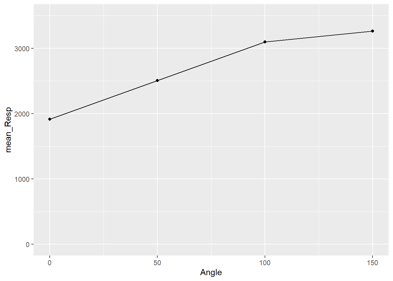
Figure 3.9: Basic Scatterplot of Response Time by Angle of Rotation
Thinking Cap Point
Great, you have replicated the figure! However, do you know what it means? What does the figure tell you about mean reaction time and angle of rotation, and how does it fit with the overall theory we introduced above? Answering this question may help:
- From the options, the figure would suggest that as angle of rotation increases:
As you can see from the figure, consistent with Shepard and Metzler (1971), the participants from Ganis and Kievit (2016) showed an increase in reaction time as the angle of rotation increased. Therefore, Ganis and Kievit (2016) have replicated the findings of Shepard and Metzler (1971).
A quick note though is that, yes, mean reaction time does increase with angle of rotation, but it is not a consistent increase. You will see that the difference between mean reaction times for 150 and 100 degrees is smaller than between 0 and 50. Reaction times start to plateau after a certain angle of rotation.
3.3.4 Task 3: Examining Additional Variable Effects
In the previous section, we looked at sex of participant and that was quite interesting. It is not covered in Ganis and Kievit (2016), so let us take a look at it for them.
- To your pipeline of Task 2, add the variable
Sexto thegroup_by()function to group the data byAngleandSex. - Running the code again creates the below figure.
Remember, to add more grouping variables just separate them by a comma. Everything else in our code stays the same.
## `summarise()` has grouped output by 'Angle'. You can override using the
## `.groups` argument.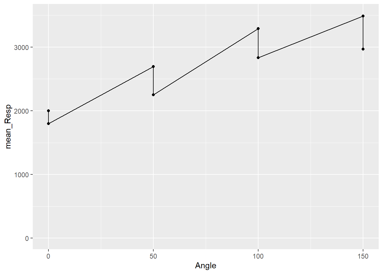
Figure 3.10: Separating points by Sex
Hmmm, that figure does not look that informative. It looks similar to the one we created but the dots have doubled - we now have 8 instead of 4 - but we do not know which is male or female, and the connecting line is confusing. We need to add a little more to the code to tell it how to separate the data based on Sex.
3.3.5 Task 4: Grouping the Figure Data
- In the previous section we used
fillandcolorinside theaes()to change basic information about the figure. There is also one calledgroup. Add agroupcall inside youraes(...)to separate the data bySex. - Run the code again and see what your figure looks like
ggplot(....., aes(x = , y = , group = ???))
You should now at least see different lines for the two sex, but we still can't tell which sex is which line, can we? It just looks like two black parallel lines, one slightly higher than the other. What would be ideal would be changing the color of the points based on whether they are from male or female participants! Fortunately, the geoms can also take information as well.
3.3.6 Task 5: Identifying Groups Using aes()
- Add an
aes()call inside yourgeom_point()function tocolorthe dots bySex.
geom_point(aes(??? = ???)
You should now have something like this:
## `summarise()` has grouped output by 'Angle'. You can override using the
## `.groups` argument.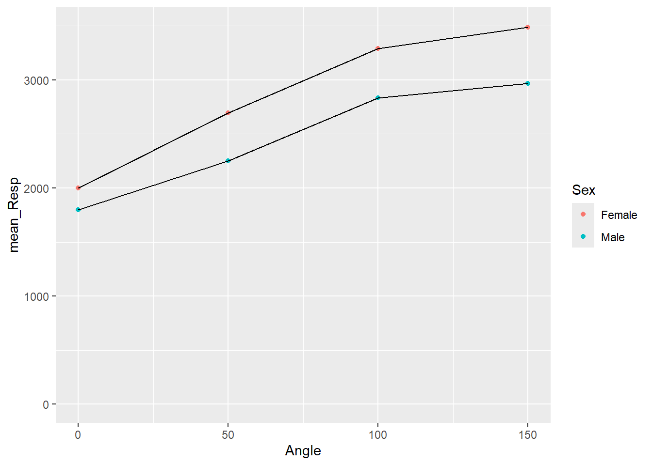
Figure 3.11: Separate lines for each Sex
Great! We can now see that the female line is on top and the male line is on the bottom. But before we start interpreting this figure let's finish tidying it up with a few more tasks. For example the dots for each data point are perhaps a little small to see, so we could increase them in size. Also, color is great if you can print in color, but we could also change the shape of the dots to help people distinguish between the Sex for when displaying in color isn't an option. To do this we will use the additional calls of shape and size within our geom_point().
3.3.7 Task 6: Changing the Shape and Size of Data Points
We want each Sex to have different shaped points, so add a call to
shapewithin theaes()call of ourgeom_point()function, just like you did for color.However, we want each Sex to have the same size of point, so add a call to
sizewithin thegeom_point()function, but not inside theaes()call. Set an appropriate number for the size instead of naming a variable. Maybesize = 3?
geom_point(aes(color = Sex, Shape = ???), size = ???)
This should give you a figure like this:
## `summarise()` has grouped output by 'Angle'. You can override using the
## `.groups` argument.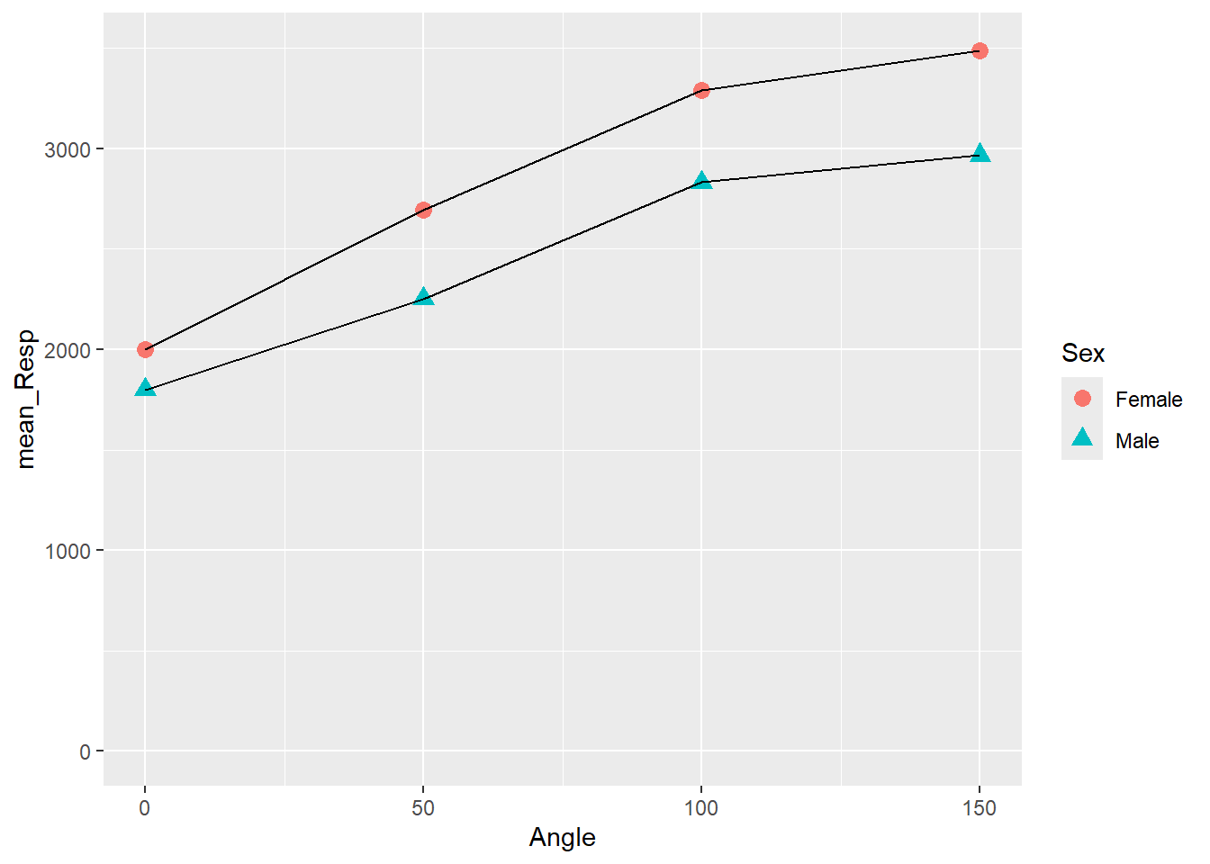
Figure 3.12: Changing Shape and Size of Data Points
A quick point - in, out, what's the aes about?
Hopefully you are beginning to spot the difference between setting a call within aes() (which stands for aesthetics) and setting outside the aes(). Outside aes() means that all observations take the one value or color or type. Inside means that each observation within a condition takes the same value or color or type, but different conditions have different values/color/type.
Let's look at what we have done above to help us compare:
sizeis called outside of theaes()and we assign it a specific value. As you can see from the Task 6 figure, each condition now has the same size of points. We could set this size to what we want, but keep it smallish: 3 or 5 are ok; 50 would be artistic, but not that informative. Had we set the size withinaes(), something likegeom_point(aes(shape = Sex, size = Sex))then both male and female would have different shapes AND different sizes. You can play around with this in your code to see how things work.In contrast, we called
shapeinside theaes()and we set it based on a variable,Sex. Doing it this way ensures that each level of theSexvariable, male or female, get a different shape. Had we instead setshapeoutside theaes(), something likegeom_point(shape = 3, size = 3)then all conditions would have the same shape and the same size. Different numbers relate to different shapes and different sizes. For example compareshape = 3toshape = 13
There are other arguments you could use: For example, if you wanted all points to have the same color, say red for example, then you could do geom_point(color = "red"). Remember to put the quotes around the color.
So hopefully this is starting to make sense and you can think about implementing it in your own figures. Note that arguments are separated by a comma. e.g. geom_point(color = "red", size = 3, shape = 2).
3.3.8 Task 7: Adding Labels and Changing the Background
This figure is looking really nice now. Let's finish it off by adding appropriate labels and editing the background. We introduced these to you in the previous section so hopefully you had a play with them to see how they work.
To change a label, we use the labs() function and it works like labs(x = "Name", y = "Name", title = "Name").
Add this function to your code so that the y-axis indicates
Mean Reaction Time (ms)and the x-axis indicatesAngle of Rotation (degrees). We haven't set a title here, but you can if you want some practice. Titles on Psychology figures are not common.Set the figure as
theme_bw()- this looks nice, but there are other options you might want to try which you can explore through?themeor the cheatsheet.
labs(x = "...", y = "...") + theme_bw()
The key thing is to remember to + the layer into the
ggplot chain. And don’t get this confused with pipes (%>%).
Note: You add (+) layers to figures, and you pipe (%>%) between functions.
3.3.9 Task 8: Separating a Variable and Removing Legends
Finally, we showed you two other functions that you could use to tidy up figures: facet_wrap() and guides().
facet_wrap()is really effective for splitting up figures into panels based on a variable; it works likefacet_wrap(~variable)where~can be read asby. So "split up the figure by variable", for exampleSex. And if you had two variables to split the figure by, then:facet_wrap(~variable1 + variable2).guides()is handy for turning legends on and off which might be taking up space. For instance, if you use afacet_wrap()to split the panels into Female and Male, do you really need the legend on the right saying Female and Male? You will normally have a guide for all thecolor,shape,etc, calls you have in your pipeline within youraes()calls. It works likeguide(call = FALSE).
Add a
facet_wrap()to have separate panels in your figure based onSex.Turn off all guides so that you do not have a legend in your figure.
-
facet_wrap(~variable) -
guides(group = FALSE, ???? = False, ....)
Thinking Cap Point
If you have followed all the tasks correctly, then you should have the following figure:
## `summarise()` has grouped output by 'Sex'. You can override using the `.groups`
## argument.## Warning: The `<scale>` argument of `guides()` cannot be `FALSE`. Use "none" instead as
## of ggplot2 3.3.4.
## This warning is displayed once every 8 hours.
## Call `lifecycle::last_lifecycle_warnings()` to see where this warning was
## generated.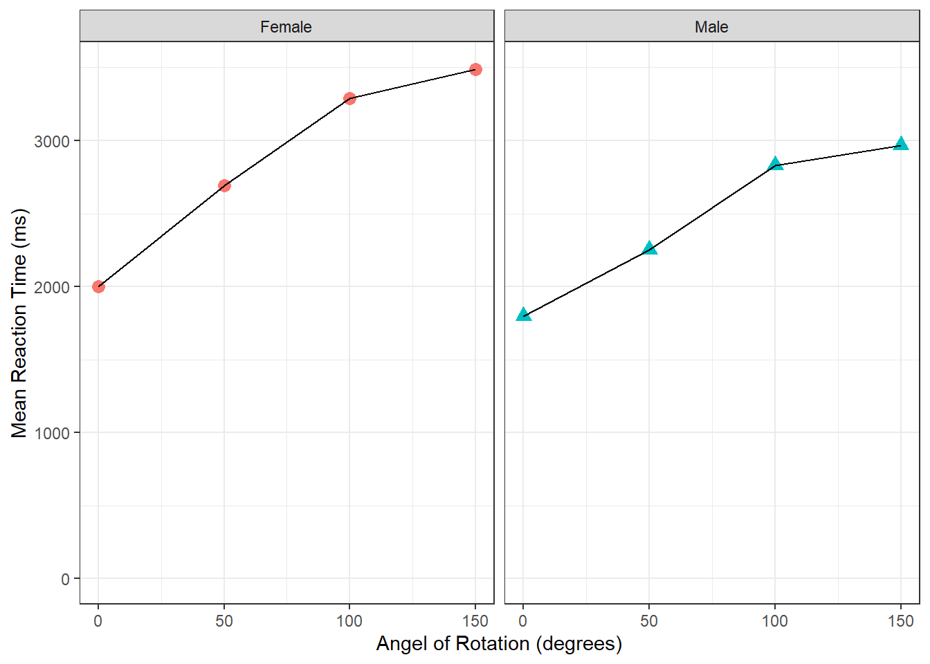
Figure 3.13: The finished figure!
Take a few minutes to look at the figure and try to interpret it in terms of reaction time as a function of rotation and sex. Try answering the following questions:
In both sexes, mean reaction time angle of rotation.
Angle of Rotation influences more than
By looking at the figure, as angle of rotation increases (moving to the right of the x-axis), the mean reaction time increases (getting higher on the y-axis), indicating that participants take longer to respond the further the target image is rotated from the original. Also, as the male mean reaction times are quicker overall than the female mean reaction times, and the differences in reaction times between 0 degrees and 150 degrees is smaller in males, then you could perhaps say that males are affected less than females, or males perform the task quicker.
Keep in mind that we are only looking at correct responses here. As such, this figure would suggest the difference is not just male participants just responding quicker overall; instead it may suggest that males are responding correctly quicker overall.
Differences in mental rotation tasks have received much attention over the years and you should refer to the reference sections of the two main papers of this activity should you wish to follow the topic further.
3.3.10 Final Considerations
- Many of the options we have seen in terms of
geom_point()could have been applied togeom_line()to make alterations to the line. Try playing with these options. For example, the code line below would result in both sexes having a red line of equal size, but the style of line being different. Give it a shot!
geom_line(aes(linetype = Sex), size = .5, color = "red")
- Finally, if you look closely at the figure, you will see that the line between points actually goes in front of the points. It looks a bit messy. How could you make it tidier by having the line run behind the data points? Not sure? Remember that figures are constructed based on a series of layers. We draw one layer and then the next, so try changing Task 8 to draw the lines first and then the points on top. Give it a go!
ggplot(data = menrot_facet_guide, aes(x = Angle, y = mean_Resp, group = Sex)) +
  geom_line() +
  geom_point(aes(color = Sex, shape = Sex), size = 3) +
  coord_cartesian(ylim = c(0, 3500), expand = TRUE) +
  labs(x = "Angel of Rotation (degrees)", y = "Mean Reaction Time (ms)") +
  facet_wrap(~Sex) +
  guides(group = FALSE, color = FALSE, shape = FALSE) +
  theme_bw()
In this chapter we have looked at working with layers and a variety of calls to shape, color, fills, etc, to create professional looking figures. Understanding figures through ggplot can seem like trial and error until you have a lot of experience. The beauty of it all is that once you have a figure you really like, you run the code and you get exactly the same figure again.
3.4 Practice Your Skills
In order to complete these tasks you will need to download the data .csv files and the .Rmd file, which you need to edit, titled Ch3_PracticeSkills_Visualisations.Rmd. These can be downloaded within a zip file from the below link. Once downloaded and unzipped, you should create a new folder that you will use as your working directory; put the data files and the .Rmd file in that folder and set your working directory to that folder through the drop-down menus at the top. Download the Exercises .zip file from here.
Now open the .Rmd file within RStudio. You will see there is a code chunk for each task. Follow the instructions on what to edit in each code chunk. This will often be entering code based on what we have covered up until this point.
Happy Data Visualising!
3.5 Solutions to Questions
Below you will find the solutions to the questions for the Activities for this chapter. Only look at them after giving the questions a good try and speaking to the tutor about any issues.
3.5.1 Data Visualisation Application
3.5.1.1 Task 1
library("tidyverse")

menrot <- read_csv("MentalRotationBehavioralData.csv")
demog <- read_csv("demographics.csv")3.5.1.2 Task 2
menrot_angle <- filter(menrot, CorrectResponse == "Correct") %>%
  inner_join(demog, "Participant") %>%
  group_by(Angle) %>%
  summarise(mean_Resp = mean(Time))

ggplot(data = menrot_angle, aes(x = Angle, y = mean_Resp)) +
  geom_point() +
  geom_line() +
coord_cartesian(ylim = c(0, 3500), expand = TRUE)-
coord_cartesian()is a function that can be used to show certain parts of a figure, controlling the visible X and Y axes.expand = TRUEadds a smaller buffer to the numbers you set. If you want to remove this buffer then setexpand = FALSE.
3.5.1.3 Task 3
menrot_angle_sex <- filter(menrot, CorrectResponse == "Correct") %>%
  inner_join(demog, "Participant") %>%
  group_by(Angle, Sex) %>%
  summarise(mean_Resp = mean(Time))

ggplot(data = menrot_angle_sex, aes(x = Angle, y = mean_Resp)) +
  geom_point() +
  geom_line() +
coord_cartesian(ylim = c(0, 3500), expand = TRUE)3.5.1.4 Task 4
menrot_grouped <- filter(menrot, CorrectResponse == "Correct") %>%
  inner_join(demog, "Participant") %>%
  group_by(Angle, Sex) %>%
  summarise(mean_Resp = mean(Time))

ggplot(data = menrot_grouped, aes(x = Angle, y = mean_Resp, group = Sex)) +
  geom_point() +
  geom_line() +
coord_cartesian(ylim = c(0, 3500), expand = TRUE)3.5.1.5 Task 5
menrot_grouped_color <- filter(menrot, CorrectResponse == "Correct") %>%
  inner_join(demog, "Participant") %>%
  group_by(Angle, Sex) %>%
  summarise(mean_Resp = mean(Time))

ggplot(data = menrot_grouped_color, aes(x = Angle, y = mean_Resp, group = Sex)) +
  geom_point(aes(color = Sex)) +
  geom_line() +
coord_cartesian(ylim = c(0, 3500), expand = TRUE)3.5.1.6 Task 6
menrot_shape_size <- filter(menrot, CorrectResponse == "Correct") %>%
  inner_join(demog, "Participant") %>%
  group_by(Angle, Sex) %>%
  summarise(mean_Resp = mean(Time))

ggplot(data = menrot_shape_size, aes(x = Angle, y = mean_Resp, group = Sex)) +
  geom_point(aes(color = Sex, shape = Sex), size = 3) +
  geom_line() +
coord_cartesian(ylim = c(0, 3500), expand = TRUE)3.5.1.7 Task 7
menrot_lab_theme <- filter(menrot, CorrectResponse == "Correct") %>%
  inner_join(demog, "Participant") %>%
  group_by(Angle, Sex) %>%
  summarise(mean_Resp = mean(Time))

ggplot(data = menrot_lab_theme, aes(x = Angle, y = mean_Resp, group = Sex)) +
  geom_point(aes(color = Sex, shape = Sex), size = 3) +
  geom_line() +
  coord_cartesian(ylim = c(0, 3500), expand = TRUE) +
  labs(x = "Angel of Rotation (degrees)", y = "Mean Reaction Time (ms)") +
theme_bw()3.5.1.8 Task 8
manrot_facet_guide <- filter(menrot, CorrectResponse == "Correct") %>%
  inner_join(demog, "Participant") %>%
  group_by(Angle, Sex) %>%
  summarise(mean_Resp = mean(Time))
## `summarise()` has grouped output by 'Angle'. You can override using the
## `.groups` argument.
ggplot(data = manrot_facet_guide, aes(x = Angle, y = mean_Resp, group = Sex)) +
  geom_point(aes(color = Sex, shape = Sex), size = 3) +
  geom_line() +
  coord_cartesian(ylim = c(0, 3500), expand = TRUE) +
  labs(x = "Angel of Rotation (degrees)", y = "Mean Reaction Time (ms)") +
  facet_wrap(~Sex) +
  guides(group = FALSE, color = FALSE, shape = FALSE) +
  theme_bw()
## Warning: The `<scale>` argument of `guides()` cannot be `FALSE`. Use "none" instead as
## of ggplot2 3.3.4.
## This warning is displayed once every 8 hours.
## Call `lifecycle::last_lifecycle_warnings()` to see where this warning was
## generated.
Figure 3.14: Task 8
- Remembering it is a layer system, we could use the below code to have the lines behind the points.
manrot_facet_guide <- filter(menrot, CorrectResponse == "Correct") %>%
  inner_join(demog, "Participant") %>%
  group_by(Angle, Sex) %>%
  summarise(mean_Resp = mean(Time))
## `summarise()` has grouped output by 'Angle'. You can override using the
## `.groups` argument.
ggplot(data = manrot_facet_guide, aes(x = Angle, y = mean_Resp, group = Sex)) +
  geom_line() +
  geom_point(aes(color = Sex, shape = Sex), size = 3) +
  coord_cartesian(ylim = c(0, 3500), expand = TRUE) +
  labs(x = "Angel of Rotation (degrees)", y = "Mean Reaction Time (ms)") +
  facet_wrap(~Sex) +
  guides(group = FALSE, color = FALSE, shape = FALSE) +
  theme_bw()
Figure 3.15: Task 8 Alternative
3.5.2 Practice Your Skills
Check your work against the solution to the tasks here: Chapter 3 Practice Your Skills Solution.
3.6 Additional Material
Below is some additional material that might help you understand figures a bit more and how to present them in reports. Thus, if you want further clarification on the aes() call or want to know how to combine several plots into one, then read on!
3.6.1 More on aes()
In this chapter, we added a short note about using the aes() call, but we see people having issues with this so we thought a quick demonstration might help. Here is the code from the previous activity:
menrot_angle_sex <- filter(menrot, CorrectResponse == "Correct") %>%
  inner_join(demog, "Participant") %>%
  group_by(Angle, Sex) %>%
  summarise(mean_Resp = mean(Time))
## `summarise()` has grouped output by 'Angle'. You can override using the
## `.groups` argument.
ggplot(data = menrot_angle_sex, aes(x = Angle, y = mean_Resp, group = Sex)) +
  geom_point(aes(color = Sex, shape = Sex), size = 3) +
  geom_line() +
  coord_cartesian(ylim = c(0, 3500), expand = TRUE) +
  theme_gray()
Figure 3.16: Changing Shape and Size of Data Points
Specifically, we are going to focus on the geom_point() line. Inside the aes() we stated color = Sex, shape = Sex and outside the aes() we stated, size = 3. Earlier we said, outside aes() means that all observations take the one value or color or type. Inside means that each observation within a condition takes the same value or color or type, but different conditions have different values/color/type. So based on that understanding, in the above plot, all shapes have the same size (i.e., 3), but there is a different shape and color of shape for each sex. Now let's demonstrate some alternatives.
- All points have the same shape, color and size - nothing is in an
aes().- here we need to state the color, shape and size we want all observations to have. We have chosen red for color (in quotes) shape style 3 (+) and size 6. We are not using a variable to split observations into groups.
- we have changed the size to make the visualisation clearer
ggplot(data = menrot_angle_sex, aes(x = Angle, y = mean_Resp, group = Sex)) +
  geom_point(color = "red", shape = 3, size = 6) +
  geom_line() +
  coord_cartesian(ylim = c(0, 3500), expand = TRUE) +
  theme_bw()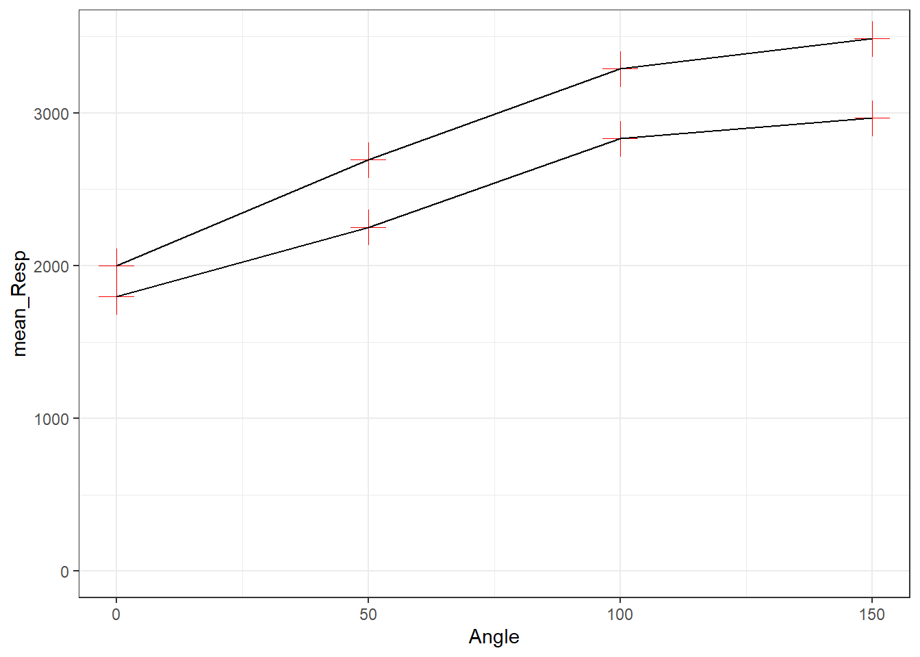
Figure 3.17: All points have the same shape, color and size
- All points have the same shape and size, but color is determined by
Sex(so goes inside theaes()).- here we need to state the shape and size we want all dots to have. But this time we are giving the different levels within
Sex(i.e., male and female) different colors - by putting that inside theaes()
- here we need to state the shape and size we want all dots to have. But this time we are giving the different levels within
ggplot(data = menrot_angle_sex, aes(x = Angle, y = mean_Resp, group = Sex)) +
  geom_point(aes(color = Sex), shape = 3, size = 6) +
  geom_line() +
  coord_cartesian(ylim = c(0, 3500), expand = TRUE) +
  theme_bw()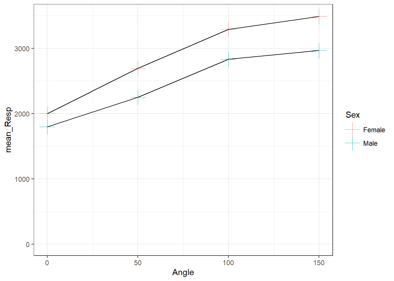
Figure 3.18: All points have the same shape and size but color is determined by Sex
- We showed the code for setting color and shape by
Sexpreviously. Instead now we will set the color, shape and size by the variableSex.- here as all options are in the
aes()we will have different colors, sizes, and shapes between males and females, but all males will have the same color, size and shape, and all females will have the same color size and shape.
- here as all options are in the
ggplot(data = menrot_angle_sex, aes(x = Angle, y = mean_Resp, group = Sex)) +
  geom_point(aes(color = Sex, shape = Sex, size = Sex)) +
  geom_line() +
  coord_cartesian(ylim = c(0, 3500), expand = TRUE) +
  theme_bw()
## Warning: Using size for a discrete variable is not advised.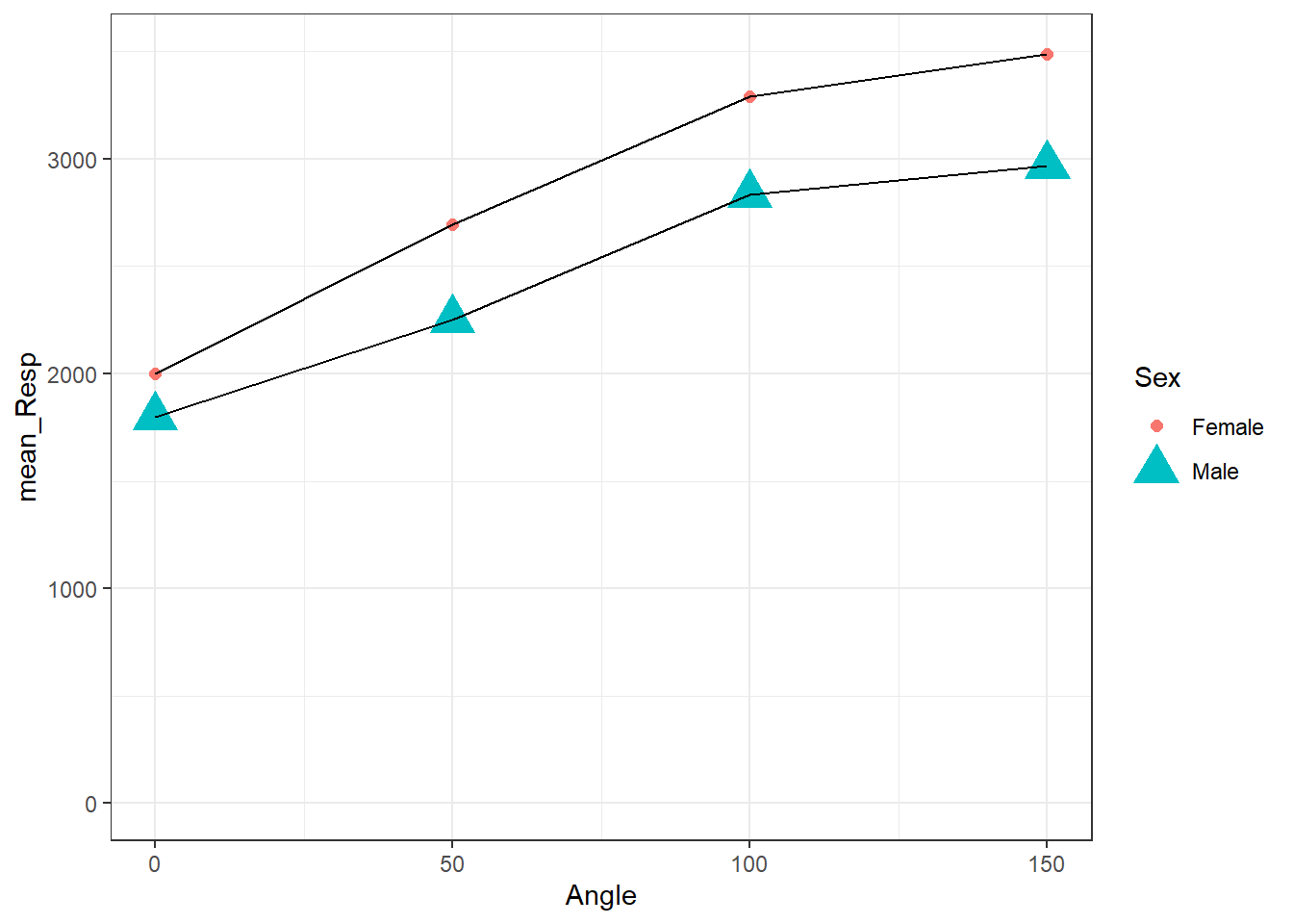
Figure 3.19: All points have the same shape and size but color is determined by Sex
You actually get a warning when doing this option. Why? Because if you had numerous options then you would have too many different shapes being created and it would cause issues with the code and may even crash it. Pay attention to warnings.
And the reason you have to decide what is the best approach for displaying your data is because if all observations within a condition are the same, then showing them as all different colors and shapes makes very little sense. You always need to think about what you are trying to convey. Look at these two figures and think about which one is easier to understand that all observations are from the same condition. The one on the left! The one on the right suggests there is something different about all the observations.
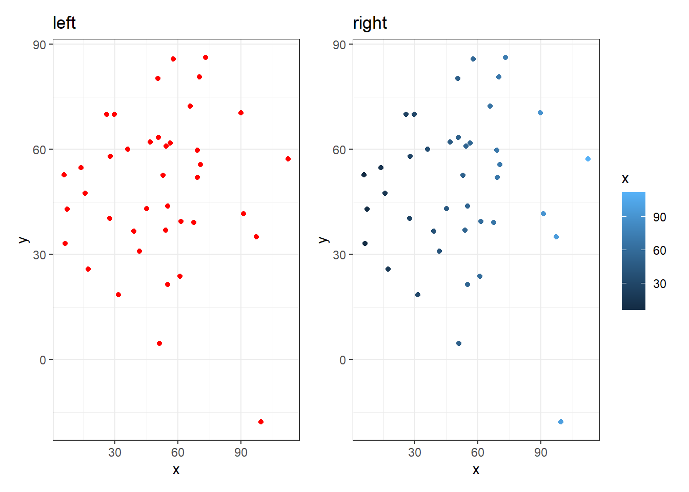
Figure 3.20: The plot on the left suggests all observations are of the same condition. The figure on the right suggests a difference between all observations. Always think about what your information you convey in your figures!
Hopefully that is beginning to become clearer. Insider the aes() means that all observations within a variable/condition are shown the same, but are different from observations from a different variable/condition. Outside the aes() means that all observations are shown as the same regardless of condition.
3.6.2 Combining Plots into one Figure
Space within a report is a commodity. Figures can be incredibly useful in getting information across in a very efficient manner, but when you have a strict word count, having multiple figures can really chew into the limit, given that each figure needs a legend and each legend counts. One way to get around this is to merge figures together into one big figure that perhaps convey similar or related information. We are going to show you how to do that using a package called patchwork.
patchwork is unlikely to be on our lab machines so
please only try this on your own machine. If you haven’t previously
installed the patchwork package on your own machine before,
you will have to install it first,
e.g. install.packages("patchwork").
Plots like boxplots and histograms, when combined, can be incredibly useful in understanding the overall shape of your data and whether or not it fits the assumptions of inferential tests, something we will come on to later. If we were to create two separate plots, we might get something like this:
menrot_hist_correct <- group_by(menrot, Participant, CorrectResponse) %>%
  summarise(Mean_Time = mean(Time, na.rm = TRUE)) %>%
  filter(CorrectResponse == "Correct") %>%
  inner_join(demog, "Participant")

ggplot(data = menrot_hist_correct,
       aes(x = Mean_Time,
           fill = Sex)) +
  geom_histogram() +
  theme_bw()
Figure 3.21: A histogram of distribution of Mean Time counts by Sex
And:
menrot_box_correct <- group_by(menrot, Participant, CorrectResponse) %>%
  summarise(Mean_Time = mean(Time, na.rm = TRUE)) %>%
  filter(CorrectResponse == "Correct") %>%
  inner_join(demog, "Participant")
## `summarise()` has grouped output by 'Participant'. You can override using the
## `.groups` argument.
ggplot(data = menrot_box_correct,
       aes(x = CorrectResponse,
           y = Mean_Time,
           fill = Sex)) +
  geom_boxplot() +
  theme_bw()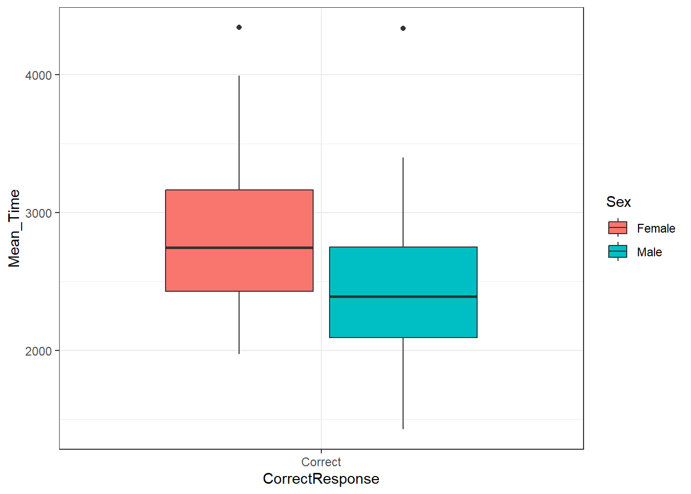
Figure 3.22: A boxplot of the spreads of Mean Time for Correct Responses by Sex
Now given that they both divide the data by sex, you can start to see how the figure legend for each plot becomes a bit repetitive, and how combining them into one figure would potentially make things easier. There are a number of packages to do this, but patchwork is very straightforward and flexible.
Let's now call in patchwork
The first thing you need to do when using patchwork is save your plots in an object (just like you would with the output of any function). Using the code above, this might look like below for the boxplot:
p_box <- ggplot(data = menrot_box_correct,
       aes(x = CorrectResponse,
           y = Mean_Time,
           fill = Sex)) +
  geom_boxplot() +
  labs(title = "A") +
  theme_bw()
And below for the histogram:
p_hist <- ggplot(data = menrot_hist_correct,
       aes(x = Mean_Time,
           fill = Sex)) +
  geom_histogram() +
  labs(title = "B") +
  theme_bw()
Note: The reason for the inclusion of a title on each plot will become clear in a second.
Note: When you run these codes no plots will be generated as you are saving them as objects - the boxplot in p_box and the histogram in p_hist. It is important to realise this distinction as if someone asks you to make produce a code where the figure is generated when your code knits, and you have saved your plot as an object, then your figure might not show. If you have save a plot as an object, you can generate the figure by just calling the name of the object. If you look at the ggplot cheatsheet you will see this approach a lot. Here is how we would call the boxplot stored in p_box.
p_box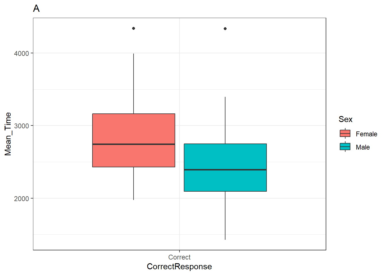
Figure 3.23: A boxplot of the spreads of Mean Time for Correct Responses by Sex
p_hist## `stat_bin()` using `bins = 30`. Pick better value with `binwidth`.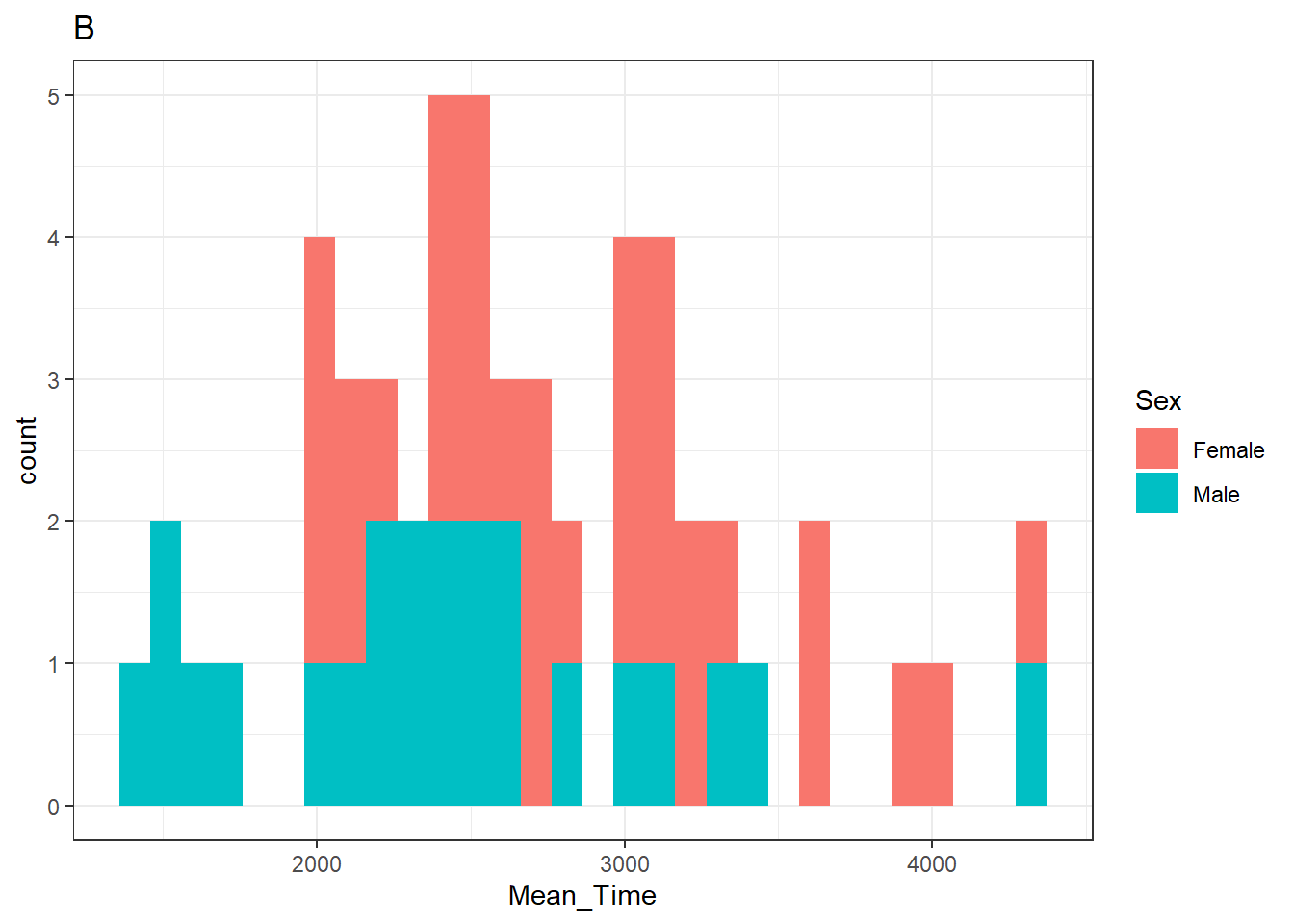
Figure 3.24: A histogram of distribution of Mean Time counts by Sex
Note: You will see a warning from the histogram plot about selecting a binwidth. We haven't really looked at this yet but will do in due course. If you wanted to "fix" that warning then changing the histrogram code to something like + geom_histogram(binwidth = 100) might work. The value that you enter is relative to the scale of your data. A binwidth of 1 would create a bin every increase of 1 ms. A binwidth of 100 creates a bin every 100 ms.
So far so nothing exciting. Looks just like what we have seen before. Didn't we say we wanted both the plots in a single figure, right? Well to do that in patchwork, we simply "add" the plots together using a plus sign (+), as such:
p_box + p_hist## `stat_bin()` using `bins = 30`. Pick better value with `binwidth`.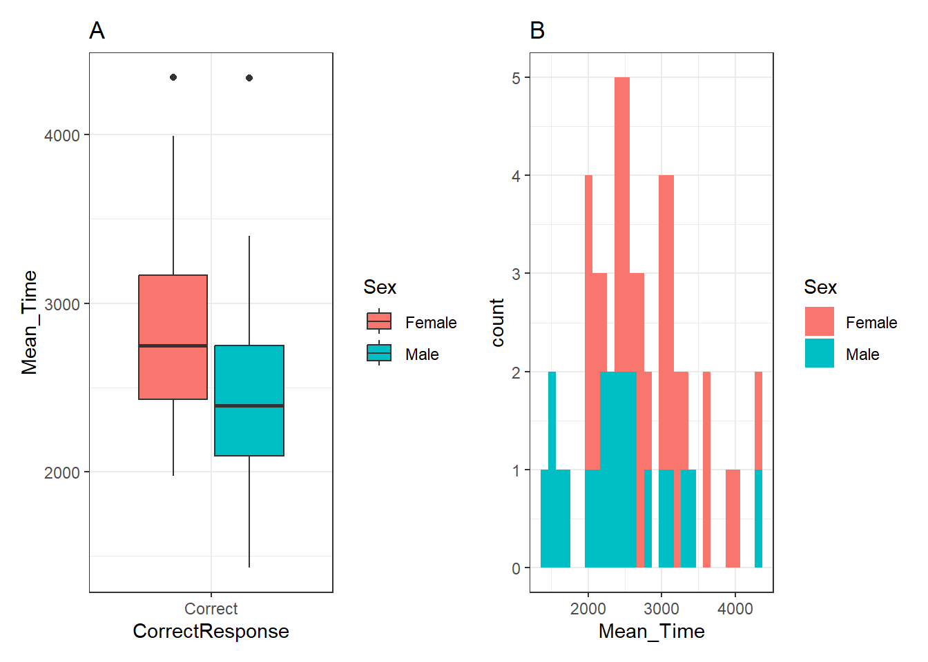
Figure 3.25: A boxplot (A - left) of the spreads of Mean Time for Correct Responses, and histogram (B - right) of distribution of Mean Time counts, both separated by Sex (female - red, male - cyan)
Note: We can use the "titles"" we added to the plots in the original code above to tell readers which plot, within the combined figure, we are referring to, A or B, left or right, as shown in the figure legend beneath the figure. This might seem a bit pedantic, but you have no control over how somebody views your published figure, and as such clarity is paramount!
Awesome, that it? No! We can also change the configuration of the plots in the combined figure. Say we wanted the plots on top of each other - portrait rather than landscape - well in that instance we divide the plots using the divide sign (/), as such:
p_box / p_hist## `stat_bin()` using `bins = 30`. Pick better value with `binwidth`.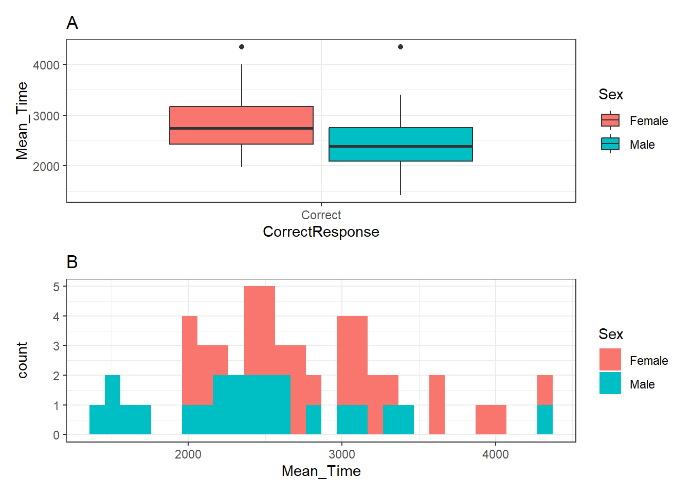
Figure 3.26: A boxplot (A - top) of the spreads of Mean Time for Correct Responses, and histogram (B - bottom) of distribution of Mean Time counts, both separated by Sex (female - red, male - cyan)
And now we refer to top and bottom, rather than left and right. In fact, patchwork is really flexible and can work with multiple plots and arrangements. Hypothetically, say you had three plots and wanted two on top of one, then you would use the approach of combining "+" and "/" as such:
(plot1 + plot2)/plot3Remember the trick to using patchwork is to save your plots as objects first (p1 <- ggplot(....)) and the rest is easy. But be sure to always know if your figure is to be shown when knitted or not; more often than not, seeing the figure is more important than seeing the code.
Happy Visualising!
End of Additional Material!