1 No Poverty
![]()
End poverty in all its forms everywhere
1.1 Original Data
Source: World Bank (2025), Poverty and Inequality Platform (version 20250401_2021_01_02_PROD) [data set]. pip.worldbank.org. Accessed on 2025-08-05
Download all country data from https://pip.worldbank.org/poverty-calculator
Column names are below, with my best guess at the meaning for some columns. You can learn more at the methodology handbook.
- region_name
- region_code: “SSA” “ECA” “OHI” “LAC” “SAS” “EAP” “MNA”
- country_name
- country_code: 3-letter country code
- reporting_year: 1963 - 2024
- reporting_level: “national”, “urban”, or “rural”
- survey_acronym
- survey_coverage
- survey_year
- welfare_type
- survey_comparability
- comparable_spell
- poverty_line
- headcount: The poverty headcount ratio measures the proportion of the population that is counted as poor
- poverty_gap: The poverty gap index is a measure that adds up the extent to which individuals on average fall below the poverty line (i.e. the depth of poverty), and expresses it as a percentage of the poverty line.
- poverty_severity: The poverty severity index is a measure of the weighted sum of poverty gaps (as a proportion of the poverty line), where the weights are the proportionate poverty gaps themselves.
- watts: The Watts index is an inequality-sensitive poverty measure
- mean: Average welfare per capita
- median: The median is the amount of welfare per capita that divides the distribution into two equal halves.
- mld: The mean log deviation belongs to the family of generalized entropy inequality measures
- gini: The Gini index ranges from 0 (perfect equality) to 1 (complete inequality)
- polarization: The Wolfson polarization index measures the extent to which the distribution of welfare is “spread out” and bi-modal.
- decile1:decile10
- cpi: Consumer Price Index
- ppp: Purchasing Power Parity
- reporting_pop
- reporting_gdp
- reporting_pce
- is_interpolated
- distribution_type
- estimation_type
- spl
- spr
- pg: The prosperity gap is the average factor by which incomes fall short of a prosperity standard of $28 per person per day (expressed in 2021 PPP dollars)
- estimate_type
Plot Code
count(pip, region_name, country_name, reporting_year) |>
  count(region_name, reporting_year) |>
  ggplot(aes(y = fct_rev(region_name), x = reporting_year, fill = n)) +
  geom_tile() +
  scale_fill_viridis_c(limits = c(0, 30),
    guide = guide_colourbar(
      position = "inside",
      nbin = 4,
      display = "rectangles",
      draw.ulim = TRUE
    )) +
  scale_x_continuous(breaks = seq(1960, 2030, 10)) +
  labs(x = NULL,
       y = NULL,
       fill = NULL) +
  theme(legend.position.inside = c(.06, .7),
        legend.key.height = unit(0.4, "cm"),
        legend.background = element_blank())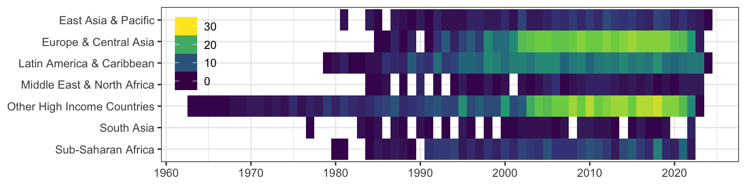
1.2 Simplified Subsets
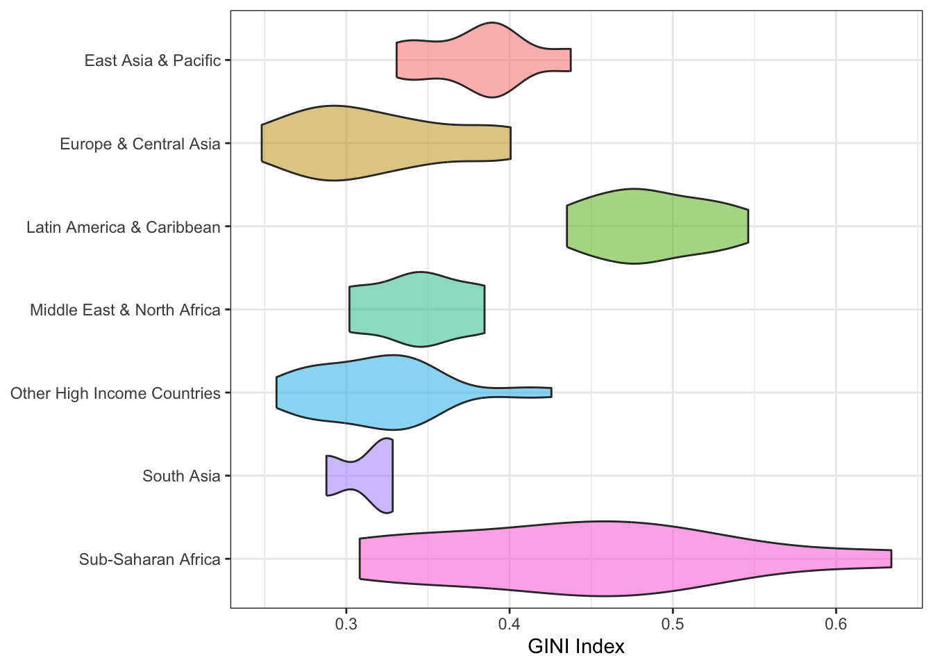
1.2.1 GINI 2010
This data set provides the GINI index for each country, at the national reporting_level, in the reporting_year 2010. Where there is more than one survery per country, we choose the first.
This data set is good for distribution plots and descriptive analyses, grouped by world region.
| region_name | region_code | country_name | country_code | reporting_year | reporting_level | gini |
|---|---|---|---|---|---|---|
| Europe & Central Asia | ECA | Armenia | ARM | 2010 | national | 0.2999258 |
| Other High Income Countries | OHI | Australia | AUS | 2010 | national | 0.3465673 |
| Other High Income Countries | OHI | Austria | AUT | 2010 | national | 0.3025166 |
| Other High Income Countries | OHI | Belgium | BEL | 2010 | national | 0.2837483 |
| South Asia | SAS | Bangladesh | BGD | 2010 | national | 0.3213032 |
| Europe & Central Asia | ECA | Bulgaria | BGR | 2010 | national | 0.3565347 |
Plot Code
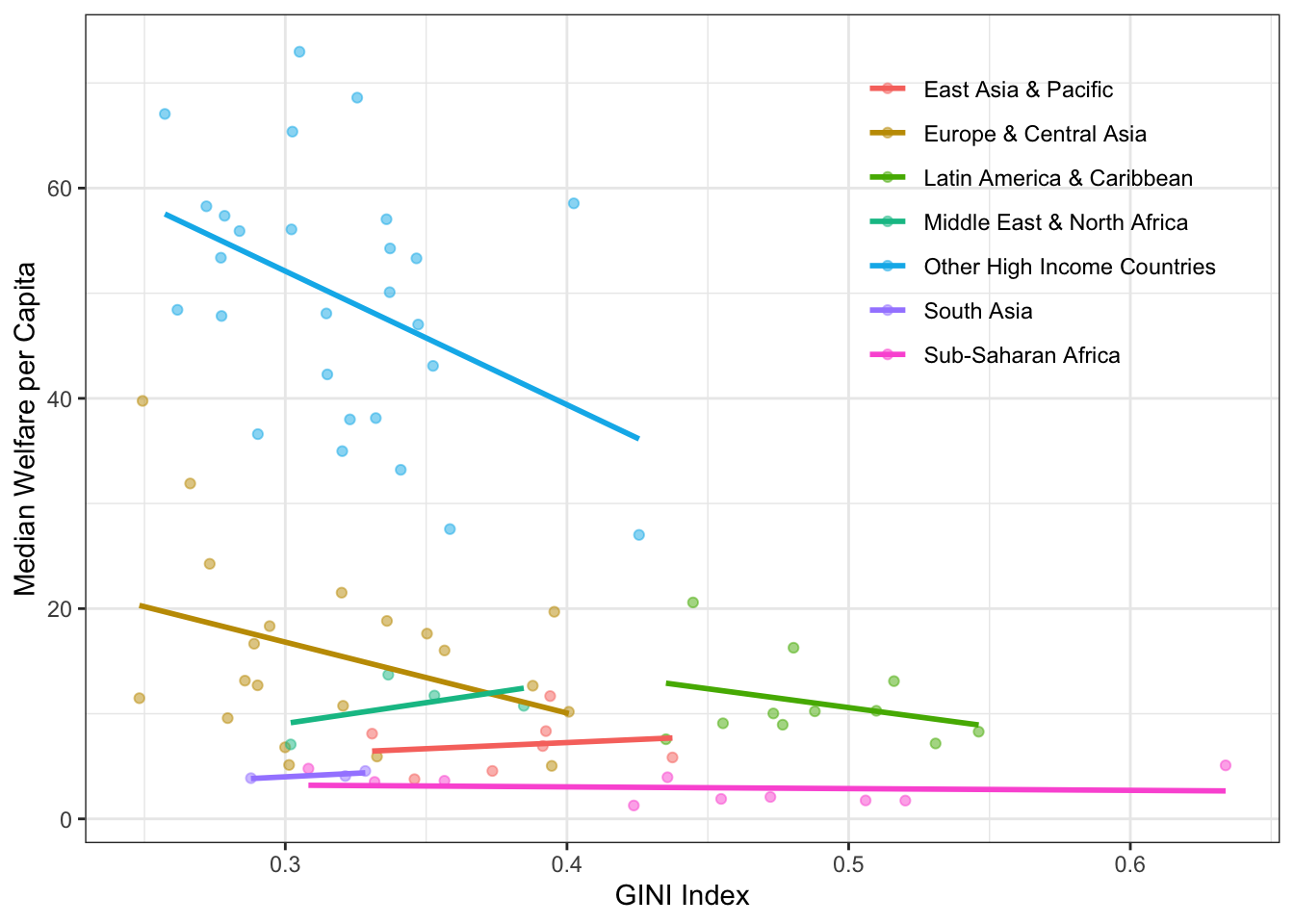
1.2.2 Welfare 2010
This data file provides the mean and median welfare per capita for all countries, at the national reporting_level, in the reporting_year 2010. Where there is more than one survey per country, we choose the first.
In combination with the Gini set above, it is good for teaching about data joining. The resulting set is good for plotting the relationship between two continuous variables and related descriptive and inferential statistics.
| region_name | region_code | country_name | country_code | reporting_year | reporting_level | mean | median |
|---|---|---|---|---|---|---|---|
| Europe & Central Asia | ECA | Armenia | ARM | 2010 | national | 8.182075 | 6.806526 |
| Other High Income Countries | OHI | Australia | AUS | 2010 | national | 66.453958 | 53.316423 |
| Other High Income Countries | OHI | Austria | AUT | 2010 | national | 75.037370 | 65.371284 |
| Other High Income Countries | OHI | Belgium | BEL | 2010 | national | 63.008029 | 55.914805 |
| South Asia | SAS | Bangladesh | BGD | 2010 | national | 5.127794 | 4.074886 |
| Europe & Central Asia | ECA | Bulgaria | BGR | 2010 | national | 19.126000 | 16.019157 |
Plot Code
inner_join(pip_gini_2010, pip_welfare_2010,
           by = c("region_name", "region_code", "country_name", "country_code", "reporting_year", "reporting_level")) |>
  ggplot(aes(x = gini, y = median, colour = region_name)) +
  geom_point(alpha = 0.5) +
  geom_smooth(method = lm, formula = y ~ x, se = F) +
  scale_x_continuous(breaks = seq(0, 1, .1)) +
  labs(x = "GINI Index", y = "Median Welfare per Capita", colour = NULL) +
  scale_color_discrete(
    guide = guide_legend(position = "inside")
  ) +
  theme(
    legend.position.inside = c(.8, .75),
    legend.background = element_blank(),
    legend.key = element_blank()
  )
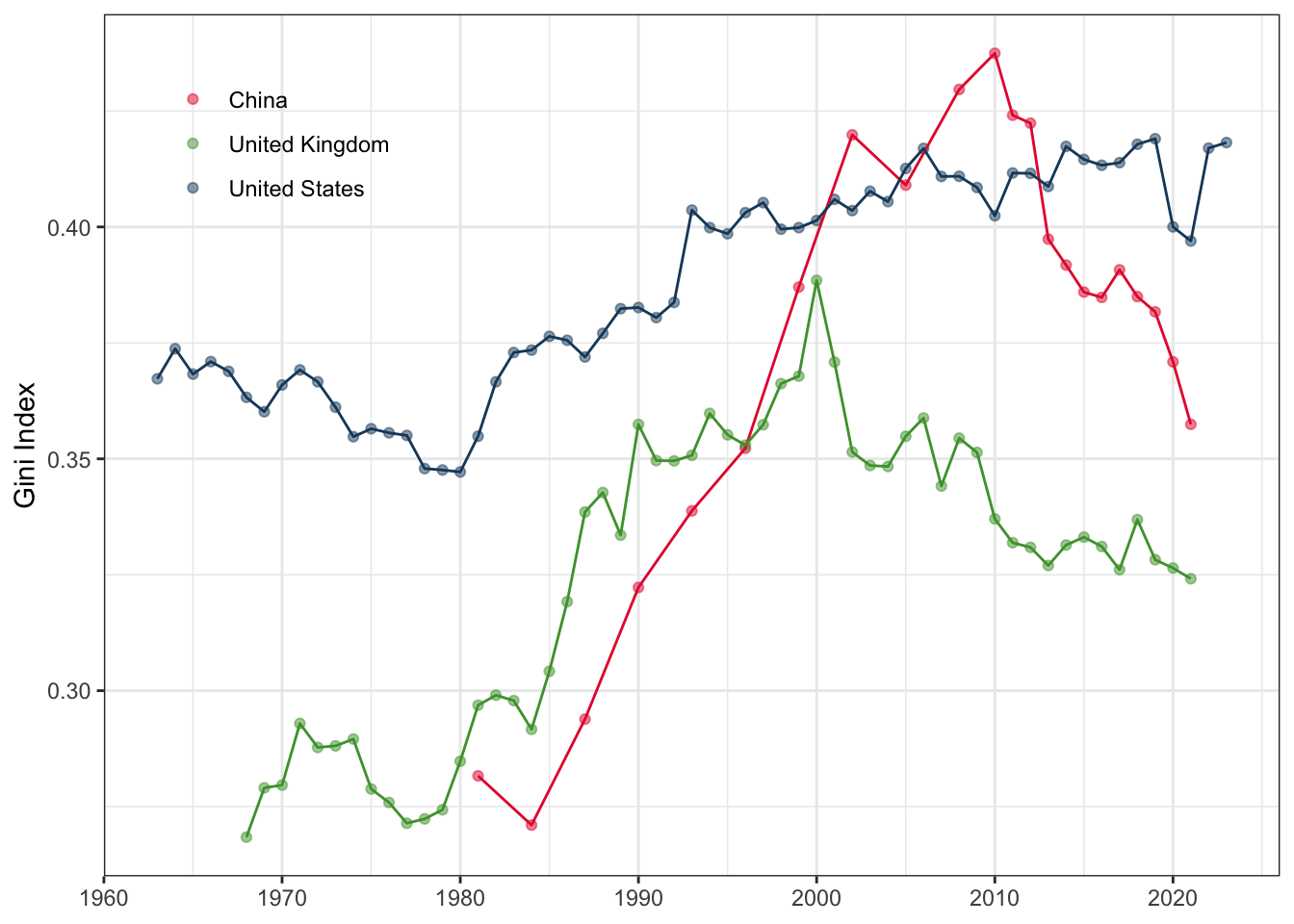
1.2.3 Gini for USA, UK and China
These three data files provide all of the available years of the GINI index for China, USA, and the UK (countries with many years of data).
This set is good for teaching about data merging and reshaping.
Code to create pip_gini_china, pip_gini_usa, pip_gini_uk
| region_name | region_code | country_name | country_code | reporting_year | reporting_level | gini |
|---|---|---|---|---|---|---|
| East Asia & Pacific | EAP | China | CHN | 1981 | national | 0.2816410 |
| East Asia & Pacific | EAP | China | CHN | 1984 | national | 0.2710230 |
| East Asia & Pacific | EAP | China | CHN | 1987 | national | 0.2938596 |
| East Asia & Pacific | EAP | China | CHN | 1990 | national | 0.3222662 |
| East Asia & Pacific | EAP | China | CHN | 1993 | national | 0.3387780 |
| East Asia & Pacific | EAP | China | CHN | 1996 | national | 0.3522766 |
Plot Code
bind_rows(pip_gini_china, pip_gini_uk, pip_gini_usa) |>
  ggplot(aes(x = reporting_year, y = gini, color = country_name)) +
  geom_point(alpha = 0.5) +
  geom_line(show.legend = FALSE) +
  scale_x_continuous(breaks = seq(1960, 2030, 10)) +
  scale_color_manual(
    values = c("#E5243B", "#4C9F38", "#19486A"),
    guide = guide_legend(position = "inside")
  ) +
  labs(x = NULL, y = "Gini Index", color = NULL) +
  theme(
    legend.position.inside = c(.15, .85),
    legend.background = element_blank(),
    legend.key = element_blank()
  )