B Additional customisation options
B.1 Adding lines to plots
Vertical Lines - geom_vline()
Often it can be useful to put a marker into our plots to highlight a certain criterion value. For example, if you were working with a scale that has a cut-off, perhaps the Austim Spectrum Quotient 10 (Allison et al., 2012), then you might want to put a line at a score of 7; the point at which the researchers suggest the participant is referred further. Alternatively, thinking about the Stroop test we have looked at in this paper, perhaps you had a level of accuracy that you wanted to make sure was reached - let's say 80%. If we refer back to Figure 3.1, which used the code below:
ggplot(dat_long, aes(x = acc)) +
  geom_histogram(binwidth = 1, fill = "white", color = "black") +
  scale_x_continuous(name = "Accuracy (0-100)")
and displayed the spread of the accuracy scores as such:
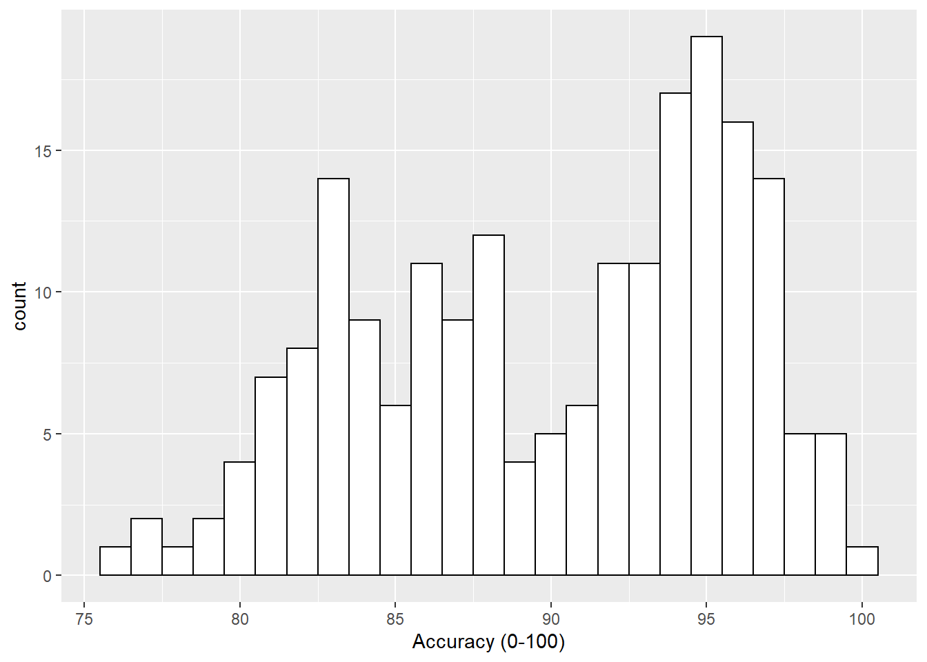
Figure B.1: Histogram of accuracy scores.
if we wanted to add a line at the 80% level then we could use the geom_vline() function, again from the ggplot2, with the argument of xintercept = 80, meaning cut the x-axis at 80, as follows:
ggplot(dat_long, aes(x = acc)) +
  geom_histogram(binwidth = 1, fill = "white", color = "black") +
  scale_x_continuous(name = "Accuracy (0-100)") +
  geom_vline(xintercept = 80)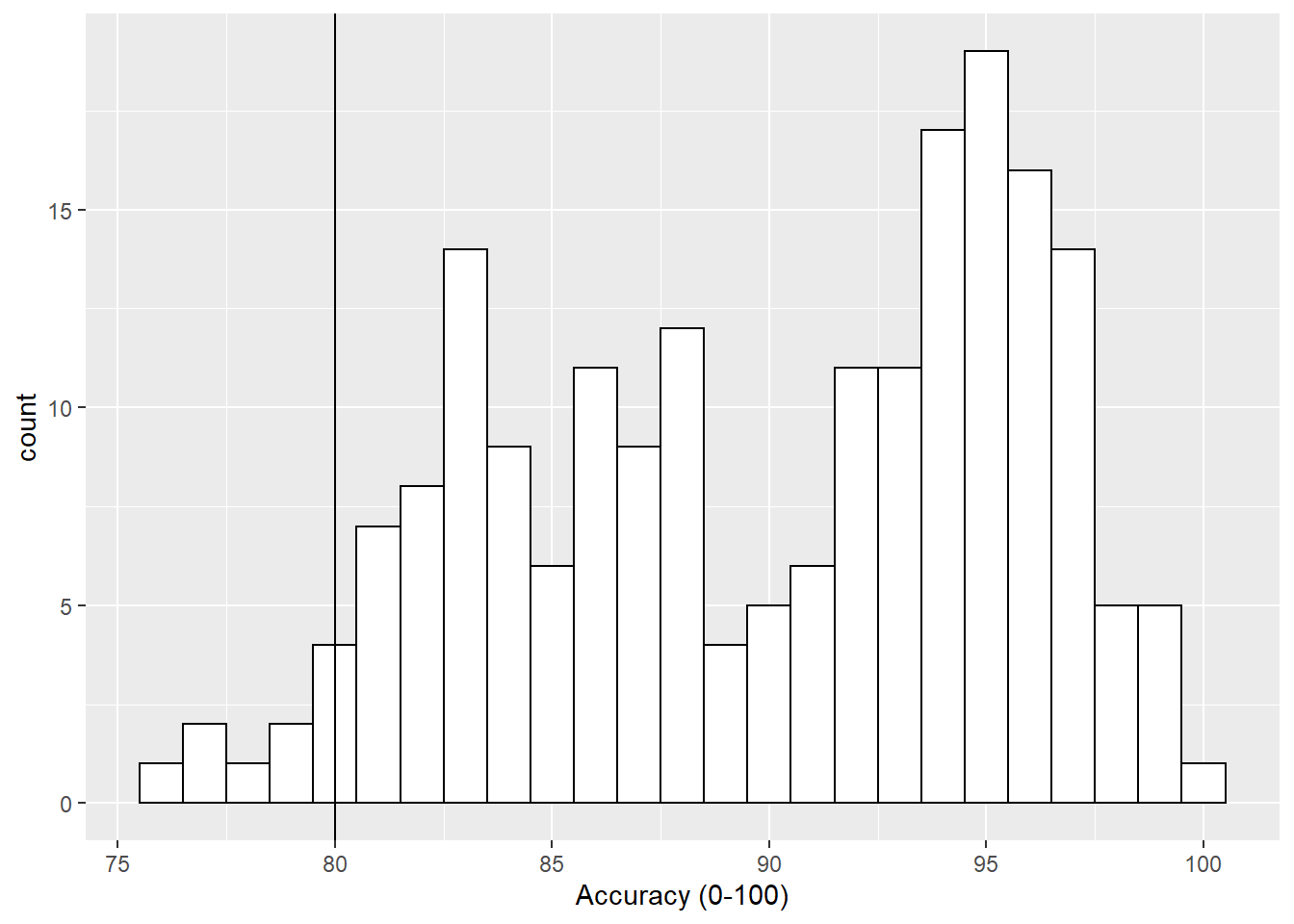
Figure B.2: Histogram of accuracy scores with black solid vertical line indicating 80% accuracy.
Now that looks ok but the line is a bit hard to see so we can change the style (linetype = value), color (color = "color") and weight (size = value) as follows:
ggplot(dat_long, aes(x = acc)) +
  geom_histogram(binwidth = 1, fill = "white", color = "black") +
  scale_x_continuous(name = "Accuracy (0-100)") +
  geom_vline(xintercept = 80, linetype = 2, color = "red", size = 1.5)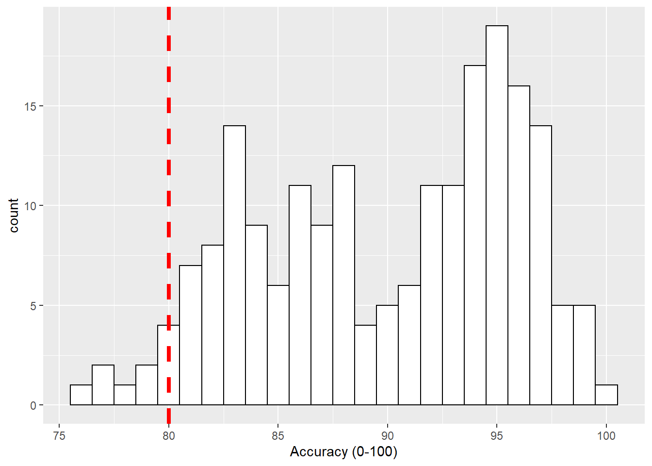
Figure B.3: Histogram of accuracy scores with red dashed vertical line indicating 80% accuracy.
Horizontal Lines - geom_hline()
Another situation may be that you want to put a horizontal line on your figure to mark a value of interest on the y-axis. Again thinking about our Stroop experiment, perhaps we wanted to indicate the 80% accuracy line on our boxplot figures. If we look at Figure 4.1, which used this code to display the basic boxplot:
ggplot(dat_long, aes(x = condition, y = acc)) +
  geom_boxplot()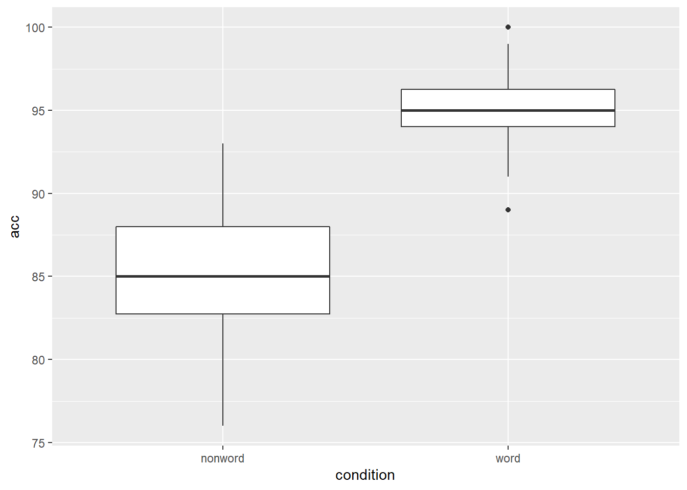
Figure B.4: Basic boxplot.
we could then use the geom_hline() function, from the ggplot2, with, this time, the argument of yintercept = 80, meaning cut the y-axis at 80, as follows:
ggplot(dat_long, aes(x = condition, y = acc)) +
  geom_boxplot() +
  geom_hline(yintercept = 80)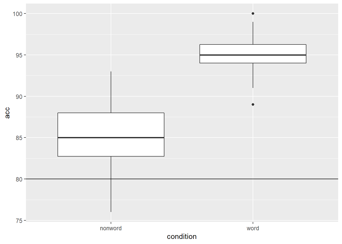
Figure B.5: Basic boxplot with black solid horizontal line indicating 80% accuracy.
and again we can embellish the line using the same arguments as above. We will put in some different values here just to show the changes:
ggplot(dat_long, aes(x = condition, y = acc)) +
  geom_boxplot() +
  geom_hline(yintercept = 80, linetype = 3, color = "blue", size = 2)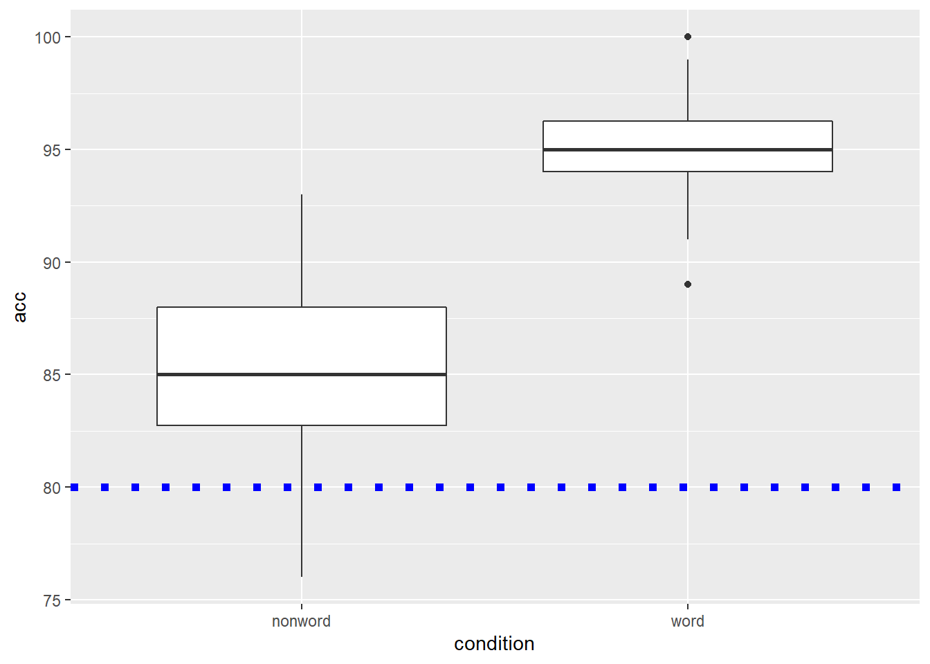
Figure B.6: Basic boxplot with blue dotted horizontal line indicating 80% accuracy.
LineTypes
One thing worth noting is that the linetype argument can actually be specified as both a value or as a word. They match up as follows:
| Value | Word |
|---|---|
| linetype = 0 | linetype = "blank" |
| linetype = 1 | linetype = "solid" |
| linetype = 2 | linetype = "dashed" |
| linetype = 3 | linetype = "dotted" |
| linetype = 4 | linetype = "dotdash" |
| linetype = 5 | linetype = "longdash" |
| linetype = 6 | linetype = "twodash" |
Diagonal Lines - geom_abline()
The last type of line you might want to overlay on a figure is perhaps a diagonal line. For example, perhaps you have created a scatterplot and you want to have the true diagonal line for reference to the line of best fit. To show this, we will refer back to Figure 3.5 which displayed the line of best fit for the reaction time versus age, and used the following code:
ggplot(dat_long, aes(x = rt, y = age)) +
  geom_point() +
  geom_smooth(method = "lm")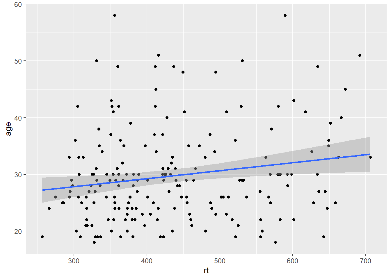
Figure B.7: Line of best fit for reaction time versus age.
By eye that would appear to be a fairly flat relationship but we will add the true diagonal to help clarify. To do this we use the geom_abline(), again from ggplot2, and we give it the arguements of the slope (slope = value) and the intercept (intercept = value). We are also going to scale the data to turn it into z-scores to help us visualise the relationship better, as follows:
dat_long_scale <- dat_long %>%
  mutate(rt_zscore = (rt - mean(rt))/sd(rt),
         age_zscore = (age - mean(age))/sd(age))

ggplot(dat_long_scale, aes(x = rt_zscore, y = age_zscore)) +
  geom_point() +
  geom_smooth(method = "lm") +
  geom_abline(slope = 1, intercept = 0)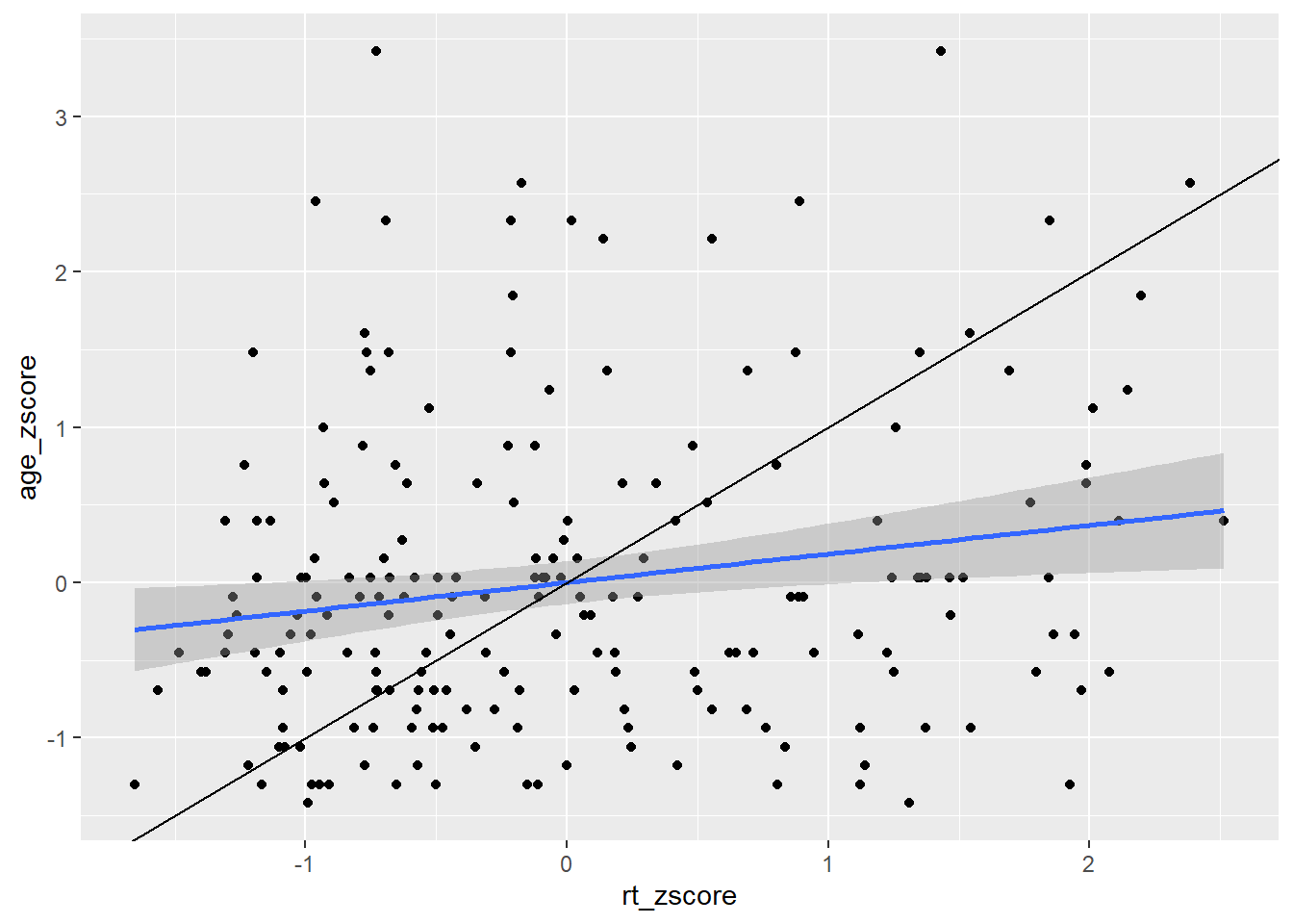
Figure B.8: Line of best fit (blue line) for reaction time versus age with true diagonal shown (black line).
So now we can see the line of best fit (blue line) in relation to the true diagonal (black line). We will come back to why we z-scored the data in a minute, but first let's finish tidying up this figure, using some of the customisation we have seen as it is a bit messy. Something like this might look cleaner:
ggplot(dat_long_scale, aes(x = rt_zscore, y = age_zscore)) +
  geom_abline(slope = 1, intercept = 0, linetype = "dashed", color = "black", size = .5) +
  geom_hline(yintercept = 0, linetype = "solid", color = "black", size = .5) +
  geom_vline(xintercept = 0, linetype = "solid", color = "black", size = .5) +
  geom_point() +
    geom_smooth(method = "lm")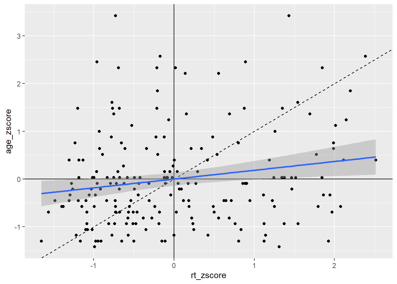
Figure B.9: Line of best fit (blue solid line) for reaction time versus age with true diagonal shown (black line dashed).
That maybe looks a bit cluttered but it gives a nice example of how you can use the different geoms for adding lines to add information to your figure, clearly visualising the weak relationship between reaction time and age. Note: Do remember about the layering system however; you will notice that in the code for Figure B.9 we have changed the order of the code lines so that the geom lines are behind the points!
Top Tip: Your intercepts must be values you can see
Thinking back to why we z-scored the data for that last figure, we sort of skipped over that, but it did serve a purpose. Here is the original data and the original scatterplot but with the geom_abline() added to the code:
ggplot(dat_long, aes(x = rt, y = age)) +
  geom_point() +
  geom_smooth(method = "lm") +
  geom_abline(slope = 1, intercept = 0)
Figure B.10: Line of best fit (blue solid line) for reaction time versus age with missing true diagonal.
The code runs but the diagonal line is nowhere to be seen. The reason is that you figure is zoomed in on the data and the diagonal is "out of shot" if you like. If we were to zoom out on the data we would then see the diagonal line as such:
ggplot(dat_long, aes(x = rt, y = age)) +
  geom_point() +
  geom_smooth(method = "lm") +
  geom_abline(slope = 1, intercept = 0) +
  coord_cartesian(xlim = c(0,1000), ylim = c(0,60))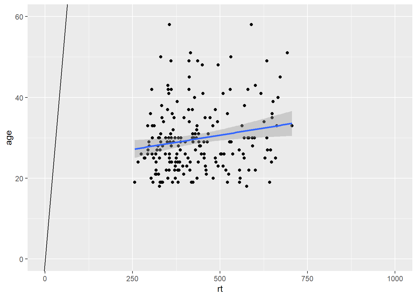
Figure B.11: Zoomed out to show Line of best fit (blue solid line) for reaction time versus age with true diagonal (black line).
So the key point is that your intercepts have to be set to visible for values for you to see them! If you run your code and the line does not appear, check that the value you have set can actually be seen on your figure. This applies to geom_abline(), geom_hline() and geom_vline().
B.2 Zooming in and out
Like in the example above, it can be very beneficial to be able to zoom in and out of figures, mainly to focus the frame on a given section. One function we can use to do this is the coord_cartesian(), in ggplot2. The main arguments are the limits on the x-axis (xlim = c(value, value)), the limits on the y-axis (ylim = c(value, value)), and whether to add a small expansion to those limits or not (expand = TRUE/FALSE). Looking at the scatterplot of age and reaction time again, we could use coord_cartesian() to zoom fully out:
ggplot(dat_long, aes(x = rt, y = age)) +
  geom_point() +
  geom_smooth(method = "lm") +
  coord_cartesian(xlim = c(0,1000), ylim = c(0,100), expand = FALSE)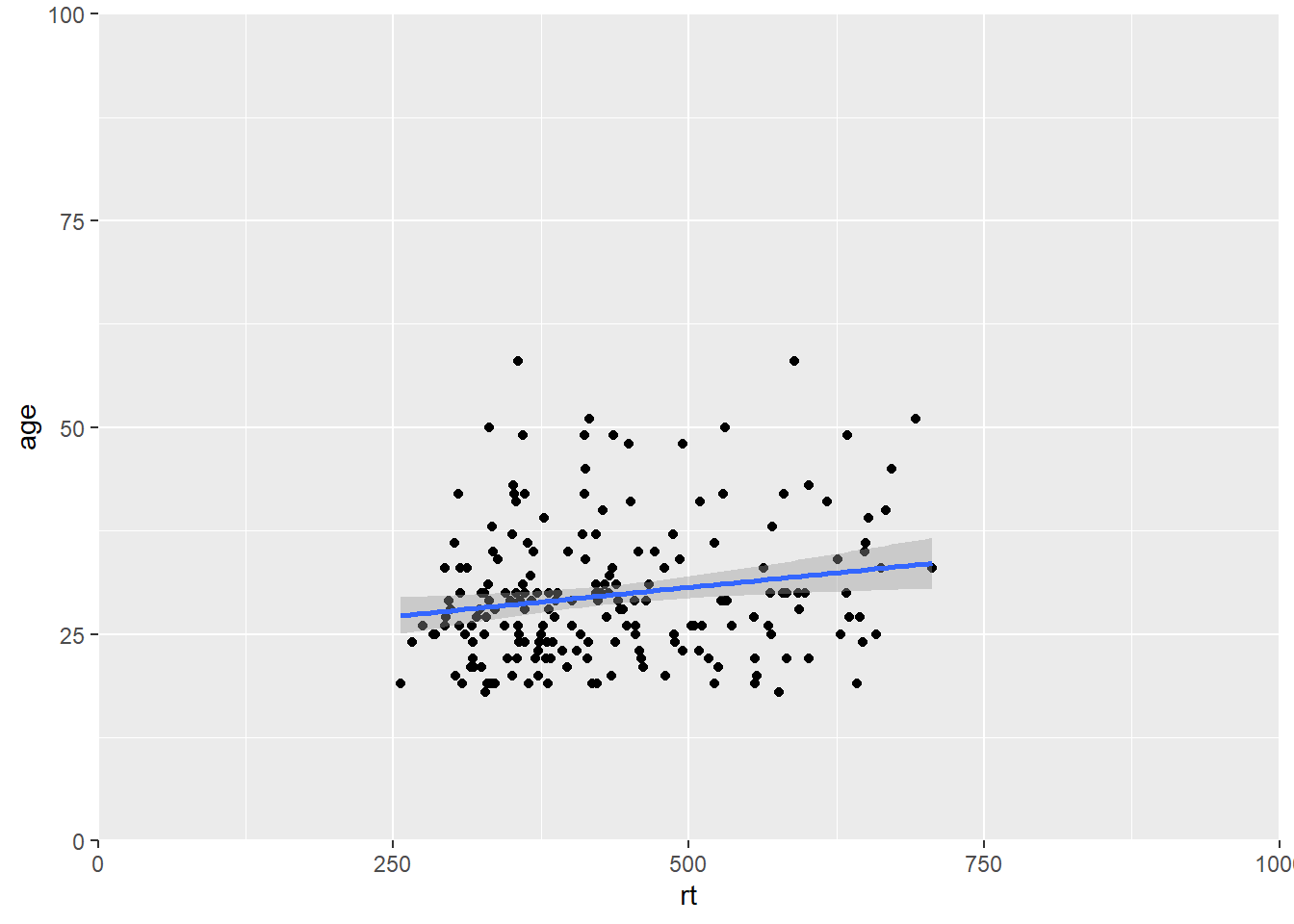
Figure B.12: Zoomed out on scatterplot with no expansion around set limits
And we can add a small expansion by changing the expand argument to TRUE:
ggplot(dat_long, aes(x = rt, y = age)) +
  geom_point() +
  geom_smooth(method = "lm") +
  coord_cartesian(xlim = c(0,1000), ylim = c(0,100), expand = TRUE)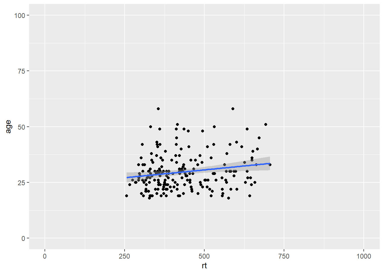
Figure B.13: Zoomed out on scatterplot with small expansion around set limits
Or we can zoom right in on a specific area of the plot if there was something we wanted to highlight. Here for example we are just showing the reaction times between 500 and 725 msecs, and all ages between 15 and 55:
ggplot(dat_long, aes(x = rt, y = age)) +
  geom_point() +
  geom_smooth(method = "lm") +
  coord_cartesian(xlim = c(500,725), ylim = c(15,55), expand = TRUE)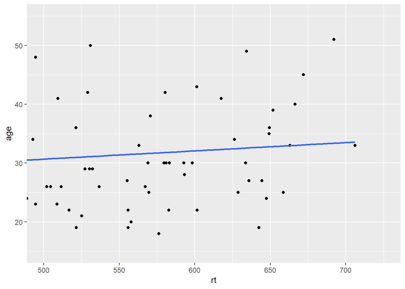
Figure B.14: Zoomed in on scatterplot with small expansion around set limits
And you can zoom in and zoom out just the x-axis or just the y-axis; just depends on what you want to show.
B.3 Setting the axis values
Continuous scales
You may have noticed that depending on the spread of your data, and how much of the figure you see, the values on the axes tend to change. Often we don't want this and want the values to be constant. We have already used functions to control this in the main body of the paper - the scale_* functions. Here we will use scale_x_continuous() and scale_y_continuous() to set the values on the axes to what we want. The main arguments in both functions are the limits (limts = c(value, value)) and the breaks (the tick marks essentially, breaks = value:value). Note that the limits are just two values (minimum and maximum), whereas the breaks are a series of values (from 0 to 100, for example). If we use the scatterplot of age and reaction time, then our code might look like this:
ggplot(dat_long, aes(x = rt, y = age)) +
  geom_point() +
  geom_smooth(method = "lm") +
  scale_x_continuous(limits = c(0,1000), breaks = 0:1000) +
  scale_y_continuous(limits = c(0,100), breaks = 0:100)
Figure B.15: Changing the values on the axes
That actually looks rubbish because we simply have too many values on our axes, so we can use the seq() function, from baseR, to get a bit more control. The arguments here are the first value (from = value), the last value (last = value), and the size of the steps (by = value). For example, seq(0,10,2) would give all values between 0 and 10 in steps of 2, (i.e. 0, 2, 4, 6, 8 and 10). So using that idea we can change the y-axis in steps of 5 (years) and the x-axis in steps of 50 (msecs) as follows:
ggplot(dat_long, aes(x = rt, y = age)) +
  geom_point() +
  geom_smooth(method = "lm") +
  scale_x_continuous(limits = c(0,1000), breaks = seq(0,1000,50)) +
  scale_y_continuous(limits = c(0,100), breaks = seq(0,100,5))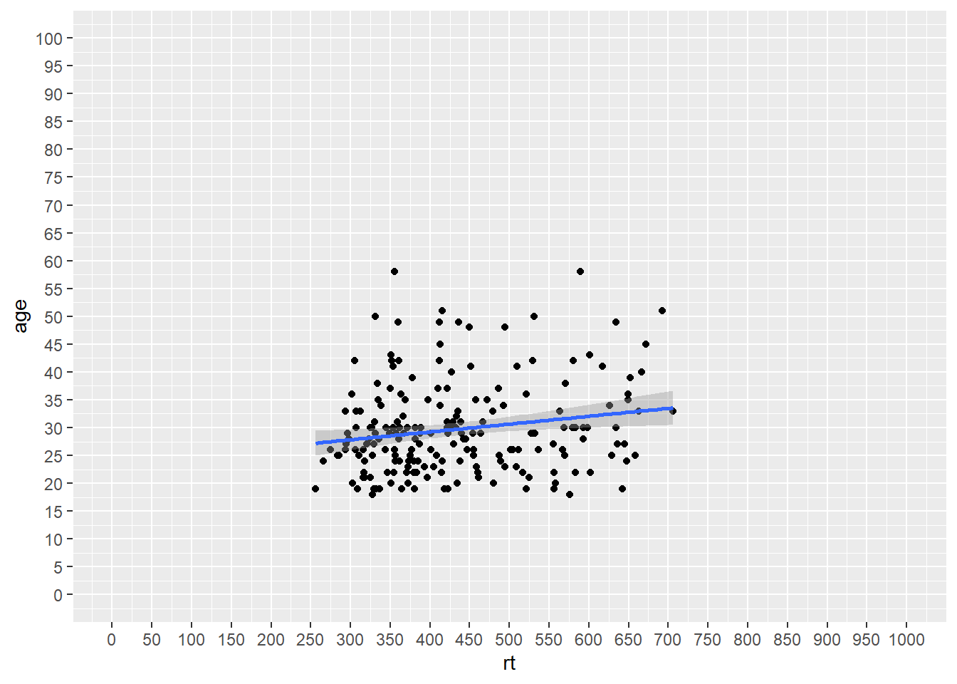
Figure B.16: Changing the values on the axes using the seq() function
Which gives us a much nicer and cleaner set of values on our axes. And if we combine that approach for setting the axes values with our zoom function (coord_cartesian()), then we can get something that looks like this:
ggplot(dat_long, aes(x = rt, y = age)) +
  geom_point() +
  geom_smooth(method = "lm") +
  scale_x_continuous(limits = c(0,1000), breaks = seq(0,1000,50)) +
  scale_y_continuous(limits = c(0,100), breaks = seq(0,100,5)) +
  coord_cartesian(xlim = c(250,750), ylim = c(15,55))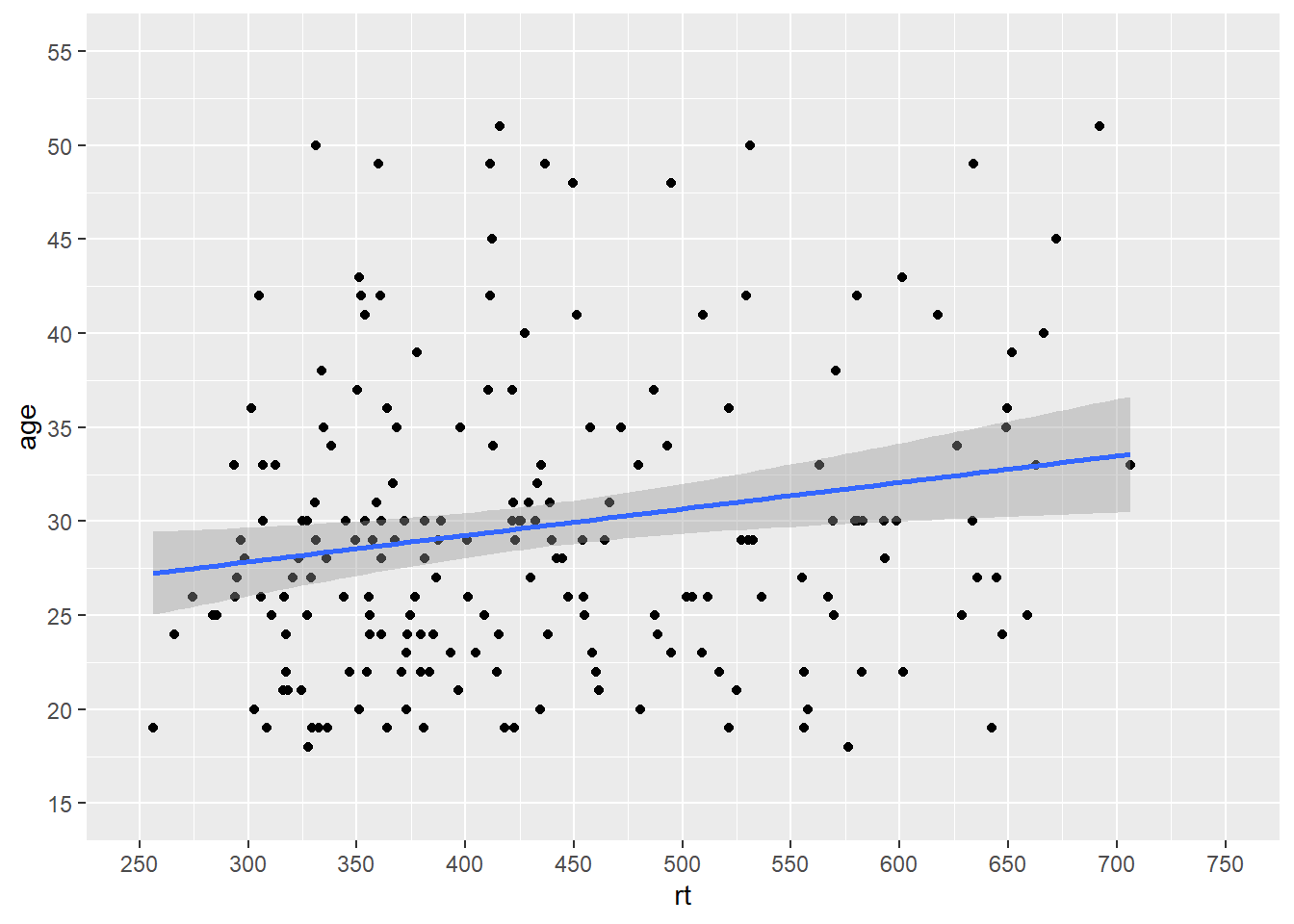
Figure B.17: Combining scale functions and zoom functions
Which actually looks much like our original scatterplot but with better definition on the axes. So you can see we can actually have a lot of control over the axes and what we see. However, one thing to note, is that you should not use the limits argument within the scale_* functions as a zoom. It won't work like that and instead will just disregard data. Look at this example:
ggplot(dat_long, aes(x = rt, y = age)) +
  geom_point() +
  geom_smooth(method = "lm") +
  scale_x_continuous(limits = c(500,600))
## Warning: Removed 166 rows containing non-finite values (stat_smooth).## Warning: Removed 166 rows containing missing values (geom_point).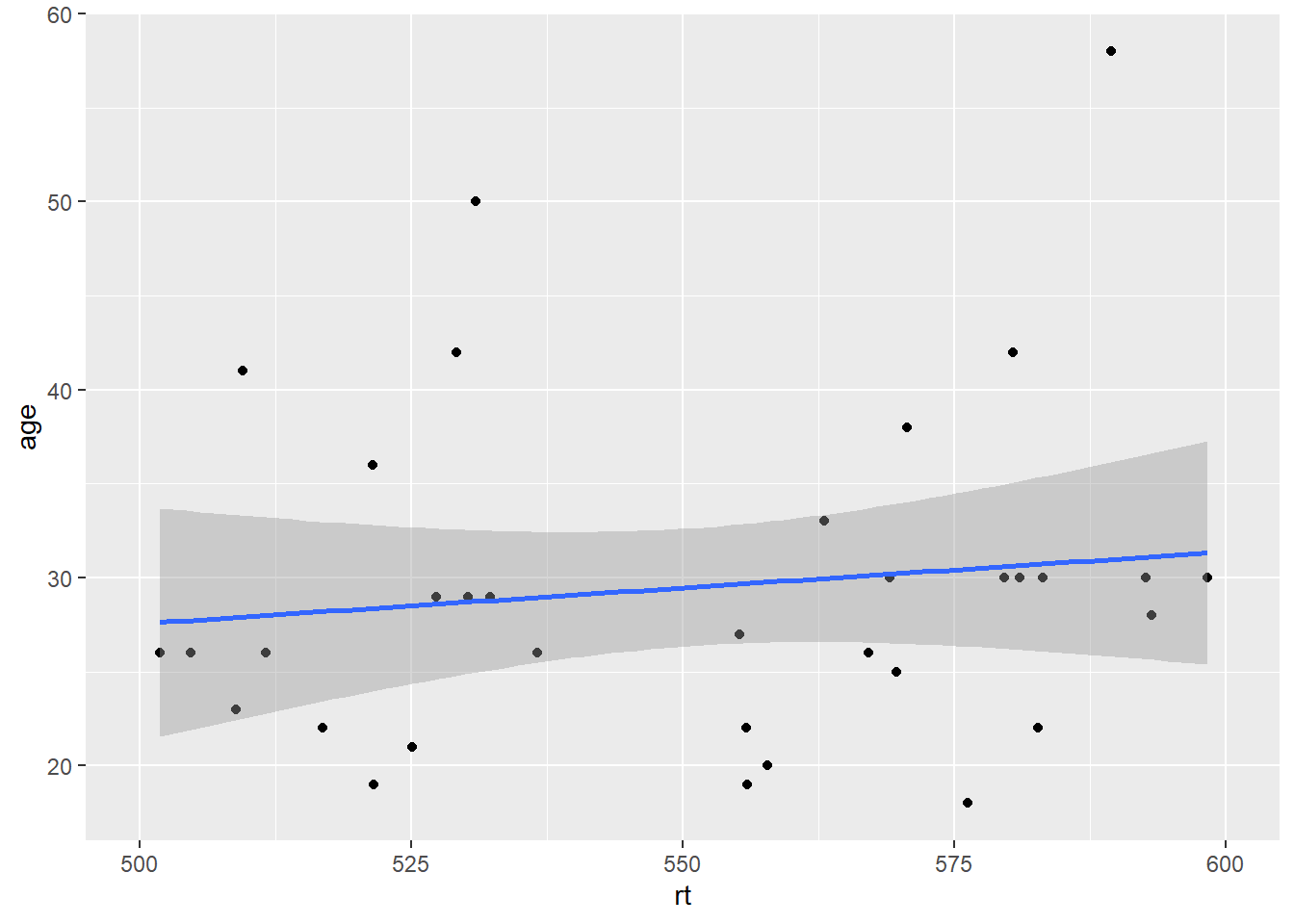
Figure B.18: Combining scale functions and zoom functions
It may look like it has zoomed in on the data but actually it has removed all data outwith the limits. That is what the warnings are telling you, and you can see that as there is no data above and below the limits, but we know there should be based on the earlier plots. So scale_* functions can change the values on the axes, but coord_cartesian() is for zooming in and out.
Discrete scales
The same idea of limits within a scale_* function can also be used to change the order of categories on a discrete scale. For example if we look at our boxplots again in Figure 4.10, we see this figure:
ggplot(dat_long, aes(x = condition, y= rt, fill = condition)) +
  geom_violin(alpha = .4) +
  geom_boxplot(width = .2, fatten = NULL, alpha = .5) +
  stat_summary(fun = "mean", geom = "point") +
  stat_summary(fun.data = "mean_se", geom = "errorbar", width = .1) +
  scale_fill_brewer(palette = "Dark2") +
  theme_minimal()
Figure B.19: Using transparency on the fill color.
The figures always default to the alphabetical order. Sometimes that is what we want; sometimes that is not what we want. If we wanted to switch the order of word and non-word so that the non-word condition comes first we would use the scale_x_discrete() function and set the limits within it (limits = c("category","category")) as follows:
ggplot(dat_long, aes(x = condition, y= rt, fill = condition)) +
  geom_violin(alpha = .4) +
  geom_boxplot(width = .2, fatten = NULL, alpha = .5) +
  stat_summary(fun = "mean", geom = "point") +
  stat_summary(fun.data = "mean_se", geom = "errorbar", width = .1) +
  scale_fill_brewer(palette = "Dark2") +
  scale_x_discrete(limits = c("nonword","word")) +
  theme_minimal()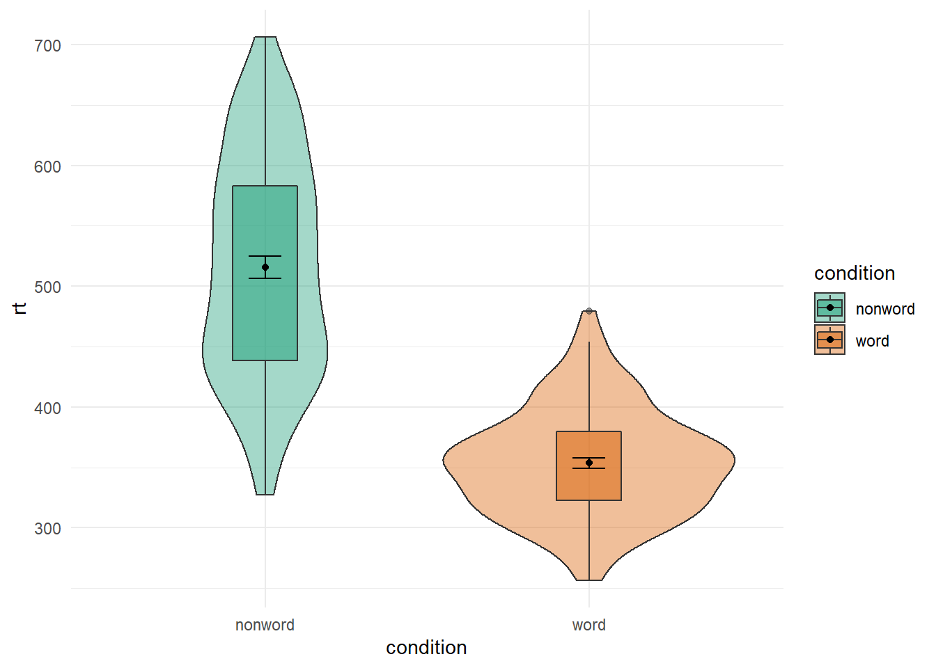
Figure B.20: Switching orders of categorical variables
And that works just the same if you have more conditions, which you will see if you compare Figure B.20 to the below figure where we have flipped the order of non-word and word from the original default alphabetical order
ggplot(dat_long, aes(x = condition, y= rt, fill = language)) +
  geom_violin() +
  geom_boxplot(width = .2, fatten = NULL, position = position_dodge(.9)) +
  stat_summary(fun = "mean", geom = "point",
               position = position_dodge(.9)) +
  stat_summary(fun.data = "mean_se", geom = "errorbar", width = .1,
               position = position_dodge(.9)) +
  scale_fill_brewer(palette = "Dark2") +
  scale_x_discrete(limits = c("nonword","word")) +
  theme_minimal()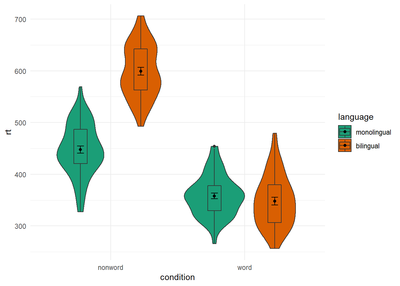
Figure B.21: Same as earlier figure but with order of conditions on x-axis altered.
Changing Order of Factors
Again, you have a lot of control beyond the default alphabetical order that ggplot2 tends to plot in. One question you might have though is why monolingual and bilingual are not in alphabetical order? f they were then the bilingual condition would be plotted first. The answer is, thinking back to the start of the paper, we changed our conditions from 1 and 2 to the factor names of monolingual and bilingual, and ggplot() maintains that factor order when plotting. So if we want to plot it in a different fashion we need to do a bit of factor reordering. This can be done much like earlier using the factor() function and stating the order of conditions we want (levels = c("factor","factor")). But be careful with spelling as it must match up to the names of the factors that already exist.
In this example, we will reorder the factors so that bilingual is presented first but leave the order of word and non-word as the alphabetical default. Note in the code though that we are not permanently storing the factor change as we don't want to keep this new order. We are just changing the order "on the fly" for this one example before putting it into the plot.
dat_long %>%
  mutate(language = factor(language,
                           levels = c("bilingual","monolingual"))) %>%
  ggplot(aes(x = condition, y= rt, fill = language)) +
  geom_violin() +
  geom_boxplot(width = .2, fatten = NULL, position = position_dodge(.9)) +
  stat_summary(fun = "mean", geom = "point",
               position = position_dodge(.9)) +
  stat_summary(fun.data = "mean_se", geom = "errorbar", width = .1,
               position = position_dodge(.9)) +
  scale_fill_brewer(palette = "Dark2") +
  theme_minimal()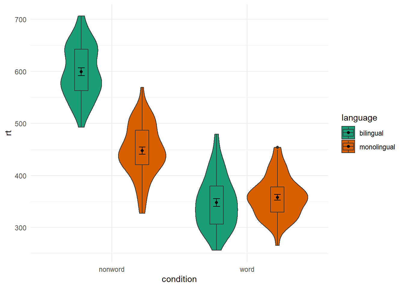
Figure B.22: Same as earlier figure but with order of conditions on x-axis altered.
And if we compare this new figure to the original, side-by-side, we see the difference:
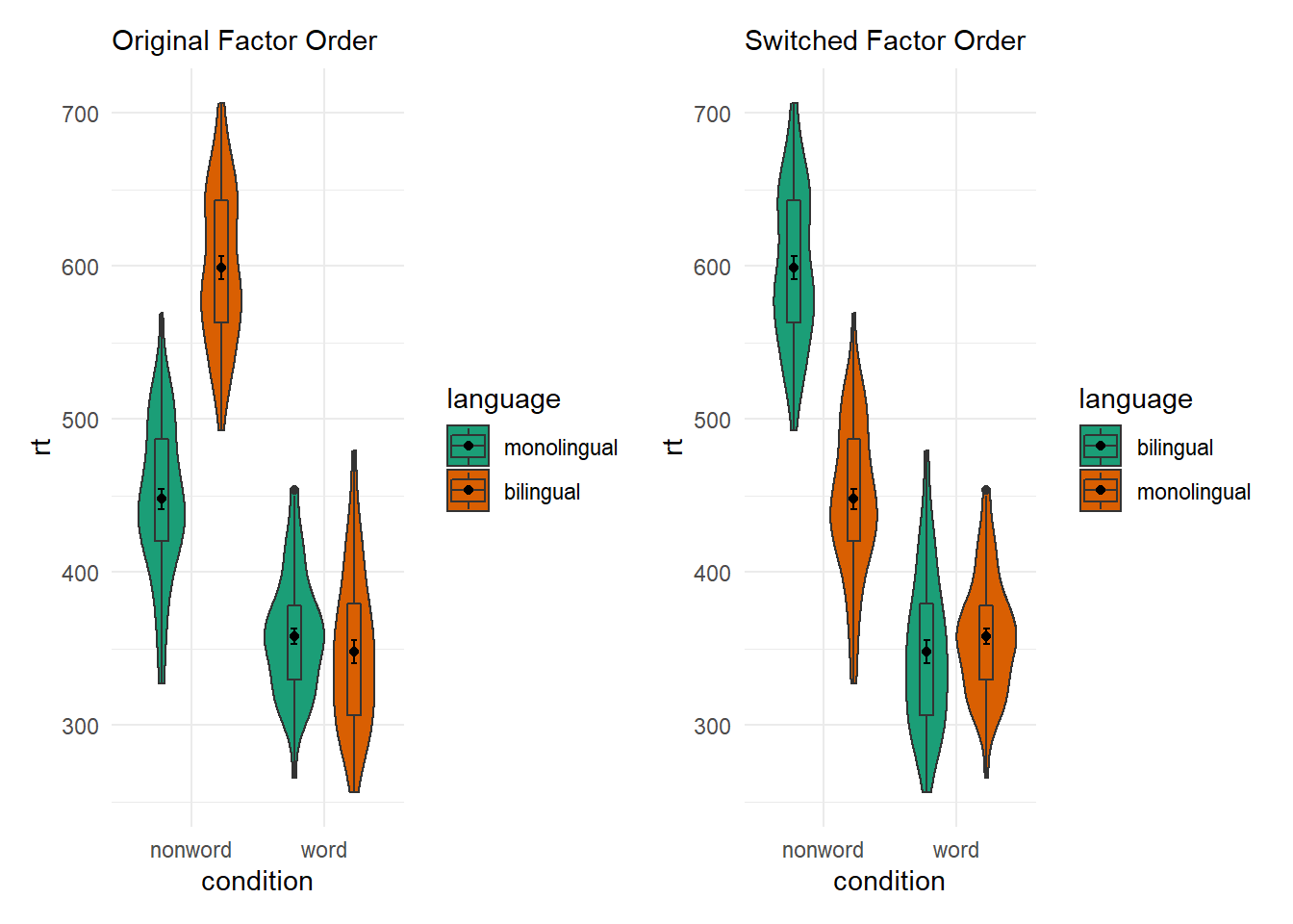
Figure B.23: Switching factor orders
B.4 Controlling the Legend
Using the guides()
Whilst we are on the subject of changing order and position of elements of the figure, you might think about changing the position of a figure legend. There is actually a few ways of doing it but a simple approach is to use the the guides() function and add that to the ggplot chain. For example, if we run the below code and look at the output:
ggplot(dat_long, aes(x = condition, y= rt, fill = condition)) +
  geom_violin(alpha = .4) +
  geom_boxplot(width = .2, fatten = NULL, alpha = .5) +
  stat_summary(fun = "mean", geom = "point") +
  stat_summary(fun.data = "mean_se", geom = "errorbar", width = .1) +
  scale_fill_brewer(palette = "Dark2") +
  guides(fill = "none") +
  theme_minimal()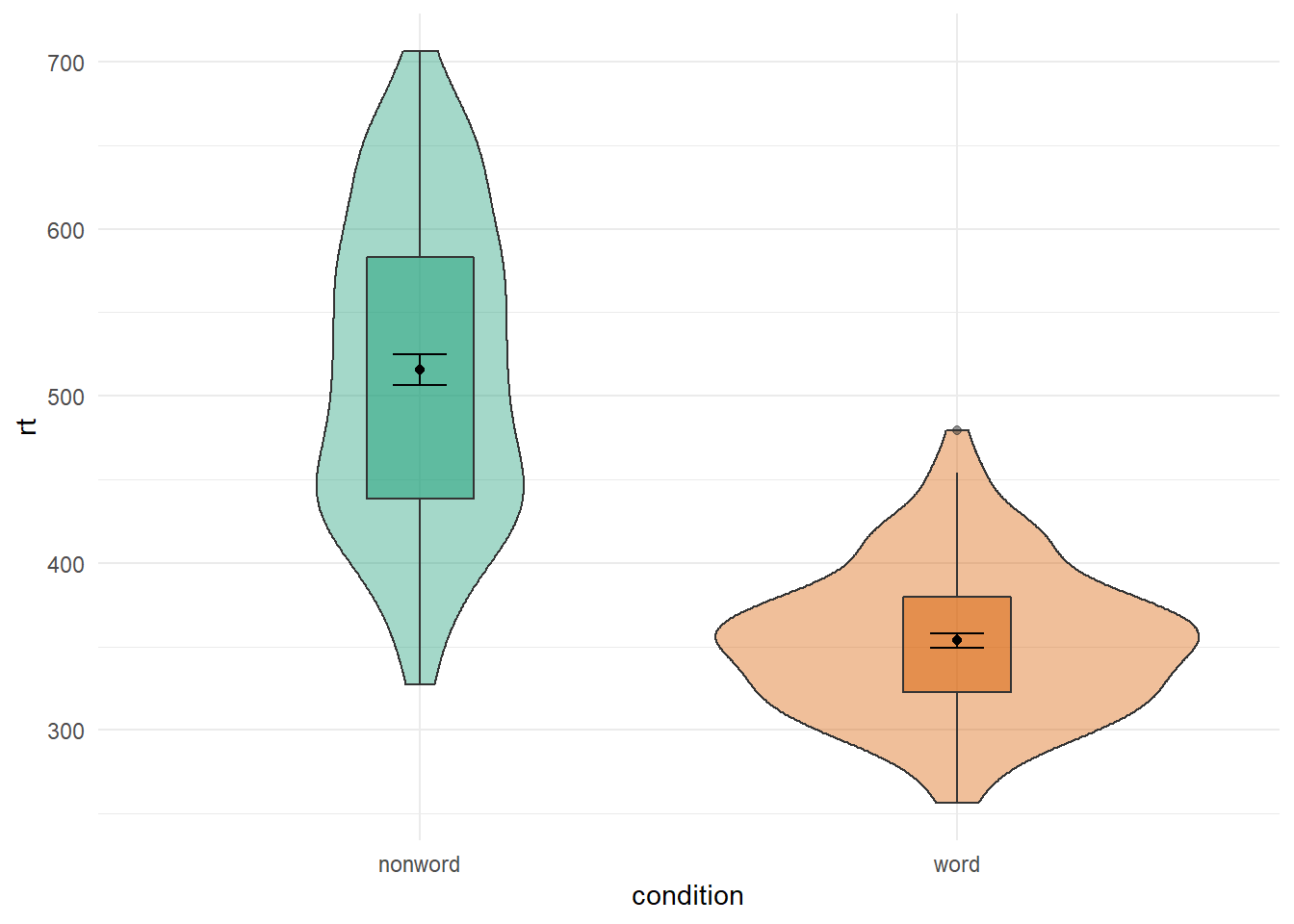
Figure B.24: Figure Legend removed using guides()
We see the same display as Figure B.19 but with no legend. That is quite useful because the legend just repeats the x-axis and becomes redundant. The guides() function works but setting the legened associated with the fill layer (i.e. fill = condition) to "none", basically removing it. One thing to note with this approach is that you need to set a guide for every legend, otherwise a legend will appear. What that means is that if you had set both fill = condition and color = condition, then you would need to set both fill and color to "none" within guides() as follows:
ggplot(dat_long, aes(x = condition, y= rt, fill = condition, color = condition)) +
  geom_violin(alpha = .4) +
  geom_boxplot(width = .2, fatten = NULL, alpha = .5) +
  stat_summary(fun = "mean", geom = "point") +
  stat_summary(fun.data = "mean_se", geom = "errorbar", width = .1) +
  scale_fill_brewer(palette = "Dark2") +
  guides(fill = "none", color = "none") +
  theme_minimal()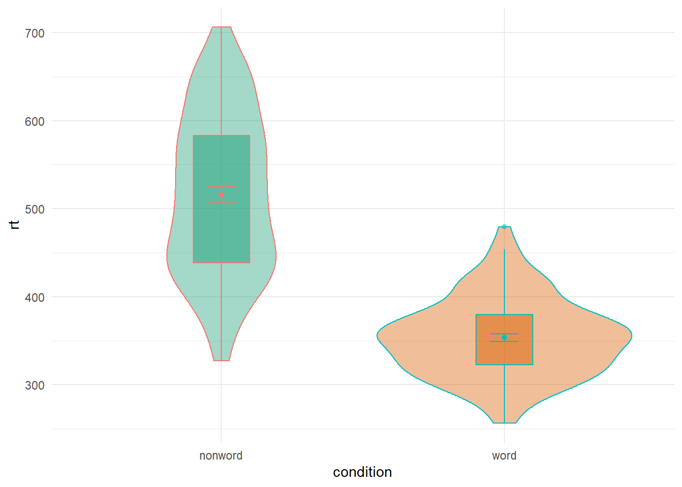
Figure B.25: Removing more than one legend with guides()
Whereas if you hadn't used guides() you would see the following:
ggplot(dat_long, aes(x = condition, y= rt, fill = condition, color = condition)) +
  geom_violin(alpha = .4) +
  geom_boxplot(width = .2, fatten = NULL, alpha = .5) +
  stat_summary(fun = "mean", geom = "point") +
  stat_summary(fun.data = "mean_se", geom = "errorbar", width = .1) +
  scale_fill_brewer(palette = "Dark2") +
  theme_minimal()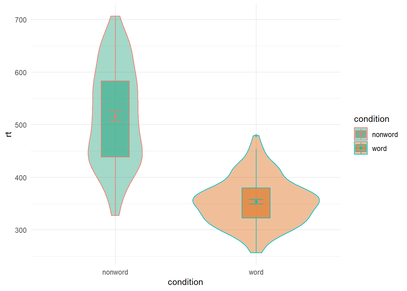
Figure B.26: Figure with more than one Legend
The key thing to note here is that in the above figure there is actually two legends (one for fill and one for color) but they are overlaid on top of each other as they are associated with the same variable. You can test this by removing either one of the options from the guides() function. One of the legends will still remain. So you need to turn them both off or you can use it to leave certain parts clear.
Using the theme()
An alternative to the guides function is using the theme() function. The theme() function can actually be used to control a whole host of options in the plot, which we will come on to, but you can use it as a quick way to turn off the legend as follows:
ggplot(dat_long, aes(x = condition, y= rt, fill = condition, color = condition)) +
  geom_violin(alpha = .4) +
  geom_boxplot(width = .2, fatten = NULL, alpha = .5) +
  stat_summary(fun = "mean", geom = "point") +
  stat_summary(fun.data = "mean_se", geom = "errorbar", width = .1) +
  scale_fill_brewer(palette = "Dark2") +
  theme_minimal() +
  theme(legend.position = "none")
Figure B.27: Removing the legend with theme()
What you can see is that within the theme() function we set an argument for legend.position and we set that to "none" - again removing the legend entirely. One difference to note here is that it removes all aspects of the legend where as, as we said, using guides() allows you to control different parts of the legend (either leaving the fill or color showing or both). So using the legend.position = "none" is a bit more brute force and can be handy when you are using various different means of distinguishing between conditions of a variable and don't want to have to remove each aspect using the guides().
An extension here of course is not just removing the legend, but moving the legend to a different position. This can be done by setting legend.position = ... to either "top", "bottom", "left" or "right" as shown:
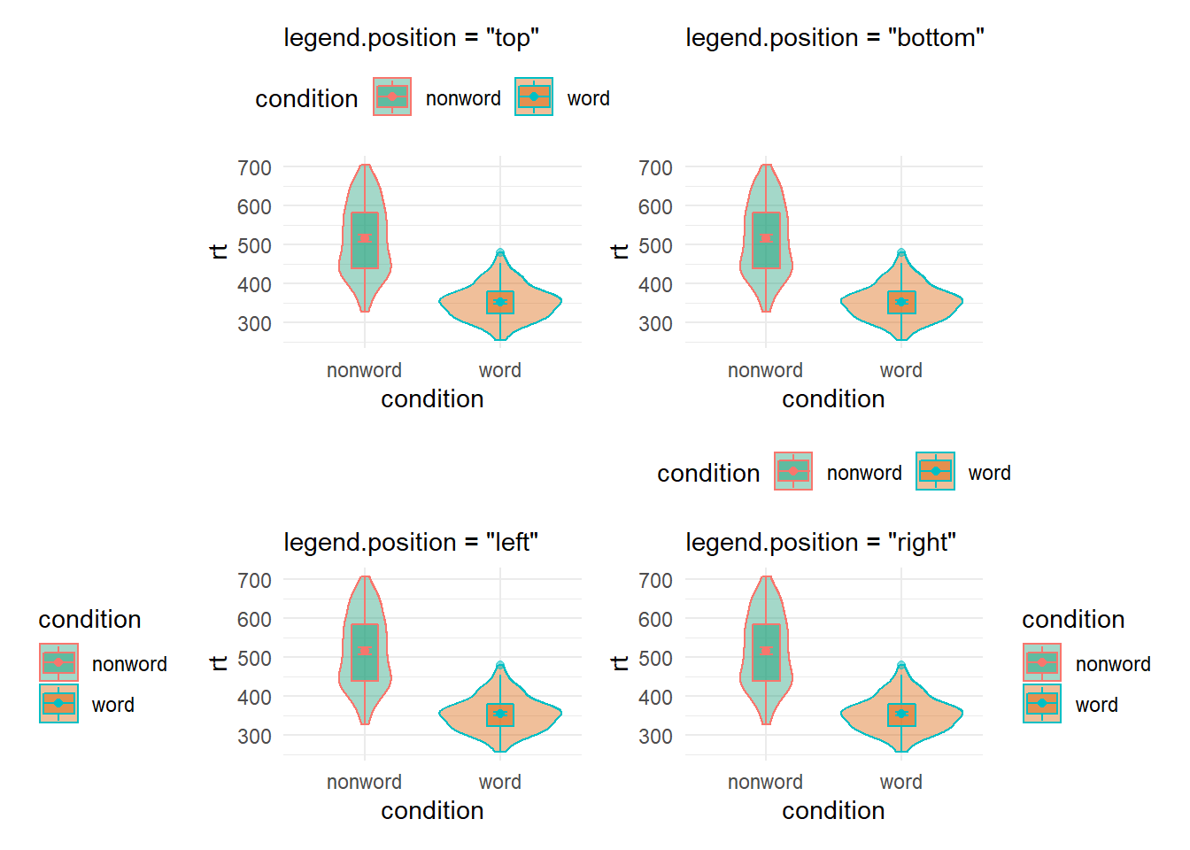
Figure B.28: Legend position options using theme()
Or even as a coordinate within your figure expressed as a propotion of your figure - i.e. c(x = 0, y = 0) would be the bottom left of your figure and c(x = 1, y = 1) would be the top right, as shown here:
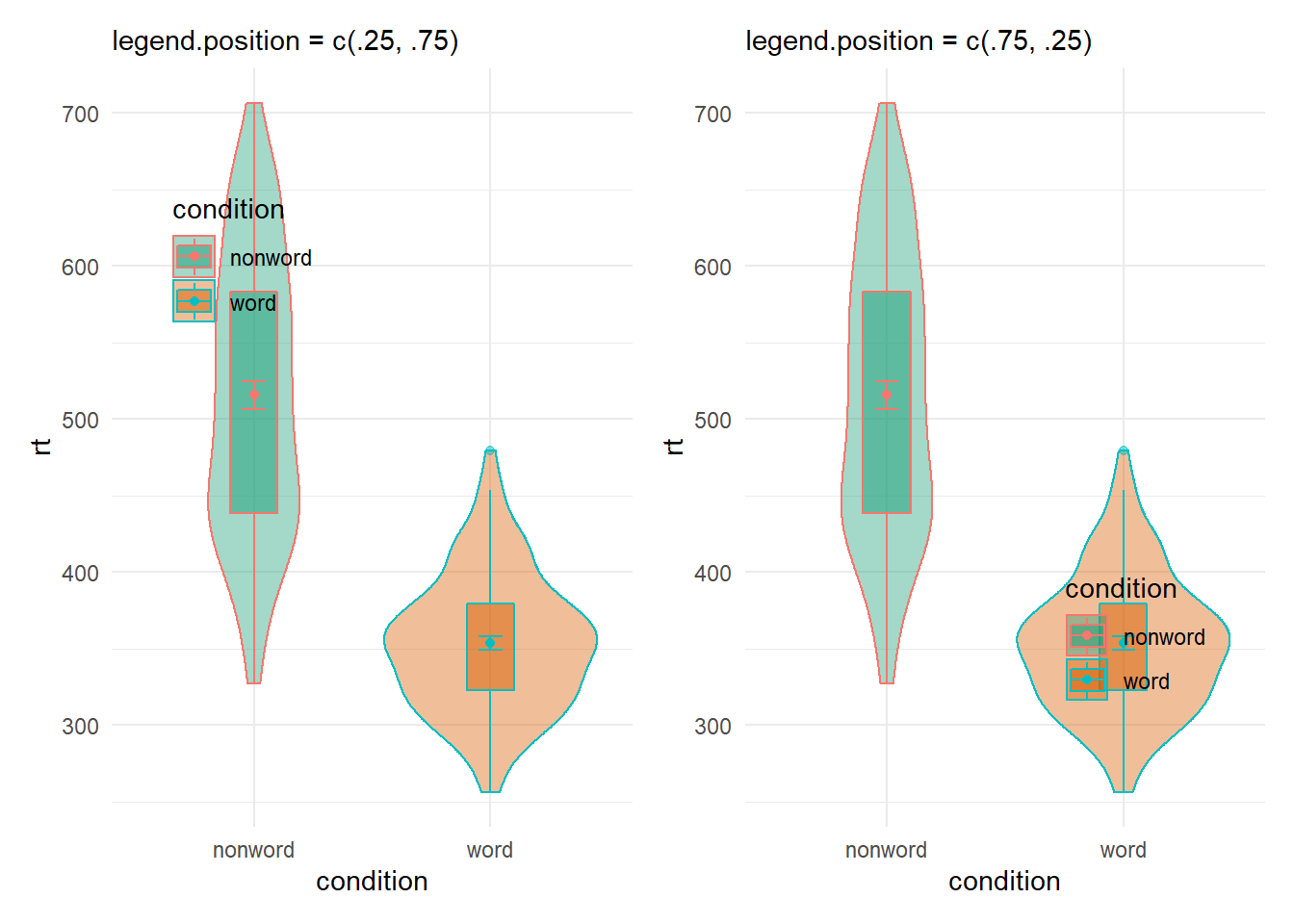
Figure B.29: Legend position options using theme()
And so with a little trial and error you can position your legend where you want it without crashing into your figure, hopefully!