4 Representing Summary Statistics
The layering approach that is used in ggplot2 to make figures comes into its own when you want to include information about the distribution and spread of scores. In this section we introduce different ways of including summary statistics in your figures.
4.1 Boxplots
As with geom_point(), boxplots also require an x- and y-variable to be specified. In this case, x must be a discrete, or categorical variable6, whilst y must be continuous.
ggplot(dat_long, aes(x = condition, y = acc)) +
  geom_boxplot()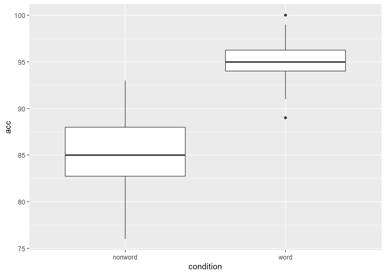
Figure 4.1: Basic boxplot.
4.1.1 Grouped boxplots
As with histograms and density plots, fill can be used to create grouped boxplots. This looks like a lot of complicated code at first glance, but most of it is just editing the axis labels.
ggplot(dat_long, aes(x = condition, y = acc, fill = language)) +
  geom_boxplot() +
  scale_fill_brewer(palette = "Dark2",
                    name = "Group",
                    labels = c("Bilingual", "Monolingual")) +
  theme_classic() +
  scale_x_discrete(name = "Condition",
                   labels = c("Non-Word", "Word")) +
  scale_y_continuous(name = "Accuracy")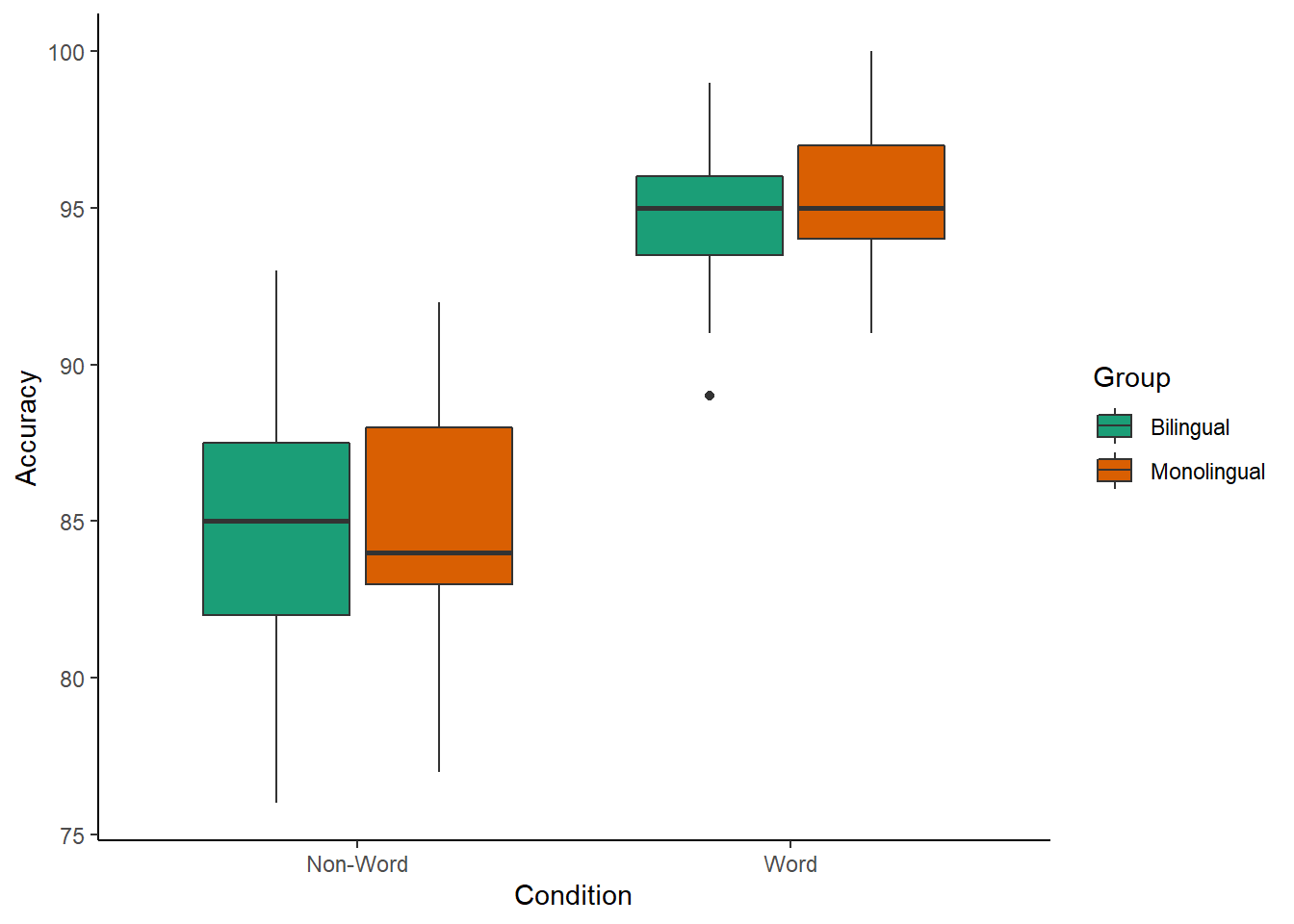
Figure 4.2: Grouped boxplots
Please note that the code and figure for this plot has been corrected from the published paper due to the labels "Word" and "Non-word" being incorrectly reversed. This is of course mortifying as authors, although it does provide a useful teachable moment that R will do what you tell it to do, no more, no less, regardless of whether what you tell it to do is wrong.
4.2 Violin plots
Violin plots display the distribution of a dataset and can be created by calling geom_violin(). They are so-called because the shape they make sometimes looks something like a violin. They are essentially sideways, mirrored density plots. Note that the below code is identical to the code used to draw the boxplots above, except for the call to geom_violin() rather than geom_boxplot().
ggplot(dat_long, aes(x = condition, y = acc, fill = language)) +
  geom_violin() +
  scale_fill_brewer(palette = "Dark2",
                    name = "Group",
                    labels = c("Bilingual", "Monolingual")) +
  theme_classic() +
  scale_x_discrete(name = "Condition",
                   labels = c("Non-word", "Word")) +
  scale_y_continuous(name = "Accuracy")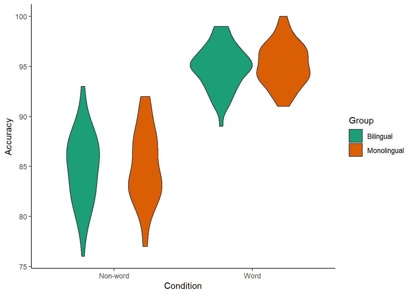
Figure 4.3: Violin plot.
Please note that the code and figure for this plot has been corrected from the published paper due to the labels "Word" and "Non-word" being incorrectly reversed. This is of course mortifying as authors, although it does provide a useful teachable moment that R will do what you tell it to do, no more, no less, regardless of whether what you tell it to do is wrong.
4.3 Bar chart of means
Commonly, rather than visualising distributions of raw data, researchers will wish to visualise means using a bar chart with error bars. As with SPSS and Excel, ggplot2 requires you to calculate the summary statistics and then plot the summary. There are at least two ways to do this, in the first you make a table of summary statistics as we did earlier when calculating the participant demographics and then plot that table. The second approach is to calculate the statistics within a layer of the plot. That is the approach we will use below.
First we present code for making a bar chart. The code for bar charts is here because it is a common visualisation that is familiar to most researchers. However, we would urge you to use a visualisation that provides more transparency about the distribution of the raw data, such as the violin-boxplots we will present in the next section.
To summarise the data into means, we use a new function stat_summary(). Rather than calling a geom_* function, we call stat_summary() and specify how we want to summarise the data and how we want to present that summary in our figure.
funspecifies the summary function that gives us the y-value we want to plot, in this case,mean.geomspecifies what shape or plot we want to use to display the summary. For the first layer we will specifybar. As with the other geom-type functions we have shown you, this part of thestat_summary()function is tied to the aesthetic mapping in the first line of code. The underlying statistics for a bar chart means that we must specify and IV (x-axis) as well as the DV (y-axis).
ggplot(dat_long, aes(x = condition, y = rt)) +
  stat_summary(fun = "mean", geom = "bar")
Figure 4.4: Bar plot of means.
To add the error bars, another layer is added with a second call to stat_summary. This time, the function represents the type of error bars we wish to draw, you can choose from mean_se for standard error, mean_cl_normal for confidence intervals, or mean_sdl for standard deviation. width controls the width of the error bars - try changing the value to see what happens.
- Whilst
funreturns a single value (y) per condition,fun.datareturns the y-values we want to plot plus their minimum and maximum values, in this case,mean_se
ggplot(dat_long, aes(x = condition, y = rt)) +
  stat_summary(fun = "mean", geom = "bar") +
  stat_summary(fun.data = "mean_se",
               geom = "errorbar",
               width = .2)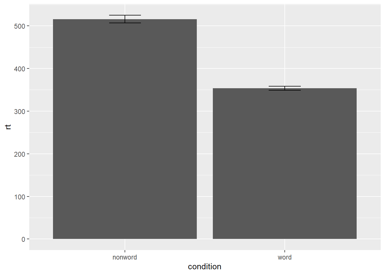
Figure 4.5: Bar plot of means with error bars representing SE.
4.4 Violin-boxplot
The power of the layered system for making figures is further highlighted by the ability to combine different types of plots. For example, rather than using a bar chart with error bars, one can easily create a single plot that includes density of the distribution, confidence intervals, means and standard errors. In the below code we first draw a violin plot, then layer on a boxplot, a point for the mean (note geom = "point" instead of "bar") and standard error bars (geom = "errorbar"). This plot does not require much additional code to produce than the bar plot with error bars, yet the amount of information displayed is vastly superior.
-
fatten = NULLin the boxplot geom removes the median line, which can make it easier to see the mean and error bars. Including this argument will result in the messageRemoved 1 rows containing missing values (geom_segment)and is not a cause for concern. Removing this argument will reinstate the median line.
ggplot(dat_long, aes(x = condition, y= rt)) +
  geom_violin() +
  # remove the median line with fatten = NULL
  geom_boxplot(width = .2,
               fatten = NULL) +
  stat_summary(fun = "mean", geom = "point") +
  stat_summary(fun.data = "mean_se",
               geom = "errorbar",
               width = .1)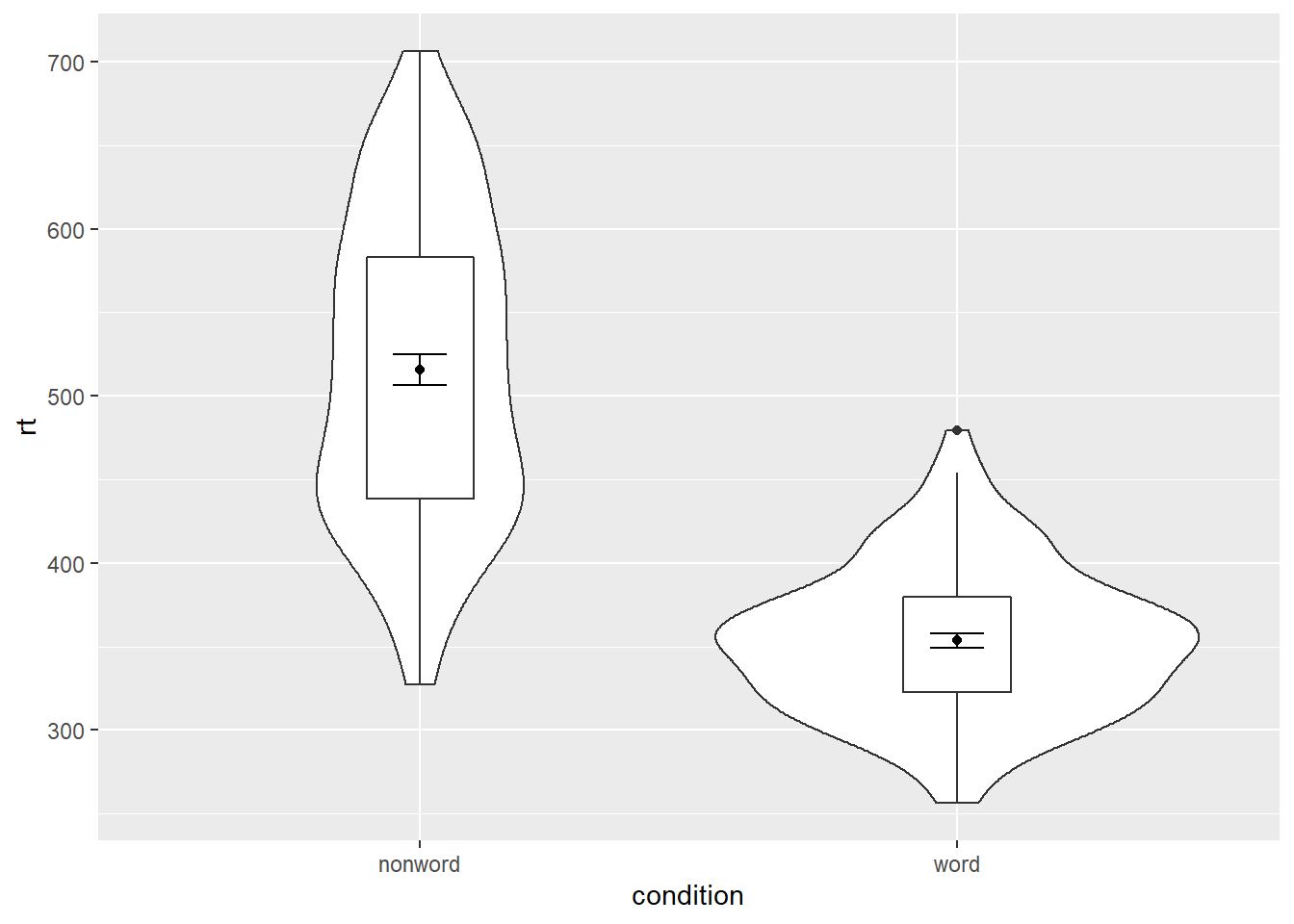
Figure 4.6: Violin-boxplot with mean dot and standard error bars.
It is important to note that the order of the layers matters and it is worth experimenting with the order to see where the order matters. For example, if we call geom_boxplot() followed by geom_violin(), we get the following mess:
ggplot(dat_long, aes(x = condition, y= rt)) +
  geom_boxplot() +
  geom_violin() +
  stat_summary(fun = "mean",  geom = "point") +
  stat_summary(fun.data = "mean_se",
               geom = "errorbar",
               width = .1)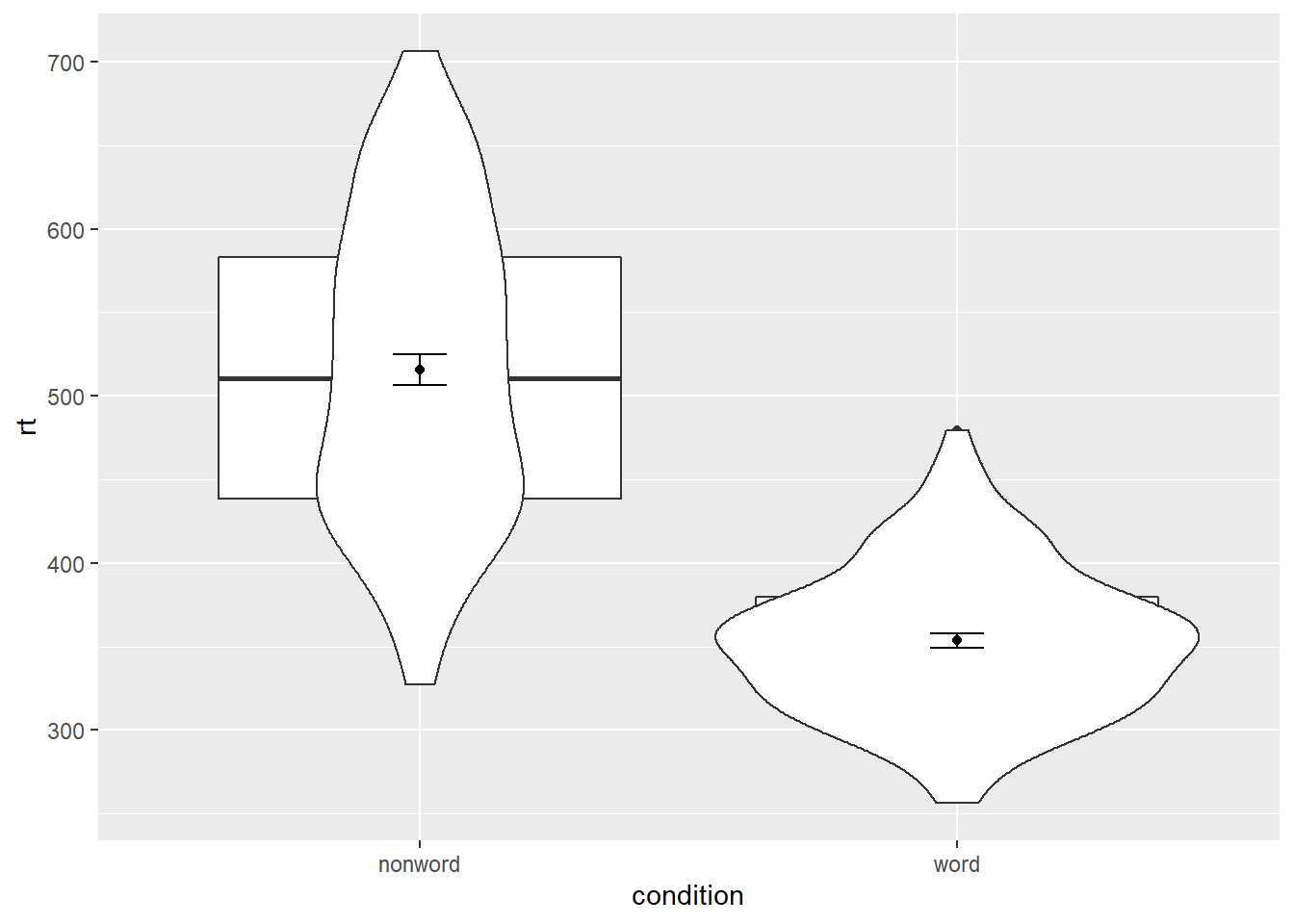
Figure 4.7: Plot with the geoms in the wrong order.
4.4.1 Grouped violin-boxplots
As with previous plots, another variable can be mapped to fill for the violin-boxplot. (Remember to add a colourblind-safe palette.) However, simply adding fill to the mapping causes the different components of the plot to become misaligned because they have different default positions:
ggplot(dat_long, aes(x = condition, y= rt, fill = language)) +
  geom_violin() +
  geom_boxplot(width = .2,
               fatten = NULL) +
  stat_summary(fun = "mean",  geom = "point") +
  stat_summary(fun.data = "mean_se",
               geom = "errorbar",
               width = .1) +
  scale_fill_brewer(palette = "Dark2")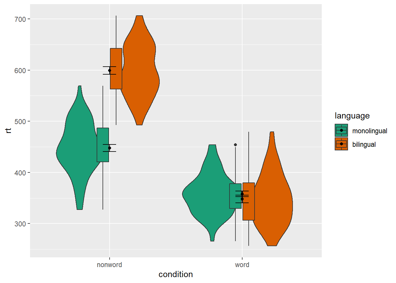
Figure 4.8: Grouped violin-boxplots without repositioning.
To rectify this we need to adjust the argument position for each of the misaligned layers. position_dodge() instructs R to move (dodge) the position of the plot component by the specified value; finding what value looks best can sometimes take trial and error.
# set the offset position of the geoms
pos <- position_dodge(0.9)

ggplot(dat_long, aes(x = condition, y= rt, fill = language)) +
  geom_violin(position = pos) +
  geom_boxplot(width = .2,
               fatten = NULL,
               position = pos) +
  stat_summary(fun = "mean",
               geom = "point",
               position = pos) +
  stat_summary(fun.data = "mean_se",
               geom = "errorbar",
               width = .1,
               position = pos) +
  scale_fill_brewer(palette = "Dark2")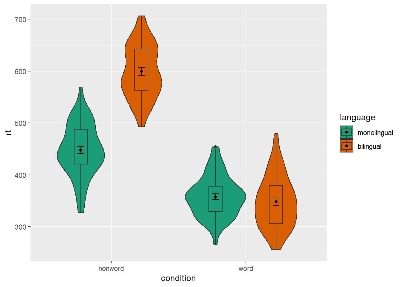
Figure 4.9: Grouped violin-boxplots with repositioning.
4.5 Customisation part 3
Combining multiple type of plots can present an issue with the colours, particularly when the fill and line colours are similar. For example, it is hard to make out the boxplot against the violin plot above.
There are a number of solutions to this problem. One solution is to adjust the transparency of each layer using alpha. The exact values needed can take trial and error:
ggplot(dat_long, aes(x = condition, y= rt, fill = language,
                     group = paste(condition, language))) +
  geom_violin(alpha = 0.25, position = pos) +
  geom_boxplot(width = .2,
               fatten = NULL,
               alpha = 0.75,
               position = pos) +
  stat_summary(fun = "mean",
               geom = "point",
               position = pos) +
  stat_summary(fun.data = "mean_se",
               geom = "errorbar",
               width = .1,
               position = pos) +
  scale_fill_brewer(palette = "Dark2")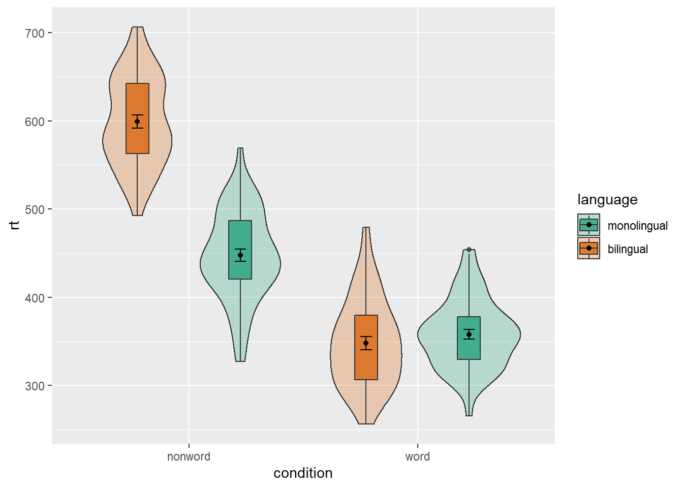
Figure 4.10: Using transparency on the fill color.
Alternatively, we can change the fill of individual geoms by adding fill = "colour" to each relevant geom. In the example below, we fill the boxplots with white. Since all of the boxplots are no longer being filled according to language, but you still want a four separate boxplots, you have to add an extra mapping to geom_boxplot() to specify that you want the output grouped by the interaction of condition and language.
ggplot(dat_long, aes(x = condition, y= rt, fill = language)) +
  geom_violin(position = pos) +
  geom_boxplot(width = .2, fatten = NULL,
               mapping = aes(group = interaction(condition, language)),
               fill = "white",
               position = pos) +
  stat_summary(fun = "mean",
               geom = "point",
               position = pos) +
  stat_summary(fun.data = "mean_se",
               geom = "errorbar",
               width = .1,
               position = pos) +
  scale_fill_brewer(palette = "Dark2")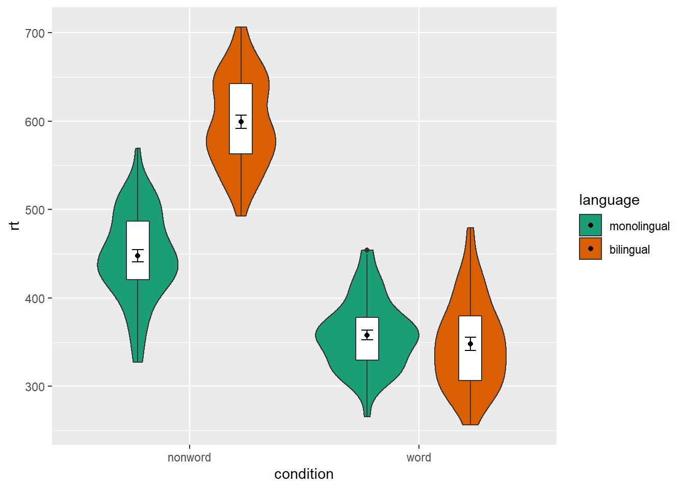
Figure 4.11: Manually changing the fill color.
4.6 Activities 3
Before you go on, do the following:
Review all the code you have run so far. Try to identify the commonalities between each plot's code and the bits of the code you might change if you were using a different dataset.
Take a moment to recognise the complexity of the code you are now able to read.
For the violin-boxplot, for
geom = "point", try changingfuntomedian
ggplot(dat_long, aes(x = condition, y= rt)) +
  geom_violin() +
  # remove the median line with fatten = NULL
  geom_boxplot(width = .2, fatten = NULL) +
  stat_summary(fun = "median", geom = "point") +
  stat_summary(fun.data = "mean_se",
               geom = "errorbar",
width = .1)- For the violin-boxplot, for
geom = "errorbar", try changingfun.datatomean_cl_normal(for 95% CI)
ggplot(dat_long, aes(x = condition, y= rt)) +
  geom_violin() +
  # remove the median line with fatten = NULL
  geom_boxplot(width = .2, fatten = NULL) +
  stat_summary(fun = "mean", geom = "point") +
  stat_summary(fun.data = "mean_cl_normal",
               geom = "errorbar",
width = .1)- Go back to the grouped density plots and try changing the transparency with
alpha.
ggplot(dat_long, aes(x = rt, fill = condition)) +
  geom_density(alpha = .4)+
  scale_x_continuous(name = "Reaction time (ms)") +
  scale_fill_discrete(name = "Condition",
                      labels = c("Non-word", "Word"))