6 Advanced Plots
This tutorial has but scratched the surface of the visualisation options available using R. In the additional online resources we provide some further advanced plots and customisation options for those readers who are feeling confident with the content covered in this tutorial. However, the below plots give an idea of what is possible, and represent the favourite plots of the authorship team.
We will use some custom functions: geom_split_violin() and geom_flat_violin(), which you can access through the introdataviz package. These functions are modified from (Allen et al., 2021).
# how to install the introdataviz package to get split and half violin plots
devtools::install_github("psyteachr/introdataviz")
6.1 Split-violin plots
Split-violin plots remove the redundancy of mirrored violin plots and make it easier to compare the distributions between multiple conditions.
ggplot(dat_long, aes(x = condition, y = rt, fill = language)) +
  introdataviz::geom_split_violin(alpha = .4, trim = FALSE) +
  geom_boxplot(width = .2, alpha = .6, fatten = NULL, show.legend = FALSE) +
  stat_summary(fun.data = "mean_se", geom = "pointrange", show.legend = F,
               position = position_dodge(.175)) +
  scale_x_discrete(name = "Condition", labels = c("Non-word", "Word")) +
  scale_y_continuous(name = "Reaction time (ms)",
                     breaks = seq(200, 800, 100),
                     limits = c(200, 800)) +
  scale_fill_brewer(palette = "Dark2", name = "Language group") +
  theme_minimal()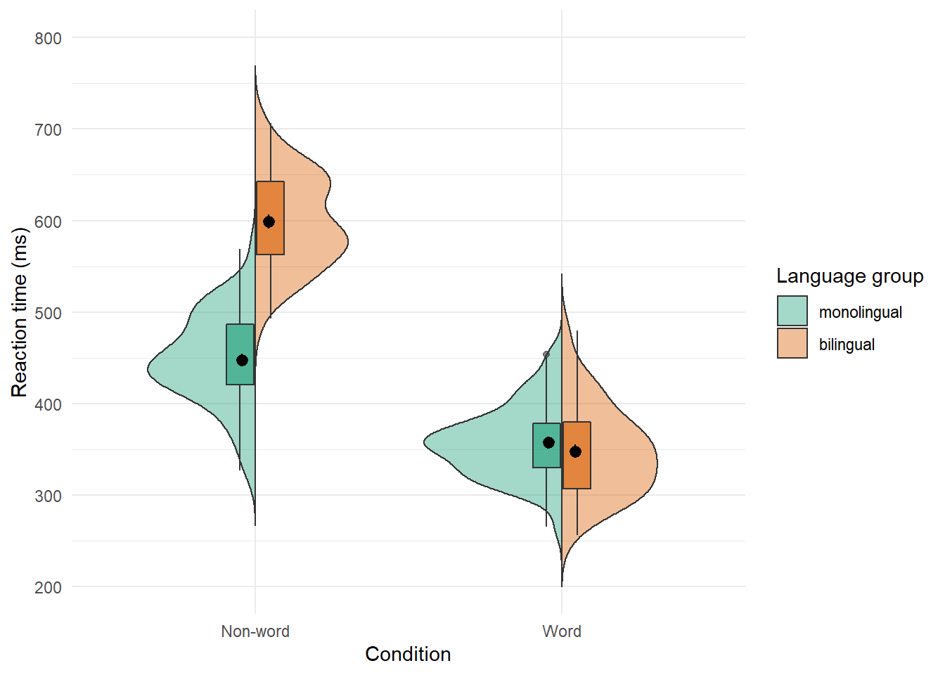
Figure 6.1: Split-violin plot
6.2 Raincloud plots
Raincloud plots combine a density plot, boxplot, raw data points, and any desired summary statistics for a complete visualisation of the data. They are so called because the density plot plus raw data is reminiscent of a rain cloud.
rain_height <- .1

ggplot(dat_long, aes(x = "", y = rt, fill = language)) +
  # clouds
  introdataviz::geom_flat_violin(trim=FALSE, alpha = 0.4,
    position = position_nudge(x = rain_height+.05)) +
  # rain
  geom_point(aes(colour = language), size = 2, alpha = .5, show.legend = FALSE,
              position = position_jitter(width = rain_height, height = 0)) +
  # boxplots
  geom_boxplot(width = rain_height, alpha = 0.4, show.legend = FALSE,
               outlier.shape = NA,
               position = position_nudge(x = -rain_height*2)) +
  # mean and SE point in the cloud
  stat_summary(fun.data = mean_cl_normal, mapping = aes(color = language), show.legend = FALSE,
               position = position_nudge(x = rain_height * 3)) +
  # adjust layout
  scale_x_discrete(name = "", expand = c(rain_height*3, 0, 0, 0.7)) +
  scale_y_continuous(name = "Reaction time (ms)",
                     breaks = seq(200, 800, 100),
                     limits = c(200, 800)) +
  coord_flip() +
  facet_wrap(~factor(condition,
                     levels = c("word", "nonword"),
                     labels = c("Word", "Non-Word")),
             nrow = 2) +
  # custom colours and theme
  scale_fill_brewer(palette = "Dark2", name = "Language group") +
  scale_colour_brewer(palette = "Dark2") +
  theme_minimal() +
  theme(panel.grid.major.y = element_blank(),
        legend.position = c(0.8, 0.8),
        legend.background = element_rect(fill = "white", color = "white"))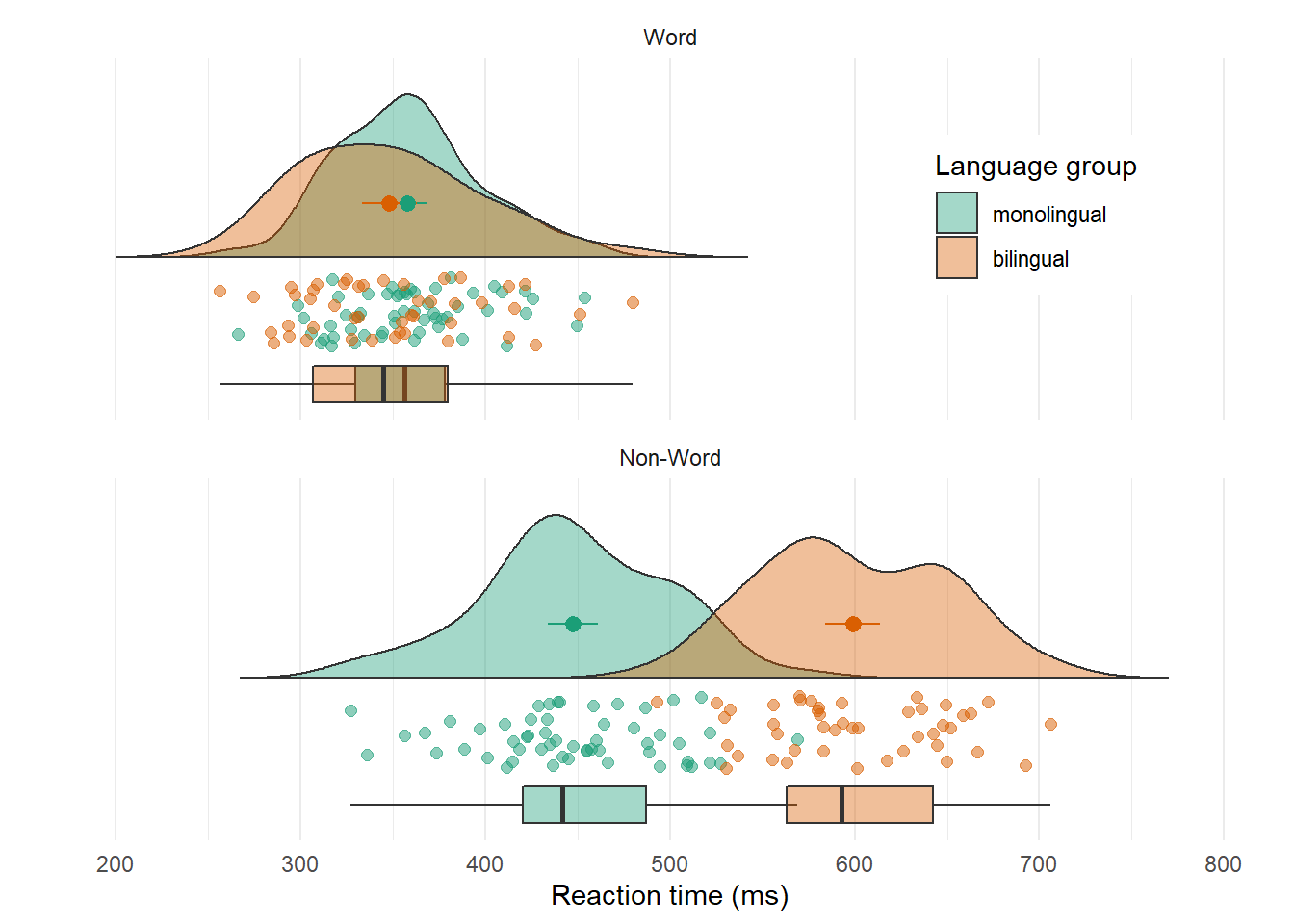
Figure 6.2: Raincloud plot. The point and line in the centre of each cloud represents its mean and 95% CI. The rain respresents individual data points.
6.3 Ridge plots
Ridge plots are a series of density plots that show the distribution of values for several groups. Figure 6.3 shows data from (Nation, 2017) and demonstrates how effective this type of visualisation can be to convey a lot of information very intuitively whilst being visually attractive.
# read in data from Nation et al. 2017
data <- read_csv("https://raw.githubusercontent.com/zonination/perceptions/master/probly.csv", col_types = "d")

# convert to long format and percents
long <- pivot_longer(data, cols = everything(),
                     names_to = "label",
                     values_to = "prob") %>%
  mutate(label = factor(label, names(data), names(data)),
         prob = prob/100)

# ridge plot
ggplot(long, aes(x = prob, y = label, fill = label)) +
  ggridges::geom_density_ridges(scale = 2, show.legend = FALSE) +
  scale_x_continuous(name = "Assigned Probability",
                     limits = c(0, 1), labels = scales::percent) +
  # control space at top and bottom of plot
  scale_y_discrete(name = "", expand = c(0.02, 0, .08, 0)) +
  scale_fill_viridis_d(option = "D") # colourblind-safe colours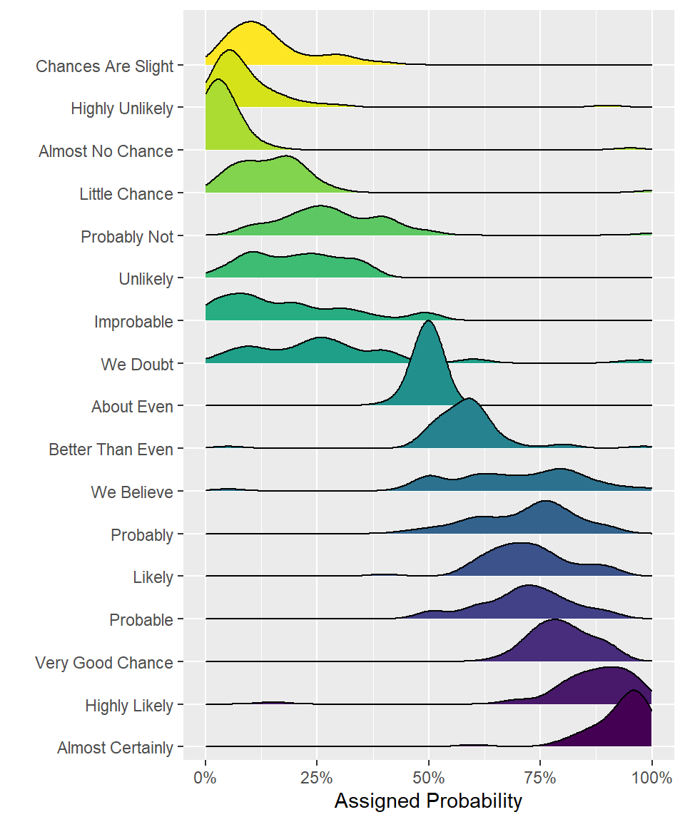
Figure 6.3: A ridge plot.
6.4 Alluvial plots
Alluvial plots visualise multi-level categorical data through flows that can easily be traced in the diagram.
library(ggalluvial)

# simulate data for 4 years of grades from 500 students
# with a correlation of 0.75 from year to year
# and a slight increase each year
dat <- faux::sim_design(
  within = list(year = c("Y1", "Y2", "Y3", "Y4")),
  n = 500,
  mu = c(Y1 = 0, Y2 = .2, Y3 = .4, Y4 = .6), r = 0.75,
  dv = "grade", long = TRUE, plot = FALSE) %>%
  # convert numeric grades to letters with a defined probability
  mutate(grade = faux::norm2likert(grade, prob = c("3rd" = 5, "2.2" = 10, "2.1" = 40, "1st" = 20)),
         grade = factor(grade, c("1st", "2.1", "2.2", "3rd"))) %>%
  # reformat data and count each combination
  tidyr::pivot_wider(names_from = year, values_from = grade) %>%
  dplyr::count(Y1, Y2, Y3, Y4)

# plot data with colours by Year1 grades
ggplot(dat, aes(y = n, axis1 = Y1, axis2 = Y2, axis3 = Y3, axis4 = Y4)) +
  geom_alluvium(aes(fill = Y4), width = 1/6) +
  geom_stratum(fill = "grey", width = 1/3, color = "black") +
  geom_label(stat = "stratum", aes(label = after_stat(stratum))) +
  scale_fill_viridis_d(name = "Final Classification") +
  theme_minimal() +
  theme(legend.position = "top")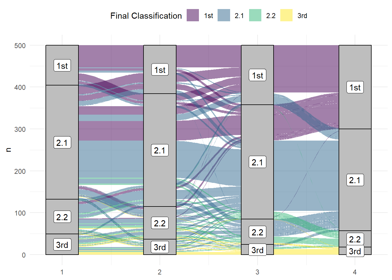
Figure 6.4: An alluvial plot showing the progression of student grades through the years.
6.5 Maps
Working with maps can be tricky. The sf package provides functions that work with ggplot2, such as geom_sf(). The rnaturalearth package provides high-quality mapping coordinates.
library(sf)          # for mapping geoms
library(rnaturalearth) # for map data

# get and bind country data
uk_sf <- ne_states(country = "united kingdom", returnclass = "sf")
ireland_sf <- ne_states(country = "ireland", returnclass = "sf")
islands <- bind_rows(uk_sf, ireland_sf) %>%
  filter(!is.na(geonunit))

# set colours
country_colours <- c("Scotland" = "#0962BA",
                     "Wales" = "#00AC48",
                     "England" = "#FF0000",
                     "Northern Ireland" = "#FFCD2C",
                     "Ireland" = "#F77613")

ggplot() +
  geom_sf(data = islands,
          mapping = aes(fill = geonunit),
          colour = NA,
          alpha = 0.75) +
  coord_sf(crs = sf::st_crs(4326),
           xlim = c(-10.7, 2.1),
           ylim = c(49.7, 61)) +
  scale_fill_manual(name = "Country",
                    values = country_colours)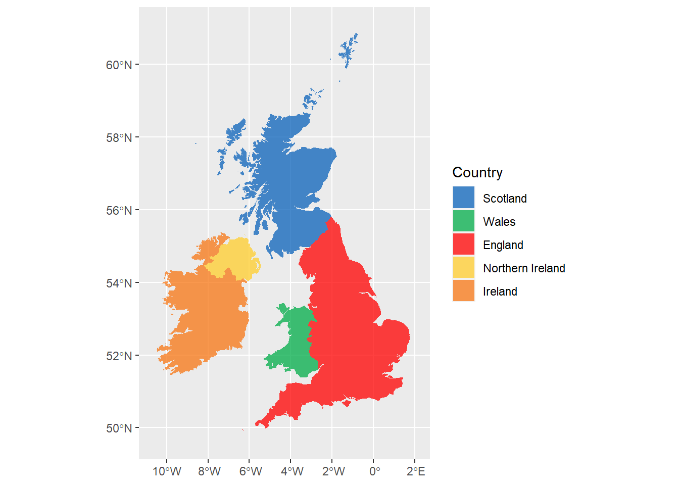
Figure 6.5: Map coloured by country.