D Advanced Plots
This appendix provides some examples of more complex plots. See Lisa's tutorials for the 2022 30-day chart challenge for even more plots.
D.1 Easter Egg - Overlaying Plots
Hopefully from some of the materials we have shown you, you will have found ways of presenting data in an informative manner - for example, we have shown violin plots and how they can be effective, when combined with boxplots, at displaying distributions. However, if you are familiar with other software you may be used to seeing this sort of information displayed differently, as perhaps a histogram with a normal curve overlaid. Whist the violin plots are better to convey that information we thought it might help to see alternative approaches here. Really it is about overlaying some of the plots we have already shown, but with some slight adjustments. For example, lets look at the histogram and density plot of reaction times we saw earlier - shown here side by side for convenience.
a <- ggplot(dat_long, aes(x = rt)) +
  geom_histogram(binwidth = 10, fill = "white", color = "black") +
  scale_x_continuous(name = "Reaction time (ms)") +
  labs(subtitle = "+ geom_histogram()")

b <- ggplot(dat_long, aes(x = rt)) +
  geom_density()+
  scale_x_continuous(name = "Reaction time (ms)") +
  labs(subtitle = "+ geom_density()")

a+b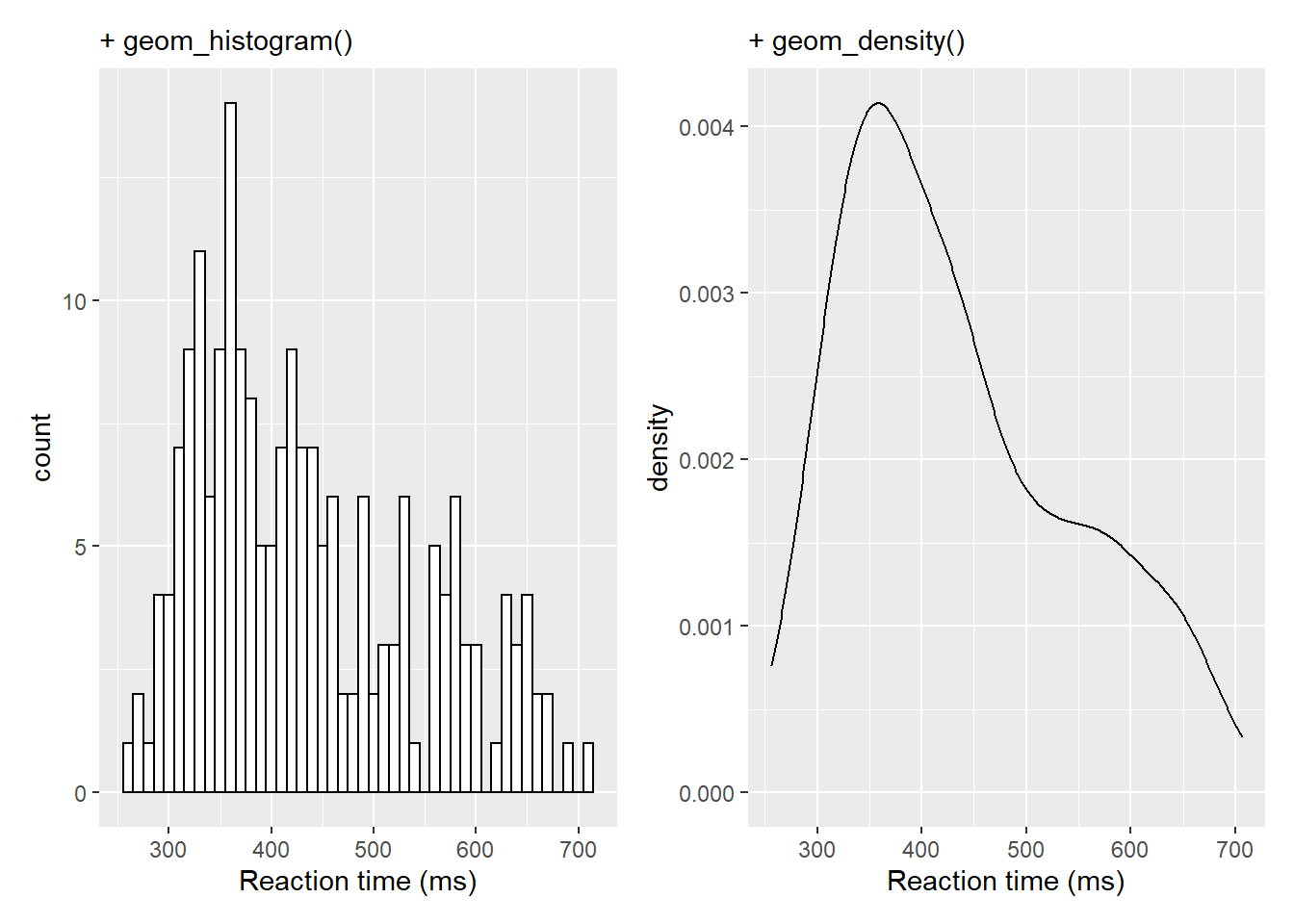
Now that in itself is fairly informative but perhaps takes up a lot of room so one option using some of the features of the patchwork library would be to inset the density plot in the top right of the histogram. We already showed a little of patchwork earlier so we won't repeat it here but all we are doing is placing one of the figures (the density plot) within the inset_element() function and applying some appropriate values to position the inset - through a little trial and error - based on the bottom left corner of the plot area being left = 0, bottom = 0, and the top right corner being right = 1, top = 1:
a <- ggplot(dat_long, aes(x = rt)) +
  geom_histogram(binwidth = 10, fill = "white", color = "black") +
  scale_x_continuous(name = "Reaction time (ms)")

b <- ggplot(dat_long, aes(x = rt)) +
  geom_density()+
  scale_x_continuous(name = "Reaction time (ms)")

a + inset_element(b, left = 0.6, bottom = 0.6, right = 1, top = 1)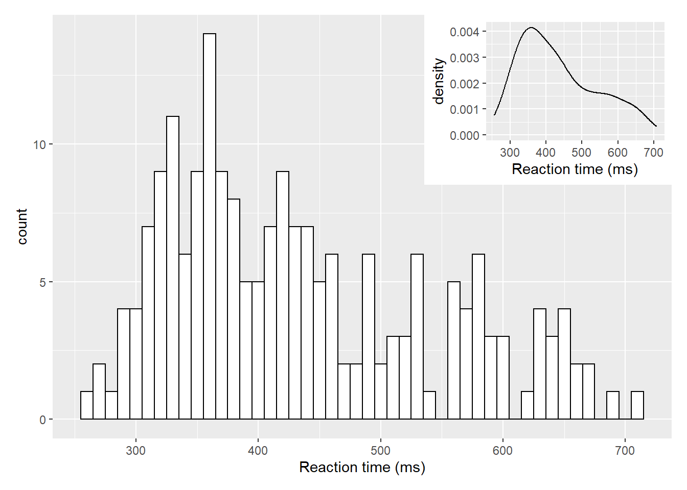
Figure D.1: Insetting a plot within a plot using inset_element() from the patchwork library
But of course that only works if there is space for the inset and it doesn't start overlapping on the main figure. This next approach fully overlays the density plot on top of the histogram. There is one main change though and that is the addition of aes(y=..density..) within geom_histogram(). This tells the histogram to now be plotted in terms of density and not count, meaning that the density plot and the histogram and now based on the same y-axis:
ggplot(dat_long, aes(x = rt)) +
  geom_histogram(aes(y = ..density..),
                 binwidth = 10, fill = "white", color = "black") +
  geom_density()+
  scale_x_continuous(name = "Reaction time (ms)")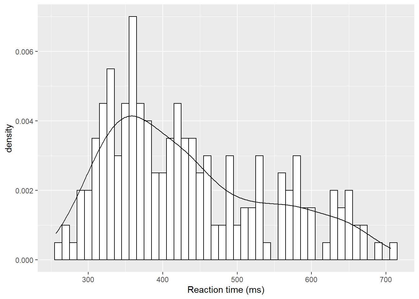
Figure D.2: A histogram with density plot overlaid
The main thing to not in the above figure is that both the histogram and the density plot are based on the data you have collected. An alternative that you might want to look at it is plotting a normal distribution on top of the histogram based on the mean and standard deviation of the data. This is a bit more complicated but works as follows:
ggplot(dat_long, aes(rt)) +
  geom_histogram(aes(y = ..density..),
                 binwidth = 10, fill = "white", color = "black") +
  stat_function(
    fun = dnorm,
    args = list(mean = mean(dat_long$rt),
                sd = sd(dat_long$rt))
  )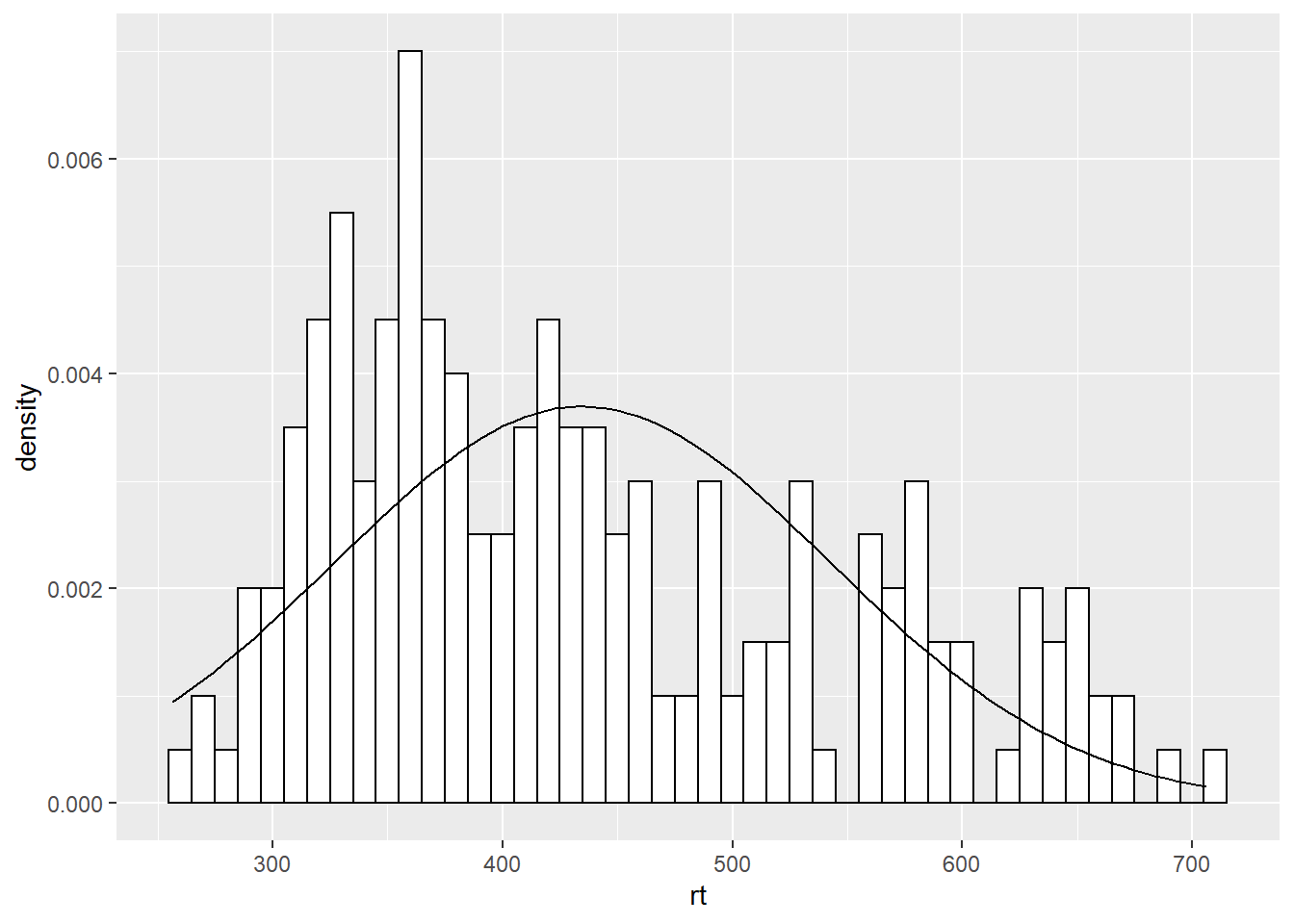
Figure D.3: A histogram with normal distribution based on the data overlaid
The first part of this approach is identical to what we say above but instead of using geom_density() we are using a statistics function called stat_function() similar to ones we saw earlier when plotting means and standard deviations. What stat_function() is doing is taking the Normal distribution density function, fun = dnorm (read as function equals density normal), and then the mean of the data (mean = mean(dat_long$rt)) and the standard deviation of the data sd = sd(dat_long$rt) and creates a distribution based on those values. The args refers to the arguments that the dnorm function takes, and they are passed to the function as a list (list()). But from there, you can then start to alter the linetype, color, and thickness (lwd = 3 for example) as you please.
ggplot(dat_long, aes(rt)) +
  geom_histogram(aes(y = ..density..),
                 binwidth = 10, fill = "white", color = "black") +
  stat_function(
    fun = dnorm,
    args = list(mean = mean(dat_long$rt),
                sd = sd(dat_long$rt)),
    color = "red",
    lwd = 3,
    linetype = 2
  )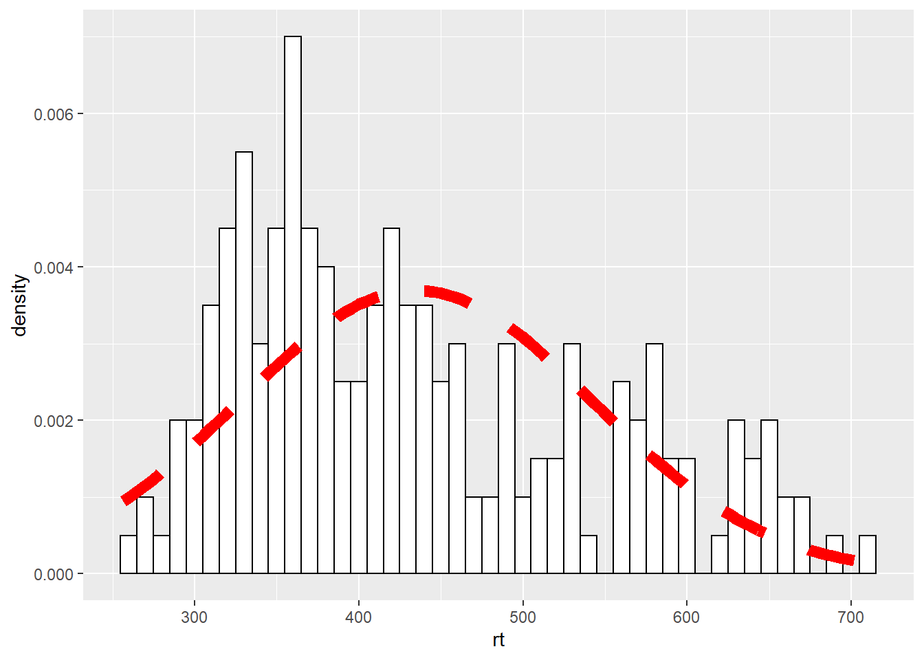
Figure D.4: Changing the line of the stat_function()
D.2 Easter Egg - A Dumbbell Plot
A nice way of representing a change across different conditions, within participants or across timepoints, is the dumbbell chart. These figures can do a lot of heavy lifting in conveying patterns within the data and are not as hard to create in ggplot as they might first appear. The premise is that you need the start point, in terms of x (x =) and y (y =), and the end point, again in terms of x (xend =) and y (yend =). You draw a line between those two points using geom_segment() and then add a data point at the both ends of the line using geom_point(). So for example, we will use the average accuracy scores for the word and non-word conditions, for monolingual and bilinguals, to demonstrate. We could do the same figure for all participants but as we have 100 participants it can be a bit wild. We first need to create the averages using a little bit of data wrangling we have seen:
dat_avg <- dat %>%
  group_by(language) %>%
  summarise(mean_acc_nonword = mean(acc_nonword),
            mean_acc_word = mean(acc_word)) %>%
  ungroup()
So our data looks as follows:
| language | mean_acc_nonword | mean_acc_word |
|---|---|---|
| monolingual | 84.87273 | 94.87273 |
| bilingual | 84.93333 | 95.17778 |
| nom |
|---|
| mean_acc_nonword |
| nom |
|---|
| mean_acc_word |
**. And now we can create our dumbbell plot as follows:
ggplot(dat_avg) +
  geom_segment(aes(x = mean_acc_nonword, y = language,
                   xend = mean_acc_word, yend = language)) +
  geom_point(aes(x = mean_acc_nonword, y = language), color = "red") +
  geom_point(aes(x = mean_acc_word, y = language), color = "blue") +
  labs(x = "Change in Accuracy")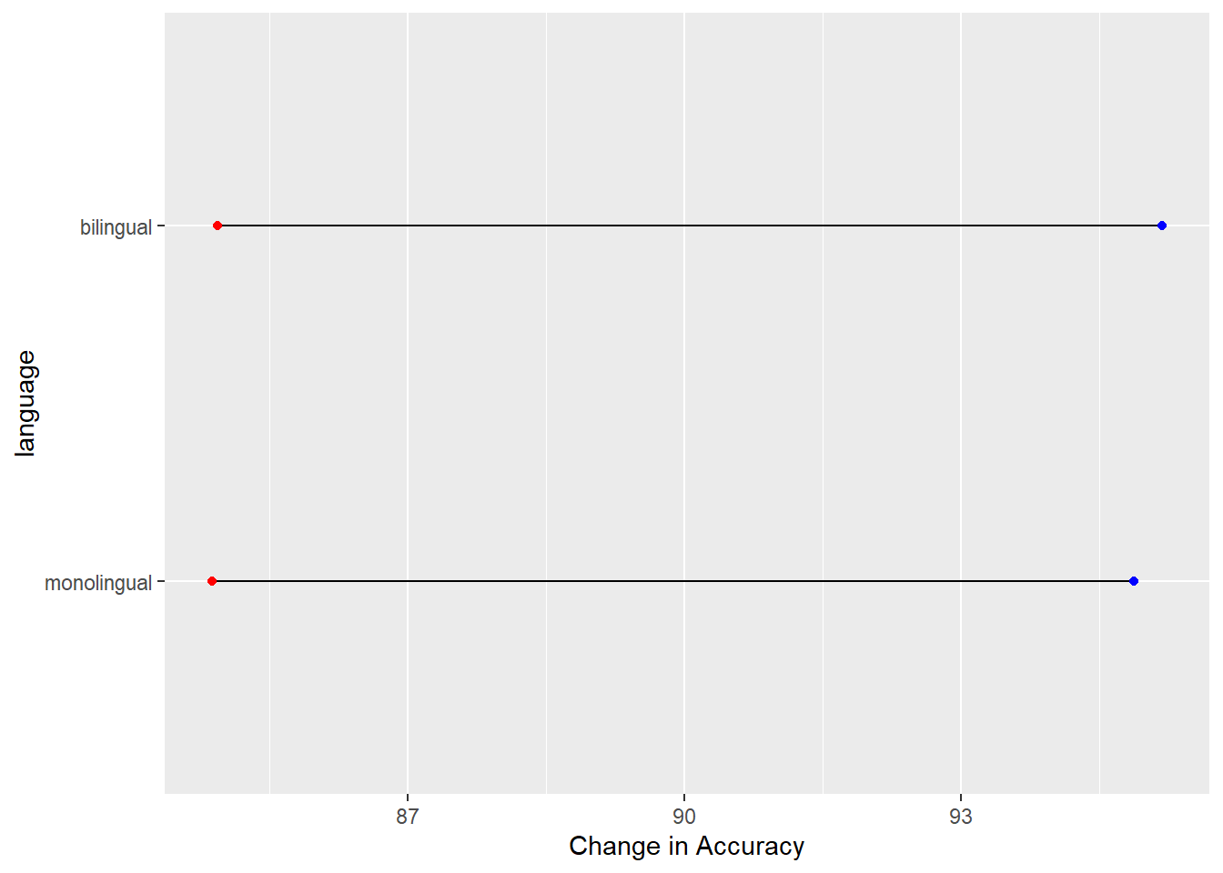
Figure D.5: A dumbbell plot of change in Average Accuracy from Non-word trials (red dots) to Word trials (blue dots) for monolingual and bilingual participants.
Which actually gives the least exciting figure ever as both groups showed the same change from the non-word trials (red dots) to the word trials (blue dots) but we can break the code down a bit just to highlight what we are doing, remembering the idea about layers. Layers one and two add the basic background and black line from the start point (x,y), the mean accuracy of non-word trials for the two conditions, to the end point (xend, yend), the mean accuracy of word trials for the two conditions:
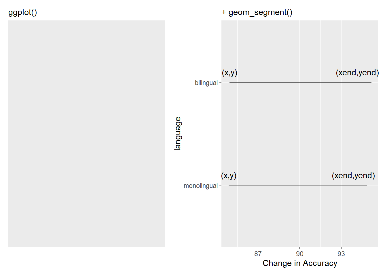
Figure D.6: Building the bars of our dumbbells. The (x,y) and (xend, yend) have been added to show the values you need to consider and enter to create the dumbbell
and the remaining lines add the dots at the end of the dumbells and changes the x axis label to something useful:
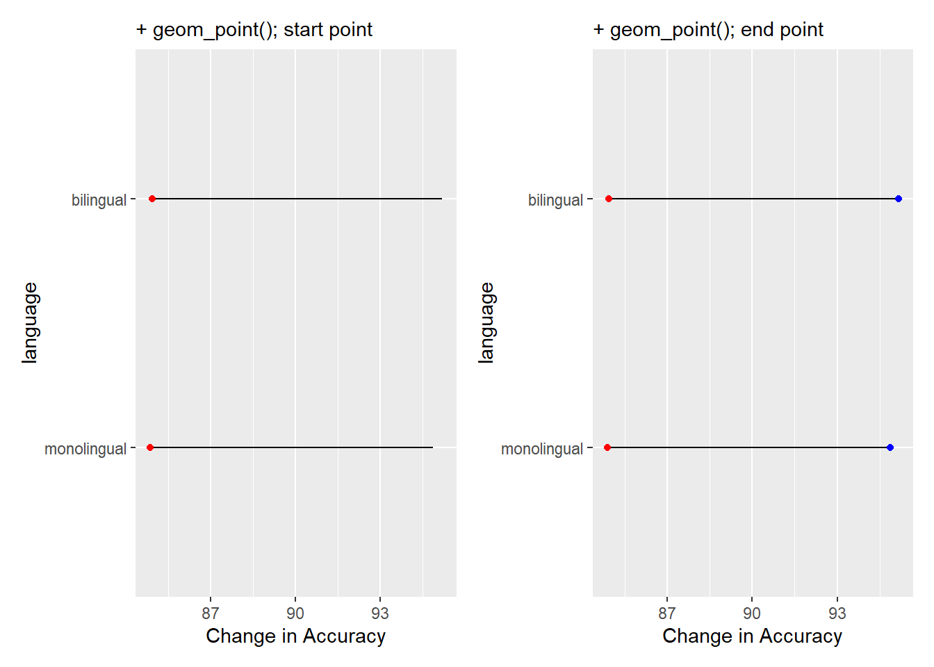
Figure D.7: Adding the weights to the dumbbells. Red dots are added in one layer to show Average Accuracy of Non-word trials, and blue dots are added in final layer to show Average Accuracy of Word trials.
Of course, worth remembering, it is better to always think of the dumbbell as a start and end point, not left and right, as had accuracy gone down when moving from Non-word trials to Word trials then our bars would run the opposite direction. If you repeat the above process using reaction times instead of accuracy you will see what we mean.
D.3 Easter Egg - A Pie Chart
Pie Charts are not the best form of visualisation as they generally require people to compare areas and/or angles which is a fairly unintuitive means of doing a comparison. They are so disliked in many fields that ggplot does not actually have a geom_...() function to create one. But, there is always somebody that wants to create a pie chart regardless and who are we to judge. So here would be the code to produce a pie chart of the demographic data we saw in the start of the paper:
count_dat <- dat %>%
  group_by(language) %>%
  count() %>%
  ungroup() %>%
  mutate(percent = (n/sum(n)*100))

ggplot(count_dat, aes(x = "",
                      y = percent,
                      fill = language)) +
  geom_bar(width = 1, stat="identity") +
  coord_polar("y", start = 0) +
  theme(
    axis.title = element_blank(),
    panel.grid = element_blank(),
    panel.border = element_blank(),
    axis.ticks = element_blank(),
    axis.text.x = element_blank()
  ) +
  geom_text(aes(y = c(75, 25),
                label = paste(percent, "%")),
            size = 6)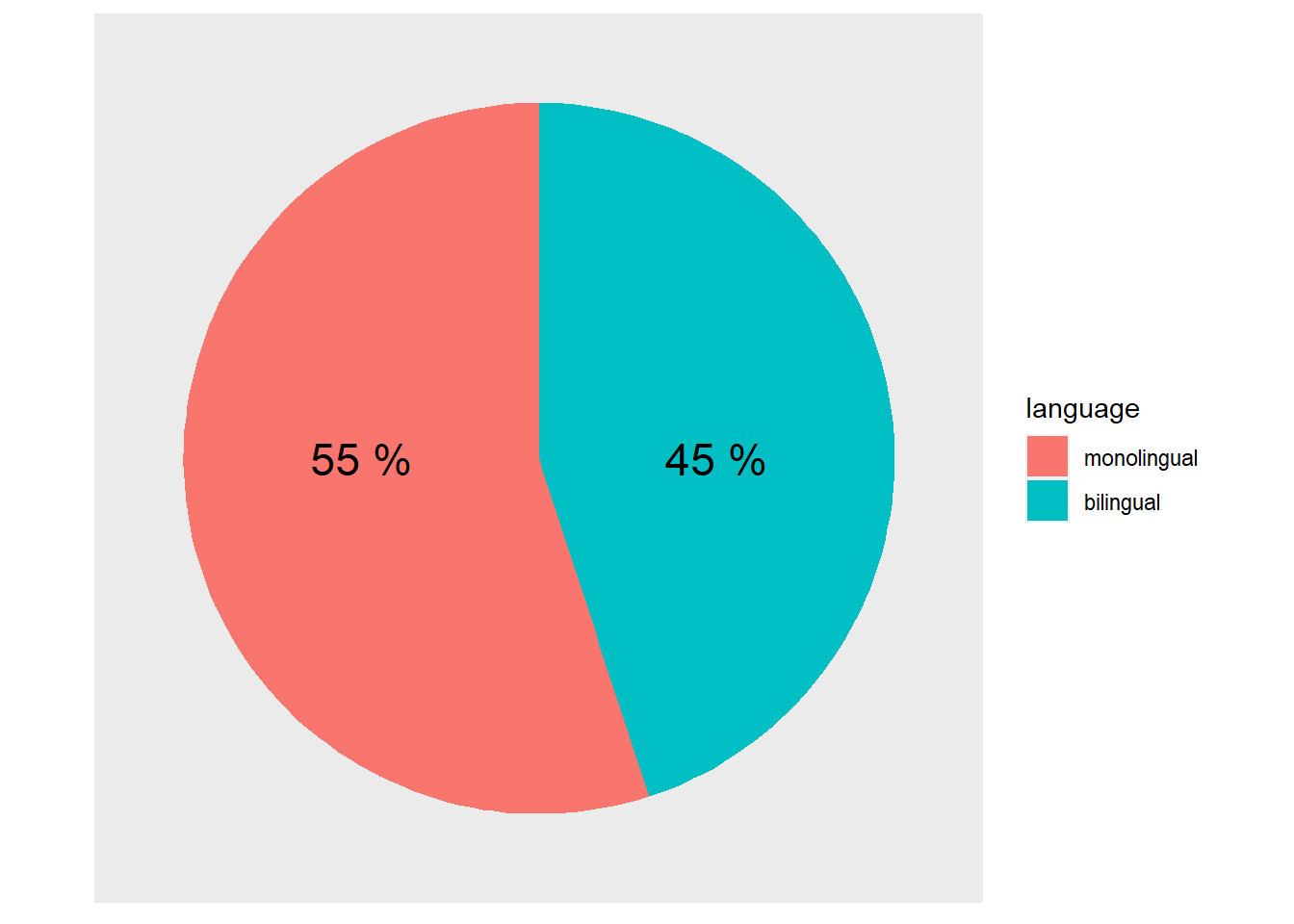
Figure D.8: A pie chart of the demographics
Note that this is effectively creating a stacked bar chart with no x variable (i.e. x = "") and then wrapping the y-axis into a circle (i.e. coord_polar("y", start = 0)). That is what the first three lines of the ggplot() code does:
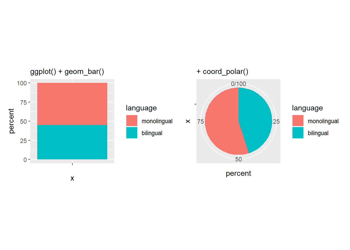
Figure D.9: The basis of a pie chart
The remainder of the code is used to remove the various panel and tick lines, and text, setting them all to element_blank() through the theme() functions we saw above, and to add new labelling text on top of the pie chart at specific y-values (i.e. y = c(75,25)). But remember, friends don't let friends make pie charts!
D.4 Easter Egg - A Lollipop Plot
Lollipop plots are a sweet alternative to pie charts for representing relative counts. They're a combination of geom_linerange() and geom_point(). Use coord_flip() to make them horizontal.
pets <- c("cats", "dogs", "ferrets", "fish", "hamsters", "snakes")
prob <- c(50, 50, 20, 30, 20, 15)
tibble(pet = sample(pets, 500, TRUE, prob) %>% factor(rev(pets))) %>%
  count(pet) %>%
  ggplot(aes(x = pet)) +
  geom_linerange(mapping = aes(ymin = 0, ymax = n),
                 size = 2) +
  geom_point(mapping = aes(y = n, colour = pet),
             shape = 21,
             size = 8,
             stroke = 4,
             fill = "white",
             show.legend = FALSE) +
  geom_text(aes(label = pet),
            y = 1, hjust = 0, size = 6,
            position = position_nudge(x = 0.3)) +
  scale_x_discrete(labels = NULL) +
  theme(axis.ticks.y = element_blank()) +
  scale_colour_viridis_d() +
  labs(x = "", y = "") +
  coord_flip(ylim = c(0, 200)) +
  theme_light()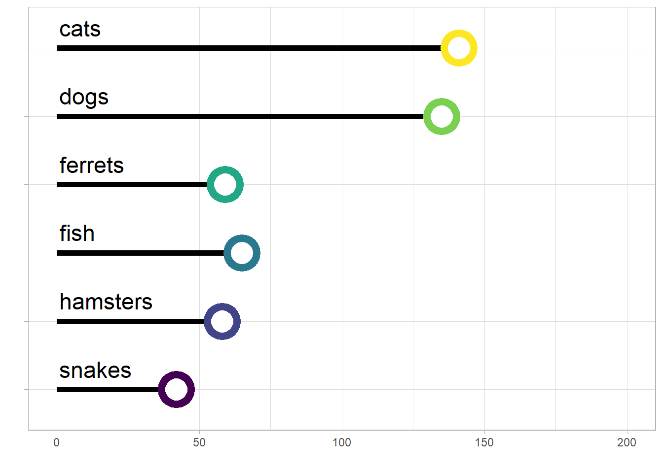
Figure D.10: A lollipop plot showing the number of different types of pets.