1 Introduction
Use of the programming language R (R Core Team, 2022) for data processing and statistical analysis by researchers is increasingly common, with an average yearly growth of 87% in the number of citations of the R Core Team between 2006-2018 (Barrett, 2019). In addition to benefiting reproducibility and transparency, one of the advantages of using R is that researchers have a much larger range of fully customisable data visualisation options than are typically available in point-and-click software, due to the open-source nature of R. These visualisation options not only look attractive, but can increase transparency about the distribution of the underlying data rather than relying on commonly used visualisations of aggregations such as bar charts of means (Newman & Scholl, 2012).
Yet, the benefits of using R are obscured for many researchers by the perception that coding skills are difficult to learn (Robins et al., 2003). Coupled with this, only a minority of psychology programmes currently teach coding skills (Wills, n.d.) with the majority of both undergraduate and postgraduate courses using proprietary point-and-click software such as SAS, SPSS or Microsoft Excel. While the sophisticated use of proprietary software often necessitates the use of computational thinking skills akin to coding (for instance SPSS scripts or formulas in Excel), we have found that many researchers do not perceive that they already have introductory coding skills. In the following tutorial we intend to change that perception by showing how experienced researchers can redevelop their existing computational skills to utilise the powerful data visualisation tools offered by R.
In this tutorial we provide a practical introduction to data visualisation using R, specifically aimed at researchers who have little to no prior experience of using R. First we detail the rationale for using R for data visualisation and introduce the "grammar of graphics" that underlies data visualisation using the ggplot2 package. The tutorial then walks the reader through how to replicate plots that are commonly available in point-and-click software such as histograms and boxplots, as well as showing how the code for these "basic" plots can be easily extended to less commonly available options such as violin-boxplots.
1.1 Why R for data visualisation?
Data visualisation benefits from the same advantages as statistical analysis when writing code rather than using point-and-click software -- reproducibility and transparency. The need for psychological researchers to work in reproducible ways has been well-documented and discussed in response to the replication crisis (e.g. Munafò et al., 2017) and we will not repeat those arguments here. However, there is an additional benefit to reproducibility that is less frequently acknowledged compared to the loftier goals of improving psychological science: if you write code to produce your plots, you can reuse and adapt that code in the future rather than starting from scratch each time.
In addition to the benefits of reproducibility, using R for data visualisation gives the researcher almost total control over each element of the plot. Whilst this flexibility can seem daunting at first, the ability to write reusable code recipes (and use recipes created by others) is highly advantageous. The level of customisation and the professional outputs available using R has, for instance, lead news outlets such as the BBC (Visual & Journalism, 2019) and the New York Times (Bertini & Stefaner, 2015) to adopt R as their preferred data visualisation tool.
1.2 A layered grammar of graphics
There are multiple approaches to data visualisation in R; in this paper we use the popular package1 ggplot2 (Wickham, 2016) which is part of the larger tidyverse2 (Wickham, 2017) collection of packages that provide functions for data wrangling, descriptives, and visualisation. A grammar of graphics (Wilkinson et al., 2005) is a standardised way to describe the components of a graphic. ggplot2 uses a layered grammar of graphics (Wickham, 2010), in which plots are built up in a series of layers. It may be helpful to think about any picture as having multiple elements that sit semi-transparently over each other. A good analogy is old Disney movies where artists would create a background and then add moveable elements on top of the background via transparencies.
Figure 1.1 displays the evolution of a simple scatterplot using this layered approach. First, the plot space is built (layer 1); the variables are specified (layer 2); the type of visualisation (known as a geom) that is desired for these variables is specified (layer 3) - in this case geom_point() is called to visualise individual data points; a second geom is added to include a line of best fit (layer 4), the axis labels are edited for readability (layer 5), and finally, a theme is applied to change the overall appearance of the plot (layer 6).
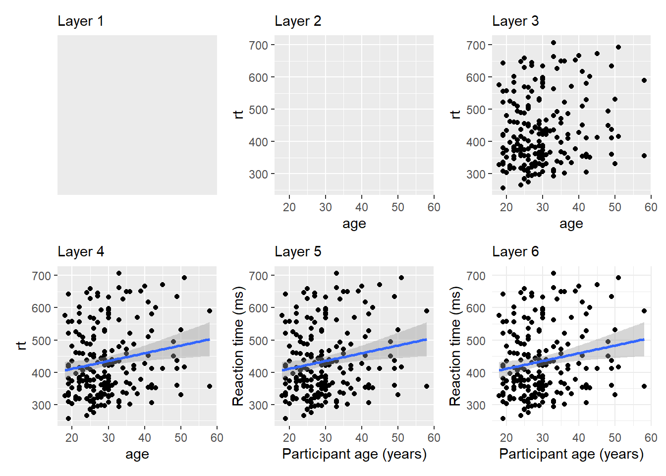
Figure 1.1: Evolution of a layered plot
Importantly, each layer is independent and independently customisable. For example, the size, colour and position of each component can be adjusted, or one could, for example, remove the first geom (the data points) to only visualise the line of best fit, simply by removing the layer that draws the data points (Figure 1.2). The use of layers makes it easy to build up complex plots step-by-step, and to adapt or extend plots from existing code.
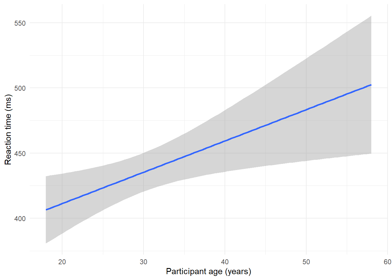
Figure 1.2: Plot with scatterplot layer removed.
1.3 Tutorial components
This tutorial contains three components.
- A traditional PDF manuscript that can easily be saved, printed, and cited.
- An online version of the tutorial published at https://psyteachr.github.io/introdataviz/ that may be easier to copy and paste code from and that also provides the optional activity solutions as well as additional appendices, including code tutorials for advanced plots beyond the scope of this paper and links to additional resources.
- An Open Science Framework repository published at https://osf.io/bj83f/ that contains the simulated dataset (see below), preprint, and R Markdown workbook.
1.4 Simulated dataset
For the purpose of this tutorial, we will use simulated data for a 2 x 2 mixed-design lexical decision task in which 100 participants must decide whether a presented word is a real word or a non-word. There are 100 rows (1 for each participant) and 7 variables:
-
Participant information:
-
id: Participant ID -
age: Age
-
-
1 between-subject independent variable (IV):
-
language: Language group (1 = monolingual, 2 = bilingual)
-
-
4 columns for the 2 dependent variables (DVs) of RT and accuracy, crossed by the within-subject IV of condition:
-
rt_word: Reaction time (ms) for word trials -
rt_nonword: Reaction time (ms) for non-word trials -
acc_word: Accuracy for word trials -
acc_nonword: Accuracy for non-word trials
-
For newcomers to R, we would suggest working through this tutorial with the simulated dataset, then extending the code to your own datasets with a similar structure, and finally generalising the code to new structures and problems.
1.5 Setting up R and RStudio
We strongly encourage the use of RStudio (RStudio Team, 2021) to write code in R. R is the programming language whilst RStudio is an integrated development environment that makes working with R easier. More information on installing both R and RStudio can be found in the additional resources.
Projects are a useful way of keeping all your code, data, and output in one place. To create a new project, open RStudio and click File - New Project - New Directory - New Project. You will be prompted to give the project a name, and select a location for where to store the project on your computer. Once you have done this, click Create Project. Download the simulated dataset and code tutorial Rmd file from the online materials (ldt_data.csv, workbook.Rmd) and then move them to this folder. The files pane on the bottom right of RStudio should now display this folder and the files it contains - this is known as your working directory and it is where R will look for any data you wish to import and where it will save any output you create.
This tutorial will require you to use the packages in the tidyverse collection. Additionally, we will also require use of patchwork. To install these packages, copy and paste the below code into the console (the left hand pane) and press enter to execute the code.
# only run in the console, never put this in a script
package_list <- c("tidyverse", "patchwork")
install.packages(package_list)
R Markdown is a dynamic format that allows you to combine text and code into one reproducible document. The R Markdown workbook available in the online materials contains all the code in this tutorial and there is more information and links to additional resources for how to use R Markdown for reproducible reports in the additional resources.
The reason that the above code is not included in the workbook is that every time you run the install command code it will install the latest version of the package. Leaving this code in your script can lead you to unintentionally install a package update you didn't want. For this reason, avoid including install code in any script or Markdown document.
For more information on how to use R with RStudio, please see the additional resources in the online appendices.
1.6 Preparing your data
Before you start visualising your data, it must be in an appropriate format. These preparatory steps can all be dealt with reproducibly using R and the additional resources section points to extra tutorials for doing so. However, performing these types of tasks in R can require more sophisticated coding skills and the solutions and tools are dependent on the idiosyncrasies of each dataset. For this reason, in this tutorial we encourage the reader to complete data preparation steps using the method they are most comfortable with and to focus on the aim of data visualisation.
1.6.1 Data format
The simulated lexical decision data is provided in a csv (comma-separated variable) file. Functions exist in R to read many other types of data files; the rio package's import() function can read most types of files. However, csv files avoids problems like Excel's insistence on mangling anything that even vaguely resembles a date. You may wish to export your data as a csv file that contains only the data you want to visualise, rather than a full, larger workbook. It is possible to clean almost any file reproducibly in R, however, as noted above, this can require higher level coding skills. For getting started with visualisation, we suggest removing summary rows or additional notes from any files you import so the file only contains the rows and columns of data you want to plot.
1.6.2 Variable names
Ensuring that your variable names are consistent can make it much easier to work in R. We recommend using short but informative variable names, for example rt_word is preferred over dv1_iv1 or reaction_time_word_condition because these are either hard to read or hard to type.
It is also helpful to have a consistent naming scheme, particularly for variable names that require more than one word. Two popular options are CamelCase where each new word begins with a capital letter, or snake_case where all letters are lower case and words are separated by an underscore. For the purposes of naming variables, avoid using any spaces in variable names (e.g., rt word) and consider the additional meaning of a separator beyond making the variable names easier to read. For example, rt_word, rt_nonword, acc_word, and acc_nonword all have the DV to the left of the separator and the level of the IV to the right. rt_word_condition on the other hand has two separators but only one of them is meaningful, making it more difficult to split variable names consistently. In this paper, we will use snake_case and lower case letters for all variable names so that we don't have to remember where to put the capital letters.
When working with your own data, you can rename columns in Excel, but the resources listed in the online appendices point to how to rename columns reproducibly with code.
1.6.3 Data values
A benefit of R is that categorical data can be entered as text. In the tutorial dataset, language group is entered as 1 or 2, so that we can show you how to recode numeric values into factors with labels. However, we recommend recording meaningful labels rather than numbers from the beginning of data collection to avoid misinterpreting data due to coding errors. Note that values must match exactly in order to be considered in the same category and R is case sensitive, so "mono", "Mono", and "monolingual" would be classified as members of three separate categories.
Finally, importing data is more straightforward if cells that represent missing data are left empty rather than containing values like NA, missing or 9993. A complementary rule of thumb is that each column should only contain one type of data, such as words or numbers, not both.