3 Introduction to Data Visualisation
In this chapter, we introduce you to data visualisation. Visualising our data and the relationships between our variables is an incredibly useful and important skill.
It is important for you before you conduct any statistical analyses or present any summary statistics. We should always visualise our data as it is a quick and easy way to check our data make sense and identify any unusual trends. It is also important for others who read your work. Data visualisation can honestly present the features of our data to anyone who reads our research and provides a faster overview of our findings than reading a wall of numbers.
Across several chapters, we introduce you to the extremely flexible ggplot2 package for data visualisation as part of the tidyverse family. In two or three lines of code, you can create plots like Figure fig-ggplotdemo for exploratory data analysis. With a few extra lines, you can create publication quality plots that could go into a report.
In this chapter, we introduce you to the ggplot2 system of creating plots and cover histograms and bar plots. In future chapters, we cover different types of plot to communicate more complex data and analyses.
Chapter Intended Learning Outcomes (ILOs)
By the end of this chapter, you will be able to:
Read data files into R/RStudio.
Understand the
ggplot2layering system of creating plots.Create and edit histograms to visualise the frequency of observations collated into bins.
Create and edit barplots to visualise the frequency of different categories.
Save plots as an image to use in reports or presentations.
3.1 Chapter preparation
3.1.1 Introduction to the data set
From now on, we are going to use different data sets from psychology to develop and practice your data skills. This will prepare you for working with different kinds of psychology data and introduce you to different kinds of research questions they might ask. For this chapter, we are using open data from Woodworth et al. (2018). The abstract of their article is:
We present two datasets. The first dataset comprises 992 point-in-time records of self-reported happiness and depression in 295 participants, each assigned to one of four intervention groups, in a study of the effect of web-based positive-psychology interventions. Each point-in-time measurement consists of a participant’s responses to the 24 items of the Authentic Happiness Inventory and to the 20 items of the Center for Epidemiological Studies Depression (CES-D) scale. Measurements were sought at the time of each participant’s enrolment in the study and on five subsequent occasions, the last being approximately 189 days after enrolment. The second dataset contains basic demographic information about each participant.
In summary, we have two files containing demographic information about participants and measurements of two scales on happiness and depression:
The Authentic Happiness Inventory (AHI),
The Center for Epidemiological Studies Depression (CES-D) scale.
3.1.2 Organising your files and project for the chapter
Before we can get started, you need to organise your files and project for the chapter, so your working directory is in order. If you need a refresher of this process, you can look back over Chapter 2 - File structure, working directories, and R Projects.
In your folder for research methods and the book
ResearchMethods1_2/Quant_Fundamentals, create a new folder calledChapter_03_intro_data_viz. WithinChapter_03_intro_data_viz, create two new folders calleddataandfigures.Create an R Project for
Chapter_03_intro_data_vizas an existing directory for your chapter folder. This should now be your working directory.Create a new R Markdown document and give it a sensible title describing the chapter, such as
03 Introduction to Data Visualisation. Delete everything below line 10 so you have a blank file to work with and save the file in yourChapter_03_intro_data_vizfolder.Download these two data files which we used at the end of Chapter 2. Data file one: ahi-cesd.csv. Data file two: participant-info.csv. Right click the links and select “save link as”, or clicking the links will save the files to your Downloads. Make sure that both files are saved as “.csv”. Do not open them on your machine as often other software like Excel can change setting and ruin the files. Save or copy the file to your
data/folder withinChapter_03_intro_data_viz.
You are now ready to start working on the chapter!
Reminder of file management if you use the online server
If we support you to use the online University of Glasgow R Server, working with files is a little different. If you downloaded R / RStudio to your own computer or you are using one of the library/lab computers, please ignore this section.
The main disadvantage to using the R server is that you will need create folders on the server and then upload and download any files you are working on to and from the server. Please be aware that there is no link between your computer and the R server. If you change files on the server, they will not appear on your computer until you download them from the server, and you need to be very careful when you submit your assessment files that you are submitting the right file. This is the main reason we recommend installing R / RStudio on your computer wherever possible.
Going forward throughout this book, if you are using the server, you will need to follow an extra step where you also upload them to the sever. As an example:
Log on to the R server using the link we provided to you.
In the file pane, click
New folderand create the same structure we demonstrated above.Download these two data files which we used at the end of Chapter 2. Data file one: ahi-cesd.csv. Data file two: participant-info.csv. Save the two files into the
datafolder you created for chapter 3. To download a file from this book, right click the link and select “save link as”. Make sure that both files are saved as “.csv”. Do not open them on your machine as often other software like Excel can change setting and ruin the files.Now that the files are stored on your computer, go to RStudio on the server and click
UploadthenBrowseand choose the folder for the chapter you are working on.Click
Choose fileand go and find the data you want to upload.
3.2 Loading the tidyverse and reading data files
3.2.1 Activity 1 - Loading the tidyverse package
For everything we do in this chapter and almost every chapter from now, we need to use the tidyverse package. The tidyverse is a package of packages, containing a kind of ecosystem of functions that work together for data wrangling, descriptive statistics, and visualisation. So let’s load that package into our library using the library() function.
To load the tidyverse, below line 10 of your RMarkdown document, create a code chunk, type the following code into your code chunk, and run the code:
Remember that sometimes in the console or below your code chunk, you will see information about the package you have loaded. If you see an error message, be sure to read it and try to identify what the problem is. For example, if you are working on your own computer, have you installed tidyverse so R/RStudio can access it? Are there any spelling mistakes in the function or package?
Remember though, not all messages are errors, tidyverse explains what packages it loaded and highlights function name clashes. See activity 3 and 4 from Chapter 1 if you need a refresher.
3.2.2 Activity 2 - Reading data files using read_csv()
Now we have loaded tidyverse, we can read in the data we need for the remaining activities. “Read” in this sense just means to bring the data into RStudio and store it in an object, so we can work with it.
We will use the function read_csv() that allows us to read in .csv files. There are also functions that allow you to read in Excel files (e.g. .xlsx) and other formats, but in this course we will only use .csv files as they are not software specific, meaning they are more accessible to share, promoting our open science principles.
Where does
read_csv() come from?
When we describe tidyverse as a package of packages, the read_csv() function comes from a package called readr. This is one of the packages that tidyverse loads and contains several functions for reading different kinds of data.
Create a new code chunk below where you loaded tidyverse, type the following code, and run the code chunk:
To break down the code:
First, we create an object called
datthat contains the data in theahi-cesd.csvfile withindata/.Next, we create an object called
pinfothat contains the data in theparticipant-info.csvfile withindata/.Both lines have the same format of
object <- function("folder/datafile_name.csv")Remember that
<-is called the assignment operator but we can read it as “assigned to”. For example, the first line can be read as the data indata/ahi-cesd.csvis assigned to the object calleddat.
Error mode
There are several common mistakes that can happen here, so be careful how you are typing the code to read in the data.
You need the double quotation marks around the data file name, so R recognises you are giving it a file path.
Computers are literal, so you must spell the data file name correctly. For example, R would not know what
data/participant-inf.csvis. This is where pressing the tab key on your keyboard can be super helpful, as you can search and auto-complete your files and avoid spelling mistakes.For the same reason as spelling mistakes, you must add the .csv part on the end to tell R the specific file you want.
You must point R to the right folder relative to your working directory. If you typed
ahi-cesd.csv, you would receive an error as R would look in your chapter folder whereahi-cesd.csvdoes not exist, rather than within thedata/folder you stored it in.
If you have done this activity correctly, you should now see the objects dat and pinfo in the environment window in the top right of RStudio. If they are not there, check there are no error messages, check the spelling of the code and file names, and check your working directory is Chapter_03_intro_data_viz.
Be careful to use the right
read_csv() function
There is also a function called read.csv(). Be very careful not to use this function instead of read_csv() as they have different ways of naming columns. For the activities and the assignments in RM1 and RM2, we will always ask and expect you to use read_csv(). This is really a reminder to watch spelling on functions and to be careful to use the right functions, especially when the names are so close.
3.2.3 Activity 3 - Wrangling the two data sets
For this final preparation step, we would like you to add the following code. We are not tackling data wrangling until the next chapter, so we are not going to fully explain the code just yet. Copy the code (if you hover over the code, there is a copy to clipboard icon in the top right) and paste it into a code chunk below where you read the two data files, then run the code again.
For a brief overview, we are joining the two data files by common columns (“id” and “intervention”) to create the object all_dat. We are then selecting 10 columns from the original 54 to make the data easier to work with in summarydata.
This final object summarydata is the source of the data we will be working with for the rest of this chapter.
3.2.4 Activity 4 - Exploring the data set
Before we start plotting, it is a good idea to explore the data set you are working with. There is a handy function called glimpse() which provides an overview of the columns and responses in your data set.
Create a new code chunk below where you read and wrangled the data, and type and run the following code:
Rows: 992
Columns: 10
$ id           <dbl> 12, 162, 162, 267, 126, 289, 113, 8, 185, 185, 246, 185, …
$ occasion     <dbl> 5, 2, 3, 0, 5, 0, 2, 2, 2, 4, 4, 0, 4, 0, 1, 4, 0, 5, 4, …
$ elapsed.days <dbl> 182.025139, 14.191806, 33.033831, 0.000000, 202.096887, 0…
$ intervention <dbl> 2, 3, 3, 4, 2, 1, 1, 2, 3, 3, 3, 3, 1, 2, 2, 2, 3, 2, 2, …
$ ahiTotal     <dbl> 32, 34, 34, 35, 36, 37, 38, 38, 38, 38, 39, 40, 41, 41, 4…
$ cesdTotal    <dbl> 50, 49, 47, 41, 36, 35, 50, 55, 47, 39, 45, 47, 33, 27, 3…
$ sex          <dbl> 1, 1, 1, 1, 1, 1, 2, 1, 2, 2, 1, 2, 1, 2, 2, 1, 1, 1, 1, …
$ age          <dbl> 46, 37, 37, 19, 40, 49, 42, 57, 41, 41, 52, 41, 52, 58, 5…
$ educ         <dbl> 4, 3, 3, 2, 5, 4, 4, 4, 4, 4, 5, 4, 5, 5, 5, 4, 3, 4, 3, …
$ income       <dbl> 3, 2, 2, 1, 2, 1, 1, 2, 1, 1, 2, 1, 3, 2, 2, 3, 2, 2, 2, …
Where does
glimpse() come from?
The glimpse() function comes from a package called dplyr, which is part of the tidyverse. This package contains many functions for wrangling data like joining data sets and selecting columns. We will explore loads of functions within dplyr in the next few chapters on data wrangling.
This function provides a condensed summary of your data. You can see there are 992 rows and 10 columns. You see all the column names for each variable in the data set. You can also see that all the variables are automatically considered as numeric (in this case double represented by <dbl>). Treating categorical variables like “sex” and “income” as numbers will cause us problems later, but it is fine for the variables we will be working on now.
3.3 ggplot2 and the layer system
There are multiple approaches to data visualisation in R but we will use ggplot2 which uses a layered grammar of graphics where you build up plots in a series of layers. You can think of it as building a picture with multiple elements that sit over each other.
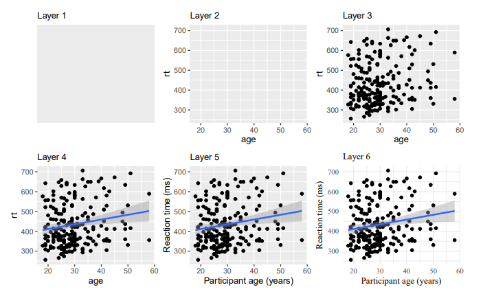
Figure fig-img-layers from Nordmann et al. (2022) demonstrates the idea of building up a plot by adding layers. One function creates the first layer, the basic plot area, and you add functions and arguments to add additional layers such as the data, the labels, the colors etc. If you are used to making plots in other software, this might seem a bit odd at first, but it means that you can customise each layer separately to make complex and beautiful figures with relative ease.
You can get a sense of what plots are possible from the website data-to-viz, but we will build up your data visualisation skills over the RM1 and RM2 courses.
3.4 Histograms and density plots
We are going to start by plotting the distribution of participant age in a histogram, and add layers to demonstrate how we build the plot step-by-step.
3.4.1 Step 1: Start with the ggplot function
This first layer tells R to access the ggplot function.
The first argument tells R to plot the summarydata dataframe. In the aes function, you specify the aesthetics of the plot, such as the axes and colours. What you need to specify depends on the plot you want to make (you will learn more about this later).
For a basic histogram, you only need to specify the x-axis (the y-axis will automatically be counts).
For each step, type the code in a new code chunk and run it after we add each layer to see it’s effect.
R Markdown tip of the chapter: Add code comments
After we introduced you to R Markdown to create reproducible documents in Chapter 2, we are going to add a tip in every chapter to demonstrate extra functionality.
In the code chunk above, we added a code comment by adding a hash (#). In code chunks and scripts, you can add a comment which R will ignore, so you can explain to yourself what the code is doing. In R Markdown, you can combine adding notes to yourself outside and inside the code chunks.
Code comments help explain what the code is doing and why you added certain values. It might seem redundant for simple functions, but as your code becomes more complex, you will forget what it is doing when you return to it after days, months, or years. Future you will thank past you.
3.4.2 Step 2: Add the geom_histogram layer
You can see that the code above produces an empty plot, because we have not specified which type of plot we want to make.
We will do this by adding another layer: geom_histogram(). A geom is an expression of the type of plot you want to create. For this variable, we want to create a histogram which is a type of plot showing the frequency of each observation.
You will see that you add the layers by adding a + at the end of each layer. As you read new code, try and read it line by line to walk through what it is doing. You can interpret + as “and then”. So, you could describe the plot as currently saying “plot the age variable from summary data, and then add a histogram”.
3.4.3 Step 3: Edit the histogram bins
In just two lines of code, we have a histogram! For exploratory data analysis, this is how ggplot2 is such a flexible and quick tool to get a visual overview of your data.
After running the last code chunk, you might have noticed a message warning you about the bin width: stat_bin() using bins = 30. A histogram describes the frequency of values within your variable. To do so, it must collect the values into “bins”. By default - the warning ggplot2 gives you - it uses 30 bins, meaning it tries to plot 30 bars. Depending on the granularity of your data, you might want more or fewer bins.
You can control this using one of two arguments. First, you can add an argument called binwidth which sets the bins by how wide you want the bars on your x-axis scale. For example, we can plot the data for every 5 years:
# Plot the variable age from summarydata
ggplot(summarydata, aes(x = age)) +  # Plot age on the x axis
  geom_histogram(binwidth = 5) # collate bins into a 5-year span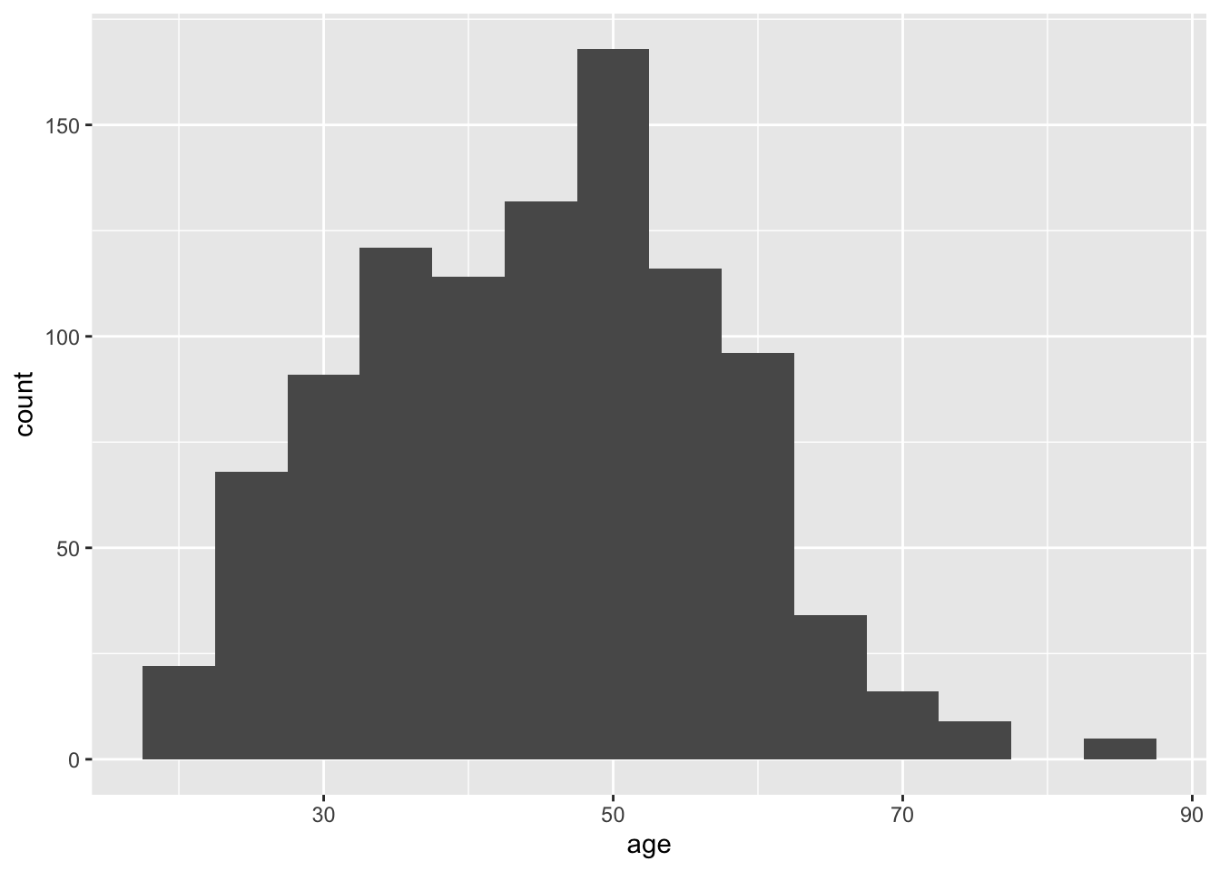
Alternatively, you can control precisely how many bars the histograms uses through the bins argument. For example, we can plot age by collecting the observations into 10 bars:
# Plot the variable age from summarydata
ggplot(summarydata, aes(x = age)) +  # Plot age on the x axis
  geom_histogram(bins = 10) # Plot age using 10 bars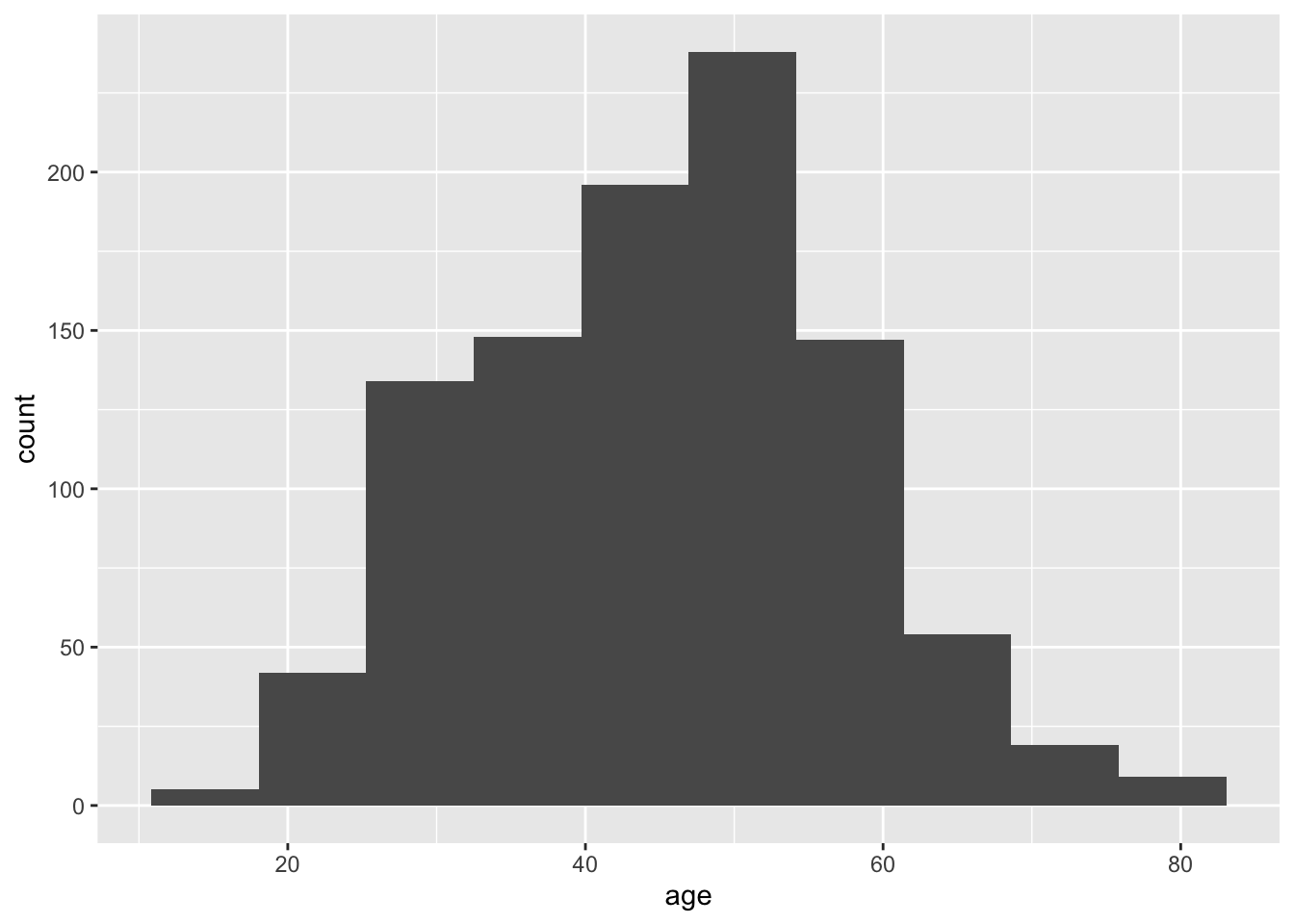
Try this
Play around with the bin and binwidth arguments to see what effect it has on the plot. One of the best ways of learning is through trial and error to see what effect your changes have on the result.
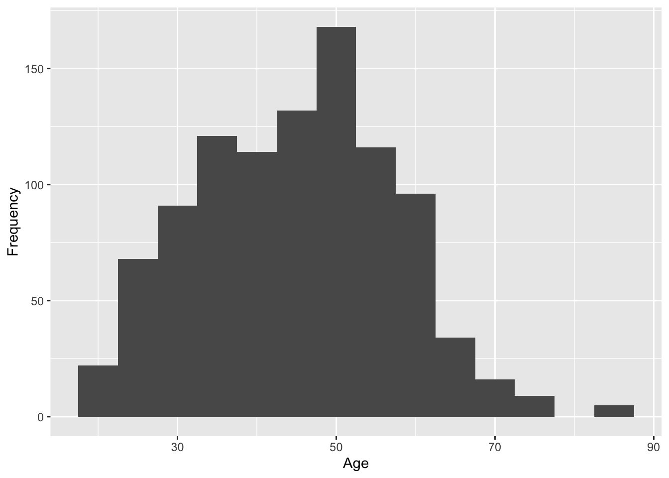
3.4.4 Step 4: Edit the axis names
By default, the axis names come from the variable names in your data. When you are making quick plots for yourself, you rarely need to worry about this. However, as you edit your plot for a report to show other people, it is normally a good idea to edit the names so they clearly communicate what they represent.
There are different layers to control the axes depending on the type of variable you use. Both the x- and y-axis here are continuous numbers, so we can use the scale_x_continuous and scale_y_continuous layers to control them.
There are many options available in ggplot2 for controlling the axes, but you will learn through experience and searching what you need in different scenarios.
3.4.5 Step 5: Change the plot theme
So far, we used the default plot theme which has the grey gridlines as a background. This looks pretty ugly, so we can edit the plot them by adding a theme_ layer. For example, we can add a black-and-white theme:
# Plot the variable age from summarydata
ggplot(summarydata, aes(x = age)) +  # Plot age on the x axis
  geom_histogram(binwidth = 5) + # collate bins into a 5-year span
  scale_x_continuous(name = "Age") +
scale_y_continuous(name = "Frequency") +
theme_bw()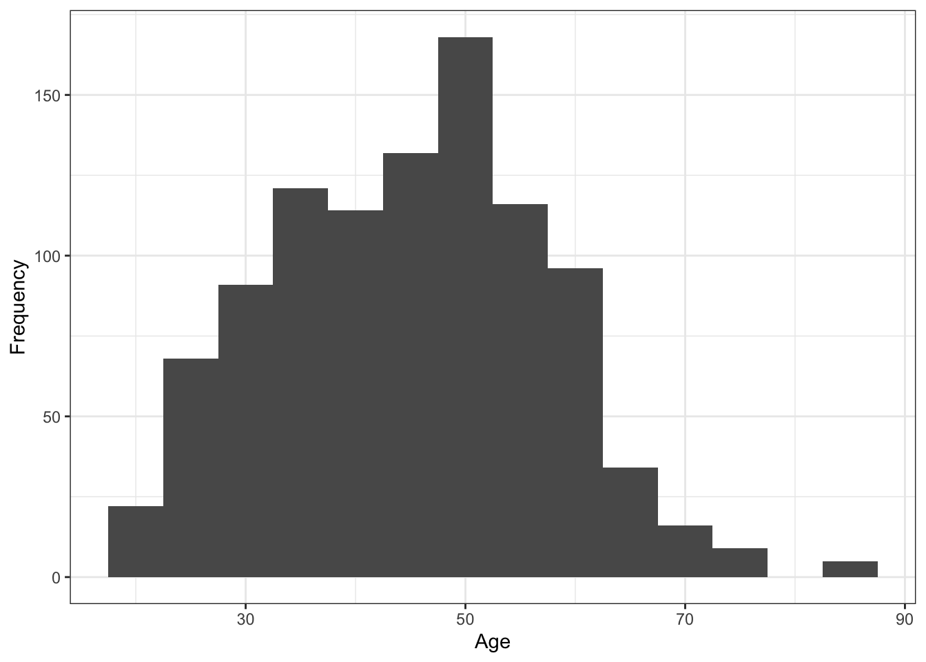
Try this
There are loads of themes available. As you start typing theme_, you should see the full range appear as a drop-down to autocomplete. Try one or two alternatives such as theme_classic() or theme_minimal() to see how they look.
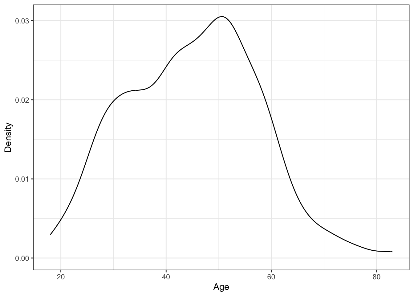
3.4.6 Switch the geom layer
The layer system makes it easy to create new types of plots by adapting existing recipes. For example, rather than creating a histogram, we can create a smoothed density plot by calling geom_density() rather than geom_histogram(). Apart from the name of the y-axis, the rest of the code remains identical to demonstrate how easy it is to customise your ggplot2 layers.
3.4.7 Activity 5 - Apply your plotting skills to a new variable
Before we move on to barplots, an important learning step is being able to apply or transfer what you learnt in one scenario to something new.
In the data set, there is a variable for The Authentic Happiness Inventory (AHI): ahiTotal. Plot the new variable and try to recreate the customisation layers before checking the solution below. It might take some trial-and-error to get some features right, so do not worry if it does not immediately look the same.
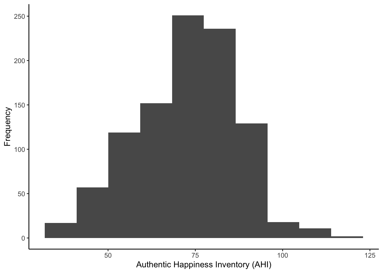
Show me the solution code
To recreate the plot, this is the code:
We were a little sneaky with using the classic theme to get you exploring.
3.5 Barplots
In the next section, we are going to cover making barplots - potentially the most common type of visualisation you will see in published research. A barplot shows counts of categorical data, or factors, where the height of each bar represents the count of that particular variable.
You will see people use them to represent continuous outcomes, such as showing the mean on the y-axis, but there is good reason to never use bar plots to communicate continuous data we will cover in the course materials (see Weissgerber et al., 2019 if you are interested). We will cover more advanced plots for continuous data in Chapter 7 - Building your data visualisation skills.
3.5.1 Activity 6 - Convert to factors
Earlier, we highlighted that all the variables were processed as numbers. This was fine for most of the variables, but sex, educ, and income should be categories or what we call factors.
To get around this, we need to convert these variables into factors. This is relates to data wrangling, so this is one final time we would like you to copy and run code, before we fully explain how to write this kind of code independently in the next chapter.
Copy and run the following code in your R Markdown document, at least below where you read and wrangled the data:
You can interpret this code as “overwrite summarydata and transform three columns (sex, educ, and income) into the same values but now considered factors and not doubles”.
Error mode
If you do not do convert numbers to factors when they should represent distinct categories, you can get some weird looking figures. Instead of treating the numbers as categories, it will try and plot the full range of numerical values. If you notice this, just go back and convert your variables to factors (which we will break down in the next chapter).
3.5.2 Activity 7 - Create a bar plot
Now you are familiar with the layering system, we will jump straight into creating the barplot. As before, type and run the code in each step, making notes to yourself either in the R Markdown document outside the code chunks, or using code comments.
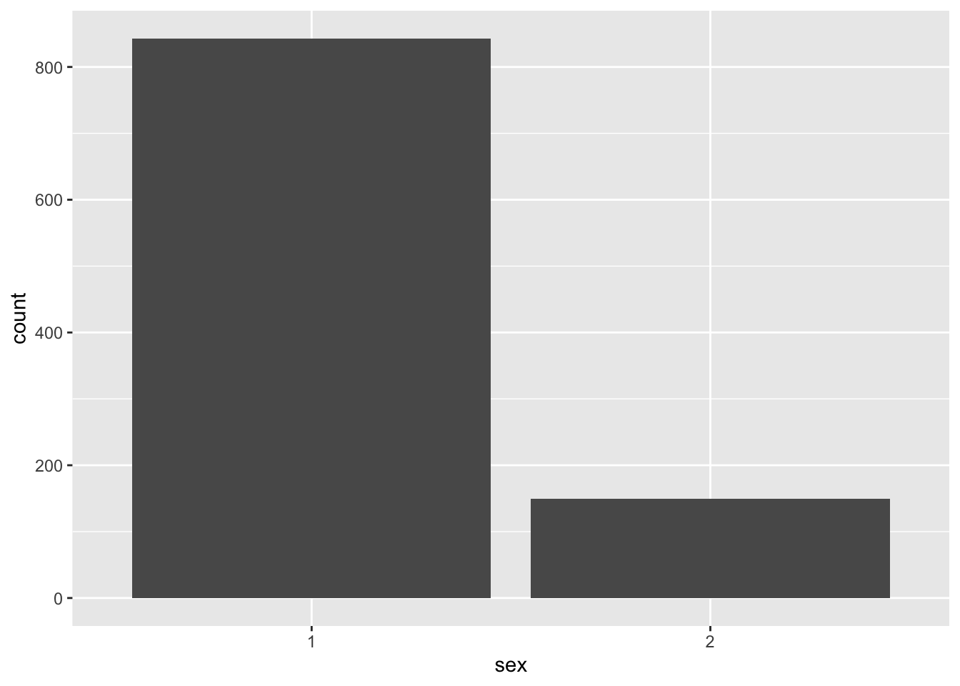
Compared to the histogram plot, the only difference here is using the geom_bar() as the layer instead. Rather than plot the frequency of your variable in bins, we plot the frequency of each unique category.
We can see 1s are way more frequent than 2s, but for this to make sense to you and your reader, we need to edit the axis labels.
3.5.3 Activity 8 - Edit the axis labels
In the histogram section, we demonstrated how to edit the axis labels. We used scale_y_continuous and scale_x_continuous as we had two continuous variables for the x-axis range and the y-axis frequency. This time, we need a slightly different layer since the x-axis now represents distinct groups: scale_x_discrete.
Type and run the following code:
# Plot the variable sex from summarydata
ggplot(summarydata, aes(x = sex)) +
geom_bar() +
scale_x_discrete(name = "Participant Sex",
labels = c("Female", # 1 = Female
"Male")) + # 2 = Male
scale_y_continuous(name = "Number of Participants")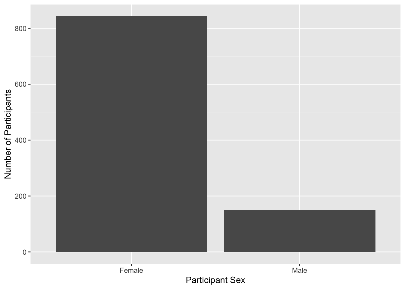
Within scale_x_discrete, we have a new argument called “labels”. This is where we can edit the labels for each category. Instead of 1 and 2, we labelled the x-axis clearer as “Female” and “Male”, making it easier to understand there are way more female participants compared to male.
What does
c() mean in labels?
When we specified the labels, you might have noticed the c("Female", "Male") format. c() stands for concatenate and you will see it a lot in R. When we give a value to a function argument, we must provide one “value”. However, in scenarios like this, we want to apply multiple values since we have several categories.
We can do this by adding all of our categories within c(), separated by a comma between each category.
Error mode
When you edit “labels”, it is crucial the values you give it are in the right order. There would be nothing stopping us from writing c("Male", "Female") and R will gladly listen to you and add those labels. However, that would be inaccurate as 1s mean Female and 2s mean Male. We are only editing the labels and not the underlying values in the data.
These errors are the most sneaky as it will not cause an error to fix, but they are still incorrect.
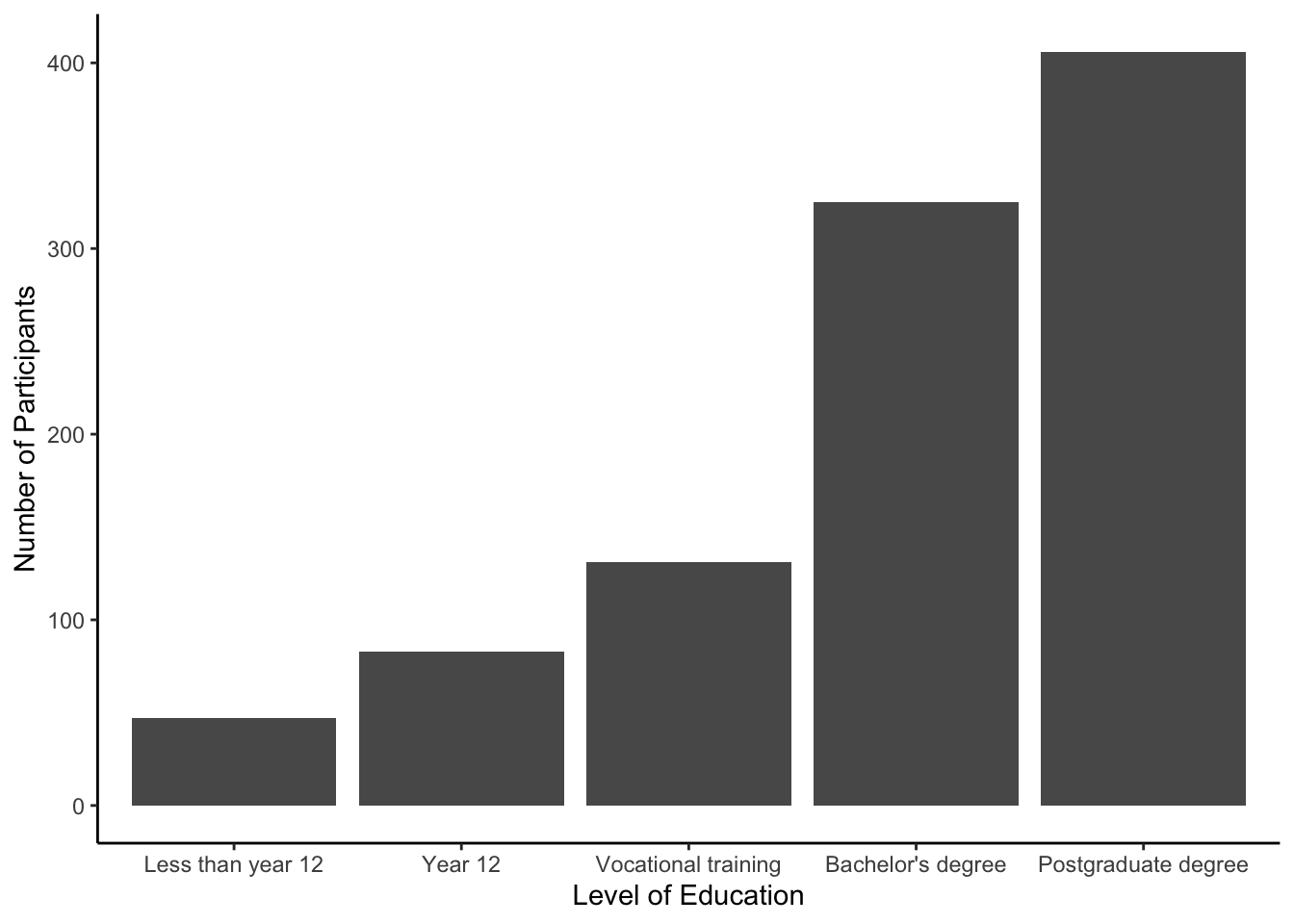
3.5.4 Activity 9 - Apply your plotting skills to a new variable
An important learning step is being able to apply or transfer what you learnt in one scenario to something new.
In the data set, there is a variable for the level of education: educ. Plot the new variable and try to recreate the customisation layers before checking the solution below.
Show me the solution code
To recreate the plot, this is the code:
# Plot the variable educ from summarydata
ggplot(summarydata, aes(x = educ)) +
  geom_bar() +
  theme_classic() +
  scale_x_discrete(name = "Level of Education",
                   labels = c("Less than year 12", # 1
                              "Year 12", # 2
                              "Vocational training", # 3
                              "Bachelor's degree", # 4
                              "Postgraduate degree")) + # 5
  scale_y_continuous(name = "Number of Participants")
3.6 Saving your Figures
The final step today will be to demonstrate how to save plots you create in ggplot2. It is so useful to be able to save a copy of your plots as an image file so that you can use them in a presentation or report. One approach we can use is the function ggsave().
3.6.1 Activity 10 - Saving your last plot
There are two ways you can use ggsave(). If you do not tell ggsave() which plot you want to save, by default it will save the last plot you created.
To demonstrate this, let us run the code again from Activity 8 to produce the final version of our barplot. You do not need to write the code again if you already have it available in a code chunk, but make sure you run the code:
Now that we have the plot we want to save as our last produced plot, all that ggsave() requires is for you to tell it the file path / name that it should save the plot to and the type of image file you want to create. The example below uses .png but you could also use .jpeg or another image type.
Type and run the following code into a new code chunk and then check your figures folder. If you have performed this correctly, then you should see the saved image. This is why we include a figures folder as part of the chapter structure, so you know exactly where your figures will be if you want to find them again.
The image tends to save at a default size, or the size that the image is displayed in your viewer, but you can change this manually if you think that the dimensions of the plot are not correct or if you need a particular size or file type. Sometimes the dimensions look a little off when you save them, so you might need to play around with the size.
Type and run the following code to overwrite the image file with new dimensions. Try different dimensions and units to see the difference. You might want to create participant_sex_barplot-v1.png, participant_sex_barplot-v2.png etc. and compare them.
One final tip, by default, the plot has a transparent background which you do not notice on a white document, but looks odd on anything else. So, you can set a specific background colour through the argument bg.
Remember, you can use ?ggsave() in the console window to bring up the help file for this function if you want to look at what other arguments are available.
3.6.2 Saving a specific plot
Alternatively, the second way of using ggsave() is to save your plot as an object, and then tell it which object you want to save.
Type and run the code below and then check your folder for the image file. Resize the plot if you think it needs it.
Warning
We do not add on ggsave() as a plot layer. Instead it is a separate line of code and we tell it which object to save. So, do not add + ggsave() as a layer to your plot.
Note that when you save a plot to an object, you will not see the plot displayed anywhere. To get the figure to display, you need to type the object name in the console (i.e., sex_barplot). The benefit of saving figures this way is that if you are making several plots, you cannot accidentally save the wrong one because you are explicitly specifying which plot to save rather than just saving the last one.
3.7 Test Yourself
To end the chapter, we have some knowledge check questions to test your understanding of the concepts we covered in the chapter. We then have some error mode tasks to see if you can find the solution to some common errors in the concepts we covered in this chapter.
3.7.1 Knowledge check
Question 1. Which of these is the appropriate order of functions to create a barplot?
Question 2. Why would this line of code not create a barplot, assuming you already loaded all data and libraries and you spelt the data and column names correctly?
Question 3. If I wanted precisely 5 bars in my histogram, what argument would I use?
Explain this answer
ggplot() + geom_histogram(bins = 5). This is the correct answer as you are asking ggplot2 to give you the plot organised into 5 bins.ggplot() + geom_histogram(bars = 5). This is incorrect as you bars is not the right argument name. You want 5 bars, but the argument is bins.ggplot() + geom_histogram(binwidth = 5). This is incorrect as binwidth controls the x-axis range to include per bar, rather than the number of bars.ggplot() + geom_histogram(). This is incorrect as you did not control the number of bins, so it will default to 30.
3.7.2 Error mode
The following questions are designed to introduce you to making and fixing errors. For this topic, we focus on reading data and using ggplot2. Remember to keep a note of what kind of error messages you receive and how you fixed them, so you have a bank of solutions when you tackle errors independently.
Create and save a new R Markdown file for these activities by following the instructions in Chapter 2. You should have a blank R Markdown file below line 10. Below, we have several variations of a code chunk and inline code errors. Copy and paste them into your R Markdown file, click knit, and look at the error message you receive. See if you can fix the error and get it working before checking the answer.
Question 4. Copy the following code chunk into your R Markdown file and press knit. You should receive an error like Error in read_csv(): ! could not find function "read_csv".
Explain the solution
If you only added this code chunk in, you have not loaded tidyverse yet. Remember R Markdown knits from start to finish in a fresh session, so it will not work even if you have loaded already tidyverse outside the R Markdown document. So, you would need to add library(tidyverse) first.
Question 5. Copy the following code chunk into your R Markdown file and press knit. You should receive an error like ! participant-info.csv does not exist in current working directory.
Explain the solution
You had tidyverse loaded this time, but it is not pointing to the right folder. Your working directory should be the main chapter folder, where participant-info.csv does not exist. You will need to edit it to data/participant-info.csv to work.
Question 6. Copy the following code chunk into your R Markdown file and press knit. You should receive a long error where the problem is buried in the first five lines:
Error in geom_histogram()
! Problem while computing stat.
i Error occurred in the 1st layer.
Caused by error in setup_params():
! stat_bin() requires an x or y aesthetic.
```{r}
library(tidyverse)

pinfo <- read_csv("data/participant-info.csv")

# Plot the variable age from pinfo
ggplot(pinfo, x = age) +   # Plot age on the x axis
  geom_histogram()
```
Explain the solution
This is potentially a sneaky one where we missed the aes() argument and it is only line 5 of the error which gives it away: ! stat_bin() requires an x or y aesthetic. The first ggplot2 layer has two key components: the data object you want to use, and the aesthetics to set. You need to add “aes()” around where you specify the x-axis: ggplot(pinfo, aes(x = age)).
Question 7. Copy the following code chunk into your R Markdown file and press knit. This…works, but does not look quite right?
```{r}
library(tidyverse)

pinfo <- read_csv("data/participant-info.csv")

# Plot the variable age from pinfo
ggplot(pinfo, aes(x = age)) # Plot age on the x axis
  geom_histogram()
```
Explain the solution
There is a missing + between the two ggplot2 layers. The code should be:
At the moment, it runs the first layer to create an empty plot, then prints the information contained within geom_histogram.
Question 8. Copy the following code chunk into your R Markdown file and press knit. You should receive a long error again with lines 5-7 key:
! stat_bin() requires a continuous x aesthetic.
x the x aesthetic is discrete.
i Perhaps you want stat="count"?
```{r}
library(tidyverse)
pinfo <- read_csv("data/participant-info.csv")
# Plot the variable age from pinfo
ggplot(pinfo, aes(x = age)) +  # Plot age on the x axis
geom_histogram() +
scale_x_discrete(name = "Participant Age")
```
Explain the solution
The error message here is a little more useful and points to how we tried to edit the x-axis name. In a histogram, the x-axis is continuous for the range of a numeric variable. We tried using the discrete version of the layer to control the axis (scale_x_discrete(name = "Participant Age")) which we had to use for the bar plot. To fix the error, you would need to correct the layer to scale_x_continuous(name = "Participant Age").
3.8 Words from this Chapter
Below you will find a list of words that were used in this chapter that might be new to you in case it helps to have somewhere to refer back to what they mean. The links in this table take you to the entry for the words in the PsyTeachR Glossary. Note that the Glossary is written by numerous members of the team and as such may use slightly different terminology from that shown in the chapter.
| term | definition |
|---|---|
| assignment-operator | The symbol <-, which functions like = and assigns the value on the right to the object on the left |
| barplot | also known as a bar chart, barplots represent the frequency or count of a variable through the height of one or more bars. |
| comment | Comments are text that R will not run as code. You can annotate .R files or chunks in R Markdown files with comments by prefacing each line of the comment with one or more hash symbols (#). |
| console | The pane in RStudio where you can type in commands and view output messages. |
| csv | Comma-separated variable: a file type for representing data where each variable is separated from the next by a comma. |
| data-visualisation | A graphical representation of your data set. |
| data-wrangling | The process of preparing data for visualisation and statistical analysis. |
| descriptive | Statistics that describe an aspect of data (e.g., mean, median, mode, variance, range) |
| double | A data type representing a real decimal number |
| environment | A data structure that contains R objects such as variables and functions |
| factor-data-type | A data type where a specific set of values are stored with labels |
| geom | The geometric style in which data are displayed, such as boxplot, density, or histogram. |
| histogram | A type of plot showing the frequency of each observation organised into bins. Bins control the width of each bar and how many observations it represents. |
| numeric | A data type representing a real decimal number or integer. |
| object | A word that identifies and stores the value of some data for later use. |
| tidyverse | A set of R packages that help you create and work with tidy data |
3.9 End of chapter
Well done! It takes a while to get used to the layering system in ggplot2, particularly if you are used to making graphs a different way. But once it clicks, you will be able to make informative and professional visualisations with ease. Remember, data visualisation is useful for yourself to quickly plot your data, and it’s useful for your reader in communicating your key findings.
Nordmann, E., McAleer, P., Toivo, W., Paterson, H., & DeBruine, L. M. (2022). Data Visualization Using R for Researchers Who Do Not Use R. Advances in Methods and Practices in Psychological Science, 5(2), 25152459221074654. https://doi.org/10.1177/25152459221074654
Weissgerber, T. L., Winham, S. J., Heinzen, E. P., Milin-Lazovic, J. S., Garcia-Valencia, O., Bukumiric, Z., Savic, M. D., Garovic, V. D., & Milic, N. M. (2019). Reveal, Don’t Conceal. Circulation, 140(18), 1506–1518. https://doi.org/10.1161/CIRCULATIONAHA.118.037777
Woodworth, R. J., O’Brien-Malone, A., Diamond, M. R., & Schüz, B. (2018). Data from, “Web-based Positive Psychology Interventions: A Reexamination of Effectiveness.” Journal of Open Psychology Data, 6(1), 1. https://doi.org/10.5334/jopd.35