| species | island | bill_length_mm | bill_depth_mm | flipper_length_mm | body_mass_g | sex | year |
|---|---|---|---|---|---|---|---|
| Adelie | Torgersen | 39.1 | 18.7 | 181 | 3750 | male | 2007 |
| Adelie | Torgersen | 39.5 | 17.4 | 186 | 3800 | female | 2007 |
| Adelie | Torgersen | 40.3 | 18.0 | 195 | 3250 | female | 2007 |
| Adelie | Torgersen | NA | NA | NA | NA | NA | 2007 |
| Adelie | Torgersen | 36.7 | 19.3 | 193 | 3450 | female | 2007 |
| Adelie | Torgersen | 39.3 | 20.6 | 190 | 3650 | male | 2007 |
4 Data viz I
Intended Learning Outcomes
By the end of this chapter, you should be able to:
- explain the layered grammar of graphics
- choose an appropriate plot for categorical variables
- create a basic version of an appropriate plot
- apply additional layers to modify the appearance of the plot
It is time to think about selecting the most appropriate plot for your data. Different types of variables call for different kinds of plots, which depends on how many variables you’re aiming to plot and what their data types are. In this chapter, we will focus on plots for categorical data. Next week, we will explore plots for continuous variables and learn which plots work best when combining continuous and categorical data.
Individual Walkthrough
4.1 Building plots
We are using the package ggplot2 to create data visualisations. It’s part of the tidyverse package. Actually, most people call th package ggplot but it’s official name is ggplot2.
We’ll be using the ggplot2 package to create data visualisations. It’s part of the tidyverse suite of packages. Although many people refer to it simply as ggplot, its official name is ggplot2.
ggplot2 uses a layered grammar of graphics, where plots are constructed through a series of layers. You start with a base layer (by calling ggplot), then add data and aesthetics, followed by selecting the appropriate geometries for the plot.
These first 3 layers will give you the most simple version of a complete plot. However, you can enhance the plot’s clarity and appearance by adding additional layers such as scales, facets, coordinates, labels and themes.
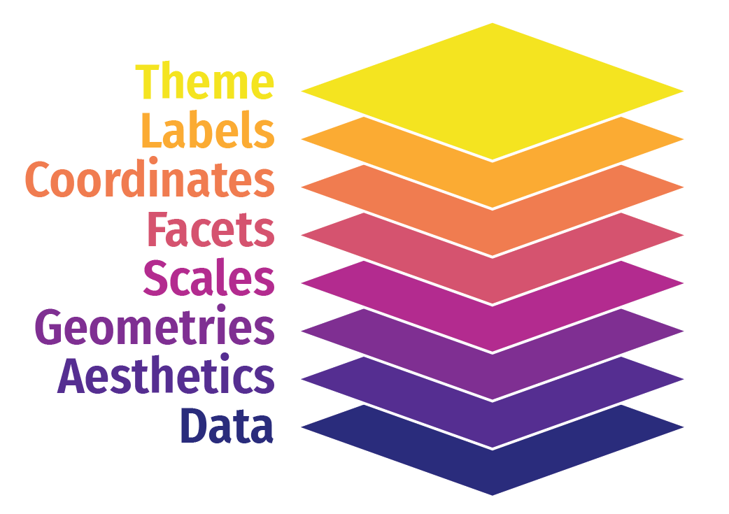
To give you a brief overview of the layering system, we will use the palmerpenguins package (https://allisonhorst.github.io/palmerpenguins/). This dataset contains information about penguins, including bill length and depth, flipper length, body mass, and more.
Let’s build a basic scatterplot to show the relationship between flipper_length and body_mass. We will customise plots further later on in the individual plots. This is just a quick overview of the different layers.
Let’s build a basic scatterplot to show the relationship between flipper_length and body_mass. We will further customise the plots in subsequent sections, but for now, this will provide a quick overview of the different layers.
- Layer 1 creates the base plot that we build upon.
-
Layer 2 adds the
dataand someaesthetics:- The data is passed as the first argument.
- Aesthetics are added via the mapping argument, where you define your variables (e.g., x or both x and y). This also allows you to specify general properties, like the color for grouping variables, etc.
-
Layer 3 adds geometries, or
geom_?for short. This tells ggplot how to display the data points. Remember to add these layers with a+, rather than using a pipe (%>%). You can also add multiple geoms if needed, for example, combining a violin plot with a boxplot. -
Layer 4 includes
scale_?functions, which let you customise aesthetics like color. You can do much more with scales, but we’ll explore later. -
Layer 5 introduces facets, such as
facet_wrap(), allowing you to add an extra dimension to your plot by showing the relationship you are interested in for each level of a categorical variable. -
Layer 6 involves coordinates, where
coord_cartesian()controls the limits for the x- and y-axes (xlim and ylim), enabling you to zoom in or out of the plot. - Layer 7 helps you modify axis labels.
-
Layer 8 controls the overall style of the plot, including background color, text size, and borders. R provides several predefined themes, such as
theme_classic,theme_bw,theme_minimal, andtheme_light.
Click on the tabs below to see how each layer contributes to refining the plot.
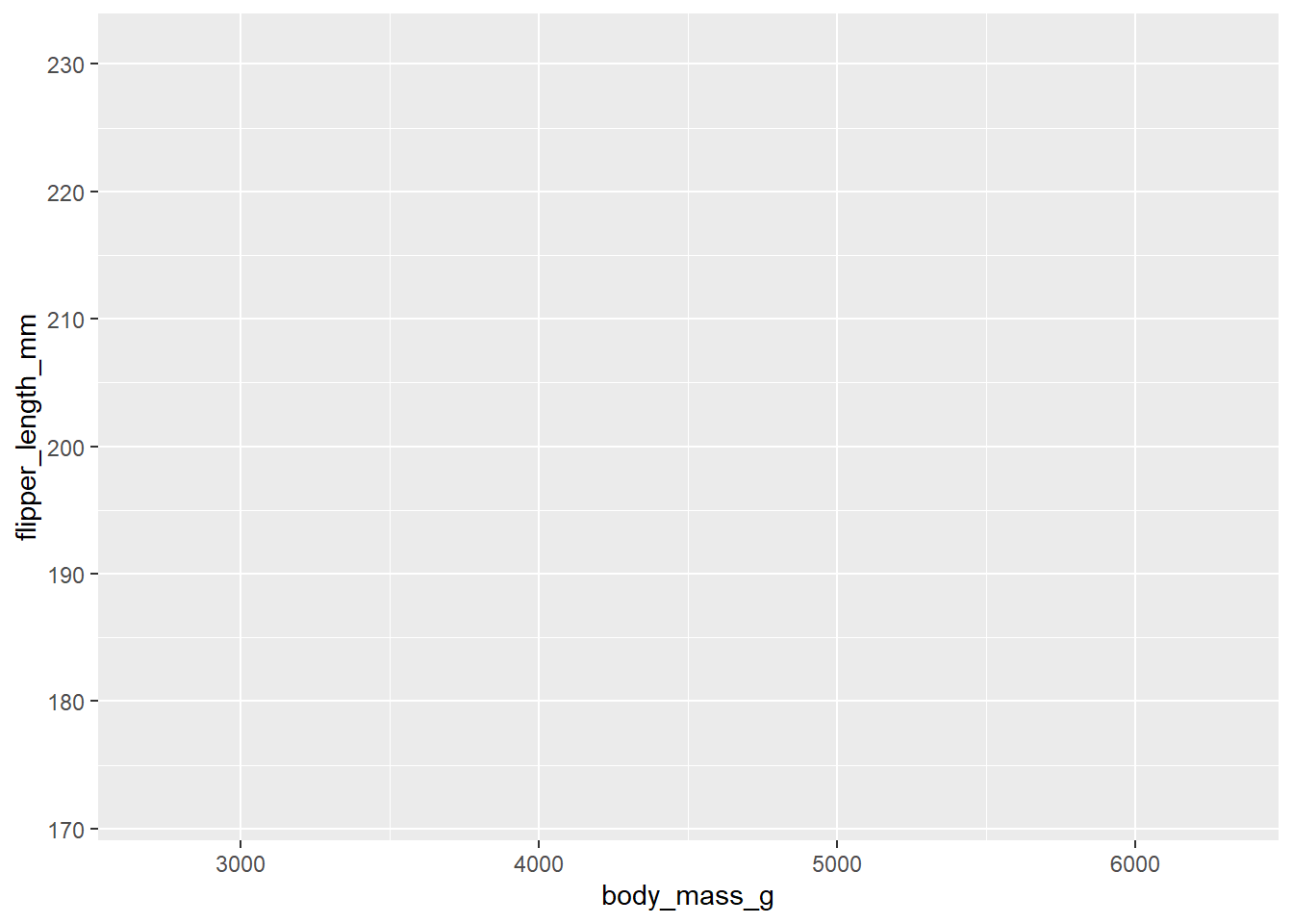
You won’t see any data points yet because we haven’t specified how to display them. However, we have mapped the aesthetics, indicating that we want to plot body_mass on the x-axis and flipper_length on the y-axis. This also sets the axis titles, as well as the axis values and breakpoints.
You won’t need to add data = or mapping = if you keep those arguments in exactly that order. Likewise, the first column name you enter within the aes() function will always be interpreted as x, and the second as y, so you could omit them if you wish.
You don’t need to include data = or mapping = if you keep those arguments in the default order. Similarly, the first column name you enter in the aes() function will automatically be interpreted as the x variable, and the second as y, so you can omit specifying x and y if you prefer.
will give you the same output as the code above.
ggplot(data = penguins, mapping = aes(x = body_mass_g, y = flipper_length_mm, colour = sex)) +
  geom_point()
Warning: Removed 2 rows containing missing values or values outside the scale range
(`geom_point()`).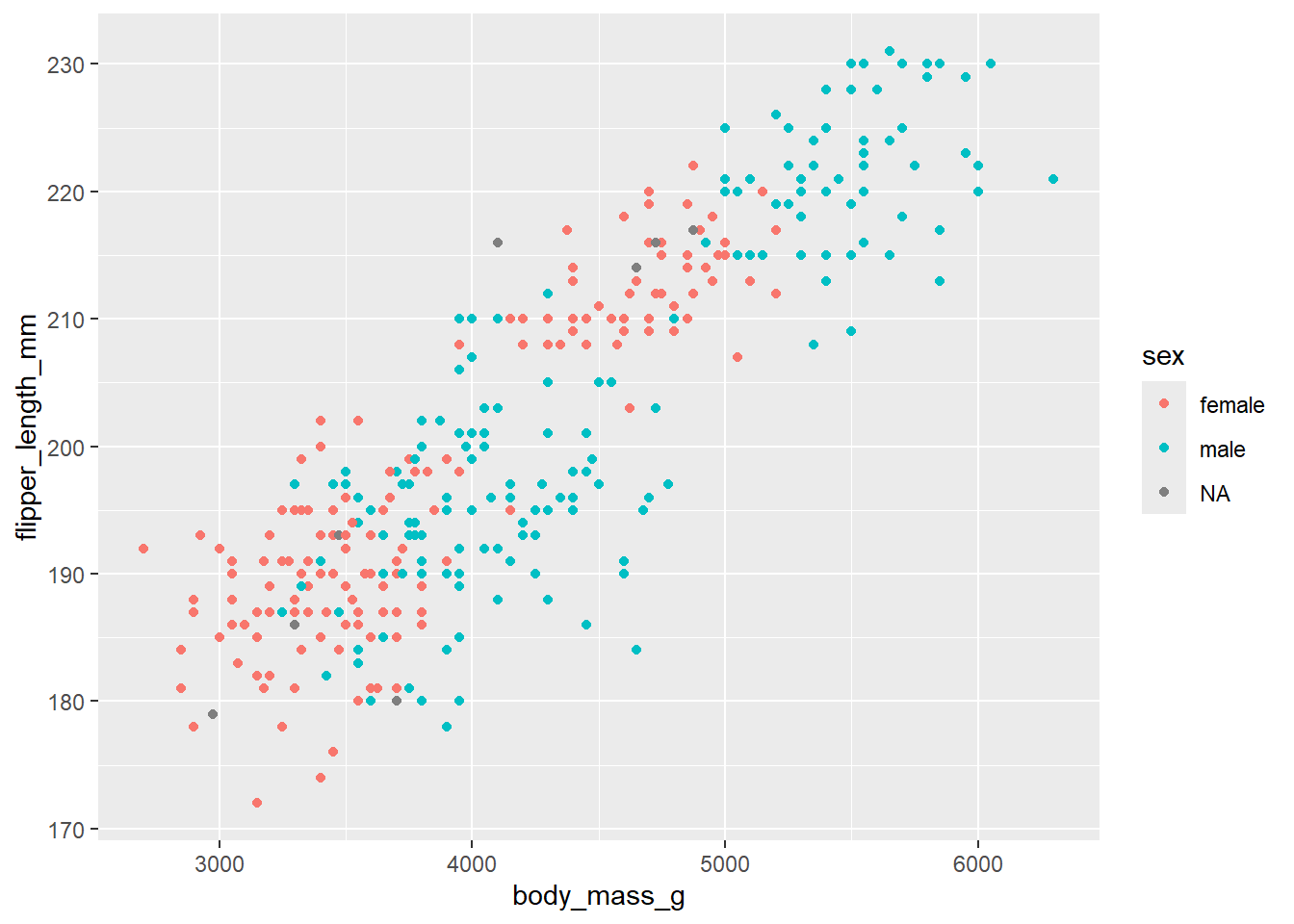
Here we are telling ggplot to add a scatterplot. You may notice a warning indicating that some rows were removed due to missing values.
The colour argument adds colour to the points based on a grouping variable (in this case, sex). If you want all the points to be black — representing only two dimensions rather than three — simply omit the colour argument.
ggplot(data = penguins, mapping = aes(x = body_mass_g, y = flipper_length_mm, colour = sex)) +
  geom_point() +
  # changes colour palette
  scale_colour_brewer(palette = "Dark2") +
  # add breaks from 2500 to 6500 in increasing steps of 500
  scale_x_continuous(breaks = seq(from = 2500, to = 6500, by = 500))
Warning: Removed 11 rows containing missing values or values outside the scale range
(`geom_point()`).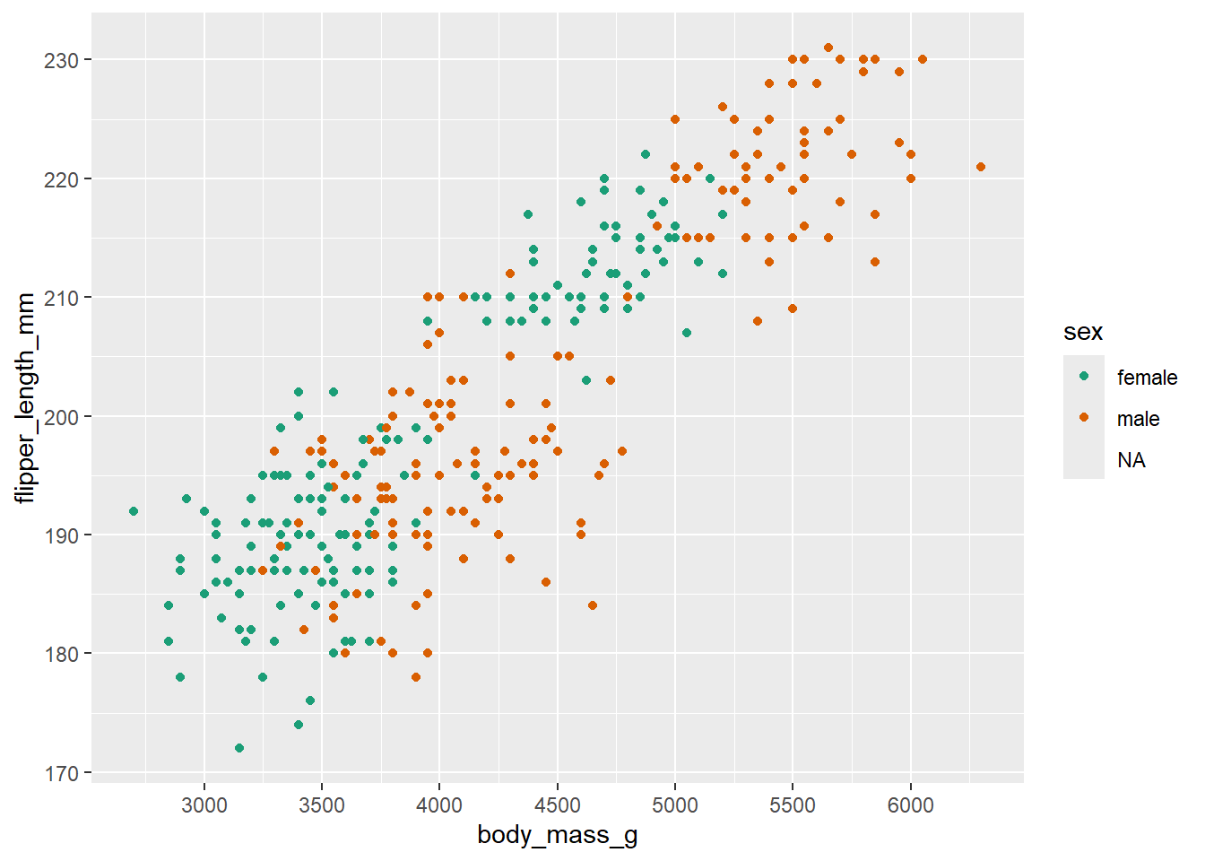
The scale_? functions allow us to modify the color palette of the plot, adjust axis breaks, and more. You could change the axis labels within scale_x_continuous() as well or leave it for Layer 7.
ggplot(data = penguins, mapping = aes(x=body_mass_g, y=flipper_length_mm, colour=sex)) +
  geom_point() +
  scale_colour_brewer(palette = "Dark2") +
  # split main plot up into different subplots by species
  facet_wrap(~ species)
Warning: Removed 11 rows containing missing values or values outside the scale range
(`geom_point()`).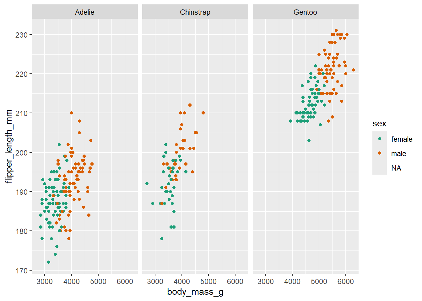
In this step, we’re using faceting to split the plot by species.
ggplot(data = penguins, mapping = aes(x=body_mass_g, y=flipper_length_mm, colour=sex)) +
  geom_point() +
  scale_colour_brewer(palette = "Dark2") +
  facet_wrap(~ species) +
  # limits the range of the y axis
  coord_cartesian(ylim = c(0, 250))
Warning: Removed 11 rows containing missing values or values outside the scale range
(`geom_point()`).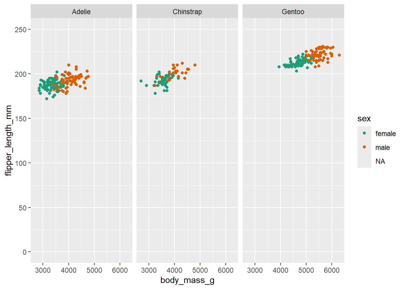
Here we adjust the limits of the y-axis to zoom out of the plot. If you want to zoom in or out of the x-axis, you can add the xlim argument to the coord_cartesian() function.
ggplot(data = penguins, mapping = aes(x=body_mass_g, y=flipper_length_mm, colour=sex)) +
  geom_point() +
  scale_colour_brewer(palette = "Dark2") +
  facet_wrap(~ species) +
  labs(x = "Body Mass (in g)", # labels the x axis
       y = "Flipper length (in mm)", # labels the y axis
       colour = "Sex") # labels the grouping variable in the legend
Warning: Removed 11 rows containing missing values or values outside the scale range
(`geom_point()`).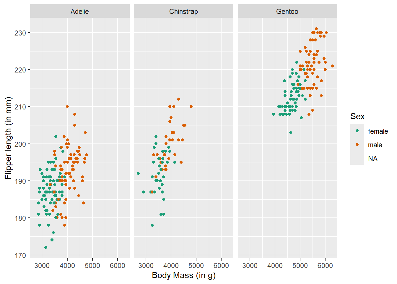
You can change the axis labels using the labs() function, or you can modify them when adjusting the scales (e.g., within the scale_x_continuous() function).
ggplot(data = penguins, mapping = aes(x=body_mass_g, y=flipper_length_mm, colour=sex)) +
  geom_point() +
  scale_colour_brewer(palette = "Dark2") +
  facet_wrap(~ species) +
  labs(x = "Body Mass (in g)",
       y = "Flipper length (in mm)",
       colour = "Sex") +
  # add a theme
  theme_classic()
Warning: Removed 11 rows containing missing values or values outside the scale range
(`geom_point()`).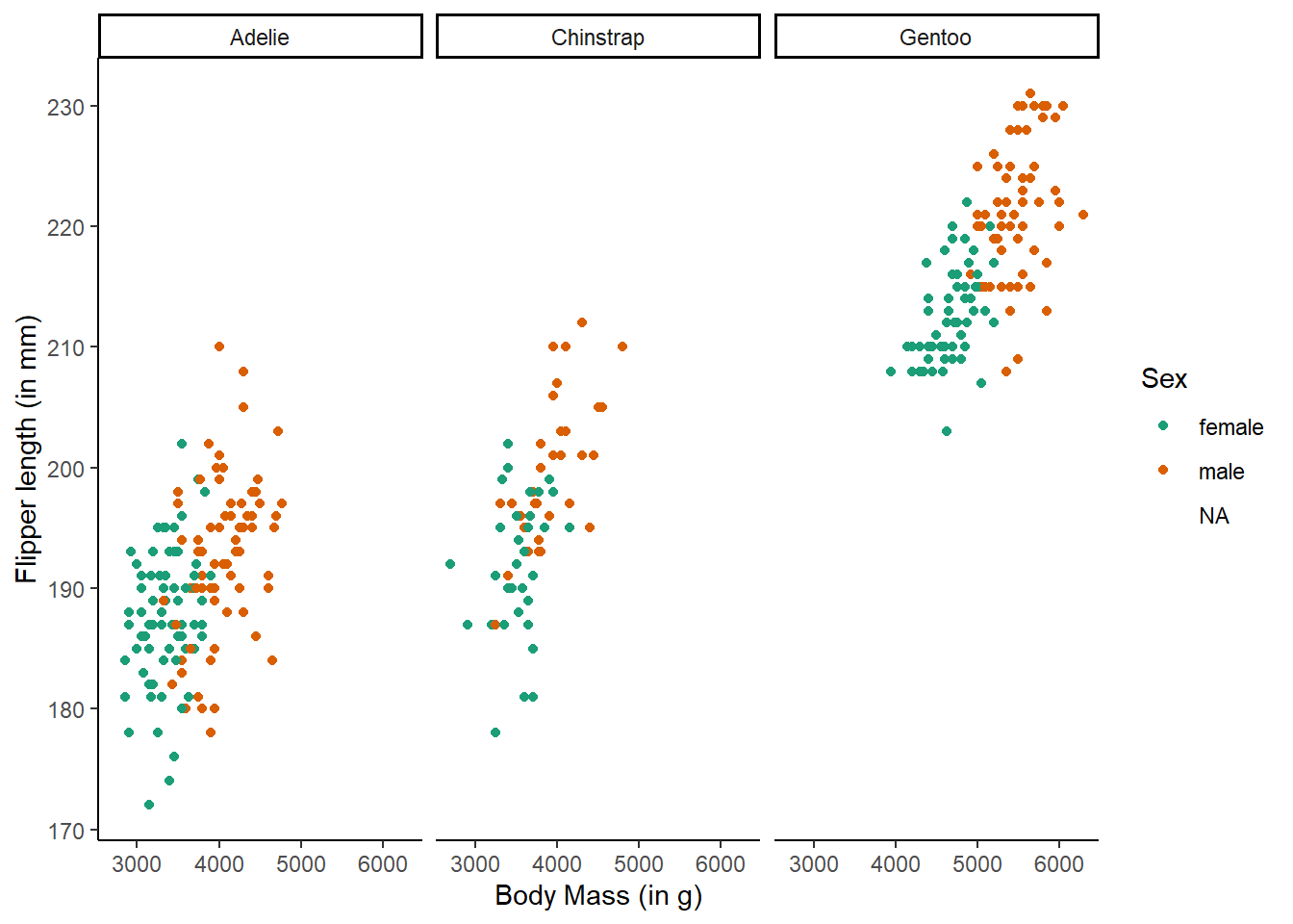
The theme_classic() function is applied to change the overall appearance of the plot.
You need to stick to the first three layers to create your base plot. Everything else is optional, meaning you don’t need to use all eight layers. Additionally, layers 4-8 can be added in any order (more or less), whereas layers 1-3 must follow a fixed sequence.
4.2 Activity 1: Set-up and data for today
- We are still working with the data from Pownall et al. (2023), so open your project.
- However, let’s start with a fresh R Markdown file: Create a new
.Rmdfile and save it in your project folder. Give it a meaningful name (e.g., “chapter_04.Rmd” or “04_data_viz.Rmd”). If you need guidance, refer to Section 1.3. Delete everything below line 12, but keep the setup code chunk. - We previously aggregated the data in Chapter 2 and Chapter 3. If you want a fresh copy, download the data here: data_prp_for_ch4.csv. Make sure to place the csv file in the project folder.
- If you need a reminder about the data and variables, check the codebook or refer back to Section 1.4.
4.3 Activity 2: Load in libraries, read in data, and adjust data types
Today, we will be using the tidyverse package and the dataset data_prp_for_ch4.csv.
As mentioned in Section 1.6, it is always a good idea to take a glimpse at the data to see how many variables and observations are in the dataset, as well as the data types.
We can see that some of the categorical data in data_prp_viz was read in as numeric variables which makes them continuous. This will haunt us big time when building the plots. We would be better off addressing these changes in the dataset before we start plotting (and potentially getting frustrated with R and data viz in general).
Let’s convert some of the categorical variables into factors. We’ll use the factor() function, which requires the variable to convert, the levels (where we can re-order them as needed), and the corresponding labels.
data_prp_viz <- data_prp_viz %>%
  mutate(Gender = factor(Gender,
                         levels = c(2, 1, 3),
                         labels = c("females", "males", "non-binary")),
         Secondyeargrade = factor(Secondyeargrade,
                                  levels = c(1, 2, 3, 4, 5),
                                  labels = c("≥ 70% (1st class grade)", "60-69% (2:1 grade)", "50-59% (2:2 grade)", "40-49% (3rd class)", "< 40%")),
         Plan_prereg = factor(Plan_prereg,
                              levels = c(1, 3, 2),
                              labels = c("Yes", "Unsure", "No")),
         Closely_follow = factor(Closely_follow,
                                 levels = c(2, 3),
                                 labels = c("Followed it somewhat", "Followed it exactly")),
         Research_exp = factor(Research_exp),
         Pre_reg_group = factor(Pre_reg_group))
4.4 Activity 3: Barchart (geom_bar())
A barchart is the best choice when you want to plot a single categorical variable.
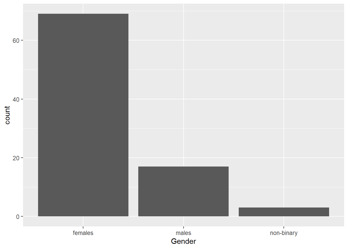
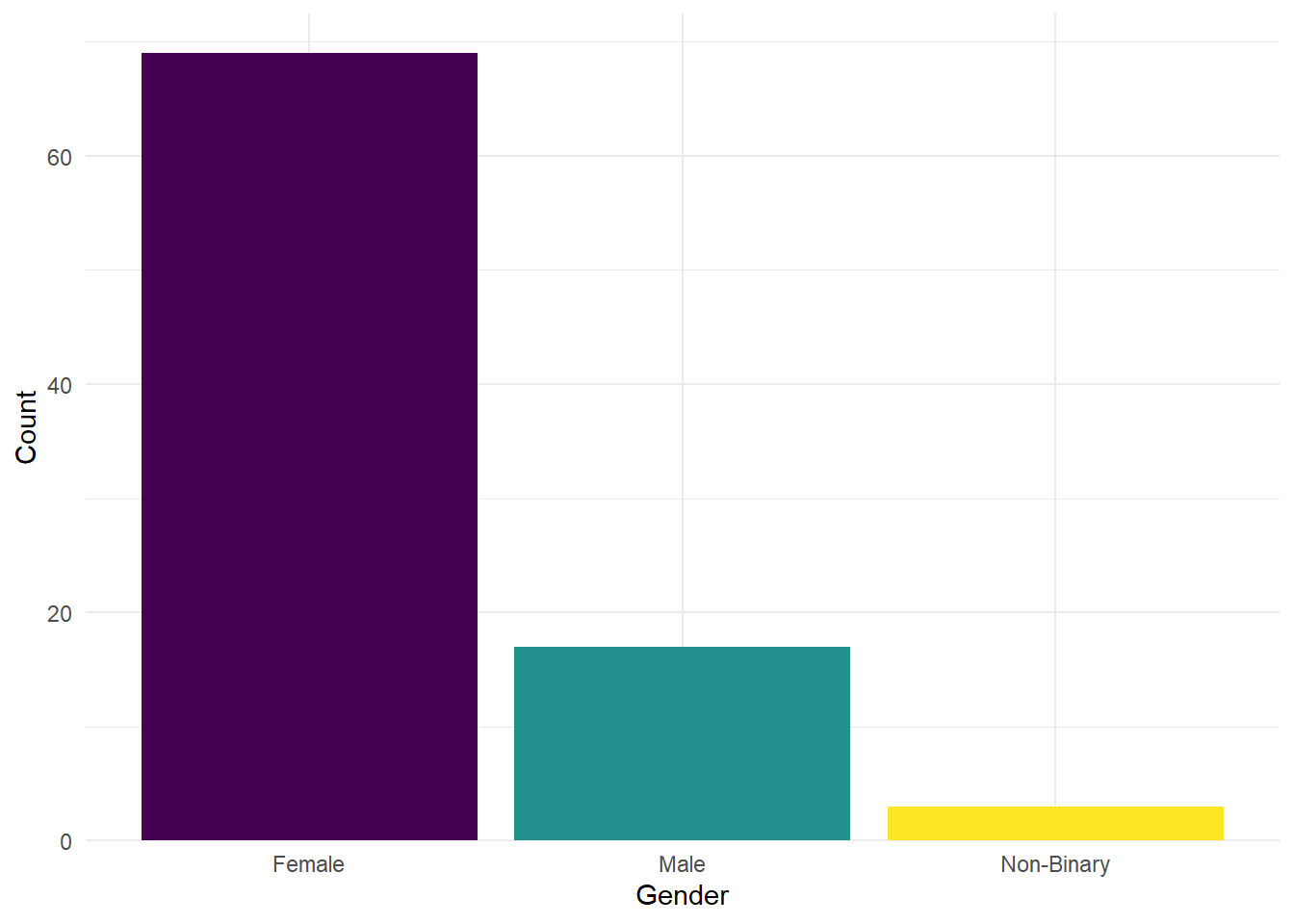
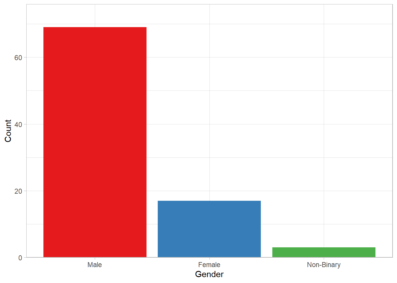
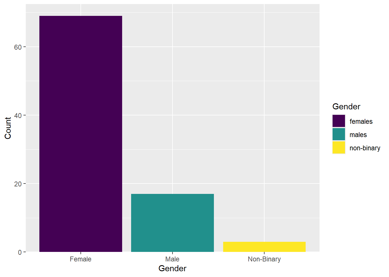
For example, let’s say we want to count some demographic data, such as gender. To visualise the gender counts, we would use a barplot. This is done with geom_bar() in the third layer. Since the counting is done automatically in the background, the aes() function only requires an x value (i.e., the name of your variable).
This is the base plot done. You can customise it by adding different layers. For example, the labels could be clearer, or you might want to add a splash colour. Click on the tabs below to see examples of additional customisations, and try applying them to your base plot in your own .Rmd file.
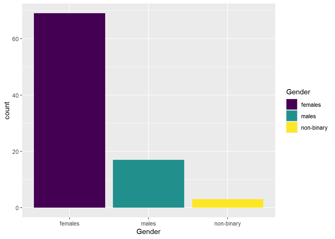
We can change the colour by adding a fill argument in the aes(). If we want to modify these colours further, we would add a scale_fill_? argument. If you have specific colours in mind, you would use scale_fill_manual(), or if you prefer to stick with pre-defined options like viridis, you can use scale_fill_viridis_d().
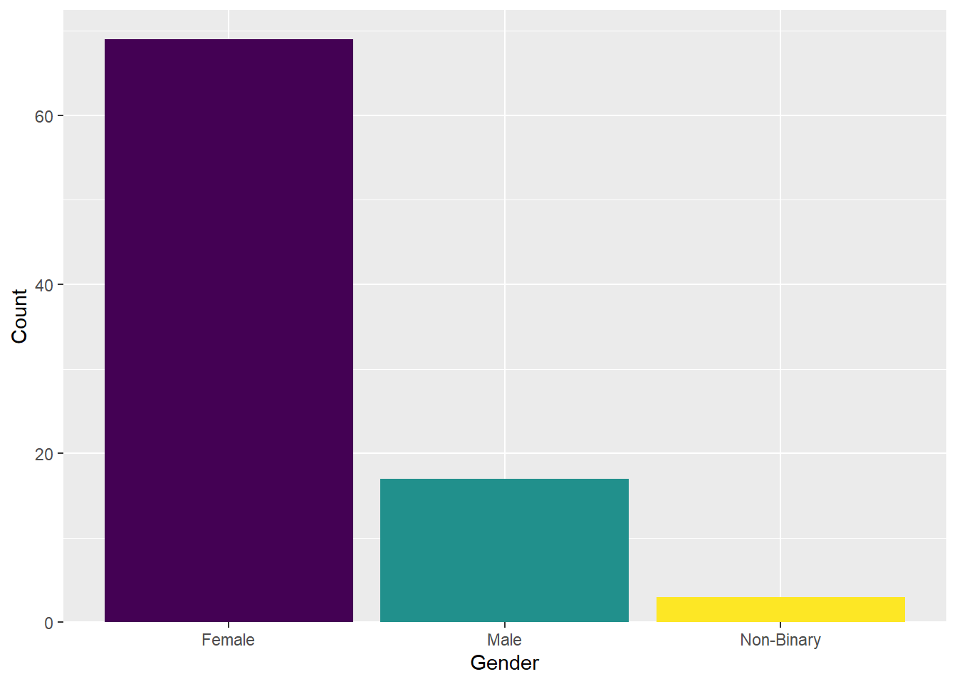
The x-axis label is fine, but the categories need to be relabelled. You can achieve this with the scale_x_discrete() function and the labels = argument. Just make sure to order the labels according to the order in the dataframe.
There is also a gap between the bottom of the chart and the bars that looks a bit odd. You can remove it by using the expansion() function.
ggplot(data_prp_viz, aes(x = Gender, fill = Gender)) +
  geom_bar() +
  scale_fill_viridis_d() +
  # changing group labels on the breaks of the x axis
  scale_x_discrete(labels = c("Female", "Male", "Non-Binary")) +
  scale_y_continuous(
    # changing name of the y axis
    name = "Count",
    # remove the space below the bars (first number), but keep a tiny bit (5%) above (second number)
    expand = expansion(mult = c(0, 0.05))
  )
The legend does not add any useful information because the labels are already provided on the x-axis. We can remove the legend by adding the argument guide = "none" to the scale_fill function.
Let’s experiment with the themes. For this plot we have chosen theme_minimal().
4.5 Activity 4: Column plot (geom_col())
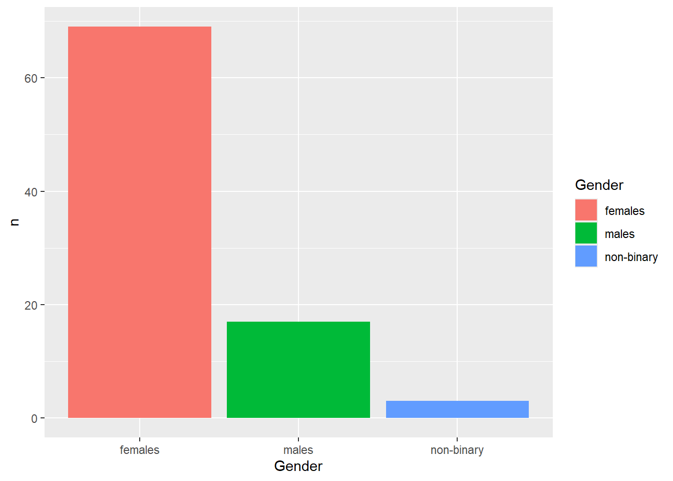
If the counts had already been summarised for you, geom_bar() would not work. Instead, you’d need to use geom_col() to display the pre-aggregated data.
| Gender | n |
|---|---|
| females | 69 |
| males | 17 |
| non-binary | 3 |
The mapping for geom_col() requires both x and y aesthetics. In this example, x would represent the categorical variable (e.g., Gender), while y would refer to the column storing the summarised values (e.g., n). Notice how the axis title now reflects n instead of count in the base version.
4.6 Activity 5: Stacked, Percent Stacked, and Grouped Barchart
When dealing with two categorical variables, you have three options for displaying stacked barcharts: the “normal” Stacked Barchart (the default option), a Percent Stacked Barchart, or a Grouped Barchart.
For this activity, we will explore the variable Plan_prereg, which measures whether students planned to pre-register their undergraduate dissertation at time point 1, and Pre_reg_group, which tracks whether they actually followed through with a pre-registration for their dissertation.
One way to display this data is by creating either a Stacked Barchart (the default) or a Percent Stacked Barchart. In both cases, the subgroups are displayed on top of each other. To make comparison easier, we will place the two plots side by side and move the legend to the bottom of the chart.
## Stacked barchart
ggplot(data_prp_viz, aes(x = Plan_prereg, fill = Pre_reg_group)) +
  geom_bar() + # no position argument added
  theme(legend.position = "bottom") # move legend to the bottom

## Percent stacked barchart
ggplot(data_prp_viz, aes(x = Plan_prereg, fill = Pre_reg_group)) +
  geom_bar(position = "fill") + # add position argument here
  theme(legend.position = "bottom") # move legend to the bottom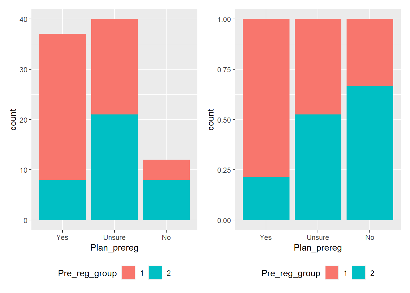
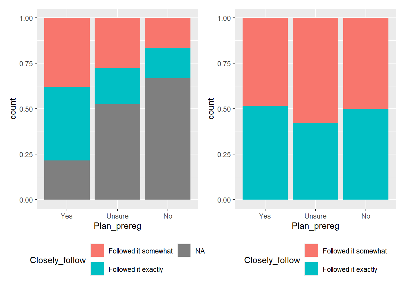
In the stacked barchart (Figure 4.3, left plot), you can display participant numbers. From this, we can see that the highest number of students were unsure whether they wanted to pre-register their dissertation, followed closely by those who answered “yes.” We also see that the number of students who did not end up with a pre-registered dissertation (blue category) is the same for both those who had planned to pre-register and those who did not want to. However, since the “No” category has significantly fewer participants than the other two, it’s difficult to tell if the ratio remains consistent across all three groups.
If we want to highlight this ratio, a Percent Stacked Barchart (Figure 4.3, right plot) would be more appropriate. This plot shows that approximately 80% of the students who had planned to pre-register their dissertations, 50% of the students who were initially unsure, and only 33% of the students who had no plan to pre-register ended up with a pre-registered dissertation. BUT! We would lose the information about the raw values in the sample.
It’s all a trade-off, and the plot you choose depends on the “story” you want the data to tell.
The position argument position = "stack" is the default. Adding this argument to the code for the left plot in Figure 4.3 would produce the same plot as leaving the argument out.
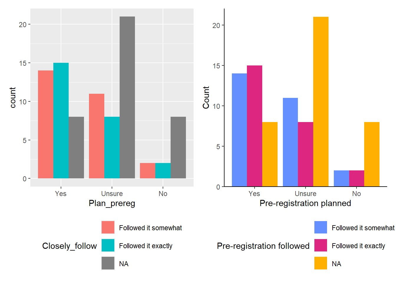
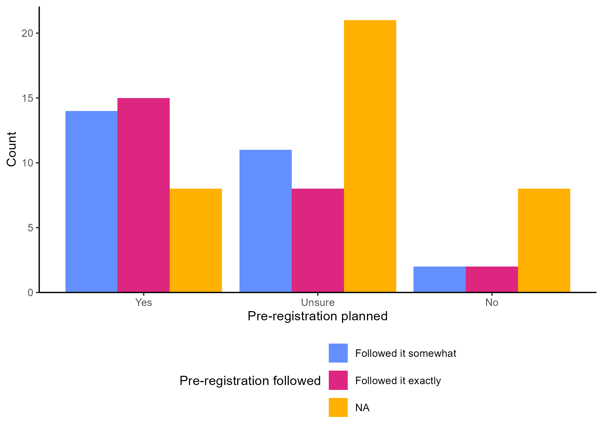
The other option is a Grouped Barchart, which displays the bars next to each other. You can achieve this by changing the position argument to "dodge". You can see the default version of the plot in Figure 4.4 on the left, and one with additional layers on the right.
Instead of using a pre-existing colour palette, we manually changed the colours using hex codes. These are some of the colours Gaby used in her PhD thesis, but you can:
- create your own colour hex codes by using this website, OR
- use pre-defined colour names like “green” or “purple” instead. See a full list here.
Feel free to explore.
Since the legend title for the second plot is a bit long, we displayed the legend content across two rows by adding the layer guides(fill = guide_legend(nrow = 2)) at the end.
## Default grouped barchart
ggplot(data_prp_viz, aes(x = Plan_prereg, fill = Pre_reg_group)) +
  geom_bar(position = "dodge") + # add position argument here
  theme(legend.position = "bottom") # move legend to the bottom

## Prettier grouped barchart
ggplot(data_prp_viz, aes(x = Plan_prereg, fill = Pre_reg_group)) +
  geom_bar(position = "dodge") + # add position argument here
  # changing labels for x, y, and fill category - alternative method
  labs(x = "Pre-registration planned", y = "Count", fill = "Pre-registered dissertation") +
  # manual colour change for values
  scale_fill_manual(values = c('#648FFF', '#DC267F'),
                    labels = c("Yes", "No")) +
  scale_y_continuous(
    # remove the space below the bars, but keep a tiny bit (5%) above
    expand = expansion(mult = c(0, 0.05))
  ) +
  # pick a theme
  theme_classic() +
  # need to move this following line to the end otherwise the `theme_*` overrides it
  theme(legend.position = "bottom") +
  # display across 2 rows
  guides(fill = guide_legend(nrow = 2))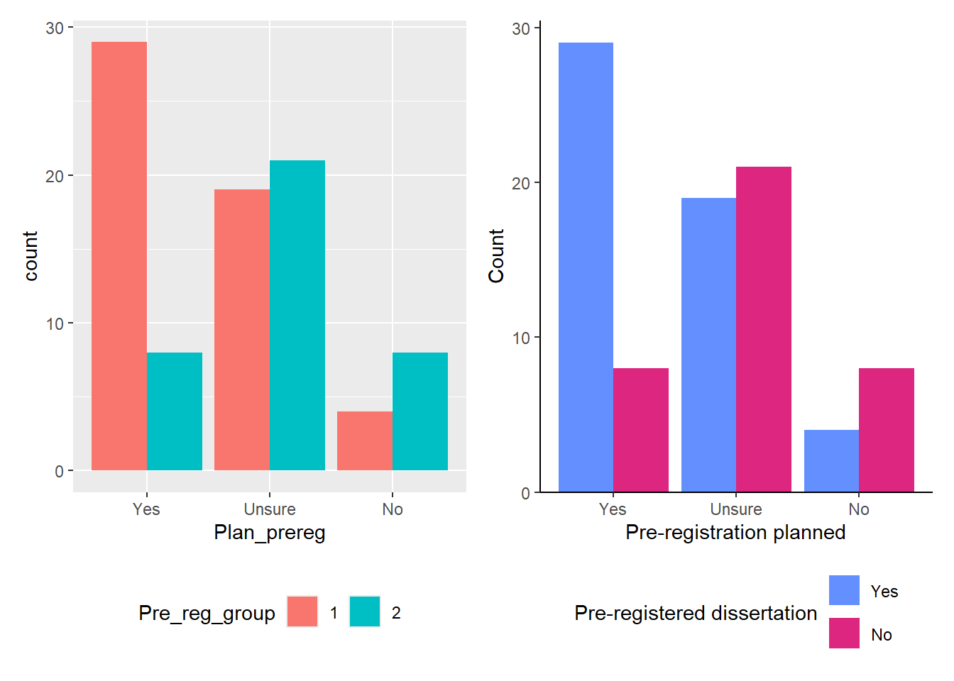
4.7 Activity 6: Save your plots
You can save your figures using the ggsave() function, which will save them to your project folder.
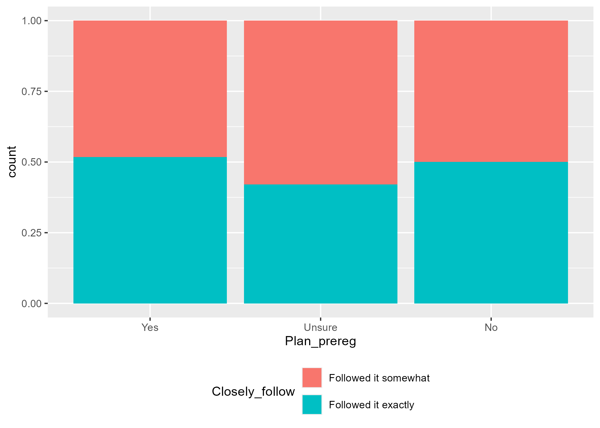
There are two ways to use ggsave(). If you don’t specify which plot to save, by default it will save the last plot you created. In our case, the last plot was the one without NA from the special case scenario (Figure 4.6). However, if you did not follow along with the special case scenario, your last plot will be the grouped bar chart on the right from Figure 4.4.
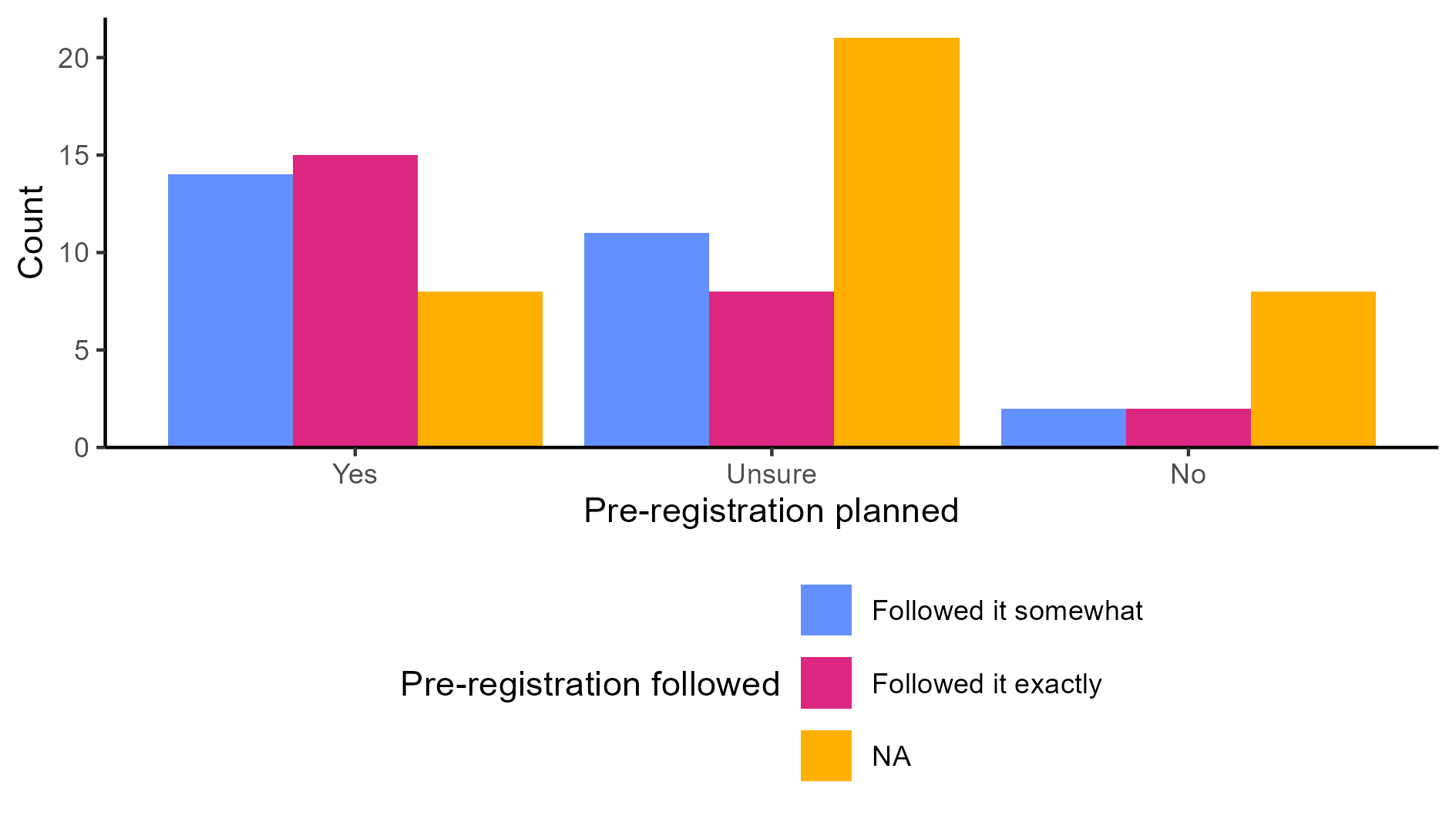
The second option is to save the plot as an object and refer to the object within ggsave(). As an example, let’s save the grouped barchart that contained missing values (Figure 4.4) as an object called grouped_bar.
The second option is to save the plot as an object and then refer to that object within ggsave(). For example, let’s save the grouped barchart that contained missing values (Figure 4.4) as an object called grouped_bar.
grouped_bar <- ggplot(data_prp_viz, aes(x = Plan_prereg, fill = Closely_follow)) +
  geom_bar(position = "dodge") +
  labs(x = "Pre-registration planned", y = "Count", fill = "Pre-registration followed") +
  # manual colour change for values of the factor and the NA responses
  scale_fill_manual(values = c('#648FFF', '#DC267F'), na.value = '#FFB000') +
  scale_y_continuous(
    expand = expansion(mult = c(0, 0.05))
  ) +
  theme_classic() +
  theme(legend.position = "bottom") +
  guides(fill = guide_legend(nrow = 3)) # display across 3 rows
Then, you can run the following line:
Saving 7 x 5 in imageThe filename is the name you want your PNG file to have, and plot refers to the name of the plot object.
This is the plot saved with the default settings. If you like it, feel free to keep it as is. However, if it seems a bit “off”, you can adjust the width, height, and units (e.g., “cm”, “mm”, “in”, “px”). You might need to experiment with the dimensions until it feels about right.
Pair-coding
Task 1: Open the R project for the lab
Task 2: Create a new .Rmd file
… and name it something useful. If you need help, have a look at Section 1.3.
Task 3: Load in the library and read in the data
The data should already be in your project folder. If you want a fresh copy, you can download the data again here: data_pair_coding.
We are using the package tidyverse today, and the datafile we should read in is dog_data_clean_wide.csv.
Task 4: Create an appropriate plot
Pick any single or two categorical variables from the Binfet dataset and choose one of the appropriate plot choices. Things to think about:
-
Select your categorical variable(s):
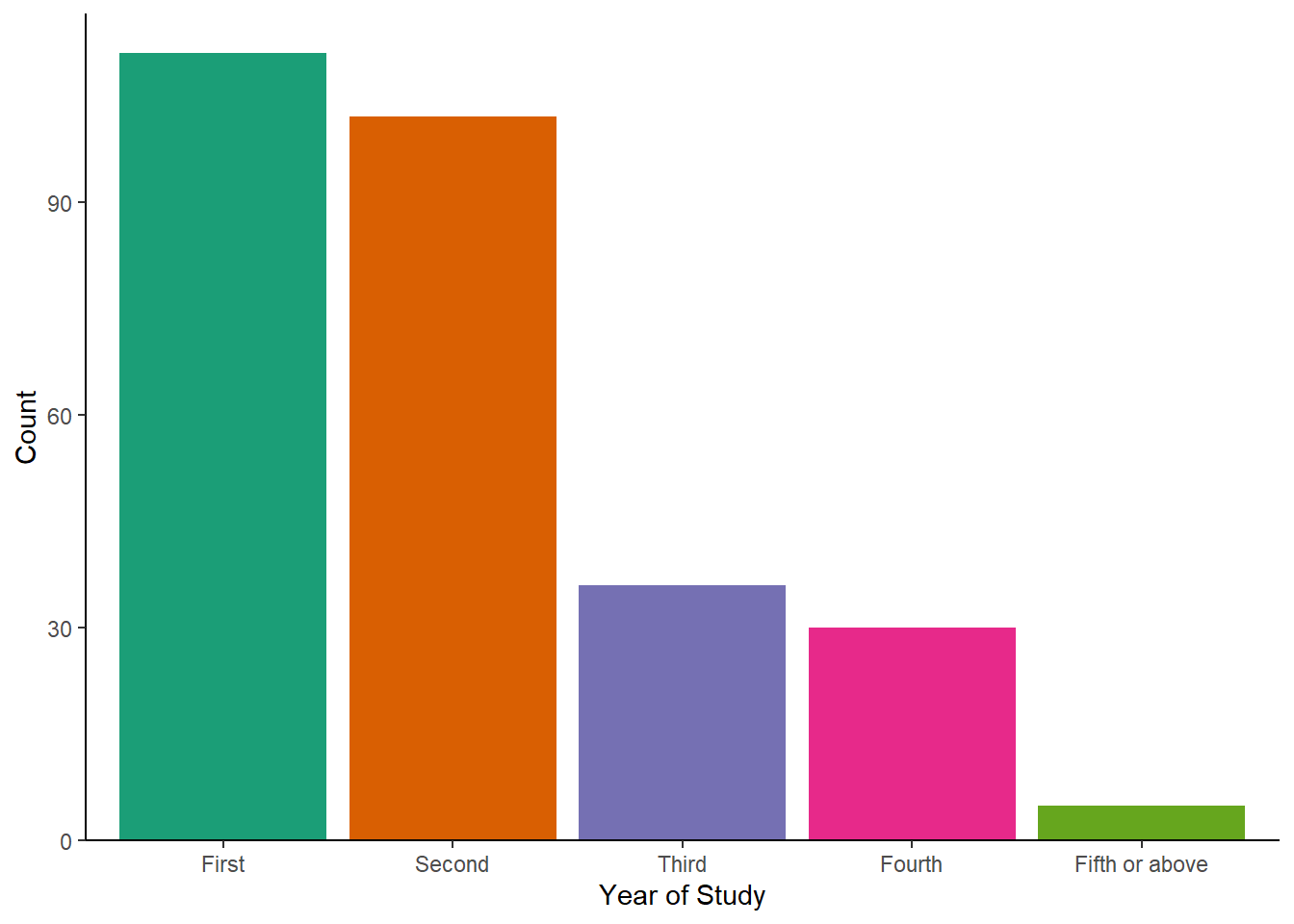
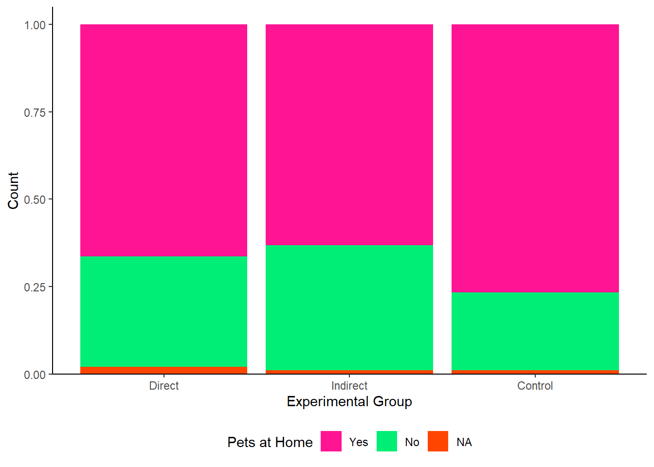
GroupAssignment,Year_of_Study,Live_Pets, and/orConsumer_BARK - Decide on the plot you want to display: barchart, stacked barchart, percent stacked barchart, or grouped barchart
- You may need to convert your variables into factors
- Think about what you want to do with missing data
- Pick a colour scheme (manual or pre-defined colour palette)
- Tidy the axes labels
- Decide whether you need a legend or not, and if so, where you would want to place it
- Remove the gap between the bottom of the chart and the bars
- Pick a theme
Test your knowledge
Let’s go back to the palmerpenguins package (https://allisonhorst.github.io/palmerpenguins/), and assume you have the following data available:
library(palmerpenguins)

penguin_selection <- penguins %>%
  group_by(species, island) %>%
  summarise(penguin_count = n())

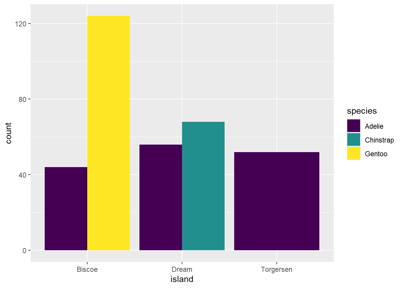
penguin_selection| species | island | penguin_count |
|---|---|---|
| Adelie | Biscoe | 44 |
| Adelie | Dream | 56 |
| Adelie | Torgersen | 52 |
| Chinstrap | Dream | 68 |
| Gentoo | Biscoe | 124 |
Knowledge check
Question 1
What geom would you use to plot penguin count for each species?
Question 2
What mapping would you use to display penguin count across species?Question 3
What geom would you use to count the number of species on each island?
Question 4
What mapping would you use to display the count of species per island?Error mode
Some of the code chunks contain mistakes and result in errors, while others do not produce the expected results. Your task is to identify any issues, explain why they occurred, and, if possible, fix them.
Question 5
We want to plot the number of penguins across the different islands.
Error in `geom_bar()`:
! Problem while computing aesthetics.
ℹ Error occurred in the 1st layer.
Caused by error in `check_aesthetics()`:
! Aesthetics must be either length 1 or the same as the data (344).
✖ Fix the following mappings: `x`.
What does this error message mean and how do you fix it?
Question 6
Next, we want to create a grouped bar chart displaying species per island, using the viridis color palette.
ggplot(penguins, aes(x = island, fill = species)) +
  geom_bar(position = "dodge") +
  scale_fill_viridis()
Error in scale_fill_viridis(): could not find function "scale_fill_viridis"What does this error message mean and how do you fix it?
Question 7
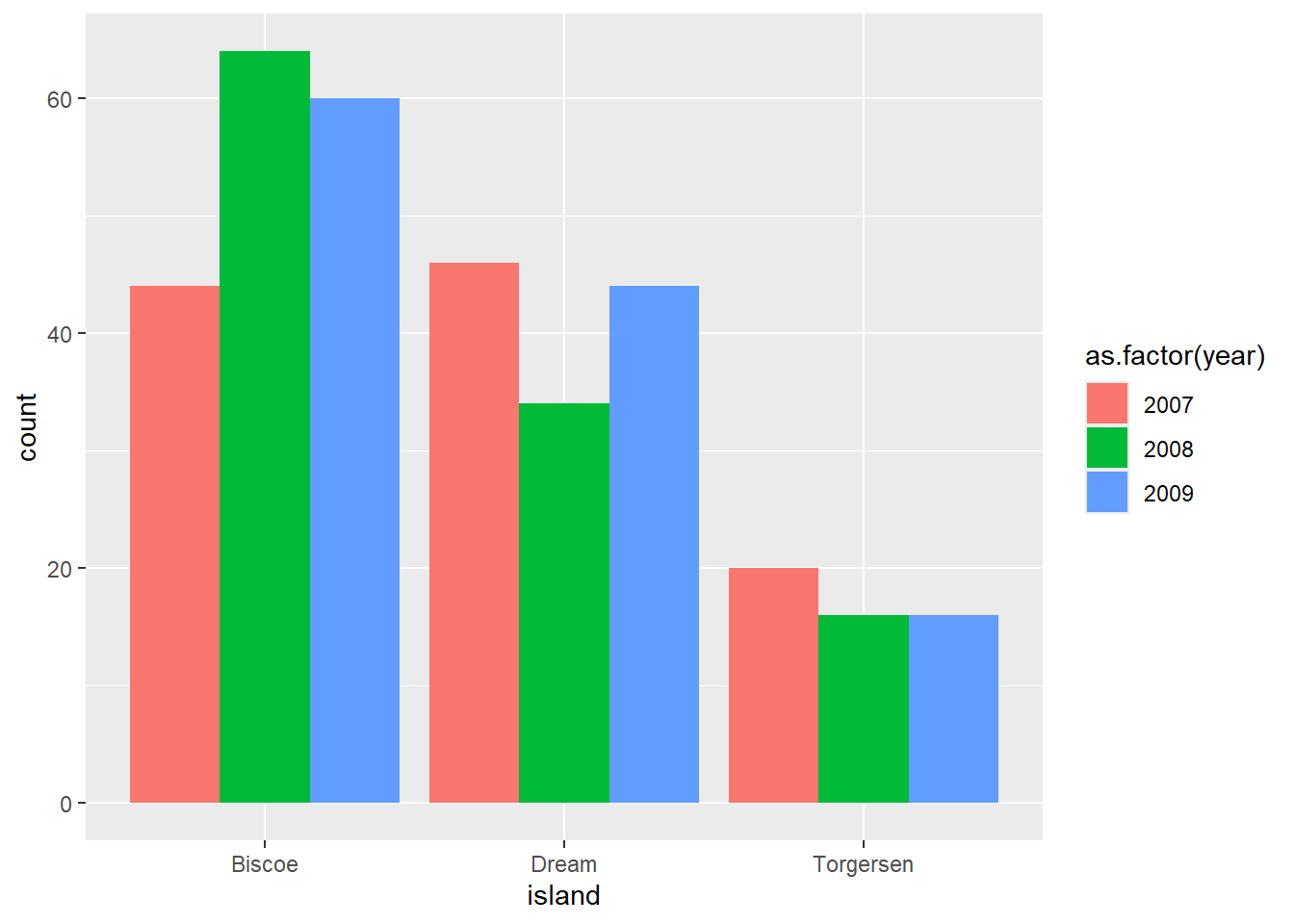
We want to create a grouped bar chart showing the number of penguins on each island, broken down by year.
Warning: The following aesthetics were dropped during statistical transformation: fill.
ℹ This can happen when ggplot fails to infer the correct grouping structure in
  the data.
ℹ Did you forget to specify a `group` aesthetic or to convert a numerical
  variable into a factor?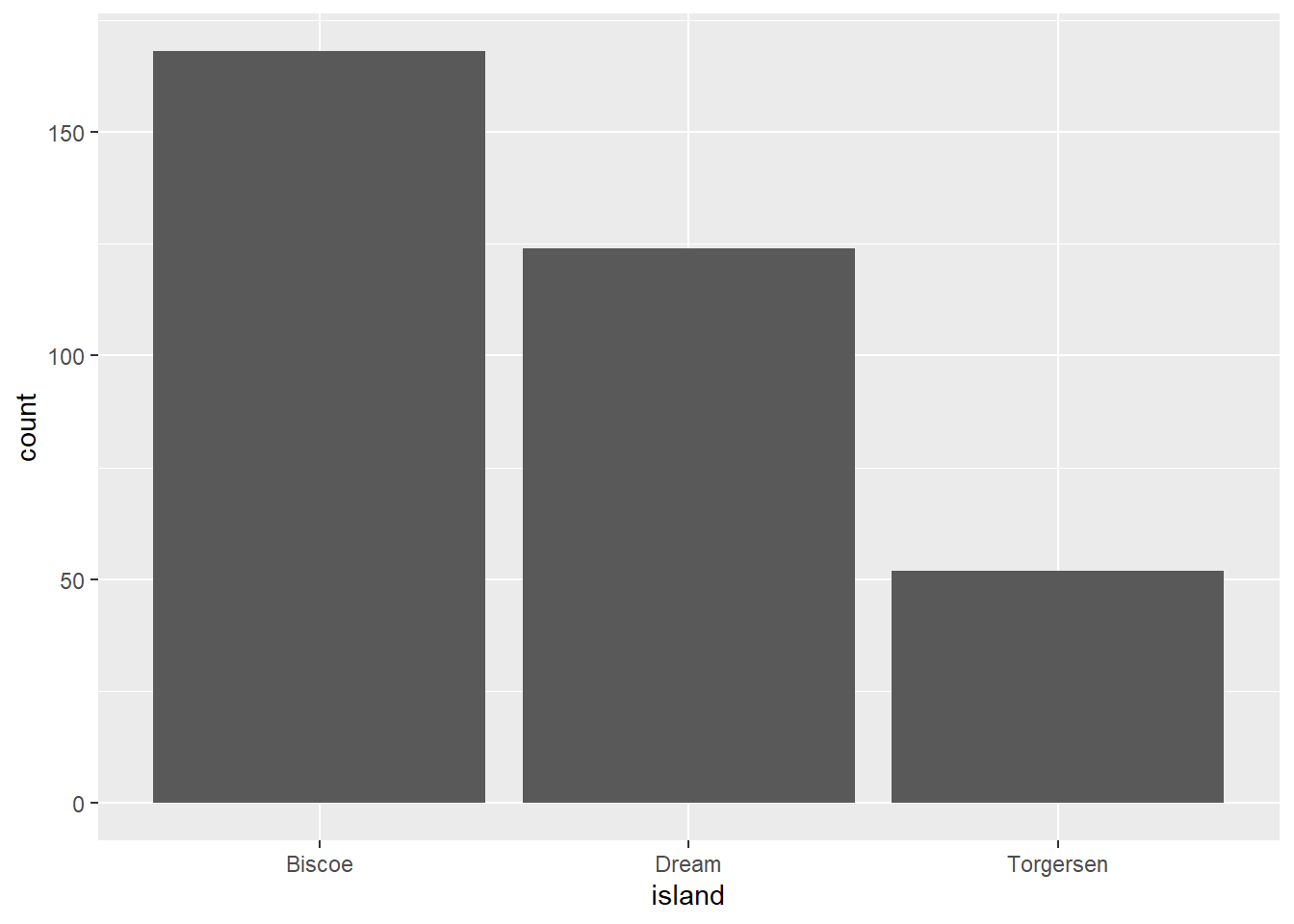
Hmmm. We got a plot, but certainly not the one we intended. The warning message mentions something about the grouping structure and gives some additional hints.
Question 8
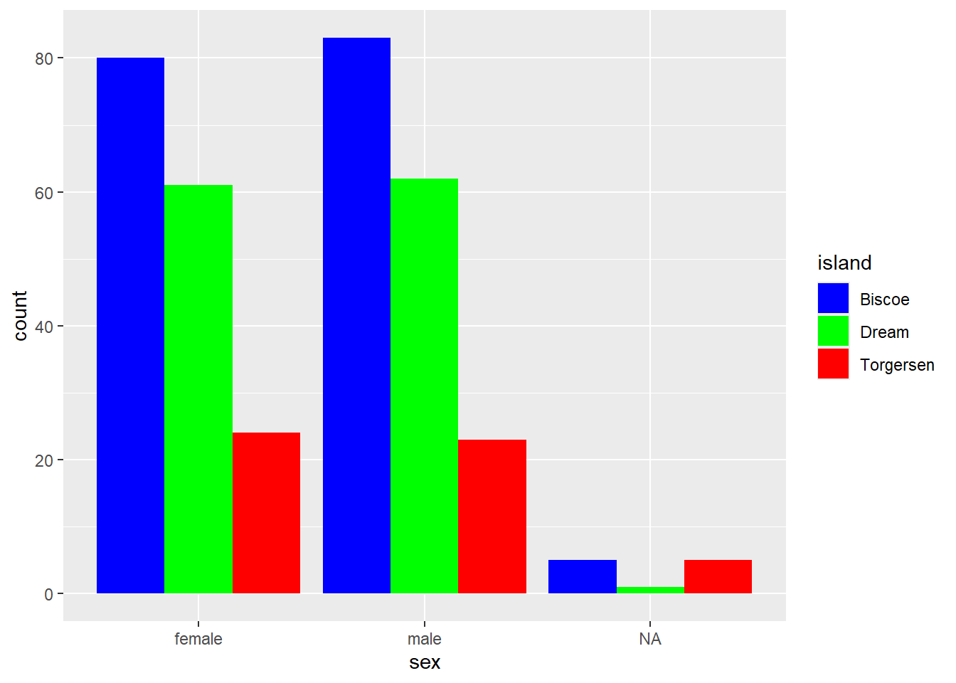
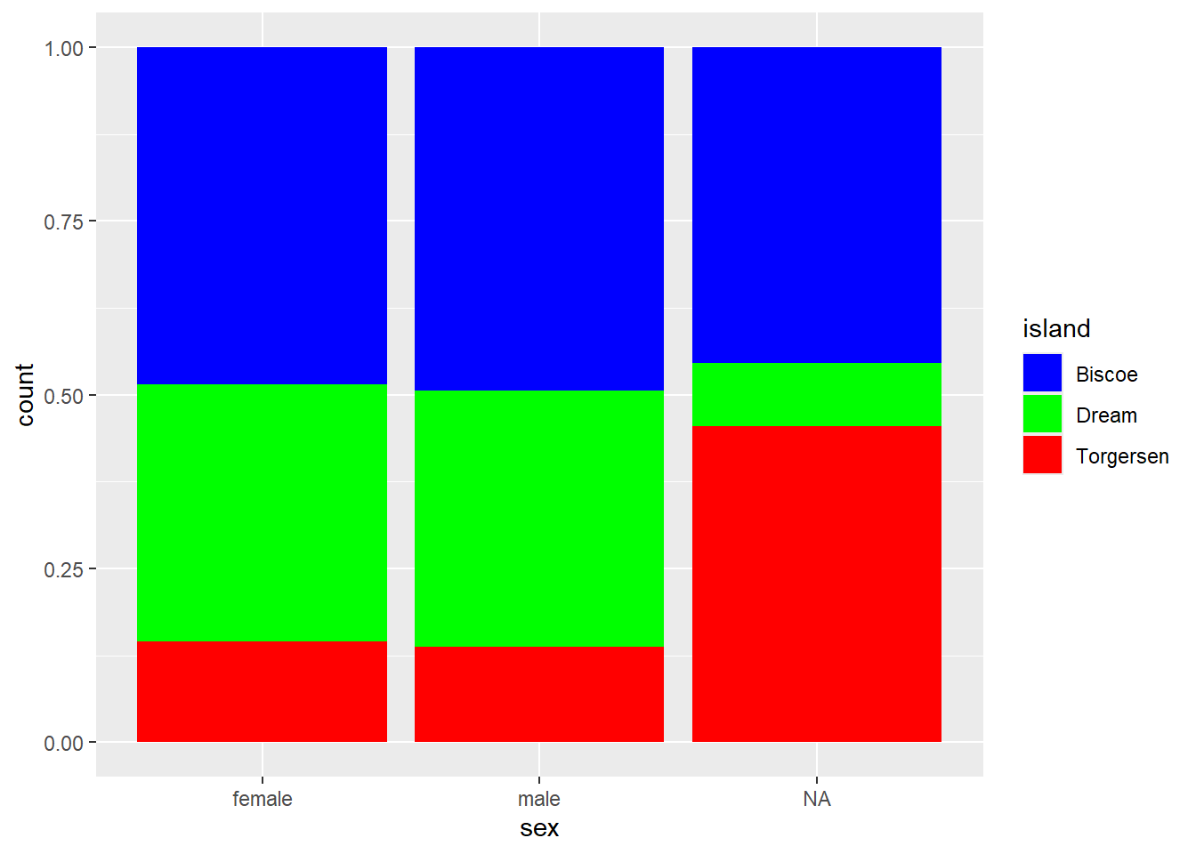
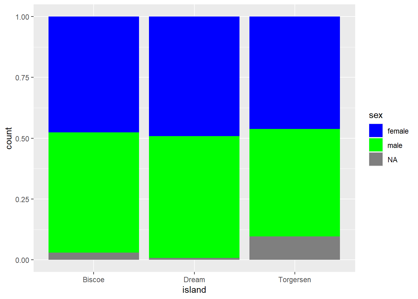
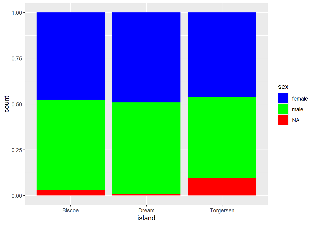
We want to create a percent stacked bar chart that displays the ratio of penguins’ sex on each island, using a manual color palette. Female penguins should be displayed in blue, males in green, and NA values in red.
Note: This task is trickier than it looks. Although the code runs and produces a plot, there are three mistakes to identify and fix.

