10 Simple regression
Intended Learning Outcomes
By the end of this chapter you should be able to:
- Compute a Simple linear regression.
- Read and interpret the output.
- Report the results.
Individual Walkthrough
10.1 Activity 1: Setup & download the data
This week, we will be working with a new dataset. Follow the steps below to set up your project:
- Create a new project and name it something meaningful (e.g., “2B_chapter10”, or “10_regression”). See Section 1.2 if you need some guidance.
-
Create a new
.Rmdfile and save it to your project folder. See Section 1.3 if you need help. - Delete everything after the setup code chunk (e.g., line 12 and below)
- Download the new dataset here: data_ch10.zip. The zip folder includes the data file and the codebook.
- Extract the data file from the zip folder and place it in your project folder. If you need help, see Section 1.4.
Citation
Alter, U., Dang, C., Kunicki, Z. J., & Counsell, A. (2024). The VSSL scale: A brief instructor tool for assessing students’ perceived value of software to learning statistics. Teaching Statistics, 46(3), 152-163. https://doi.org/10.1111/test.12374
Abstract
The biggest difference in statistical training from previous decades is the increased use of software. However, little research examines how software impacts learning statistics. Assessing the value of software to statistical learning demands appropriate, valid, and reliable measures. The present study expands the arsenal of tools by reporting on the psychometric properties of the Value of Software to Statistical Learning (VSSL) scale in an undergraduate student sample. We propose a brief measure with strong psychometric support to assess students’ perceived value of software in an educational setting. We provide data from a course using SPSS, given its wide use and popularity in the social sciences. However, the VSSL is adaptable to any statistical software, and we provide instructions for customizing it to suit alternative packages. Recommendations for administering, scoring, and interpreting the VSSL are provided to aid statistics instructors and education researchers understand how software influences students’ statistical learning.
The data is available on OSF: https://osf.io/bk7vw/
Changes made to the dataset
- We converted the Excel file into a CSV file.
- We aggregated the main scales (columns 50-57) by reverse-scoring all reverse-coded items (as specified in the codebook), and then computed an average score for each scale.
- However, responses to the individual questionnaire items (columns 1-49) remain as raw data and have not been reverse-coded. If you’d like to practice your data-wrangling skills, feel free to do so!
- We tidied the columns
RaceEthE,GradesE, andMajorE, but we’ve left Gender and Student Status for you to clean.
10.2 Activity 2: Load in the library, read in the data, and familiarise yourself with the data
Today, we will be using the packages tidyverse, performance, and pwr, along with the dataset Alter_2024_data.csv.
As always, take a moment to familiarise yourself with the data before starting your analysis.
Potential Research Question & Hypthesis
Let’s assume that individuals who are confident in quantitative reasoning are more likely to feel comfortable using statistical software.
- Potential research question: “Does quantitative self-efficacy predict attitudes toward SPSS, as measured by the VSSL Scale?”
- Null Hypothesis (H0): “Quantitative self-efficacy does not significantly predict attitudes toward SPSS (VSSL scores).”
- Alternative Hypothesis (H1): “Quantitative self-efficacy significantly predicts attitudes toward SPSS (VSSL scores), such that higher quantitative self-efficacy is associated with more positive attitudes toward SPSS.”
Thus, in this hypothetical scenario, the regression model would be:
- Independent Variable (IV)/ Predictor: Quantitative self-efficacy
- Dependent Variable (DV)/ Outcome: Attitudes toward SPSS (measured by the VSSL Scale)
10.3 Activity 3: Preparing the dataframe
The dataframe is already tidy for most variables, except for Gender and Student Status. This means we’re all set for this week.
However, working with a smaller subset of the data will be beneficial. Select the relevant variables of interest and store the results in a new data object called data_alter_reduced.
10.4 Activity 4: Compute descriptives
Now, we can calculate the means and standard deviations for our predictor and outcome variables.
10.5 Activity 5: Create an appropriate plot
Now, let’s recreate the following appropriate plot using data_alter_reduced:
`geom_smooth()` using formula = 'y ~ x'
10.6 Activity 6: Check assumptions
Assumption 1: Levels of measurement
- The outcome variable must be interval/ratio (continuous)
- The predictor variable must be either interval/ratio (continuous) or categorical (with two levels)
In our case, both the predictor variable (Quantitative self-efficacy) and the outcome variable (Attitudes toward SPSS as measured by the VSSL Scale) are continuous. The assumption holds.
Assumption 2: Independence of cases/observations
We must assume that each observation is independent of the others, meaning that each score comes from a different participant. Like assumption 1, this assumption is determined by the study design and it holds.
Assumption 3: Non-zero variance
Simply put, we need to have some spread in the data. The variance must be greater than zero.
We can check this by looking at the scatterplot: both the x-axis (predictor) and y-axis (outcome) should show variability. Similarly, we computed standard deviations for both variables in Activity 4, and both of them had values different to 0. So this assumption holds as well.
Assumption 4: Linearity
Since we will need the linear model for the next few assumptions and later for inferential statistics, we should first save it to the Global Environment as an object called mod.
The linear model function lm() requires the following arguments:
- The outcome variable, followed by a tilde (
~), followed by the the predictor variable - The dataset
Now we can continue with the assumption check of linearity. The relationship between the two variables must be linear.
We can assess linearity visually, just as we did in the correlation chapter, by using a Residuals vs Fitted plot. We can use the plot() function on our linear model (mod) with the which argument set to 1.
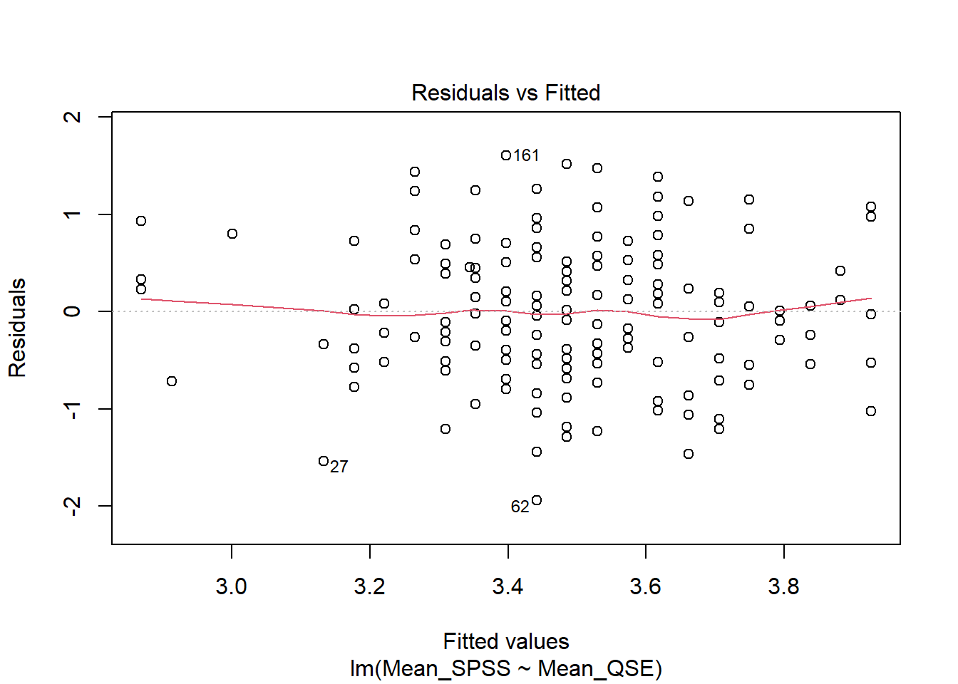
Verdict: The red line is roughly horizontal and flat, indicating that the relationship between the predictor and outcome is linear. This assumption holds.
Assumption 5: Normality
Residuals for both variables should follow a bivariate normal distribution (i.e., both together normally distributed).
We can visually check this assumption using a Q-Q plot. To generate it, we use the plot() function on our linear model mod, setting the which argument to 2. Again, this is the same approach we used in the correlation chapter to check for normality.
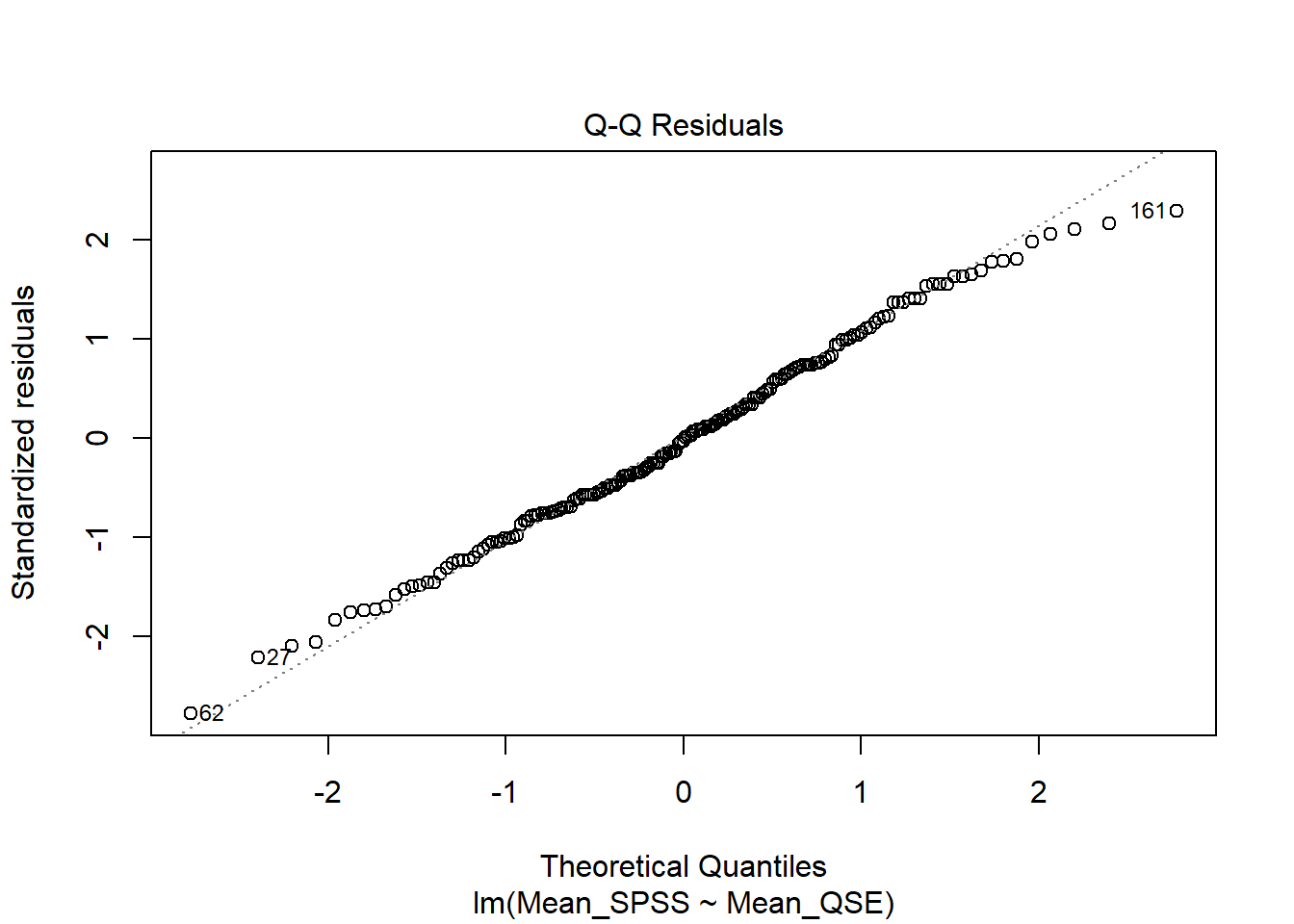
Verdict: Doesn’t this look beautiful? ✨ The points closely follow the diagonal line, indicating that the assumption of normality holds.
Assumption 6: Homoscedasticity
Homoscedasticity assumes that the spread of residuals is consistent across all levels of the predictor variable, meaning that the data is evenly distributed around the line of best fit, with no visible pattern. We can assess this assumption visually using a Scale-Location plot.
To generate it, we use the plot() function on our linear model mod, setting the which argument to 3:
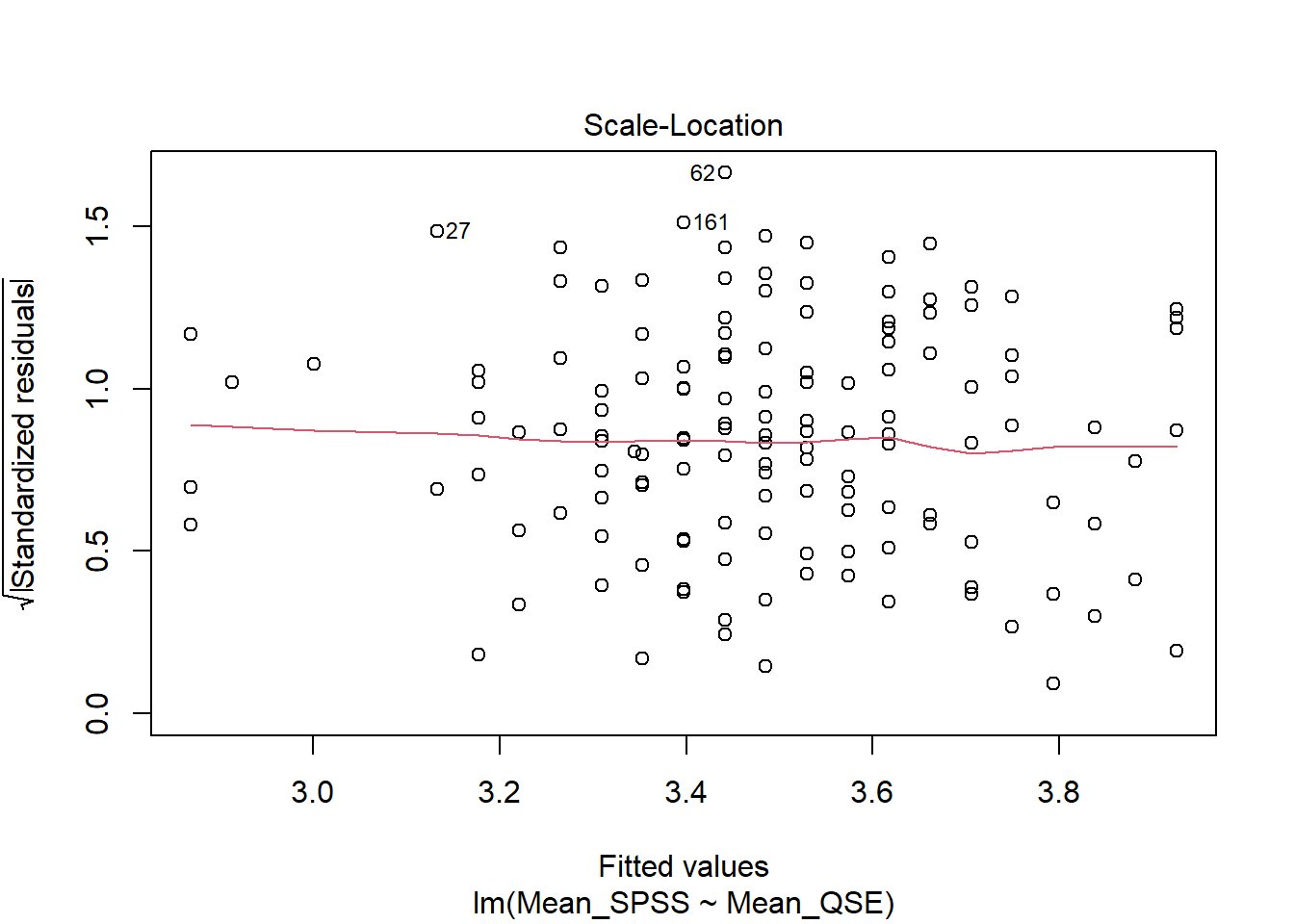
Verdict: The variance of the residual is constant along the values of predictor variable as indicated by this roughly flat and horizontal red line. Hence, we consider this assumption met.
Checking Assumptions Differently: Using check_model() from the performance package
Assumptions 4-6 can also be tested using the check_model() function from the performance package. This function provides the same diagnostic checks as plot(), but with a cleaner presentation and useful reminders of what to look for.
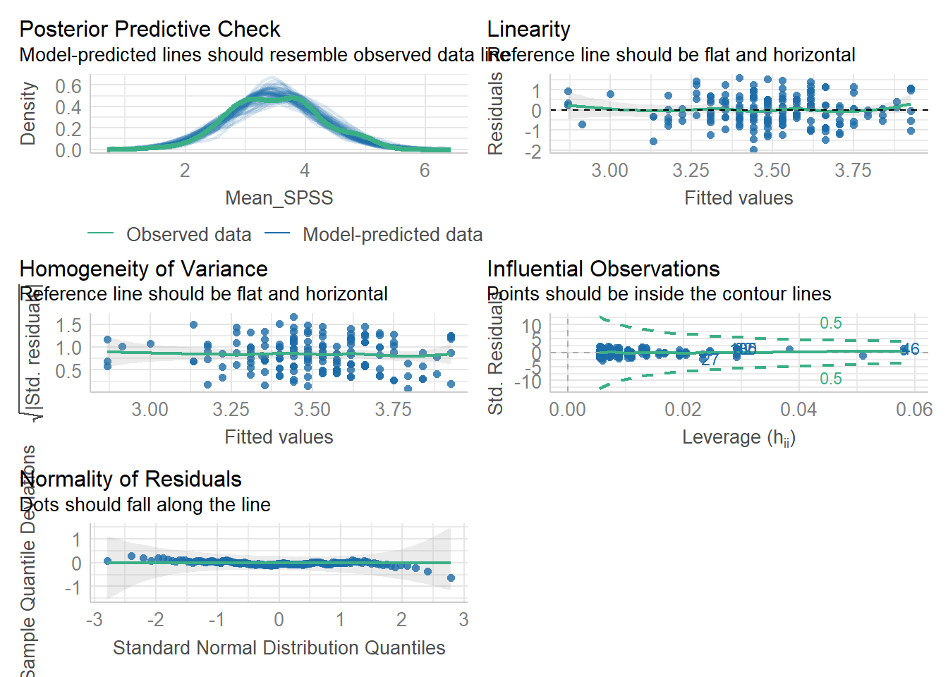
One key difference is that you get a posterior predictive check, which compares observed values to the model’s predictions. Additionally, the Q-Q plot for normality of residuals is displayed different. Instead of a diagonal reference line, residuals are plotted as deviations from a horizontal line. This visualisation can sometimes exaggerate small deviations, so focus on identifying clear overall patterns rather than minor fluctuations.
The diagnostic plots in the performance package are generated using ggplot2, so you can save them using ggsave() if needed.
But again; all assumptions are met. Let’s move on to inferential statistics!
10.7 Activity 7: Compute the regression, confidence intervals, and effect size
The lm() function from Base R is the main function to estimate a Linear Model (hence the function name lm). And if you’re experiencing a hint of déjà vu, you’re onto something! We have actually already used this function to store our linear model for assumption checks (remember the object called mod???).
Just to recap, the lm() function uses formula syntax with the following arguments:
For our example, the variables are:
- IV (Predictor): Quantitative self-efficacy, and
- DV (Outcome): Attitudes toward SPSS (measured by the VSSL Scale)
Thus, our regression model is:
As you can see in the Global Environment, mod stores a list of 12 elements, containing quite a bit of information about the regression model.
To view the results of our simple linear regression, use the summary() function on the mod object:
Call:
lm(formula = Mean_SPSS ~ Mean_QSE, data = data_alter_reduced)

Residuals:
     Min       1Q   Median       3Q      Max
-1.94132 -0.48539 -0.01985  0.51461  1.60274

Coefficients:
            Estimate Std. Error t value Pr(>|t|)
(Intercept)  2.60403    0.23404  11.126  < 2e-16 ***
Mean_QSE     0.26441    0.06722   3.933  0.00012 ***
---
Signif. codes:  0 '***' 0.001 '**' 0.01 '*' 0.05 '.' 0.1 ' ' 1

Residual standard error: 0.7023 on 179 degrees of freedom
Multiple R-squared:  0.07956,   Adjusted R-squared:  0.07442
F-statistic: 15.47 on 1 and 179 DF, p-value: 0.0001196When working with a continuous predictor, the sign of the slope is important to consider:
- A positive slope indicates that as the predictor increases, the outcome variable also tends to increase.
- A negative slope means that as the predictor increases, the outcome variable tends to decrease.
Understanding the direction of the relationship is crucial for correctly interpreting the regression coefficient.
Sooo. We already have several key values, but we still need confidence intervals and effect sizes to fully report our results.
R has a built-in function called confint() to calculate confidence intervals using our linear model object mod.
The effect size for a simple linear regression is Cohen’s \(f^2\). We can calculate it manually. As you may recall from the lectures, the formula for Cohen’s \(f^2\) is:
\[ f^2 = \frac{R^2_{Adjusted}}{1-R^2_{Adjusted}} \]
In our case, we can extract \(R^2_{Adjusted}\) from the summary(mod) output.
And then, we just use r_sq_adj in the formula above:
Now, we have all the necessary values to write up the results!
10.8 Activity 8: Sensitivity power analysis
As usual, we can calculate the smallest effect size that our study was able to detect, given our design and sample size.
To do this, we use the pwr.f2.test() function from the pwr package. This function requires the following arguments:
-
u= Numerator degrees of freedom. This the number of coefficients you have in your model (minus the intercept) -
v= Denominator degrees of freedom. This is calculated as \(v=n-u-1\), where \(n\) is the number of participants. -
f2= The effect size. Here we are solving the effect size, so this parameter is left out -
sig.level= The significance level of your study -
power= The power level of your study
     Multiple regression power calculation

              u = 1
              v = 179
             f2 = 0.04381313
      sig.level = 0.05
          power = 0.8
With the design and sample size we have, we could have detected an effect as small as \(f^2 = 0.044\). Since the observed effect size from our inferential statistics was larger (\(f^2 = 0.080\)), this means our test was sufficiently powered to detect the observed effect.
10.9 Activity 9: The write-up
A simple linear regression was performed with Attitudes toward SPSS \((M = 3.50, SD = 0.73)\) as the outcome variable and Quantitative self-efficacy \((M = 3.39, SD = 0.78)\) as the predictor variable.
The results of the regression indicated that the model significantly predicted Attitudes toward SPSS \((F(1, 179) = 15.47 p < .001, R^2_{Adjusted} = .074, f^2 = 0.080)\), accounting for 7.4% of the variance. The effect of Quantitative self-efficacy was statistically significant, positive, and of small magnitude \((b = 0.26, 95\% CI = [.13, .40], p <.001)\).
Pair-coding
Task 1: Open the R project for the lab
Task 2: Create a new .Rmd file
… and name it something useful. If you need help, have a look at Section 1.3.
Task 3: Load in the library and read in the data
The data should already be in your project folder. If you want a fresh copy, you can download the data again here: data_pair_coding.
We are using the packages tidyverse and performance today. If you have already worked through this chapter, you will have all the packages installed. If you have yet to complete Chapter 10, you will need to install the package performance (see Section 1.5.1 for guidance if needed).
We also need to read in dog_data_clean_wide.csv. Again, I’ve named my data object dog_data_wide to shorten the name but feel free to use whatever object name sounds intuitive to you.
Task 4: Tidy data & Selecting variables of interest
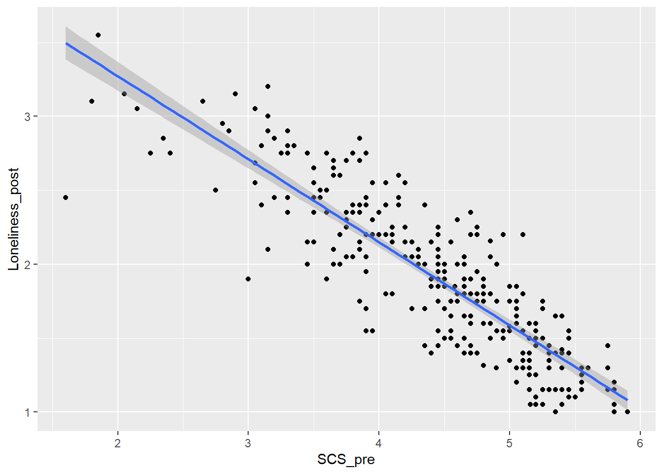
Let’s try to answer the question whether pre-intervention social connectedness (SCS_pre) predicts post-intervention loneliness (Loneliness_post)?
Not much tidying to do today.
Step 1: Select the variables of interest. Store them in a new data object called dog_reg.
Step 2: Check for missing values and remove participants with missing in either variable.
Task 5: Visualise the relationship
I’ve used the following code to create a scatterplot to explore the relationship between social connectedness (pre-test) and loneliness (post-test). Can you check I did it correctly?
`geom_smooth()` using formula = 'y ~ x'
Did I do it right?
The scatterplot is incorrect. Since we are predicting loneliness from social connectedness, the axes should be reversed.
In a correlation, the order of x and y does not matter, but in a regression, the predictor variable must be on the x-axis, and the outcome variable must be on the y-axis.
Here is the corrected scatterplot:
Task 6: Model creating & Assumption checks
Let’s store our linear model as mod and then use the check_model() function from the performance package to check assumptions.
Remember, the structure of the linear model is:
Once the model is stored as mod, we can check its assumptions using check_model(mod).
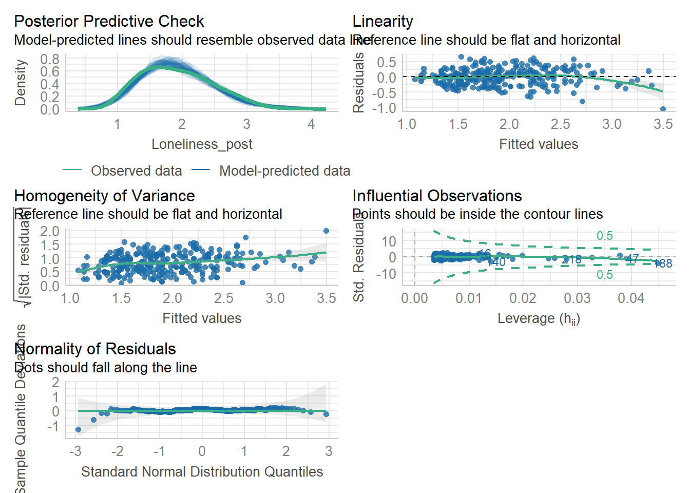
Assumptions 1-3 hold due to the study design, but let’s take a closer look at the following output:
- Linearity: The relationship appears to be .
- Normality: The residuals are .
- Homoscedasticity: There is .
Task 7: Computing a Simple Regression & interpret the output
To compute the simple regression, we need to use the summary() on our linear model mod.
How do you interpret the output?
The estimate of the y-intercept for the model, rounded to two decimal places, is
The relationship is
The model indicated that
How much the variance is explained by the model (rounded to two decimal places)? %.
Test your knowledge
Question 1
What is the main purpose of a simple regression analysis?
Question 2
A sports scientist wants to examine whether an athlete’s reaction time (in milliseconds) can predict their sprint speed (in seconds) in a 100m race.
Which of the following correctly specifies the simple regression model in R?
Question 3
In a simple regression model where reaction time (milliseconds) predicts sprint speed (seconds), the regression output shows:
\[ Sprint Speed = 10.2 + 0.08 × Reaction Time \]
How should the slope be interpreted?
Question 4
A simple regression analysis finds an \(R^2_{Adjusted} = 0.62\) when predicting sprint speed from reaction time. What does this mean?