11 Multiple regression
Intended Learning Outcomes
By the end of this chapter you should be able to:
- Apply and interpret multiple linear regression models.
- Interpret coefficients from individual predictors and interactions.
- Visualise interactions as model predictions to understand and communicate your findings.
- Calculate statistical power for a multiple regression model.
In the previous chapter, we have looked at simple regressions - predicting an outcome variable using one predictor variable. In this chapter, we will expand on that and look at scenarios where we predict an outcome using more than one predictor in the model - hence, multiple regression.
Individual Walkthrough
11.1 Activity 1: Setup & download the data
This week, we will be working with a new dataset. Follow the steps below to set up your project:
- Create a new project and name it something meaningful (e.g., “2B_chapter11”, or “11_multiple_regression”). See Section 1.2 if you need some guidance.
-
Create a new
.Rmdfile and save it to your project folder. See Section 1.3 if you need help. - Delete everything after the setup code chunk (e.g., line 12 and below)
-
Download the new dataset here: data_ch11.zip. The zip folder includes:
- the demographics data file (
Przybylski_2017_demographics.csv) - the screentime data file (
Przybylski_2017_screentime.csv) - the wellbeing data file (
Przybylski_2017_wellbeing.csv), and the - the codebook (
Przybylski_2017_Codebook.xlsx).
- the demographics data file (
- Extract the data file from the zip folder and place it in your project folder. If you need help, see Section 1.4.
Citation
Przybylski, A. K., & Weinstein, N. (2017). A Large-Scale Test of the Goldilocks Hypothesis: Quantifying the Relations Between Digital-Screen Use and the Mental Well-Being of Adolescents. Psychological Science, 28(2), 204-215. https://doi.org/10.1177/0956797616678438
Abstract
Although the time adolescents spend with digital technologies has sparked widespread concerns that their use might be negatively associated with mental well-being, these potential deleterious influences have not been rigorously studied. Using a preregistered plan for analyzing data collected from a representative sample of English adolescents (n = 120,115), we obtained evidence that the links between digital-screen time and mental well-being are described by quadratic functions. Further, our results showed that these links vary as a function of when digital technologies are used (i.e., weekday vs. weekend), suggesting that a full understanding of the impact of these recreational activities will require examining their functionality among other daily pursuits. Overall, the evidence indicated that moderate use of digital technology is not intrinsically harmful and may be advantageous in a connected world. The findings inform recommendations for limiting adolescents’ technology use and provide a template for conducting rigorous investigations into the relations between digital technology and children’s and adolescents’ health.
The data is available on OSF: https://osf.io/bk7vw/
Changes made to the dataset
- The original SPSS file was converted into a CSV format. Although a CSV file was available in the OSF folder, it lacked labels and value explanations, so we opted to work from the SPSS file, which contained more information.
- We reduced the dataset by selecting some of the variables relating to demographics, screentime and wellbeing.
- The data was split into three separate files: demographics, screentime, and wellbeing.
- Screen time values were recoded to reflect hours according to the codebook.
- Rows with missing values were removed from
screentime.csvandwellbeing.csv. - A codebook was created for the selected variables.
11.2 Activity 2: Load in the library, read in the data, and familiarise yourself with the data
Today, we will use the following packages tidyverse, sjPlot, performance, and pwr, along with the three data files from the Przybylski and Weinstein (2017) study.
As always, take a moment to familiarise yourself with the data before starting your analysis.
Once you have explored the data objects and the codebook, try and answer the following questions:
- The variable Gender is located in the object named .
- The wellbeing data is in format and contains observations from participants.
- The wellbeing questionnaire has items.
- Individual participants in this dataset are identified by the variable , which allows us to link information across the three tables.
- Are there any missing data points?
Potential Research Question & Hypthesis
There is ongoing debate about how smartphones affect well-being, particularly among children and teenagers. Therefore, we will examine whether smartphone use predicts mental well-being and whether this relationship varies by gender among adolescents.
- Potential research question: “Does smartphone use predict mental well-being, and does this relationship differ between male and female adolescents?”
- Null Hypothesis (H0): “Smartphone use does not predict mental well-being, and there is no difference in this relationship between male and female adolescents.”
- Alternative Hypothesis (H1): “Smartphone use is a significant predictor of mental well-being, and the effect of smartphone use on well-being differs between male and female adolescents.”
Note that in this analysis, we have:
- A continuous dependent variable (DV)/Outcome: well-being
- A continuous independent variable (IV)/Predictor: screen time
- A categorical independent variable (IV)/Predictor: gender
* these variables are only quasi-continuous, inasmuch as only discrete values are possible. However, there are a sufficient number of discrete categories that we can treat them as effectively continuous.
11.3 Activity 3: Compute descriptives
Today, most of the data wrangling will be done in the upcoming activities. To streamline the process, we will move “Computing descriptives” forward.
11.3.1 Well-being
We need to do some initial data wrangling on wellbeing.
For each participant, compute the total score for the mental health questionnaire. Store the output in a new data object called wemwbs.
The new dataset should have two variables:
-
Serial- the participant ID. -
WEMWBS_sum- the total WEMWBS score.
In the original paper, Przybylski and Weinstein (2017) reported: “Scores ranged from 14 to 70 (M = 47.52, SD = 9.55)”. Can you reproduce these values?
11.3.2 Screentime
We need to calculate the means and standard deviations for smartphone use (in hours) during the week and on the weekend.
11.4 Activity 4: Recreating the plot from the paper
If there’s a challenge in this session, this is it! Our task is to wrangle the data and recreate the plot from the original article (shown below).
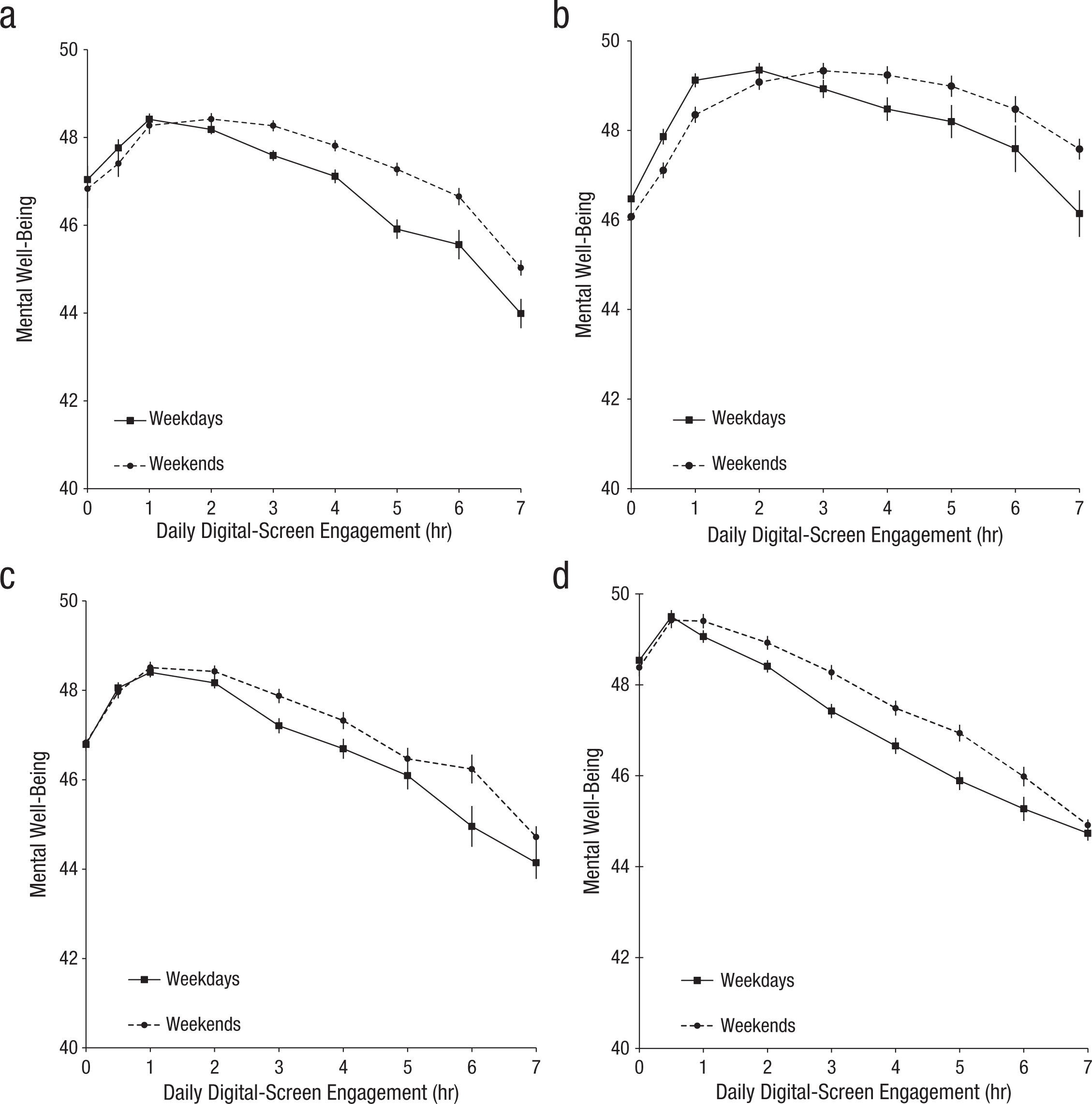
The graph shows that smartphone use of more than 1 hour per day is associated with increasingly negative well-being.
We can plot the relationship between well-being and hours of technology use, split into four categories of technology (video games, computers, smartphones, TV).
This plot involves faceting, and some of the required functions may be new to you. Don’t worry—we’ll guide you through the process!
Now it’s just figuring out which sequence we need them to be in. There are steps to do (or that easier to do) in the dataframe and then there is plotting.
Sooo, let’s start with any changes we can apply to the dataframe screentime. We should store the new output in an object called screen_long.
Step 1: Pivot screentime into long format.
Step 2: Extracting technology type and time period To access information on weekday/weekend and the four categories of technology, we need to separate information currently stored in column names. Anything before the separator _ represents the technology type. Anything after the separator _ indicates whether the data is from weekdays (wk) or weekends (we). (e.g., Watch_we, Smart_wk). Restructuring is easier when the data is in long format.
Step 3: The current labels Watch, Smart, we or wk are not really informative. Since these labels will be displayed in the facets and legends of the final plot, we should rename them here to improve readability. Although legend labels can be adjusted later in the plot, facet labels are more difficult to modify, so it’s better to clean them now.
- “Watch” \(\rightarrow\) “Watching TV”,
- “Comp” \(\rightarrow\) “Playing Video Games”,
- “Comph” \(\rightarrow\) “Using Computers”,
- “Smart” \(\rightarrow\) “Using Smartphone”,
- “wk” \(\rightarrow\) “Weekdays”, and
- “we” \(\rightarrow\) “Weekends”.
Step 4: To ensure all necessary information is in one place, join screen_long and wemwbs so that each participant has corresponding values from both dataframes.
Step 5: For each technology type and screen time level, compute the average well-being scores separately for weekdays and weekends.
Since steps 4 and 5 contribute to creating a summary dataset rather than modifying individual records, it might be best to store the output in a new object called dat_means.
Now we are ready to create the plot! This visualization includes a few new features related to line plots and point shapes. Take a moment to explore them.
ggplot(dat_means, aes(x = hours, y = mean_wellbeing, linetype = day, shape = day)) +
  geom_line() +
  geom_point() +
  scale_shape_manual(values=c(15, 16)) +
  facet_wrap(~ technology_type) +
  theme_classic() +
  labs(x = "Hours of Technology Use",
       y = "Mean Well-Being Score")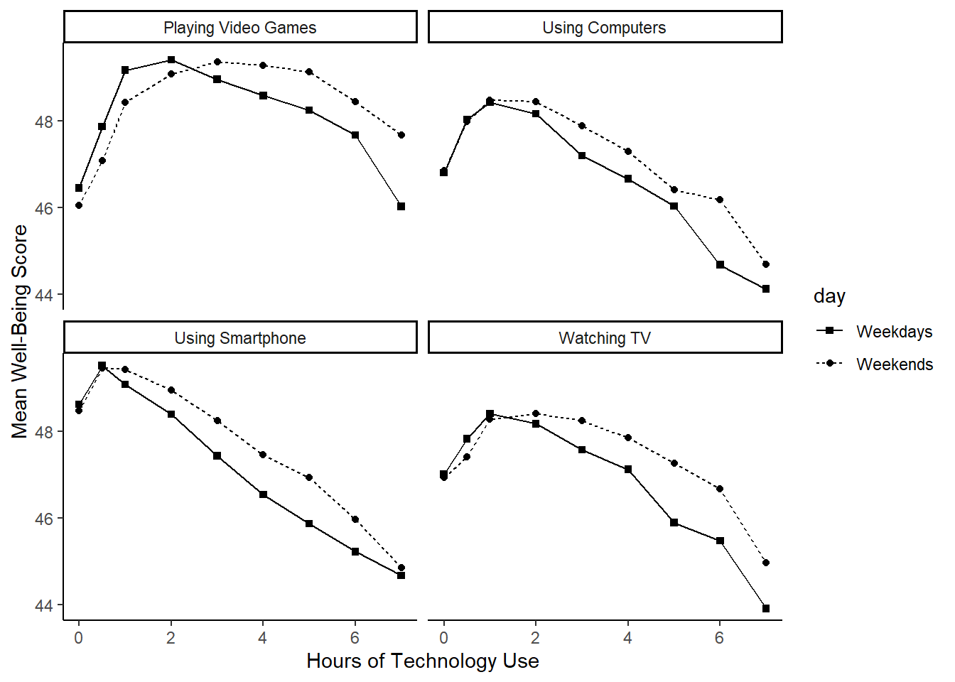
- The
aes(linetype = …)argument controls the type of line (e.g., solid or dotted). Here, we used it to differentiate between weekdays and weekends. More on line types can be found here: https://sape.inf.usi.ch/quick-reference/ggplot2/linetype.html - To change the shape of the points, we set
shapeinsideaes(), linking it to the day type. However, by default, the shapes appeared as dots and triangles, whereas the original plot suggests dots and squares. We corrected this usingscale_shape_manual(). More on point shapes can be found here: https://www.sthda.com/english/wiki/ggplot2-point-shapes
If you are looking really closely, you will notice that the order of the categories is slightly different, and that the x- and y-axis ranges extend a bit further. Feel free to fix that yourself.
Hmm. Actually, it seems the original authors created four separate plots and then combined them using a package like patchwork. Here, we used facets rather than creating those individual plots. That also means that the axis labels span across all plots rather than being repeated for each. Plus, the legend appears on the side instead of within each plot.
Ah well! Let’s call it a conceptual replication, then, shall we?
11.5 Activity 5: Dataframe for the regression model
Now, we shift our focus to our hypothetical research question:
“Does smartphone use predict mental well-being, and does this relationship differ between male and female adolescents?”
11.5.1 Final data wrangling steps
Create a new data object that contains the average daily smartphone use per participant, averaged across weekdays and weekends.
Since Przybylski and Weinstein’s findings suggest that smartphone use exceeding one hour per day is associated with increasingly negative well-being, we will filter the data to include only participants who use a smartphone for more than one hour per day.
We have already structured much of the data when creating screen_long, so we have two options:
- Start from
screen_longto simplify the process, or - Return to the original
screentimedataset, where smartphone use was recorded separately for weekdays and weekends.
Next, we need to merge the wrangled data with well-being scores (as we did earlier) and also join it with the participant information, since we need the Gender variable for our analysis.
Finally, store the cleaned dataset in an object called data_smartphone.
11.5.2 Mean-centering variables
As you have seen in the lectures, when you have continuous variables in a regression model, it is often sensible to transform them by mean centering. You mean center a predictor X by subtracting the mean of the predictor (X_centered = X - mean(X)) or you can use the scale() function. This has two useful consequences:
The model intercept represents the predicted value of \(Y\) when the predictor variable is at its mean, rather than at zero in the unscaled version.
When interactions are included in the model, significant effects can be interpreted as the overall effect of a predictor on the outcome (i.e., a main effect) rather than its effect at a specific level of another predictor (i.e., a simple effect).
For categorical predictors with two levels, these become coded as -.5 and .5 (because the mean of these two values is 0). This is also known as deviation coding.
If we used dummy coding (i.e., leaving the categorical predictor as “Male” and “Female or unknown; default for R) instead of deviation coding, the interpretation would change slightly:
- Dummy-coding interpretation: The intercept represents the predicted outcome for the reference group (coded as 0), and the coefficient for the categorical predictor represents the difference in the outcome between the two groups.
- Deviation-coding interpretation: The intercept represents the overall mean outcome across both groups, and the coefficient for the categorical predictor represents the average difference between the two groups, centered around zero.
Use mutate() to add two new variables to data_smartphone:
-
average_hours_centered: calculated as a mean-centered version of thetotal_hourspredictor -
gender_recoded: recode Gender .5 for “Male” and -.5 for “Female or unknown”.
11.6 Activity 6: Compute the regression, confidence intervals, and effect size
For the data in data_smartphone, use the lm() function to calculate the multiple regression model:
\(Y_i = \beta_0 + \beta_1 X_{1i} + \beta_2 X_{2i} + \beta_3 X_{3i} + e_i\)
where
\(Y_i\) is the well-being score for participant \(i\);
\(X_{1i}\) is the mean-centered smartphone use for participant \(i\);
\(X_{2i}\) is gender (coded as -0.5 = female, 0.5 = male);
\(X_{3i}\) is the interaction between smartphone use and gender (\(= X_{1i} \times X_{2i}\))
In R, this model is specified as:
The formula lm(Outcome ~ Predictor1 + Predictor2, data) includes both predictors in the model, allowing you to examine their individual contributions (i.e., main effects) in explaining the outcome variable.
However, if you are also interested in their interaction, you have two options:
- Using the shorthand
*operator:lm(Outcome ~ Predictor1 * Predictor2, data)automatically includes both main effects and their interaction. OR - Manually specifying the interaction term by using the
:operator:lm(Outcome ~ Predictor1 + Predictor2 + Predictor1:Predictor2, data). Note: The colon (:) specifies an interaction term without including the main effects, so both predictors must also be listed separately to ensure a full model.
Both approaches yield the same results, but the * shorthand is often preferred for readability.
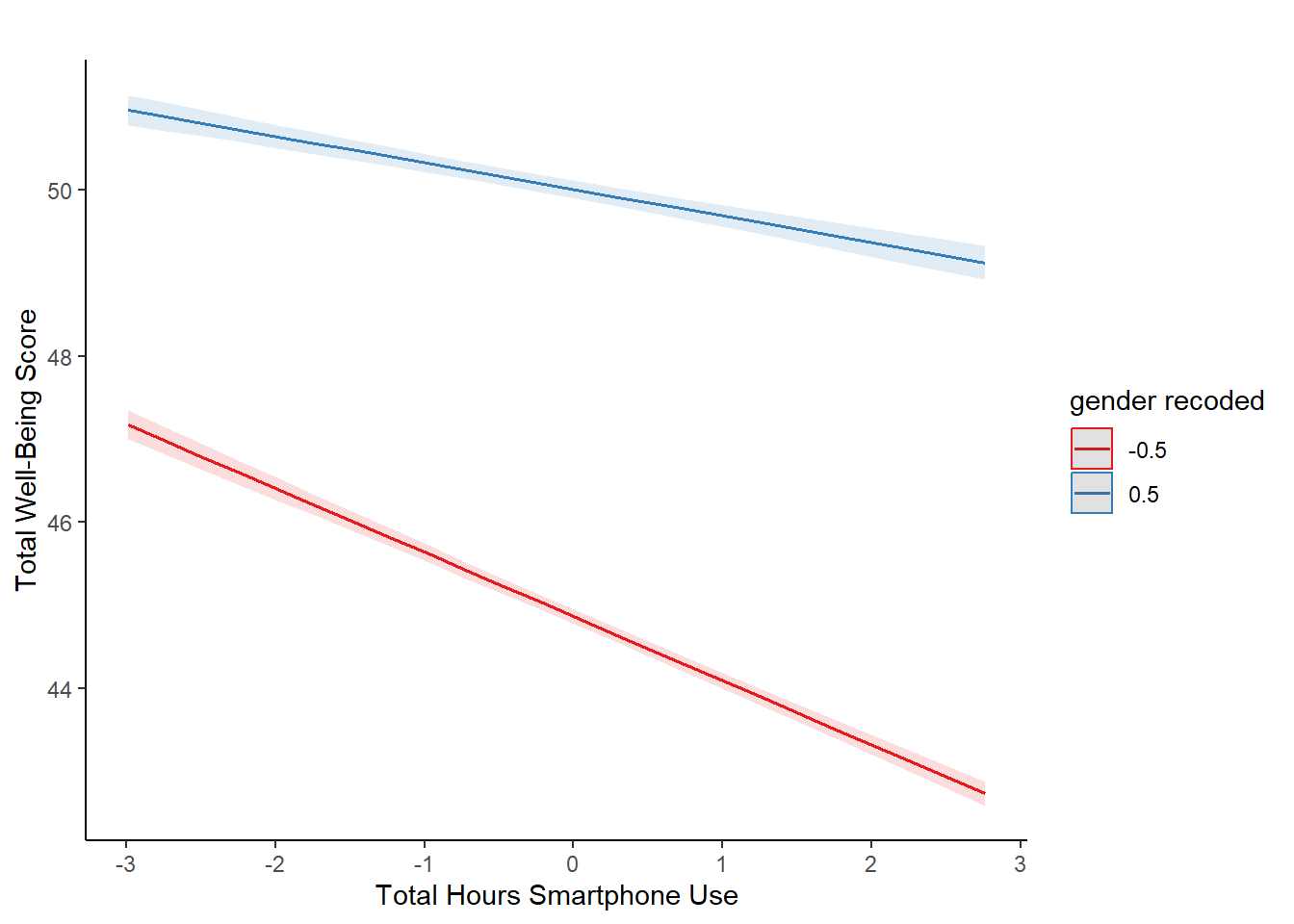
11.7 Activity 7: Visualising interactions
It is very difficult to understand an interaction from the coefficient alone, so your best bet is visualising the interaction to help you understand the results and communicate your results to your readers.
There is a great package called sjPlot which takes regression models and helps you plot them in different ways. We will demonstrate plotting interactions, but for further information and options, see the online documentation.
To plot the interaction, you need the model object (not the summary), specify “pred” as the type as we want to plot predictions, and add the terms you want to plot.
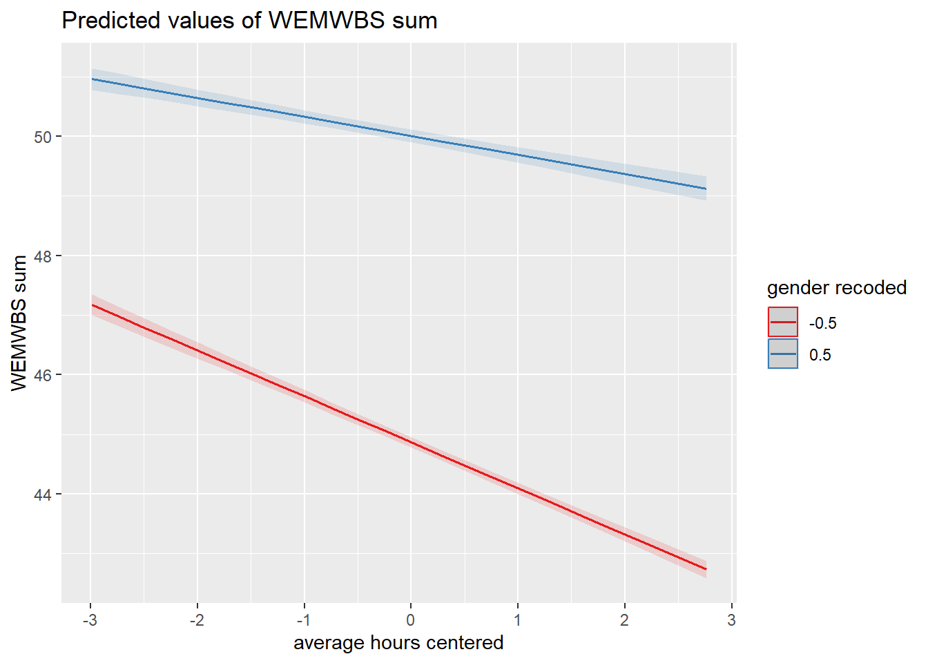
What is the most reasonable interpretation of the interaction?
plot_model() uses ggplot2 in the background. You can add further customisation by adding layers after the initial function. You can also use ggsave() to save your plots and insert them into your work.
11.8 Activity 8: Check assumptions
Now it’s time to test those pesky assumptions. The assumptions for multiple regression are the same as simple regression but there is one additional assumption, that of multicollinearity. This is the idea that predictor variables should not be too highly correlated.
Assumptions are:
- The outcome/DV is a interval/ratio level data, and the predictor variable is interval/ratio or categorical (with two levels).
- All values of the outcome variable are independent (i.e., each score should come from a different participant).
- The predictors have non-zero variance.
- The relationship between outcome and predictor is linear.
- The residuals should be normally distributed.
- There should be homoscedasticity (homogeneity of variance, but for the residuals).
- Multicollinearity: predictor variables should not be too highly correlated.
We can use the plot() function for diagnostic plots or the check_model() from the performance package.
One difference from when we used check_model() previously is that rather than just letting it run all the tests it wants, we are going to specify which tests to stop it throwing an error.
A word of warning - these assumption tests will take longer than usual to run because it’s such a big data set.

Assumptions 1-3
From the work we have done so far, we know that we meet assumptions 1-3.
Assumption 4: Linearity
We already know from looking at the scatterplot that the relationship is linear, but the residual plot also confirms this.
Assumption 5: Normality of residuals
The residuals look good in both plots and this provides an excellent example of why it’s often better to visualise than rely on statistics. With a sample size this large, any statistical diagnostic tests will be highly significant as they are sensitive to sample size.
Assumption 6: Homoscedasticity
The plot is missing the reference line. Fun fact, this took us several days of our lives and asking for help on social media to figure out. The reason the line is not there is because the data set is so large that is creates a memory issue. However, if you use the plot() version, it does show the reference line.
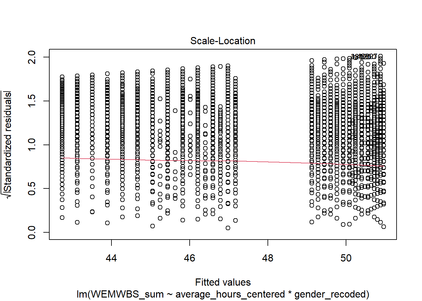
It is not perfect, but the reference line is roughly flat to suggest there are no serious issues with homoscedasticity.
Assumption 7: Multicollinearity
From the collinearity plot, we can see that both main effects and the interaction term are in the “green zone” which is great. Howeverm we can also test this statistically using check_collinearity() to produce VIF (variance inflation factor) and tolerance values.
Essentially, this function estimates how much the variance of a coefficient is “inflated” because of linear dependence with other predictors, i.e., that a predictor is not actually adding any unique variance to the model, it’s just really strongly related to other predictors. You can read more about this online. Thankfully, VIF is not affected by large samples like other statistical diagnostic tests.
There are various rules of thumb, but most converge on a VIF of above 2 - 2.5 for any one predictor to be problematic. Here we are well under 2 for all 3 terms of the model.
| Term | VIF | VIF_CI_low | VIF_CI_high | SE_factor | Tolerance | Tolerance_CI_low | Tolerance_CI_high |
|---|---|---|---|---|---|---|---|
| average_hours_centered | 1.721968 | 1.704219 | 1.740165 | 1.312238 | 0.5807308 | 0.5746582 | 0.5867789 |
| gender_recoded | 1.035552 | 1.028488 | 1.044369 | 1.017621 | 0.9656682 | 0.9575159 | 0.9723014 |
| average_hours_centered:gender_recoded | 1.716349 | 1.698683 | 1.734463 | 1.310095 | 0.5826319 | 0.5765474 | 0.5886915 |
11.9 Activity 9: Sensitivity power analysis
As usual, we want to calculate the smallest effect size that our study was able to detect, given our design and sample size.
To do this, we use the pwr.f2.test() function from the pwr package. This is the same as in chapter 10 for simple linear regression. Remember the arguments for this function:
-
u= Numerator degrees of freedom. This the number of coefficients you have in your model (minus the intercept) -
v= Denominator degrees of freedom. This is calculated as \(v=n-u-1\), where \(n\) is the number of participants. -
f2= The effect size. Here we are solving the effect size, so this parameter is left out -
sig.level= The significance level of your study. This is usually set to 0.05 -
power= The power level of your study. This is usually set to 0.8, but let’s go for 0.99 this time (just because we have such a large number of participants)
Run the sensitivity power analysis and then answer the following questions:
- To 4 decimal places, what is the smallest effect size that this study could reliably detect?
Since the observed effect size from our inferential statistics was than the effect you could reliably detect with this design, the test was to detect the observed effect.
11.10 Activity 10: The write-up
All continuous predictors were mean-centered and deviation coding was used for categorical predictors. The results of the regression indicated that the model significantly predicted wellbeing \((F(3, 71029) = 2451, p < .001, R^2_{Adjusted} = .094, f^2 = 0.103)\), accounting for 9.4% of the variance. Total screen time was a significant negative predictor of wellbeing scores \((\beta = -0.77, 95\% CI = [-0.82, -0.73], p < .001\)), as was gender \((\beta = 5.14, p < .001\)), with girls having lower wellbeing scores than boys. Importantly, there was a significant interaction between screen time and gender \((\beta = 0.45, 95\% CI = [0.38, 0.52], p < .001\)), meaning that smartphone use was more negatively associated with well-being for girls than for boys.
Pair-coding
Task 1: Open the R project for the lab
Task 2: Create a new .Rmd file
Task 3: Load in the library and read in the data
The data should already be in your project folder. If you want a fresh copy, you can download the data again here: data_pair_coding.
We are using the packages tidyverse, sjPlot, and performance today.
Just like last week, we also need to read in dog_data_clean_wide.csv.
Task 4: Tidy data & Selecting variables of interest
Let’s define a potential research question:
To what extent do pre-intervention loneliness and pre-intervention flourishing predict post-intervention loneliness, and is there an interaction between these predictors?
To get the data into shape, we should select our variables of interest from dog_data_wide and remove any missing values .
Furthermore, we need to mean-center our two continuous predictors. Since this is a new concept, simply run the code below.
Task 5: Model creating & Assumption checks
Now, let’s create our regression model. This follows the same approach as Chapter 10, but with additional predictors.
According to our research question, we have the following model variables:
- Dependent Variable (DV)/Outcome: Loneliness post intervention
- Independent Variable (IV1)/Predictor1: Flouring before the intervention
- Independent Variable (IV2)/Predictor2: Loneliness before the intervention
- Does our model require an interaction term?
As a reminder, the multiple linear regression model has the following structure:
The asterisk (*) means that the model includes main effects for both predictors (i.e., Pre-intervention flourishing & Pre-intervention loneliness) as well as their interaction term (which tests whether the effect of one predictor depends on the other).
Test your knowledge
Question 1
What is the main purpose of a multiple regression analysis?
Question 2
A researcher investigates whether a student’s exam performance can be predicted by their hours of study and test anxiety levels.
Which of the following correctly specifies the multiple regression model in R?
Question 3
A multiple regression model is used to predict life satisfaction based on sleep quality and daily screen time. The output includes the following regression equation:
\(Life Satisfaction = 50.2 + 1.8 * Sleep Quality − 0.9 * ScreenTime\)
How should the coefficient for Sleep Quality (1.8) be interpreted??
Question 4
A multiple regression model predicts self-esteem based on social support and stress levels. The output includes an interaction term for social support and stress with a p-value of .007. What does this suggest?