3 Data Visualisation
3.1 Learning Objectives
Basic
- Understand what types of graphs are best for different types of data (video)
- 1 discrete
- 1 continuous
- 2 discrete
- 2 continuous
- 1 discrete, 1 continuous
- 3 continuous
- Create common types of graphs with ggplot2 (video)
- Set custom size, labels, colours, and themes (video)
- Combine plots on the same plot, as facets, or as a grid using patchwork (video)
- Save plots as an image file (video)
Intermediate
- Add lines to graphs
- Deal with overlapping data
- Create less common types of graphs
- Adjust axes (e.g., flip coordinates, set axis limits)
- Create interactive graphs with
plotly
3.3 Common Variable Combinations
Continuous variables are properties you can measure, like height. Discrete variables are things you can count, like the number of pets you have. Categorical variables can be nominal, where the categories don't really have an order, like cats, dogs and ferrets (even though ferrets are obviously best). They can also be ordinal, where there is a clear order, but the distance between the categories isn't something you could exactly equate, like points on a Likert rating scale.
Different types of visualisations are good for different types of variables.
Load the pets dataset and explore it with glimpse(pets) or View(pets). This is a simulated dataset with one random factor (id), two categorical factors (pet, country) and three continuous variables (score, age, weight).
data("pets", package = "reprores")
# if you don't have the reprores package, use:
# pets <- read_csv("https://psyteachr.github.io/reprores/data/pets.csv", col_types = "cffiid")
glimpse(pets)
## Rows: 800
## Columns: 6
## $ id <chr> "S001", "S002", "S003", "S004", "S005", "S006", "S007", "S008"…
## $ pet <fct> dog, dog, dog, dog, dog, dog, dog, dog, dog, dog, dog, dog, do…
## $ country <fct> UK, UK, UK, UK, UK, UK, UK, UK, UK, UK, UK, UK, UK, UK, UK, UK…
## $ score <int> 90, 107, 94, 120, 111, 110, 100, 107, 106, 109, 85, 110, 102, …
## $ age <int> 6, 8, 2, 10, 4, 8, 9, 8, 6, 11, 5, 9, 1, 10, 7, 8, 1, 8, 5, 13…
## $ weight <dbl> 19.78932, 20.01422, 19.14863, 19.56953, 21.39259, 21.31880, 19…Before you read ahead, come up with an example of each type of variable combination and sketch the types of graphs that would best display these data.
- 1 categorical
- 1 continuous
- 2 categorical
- 2 continuous
- 1 categorical, 1 continuous
- 3 continuous
3.4 Basic Plots
R has some basic plotting functions, but they're difficult to use and aesthetically not very nice. They can be useful to have a quick look at data while you're working on a script, though. The function plot() usually defaults to a sensible type of plot, depending on whether the arguments x and y are categorical, continuous, or missing.
plot(x = pets$pet)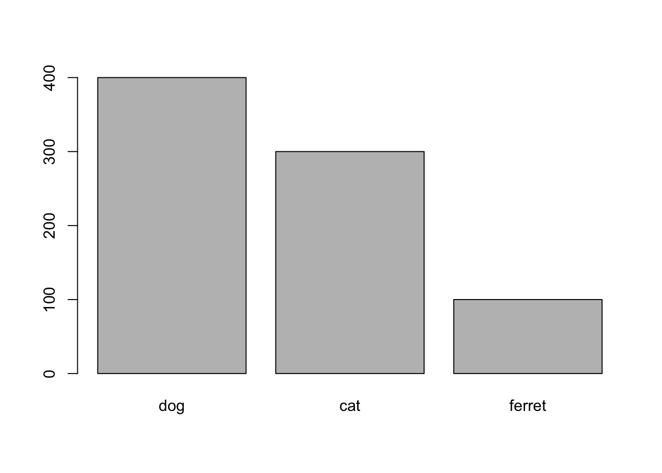
Figure 3.1: plot() with categorical x
plot(x = pets$pet, y = pets$score)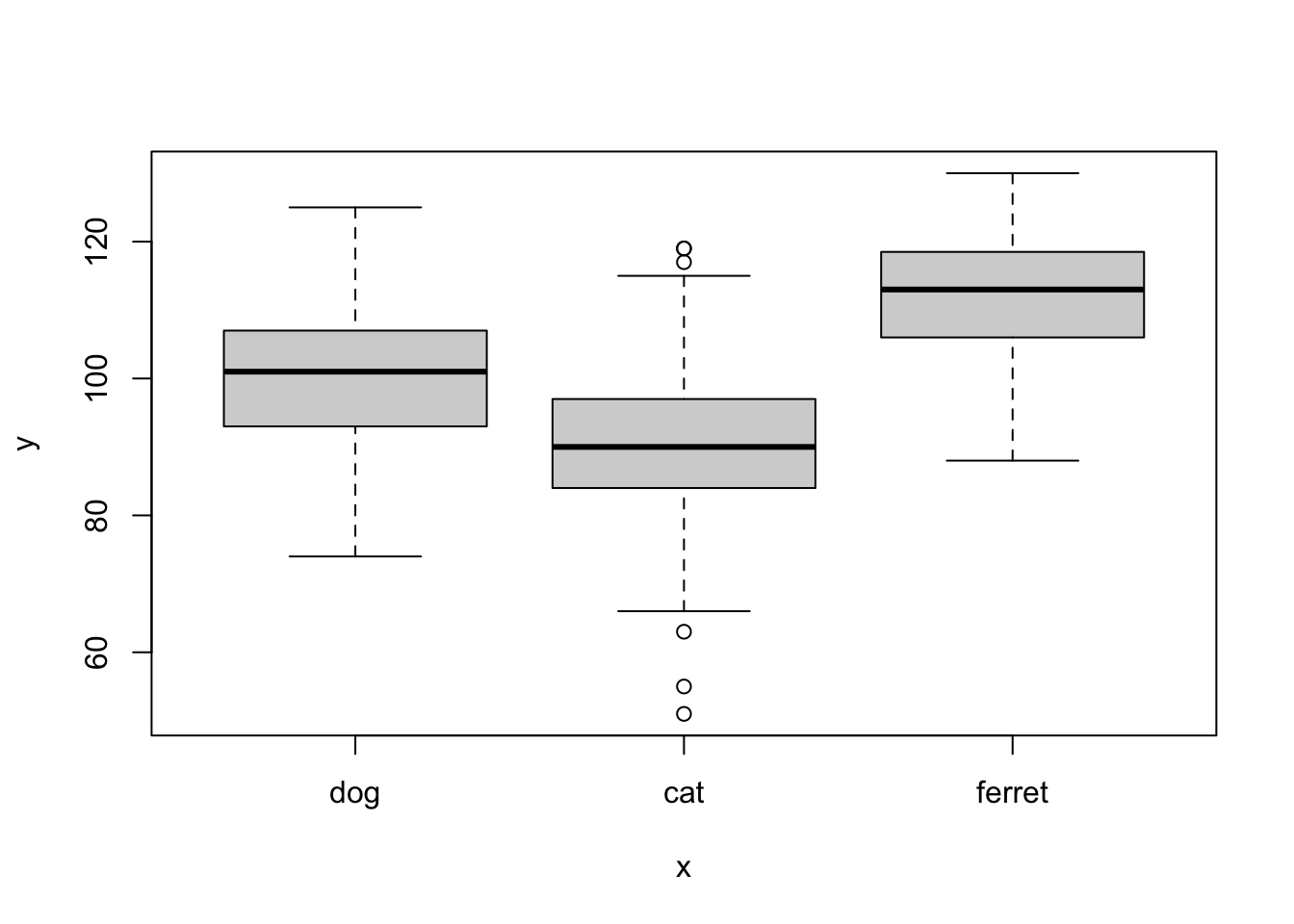
Figure 3.2: plot() with categorical x and continuous y
plot(x = pets$age, y = pets$weight)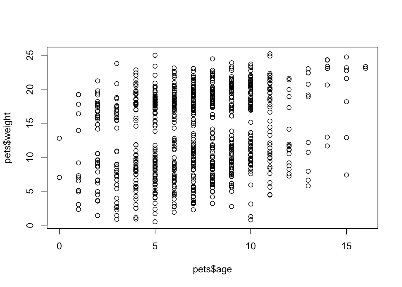
Figure 3.3: plot() with continuous x and y
The function hist() creates a quick histogram so you can see the distribution of your data. You can adjust how many columns are plotted with the argument breaks.
hist(pets$score, breaks = 20)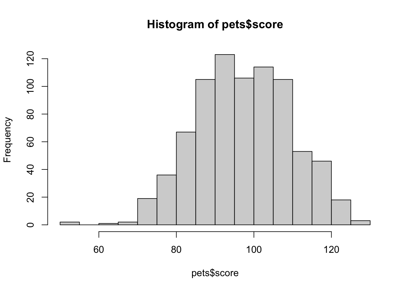
Figure 3.4: hist()
3.5 GGplots
While the functions above are nice for quick visualisations, it's hard to make pretty, publication-ready plots. The package ggplot2 (loaded with tidyverse) is one of the most common packages for creating beautiful visualisations.
ggplot2 creates plots using a "grammar of graphics" where you add geoms in layers. It can be complex to understand, but it's very powerful once you have a mental model of how it works.
Let's start with a totally empty plot layer created by the ggplot() function with no arguments.
ggplot()
Figure 3.5: A plot base created by ggplot()
The first argument to ggplot() is the data table you want to plot. Let's use the pets data we loaded above. The second argument is the mapping for which columns in your data table correspond to which properties of the plot, such as the x-axis, the y-axis, line colour or linetype, point shape, or object fill. These mappings are specified by the aes() function. Just adding this to the ggplot function creates the labels and ranges for the x and y axes. They usually have sensible default values, given your data, but we'll learn how to change them later.
mapping <- aes(x = pet,
               y = score,
               colour = country,
               fill = country)
ggplot(data = pets, mapping = mapping)
Figure 3.6: Empty ggplot with x and y labels
People usually omit the argument names and just put the aes() function directly as the second argument to ggplot. They also usually omit x and y as argument names to aes() (but you have to name the other properties).
Next we can add "geoms", or plot styles. You literally add them with the + symbol. You can also add other plot attributes, such as labels, or change the theme and base font size.
ggplot(pets, aes(pet, score, colour = country, fill = country)) +
  geom_violin(alpha = 0.5) +
  labs(x = "Pet type",
       y = "Score on an Important Test",
       colour = "Country of Origin",
       fill = "Country of Origin",
       title = "My first plot!") +
  theme_bw(base_size = 15)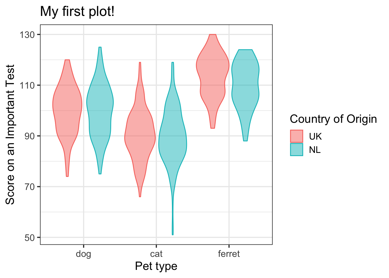
Figure 3.7: Violin plot with country represented by colour.
3.6 Common Plot Types
There are many geoms, and they can take different arguments to customise their appearance. We'll learn about some of the most common below.
3.6.1 Bar plot
Bar plots are good for categorical data where you want to represent the count.
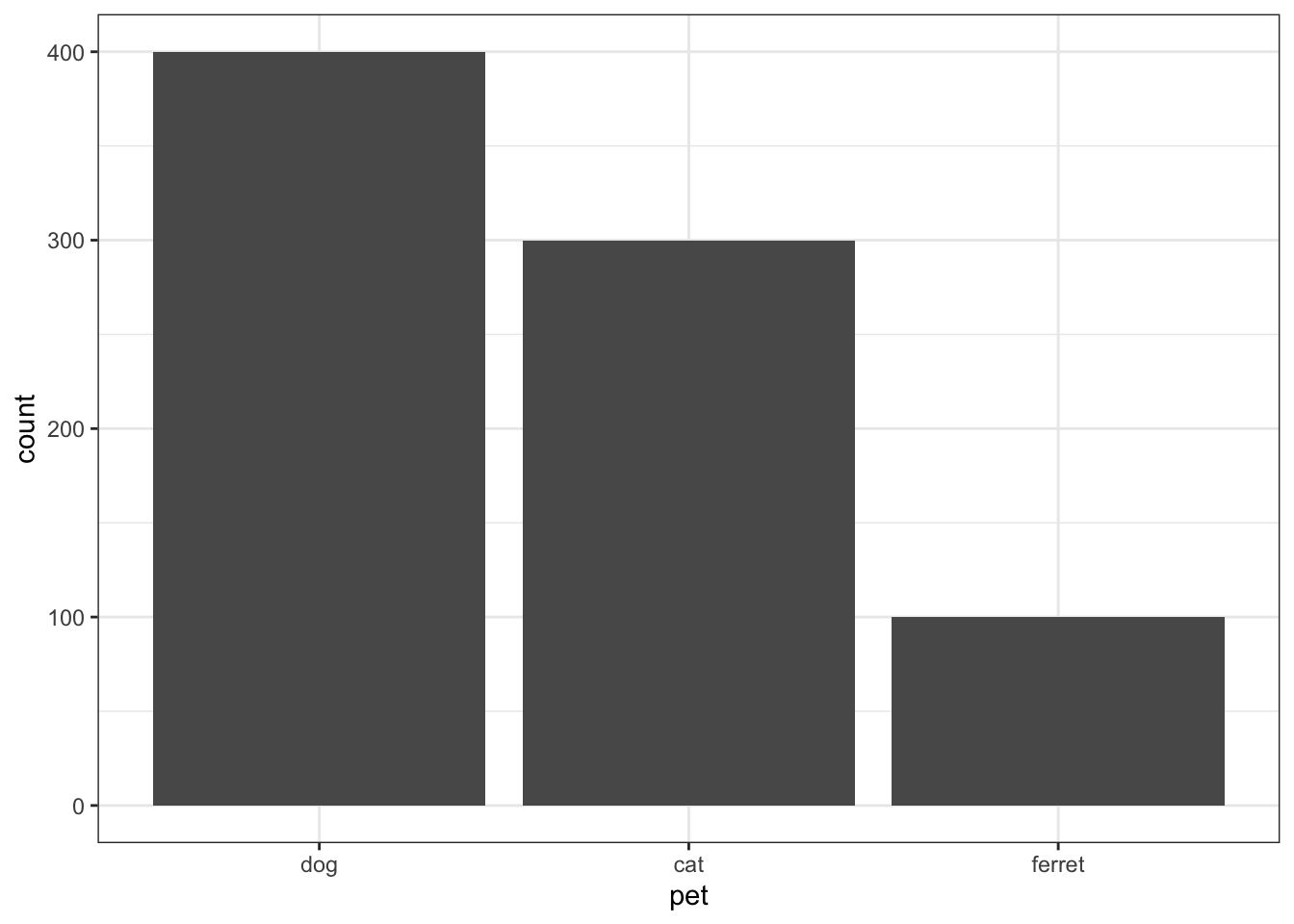
Figure 3.8: Bar plot
3.6.2 Density plot
Density plots are good for one continuous variable, but only if you have a fairly large number of observations.
ggplot(pets, aes(score)) +
  geom_density()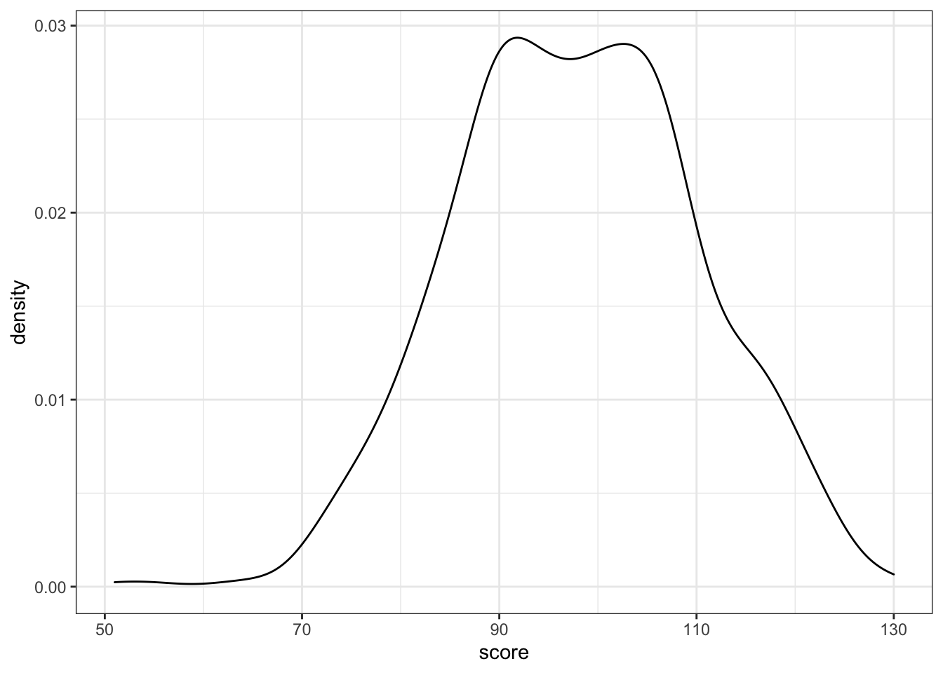
Figure 3.9: Density plot
You can represent subsets of a variable by assigning the category variable to the argument group, fill, or color.
ggplot(pets, aes(score, fill = pet)) +
  geom_density(alpha = 0.5)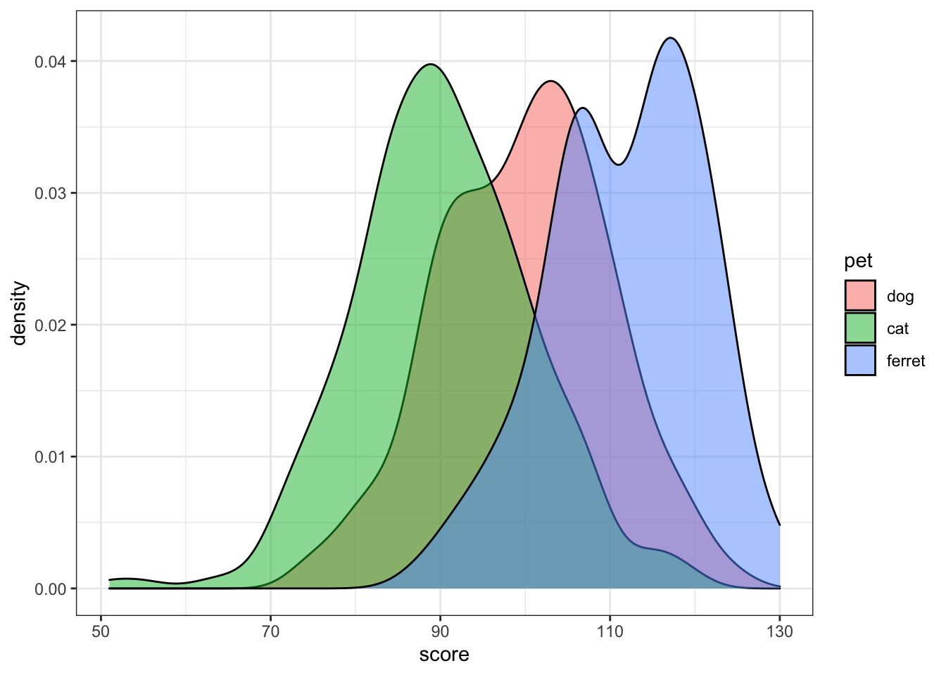
Figure 3.10: Grouped density plot
Try changing the alpha argument to figure out what it does.
3.6.3 Frequency polygons
If you want the y-axis to represent count rather than density, try geom_freqpoly().
ggplot(pets, aes(score, color = pet)) +
  geom_freqpoly(binwidth = 5)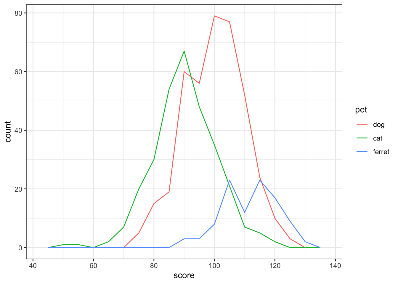
Figure 3.11: Frequency ploygon plot
Try changing the binwidth argument to 10 and 1. How do you figure out the right value?
3.6.4 Histogram
Histograms are also good for one continuous variable, and work well if you don't have many observations. Set the binwidth to control how wide each bar is.
ggplot(pets, aes(score)) +
  geom_histogram(binwidth = 5, fill = "white", color = "black")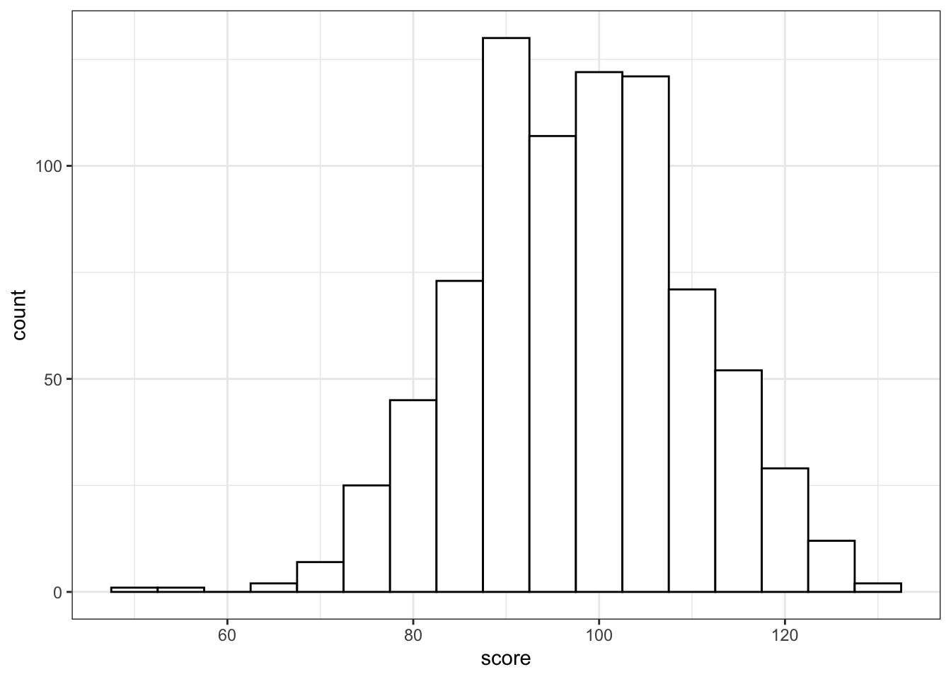
Figure 3.12: Histogram
Histograms in ggplot look pretty bad unless you set the fill and color.
If you show grouped histograms, you also probably want to change the default position argument.
ggplot(pets, aes(score, fill=pet)) +
  geom_histogram(binwidth = 5, alpha = 0.5,
                 position = "dodge")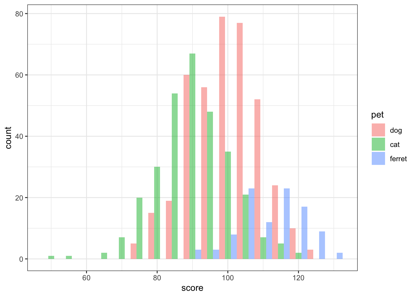
Figure 3.13: Grouped Histogram
Try changing the position argument to "identity", "fill", "dodge", or "stack".
3.6.5 Column plot
Column plots are the worst way to represent grouped continuous data, but also one of the most common. If your data are already aggregated (e.g., you have rows for each group with columns for the mean and standard error), you can use geom_bar or geom_col and geom_errorbar directly. If not, you can use the function stat_summary to calculate the mean and standard error and send those numbers to the appropriate geom for plotting.
ggplot(pets, aes(pet, score, fill=pet)) +
  stat_summary(fun = mean, geom = "col", alpha = 0.5) +
  stat_summary(fun.data = mean_se, geom = "errorbar",
               width = 0.25) +
  coord_cartesian(ylim = c(80, 120))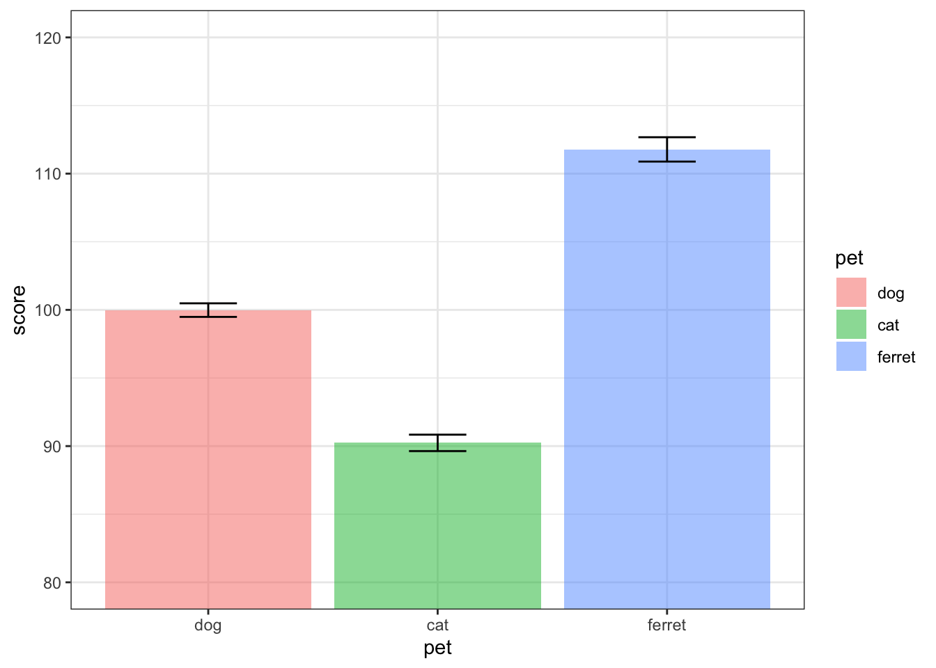
Figure 3.14: Column plot
Try changing the values for coord_cartesian. What does this do?
3.6.6 Boxplot
Boxplots are great for representing the distribution of grouped continuous variables. They fix most of the problems with using bar/column plots for continuous data.
ggplot(pets, aes(pet, score, fill=pet)) +
  geom_boxplot(alpha = 0.5)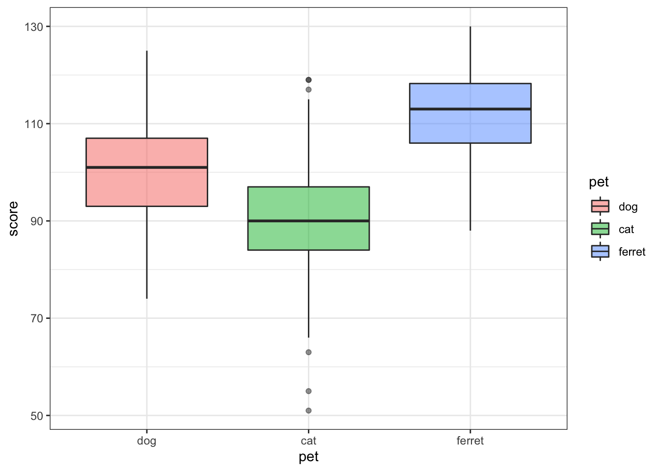
Figure 3.15: Box plot
3.6.7 Violin plot
Violin pots are like sideways, mirrored density plots. They give even more information than a boxplot about distribution and are especially useful when you have non-normal distributions.
ggplot(pets, aes(pet, score, fill=pet)) +
  geom_violin(draw_quantiles = .5,
              trim = FALSE, alpha = 0.5,)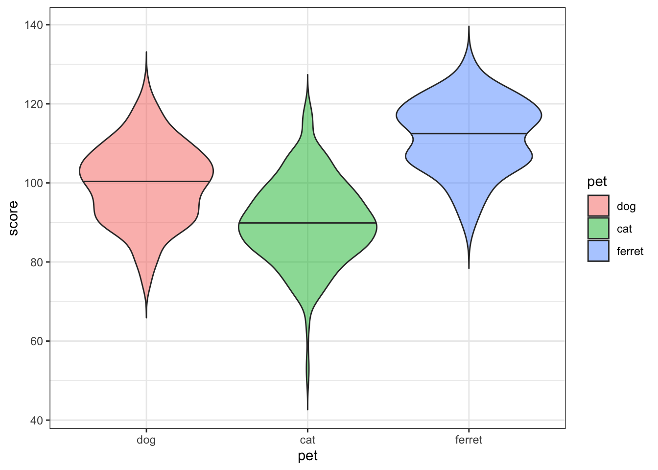
Figure 3.16: Violin plot
Try changing the quantile argument. Set it to a vector of the numbers 0.1 to 0.9 in steps of 0.1.
3.6.8 Vertical intervals
Boxplots and violin plots don't always map well onto inferential stats that use the mean. You can represent the mean and standard error or any other value you can calculate.
Here, we will create a table with the means and standard errors for two groups. We'll learn how to calculate this from raw data in the chapter on data wrangling. We also create a new object called gg that sets up the base of the plot.
dat <- tibble(
  group = c("A", "B"),
  mean = c(10, 20),
  se = c(2, 3)
)
gg <- ggplot(dat, aes(group, mean,
                      ymin = mean-se,
                      ymax = mean+se))
The trick above can be useful if you want to represent the same data in different ways. You can add different geoms to the base plot without having to re-type the base plot code.
gg + geom_crossbar()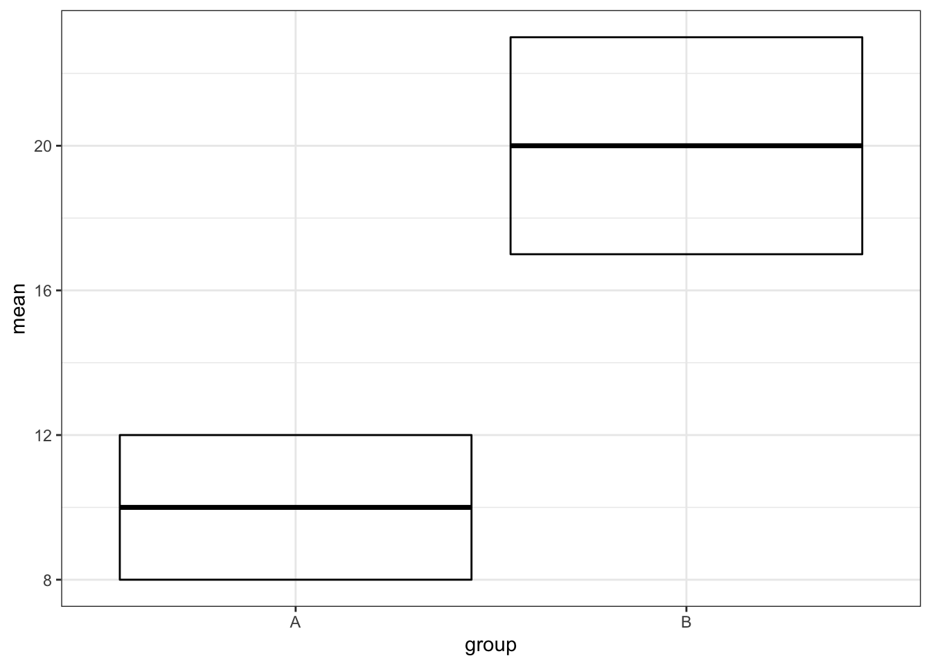
Figure 3.17: geom_crossbar()
gg + geom_errorbar()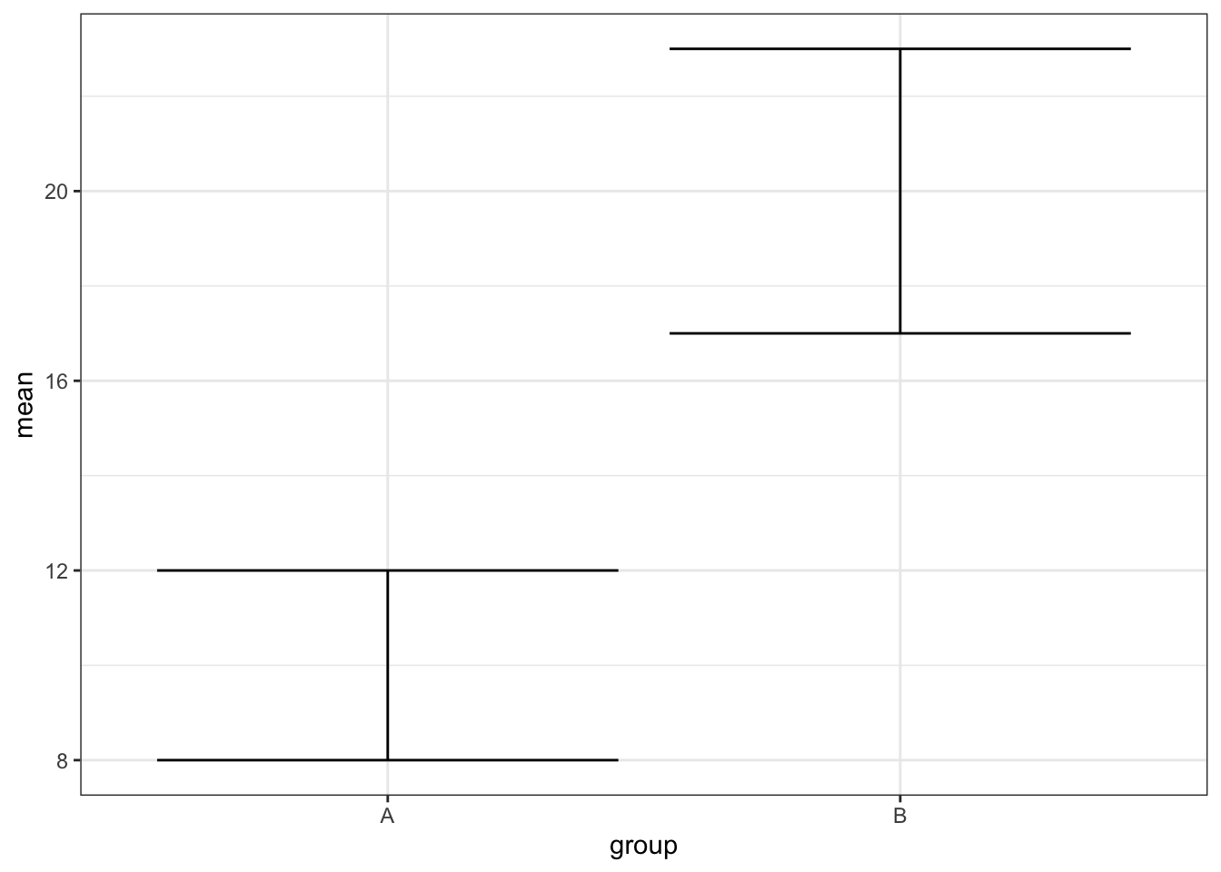
Figure 3.18: geom_errorbar()
gg + geom_linerange()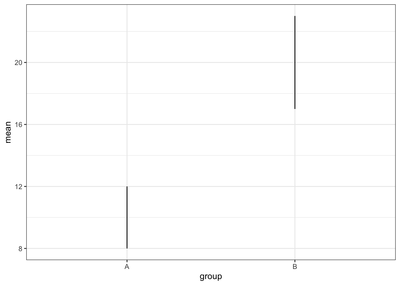
Figure 3.19: geom_linerange()
gg + geom_pointrange()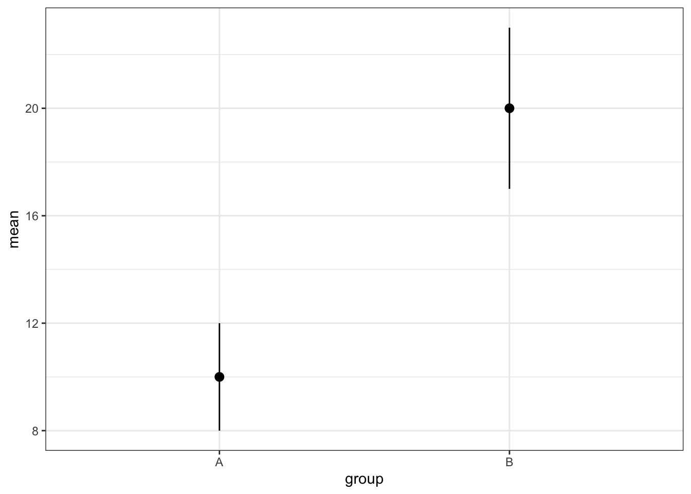
Figure 3.20: geom_pointrange()
You can also use the function stats_summary to calculate mean, standard error, or any other value for your data and display it using any geom.
ggplot(pets, aes(pet, score, color=pet)) +
  stat_summary(fun.data = mean_se, geom = "crossbar") +
  stat_summary(fun.min = function(x) mean(x) - sd(x),
               fun.max = function(x) mean(x) + sd(x),
               geom = "errorbar", width = 0) +
  theme(legend.position = "none") # gets rid of the legend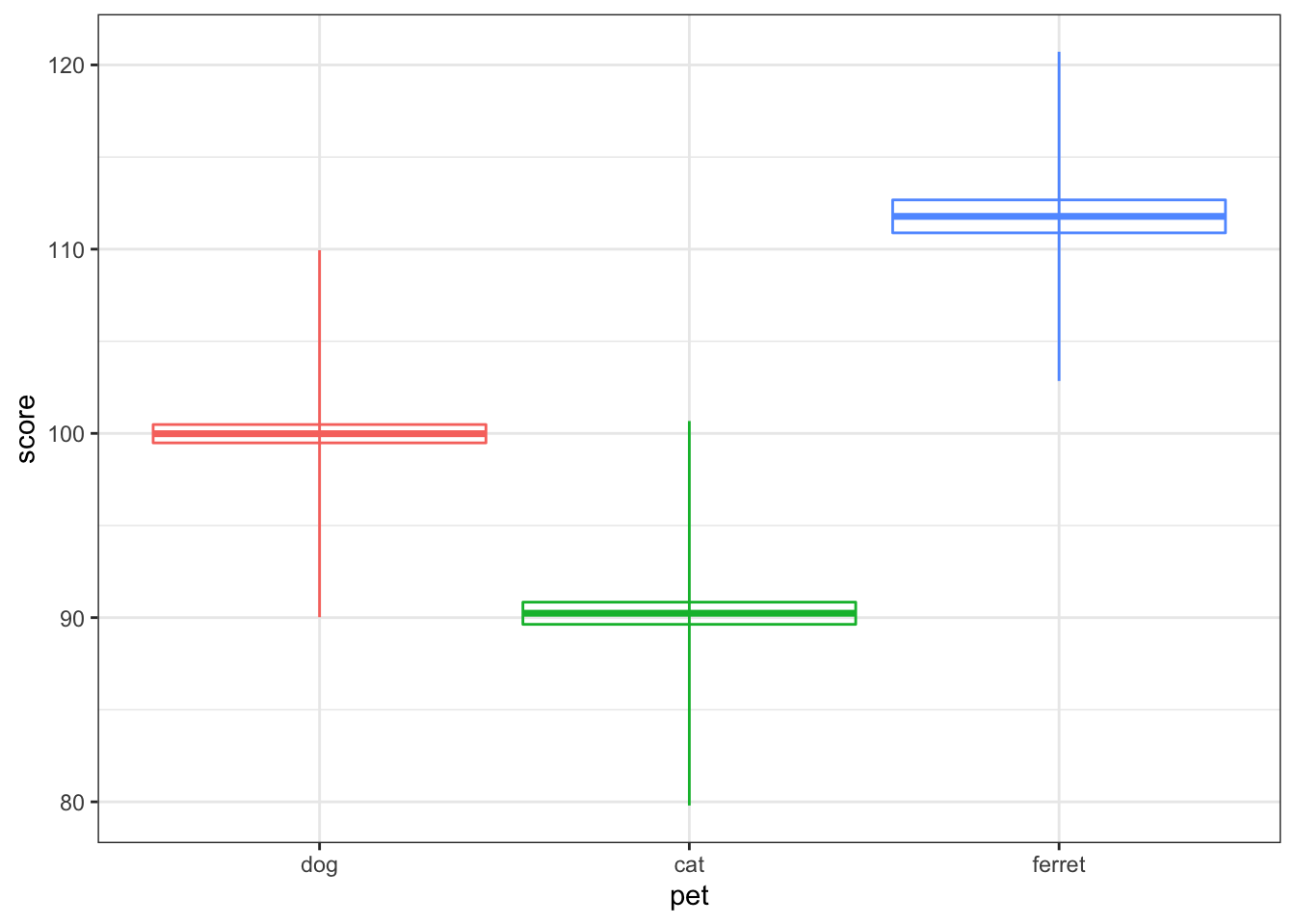
Figure 3.21: Vertical intervals with stats_summary()
3.6.9 Scatter plot
Scatter plots are a good way to represent the relationship between two continuous variables.
ggplot(pets, aes(age, score, color = pet)) +
  geom_point()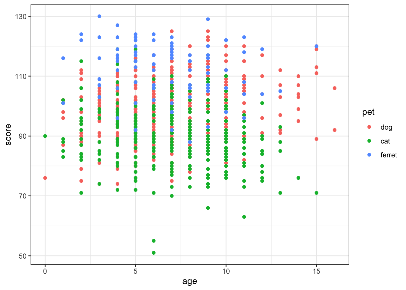
Figure 3.22: Scatter plot using geom_point()
3.6.10 Line graph
You often want to represent the relationship as a single line.
ggplot(pets, aes(age, score, color = pet)) +
  geom_smooth(formula = y ~ x, method="lm")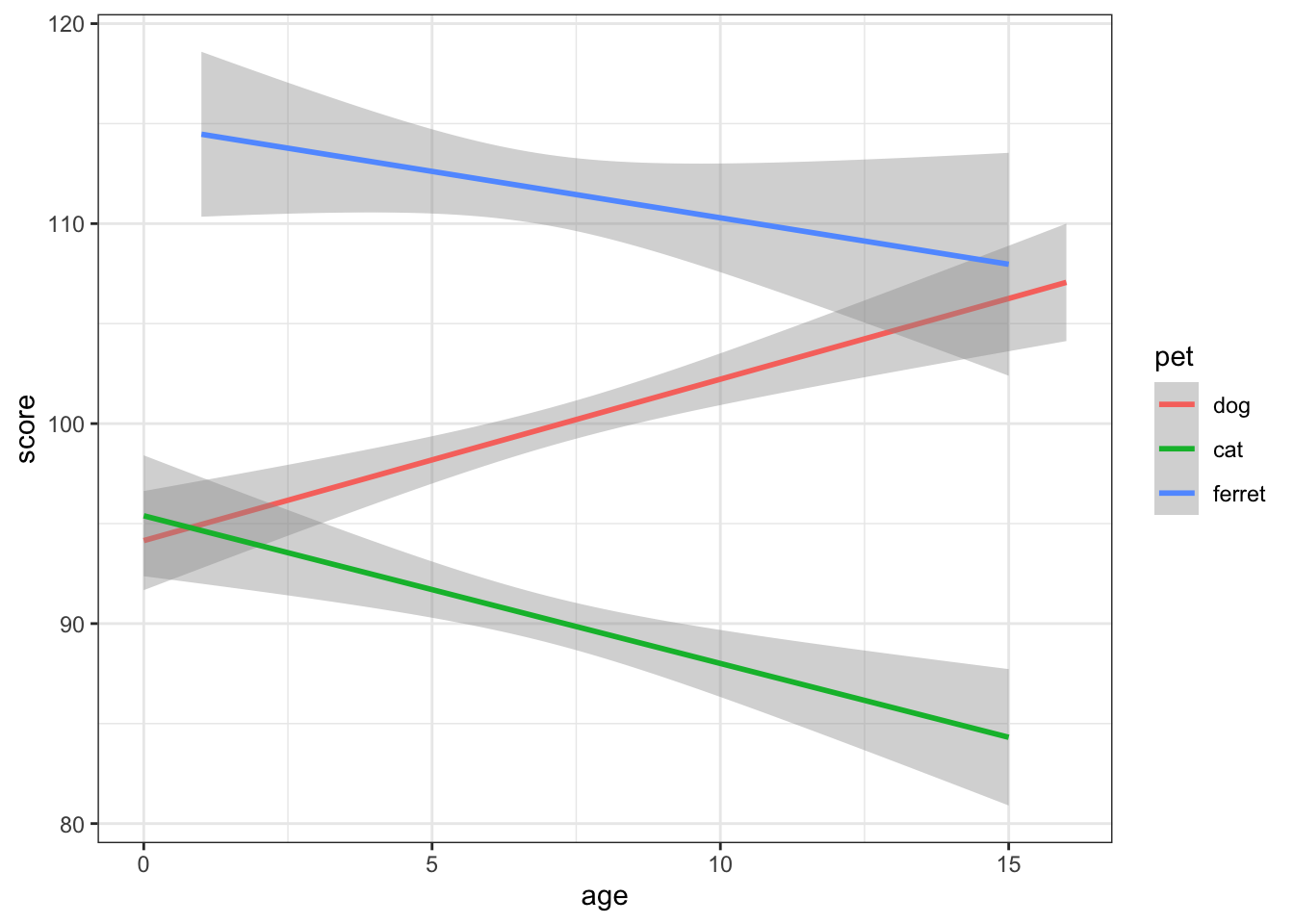
Figure 3.23: Line plot using geom_smooth()
What are some other options for the method argument to geom_smooth? When might you want to use them?
You can plot functions other than the linear y ~ x. The code below creates a data table where x is 101 values between -10 and 10. and y is x squared plus 3*x plus 1. You'll probably recognise this from algebra as the quadratic equation. You can set the formula argument in geom_smooth to a quadratic formula (y ~ x + I(x^2)) to fit a quadratic function to the data.
quad <- tibble(
  x = seq(-10, 10, length.out = 101),
  y = x^2 + 3*x + 1
)

ggplot(quad, aes(x, y)) +
  geom_point() +
  geom_smooth(formula = y ~ x + I(x^2),
              method="lm")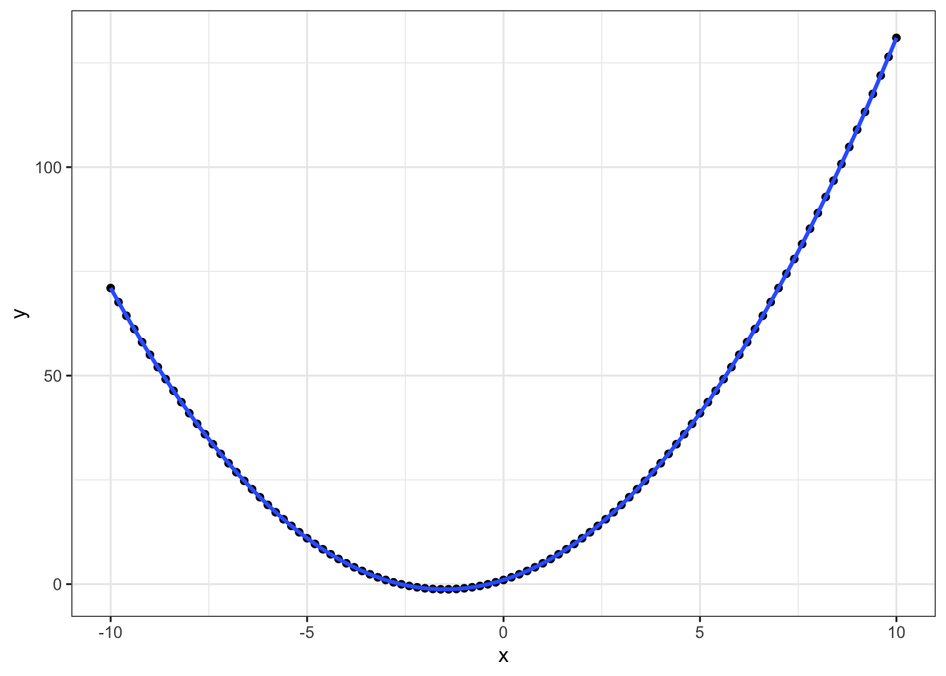
Figure 3.24: Fitting quadratic functions
3.7 Customisation
3.7.1 Size and Position
You can change the size, aspect ratio and position of plots in an R Markdown document in the setup chunk.
knitr::opts_chunk$set(
  fig.width  = 8, # figures default to 8 inches wide
  fig.height = 5, # figures default to 5 inches tall
  fig.path   = 'images/', # figures saved in images directory
  out.width = "90%", # images take up 90% of page width
  fig.align = 'center' # centre images
)
You can change defaults for any single image using chunk options.
```{r fig-pet1, fig.width=10, fig.height=3, out.width="100%", fig.align="center", fig.cap="10x3 inches at 100% width centre aligned."}
ggplot(pets, aes(age, score, color = pet)) +
  geom_smooth(formula = y~x, method = lm)
```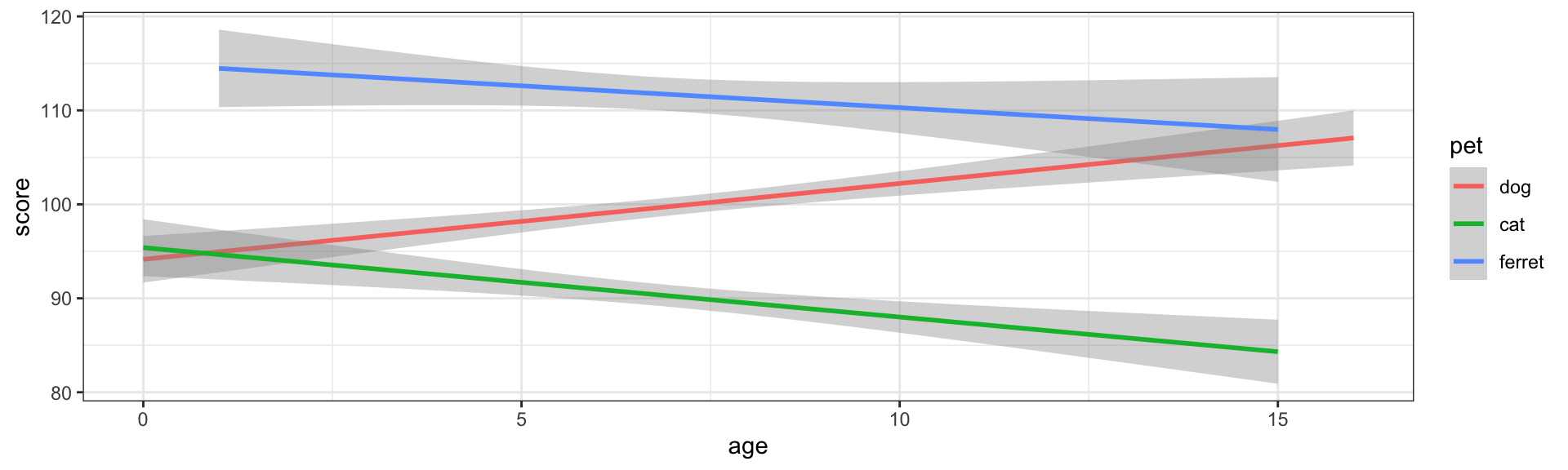
Figure 3.25: 10x3 inches at 100% width centre aligned.
```{r fig-pet2, fig.width=5, fig.height=3, out.width="50%", fig.align="left", fig.cap="5x3 inches at 50% width aligned left."}
ggplot(pets, aes(age, score, color = pet)) +
  geom_smooth(formula = y~x, method = lm)
```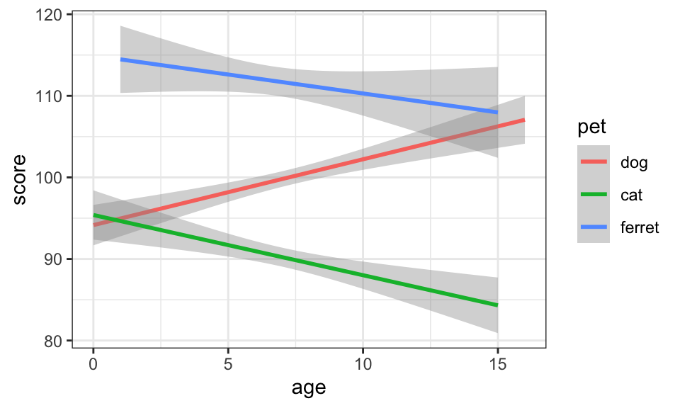
Figure 3.26: 5x3 inches at 50% width aligned left.
3.7.2 Labels
You can set custom titles and axis labels in a few different ways.
ggplot(pets, aes(age, score, color = pet)) +
  geom_smooth(formula = y ~ x, method="lm") +
  labs(title = "Pet Score with Age",
       x = "Age (in Years)",
       y = "Pet Score",
       color = "Pet Type")
Figure 3.27: Set custom labels with labs()
ggplot(pets, aes(age, score, color = pet)) +
  geom_smooth(formula = y ~ x, method="lm") +
  ggtitle("Pet Score with Age") +
  xlab("Age (in Years)") +
  ylab("Pet Score")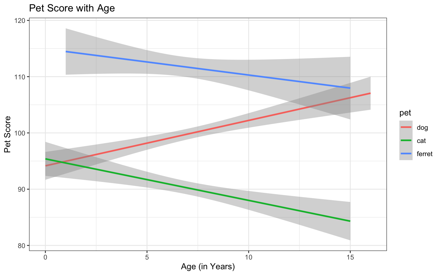
Figure 3.28: Set custom labels with individual functions
The functions labs(), xlab(), and ylab() are convenient when you just want to change a label name, but the scale_{aesthetic}_{type} functions are worth learning because they let you customise many things about any aesthetic property (e.g., x, y, colour, fill, shape, linetype), as long as you choose the correct type (usually continuous or discrete, but there are also special scale functions for other data types like dates).
ggplot(pets, aes(age, score, color = pet)) +
  geom_smooth(formula = y ~ x, method="lm") +
  ggtitle("Pet Score with Age") +
  scale_x_continuous(name = "Age (in Years)",
                     breaks = 0:16,
                     minor_breaks = NULL,
                     trans = "reverse",
                     position = "top") +
  scale_y_continuous(name = "Pet Score",
                     n.breaks = 16,
                     limits = c(0, 150)) +
  scale_color_discrete(name = "Pet Type",
                       labels = c("Dogs", "Cats", "Ferrets"),
                       type = c("purple", "green", "orange"))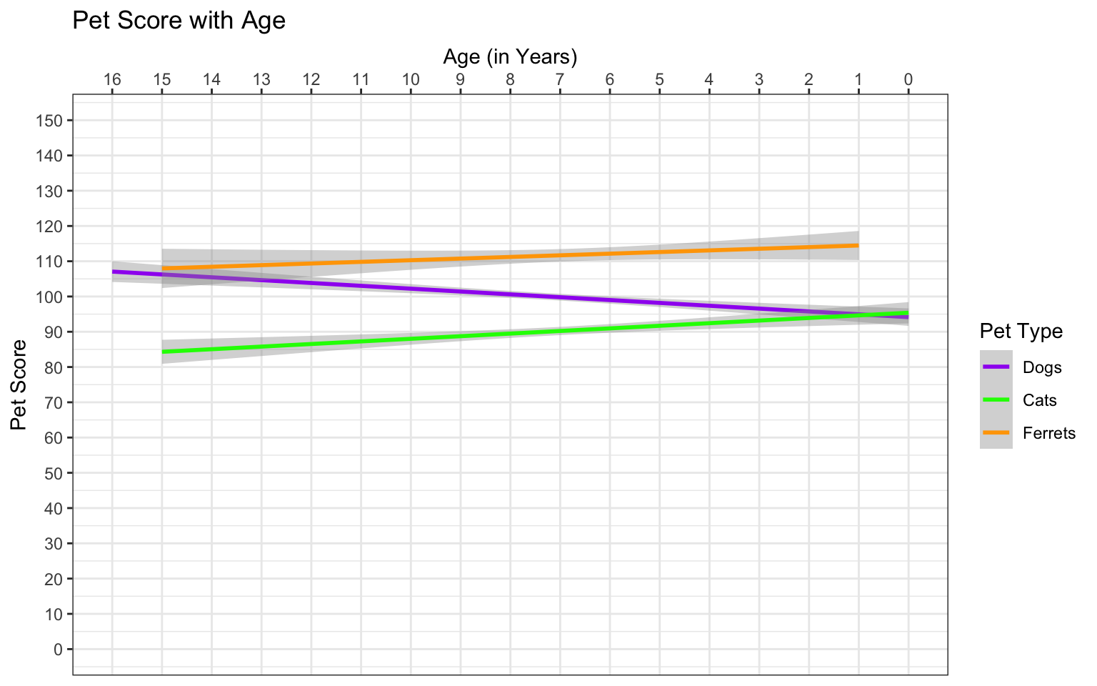
Figure 3.29: Set custom labels with scale functions
Use the help on the scale functions above to learn about the possible arguments. See what happens when you change the arguments above.
3.7.3 Colours
You can set custom values for colour and fill using the scale_{aesthetic}_{type} functions like scale_colour_manual() or scale_fill_manual().
ggplot(pets, aes(pet, score, colour = pet, fill = pet)) +
  geom_violin() +
  scale_color_manual(values = c("darkgreen", "dodgerblue", "orange")) +
  scale_fill_manual(values = c("#CCFFCC", "#BBDDFF", "#FFCC66"))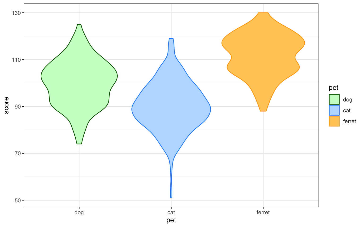
Figure 3.30: Set custom colour
The Colours chapter in Cookbook for R has many more ways to customise colour.
3.7.4 Themes
GGplot comes with several additional themes and the ability to fully customise your theme. Type ?theme into the console to see the full list. Other packages such as cowplot also have custom themes. You can add a custom theme to the end of your ggplot object and specify a new base_size to make the default fonts and lines larger or smaller.
ggplot(pets, aes(age, score, color = pet)) +
  geom_smooth(formula = y ~ x, method="lm") +
  theme_minimal(base_size = 18)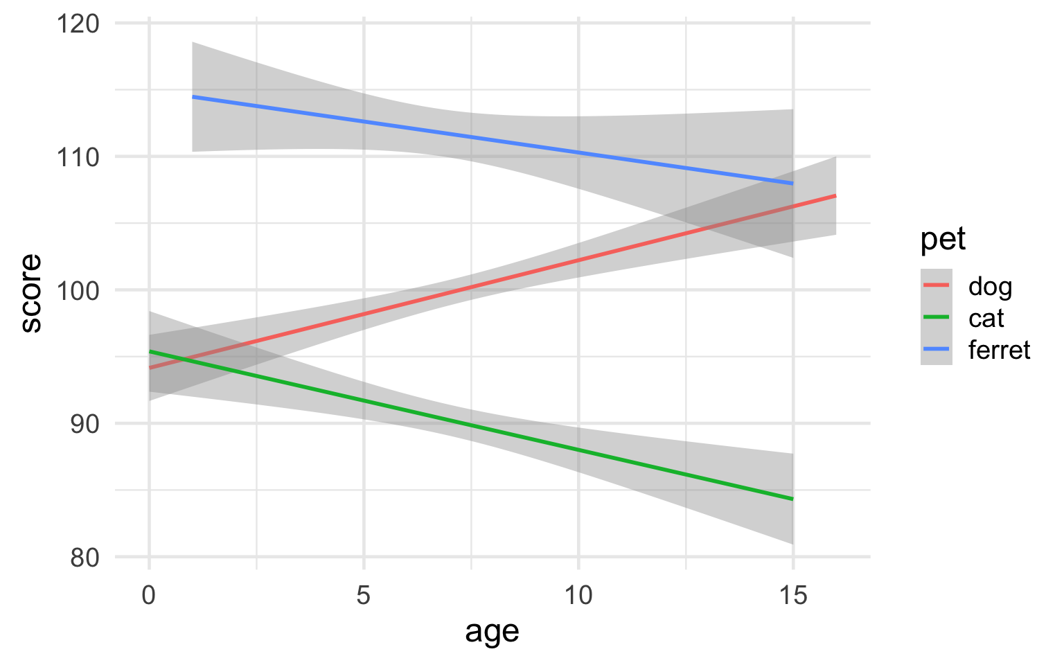
Figure 3.31: Minimal theme with 18-point base font size
It's more complicated, but you can fully customise your theme with theme(). You can save this to an object and add it to the end of all of your plots to make the style consistent. Alternatively, you can set the theme at the top of a script with theme_set() and this will apply to all subsequent ggplot plots.
# always start with a base theme that is closest to your desired theme
vampire_theme <- theme_dark() +
  theme(
    rect = element_rect(fill = "black"),
    panel.background = element_rect(fill = "black"),
    text = element_text(size = 20, colour = "white"),
    axis.text = element_text(size = 16, colour = "grey70"),
    line = element_line(colour = "white", size = 2),
    panel.grid = element_blank(),
    axis.line = element_line(colour = "white"),
    axis.ticks = element_blank(),
    legend.position = "top"
  )

theme_set(vampire_theme)

ggplot(pets, aes(age, score, color = pet)) +
  geom_smooth(formula = y ~ x, method="lm")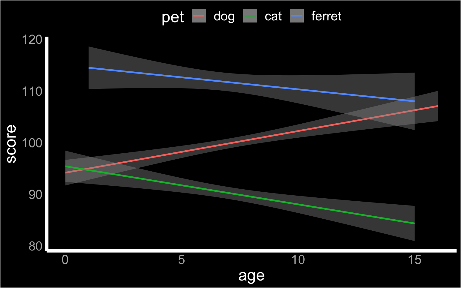
Figure 3.32: Custom theme
3.7.5 Save as file
You can save a ggplot using ggsave(). It saves the last ggplot you made, by default, but you can specify which plot you want to save if you assigned that plot to a variable.
You can set the width and height of your plot. The default units are inches, but you can change the units argument to "in", "cm", or "mm".
box <- ggplot(pets, aes(pet, score, fill=pet)) +
  geom_boxplot(alpha = 0.5)

violin <- ggplot(pets, aes(pet, score, fill=pet)) +
  geom_violin(alpha = 0.5)

ggsave("demog_violin_plot.png", width = 5, height = 7)

ggsave("demog_box_plot.jpg", plot = box, width = 5, height = 7)
The file type is set from the filename suffix, or by
specifying the argument device, which can take the following values:
"eps", "ps", "tex", "pdf", "jpeg", "tiff", "png", "bmp", "svg" or "wmf".
3.8 Combination Plots
3.8.1 Violinbox plot
A combination of a violin plot to show the shape of the distribution and a boxplot to show the median and interquartile ranges can be a very useful visualisation.
ggplot(pets, aes(pet, score, fill = pet)) +
  geom_violin(show.legend = FALSE) +
  geom_boxplot(width = 0.2, fill = "white",
               show.legend = FALSE)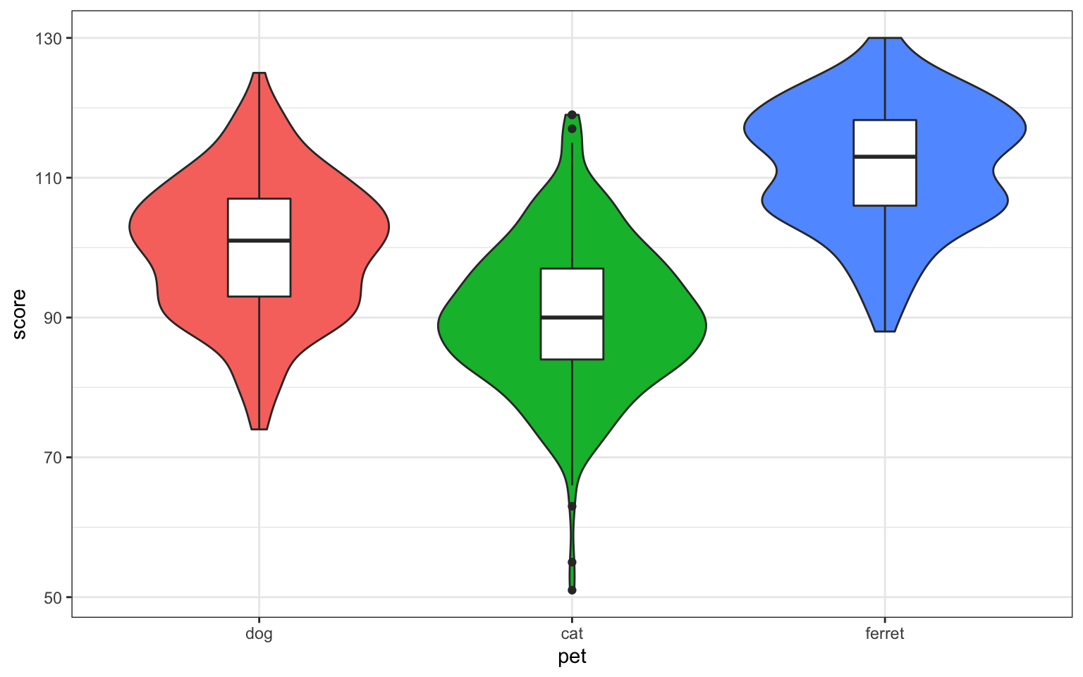
Figure 3.33: Violin-box plot
Set the show.legend argument to FALSE to hide the legend. We do this here because the x-axis already labels the pet types.
3.8.2 Violin-point-range plot
You can use stat_summary() to superimpose a point-range plot showing the mean ± 1 SD. You'll learn how to write your own functions in the lesson on Iteration and Functions.
ggplot(pets, aes(pet, score, fill=pet)) +
  geom_violin(trim = FALSE, alpha = 0.5) +
  stat_summary(
    fun = mean,
    fun.max = function(x) {mean(x) + sd(x)},
    fun.min = function(x) {mean(x) - sd(x)},
    geom="pointrange"
  )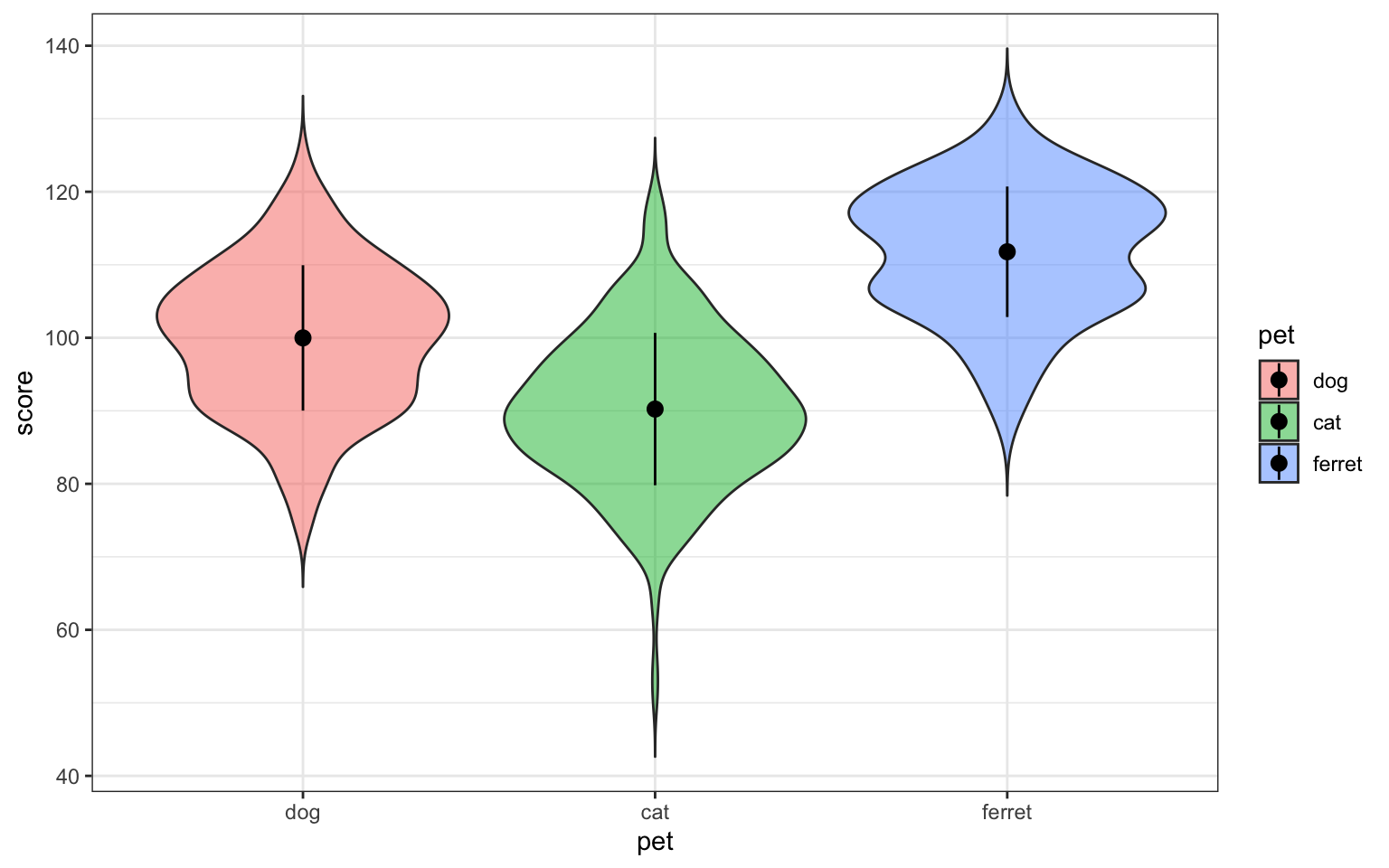
Figure 3.34: Point-range plot using stat_summary()
3.8.3 Violin-jitter plot
If you don't have a lot of data points, it's good to represent them individually. You can use geom_jitter to do this.
# sample_n chooses 50 random observations from the dataset
ggplot(sample_n(pets, 50), aes(pet, score, fill=pet)) +
  geom_violin(
    trim = FALSE,
    draw_quantiles = c(0.25, 0.5, 0.75),
    alpha = 0.5
  ) +
  geom_jitter(
    width = 0.15, # points spread out over 15% of available width
    height = 0, # do not move position on the y-axis
    alpha = 0.5,
    size = 3
  )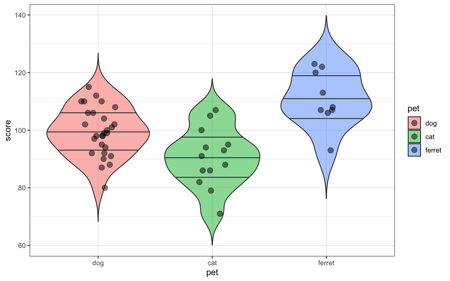
Figure 3.35: Violin-jitter plot
3.8.4 Scatter-line graph
If your graph isn't too complicated, it's good to also show the individual data points behind the line.
ggplot(sample_n(pets, 50), aes(age, weight, colour = pet)) +
  geom_point() +
  geom_smooth(formula = y ~ x, method="lm")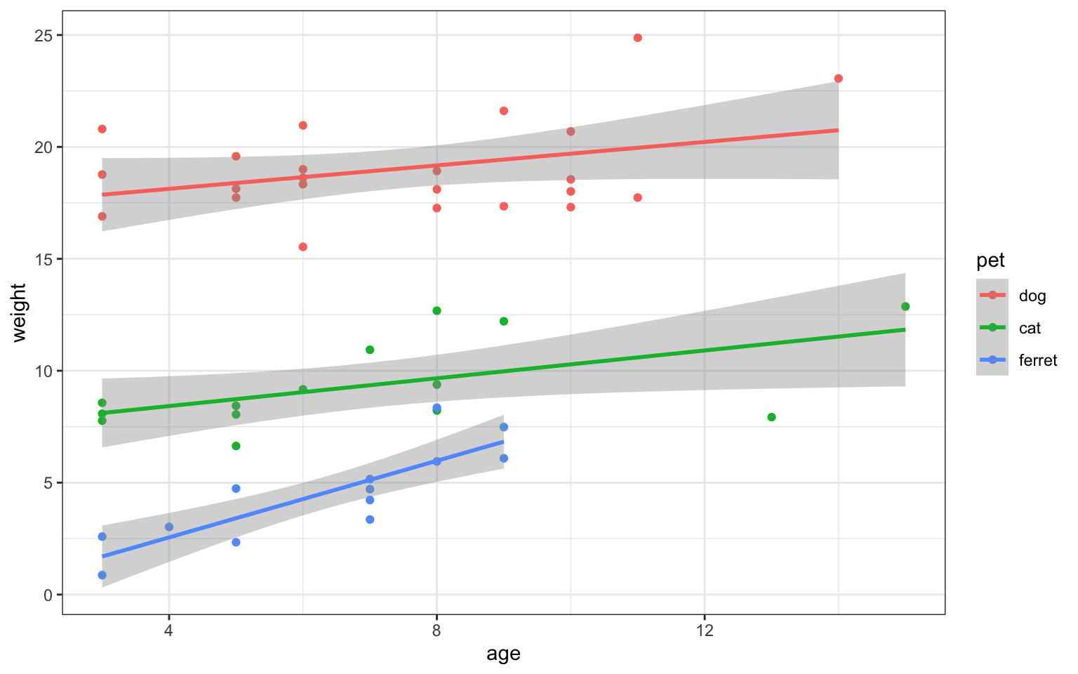
Figure 3.36: Scatter-line plot
3.8.5 Grid of plots
You can use the patchwork package to easily make grids of different graphs. First, you have to assign each plot a name.
gg <- ggplot(pets, aes(pet, score, colour = pet))
nolegend <- theme(legend.position = 0)

vp <- gg + geom_violin(alpha = 0.5) + nolegend +
  ggtitle("Violin Plot")
bp <- gg + geom_boxplot(alpha = 0.5) + nolegend +
  ggtitle("Box Plot")
cp <- gg + stat_summary(fun = mean, geom = "col", fill = "white") + nolegend +
  ggtitle("Column Plot")
dp <- ggplot(pets, aes(score, colour = pet)) +
  geom_density() + nolegend +
  ggtitle("Density Plot")
Then you add all the plots together.
vp + bp + cp + dp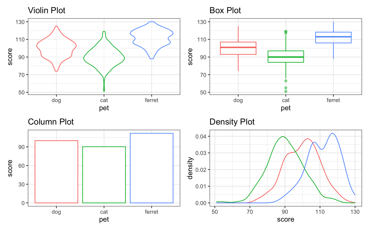
Figure 3.37: Default grid of plots
You can use +, |, /, and parentheses to customise your layout.
(vp | bp | cp) / dp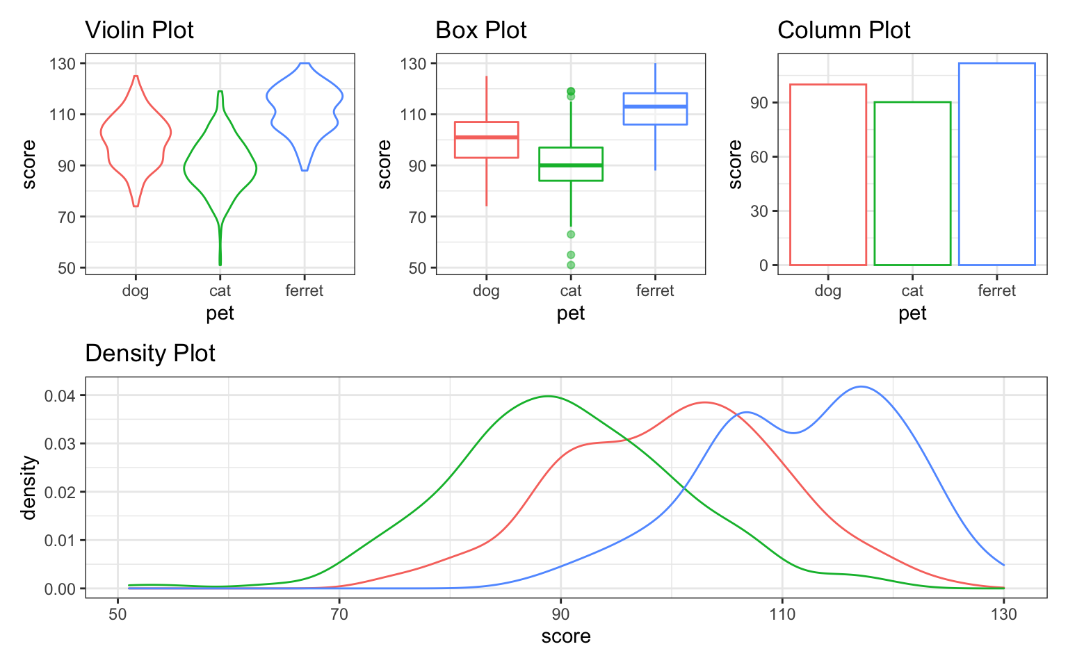
Figure 3.38: Custom plot layout.
You can alter the plot layout to control the number and widths of plots per row or column, and add annotation.
vp + bp + cp +
  plot_layout(nrow = 1, width = c(1,2,1)) +
  plot_annotation(title = "Pet Scores",
                  subtitle = "Three plots visualising the same data",
                  tag_levels = "a")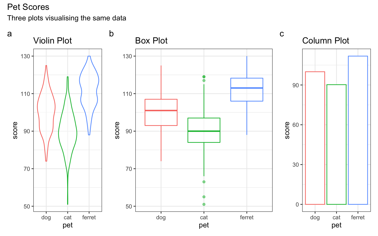
Figure 3.39: Plot annotation.
Check the help for plot_layout() and plot_annotation()` to see what else you can do with them.
3.9 Overlapping Discrete Data
3.9.1 Reducing Opacity
You can deal with overlapping data points (very common if you're using Likert scales) by reducing the opacity of the points. You need to use trial and error to adjust these so they look right.
ggplot(pets, aes(age, score, colour = pet)) +
  geom_point(alpha = 0.25) +
  geom_smooth(formula = y ~ x, method="lm")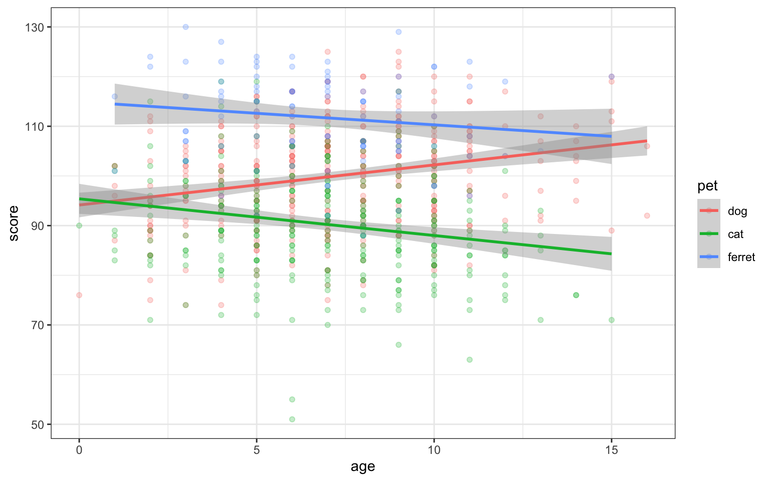
Figure 3.40: Deal with overlapping data using transparency
3.9.2 Proportional Dot Plots
Or you can set the size of the dot proportional to the number of overlapping observations using geom_count().
ggplot(pets, aes(age, score, colour = pet)) +
  geom_count()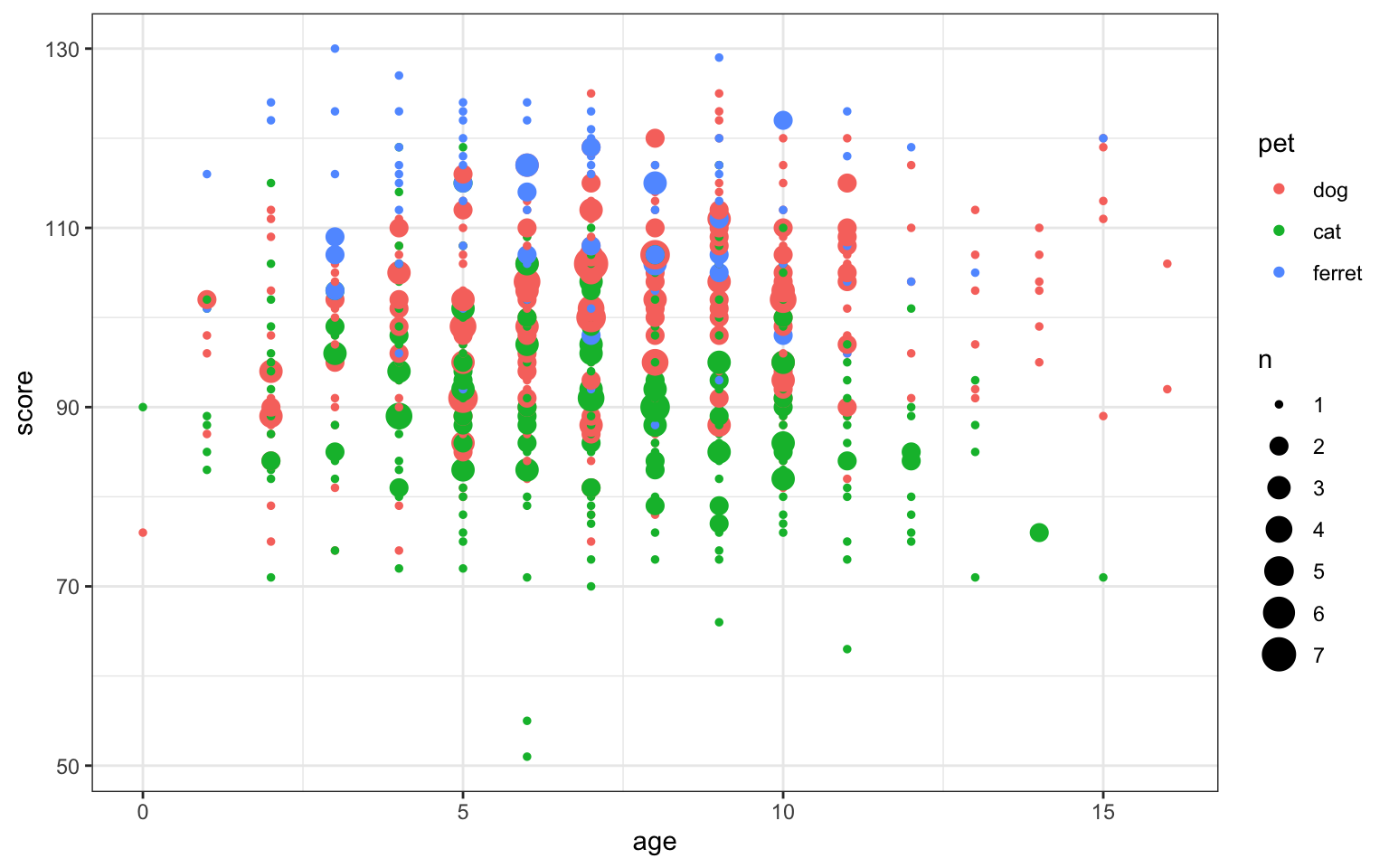
Figure 3.41: Deal with overlapping data using geom_count()
Alternatively, you can transform your data (we will learn to do this in the data wrangling chapter) to create a count column and use the count to set the dot colour.
pets %>%
  group_by(age, score) %>%
  summarise(count = n(), .groups = "drop") %>%
  ggplot(aes(age, score, color=count)) +
  geom_point(size = 2) +
  scale_color_viridis_c()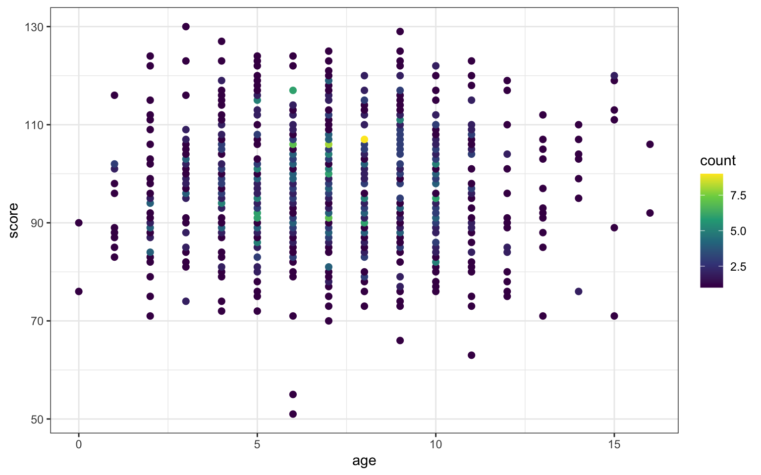
Figure 3.42: Deal with overlapping data using dot colour
The viridis package changes the colour themes to be easier to read by people with colourblindness and to print better in greyscale. Viridis is built into ggplot2 since v3.0.0. It uses scale_colour_viridis_c() and scale_fill_viridis_c() for continuous variables and scale_colour_viridis_d() and scale_fill_viridis_d() for discrete variables.
3.10 Overlapping Continuous Data
Even if the variables are continuous, overplotting might obscure any relationships if you have lots of data.
ggplot(pets, aes(age, score)) +
  geom_point()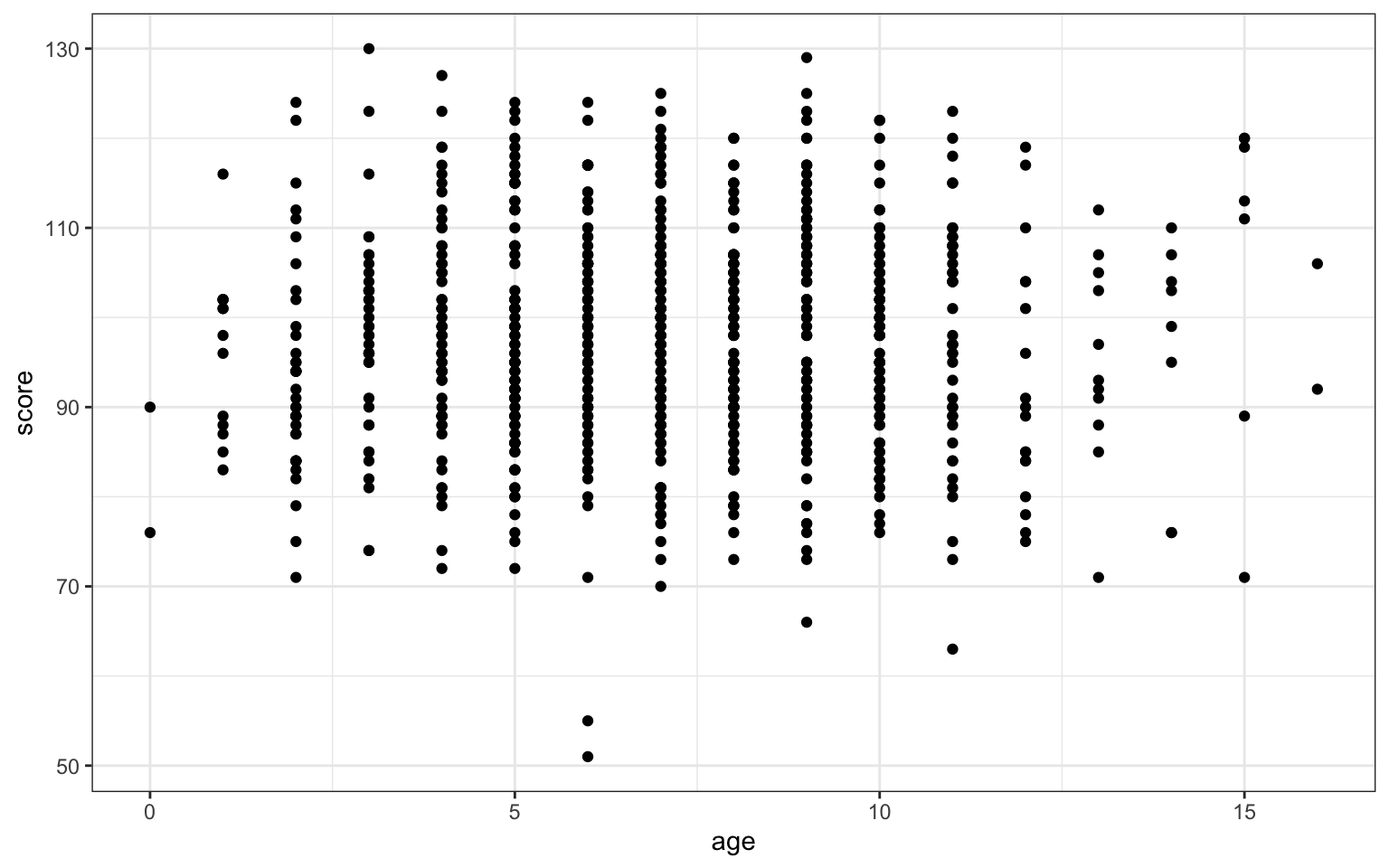
Figure 3.43: Overplotted data
3.10.1 2D Density Plot
Use geom_density2d() to create a contour map.
ggplot(pets, aes(age, score)) +
  geom_density2d()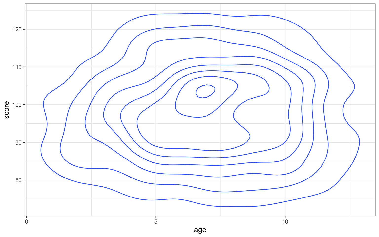
Figure 3.44: Contour map with geom_density2d()
You can use geom_density2d_filled() to create a heatmap-style density plot.
ggplot(pets, aes(age, score)) +
  geom_density2d_filled(n = 5, h = 10)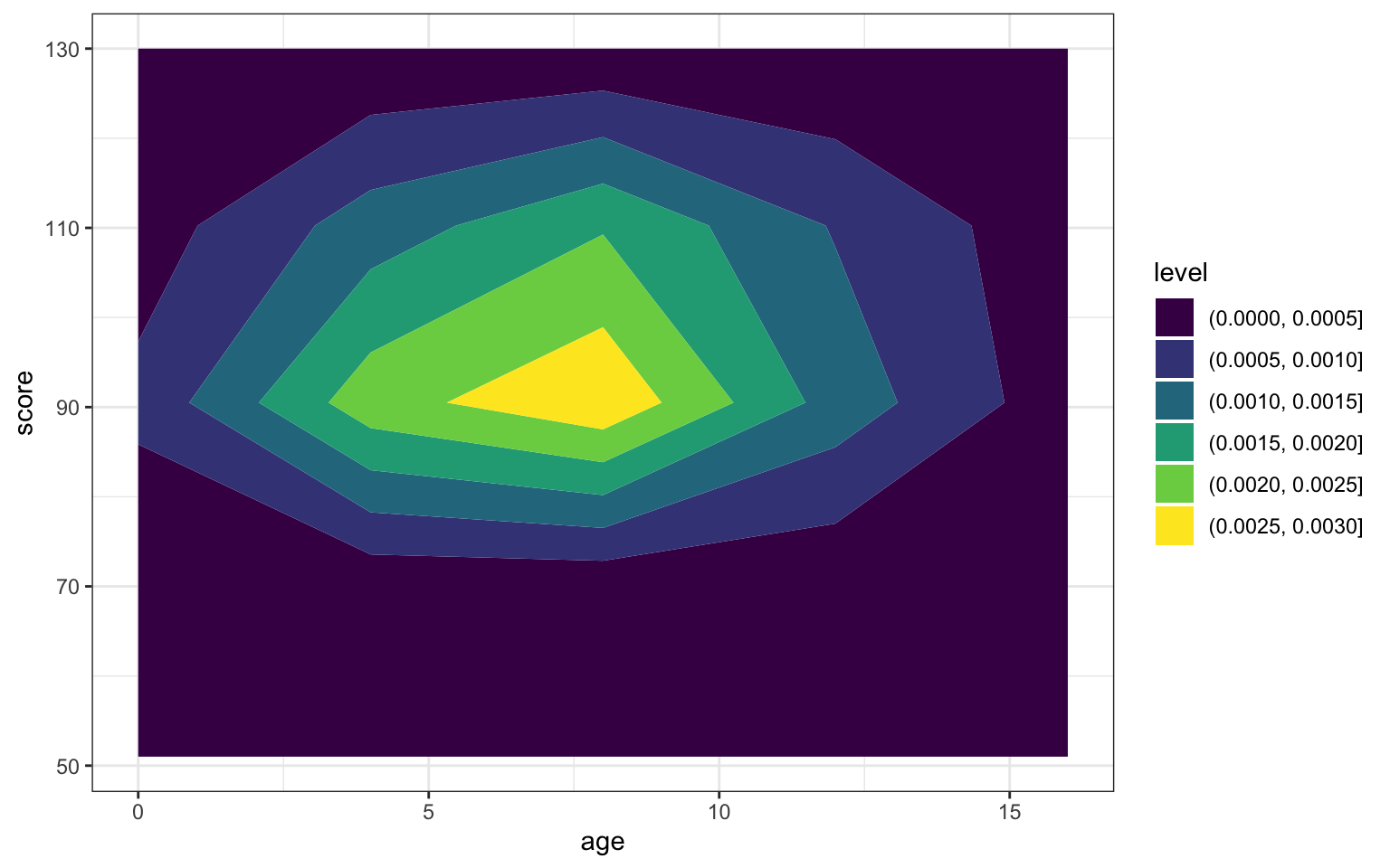
Figure 3.45: Heatmap-density plot
Try geom_density2d_filled(n = 5, h = 10) instead. Play with different values of n and h and try to guess what they do.
3.10.2 2D Histogram
Use geom_bin2d() to create a rectangular heatmap of bin counts. Set the binwidth to the x and y dimensions to capture in each box.
ggplot(pets, aes(age, score)) +
  geom_bin2d(binwidth = c(1, 5))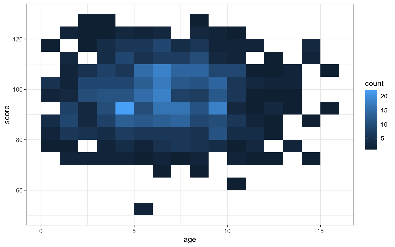
Figure 3.46: Heatmap of bin counts
3.10.3 Hexagonal Heatmap
Use geomhex() to create a hexagonal heatmap of bin counts. Adjust the binwidth, xlim(), ylim() and/or the figure dimensions to make the hexagons more or less stretched.
## Warning: Computation failed in `stat_binhex()`:
Figure 3.47: Hexagonal heatmap of bin counts
3.10.4 Correlation Heatmap
I've included the code for creating a correlation matrix from a table of variables, but you don't need to understand how this is done yet. We'll cover mutate() and gather() functions in the dplyr and tidyr lessons.
heatmap <- pets %>%
  select_if(is.numeric) %>% # get just the numeric columns
  cor() %>% # create the correlation matrix
  as_tibble(rownames = "V1") %>% # make it a tibble
  gather("V2", "r", 2:ncol(.)) # wide to long (V2)
Once you have a correlation matrix in the correct (long) format, it's easy to make a heatmap using geom_tile().
ggplot(heatmap, aes(V1, V2, fill=r)) +
  geom_tile() +
  scale_fill_viridis_c()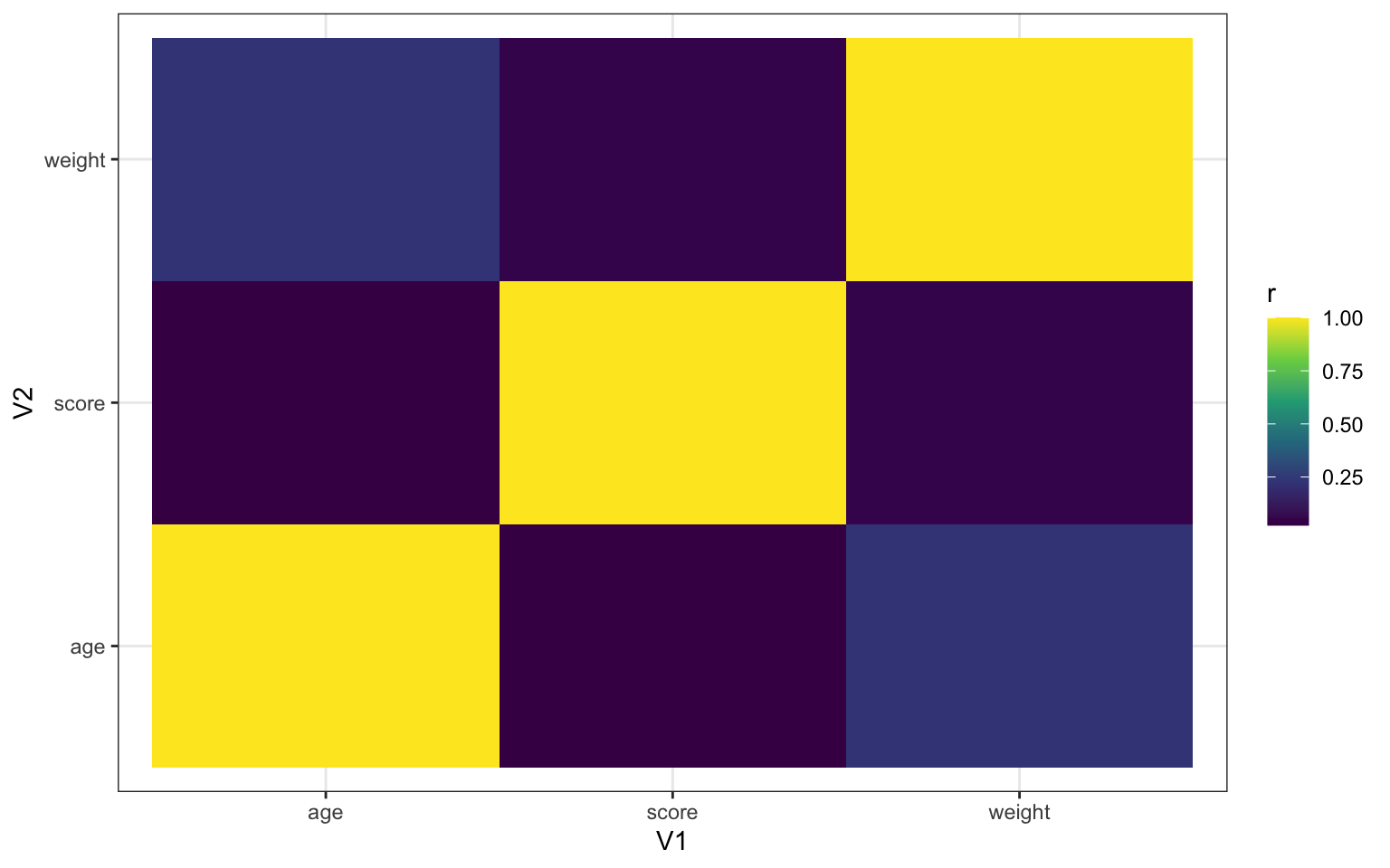
Figure 3.48: Heatmap using geom_tile()
3.11 Word Clouds
You can visualise qualitative data using the package ggwordcloud. In the example below, we'll use a dataset from ggwordcloud called thankyou_words_small that lists the words for "thank you" in 34 languages, plus the number of native speakers and total speakers. We're going to plot the names of the languages, sized by the number of speakers.
# load the data
data("thankyou_words_small", package = "ggwordcloud")

# create the ggwordclouds
ggplot(thankyou_words_small,
                   aes(label = name,
                       color = name,
                       size = speakers)) +
  ggwordcloud::geom_text_wordcloud() +
  scale_size_area(max_size = 12) +
  theme_minimal()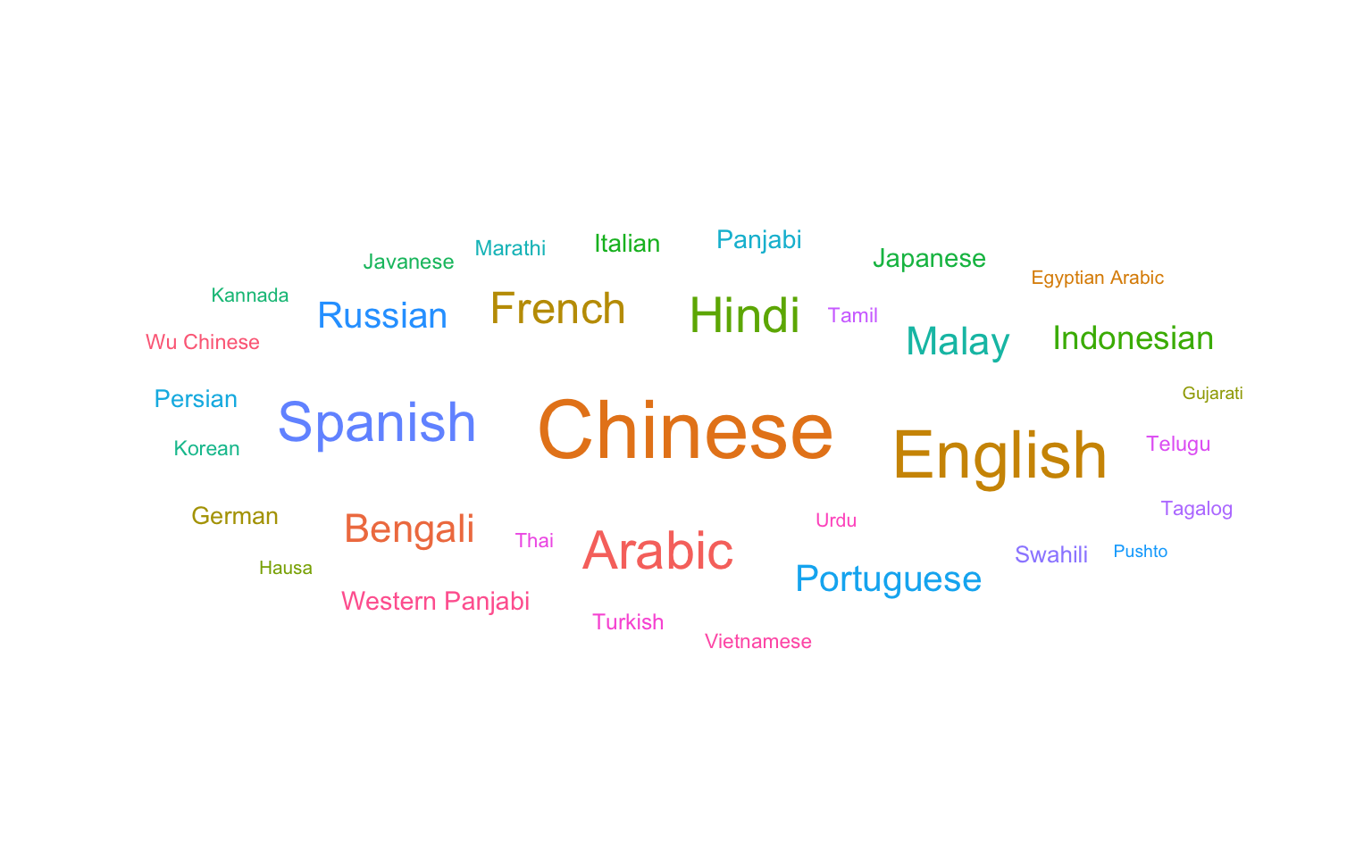
Look at the ggwordcloud vignette and see what elese you can do with the plot above. Try changing the colour scheme or the maximum word size. What happens if you use the thankyou_words dataset with 147 words?
3.12 Interactive Plots
You can use the plotly package to make interactive graphs. Just assign your ggplot to a variable and use the function ggplotly().
demog_plot <- ggplot(pets, aes(age, score, fill=pet)) +
  geom_point() +
  geom_smooth(formula = y~x, method = lm)

ggplotly(demog_plot)
Figure 3.49: Interactive graph using plotly
Hover over the data points above and click on the legend items.
3.13 Glossary
| term | definition |
|---|---|
| chunk | A section of code in an R Markdown file |
| continuous | Data that can take on any values between other existing values. |
| discrete | Data that can only take certain values, such as integers. |
| geom | The geometric style in which data are displayed, such as boxplot, density, or histogram. |
| likert | A rating scale with a small number of discrete points in order |
| nominal | Categorical variables that don't have an inherent order, such as types of animal. |
| ordinal | Discrete variables that have an inherent order, such as level of education or dislike/like. |
3.14 Further Resources
- Data visualisation using R, for researchers who don't use R
- Chapter 3: Data Visualisation of R for Data Science
- ggplot2 cheat sheet
- ggplot2 FAQs
- Chapter 28: Graphics for communication of R for Data Science
- Look at Data from Data Vizualization for Social Science
- Hack Your Data Beautiful workshop by University of Glasgow postgraduate students
- Graphs in Cookbook for R
- ggplot2 documentation
- The R Graph Gallery (this is really useful)
- Top 50 ggplot2 Visualizations
- R Graphics Cookbook by Winston Chang
- ggplot extensions
- plotly for creating interactive graphs