Lab 15 Combining ANOVA and Regression (e.g. ANCOVAs)
Note: This chapter looks at regression where you have one continuous IV and one categorical IV. More often than not this approach would be called an ANCOVA. However, it can also simply be considered as multitple regression, or the General Linear Model, as really that is what it is all about; just extended to having a mix of continuous and categorical variables.
15.1 Overview
Over the last few weeks of the semester we have been really building up our skills on regression and on ANOVAs and now we'll focus on seeing the link between them. Most places would tell you that they are separate entities but, as you will see from the reading and activities in this lab, they are related. ANOVAs to some degree are just a special type of regression where you have categorical predictors. The question you probably now have is, well, if they are related, can't we merge them and combine categorical and continuous predictors in some fashion? Yes, yes we can! And that is exactly what we are going to do today whilst learning a little bit about screen time and well-being.
The goals of this lab are:
- to gain a conceptual understanding of how ANOVA and regression are interlinked
- to get practical experience in analysing continuous and categorical variables in one design
- to consolidate the wrangling skills we have learnt for the past two years
15.2 PreClass Activity
In this final PreClass we have two activities. The first is a very short blog by Prof. Dorothy Bishop that helps draw the links between ANOVA and Regression. The second is really the first part of the InClass activity. It is quite a long InClass, which you will be able to cope with, but we have split it across the PreClass and InClass to allow you some time to get some of the more basic wrangling steps out of the way and so you can come to the class and focus on the actual analysis. It would be worth doing most, if not all, of the activity now.
15.2.1 Read
Blog
Read this short blog by Prof. Dorothy Bishop on combining ANOVA and regression, and how it all fits together.
ANOVA, t-tests and regression: different ways of showing the same thing
15.2.2 Activity
Background: Smartphone screen time and wellbeing
There is currently much debate (and hype) surrounding smartphones and their effects on well-being, especially with regard to children and teenagers. We'll be looking at data from this recent study of English adolescents:
Przybylski, A. & Weinstein, N. (2017). A Large-Scale Test of the Goldilocks Hypothesis. Psychological Science, 28, 204--215.
This was a large-scale study that found support for the "Goldilocks" hypothesis among adolescents: that there is a "just right" amount of screen time, such that any amount more or less than this amount is associated with lower well-being. Much like the work you have been doing, this was a huge survey study with data containing responses from over 120,000 participants! Fortunately, the authors made the data from this study openly available, which allows us to dig deeper into their results. And the question we want to expand on in this exercise is whether the relationship between screen time and well-being is modulated by partcipant's (self-reported) sex. In other words, does screen time have a bigger impact on males or females, or is it the same for both?
The dependent measure used in the study was the Warwick-Edinburgh Mental Well-Being Scale (WEMWBS). This is a 14-item scale with 5 response categories, summed together to form a single score ranging from 14-70.
On Przybylski & Weinstein's page for this study on the Open Science Framework, you can find the participant survey, which asks a large number of additional questions (see page 14 for the WEMWBS questions and pages 4-5 for the questions about screen time). Within the same page you can also find the raw data; however, for the purpose of this exercise, you will be using local pre-processed copies of the data found in the accompanying zip file on Moodle or download from here.
Przybylski and Weinstein looked at multiple measures of screen time, but again for the interests of this exercise we will be focusing on smartphone use, but do feel free to expand your skills after by looking at different definitions of screen time. Overall, Przybylski and Weinstein suggested that decrements in wellbeing started to appear when respondents reported more than one hour of daily smartphone use. So, bringing it back to our additional variable of sex, our question is now, does the negative association between hours of use and wellbeing (beyond the one-hour point) differ for boys and girls?
Let's think about this in terms of the variables. We have:
a continuous\(^*\) DV, well-being;
a continuous\(^*\) predictor, screen time;
a categorical predictor, sex.
Note: these variables (\(^*\)) are technically only quasi-continuous inasmuch as that only discrete values are possible. However, there are a sufficient number of discrete categories in our data that we can treat the data as effectively continuous.
Now, in terms of analysis, what we are effectively trying to do is to estimate two slopes relating screen time to well-being, one for girls and one for boys, and then statistically compare these slopes. Sort of like running a correlation for boys, a correlation for girls, and comparing the two. Or alternatively, where you would run a regression (to estimate the slopes) but also one where you would need a t-test (to compare two groups). But the expressive power of regression allows us to do this all within a single model. Again, as we have seen building up to this lab, an independent groups t-test is just a special case of ordinary regression with a single categorical predictor; ANOVA is just a special case of regression where all predictors are categorical. But remember, although we can express any ANOVA design using regression, the converse is not true: we cannot express every regression design in ANOVA. As such people like regression, and the general linear model, as it allows us to have any combination of continuous and categorical predictors in the model. The only inconvenience with running ANOVA models as regression models is that you have to take care in how you numerically code the categorical predictors. We will use an approach called deviation coding which we will look at today later in this lab.
Let's Begin!
15.2.3 Loading in the data
As always we will need to load in the tidyverse package and load in the data from the accompanying csv files, wellbeing.csv, participant_info.csv, and screen_time.csv.
Create a new R Markdown file and put the csv files in the same directory with the Rmd file you've just created. Then load them in as follows (the solution is at the end of the chapter):
pinfo stores participant_info.csv
wellbeing stores wellbeing.csv
screen stores screen_time.csv
The Data
Take a look at the resulting tibbles pinfo, wellbeing, and screen. The wellbeing tibble has information from the WEMWBS questionnaire; screen has information about screen time use on weekends (variables ending with we) and weekdays (variables ending with wk) for four types of activities: using a computer (variables starting with Comph; Q10 on the survey), playing video games (variables starting with Comp; Q9 on the survey), using a smartphone (variables starting with Smart; Q11 on the survey) and watching TV (variables starting with Watch; Q8 on the survey). If you want more information about these variables, look at the items 8-11 on pages 4-5 of the the PDF version of the survey on the OSF website.
- note that sex is coded as male = 1, female = 0.
- also, Serial is common across all datasets and is the participant ID.
15.2.4 Compute the well-being score for each participant
Ok, our data is in and we need to create a well-being score for each participant on each item of the WEMWBS. To do this, and to calculate the well-being score for each participant, we simply sum all the items together for that participant.
- Write code to create a new tibble, called
wemwbs, with two variables:Serial, andtot_wellbeing, which is the the total WEMWBS score for each participant.
Step 1:
-
reshape table from wide to long using
pivot_longer(). We suggest creating a new column calledvarwith the labels and a new column calledscoreand gathering all the columns except Serial (e.g.cols = -Serial)
Step 2:
-
group_by();summarise(tot_wellbeing = ...) - Alternatively, mutate on the sum of all columns, then select the two needed.
15.2.5 Visualising Screen time on all technologies
Great, so we have the well-being scores sorted out, we now need to think about the screen time usage and whether it is being used on a weekday or a weekend. As always, to get an idea of the data, it is often very useful to visualize the distributions of variables before proceeding with the analysis.
- Try recreating this figure based on the data in
screen. Note that this will require some tidying of the data inscreen:
You'll first need to gather the
screentibble into long format and then break apart the column names into two separate columns, one for the name of the variable (Watch,Comp,Comph, andSmart) and the other for part of the week (wkandwe). This is going to take using theseparate()function which we haven't used yet but we think you can manage using the hints below.Next, you'll need to alter the values of the variables to reflect the more descriptive text that appears in the plot (e.g.,
"Watch"becomes"Watching TV";"wk"becomes"Weekday"). This is arecode()issue which you have done a number of times.
This is quite a tricky bit of wrangling which we think you are capable of but, do not be put off if you can't quite get it yet. The code is at the end of the chapter for you to use once you have had a shot at it.
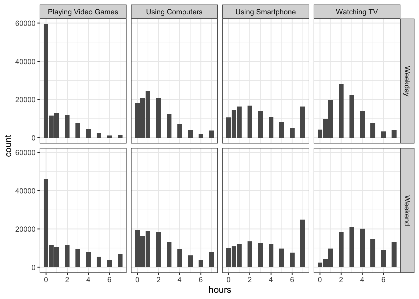
Figure 15.1: Count of the hours of usage of different types of social media at Weekdays and Weekends
Step 1
-
pivot_longer()the data inscreeninto three columns: Serial, var, hours. Do this by gathering all the columns together except Serial (e.g.cols = -Serial) and creating the new columns ofvarwith the label names andhourswith the values in it. -
?separate()in the console -
seperate(data, column_name_containing_variables_to_split, c("column_1_to_create","column_2_to_create"), "character_to_split_by") -
each variable (category) has an underscore in its name. Use that to split it. I.e.
Comph_wewill get split intoComphandweif you split by_
Step 2
data %>% mutate(new_variable_name = recode(old_variable_name, "wk" = "Weekday", "we" = "Weekend"))
15.2.6 Visualising the Screen time and Well-being relationship
Brilliant, that is truly excellent work and you should be really pleased with yourself. Looking at the figures, it would appear that there is not much difference between screen time use of smartphones in weekend and weekdays so we could maybe collapse that variable together later when we come to analyse it. Overall, people tend to be using all the different technologies for a peak around 3 hours, and then each distribution tails off as you get longer exposure suggesting that there are some that stay online a long time. Video games is the exception where there is a huge peak in the first hour and then a tailing off after that.
But first, another visualisation. We should have a look at the relationship between screen time (for the four different technologies) and measures of well-being. This relationship looks like this shown below and the code to recreate this figure is underneath:
## `summarise()` has grouped output by 'variable', 'day'. You can override using the `.groups` argument.
Figure 15.2: Scatterplot showing the relationship between screen time and mean well-being across four technologies for Weekdays and Weekends
At the start we said we were only going to focus on smartphones. So looking at the bottom left of the figure we could suggest that smartphone use of more than 1 hour per day is associated with increasingly negative well-being the longer screen time people have. This looks to be a similar effect for Weekdays and Weekends, though perhaps overall well-being in Weekdays is marginally lower than in Weekends (the line for Weekday is lower on the y-axis than Weekends). This makes some sense as people tend to be happier on Weekends! Sort of makes you wish we had more of them right?
Job Done - Activity Complete!
That is great work today and it just shows you how far you have come with your wrangling skills over the last couple of years. We will pick up from here in the lab during the week where we will start to look at the relationship in boys and girls. Don't forget to make any notes for yourself that you think will be good to remember - rounding off your Portfolio and bank on skills that you have built up. Any questions or problems, as always post them on the forums or bring them to the lab for discussion.
15.3 InClass Activity
Continued: Smartphone screen time and wellbeing
We are going to jump straight into this as you will have already started the analysis in the PreClass activity but as a quick recap, there is currently much debate surrounding smartphones and their effects on well-being, especially with regard to children and teenagers. In the PreClass, and continuing today, we have been looking at data from this recent study of English adolescents:
Przybylski, A. & Weinstein, N. (2017). A Large-Scale Test of the Goldilocks Hypothesis. Psychological Science, 28, 204--215.
This was a large-scale study that found support for the "Goldilocks" hypothesis among adolescents: that there is a "just right" amount of screen time, such that any amount more or less than this amount is associated with lower well-being. The dependent measure used in the study was the Warwick-Edinburgh Mental Well-Being Scale (WEMWBS). This is a 14-item scale with 5 response categories, summed together to form a single score ranging from 14-70, and we have been working with a version of some of the available data which can be found in the accompanying zip file on Moodle or download from here
Przybylski and Weinstein looked at multiple measures of screen time, but again for the interests of this exercise we will be focusing on smartphone use only, but do feel free to expand your skills after by looking at different definitions of screen time. Overall, Przybylski and Weinstein suggested that decrements in wellbeing started to appear when respondents reported more than one hour of daily smartphone use. So, bringing it back to our additional variable of sex, our question is now, does the negative association between hours of use and wellbeing (beyond the one-hour point) differ for boys and girls?
Let's think about this in terms of the variables. We have:
a continuous DV, well-being;
a continuous predictor, screen time;
a categorical predictor, sex.
And to recap in terms of analysis, what we are effectively trying to do is to estimate two slopes relating screen time to well-being, one for girls and one for boys, and then statistically compare these slopes. Again, as we have seen building up to this lab, an independent groups t-test is just a special case of ordinary regression with a single categorical predictor; ANOVA is just a special case of regression where all predictors are categorical. But remember, although we can express any ANOVA design using regression, the converse is not true: we cannot express every regression design in ANOVA. As such people like regression, and the general linear model, as it allows us to have any combination of continuous and categorical predictors in the model. The only inconvenience with running ANOVA models as regression models is that you have to take care of how you numerically code the categorical predictors. We will use an approach called deviation coding which we will look at today later in this lab.
Let's Begin!
15.3.1 Smartphone and well-being for boys and girls
Continuing from where we left on in the PreClass, so far we have been matching what the original authors suggested we would find in the data, this drop off in self-reported well-being for longer exposures of smart-phone use (i.e. >1 hour). However, we said we wanted to look at this in terms of males and females, or boys and girls really, so we need to do a bit more wrangling. Also, as above we said there seemed to be only a small difference between Weekday and Weekends so, we will collapse weekday and weekend usage in smartphones.
- Create a new table,
smarttot, that takes the information inscreen2and keeps only the smarthphone usage. - Now, create an average smartphone usage for each participant, called
tothours, using a group_by and summarise, regardless of whether or not it is the weekend or weekday, i.e. the mean number of hours per day of smartphone use (averaged over weekends/weekdays) for that participant. - Now, create a new tibble
smart_wbthat only includes participants fromsmarttotwho used a smartphone for more than one hour per day each week, and then combine this tibble with the information in thewemwbstibble and thepinfotibble.
The finished table should look something like this (we are only showing the first 5 rows here):
| Serial | tothours | tot_wellbeing | sex | minority | deprived |
|---|---|---|---|---|---|
| 1000003 | 2.0 | 41 | 0 | 0 | 1 |
| 1000004 | 2.5 | 47 | 0 | 0 | 1 |
| 1000005 | 3.5 | 32 | 0 | 0 | 1 |
| 1000006 | 2.0 | 29 | 0 | 0 | 1 |
| 1000008 | 1.5 | 42 | 0 | 0 | 1 |
Step 1
-
filter("Using Smartphone")to keep only smartphone use
Step 2
- group_by(Participant) %>% summarise(tothours = mean())
Step 3
-
filter(),inner_join() - hours greater than 1
- what is the common column to join each time by? Participant?
15.3.2 Visualising and Interpreting the relationship between smartphone use and wellbeing by sex
Excellent! Lots of visualisation and wrangling in the PreClass and today but that is what we have been working on and building our skills on up to this point so, we are coping fine! Just a couple more visualisation and wrangles to go before we run the analysis (the easy part!)
- Using the data in
smart_wbcreate the following figure. You will need to first calculate the mean wellbeing scores for each combination ofsexandtothours, and then create a plot that includes separate regression lines for each sex. - Next, or if you just want to look at the figure and not create it, make a brief interpretation of the figure. Think about it in terms of who has the overall lower mean wellbeing score and also are both the slopes the same or is one more negative, one more positive, etc.
## `summarise()` has grouped output by 'tothours'. You can override using the `.groups` argument.## `geom_smooth()` using formula 'y ~ x'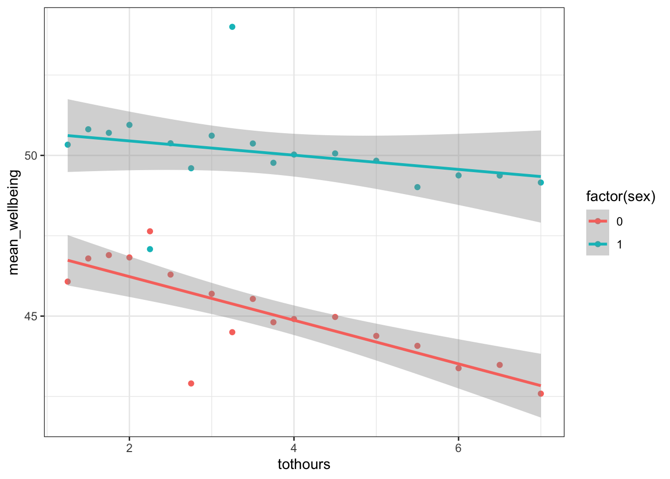
Figure 15.3: Scatterplot and slopes for relationships between total hours and mean wellbeing score for boys (cyan) and girls (red)
15.3.3 A side point on mean centering and deviation coding
Last bit of wrangling, I promise, before the analysis. Here, we will introduce something that is worth doing to help with our interpretation. You can read up more on this later, and we will cover it in later years more in-depth, but when you have continuous variables in a regression, it is often sensible to transform them by mean centering them which has two very useful outcomes:
the intercept of the model now shows the predicted value of \(Y\) for the mean value of the predictor variable rather than the predicted value of \(Y\) at the zero value of the unscaled variable as it normally would;
if there are interactions in the model, any lower-order effects (e.g. main effects) can be interpreted as they would have been, had it been simply an ANOVA.
These steps seem rather worthwhile in terms of interpretation and the process is really straightforward. You can mean center a continuous predictor, for example X, simply by subtracting the mean from each value of the predictor: i.e.X_centered = X - mean(X).
A second very useful thing to do that aids the interpretation is to convert your categorical variables into what is called deviation coding. Again, we are going to focus more on this in L3 but it is good to hear the term in advance as you will see it from time to time. Again, all this does is to allow you to interpret the categorical predictors as if it were an ANOVA.
We are going to do both of these steps, mean centering of our continuous variable and deviation coding of our categorical variable. Here is the code to do it. Copy it and run it but be sure that you understand what it is doing.
- totothours_c is the mean centered values of tothours
- sex_c is the deviation coding of the sex column (sex) where male, which was coded as 1, is now coded as .5, and female is now coded as -.5 instead of 0. The
ifelse()basically says, if that column you want me to look at, says this (e.g. sex == 1), then I will put a .5, otherwise (or else) I will put a -.5.
smart_wb <- smart_wb %>%
  mutate(tothours_c = tothours - mean(tothours),
         sex_c = ifelse(sex == 1, .5, -.5)) %>%
  select(-tothours, -sex)
15.3.4 Estimating model parameters
Superb! And now finally, after all that wrangling and visualisation, the models. Finally, we are going to see if there is statistical support for our above interpretation of the Figure 15.3, where we saw that overall, girls have lower well-being and that they are affected more by prolonged smartphone usage than boys are. Just to recap, the previous authors have already looked at smartphone usage and wellbeing but, we want to look at whether it has more of an impact in girls than boys, or boys than girls, or about the same.
The multiple regression model, from the general linear model, for this analysis would be written as:
\(Y_i = \beta_0 + \beta_1 X_{1i} + \beta_2 X_{2i} + \beta_3 X_{3i} + e_i\)
where:
- \(Y_i\) is the wellbeing score for participant \(i\);
- \(X_{1i}\) is the mean-centered smartphone use predictor variable for participant \(i\);
- \(X_{2i}\) is gender, where we used deviation coding (-.5 = female, .5 = male);
- \(X_{3i}\) is the interaction between smartphone use and gender (\(= X_{1i} \times X_{2i}\))
You have seen multiple regression models before in R and they usually take a format something like, y ~ a + b. The one for this analysis is very similar but with one difference, we need to add the interaction. To do that, instead of saying a + b we do a * b. This will return us the effects of a and b by themselves as well as the interaction of a and b. Just like you would in an ANOVA but here one of the variables is continuous and one is categorical.
- With that in mind, using the data in
smart_wb, use thelm()function to estimate the model for this analysis where we predicttot_wellbeingfrom mean centered smartphone usage (tothours_c) and the deviation coded sex (sex_c)
-
R formulas look like this:
y ~ a + b + a:bwherea:bmeans interaction -
This can be written in short form of
y ~ a * b
- Next, use the
summary()function on your model output to view it. The ouput should look as follows:
##
## Call:
## lm(formula = tot_wellbeing ~ tothours_c * sex_c, data = smart_wb)
##
## Residuals:
##     Min      1Q  Median      3Q     Max
## -36.881  -5.721   0.408   6.237  27.264
##
## Coefficients:
##                  Estimate Std. Error t value Pr(>|t|)
## (Intercept)      47.43724    0.03557 1333.74   <2e-16 ***
## tothours_c       -0.54518    0.01847  -29.52   <2e-16 ***
## sex_c             5.13968    0.07113   72.25   <2e-16 ***
## tothours_c:sex_c  0.45205    0.03693   12.24   <2e-16 ***
## ---
## Signif. codes:  0 '***' 0.001 '**' 0.01 '*' 0.05 '.' 0.1 ' ' 1
##
## Residual standard error: 9.135 on 71029 degrees of freedom
## Multiple R-squared:  0.09381,    Adjusted R-squared:  0.09377
## F-statistic:  2451 on 3 and 71029 DF,  p-value: < 2.2e-16
15.3.5 Final Interpretations
Finally, just some quick interpretation questions to round off all our work! To help you, here is some info:
- The intercept for the male regression line can be calculated by: the Intercept + (the beta of sex_c * .5)
- The slope of the male regression line can be calculated by: the beta of the tothours_c + (the beta of interaction * .5)
- The intercept for the female regression line can be calculated by: the Intercept + (the beta of sex_c * -.5)
- The slope of the female regression line can be calculated by: the beta of the tothours_c + (the beta of interaction * -.5)
Look at your model output in the summary() and try to answer the following questions. The solutions are below.
The interaction between smartphone use and gender is shown by the variable , and this interaction was at the \(\alpha = .05\) level.
To two decimal places, the intercept for male participants is:
To two decimal places, the slope for male participants is:
To two decimal places, the intercept for female participants is:
To two decimal places, the slope for female participants is:
As such, given the model of Y = intercept + (slope * X) where Y is wellbeing and X is total hours on smartphone, what would be the predicted wellbeing score for a male and a female who use their smartphones for 8 hours. Give your answer to two decimal places:
- Male:
- Female:
And finally, what is the most reasonable interpretation of these results?
Job Done - Activity Complete!
One last thing:
Before ending this section, if you have any questions, please post them on the available forums or speak to a member of the team. Finally, don't forget to add any useful information to your Portfolio before you leave it too long and forget. Remember the more you work with knowledge and skills the easier they become.
15.4 Test Yourself
This is a formative assignment meaning that it is purely for you to test your own knowledge, skill development, and learning, and does not count towards an overall grade. However, you are strongly encouraged to do the assignment as it will continue to boost your skills which you will need in future assignments. You will be instructed by the Course Lead on Moodle as to when you should attempt this assignment. Please check the information and schedule on the Level 2 Moodle page.
Chapter 15: Regression with categorical and continuous factors
Welcome to the final formative assignment of this book where we will look at rounding off the main topics of the quantitative approach we have looked at over the past few months. Over the weeks we have looked at analysing data from categorical factors in ANOVAs as well as continuous factors in regression. However, we have also looked that the General Linear Model and how it shows that ANOVAs and Regression are all part of the same model. If that is true then in principle you should be able to perform analysis with both categorical and continuous factors in the same model. This is what we looked at in the inclass activities of recent chapters and it is how we will round off the book, sending you on your way primed and ready for the next stage of your development!
In order to complete this assignment you first have to download the assignment .Rmd file which you need to edit for this assignment: titled GUID_Level2_Semester2_Ch15.Rmd. This can be downloaded within a zip file from the below link. Once downloaded and unzipped you should create a new folder that you will use as your working directory; put the .Rmd file in that folder and set your working directory to that folder through the drop-down menus at the top. Download the Assignment .zip file from here.
Background
For this assignment, we will be looking at data from the following archival data:
Han, C., Wang, H., Fasolt, V., Hahn, A., Holzleitner, I. J., Lao, J., DeBruine, L., Feinberg, D., Jones, B. C. No evidence for correlations between handgrip strength and sexually dimorphic acoustic properties of voices. Available on the Open Science Framework, retrieved from https://osf.io/na6be/
Han and colleagues studied the relationship between the pitch of a person's voice (as measured by fundamental frequency - see Chapter 14) and hand grip strength to test the theory that lower voices signal physical strength. In particular, the study sought to replicate a previous study that found lower voices associated with greater grip strength in male participants but in for female participants. The idea proposed in previous studies is that pitch is a signal of physical strength and people use it as a mate preference signal, though more recent work, including this data, would tend to refute this notion.
So in summary, the main relationship of interest is between voice frequency (F0 - pronounced F zero) and hand grip strength (HGS) as modulated by sex (male or female), testing the hypothesis that there is a negative relationship between F0 and HGS in male voices but not in female voices.
- Note 1: Lower values of
F0are associated with lower pitch voices (deep voices) and higher values ofHGSwould be associated with a stonger grip. - Note 2: The data also contains nationality but we will not look at that today.
- Note 3: On the original OSF page for this archival data, the data is in excel format. You can actually read in excel data using
readxl::read_excel()but we have given you the data in.csvformat for consistency and to keep our open practices. Excel is software that most people have to purchase and as such does not fully conform with the ideas of open science. Hence, creating and transferring data as.csvformat is always preferrable. Today, make sure to use the.csvformat we have been teaching all year. - Note 4: Pay particular attention to your spelling when working with the pitch column. Note that it is labelled as
F0(F and the number 0) and notFO(F and the letter O). Do not rename the column. Be exact on your spelling and typing.
Before starting let's check:
The
.csvfile is saved into a folder on your computer and you have manually set this folder as your working directory.The
.Rmdfile is saved in the same folder as the.csvfiles. For assessments we ask that you save it with the formatGUID_Level2_Semester2_Ch15.RmdwhereGUIDis replaced with yourGUID. Though this is a formative assessment, it may be good practice to do the same here.
15.4.1 Task 1A: Load add-on packages
- Today we will need only the
tidyversepackage. Load in this package by putting the appropriate code into theT1Acode chunk below.
# call in the required library packages15.4.2 Task 1B: Load the data
- Using
read_csv()replace theNULLin theT1Bcode chunk to read in the data file with the exact filename you have been given.- Store
Han_OSF_HGSandVoiceData.csvas a tibble indat
- Store
dat <- NULLBe sure to have a look at your data through the viewer or by using commands in your console only, not in your code.
15.4.3 Task 2: Demographics
Because the researchers are really excellent the data is already set up in a nice layout for us to quickly create some demographics.
- In the
T2code chunk below replace theNULLwith a code pipeline that calculates the number of male and female participants there are, in the data, as well as the mean age and standard deviation of age for both sex.- store the output as a tibble in
demogs - the resulting tibble will have the following columns in this exact order:
sex,n,mean_age,sd_age. - there will be four columns (as named above in that order) with 2 rows; i.e. 1 row for each sex of voice.
- Be exact on spelling and order of column names. By alphabetical order, female data will be in row one.
- store the output as a tibble in
demogs <- NULL15.4.4 Task 3: Plotting the general relationship of F0 and HGS
Great, we will need that data later on but for now let's start looking at the data by plotting a basic relationship between F0 and HGS regardless of sex.
- Enter code into the
T3code chunk below to exactly replicate the shown figure.- you must use ggplot()
- make sure the background, colors, labels, and x and y dimensions match what is shown below.
# replicate the figure shown using a ggplot() approach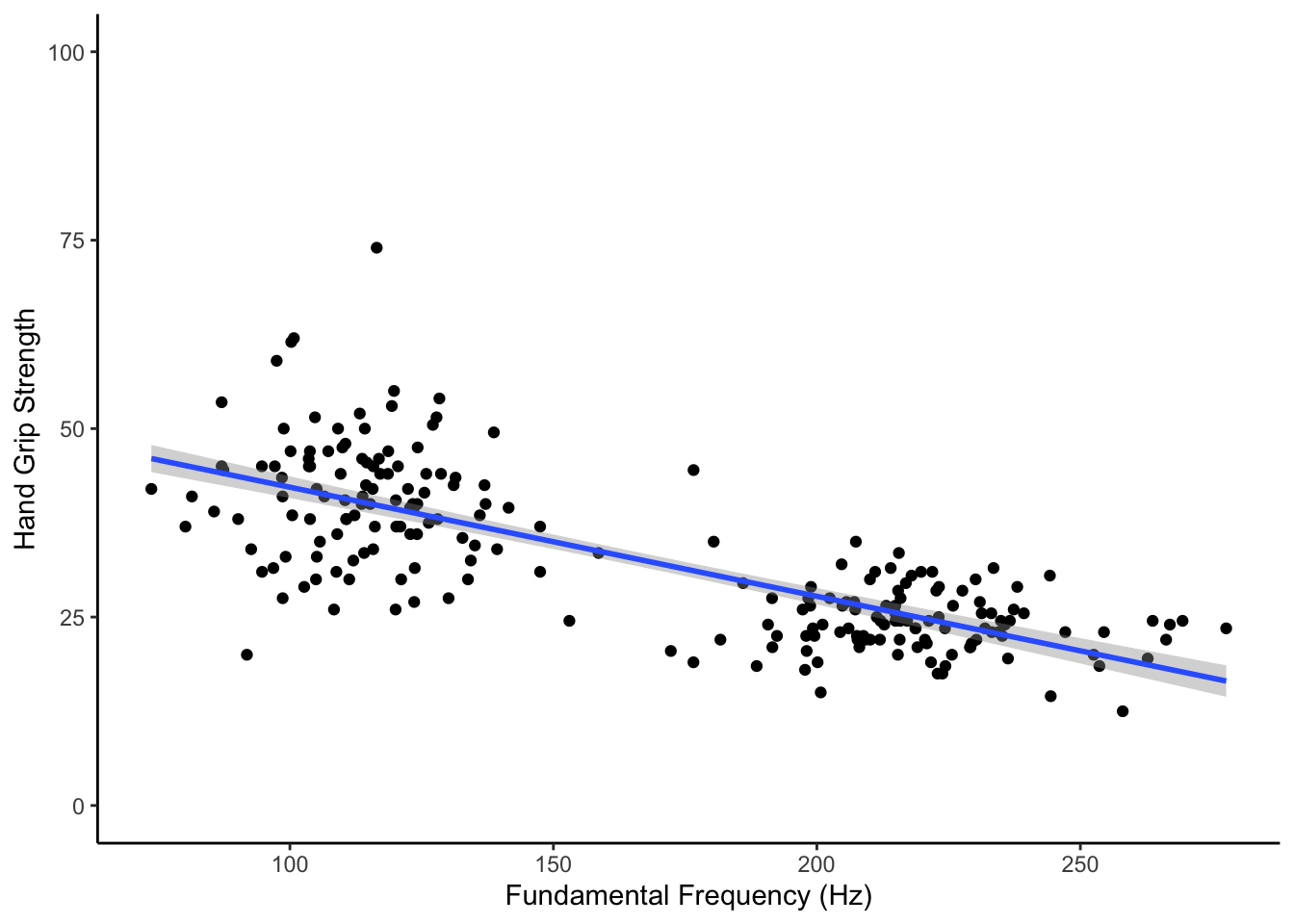
Figure 15.4: Replicate this Figure
15.4.5 Task 4: Analysing the general relationship of F0 and HGS
Hmmm, so the scatterplot illustrates the basic relationship between F0 and HGS but we should test this using a simple linear regression.
- Using the data in
dat, replace theNULLin theT4code chunk below to run a simple linear regression testing the relationship of F0 (our IV) predicting hand grip strength (our DV).- store the output of the regression in
mod1 - Do nothing to the output of lm() other than store it in the variable named
mod1(note: technically it will store as a list). - do not include sex in this model. Just include the stated DV and the IV.
- You will need to think about the order to make sure F0 is predicting hand grip strength.
- store the output of the regression in
mod1 <- NULL15.4.6 Task 5: Interpreting the general relationship of F0 and HGS
You should have a look at the output of mod1 but only do this in the console and not in your code. Based on that output and on the scatterplot in Task 4, one of the below statements is a coherent and accurate summary of the above analysis.
- As illustrated in the scatterplot of Task 4, the model revealed that fundamental frequency does predict hand grip strength, explaining approximately 56.7% of the population variance. The model would suggest that there is a negative relationship between F0 and HGS (b = -.145) supporting the basic hypothesis that as pitch increases, hand grip strength decreases (Adjusted R-squared = .567, F(1, 289.3) = 219, p < .001.
- As illustrated in the scatterplot of Task 4, the model revealed that fundamental frequency does predict hand grip strength, explaining approximately 56.7% of the population variance. The model would suggest that there is a positive relationship between F0 and HGS (b = .145) supporting the basic hypothesis that as pitch increases, hand grip strength increases (Adjusted R-squared = .567, F(1, 289.3) = 219, p < .001.
- As illustrated in the scatterplot of Task 4, the model revealed that fundamental frequency does predict hand grip strength, explaining approximately 56.7% of the population variance. The model would suggest that there is a negative relationship between F0 and HGS (b = -.145) supporting the basic hypothesis that as pitch increases, hand grip strength decreases (Adjusted R-squared = .567, F(1, 219) = 289.3, p < .001.
- As illustrated in the scatterplot of Task 4, the model revealed that fundamental frequency does predict hand grip strength, explaining approximately 56.7% of the population variance. The model would suggest that there is a positive relationship between F0 and HGS (b = .145) supporting the basic hypothesis that as pitch increases, hand grip strength increases (Adjusted R-squared = .567, F(1, 219) = 289.3, p < .001.
- In the
T5code chunk below, replace theNULLwith the number of the statement below that best summarises this analysis. Store this single value inanswer_t5
answer_t5 <- NULL15.4.7 Task 6: Plotting the modulation of voice/strength relationship by sex
Well that is interesting but we really want to look at the relationship between fundamental frequency and hand grip strength separately for male and female participants.
- Let's start by plotting the relationship between F0 and HGS for males and females separately. Enter code into the
T6code chunk below to represent this relationship for each sex separately.- This has to be one figure, meaning only one ggplot call. Two ggplot calls will not be accepted.
- male and female can be represented on the same plot area or split into two plot areas using any method previously shown.
- Why not start with your code from Task 3 and simply add an aes call or an additional line to split the male and female data.
- Your output should show two separate regression lines; one for the male participants and one for the female participants.
- Make any other changes to your figure that you wish, the only criteria are: that there is only one ggplot call in your code chunk; that each participant is represented by a dot; that voice pitch is on the x-axis; that there are two regression lines, one for each sex.
# you must use the stated function15.4.8 Task 7: Mean centering and Deviation coding the variables.
Looking at your new figure this would perhaps suggest that there is not quite as clear a relationship between HGS and F0 as our previous analysis showed. Now that we have split male and female data, the regression lines for both sex look relatively flat and not the sloping relationship we saw earlier. We are going to test the relationship in the next Task but, before doing that, thinking back to the in-class activities of the chapter, we said we needed to do two things to the data first before running a regression that has both continuous and categorical data. Those two steps were mean centering the continuous predictor and deviation code the categorical predictor.
- In the
T7code chunk below, replace theNULLwith a line of code that adds on two new columns to the dataset. The first new column will be the mean centered continuous variable (F0). The second new column will be the deviation coded categorical variable (sex)- store the output of this wrangle in the tibble called
dat_dev. - call the column containing the mean centered continuous variable
F0_C. To clarify, that is pronounced as F zero underscore C. Both the F and C should be capital letters. - call the column containing the deviation coded categorical variable
sex_C. To clarify, that is pronounced as sex underscore C. The C is a capital letter but the s is a lowercase letter. - deviation code females as -.5 and males as .5
- Keep all other columns and pay strict attention to the order asked for when adding the two new columns;
F0_Cthensex_C.
- store the output of this wrangle in the tibble called
dat_dev <- NULL15.4.9 Task 8: Estimate the modulation of voice/strength relationship by sex
Ok great, the data is now in the correct format for us to test the hypothesis that there is a significant relationship between fundamental frequency and HGS in male voices but not in female voices. Another way of saying this is that the F0 and HGS relationship is modulated by sex, or that there is an interaction between sex and F0 when predicting HGS.
- Using the data in
dat_dev, replace theNULLin theT8code chunk below to run a regression model testing the relationship of fundamental frequency and sex (our IVs) on predicting hand grip strength (our DV).- store the output of the regression in
mod2 - Do nothing to the output of lm() other than store it in the variable named
mod1(note: technically it will store as a list). - Remember that we want the interaction of fundamental frequency and sex so set the model accordingly.
- Put fundamental frequency as the first predictor and sex as the second predictor, and do not forget to use the mean centered and deviation coded variables.
- store the output of the regression in
mod2 <- NULL15.4.10 Task 9: Interpreting the output 1
Looking at the output of mod2 (remember to do this only in your console and not in the code), one of the below statements is a true synopsis of each of the three effects.
- The beta coeffecient of fundamental frequency (b = -.016) and the interaction (-.033) are not significant but the coeffecient of sex is significant (b = 13.182).
- The beta coeffecient of fundamental frequency (b = -.033) and the interaction (-.016) are significant but the coeffecient of sex is not significant (b = 13.182).
- The beta coeffecient of fundamental frequency (b = -.016) and the interaction (-.033) are significant but the coeffecient of sex is not significant (b = 13.182).
- The beta coeffecient of fundamental frequency (b = -.033) and the interaction (-.016) are not significant but the coeffecient of sex is significant (b = 13.182).
- In the
T9code chunk below, replace theNULLwith the number of the statement below that best summarises this analysis. Store this single value inanswer_t9
answer_t9 <- NULL15.4.11 Task 10: Interpreting the output 2
Based on the output of mod2 one of the below statements is a true synopsis of slopes for male and female participants. Do any necessary additional calculations in your console, not in the script.
- The slope of the male regression line (slope = -.042) is marginally more negative than the slope of the female regression line (slope = -.025).
- The slope of the male regression line (slope = .042) is marginally more positive than the slope of the female regression line(slope = .025).
- The slope of the female regression line (slope = -.042) is marginally more negative than the slope of the male regression line (slope = -.025).
- The slope of the female regression line (slope = .042) is marginally more positive than the slope of the male regression line (slope = .025).
- In the
T10code chunk below, replace theNULLwith the number of the statement below that best summarises this analysis. Store this single value inanswer_t10
answer_t10 <- NULL15.4.12 Task 11: Interpreting the output 3
Based on the output of all of the above, one of the below statements is a true synopsis of the analyses.
An analysis involving 221 participants (male: N = 110, Mean Age = 22.93, SD Age = 3.35; female: N = 111, Mean Age = 23.87, SD Age = 5.14) was conducted to test the hypothesis that there was a negative relationship between fundamental frequency and hand grip strength in males but not in females. A simple linear regression suggested that there was a significant negative relationship between F0 and HGS, when not controlling for sex. However, after controlling for participant sex, there appears to be no significant relationship between fundamental frequency and grip strength. The only significant effect suggests that there is a difference in hand grip strength between males and females but this is not related to fundamental frequency.
An analysis involving 221 participants (female: N = 110, Mean Age = 22.93, SD Age = 3.35; male: N = 111, Mean Age = 23.87, SD Age = 5.14) was conducted to test the hypothesis that there was a negative relationship between fundamental frequency and hand grip strength in males but not in females. A simple linear regression suggested that there was no significant negative relationship between F0 and HGS, when not controlling for sex. Likewise, after controlling for participant sex, there appears to be no significant relationship between fundamental frequency and grip strength. The only significant effect suggests that there is a difference in hand grip strength between males and females but this is not related to fundamental frequency.
An analysis involving 221 participants (female: N = 110, Mean Age = 22.93, SD Age = 3.35; male: N = 111, Mean Age = 23.87, SD Age = 5.14) was conducted to test the hypothesis that there was a negative relationship between fundamental frequency and hand grip strength in females but not in males. A simple linear regression suggested that there was a significant negative relationship between F0 and HGS, when not controlling for sex. However, after controlling for participant sex, there appears to be no significant relationship between fundamental frequency and grip strength. The only significant effect suggests that there is a difference in hand grip strength between males and females but this is not related to fundamental frequency.
An analysis involving 221 participants (female: N = 110, Mean Age = 22.93, SD Age = 3.35; male: N = 111, Mean Age = 23.87, SD Age = 5.14) was conducted to test the hypothesis that there was a negative relationship between fundamental frequency and hand grip strength in males but not in females. A simple linear regression suggested that there was a significant negative relationship between F0 and HGS, when not controlling for sex. However, after controlling for participant sex, there appears to be no significant relationship between fundamental frequency and grip strength. The only significant effect suggests that there is a difference in hand grip strength between males and females but this is not related to fundamental frequency.
- In the
T11code chunk below, replace theNULLwith the number of the statement below that best summarises this analysis. Store this single value inanswer_t11
answer_t11 <- NULLJob Done - Activity Complete!
Well done, you are finished! Now you should go check your answers against the solution file which can be found on Moodle. You are looking to check that the resulting output from the answers that you have submitted are exactly the same as the output in the solution - for example, remember that a single value is not the same as a coded answer. Where there are alternative answers it means that you could have submitted any one of the options as they should all return the same answer. If you have any questions please post them on the forums.
15.5 Solutions to Questions
Below you will find the solutions to the questions for the PreClass and InClass activities for this chapter. Only look at them after giving the questions a good try and speaking to the tutor about any issues.
15.5.1 PreClass Activities
15.5.1.1 Loading the Data
library("tidyverse")

pinfo <- read_csv("participant_info.csv")
wellbeing <- read_csv("wellbeing.csv")
screen <- read_csv("screen_time.csv")15.5.1.2 Compute the well-being score for each participant
- Both of these solutions would produce the same output.
Version 1
- bit quicker in terms of coding and reduces chance of error by perhaps forgetting to include a specific column
wemwbs <- wellbeing %>%
  pivot_longer(names_to = "var", values_to = "score", cols = -Serial) %>%
  group_by(Serial) %>%
summarise(tot_wellbeing = sum(score))- This is how you would do the same above with the
gather()function in case there are still somegather()in this chapter by mistake. It does the same task but just slightly different input and can create a slightly different output because it has a different sorting function within it compared topivot_longer()
wemwbs <- wellbeing %>%
  gather(key = "var", value = "score", -Serial) %>%
  group_by(Serial) %>%
  summarise(tot_wellbeing = sum(score))
Version 2
- this one is a bit slower
wemwbs <- wellbeing %>%
  mutate(tot_wellbeing = WBOptimf + WBUseful +
           WBRelax + WBIntp +   WBEnergy + WBDealpr +
           WBThkclr + WBGoodme + WBClsep + WBConfid +
           WBMkmind + WBLoved + WBIntthg + WBCheer) %>%
  select(Serial, tot_wellbeing) %>%
arrange(Serial)15.5.1.3 Visualising Screen time on all technologies
## screen time

screen_long <- screen %>%
  pivot_longer(names_to = "var", values_to = "hours", cols = -Serial) %>%
  separate(var, c("variable", "day"), "_")

screen2 <- screen_long %>%
  mutate(variable = recode(variable,
               "Watch" = "Watching TV",
               "Comp" = "Playing Video Games",
               "Comph" = "Using Computers",
               "Smart" = "Using Smartphone"),
     day = recode(day,
              "wk" = "Weekday",
              "we" = "Weekend"))

ggplot(screen2, aes(hours)) +
  geom_bar() +
  facet_grid(day ~ variable)
Figure 15.5: Count of the hours of usage of different types of social media at Weekdays and Weekends
- This is how you would do the first step above with the
gather()function in case there are still somegather()in this chapter by mistake. It does the same task but just slightly different input and can create a slightly different output because it has a different sorting function within it compared topivot_longer()
screen_long <- screen %>%
  gather("var", "hours", -Serial) %>%
separate(var, c("variable", "day"), "_")15.5.1.4 Visualising the Screen time and Well-being relationship
dat_means <- inner_join(wemwbs, screen2, "Serial") %>%
  group_by(variable, day, hours) %>%
  summarise(mean_wellbeing = mean(tot_wellbeing))
## `summarise()` has grouped output by 'variable', 'day'. You can override using the `.groups` argument.ggplot(dat_means, aes(hours, mean_wellbeing, linetype = day)) +
geom_line() +
geom_point() +
facet_wrap(~variable, nrow = 2)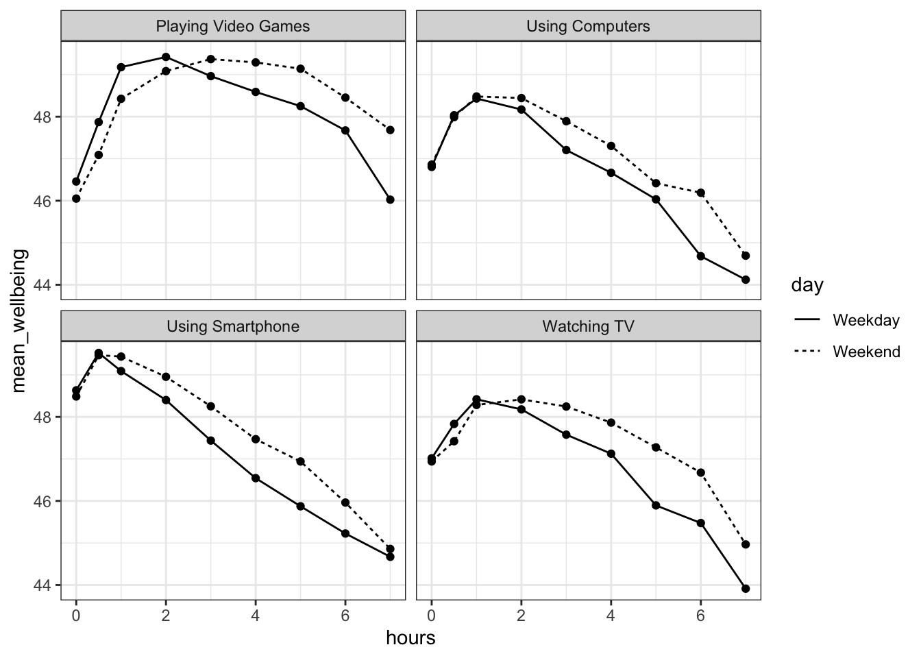
Figure 15.6: Scatterplot showing the relationship between screen time and mean well-being across four technologies for Weekdays and Weekends
15.5.2 InClass Activities
15.5.2.1 Smartphone and well-being for boys and girls
Solution Steps 1 to 2
smarttot <- screen2 %>%
  filter(variable == "Using Smartphone") %>%
  group_by(Serial) %>%
  summarise(tothours = mean(hours))
Solution Step 3
smart_wb <- smarttot %>%
  filter(tothours > 1) %>%
  inner_join(wemwbs, "Serial") %>%
inner_join(pinfo, "Serial") 15.5.2.2 Visualise and Interpreting the relationship of smartphone use and wellbeing by sex
The Figure
smart_wb_gen <- smart_wb %>%
  group_by(tothours, sex) %>%
  summarise(mean_wellbeing = mean(tot_wellbeing))
## `summarise()` has grouped output by 'tothours'. You can override using the `.groups` argument.ggplot(smart_wb_gen, aes(tothours, mean_wellbeing, color = factor(sex))) +
geom_point() +
geom_smooth(method = "lm")## `geom_smooth()` using formula 'y ~ x'
Figure 15.7: Scatterplot and slopes for relationships between total hours and mean wellbeing score for boys (cyan) and girls (red)
A brief Interpretation
Girls show lower overall well-being compared to boys. In addition, the slope for girls appears more negative than that for boys; the one for boys appears relatively flat. This suggests that the negative association between well-being and smartphone use is stronger for girls.
15.5.2.3 Estimating model parameters
- This is the chunk we gave in the materials.
smart_wb <- smart_wb %>%
  mutate(tothours_c = tothours - mean(tothours),
         sex_c = ifelse(sex == 1, .5, -.5)) %>%
select(-tothours, -sex)- and the model would be specified as:
mod <- lm(tot_wellbeing ~ tothours_c * sex_c, smart_wb)- or alternatively
mod <- lm(tot_wellbeing ~ tothours_c + sex_c + tothours_c:sex_c, smart_wb)- and the output called by:
summary(mod)##
## Call:
## lm(formula = tot_wellbeing ~ tothours_c + sex_c + tothours_c:sex_c,
## data = smart_wb)
##
## Residuals:
## Min 1Q Median 3Q Max
## -36.881 -5.721 0.408 6.237 27.264
##
## Coefficients:
## Estimate Std. Error t value Pr(>|t|)
## (Intercept) 47.43724 0.03557 1333.74 <2e-16 ***
## tothours_c -0.54518 0.01847 -29.52 <2e-16 ***
## sex_c 5.13968 0.07113 72.25 <2e-16 ***
## tothours_c:sex_c 0.45205 0.03693 12.24 <2e-16 ***
## ---
## Signif. codes: 0 '***' 0.001 '**' 0.01 '*' 0.05 '.' 0.1 ' ' 1
##
## Residual standard error: 9.135 on 71029 degrees of freedom
## Multiple R-squared: 0.09381, Adjusted R-squared: 0.09377
## F-statistic: 2451 on 3 and 71029 DF, p-value: < 2.2e-1615.5.2.4 Final Interpretations
The interaction between smartphone use and gender is shown by the variable tothours_c:sex_c, and this interaction was significant at the \(\alpha = .05\) level, meaning that there is an significant interaction between sex and hours of smartphone usage on wellbeing
To two decimal places, the intercept for male participants is: 50.01
To two decimal places, the slope for male participants is: -0.32
To two decimal places, the intercept for female participants is: 44.87
To two decimal places, the slope for female participants is: -0.77
As such, given the model of Y = intercept + (slope * X) where Y is wellbeing and X is total hours on smartphone, what would be the predicted wellbeing score for a male and a female who use their smartphones for 8 hours. Give your answer to two decimal places:
- Male: 47.45
- Female: 38.71
And finally, the most reasonable interpretation of these results is that smartphone use was more negatively associated with wellbeing for girls than for boys.
15.5.3 Test Yourself Activities
15.5.3.1 Task 1A: Load add-on packages
The tidyverse would be loaded in as shown below.
library(tidyverse)15.5.3.2 Task 1B: Load the data
The data would be read in as follows.
dat <- read_csv("Han_OSF_HGSandVoiceData.csv")- Remember to check that you have used
read_csv() - Double check the spelling of the data file.
- Be sure to have a look at your data through the viewer or by using commands in your console only, not in your code.
15.5.3.3 Task 2: Demographics
This would be carried out using a group_by() and summarise() combination as shown. As always be sure to pay attention to the spelling of variables
demogs <- dat %>% group_by(sex) %>%
  summarise(n = n(),
            mean_age = mean(age),
sd_age = sd(age))15.5.3.4 Task 3: Plotting the general relationship of F0 and HGS
The below figure would be appropriate here:
## `geom_smooth()` using formula 'y ~ x'
Figure 15.4: The relationship between fundamental frequency (Hz) and hand grip strength
And would be created with the following code:
ggplot(dat, aes(F0, HGS)) +
  geom_point() +
  geom_smooth(method = "lm") +
  labs(x = "Fundamental Frequency (Hz)", y = "Hand Grip Strength") +
  coord_cartesian(ylim = c(0,100)) +
theme_classic()15.5.3.5 Task 4: Analysing the general relationship of F0 and HGS
The appropriate way to run this analysis would be as shown below:
HGSis the dependent variable (or the outcome variable)F0is the independent variable (or the predictor variables- The data is stored in
dat
mod1 <- lm(HGS ~ F0, dat)Note: Be sure to watch spelling and capitalisation of the variables. For example, F0_C is pronounced as "F Zero" and the F is capitalised.
15.5.3.6 Task 5: Interpreting the general relationship of F0 and HGS
An appropriate summary would be:
As illustrated in the scatterplot of Task 4, the model revealed that fundamental frequency does predict hand grip strength, explaining approximately 56.7% of the population variance. The model would suggest that there is a negative relationship between F0 and HGS (b = -.145) supporting the basic hypothesis that as pitch increases, hand grip strength decreases (Adjusted R-squared = .567, F(1, 219) = 289.3, p < .001.
As such the answer is:
answer_t5 <- 315.5.3.7 Task 6: Plotting the modulation of voice/strength relationship by sex
The below figure would be sufficient for this task:
## `geom_smooth()` using formula 'y ~ x'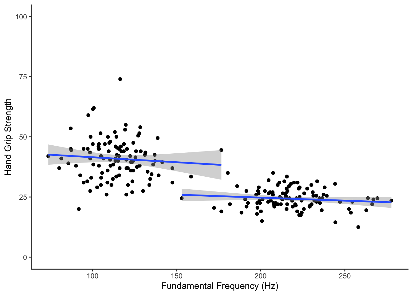
Figure 15.8: The relationship between fundamental frequency and hand grip strength by sex
And would be created as follows.
ggplot(dat, aes(F0, HGS, group = sex)) +
  geom_point() +
  geom_smooth(method = "lm") +
  labs(x = "Fundamental Frequency (Hz)", y = "Hand Grip Strength") +
  coord_cartesian(ylim = c(0,100)) +
theme_classic()15.5.3.8 Task 7: Mean centering and Dummy coding the variables.
One way to complete this task using a mutate() function as shown below. Be sure however to keep an eye on spelling and capitalisation of variables. For example, F0_C is pronounced as "F Zero underscore C" and the F and C are both capitalised.
dat_dummy <- dat %>%
  mutate(F0_C = F0 - mean(F0),
sex_C = ifelse(sex == "female", -.5, .5))15.5.3.9 Task 8: Estimate the modulation of voice/strength relationship by sex
The appropriate way to run this analysis would be as shown below:
HGSis the dependent variable (or the outcome variable)F0_Candsex_Care the independent variables (or the predictor variables)- The data is stored in
dat_dummy
mod2 <- lm(HGS ~ F0_C * sex_C, dat_dummy)Note: Be sure to watch spelling and capitalisation of the variables. For example, F0_C is pronounced as "F Zero underscore C" and the F and C are both capitalised.
15.5.3.10 Task 9: Interpreting the output 1
The appropriate synopsis would be:
The beta coeffecient of fundamental frequency (b = -.033) and the interaction (-.016) are not significant but the coeffecient of sex is significant (b = 13.182).
As such the correct answer is:
answer_t9 <- 415.5.3.11 Task 10: Interpreting the output 2
The appropriate synopsis would be:
The slope of the male regression line (slope = -.042) is marginally more negative than the slope of the female regression line (slope = -.025).
As such the correct answer is:
answer_t10 <- 115.5.3.12 Task 11: Interpreting the output 3
A good summary of the analysis would be as follows:
An analysis involving 221 participants (female: N = 110, Mean Age = 22.93, SD Age = 3.35; male: N = 111, Mean Age = 23.87, SD Age = 5.14) was conducted to test the hypothesis that there was a negative relationship between fundamental frequency and hand grip strength in males but not in females. A simple linear regression suggested that there was a significant negative relationship between F0 and HGS, when not controlling for sex. However, after controlling for participant sex, there appears to be no significant relationship between fundamental frequency and grip strength. The only significant effect suggests that there is a difference in hand grip strength between males and females but this is not related to fundamental frequency.
As such the correct answer is:
answer_t11 <- 4Chapter Complete!