Lab 7 Within-Subjects t-test
7.1 Overview
In the previous chapters we have looked at one-sample t-tests and between-samples t-tests. In this chapter we will continue to look at t-tests in general, with the PreClass Activity looking really at the assumption of variance in a between-subjects t-test, and the InClass Activity looking at the remaining type of t-test; the within-subjects t-test (sometimes called the dependent sample or paired-sample t-test). The within-subjects t-test is a statistical procedure used to determine whether the mean difference between two sets of observations from the same or matched participants is zero.
As in all tests, the within-subjects t-test has two competing hypotheses: the null hypothesis and the alternative hypothesis.
- The null hypothesis assumes that the true mean difference between the paired samples is zero: \[H_0: \mu1 = \mu_2\].
- The alternative hypothesis assumes that the true mean difference between the paired samples is not equal to zero: \[H_1: \mu1 \ne \mu_2\].
In this chapter we are going to look at running the within-subjects t-test but to begin with we will do a little work on the checks of your data that you need to perform prior to analysis.
Assumptions of tests
So far we have focussed your skills on data-wrangling, visualisations and probability, and now we are moving more towards the actual analysis stage of research. However, as you will know from your lectures, all tests, and particularly parametric tests, make a number of assumptions about the data that is being tested, and that you, as a responsible researcher, need to check these assumptions are "held" as any violation of the assumptions may make your results invalid.
For t-tests the assumptions change for between-subjects and within-subjects designs (the one-sample and matched-pairs designs can be thought of as within-subjects designs).
The assumptions of the between-subjects t-test are:
- All data points are independent.
- The variance across both groups/conditions should be equal.
- The dependent variable must be continuous (interval/ratio).
- The dependent variable should be normally distributed.
And the assumptions of the within-subjects t-test are:
- All participants appear in both conditions/groups.
- The dependent variable must be continuous (interval/ratio).
- The dependent variable should be normally distributed.
Before beginning any analysis, using your data-wrangling skills, you must check to see if the data deviates from these assumptions, and whether it contains any outliers, in order to assess the quality of the results.
So in this lab we will:
- Understand about assumptions of t-tests in general
- Learn about the assumption of equal variance in between-subjects t-tests
- Run all assumption checks and analysis in an experiment with a within-subjects design.
7.2 PreClass Activity
A bit of a change of pace in this PreClass Activity. In order to give you a bit more of an understanding of the assumptions of the between-subjects t-test, and a viable alternative to the standard Student's t-test, we ask that you read the following blog (and even the full paper if you have time) and then try out the couple of tasks below.
7.2.1 Reading
Read the following blog on using Welch's t-test for between-subjects designs.
Blog:
- Always use Welch's t-test instead of Student's t-test by Daniel Lakens.
For further reading you can look at the paper that resulted from this blog:
Paper:
- Delacre, M., Lakens, D., & Leys, C. (in press) Why Psychologists Should by Default Use Welch's t-test Instead of Student's t-test. International Review of Social Psychology.
7.2.2 Task
- Copy the script within the blog into an R script and try running it to see the difference between Welch's t-test (the recommended test in the blog) and Student's t-test (the standard test in the field).
- Note: You will need the
carpackage. This is installed already in the Boyd Orr labs so if doing this in the labs, do not install the package, just call it to the library with library(car). If yuo are using your own machine then you will need to install thecarpackage. - Note: The code will take a minute or two to run as there is a stage of simulating data (just like we did in Chapter 5) that will take a little time to run.
Don't worry if you don't yet understand all the code. It is highly commented, with each line stating what it does, but it is tricky. The key thing is to try and run it and to look at the figures that come out of it - particularly the third figure that you see in the blog, the one with the red line on it that compares p-values in the two tests. Look at how many tests (dots) are significant on one test and not the other. We give an explanation of the blog below but it is worth trying it out yourself first.
Now try changing the values for n1, n2, sd1 and sd2 at the top of the script to see what effect this has on the Type 1 Error rate (alpha = .05). Again look at the figure with the red line, comparing significance on one test versus significance on the other. This is what should change depending on the n of each sample and whether the variance is equal or not.
Think about the overall point of this blog and which test we should use when conducting a t-test. Once you have thought about this, read the blog below and see if you follow it. We will look at this more again in later chapters and lectures.
Understanding the Blog and the assumption of variance
What the blog and paper are trying to help us recognise is that if the two groups you have sampled have equal number of participants and equal variance, then both the Student's t-test and the Welch's t-test will return the same t-value and, therefore, p-value. This means that you would reject the null hypothesis an equal number of times regardless of which test you used. You can see this in the first figure below with significant results shown as blue circles and non-significant resutls show as orange circles. We have used an adapted version of the code from the blog to create this figure - the settings we have used are in the box shown and you can change your code to match them (remember to set the seed to get the same values)
set.seed(1409)

n1 <- 38
n2 <- 38
sd1 <- 1.85
sd2 <- 1.85

nSims <- 500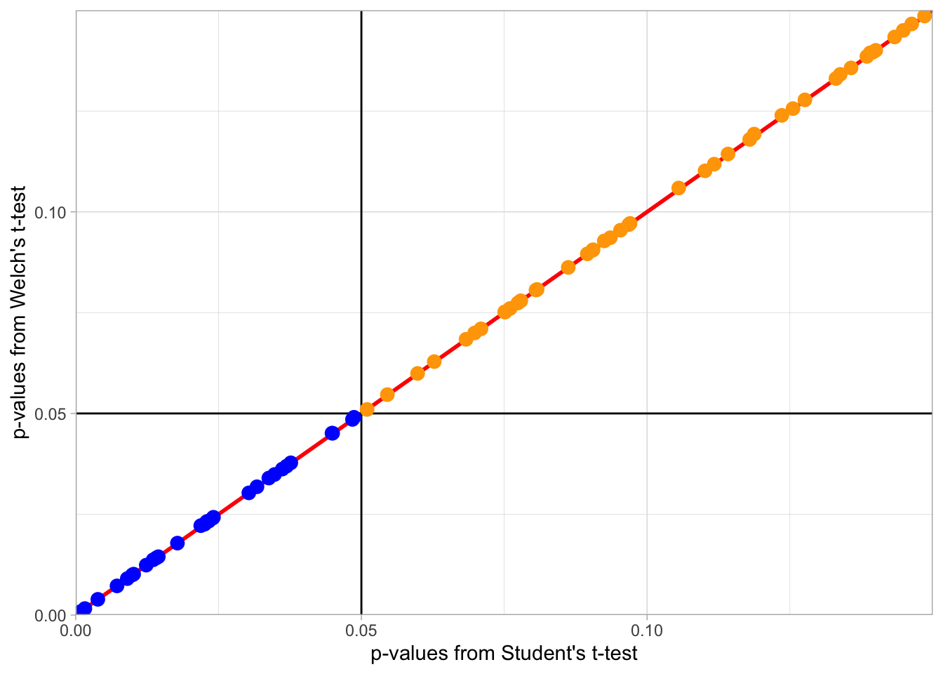
Figure 7.1: Scatterplot illustrating that with equal number of participants and equal variance, Welch's t-test and Student's t-test find the same results as significant (Blue Circles) and the same results as non-significant (Orange Circles). The horizontal and vertical black lines represent the alpha = .05 for both tests. Dots falling on diagonal red line show tests with the same p-value for Welch's and Student's t-tests.
However, and the key point of the blog, if the two groups have unequal variance and/or an unequal number of participants, the two tests start to give different findings. This is shown in the below figure where findings that are significant in both tests are shown in blue, findings that are non-significant in both tests are shown in orange, and findings that are significant using the Student's t-test but non-significant by using Welch's t-test are shown in pink. If we read the blog, especially about how p-values work when there is no actual difference between two groups, then we can come to the conclusion that Welch's t-test is working better than the Student's t-test in this scenario. To put it in ther words, the Student's t-test is finding more tests as significant than it should, and as such has a false positive rate (Type 1 error rate) much higher than the expected \(\alpha = .05\). Have a look at the figure and see if you can understand it.
set.seed(1409)

n1 <- 38
n2 <- 25
sd1 <- 1.15
sd2 <- 1.85

nSims <- 500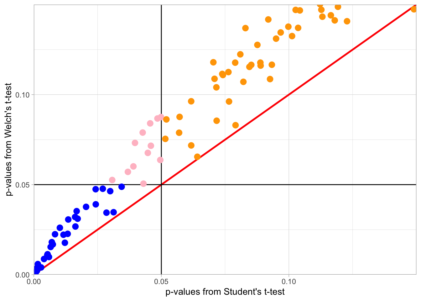
Figure 7.2: Figure illustrates that with unequal number of participants and/or unequal variance, Welch's t-test and Student's t-test work differently, returning conflciting findings. Findings that are significant in both tests are shown in blue, findings that are non-significant in both tests are shown in orange, and findings that are significant using the Student's t-test but non-significant by using Welch's t-test are shown in pink. The horizontal and vertical black lines represent the alpha = .05 for both tests. Dots falling on diagonal red line show tests with the same p-value for Welch's and Student's t-tests. Dots above (below) the red line shown tests where p-value is smaller (larger) in the Student's t-test.
So what is the difference between the two tests? The answer relates to the assumption of variance. What is considered the common/standard t-test in the field, Student's t-test, has the assumption of equal variance, whereas Welch's t-test has no assumption of equal variace - it does however have all the other same assumptions as the Student's t-test. What this blog shows is that if the groups have equal variance then both tests return the same finding. However if the assumption of equal variance is violated, i.e. the groups have unequal variance, then Welch's test produce the more accurate finding, based on the data. This is important as often the final decision on whether assumptions are "held" or "violated" is subjective; i.e. it is down to the researcher to fully decide. Nearly all data will show some level of unequal variance (with perfectly equal variance across multiple conditions actually once revealing fraudulent data). Researchers using the Student's t-test regularly have to make a judgement about whether the variance across the two groups is "equal enough". As such, this blog shows that it is always better to run a Welch's t-test to analyse a between-subjects design as a) Welch's t-test does not have the assumption of equal variance, b) Welch's t-test gives more accurate results when variance is not equal, and c) Welch's t-test performs exactly the same as the Student t-test when variance is equal across groups.
In short, Welch's t-test takes a level of ambiguity (or what may be called a "researcher degree of freedom") out of the analysis and makes the analysis less open to bias or subjectivity. As such, from now on, unless stated otherwise, you should run a Welch's t-test.
In practice it is very easy to run the Welch's t-test, and you can switch between the tests as shown:
- to run a Student's t-test you set
var.equal = TRUE - to run a Welch's t-test you set
var.equal = FALSE
For example, if we created some simulated data of two groups (A vs B) with twenty data points in each group:
my_data <- tibble(my_iv = rep(c("A", "B"), each = 20),
                  my_dv = c(rnorm(20,0,1),rnorm(20,0,1)))
This would run a Student's t-test:
t.test(my_dv ~ my_iv, data = my_data, var.equal = TRUE)##
## Two Sample t-test
##
## data: my_dv by my_iv
## t = 0.74956, df = 38, p-value = 0.4581
## alternative hypothesis: true difference in means between group A and group B is not equal to 0
## 95 percent confidence interval:
## -0.5021683 1.0926848
## sample estimates:
## mean in group A mean in group B
## 0.32491425 0.02965598This would run the Welch's test:
t.test(my_dv ~ my_iv, data = my_data, var.equal = FALSE)##
## Welch Two Sample t-test
##
## data: my_dv by my_iv
## t = 0.74956, df = 37.933, p-value = 0.4581
## alternative hypothesis: true difference in means between group A and group B is not equal to 0
## 95 percent confidence interval:
## -0.5022146 1.0927312
## sample estimates:
## mean in group A mean in group B
## 0.32491425 0.02965598And two ways to know that you have run the Welch's t-test are:
- The output says you ran the Welch Two Sample t-test
- The df is likely to have decimal places in the Welch's t-test whereas it will be a whole number in the Student's t-test.
Always run the Welch's test in a between-subjects design when using R!
Don't worry if you don't yet fully understand this blog. We will have some practice on it in coming chapters but in short Welch's t-test is better as it does not require the assumption of equal variance.
Conversely, there is no concern with variance in a within-subjects t-test because, as you will know from lectures, the top half of the equation of the formula (the numerator) is the mean difference between the two conditions, and so it is only one set of values and there is nothing to equate it to. We are going to explore the assumptions of the within-subjects t-test in much more depth next in the InClass Activities!
Job Done - Activity Complete!
That's it for the PreClass Activity! This is a bit of a change to the PreClass activities you have done so far, and you will start to see this approach more in the later chapters of this book - you being asked to read blogs, papers, and chapters from other books. Don't forget though that it is really important to summarise information in your own words to help you really understand it, so you should always be going back and adding informative points to your Portfolio. And, as always, post any questions you have on the available forums or ask a member of staff.
7.3 InClass Activity
Up to now we have covered the one-sample t-test and the between-subjects t-test, and we have talked a little about the assumptions of the between-subjects t-test. We are now going to expand on that by looking at the final t-test we need to cover, the within-subjects t-test; used when you have the same participants in both conditions, or you have two groups of people that are very closely matched on various demographics such as age, IQ, verbal acuity, etc.
In explorting the within-subjects t-test we will also look more at checking the assumptions of t-tests. If you refer back to the earlier activities you will know that many of the assumptions of the different t-tests are largely similar (apart from equal variance, for exmple), so by looking at these assumption check here you can apply them to other tests.
For this activity we will look at a replication of Furnham (1986) that the School of Psychology, University of Glasgow, carried out in 2016 - 2017. It would be worth familiarising yourself with the original study at some point for more information regarding the concepts of the study, but it is not essential in order to complete the assignment: Furnham, A. (1986), The Robustness of the Recency Effect: Studies Using Legal Evidence. We will explain a little about the study before carrying out some tasks to check the assumptions and to analyse the data.
Juror Decision Making: Does the order of information affect juror judgements of guilt or innocence?
The overall aim of the original experiment was to investigate whether the decision a jury member makes about the innocence or guilt of a defendant could be influenced by something as simple as when crucial evidence is presented during a trial. During the experiment participants (Level 2 Psychology students) listened to a series of recordings that recreated the 1804 trial of a man known as Joseph Parker who was accused of assuming two identities and marrying two women; i.e. bigamy. Each participant listened to the same recordings of evidence, presented by both prosecution and defence witnesses, and were asked to judge how guilty they thought Mr. Parker was at 14 different TimePoints during the experiment on a scale of 1 to 9: 1 being innocent and 9 being guilty. The 14 TimePoints came immediately after certain pieces of evidence.
The manipulation in the experiment was that the order of evidence was altered so that half the participants received one order of evidence and the other half received the second order of evidence. Key to the order change was the time at which a critical piece of evidence was presented. This critical evidence proved that the defendant was innocent. The middle group heard this evidence at Timepoint 9 of the trial whereas the late group heard this evidence at Timepoint 13. You will have an opportunity to look at all the data in due course but, for today's exercise, we will only focus on the late group.
In this exercise, your task is to analyse the data to examine whether the participants' ratings of guilt significantly changed before and after the presentation of the critical evidence in the late condition. If the critical evidence, which proved the defendant's innocence, had the desired effect then you should see a significant drop in ratings of guilt after hearing this evidence (Timepoint 13) compared to before (Timepoint 12). Or in other words, we hypothesised that there would be a significant decrease in ratings of guilt, caused by presentation of the critical evidence, from Timepoint 12 to Timepoint 13.
7.3.1 Task 1: Load the Data
- Download the data for this experiment from here.
- Unzip the data and save it into a folder you have access to and set that folder as your working directory.
- Open a new R script.
- Today you will need the
broomandtidyverselibraries. Load these in this order. Remember that the order you load in libraries matters. - Using
read_csv(), load in the data from the experiment contained inGuiltJudgements.csvand store it in a tibble calledratings.
7.3.2 Task 2: Wrangle the Data
As above, you are only interested in the 75 participants of the Late group for this assignment and only for Timepoints 12 (rating before key evidence) and 13 (rating after key evidence). But having had a look at ratings you will see that the Timepoints are in wide format (columns 1 to 14 - each a different timepoint) and the Evidence column contains the Middle group as well. Hmmmm! We need to do some wrangling to make the data look like it is shown in Table 7.1 below. The stept to do this are as follows:
filter()only those participants from theLatecondition.select()only the Timepoints 12 and 13.rename()these Timepoints as Twelve and Thirteen as numerical names are hard to deal with.pivot_longer()to gather the data so that you have the below structure. Note that only the first four rows are shown.Do this all as one pipe and store it in a tibble called
lates. Your tibble,lateswill have 150 rows and 4 columns.
Check that your table looks like the table below.
| Participant | Evidence | Timepoint | GuiltRating |
|---|---|---|---|
| 1 | Late | Twelve | 7 |
| 1 | Late | Thirteen | 5 |
| 2 | Late | Twelve | 5 |
| 2 | Late | Thirteen | 3 |
-
You need to specify the column you want to filter from, stating which variable (i.e.
Late) that this column is 'equal to' (i.e. '==') -
Other than the two columns representing Timepoints 12 and 13, there are two other columns you need to keep in order to identify the participant and group. Use the table as a guide.
-
When renaming, first state the new variable name and then designate this to the old variable name. i.e.
rename(data, new_column_name = old_column_name). If the old column is a number, put it in backticks e.g. Five = backtick 5 backtick (but be sure to use `s). We have seen how to recode a few times now; where have you made a note of the blog from Lisa DeBruine. -
The structure shown has two new columns:
TimepointandGuiltRating, which are both created from columns Twelve to Thirteen. You should state these new column names when usingpivot_longer(), as well as the columns you used to create them. Think about completing this:cols = X:Y, names_to = "Where", values_to = "Where"
Quickfire Questions
- To check you have completed this Task correctly, enter the appropriate values into the boxes.
- This dataset has: columns by rows and participants.
7.3.3 Task 3: Look at the Histogram for Normality
We are now going to show you how to start checking data in terms of assumptions such as Normality. We will do this through creating some visualisations of the data and then spending a few minutes thinking about what these visualisations tell us about the data. First we will create a histogram for each of the two timepoints to see if their individual distributions appear normally distributed.
- Use your visualisation skills to plot a histogram for each TimePoint. Have the two histograms side-by-side in the one figure and set the histogram binwidth to something reasonable for this experiment.
-
ggplot() + geom_?
-
A histogram only requires you to state
aes(x)and notaes(x, y). We are examining the differences in guilt rating scores across participants. Which column fromlatesshould be 'x'? It should be your categorical Independent Variable. -
binwidthis an argument you can specify withingeom_histogram()such asgeom_historgram(binwidth = ...). Think about an appropriate binwidth. Your guilt rating scale runs from 1 to 9 in increments of 1. -
You have used something like
facet_?()to display a categorical variables (i.e.Timepoint) according to the different levels it contains. You need to specify the variable you want to use, using~before the variable name. -
Beyond this point, you can think about adding appropriate labels and color if you like.
7.3.4 Task 4: A Boxplot of Outliers
We can also check for outliers in the different conditions. Outliers can obviously create skewed data and make the mean value misleading.
- Create a boxplot for each
TimepointbyGuiltRatingand check for outliers.
-
This time when using
ggplot()to create a boxplot, you need to specify both 'x', which is the discrete/categorical variable, and 'y', which is the continuous variable. -
- geom_boxplot() - see Chapter 3 for an example.
Quickfire Questions
- How many outliers do you see?
Remember that outliers are normally represented as dots or stars beyond the whiskers of the boxplot. As you will see in the solution the data contains an outlier. We won't deal with outliers today but it is good to be able to spot them at the moment. It would be worth thinking about how you could deal with outliers and maybe discuss it as a group. There are numerous methods such as replacing with a given value or removing the participants. Remember though that this decision, how to deal with outliers, and any deviation from normality, should be considered and written down in advance as part of your preregistration protocol.
7.3.5 Task 5: The Violin Plot
So far so visualising good! Boxplots and histograms tell you slightly different information about the same data, which we will discuss in a minute, and you are developing your skills of plotting and interpreting them. But we have already introduced you to a new type of figure that we can combine the information from a boxplot and a histograom into the one figure. We do this using a violin plot and can be created using the geom_violin() function.
- Take the code you've written above for the boxplot (Task 4) and add on
geom_violinas another layer. You may need to rearrange your code (i.e. the boxplot and violin plot functions) so that the violin plots appear underneath the boxplot. Think layers of the visualisation!
-
ggplot()works on layers - the first layer (i.e. the first plot you call) is underneath the second layer. This means that to get a boxplot showing on top of a violin plot, the violin must come first (i.e. you need to callgeom_violin()before you callgeom_boxplot()) -
We have embellished the figure a little in the solution that you can have a look at once you have the basics sorted. Things like adding a
widthcall to the boxplot, or analphacall to the violin.
Do you see how the violin plot relates to the histogram you created earlier? In your head, rotate your histograms so that the bars are pointing to the left and imagine there is a mirror-image of them (making a two-sided histogram). This should look similar to your violin plot. Do you see it? And be sure to be able to still locate the outlier in th Thirteen condition.
WAIT JUST A SECOND!!!!!!
As you will know from your lectures and previous discussions of the assumptions of a within-subjects t-test, when dealing with a within-subejcts design, and a paired t-test, normality is actually determined based on the difference between the two conditions. That is, we should in fact check that the distribution of the scores of the difference between the two conditions is normally distributed. We have been looking at it in terms of separate conditions, to some degree to show you the process of the visualisations, but to really follow the within-subjects t-test need to look at the normality of the difference. The code below will create a violin and boxplot visualisation of the difference between the two conditions and you should now be able to understand this code.
Have a look at the output, and at the code, and think about whether the scores of the difference between the two conditions is normally distributed.
Note that in the code below outliers will appear as red circles and inidividual data points will appear as blue Xs. Can you see what is controlling this? Why is this an important step? We will say why in a second but it is worth thinking about yourself for a minute or two.
lates %>%
  spread(Timepoint, GuiltRating) %>%
  mutate(diff = Thirteen - Twelve) %>%
  ggplot(aes(x = Evidence, y = diff)) +
  geom_violin() +
  geom_boxplot(fill = "red",
               width = .5,
               alpha = .1,
               outlier.colour = "red") +
  geom_jitter(color = "blue",
              width = .1,
              shape = 4) +
  theme_classic()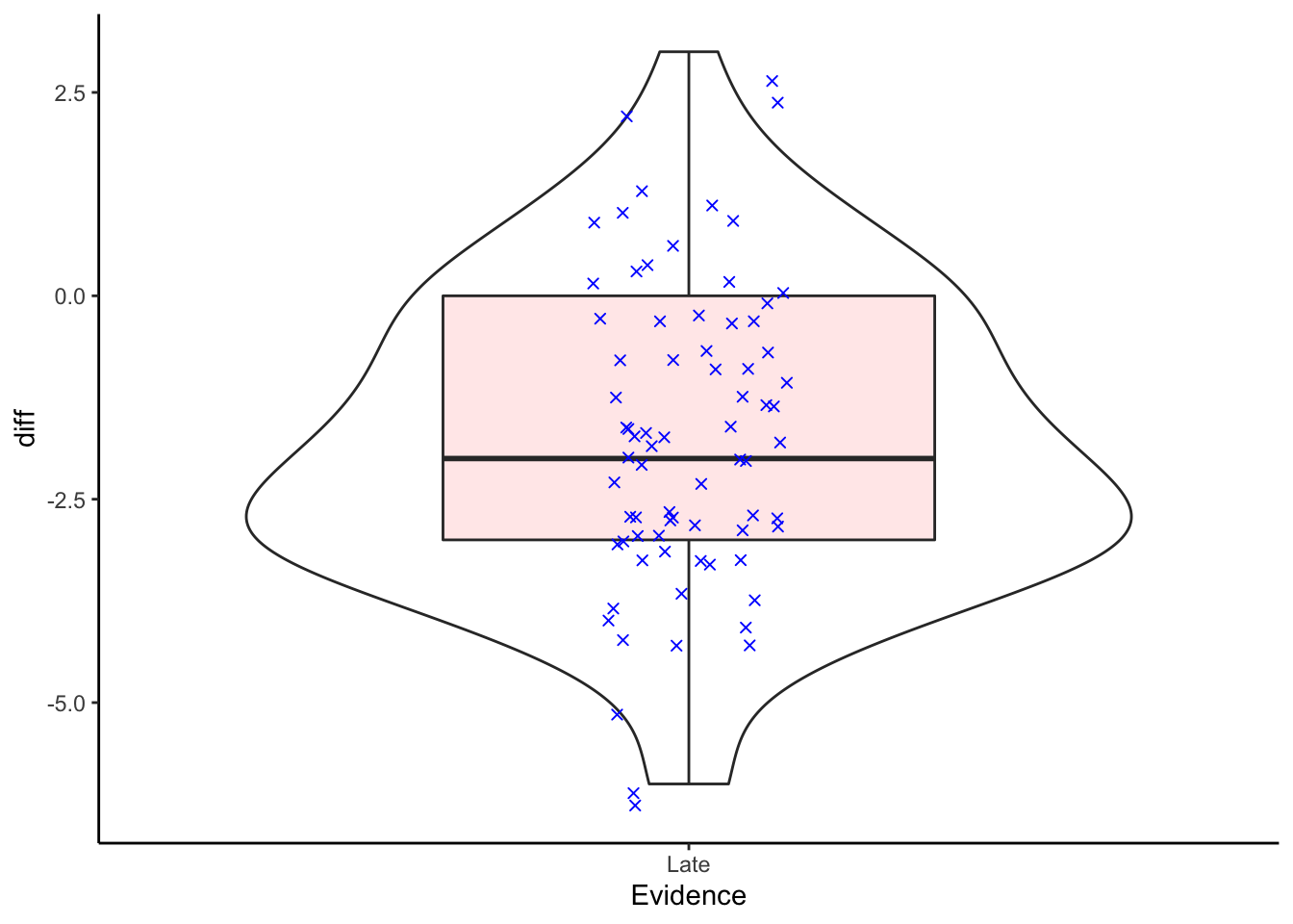
Figure 7.3: A violin and boxplot showing the distribution of the scores of the difference between the Thirteen and Twelve conditions. Individual participant data show as blue stars. Positive values would indicate that the rating in the Thirteen condition is higher than the rating in the Twelve condition. Oultiers will show as red circles.
Group Discussion Point
We have now checked our assumptions but we sort of still need to make a decision regarding normality. Having had a look at the figures we have created, spend a few minutes thinking about whether the data is normally distributed or not.
Also, spend a few minutes thinking about why this data shows no outliers but the individaul conditions did show an outlier. Lastly, think about why it is important to code different presentations of outliers from the individaul data points.
Is the data normally distributed or not
What you are looking for is a nice symmetry around the topp and bottom half of the violin and boxplot. You are looking for the median (thick black line to be roughly in the middle of the boxplot), and the whiskers of the boxplot to be roughly equal length. Also, you want the violin to have a the bulge in the middle of the figure and to taper off at the top and at the bottom. You also want to have just one bulge on the violin (symbolising where most of the scores are). Two bulges in the violin may be indicative of two different response patterns or samples within the one dataset.
Now we need to make our judgememt on normality. Remember that real data will never have the textbook curve that the normal distribution has. It will always be a bit messier than that and to some degree a judgement call is needed or you need to use a test to compare your sample distribution to the normal distribution. Tests such as a permutation bootstrap test that you saw in Chapter 5 (convert to z-scores and create a distribution of the difference of permuted means to the normal mean), or tests such as the Kolmogorov-Smirnov and the Shapiro-Wilks tests are sometimes recommended. However, these last two tests are not that reliable depending on sample size and often we revert back to the judgement call. Again this is really important why steps are documented so a future researcher can check and confirm the process.
Overall, the data looks normally distributed - at least visually.
Outliers vs DataPoints
You have to be careful when using geom_jitter() to show individual data points. You can overcomplicate a figure and if you have a large number of participants then it might not make sense to include the individual data points as it can just create a noisy figure. A second point is that you want to make sure that your outliers are not confused with individual data points; all outliers are datapoints but not all data points are outliers. So, in order not to confuse data and outliers, you need to make sure you are properly controlling the colors and shapes of different information in a figure. And be sure to explain in the figure legend what each element shows.
Lastly, you will have noted that when we plotted the original boxplots for the individual conditions, the Thirteen group had an outlier. However now when we plot the difference as a boxplot we see no outliers. This is important and reinforces why you have to plot the corret data in order to check the assumptions. The assumptions for a within-subjects t-test is based on the difference between the scores of individual participants. What we see here is that when we calculate the difference of scores there is no outlier, even though the original data point was an outlier. That is fine within consideration of the assumption - as the assumption only looks at the difference. That said, you might also want to check that the original outlier was an acceptable value on the rating scale (e.g. between 1 and 9) and not some wild value that has come about through bad data entry (e.g. a rating of 13; say if the rating and the condition got mixed up somehow).
Great. We have run some data checks on the assumptions of the within-subjects t-test. To remind you, the assumptions of a within-subjects t-test are:
- All participants appear in both conditions/groups.
- The dependent variable must be continuous (interval/ratio).
- The dependent variable should be normally distributed.
We checked the data for normal distribution, using a violin plot and a boxplot, looking for skewed data and outliers. And from our understanding of the data, and of arguments in the field, whilst the rating scale used could be called ordinal, many, including Furnham treat it as interval. Finally, we haven't spotted any issues in our code to suggest that any participant didnt give a response in both conditions but we can check that again in the descriptives - both conditions should have an n = 75.
We will do that check and also run some descriptives to start understanding the relationship between the two levels of interest: Timepoint 12 and Timepoint 13.
7.3.6 Task 6: Calculating Descriptives
- Calculate the mean, standard deviation, and Lower and Upper values of the 95% Confidence Interval for both levels of the Independent Variable (the two timepoints). You will need to also calculate the
n()- see Chapter 2 - and the Standard Error to complete this task. Store all this data in a tibble calleddescriptives.
- The solution shows the values you should obtain but be sure to have a go first. Be sure to confirm that both groups have 75 people in it!
- Answering these questions may help on calculating the CIs:
Quickfire Questions
- From the options, which equation would use to calculate the LowerCI?
- From the options, which equation would use to calculate the UpperCI?
-
group_by()the categorical columnTimepoint. This is the column you want to compare groups for. -
summarise() -
Different calculations can be used within the same
summarise()function as long as they are calculated in the order which you require them. For example, you first need to calculate the participant number,n = n(), and the standard deviation,sd = sd(variable), in order to calculate the standard error,se = sd/sqrt(n), which is required to calculate your Confidence Intervals. -
For the 95% Confidence Interval, you need to calculate an LowerCI and a UpperCI using the appropriate formula. Remember it will be
mean + 1.96seandmean - 1.96se. If you don't include the mean then you are just calculating how much higher and lower than the mean the CI should be. We want the actual interval
Let's think about your task. You're looking to calculate the 95% Confidence Interval for normally distributed data. To do this you require a z-score which tells you how many standard deviations you are from the mean. 95% of the area under a normal distribution curve lies within 1.96 standard deviations from the mean; i.e. 1.96SD above and below the mean.
If you were looking to calculate a 99% Confidence Interval you would instead use a z-score of 2.576. This takes into account a greater area under the normal distribution curve and so you are further away from the mean (i.e. closer to the tail ends of the curve), resulting in a higher z-score.
7.3.7 Task 7: Visualising Means and Descriptives
- Using the data in
descriptives, produce a plot that visualises the mean and 95% Confidence Intervals.- One way would be a basic barplot, shown in previous chapters, with error bars indicating the 95% CI.
- To add the error bars you could add a layer like below.
- Feel free to embellish the figure as you see fit.
- We have shown a couple of options in the solution that you should look at and try adjusting, after you have tried your own plot.
geom_errorbar(aes(ymin = LowerCI, ymax = UpperCI),
position = "dodge", width = .15)-
We recommend using
geom_col() -
Remember to add (+) the
geom_errorbar()line above to your code! Don't pipe it. -
In the above code for error bars, the aesthetic,
aes(), allows you to set the min and max values of the error bars - these will be the max and min of your CIs. -
position = "dodge"does the same asposition = position_dodge()andposition = position_dodge(width = .9). There are a number of ways to use a position call and they all do the same thing.
Important to remember: as we have mentioned in previous labs, barplots are not that informative in themselves. Going ahead in your research, keep in mind that you should look to use plots that incorporate a good indication of the distribution/spread of the individual data points as well, when needed. Barplots give a good representation on categorical counts like in a chi-square test but not so much on ordinal or interval data where there is likely to be a spread.
Group Discussion Point
Now that we have some descriptives to look at we need to think what they tell us - or really how we interpret them. First thing is to think back to the hypothesis as every interpretation is phrased around the hypothesis. We hypothesised that there would be a significant decrease in ratings of guilt, caused by presentation of the critical evidence, from Timepoint 12 to Timepoint 13. Spend a few minutes talking to your group about whether you think there will be a significant difference between the two timepoints. What evidence do you have? Think about the overlap of confidence intervals! Remember the key thing at this stage is that it is a subjective impression - "It appears that there might be...." or words to that effect.
7.3.8 Task 8: The t-test
Now we have checked our assumptions and ran our dscriptives, the last thing we need to do is to perform the within-subjects t-test to test the differences between the two time points.
To perform the within-subjects t-test you use the same t.test function as you did in Chapter 6. However, this time you add the argument, paired = TRUE, as this is what tells the code "yes, this is a paired t-test".
- Perform a paired-sample t-test between guilt ratings at the crucial time points (Twelve and Thirteen) for the subjects in the late group. Store the data (e.g.
tidy) in a tibble calledresults.
From your work in earlier chapters you will know two ways to use the t.test() function. It might help to read the additional materials at the end of Chapter 6 if that is still unclear. But basically the two options are:
The formula approach
-
t.test(x ~ y, data, paired = TRUE/FALSE, alternative ="two.sided"/"greater"/"less") -
where
xis the columns containing your DV andyis typically your grouping variable (i.e. your independent variable).
The vector approach
-
t.test(data %>% filter(condition1) %>% pull(data),data %>% filter(condition2) %>% pull(data), paired = TRUE) -
To pull out the
TwelveandThirteencolumns to pass ascondition1andcondition2, you can use:lates %>% pull(Twelve)andlates %>% pull(Thirteen).
Regardless of method
-
Do not forget to state
paired = TRUEor you will run a between-subjects t-test -
Once you've calculated
results, don't forget totidy()- you can add this using a pipe! -
If you don't quite understand the use of
tidy()yet, run yourt.test()withouttidy()and see what happens! -
Note: Both options of running the t-test will give the same result. The only difference will be whether the t-value is positive or negative. Remember that the vector approach allows you to state what is condition 1 and what is condition 2. The formula approach just runs conditions alphabetically.
Group Discussion Point
Now look at the output of your test within the tibble results. In your group, spend some time breaking down the results you can see. Do you understand what all the values mean and where they come from. You may have to match up some of your knowledge from your lectures. Was there a significant difference or not? We are about to write it up so best we know for sure. How can you tell? One you have had some time to discuss the output, try to complete the next task.
7.3.9 Task 9: The Write-up
Fill in the blanks below to complete this paragraph, summarising the results of the study. You will need to refer back to the information within results and descriptives to get the correct answers and to make sure you understand the output of the t-test.
- Enter all values to two decimal places and present the absolute t-value.
- The solutions contain a completed version of this paragraph for you to compare against.
"A was ran to compare the change in guilt ratings before (M = , SD = ) and after (M = , SD = ) the crucial evidence was heard. A difference was found (t() = , p ) with Timepoint 13 having an average rating units lower than Timepoint 12. This tells us `
-
t-tests take the following format: t(df) = t-value, p = p-value
-
your
resultsstates degrees of freedom asparameter, and your t-value asstatistic. -
estimateis your mean difference between ratings at Timepoints Twelve and Thirteen. -
The
conf.lowandconf.highvalues are the 95% Confidence Intervals for the mean difference between the two conditions. We havent included them in the write-up here but you could do. This could be written as something like, "there was a difference between the two groups (M = -1.76, 95% CI = [-2.19, -1.33])".
Note: If you were to write up the above for your own report, you can make your write-up reproducible as well by using the output of your tibbles and calling specific columns. For example, t(`r results$parameter`) = `r results$statistic %>% abs()`, p < .001, when knitted will become t(74) = 8.23, p < .001. So code can prevent mistakes in write-ups! However working with rounding up p-values can be tricky and we have offered a code to show you how, in the solutions.
Note: Another handy function when writing up is the round() function for putting values to a given number of decimal places. For example in the above if we wanted to round the absolute t-value to two decimal places we might do results %>% pull(statistic) %>% abs() %>% round(2) which would give t = 8.23. Or maybe we want three decimal places: results$statistic %>% abs() %>% round(3) which would give t = 8.232. So really handy function and follows the format of round(value_to_round, number_of_decimal_places)
Job Done - Activity Complete!
Excellent work! You have now completed the PreClass and InClass activities for this chapter! You can see how performing the t-test is only a small part of the entire process: wrangling the data, calculating descriptives, and plotting the data to check the distributions and assumptions is a major part of the analysis process. Over the past Chapters, you have been building all of these skills and so you should be able to see them being put to good use now that we have moved onto more complex data analysis. Running the inferential part is usually just one line of code.
If you're wanting to practice your skills further, you could perform a t-test for the "middle" group where the crucial evidence was presented on time point 9. Otherwise, you should now be ready to complete the Homework Assignment for this lab. The assignment for this Lab is summative and should be submitted through the Moodle Level 2 Assignment Submission Page no later than 1 minute before your next lab. If you have any questions, please post them on the available forums for discussion or ask a member of staff. Finally, don't forget to add any useful information to your Portfolio before you leave it too long and forget.
7.4 Assignment
This is a summative assignment and as such, as well as testing your knowledge, skills, and learning, this assignment contributes to your overall grade for this semester. You will be instructed by the Course Lead on Moodle as to when you will receive this assignment, as well as given full instructions as to how to access and submit the assignment. Please check the information and schedule on the Level 2 Moodle page.
7.5 Solutions to Questions
Below you will find the solutions to the questions for the Activities for this chapter. Only look at them after giving the questions a good try and speaking to the tutor about any issues.
7.5.1 InClass Activities
7.5.1.1 InClass Task 1
library(broom)
library(tidyverse)

ratings <- read_csv("GuiltJudgements.csv")7.5.1.2 InClass Task 2
lates <- ratings %>%
  filter(Evidence == "Late") %>%
  select(Participant, Evidence, `12`, `13`) %>%
  rename(Twelve = `12`, Thirteen = `13`) %>%
  pivot_longer(cols = Twelve:Thirteen,
               names_to = "Timepoint",
values_to = "GuiltRating")- If you have carried this out correctly,
lateswill have 150 rows and 4 columns. This comes from 75 participants giving two responses each - TimePoint 12 and TimePoint 13.
7.5.1.3 InClass Task 3
lates %>%
  ggplot(aes(GuiltRating)) +
  geom_histogram(binwidth = 1) +
 facet_wrap(~Timepoint) +
  labs(x = "GuiltRating", y = NULL) +
theme_bw()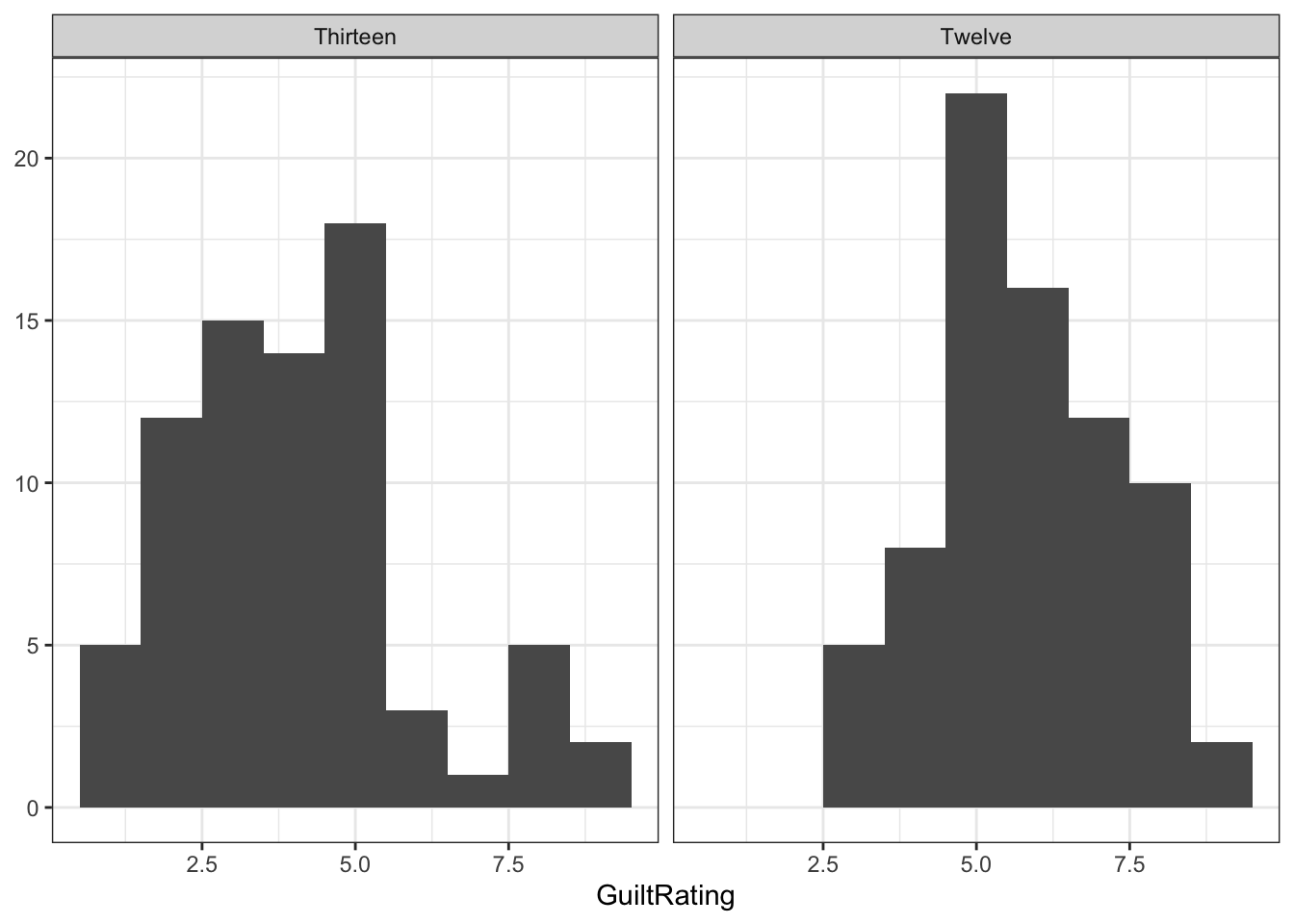
Figure 7.4: Potential Solution to Task 3
7.5.1.4 InClass Task 4
The Task only asks for the boxplot. We have added some additional functions to tidy up the figure a bit that you might want to play with.
lates %>%
  ggplot(aes(x = Timepoint,
             y = GuiltRating)) +
  geom_boxplot() +
  scale_y_continuous(breaks = c(1:9)) +
  coord_cartesian(xlim = c(.5, 2.5), ylim = c(1,9), expand = TRUE) +
  theme_bw()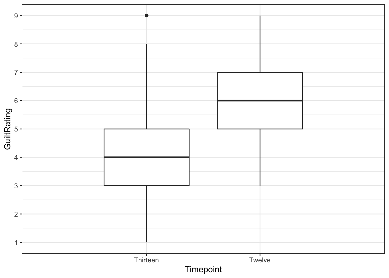
Figure 7.5: Potential Solution to Task 4
You can see that there is one outlier in the Thirteen condition. It is represented by the the single dot far above the whiskers of that boxplot.
7.5.1.5 InClass Task 5
We have added color but that was not necessary:
lates %>%
  ggplot(aes(x=Timepoint,y=GuiltRating))+
  geom_violin(aes(fill = Timepoint), alpha = .2) +
  geom_boxplot(width = 0.5) +
  scale_y_continuous(breaks = c(1:9)) +
  coord_cartesian(ylim = c(1,9), expand = TRUE) +
  theme_bw()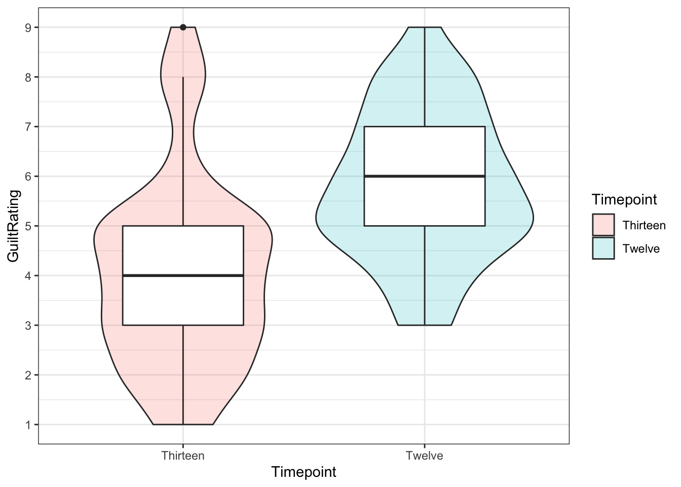
Figure 7.6: Potential Solution to Task 5
- You can still see the outlier at the top of the figure as a solid black dot.
You could even add the geom_jitter to have all the data points:
lates %>%
  ggplot(aes(x=Timepoint,y=GuiltRating))+
  geom_violin(aes(fill = Timepoint), alpha = .2) +
  geom_boxplot(width = 0.5) +
  geom_jitter(aes(fill = Timepoint), width = .1, alpha = .2) +
  scale_y_continuous(breaks = c(1:9)) +
  coord_cartesian(ylim = c(1,9), expand = TRUE) +
  theme_classic()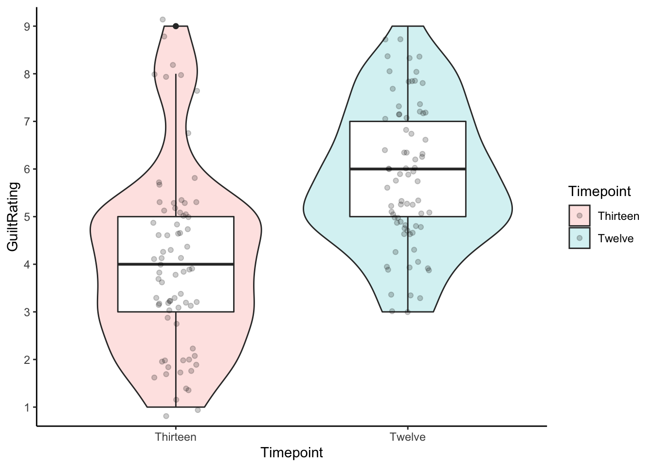
Figure 7.7: Alternative Potential Solution to Task 5
7.5.1.6 InClass Task 6
descriptives <- lates %>%
  group_by(Timepoint) %>%
  summarise(n = n(),
            mean = mean(GuiltRating),
            sd = sd(GuiltRating),
            se = sd/sqrt(n),
            LowerCI = mean - 1.96*se,
            UpperCI = mean + 1.96*se)
This would show the following data:
knitr::kable(descriptives, align = "c", caption = "Descriptive data for the current study")| Timepoint | n | mean | sd | se | LowerCI | UpperCI |
|---|---|---|---|---|---|---|
| Thirteen | 75 | 4.04 | 1.934327 | 0.2233569 | 3.602221 | 4.477779 |
| Twelve | 75 | 5.80 | 1.497746 | 0.1729448 | 5.461028 | 6.138972 |
7.5.1.7 InClass Task 7
- A basic barplot with 95% Confidence Intervals.
- We have embellished the figure a little but you can mess around with the code to see what each bit does.
ggplot(descriptives, aes(x = Timepoint, y = mean, fill = Timepoint)) +
  geom_col(colour = "black") +
  scale_fill_manual(values=c("#999000", "#000999")) +
  scale_x_discrete(limits = c("Twelve","Thirteen")) +
  labs(x = "Timepoint of Evidence", y = "GuiltRating") +
  guides(fill="none") +
  geom_errorbar(aes(ymin = LowerCI, ymax = UpperCI),
                position = "dodge", width = .15) +
  scale_y_continuous(breaks = c(1:9), limits = c(0,9)) +
  coord_cartesian(ylim = c(1,9), xlim = c(0.5,2.5), expand = FALSE) +
  theme_classic()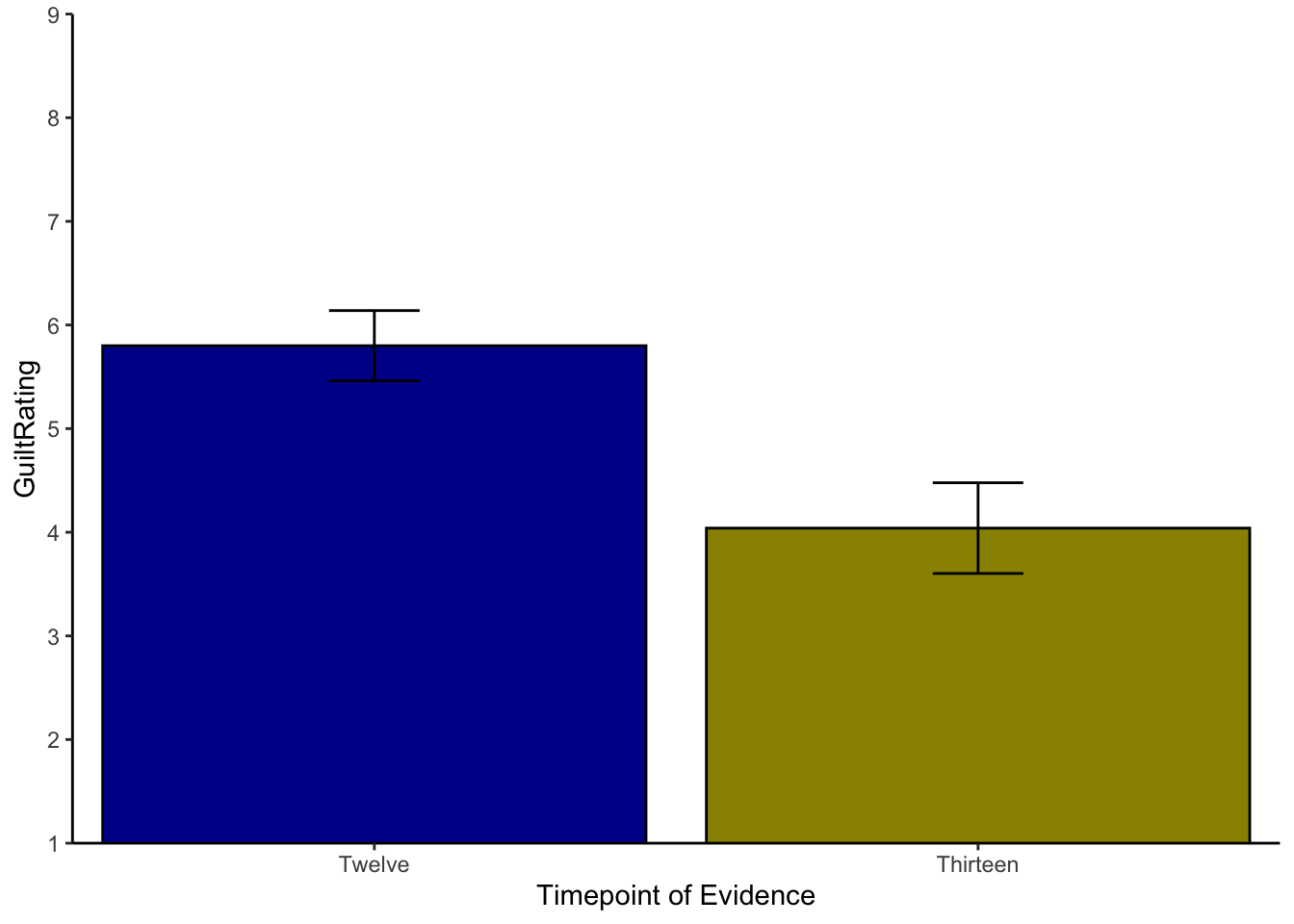
Figure 7.8: Possible Solution to Task 7
One thing to watch out for with the above code is the
scale_y_continuous()function which helps us set the length and tick marks (-) on the y-axis. Rather oddly, if you set thelimits = ...to the same values as theylim = ...incoord_cartesian()then your figure will behave oddly and may disappear.coord_cartesian()is a zoom function and must be set within the limits of the scale, set byscale_y_continuous().An alternative way to display just the means and errorbars would be to use the pointrange approach. This image shows again the 95% CI
ggplot(descriptives, aes(x = Timepoint, y = mean, fill = Timepoint)) +
  geom_pointrange(aes(ymin = LowerCI, ymax = UpperCI))+
  scale_x_discrete(limits = c("Twelve","Thirteen")) +
  labs(x = "Timepoint of Evidence", y = "GuiltRating") +
  guides(fill="none")+
  scale_y_continuous(breaks = c(1:9), limits = c(0,9)) +
  coord_cartesian(ylim = c(1,9), xlim = c(0.5,2.5), expand = FALSE) +
  theme_bw()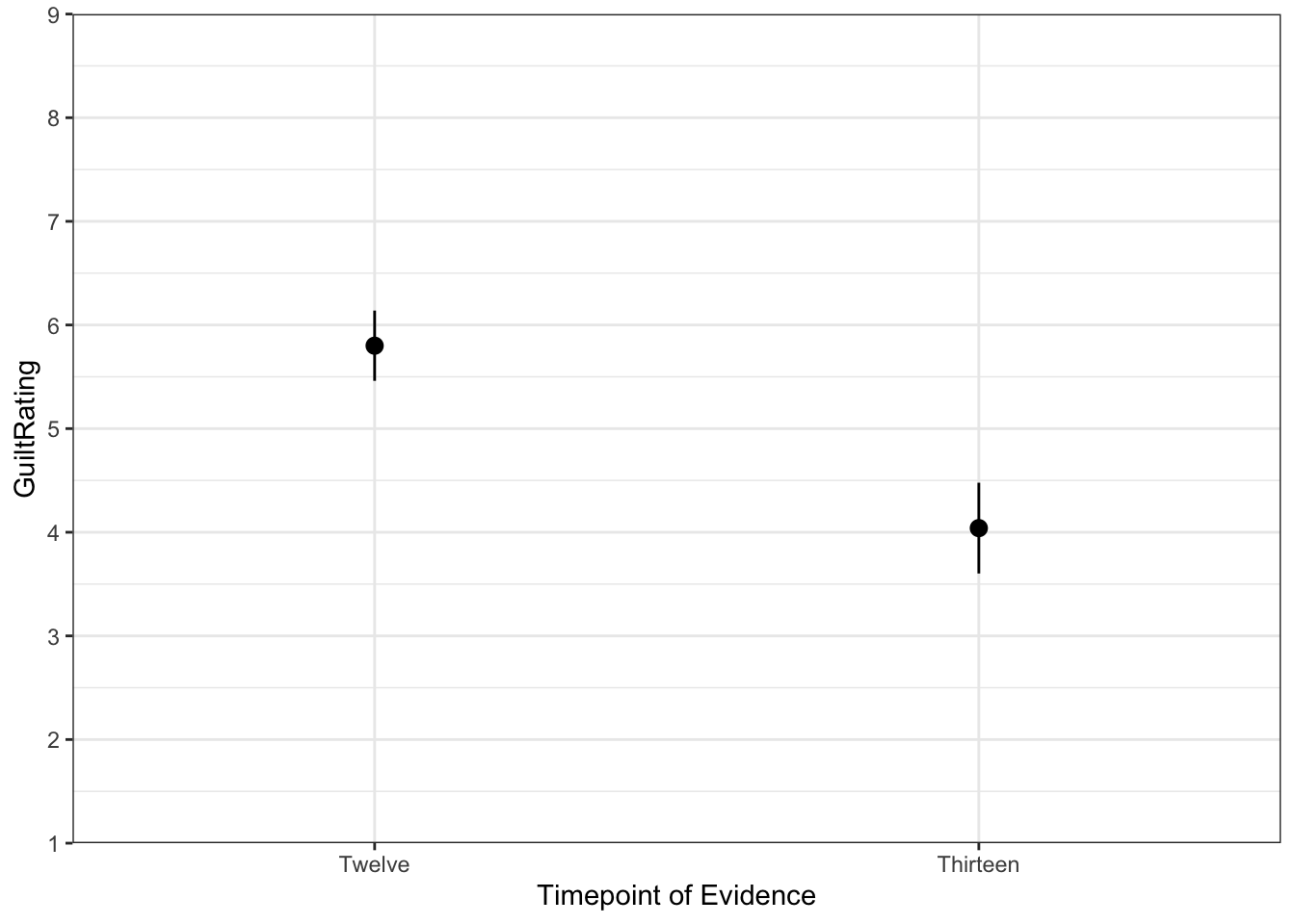
Figure 7.9: Alternative Solution to Task 7
7.5.1.8 InClass Task 8
- Remember to set
paired = TRUEto run the within-subjects t-test
results <- t.test(GuiltRating ~ Timepoint,
                  data = lates,
                  paired = TRUE,
alternative = "two.sided") %>% tidy()| estimate | statistic | p.value | parameter | conf.low | conf.high | method | alternative |
|---|---|---|---|---|---|---|---|
| -1.76 | -8.232202 | 0 | 74 | -2.185995 | -1.334005 | Paired t-test | two.sided |
- Alternatively, using the
filter()andpull()functions to make force in a given condition as the first condition. Here, below, we are forcing conditionThirteenas the first condition and so the values match the above approach. If you forced conditionTwelveas the first condition then the only difference would be that the t-value would change polarity (positive to negative or vice versa).
results <- t.test(lates %>% filter(Timepoint == "Thirteen") %>% pull(GuiltRating),
                  lates %>% filter(Timepoint == "Twelve") %>% pull(GuiltRating),
                  paired = TRUE,
alternative = "two.sided") %>% tidy()| estimate | statistic | p.value | parameter | conf.low | conf.high | method | alternative |
|---|---|---|---|---|---|---|---|
| -1.76 | -8.232202 | 0 | 74 | -2.185995 | -1.334005 | Paired t-test | two.sided |
The reason that the two outputs are the same is because the formula (top) method (x ~ y) is actually doing the same process as the second approach, but you are just not sure which is the first condition. This second approach (bottom) just makes it clearer.
Note: The conf.low and conf.high values are the 95% Confidence Intervals for the mean difference between the two conditions. This could be written as something like, "there was a difference between the two groups (M = -1.76, 95% CI = [-2.19, -1.33])".
7.5.1.9 InClass Task 9
A potential write-up for this study would be as follows:
"A paired-samples t-test was ran to compare the change in guilt ratings before (M = 5.8, SD = 1.5) and after (M = 4.04, SD = 1.93) the crucial evidence was heard. A significant difference was found (t(74) = 8.23, p = 4.7113406^{-12}) with Timepoint 13 having an average rating 1.76 units lower than Timepoint 12. This tells us that the critical evidence did have an influence on the rating of guilt by jury members."
Working with rounding p-values
When rounding off p-values that are less than .001, rounding will give you a value of 0 which is technically wrong - the probability will be very low but not 0. As such, and according to APA format, values less than .001 would normally be written as p < .001. To create a reader-friendly p-value, then you could try something like the following in your code:
ifelse(results$p.value < .001,
       "p < .001",
       paste0("p = ", round(results$p.value,3)))
So instead of writing t(74) = 8.23, p = 4.7113406^{-12}, you would write t(74) = 8.23, p < .001
The in-line coding for these options would look like:
p = `r results %>% pull(p.value)` for p = 4.7113406^{-12}
&
`r ifelse(results$p.value < .001, "p < .001", paste0("p = ", round(results$p.value,3)))` for p < .001
Chapter Complete!
7.6 Additional Material
Below is some additional material that might help you understand the tests in this Chapter a bit more as well as some additional ideas.
Non-Parametric tests
In this chapter we have really been focussing on between-subjects and within-subjects t-tests which fall under the category of parametric tests. One of the main things you will know about these tests is that they have a fair number of assumptions that you need to check first to make sure that your results are valid. We looked at how to do this in the main body of the chapter, and you will get more practice at this as we progress, but one question you might have is, what do you do if the assumptions aren't met (or are "violated"" as it is termed)?
So what options are there? Well actually you have already seen one - in Chapter 5. We could use permutation tests and bootstrapping (replication) techniques to compare two conditions. This is a nice approach as it has very few assumptions about the data - merely that the shape of the sample distribution is the shape of the population distribution. However permutation tests are a relatively new approach and require really thorough analytical skills to make sure you are doing them correctly when designs get complicated.
Alternatively, there are tests known as non-parametric tests that have fewer assumptions than the parametric tests and can be run quite quickly using the same approach as we have seen with the t-tests. The non-parametric "t-tests" generally don't require any assumption of normality and tend to work on either the medians of the data (as opposed to the mean values) or the rank order of the data - i.e. what was the highest value, the second highest, the lowest - as opposed to the actual value.
And just like there is slightly different versions of t-tests there are different non-parametric tests for between-subjects designs and within-subjects designs as such:
- The Mann-Whitney U-test is the non-parametric equivalent of the between-subjects t-test
- The Wilcoxon Signed-Ranks Test is the non-parametric equivalent of the within-subjects t-test.
- Note: Bootstrapping and permutation tests would also be considered non-parametric tests. However if you were to ask someone about a non-parametric version of a t-test they would likely think of the Mann-Whitney or the Wilcoxon Signed-Ranks Test depending on your design.
- Note: The Mann-Whitney and the Wilcoxon Signed-Ranks tests are now a bit antiquated as they were designed to be done by hand when computer processing power was limited. However they are still used in Psychology and you will still see them in older papers, so it is worth seeing one in action at least.
So for example, if you were concerned that your data was really far from being normally distributed, and weren't quite sure about permutation tests, you might use the Mann-Whitney or the Wilcoxon Signed-Ranks Test depending on your design. Here we will run through a Mann-Whitney U-test and then you can try out a Wilcoxon Signed-Ranks Test in your own time as it uses the same function - it is again just a matter of saying paired = TRUE.
Our Scenario
- Aim: To examine the influence of perceived reward on problem solving.
- Procedure: 14 Participants in 2 groups (7 per group) are asked to solve a difficult lateral thinking puzzle. One group is offered a monetary reward for completing it as quick as possible. One group is offered nothing; just the internal joy of getting the task completed and correct.
- Task: The participants are asked to solve the following puzzle. "Man walks into a bar and asks for a glass of water. The barman shoots at him with a gun. The man smiles, says thanks, and leaves. Why?"
- IV: Reward group vs. No Reward group
- DV: Time taken to solve puzzle measured in minutes.
- Hypothesis: We hypothesise that participants who are given a monetary incentive for solving a puzzle will solve the puzzle significantly faster, as measured in minutes to solve the puzzle, than those that are given no incentive.
Our Analysis
Here is our data and a boxplot of the data to try and visualise what is happening in the data.
| Participant | Group | Time |
|---|---|---|
| 1 | No Reward | 1.32 |
| 2 | No Reward | 3.56 |
| 3 | No Reward | 7.55 |
| 4 | No Reward | 8.05 |
| 5 | No Reward | 8.54 |
| 6 | No Reward | 10.18 |
| 7 | No Reward | 15.55 |
| 8 | Reward | 3.25 |
| 9 | Reward | 5.54 |
| 10 | Reward | 7.66 |
| 11 | Reward | 9.02 |
| 12 | Reward | 10.45 |
| 13 | Reward | 13.21 |
| 14 | Reward | 21.37 |
## Warning: `guides(<scale> = FALSE)` is deprecated. Please use `guides(<scale> =
## "none")` instead.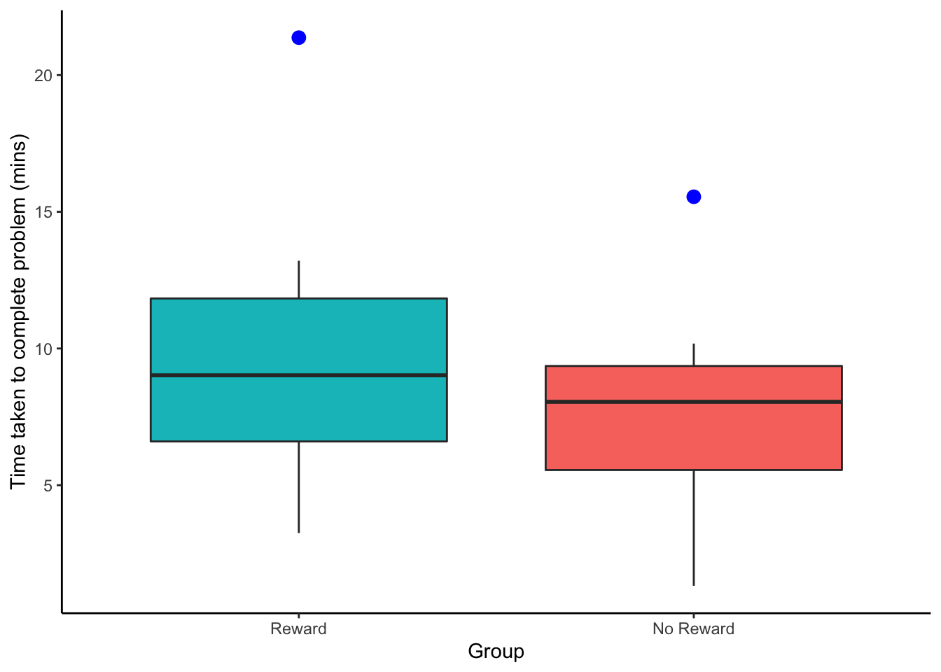
Figure 7.10: Boxplots showing the time taken to solve the puzzle for the two conditions, Reward vs No Reward. Outliers are represented by solid blue dots.
Looking at the boxplots there is potentially some issues with skew in the data (see the No Reward group in particular) and both conditions are showing as having at least one outlier. As such we are not convinced our assumption of normality is held so we will run the Mann-Whitney U-test - the non-parametric equivalent of the between-subjects t-test (i.e. independent groups) - as it does not require the assumption of normal data.
The descriptives
Next, as always, we should look at the descriptives as well to make some subjective, descriptive inference about the pattern of the results. One thing to note is that the Mann-Whitney analysis is based on the "rank order" of the data regardless of group. In this code and table below we have put the data in order from lowest to highest and added on a rank order column. We have used the rank() function to create the ranks and setting the ties.method = "average". We won't go into why that is the case here but you can read about it through ?rank.
scores_rnk <- scores %>%
  arrange(Time) %>%
mutate(ranks = rank(Time, ties.method = "average"))| Participant | Group | Time | ranks |
|---|---|---|---|
| 1 | No Reward | 1.32 | 1 |
| 8 | Reward | 3.25 | 2 |
| 2 | No Reward | 3.56 | 3 |
| 9 | Reward | 5.54 | 4 |
| 3 | No Reward | 7.55 | 5 |
| 10 | Reward | 7.66 | 6 |
| 4 | No Reward | 8.05 | 7 |
| 5 | No Reward | 8.54 | 8 |
| 11 | Reward | 9.02 | 9 |
| 6 | No Reward | 10.18 | 10 |
| 12 | Reward | 10.45 | 11 |
| 13 | Reward | 13.21 | 12 |
| 7 | No Reward | 15.55 | 13 |
| 14 | Reward | 21.37 | 14 |
Here is a table of descriptives for this dataset an the code we used to create it.
ByGrp <- group_by(scores_rnk, Group) %>%
  summarise(n_Pp = n(),
            MedianTime = median(Time),
MeanRank = mean(ranks))| Group | n_Pp | MedianTime | MeanRank |
|---|---|---|---|
| No Reward | 7 | 8.05 | 6.714286 |
| Reward | 7 | 9.02 | 8.285714 |
Based on figure and descriptive data we can suggest that there appears to be no real difference between the two groups in terms of time taken to solve the puzzle. The group that was offered a reward have a slightly higher spread of data than the no reward group. However the medians and mean ranks are very comparable.
The inferential test
We will now run the Mann-Whitney U-test to see if the difference between the two groups is significant or not. To do this, somewhat confusingly, we us the wilcox.test() function. The code to do the analysis on the current data (with the tibble scores, the DV in the column Time, and the IV in the column Group) is shown below. It works just like the t-test() functio in that you can use either vectors or the fomula approach.
- Note: There are a couple of additional calls in this function that you can read about using the
?wilcox.test()approach. - Note: We could just have easily used
scores_rnkas our tibble in thewilcox.test()as opposed toscores. We are usingscoresto show you that you don't need to put the ranks into thewilcox.test()function, it will create them itself when it runs the analysis. We only created them to run some descriptives.
result <- wilcox.test(Time ~ Group,
                      data = scores, alternative = "two.sided",
            exact = TRUE, correct = FALSE) %>%
  tidy()
And here is the output of the test after is has been tidied into a tibble using tidy()
| statistic | p.value | method | alternative |
|---|---|---|---|
| 19 | 0.534965 | Wilcoxon rank sum exact test | two.sided |
The main statistic (the test-value) of the Mann-Whitney test is called the U-value and is shown in the above table as statistic; i.e. U = 19 and you can see from the results that the difference was non-significant as p = 0.535.
- Note: The eagle-eyed of you will spot that the test actually says it is a Wilcoxon rank sum test. That is fine. The Mann-Whitney U is calculated from the sum of the ranks (shown in the table above). The Wilcoxon rank sum test is just that, a sum of the ranks. The U-value is then created from the summed ranks.
- Note: Also, don't mistake the Wilcoxon rank sum test mentioned here - for between-subjects - with the Wilcoxon Signed-Ranks test for within-subjects mentioned above. They are different tests
However, one thing to note about the U is that it is an unstandardised value - meaning that it is dependent on the values sampled and it can't be compared to other U values to look at the magnitude of one effect versus another. The second thing to note about the U-value is that wilcox.test() will return a diferent U-value depending on which condition is stated as Group 1 or Group 2.
Compare the outputs of these two tests where we have switched the order of the conditions:
Version 1:
result_v1 <- wilcox.test(scores %>% filter(Group == "Reward") %>% pull(Time),
                         scores %>% filter(Group == "No Reward") %>% pull(Time),
                         data = scores, alternative = "two.sided",
                         exact = TRUE, correct = FALSE) %>%
  tidy()
Version 2:
result_v2 <- wilcox.test(scores %>% filter(Group == "No Reward") %>% pull(Time),
                         scores %>% filter(Group == "Reward") %>% pull(Time),
                         data = scores, alternative = "two.sided",
                         exact = TRUE, correct = FALSE) %>%
  tidy()
The U-value for these two tests are, for Version 1, U = 30 and for Versoin 2, U = 19. This may seem odd but actually both those test are correct. However, strictly speaking the U-value is the smaller of the two-values given by the different outputs. It is to do with how the U-value is calculated. Both groups have a U-value and the one that is checked for significance is the smaller of the two.
So for the reasons mentioned above, when we present the Mann-Whitney U-test we usually also give a Z-statistic, which is the standardised version of the U-value. We also present an effect size, commonly r.
Z and r can be calculated as follows:
Z = \(\frac{U - \frac{N1 \times N2}{2}}{\sqrt\frac{N1 \times N2 \times (N1 + N2 + 1)}{12}}\)
r = \(\frac{Z}{\sqrt(N1 + N2)}\)
Putting these formulas into a coded format would look like this:
U <- result$statistic
N1 <- ByGrp %>% filter(Group == "Reward") %>% pull(n_Pp)
N2 <- ByGrp %>% filter(Group == "No Reward") %>% pull(n_Pp)
Z <- (U - ((N1*N2)/2))/ sqrt((N1*N2*(N1+N2+1))/12)
r <- Z/sqrt(N1+N2)
And as such the write-up could be written as:
The time taken to solve the problem for the Reward group (n = 7, Mdn Time = 9.02, Mean Rank = 8.29) and the no reward group (n = 7, Mdn Time = 8.05, Mean Rank = 6.71) were compared using a Mann-Whitney U-test. No significance difference was found, U = 19, Z = -0.703, p = 0.535, r = -0.188
Last point on calculating U
In the final write-up there we know, because of our codes, that U = 19 is the smallest U-value of the test. However had you put the alternative U, U = 30, when you calculated Z you would have got Z = 0.703, as opposed to Z = -0.703. So your standardised statistic will have the same value but just the opposite polarity (either positive or negative). That is fine though as you can look at the medians and mean ranks to make sure you are interpreting the data correctly.
However, what you do have to watch out for when writing up this test is that you are presenting the correct U-value - remembering that technically you should present the smallest of the two U-values (refer back to Version 1 and Version 2 of using the wilcox.test()) above. Fortunately you don't have to run both analyses to figure out which is the smaller U (though you could if you wanted). There is a quicker way using the below formula:
\(U1 + U2 = N1 \times N2\)
- where U1 is the U-value from your
wilcox.test()function - N1 is the number of people in one group (technically doesnt matter which group) and N2 is the number of people in the other group
We actually know both our U-values as we ran both tests; they are U1 = 30 and U2 = 19, and we know our two groups are N1 = 7 and N2 = 7. And if we put those numbers in the formula we get
\(U1 + U2 = N1 \times N2\)
=> \(30 + 19 = 7 \times 7\)
=> \(49 = 49\)
So both sides equal 49. But say you only know one of the U-values; you of course will know both Ns. Well you can quickly figure out the other U-value based on:
\(U2 = (N1 \times N2) - U1\)
for example, if you know U1 = 19, N1 = 7 and N = 7 then:
\(U2 = (7 \times 7) - 19\)
=> \(U2 = (49) - 19\)
=> \(U2 = 30\)
And then you just have to present the smallest of the two U-values, in this case U = 19.
That is it for this additional materials and hopefully you now have a decent understanding of the Mann-Whitney test. Remember you have the skills to simulate data to run some new examples. You could also try running a Wilcoxon Signed-Ranks Test as well though you might have to read a little on how to present those. It is similar to the Mann-Whitney though and you should be able to get there. However, if stuck, do ask!
Oh, and last last point, how to remember which test is which? Is the Mann-Whitney for between-subjects or within-subjects, and what is the Wilcoxon Signed-Ranks test for? You know they do different designs but which is which? Well, as silly as this memory aid is... The other name of between-subjects designs, as you know, is independent designs. Add to that the fact that the late great singer Whitney Houston once starred in "The Bodyguard" which was about maintaining your right to freedom and independence. So whenever you get stuck on knowing which test is which, remember Whitney wanted independence in The Bodyguard and you should be ok. We did not say this was a very good memory aid!
End of Additional Material!